After Color: Curated by Amani Olu @Bose Pacia

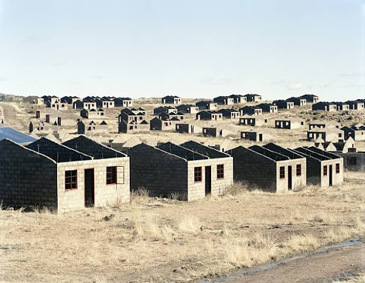
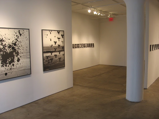
JTF (just the facts): A total of 32 works by nine different artists, hung in a single gallery space with a dividing wall. All of the works come from the period 2000-2009, with most made in the last year or so. The exhibit was curated by Amani Olu. (Installation shots at right.)

The following artists have been included in the show, with the number of works on display in parentheses and background details on the prints afterward:

  • Michael Bühler-Rose (3): Framed in white with no mat; 8×10, acrylic on photogram
  • Talia Chetrit (8): Framed in black with no mat; 8×10; gelatin silver contact prints, in editions of 4+1
  • Matthew Gamber (4): Not framed; 40×50; archival inkjet prints; in editions of 3
  • Stephen Gill (1): Artist book, unfolded to show 18 images; pinned to wall with no frame; in edition of 1000
  • Adrien Missika (4): Taped directly to wall with no frame; 8×12; screen prints on paper; in editions of 5
  • Pushpamala N (4): Framed in black with no mat; 5.75×8; C prints on metallic paper; in unlimited editions
  • Noel RodoVankeulen (1): Running loop of animated GIFs on screen; in edition of 10
  • Arthur Ou (3): Framed in grey metal with no mat; 51×40; archival pigment prints on silver rag tape; in editions of 4+1
  • Michael Vahrenwald (4): Framed in black with no mat; 16×24; gelatin silver prints; in editions of 5+2

Comments/Context: In a photography world recently and overwhelmingly dominated by digital color, the rightful place for work done in black and white is still unsettled. In just a few short years, making monochrome photographs has become a contrarian act, an overt rejection of the mainstream. For many, this rebellion is nostalgia in hiding, a desire to go back to the old, classic ways that we have loved for so long. But for others, using black and white represents a bolder and surprising step forward, a movement beyond the homogeneity of color and the search for something altogether new.

The group show now on at Bose Pacia gathers together a sampling of photographers who are testing this new boundary, using black and white as an element of more conceptual work. The standouts in this show (for us) are Matthew Gamber, Stephen Gill, and Talia Chetrit; many of the others seemed a bit forced – trying too hard or still struggling to refine their ideas into something truly novel.

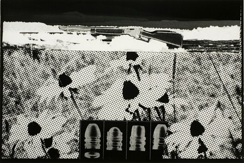
Matthew Gamber makes images of empty, erased chalkboards. From a distance, they appear rubbed and washed, the slate color tinged with remnants of white. Up close, the boards are covered in minute scratches and scrapes, smudges and tape residue, creating a historical record of wear and tear (or perhaps the scene of a ritual erasing of a Cy Twombly). Overall, they are hauntingly meditative and quiet.

Stephen Gill’s artist book A Series of Disappointments creates a typology like conceptual framework for the infinite variety found in losing betting slips. They are crumpled and crushed, folded and balled, ripped and twisted, all discarded. Photographed against a neutral grey background, they become a kind of delicate origami of loneliness and despair.

Talia Chetrit’s Photoshop gradients bring to mind the nuanced experiments with light of Luisa Lambri. The best of these abstract works play with the edges of tonality, adding an element of cool refinement to color field painting. This type of camera-less Photoshop art seems to signal a big open space for artists to explore (Cory Arcangel is another artist/photographer working in this mode), the new technology asking and requiring artists to make new innovative art, rather than making the same old pictures in new ways. In just a few years, I expect we’ll see an entire subcategory of this kind of work.

Overall, this is a well edited show that provides a thoughtful array of new black and white work. While I’m not sure it delivers a satisfyingly complete answer for what comes “after color”, it certainly provides some potential signposts for where to look for the answers.

Collector’s POV: None of the emerging artists in this show have any meaningful secondary market, so collectors will need to consider gallery retail as the only available option for acquiring the work. A quick rundown on the generally reasonable prices:

  • Michael Bühler-Rose: $800 each
  • Talia Chetrit: 8 images sold as a set for $6400
  • Matthew Gamber: $4500 each
  • Stephen Gill: $350 for book
  • Adrien Missika: $850 each
  • Pushpamala N: $300 each
  • Noel RodoVankeulen: $280
  • Arthur Ou: $6000 each
  • Michael Vahrenwald: $2000 each

Rating: * (one star) GOOD (rating system described here)

Transit Hub:

  • Stephen Gill artist website (here)
  • Matthew Gamber artist website (here)
  • Talia Chetrit artist website (here)
  • Flavorwire interview with Amani Olu (here)
  • Amani Olu website (here)
  • Charlotte Cotton: The New Color: The Return of Black-and-White (here)

After Color: Curated by Amani Olu
Through August 21st

Bose Pacia
508 West 26th Street
New York, NY 10001

Intersections Intersected: The Photography of David Goldblatt @New Museum

JTF (just the facts): A total of 94 images (a mix of black and white and color) and 4 artist books, displayed on the 3rd and 4th floors of the museum. The black and white images have been framed in black with no mat, the larger color images have been binder clipped and pinned directly to the walls without frames. The images were taken between the mid 1960s and the present; all of the prints are modern exhibition prints. The exhibition was curated by Richard Flood. (Since no photography is allowed in the New Museum, unfortunately there are no installation shots of this exhibit. Incomplete houses, part of a stalled municipal development of 1000 houses. Lady Grey, Eastern Cape, 5 August 2006, at right, via Haunch of Venison.)

Comments/Context: South African photographer David Goldblatt has been documenting the complexities of life in his native country for over 50 years. Rather than focusing on the obvious flash points of history and revolution, he has instead consistently pointed his camera at the subtle incidents of everyday life that represent those frictions, and documented their often permanent imprints on the land, almost like an archaeologist, showing the remnants left behind as evidence of what happened before.
The exhibition now of view at the New Museum gathers together a wide array of Goldblatt’s work from various decades, with a heavy dose of recent color imagery, printed quite large. As such, the show doesn’t have a retrospective organization or feel; instead, it seems to be an exercise in using the old as a foil for the new, in mining the past and comparing it to the present in the search for meaning and truth.
The images on the fourth floor of the museum are arrayed in pairs: one black and white image, typically from the 1980s, and one color image, typically from the 2000s, hung side by side. While there are a few obvious “before” and “after” pairings, most of the combinations tell small stories from opposing viewpoints, or provide echoes and reverberations of similar themes across the years. There are juxtaposed images of graves of dirt and ornate tombstones, nationalist monuments and Mandela Square, fancy houses and squatter towns, and portraits of white farmers and a sea of crosses on the land. Dusty camps are seen to have become abandoned ruins or grassy knolls. All that is left of all the back and forth are the scars upon the dry scrubby land, and Goldblatt’s images typically encompass both the near foreground and the far horizon, allowing the viewer to see the residual effects on the land from a distance, and the slow hand of time that is eroding them away.
The third floor of the museum uses three distinct groups of images to consider different facets of the South African story. On the far left (if looking out from the elevators) are a selection of images from the recent Time of AIDS series, large color vignettes of life in the townships and shanties, often punctuated by a hand painted symbolic red ribbon. In a land without ubiquitous advertising, AIDS education takes place at dusty restaurants and empty truck stops, near public toilets and roadside statues of heroes.
Two small rooms on the right gather Goldblatt’s earlier portrait work (1970s), most of it square format black and white. These are images of everyday people of all races and lifestyles, in their homes and on the streets, often in pairs or families, but never far from the underlying cultural rubbing that permeates the society. It’s as if every single one has a back story, a longer narrative that explains the subtle movements or poses or looks that Goldblatt has captured, if we only knew what questions to ask.
The main part of the gallery space is used to display a series of large triptychs, where a single scene is photographed from several different angles, bringing out specific details or ironies embedded in the mundane (and bearing a stylistic resemblance to Paul Graham’s a shimmer of possibility series). A shop window contains both a ruffled table setting and a paper flyer looking for a missing girl; a roadside doctor’s office advertises treatments for a variety of maladies via a hand painted sign; a man washes his clothes; people linger around a pay day loan storefront; shoes are displayed, alongside a changing room. All of these take place against the backdrop of dusty towns, low rise buildings, dirt roads and rusty fencing, people scraping out a life in slow moving villages.
What I like best about this body of work is that has avoided the shouting and politics and taken a more complicated view of the real everyday struggles of life in South Africa. To my eye, time seems to have stopped in these pictures; memory refuses to go away, even though a new life is being built right on top of the old. It is a reminder that while democracy may overthrow tyranny, deep societal change comes slowly, new problems emerge out of the ashes of old ones, and history remains a very real part of who a people are. The answer to “now what?” isn’t always easy or obvious.
Needless to say, this is the best photography exhibit on view this summer in New York, so if you’re going to leave the beach for only one show, this is it.

Collector’s POV: David Goldblatt is represented by Goodman Gallery in Johannesburg (here). In recent years, Goldblatt’s work has not been available much in the main thoroughfares of the secondary markets; that said, a few images have come up for sale in more out of the way venues, so all in, it’s hard to derive much of an overall pricing pattern for his prints. I came away from this show with a renewed respect for Goldblatt’s work and a strong desire to see more; we’ll especially dig back into the earlier black and white work (likely via books, if we can put our hands on them), looking for an image that would fit into our city genre.

Rating: *** (three stars) EXCELLENT (rating system described here)

Transit Hub:
  • Artist site (here)
  • New York magazine slideshow (here)
  • 2006 Hasselblad Award (here)
  • Review of Intersections Intersected book @5B4 (here)
  • 2006 BAM exhibit (here)
  • 1998 MoMA exhibit (here)
Through October 11th

235 Bowery Street
New York, NY 10002

Mitch Epstein in the NY Times Magazine

A handful of Mitch Epstein’s images from his ongoing series American Power were used to highlight an article about wind power in this past weekend’s New York Times Magazine (here). There was an additional picture used on the table of contents page, but I can’t seem to find a link to that specific image anywhere (it was another one of wind turbines, in this case, flanking a golf course).

Epstein has been working on this series for many years now (artist site here, review of 2007 Sikkema Jenkins show here), and new images seem to find their way into the press from time to time. With all the attention focused on climate change and energy policy in this country, these images couldn’t have come at a more opportune time. A monograph of the entire body of work is in progress, to be published by Steidl in September (here).

Carlos Jiménez Cahua, Lima @Anastasia

JTF (just the facts): A total of 10 color images, framed in white with no mat, and hung against grey walls in a single room gallery space. All of the images were taken in 2007. The prints are ink jet on dibond, in sizes either 35×44 or 55×43. (Installation shots at right.)

Comments/Context: In his first solo show now on view at Anastasia Photo, Carlos Jiménez Cahua documents the sprawling towns on the edge of desert outside Lima, Peru. Low rise buildings made of brick and concrete, corrugated tin and plywood, with blue plastic sheeting for windows, cover the dusty land in suffocating edge to edge clusters. Rectangular boxes repeat for mile after mile, as though they were self-replicating, creating geometric patterns in the dun colored land. Misty orange street lights bathe the settlements in eerie light when the sun retreats.

Never completely out of sight are the encroaching mounds of dirt and sand, looming ominously in the background or swirled into a think foggy soup by the wind. The towns seem precipitously perched on the edge of the powerful desert, at the mercy of the natural forces that push the sand into every crack and crevice. The forecast each day seems to call for yet another dust storm.

Out of this gritty geography, Cahua has discovered a variety of memorable moments: the cinder block cemetery, full of small bricked up pods for the dead; the missing building amidst the density of the built environment, the solitary structure covered in neon paper posters. To my eye, these pictures are about the desperation of people who are forced to live in an inhospitable environment, fighting an uphill battle day after day to gain a toe hold against a land that is indifferent to their struggle.

Collector’s POV: The images in this show are priced at $2000 or $2500, depending on size. This show is another reminder of the power of well made documentary photography, and a solid first outing for a promising new photographer.

Rating: * (one star) GOOD (rating system described here)

Transit Hub:
  • Artist site (here)
Through August 15th

Anastasia Photo
166 Orchard Street
New York, NY 10002

Julius Shulman Dies

Famed architectural photographer Julius Shulman died earlier this week at the age of 98. Shulman is best known for his images of modernist architecture in California. (Kauffman House, 1947, at right, via Yancey Richardson Gallery.)

The moniker “architectural photographer” seems to me to have a slightly negative connotation, as though taking pictures of buildings is somehow easier or less important than taking pictures of people or landscapes or other subjects. I think Shulman was really a nuanced portrait photographer; his portraits were simply of built structures rather than people. And while some might consider many of his works to be celebrations of the architects who conceived and engineered the buildings, I think this misses the artistry and craftsmanship Shulman brought to his photographs. While not every image of a building he took is a stunner (and many of the subjects he was tasked with challenged conventions of beauty in architecture), Shulman always found a way to make an original view of the structure, rather than a simple, straight up documentary shot. Most often, he gave the viewer a feeling for how the building “felt” – whether from the outside (via its relationship to its site) or the inside (via its interior spaces).

Collector’s POV: Julius Shulman is represented by Yancey Richardson Gallery in New York (here). His works have regularly found their way into the secondary markets, nearly always selling for affordable prices, most between $1500 and $3000.

Transit Hub:

  • Obituaries: LA Times (here), NY Times (here)
  • Modernity and Metropolis @Getty, 2006 (here)

Lee Friedlander, Stems

JTF (just the facts): Published in 2003 by Distributed Art Publishers (here). 96 pages with a total of 65 black and white images. Includes a short introductory essay by the artist. (Cover shot at right, via Photo Eye.)

Comments/Context: Over his long career, Lee Friedlander has made many superior photography books, but Stems is my favorite. Taken during the mid 1990s when Friedlander was nursing a pair of bad knees, this series captures still life images of various vases of cut flowers that his wife regularly placed in their home. In the recent history of floral photography, these images are among the very small number of truly innovative pictures of the subject matter made in the past decade.

As the title implies, Friedlander points his camera not at the showy blossoms, but at the clusters of intertwined stems and leaves, jammed into glass vases filled with water. Each flower type on display has its own stem characteristics: thorns for roses, serrated edges for burning bush twigs, smooth elegant tubular forms for tulips and lilies, and bushy leaves for daisies. The stems are then placed in a spectrum of glass containers, from short and round to tall and square, with swirled and shaped vases in between, the combination of glass and water creating a surprising number of visual effects: fogs and bubbles, distortions and exaggerations.

Freidlander’s images have always had a signature chaos to them, a claustrophobic clustering of activity, intersecting planes and lines coming together in complex compositions. The stem still lifes are no different: the cut ends of the flowers fight each other for space in the constrained environment, creating thickets and layers of vertical lines, with broad leaves squished against the glass as contrast. Some of the vases are overfilled, choked with stems, while others have only a handful of stems or are even empty. By varying the viewing angle, Friedlander is able to use the reflections and distortions from the glass and water to further complicate the puzzle. In the end, the stems have been transformed from the boring, utilitarian end of the flower into something altogether more exciting: at once lush and luxurious, or harsh and threatening, but altogether original.

Collector’s POV: Lee Friedlander is represented by Fraenkel Gallery in San Francisco (here). Very few images from the Stems series have come up for auction, so gallery retail is likely the best option for interested collectors. In our case, given the strength of the work presented here, several years ago, we purchased an image from Stems (here) for the floral genre of our collection. The book itself is a lavish and elegant publication, with beautiful reproductions on tactile paper; it is a master class lesson in book making.

Transit Hub:

  • Lee Friedlander: A Ramble in Olmstead Parks, 2008 @Met (here)
  • Friedlander, MoMA retrospective, 2005 (here)
  • MoMA holdings (here)

Gerco De Ruijter

JTF (just the facts): Published in 2004 by Basalt Publishers. 76 pages, with 7 black and white and 46 color images. Includes an essay (in Dutch) by Petran Kockelkoren. All of the images included in the book were made between 1993 and 2003. Most of the prints are square format, in 6×6 or 32×32 dimensions; a few are wide panoramas at 33×79. (Cover shot at right, via Schaden.)

Comments/Context: In the past year or so, I’ve run across the aerial images of Dutch photographer Gerco De Ruijter in several group exhibitions and books, and so when I saw this slim monograph in the ICP bookshop recently, I was happy to bring it home for further study.

The primary difference between De Ruijter’s work and that of classic aerial photographers like William Garnett (recent review here) is derived from a change in overall scale. Instead of taking images out of the window of an airplane (thousands of feet in the air), De Ruijter makes his pictures via a camera mounted to the bottom of a kite (hundreds of feet in the air), triggering the shutter via remote control mechanism. Using this unusual approach, the artist is able to create aerial images that are much more intimate, with a more obvious relationship to the ground (even though the horizon is cropped out), and with a much finer grain of detail. Trees, grasses, waves, sand, rocks, and farm crops all are rendered with minute texture; farm animals look like plastic toys rather than dark spots.

The other main difference is of course in the landscape itself, where the countryside has been carefully altered by the Dutch over the centuries, creating a latticework of ditches and canals that slash through the land. When seen from the air, a pattern of geometric color planes is seen, divided and separated by the straight lines of roads and waterways. Endless rows of greenhouses and tractor furrows further align the unruliness of nature into simple strict forms. Even the trees have often been planted in perfectly symmetical grids.

While it might be a cliche to say that many of De Ruijter’s works hearken back to the precise geometries of Mondrian, it is fair to say that these works are highly structured, even though many depict an unkempt area of nature. While there is clearly an element of chance in the taking of these pictures, De Ruijter has clearly edited the work down to those images that have the strongest formal relationships, compositions that juxtapose fields of color to create contrast and pattern (especially when viewed from a distance).

In general, I like this work, and hope to get beyond seeing a single image in a Dutch themed group show and on to a deeper viewing of more of the work in person some point soon. In the meantime, this small monograph will have to suffice.

Collector’s POV: Gerco De Ruijter is represented by MK Galerie in Rotterdam/Berlin (here). To my knowledge, he does not have New York representation at this point, nor has his work found its way to the secondary markets in any meaningful way, so European gallery retail is the only likely avenue for follow up at this point. De Ruijter’s images would clearly make a nice contemporary addition to a series of aerial works (Garnett, Ruscha, Gowin, Burtynsky, Bridges, et al), to a collection centered on abstraction in found forms, or to an exploration of contemporary approaches to traditional landscape.

Transit Hub:

  • Artist website (here)
  • Borders @MK Galerie, 2008 (here)
  • Nature as Artifice @George Eastman House (here)
  • Dutch Dare (here)
  • H+F Collection (here)

William Garnett, Aerial Photographs

JTF (just the facts): Published in 1994 by the University of California Press. 159 pages, with 73 black and white images. Includes an introduction by Martha Sandweiss, a list of exhibitions and a bibliography. The images were made between the early 1950s and the mid 1980s. (Cover shot at right, via Amazon.)

Comments/Context: We had been searching for an inexpensive copy of this book for our library for quite a few years when recently I finally managed to unearth one on the Internet for an affordable sum. As I hold it in my hands now, it was certainly worth the wait.

While aerial photography began back with balloon flights and early airplane experiments decades earlier, William Garnett was the first flying photographer to move the images beyond their geographical/topographical/military beginnings and into the realm of art. In this volume, Garnett’s subjects are primarily the hills and valleys of the Western United States: sand dunes, water eroded canyons, the twists and turns of rivers fingering out into deltas, salt flats, frothy ocean surf, and the farmland patterns made by plows, tractors and irrigation.

In spirit, these images have much in common with the Ansel Adams school of photography: meticulous attention to craft, resulting in crisp prints with broad tonal ranges, and an overall perspective that well made images of the glories of the West could be important in the larger movement toward environmental preservation/conservation. In actual look however, with the horizon lines cropped out, many of Garnett’s images bear resemblance to the work of Minor White: amorphous, organic designs that aren’t exactly identifiable as anything specific (given uncertainties of scale), but are somehow evocative of the artist’s point of view. Light and shadow are the primary tools used to highlight the patterns and textures found in the landscape, where rivers become sinuous painterly curves and parched sand dunes and mesas become undulating sculptural forms. Only the intrusions of man bring hard edges and straight lines to these pictures: the broad stripes of strip cut grain and hay, the narrow lines of irrigation furrows, the back and forth swirls of tractor patterns, the flat edges of a sewage pond, or the perfect horizontal line of a railroad train.

Overall, this is a much deeper body of work than I had expected or known; this volume includes page after page of superlative imagery, deftly exploring astonishing facets of the abstract landscape from a bird’s eye perspective. It is a book that successfully challenges the traditional boundaries of classic landscape photography, and is one that rewards close and repeated looking.
.
Collector’s POV: It’s not at all clear which galleries might officially represent the estate of William Garnett, but both Scott Nichols Gallery in San Francisco (here) and Joseph Bellows Gallery in La Jolla (here) hold some inventory of his work. Garnett’s images have not come up at auction much in the past few years; those prints that have sold have ranged in price between $3000 and $8000. We continue to be on the lookout for a terrific Garnett print for our collection. In our particular case, one of his patterned images of suburban buildings (not included in this book, as the images here are all landscapes of one kind or another) would be the best match.

Transit Hub:

  • Getty Museum profile/holdings (here)
  • NYTimes obituary (here)

John Wood: Quiet Protest @ICP

JTF (just the facts): A total of 40 works, framed in black and matted, hung against green walls in a small single room gallery located at the far rear of the lower level. The images are a mixture of gelatin silver prints, montage/collage, cliche-verre, solarization, negative prints, and offset lithography. The mixed-media prints were made between the 1960s and the 1990s. (Since no photography is allowed at the ICP, unfortunately there are no installation shots of this show. Rifle Bullets and Daisies, 1967, at right, via the ICP website.)

Comments/Context: Until our most recent fascination with digital manipulation, photographers who rejected the path of “straight” photography in favor of drawing on, painting, and otherwise reworking their photographs were at best an actively neglected group of outcasts. Starting in the mid 1960s, John Wood abandoned the pure ideals of photography and started experimenting with a wide variety of artistic processes (old and new) to try to expand the boundaries of the medium and find ways to express his ideas more fully than a documentary photograph allowed. This small show now on view at the ICP, focused on Wood’s more activist art, is a companion piece to a larger exhibit of Wood’s work at NYU’s Grey Art Gallery (linked below).

The images collected at the ICP all center of highly charged, often political subjects: the Vietnam War, nuclear waste/warfare, and environmental destruction/ecological catastrophe. There are cooling towers, dead eagles, guns and bullets, deforested pine stumps, and references to the Exxon Valdez and other oil spills. Unlike a documentary photograph which purports to tell some sort of truth, leaving it up to the viewer to draw his/her own conclusions, Wood’s works are obviously opinionated; there is no confusion about where he stands on these issues, given the dark, shadowy montages and juxtapositions that he has created. While not falling into the easy traps of propaganda, Wood mixes his imagery to create sometimes harsh, confrontational works that force us to see these important issues from his point of view. And while I can’t say these works are fun exactly, they are certainly a splash of cold water to wake you up and get you thinking.

Collector’s POV: After some searching, I have found neither gallery representation in New York or elsewhere nor any meaningful auction record for the work of John Wood – perhaps this is a result of having a relatively common name in an age defined by search technology. In any case, please add any information that is relevant to the comments for those who might wish to follow up.

Rating: * (one star) GOOD (rating system described here)

Transit Hub:
  • Main exhibition John Wood: On the Edge of Clear Meaning at NYU’s Grey Art Gallery (here)
  • Exhibition catalogue (here)
  • NY Times review (here)
Through September 20th

International Center of Photography
1133 Avenue of the Americas
New York, NY 10036
UPDATE: Thanks to the comment below, we now know that John Wood is represented in New York by Bruce Silverstein Gallery (here).

David Seidner: Paris Fashions, 1945 @ICP

JTF (just the facts): A total of 15 color images, each framed in black with no mat and lit by its own lamp, hung against the sea blue walls of the lower level cafe eating area. All of the images are from 1990. One original wire frame doll is also on display, in a glass case. The exhibit was curated by Cynthia Young. (Since no photography is allowed at the ICP, unfortunately there are no installation shots of this show. Jean Patou, Fleurs du Mal, 1990, at right, via the ICP website.)

Comments/Context: After World War II ended, the French couture industry was in pretty bad shape. In an effort to drum up some business and create excitement, but given limited access to materials, top designers were asked to outfit a series of small wire frame dolls with miniature dresses, which were then exhibited in Paris and toured around the world. The PR campaign was a success, and the world of fashion got a much needed jolt. The dolls disappeared into a museum near Portland, OR, until 1990, when they were rediscovered and restyled for a new museum exhibition in Paris. Fashion photographer David Seidner made images of these dolls at that time, staged in unfinished sets made of rough boards and containers. A selection of these images, along with one of the dolls, is on view now at the ICP.
While there is a certain doll house novelty effect at work which makes these images unusual, the dresses are really the stars here, and the pictures document the particular styles in vogue at the time. As such, they provide an effective historical pairing with the late 1940s images by Avedon also on view (upstairs). I most enjoyed Jean Patou’s Nocturne, a flowing billowy dress with large embroidered flowers, paired with a soft red feathered hat.

Collector’s POV: While a few galleries appear to have some prints by David Seidner in inventory, it is not at all clear who might be officially representing the photographer in New York or elsewhere. A handful of his images, mostly portraits, have come up at auction in the past several years, mostly selling between $1500 and $3500.

Rating: * (one star) GOOD (rating system described here)

Transit Hub:

  • Théâtre de la Mode book (here)
  • NY Times obituary, 1999 (here)

1133 Avenue of the Americas
New York, NY 10036

Avedon Fashion, 1944-2000 @ICP

JTF (just the facts): A total of over 200 images and related ephemera, spread across the three rooms on the upper level and four rooms on the lower level of the museum. By our count, there are 169 photographs, 4 sets of contact prints, 28 magazine spreads, and a series of collages/mock ups, the photographs framed in white with mats, and the rest of the material displayed in a six glass cases, situated throughout the exhibit. After a group of introductory pictures in the first room, the show is divided into sections, mostly by chronology: 1944-1949, Paris By Night, and 1950-1959 on the upper level, and 1960-1969, 1970-2000, and a room of magazine engraving prints and mock ups on the lower level. Virtually all of the prints are gelatin silver, except a small number of later color works in the final section. The exhibit was jointly curated by Carol Squires and Vince Aletti. (Since no photography is allowed at the ICP, unfortunately there are no installation shots of this show.)

Comments/Context: One of the things a major retrospective can do is help to put an artist’s work in a larger chronological context, exposing the evolution of approach over time, in much more detail that any randomly selected handful of “great” pictures might hope to show. The comprehensive show of Richard Avedon’s fashion work from the mid 1940s through the end of the century now on view at the ICP follows his stylistic transformations over the decades and tells an unexpected rise and fall story, exactly in phase I think with changes in the world of fashion and his increasing focus on portraiture.

The upstairs galleries are a review of Avedon’s “early” work, spanning the 1940s and 1950s, primarily in Paris and all for Harper’s Bazaar. These three rooms are nothing less than a virtuoso artistic performance. In these images, Avedon single handedly redefined “glamorous” and “elegant” for a generation of people worldwide. The women and fashions are alternately seductive and graceful, sinuous and angular, always brimming with life and energy, slyly laughing at an inside joke. There is constant movement: balletic leaps and artful poses, playful happy motion swirling across the frame. (Suzy Parker and Robin Tattersall, dress by Dior, Place de la Concorde, Paris, August 1956, at right via ICP website.) And all of this fun takes place against the jarring backdrop of street life: couture gowns on broad stone staircases or on sidewalks, in casinos and nightclubs, at dinner tables and languidly exiting chauffeur driven cars. The scenes evoke romance, mystery, and magic, and show powerful, confident women in control of their lives. On the whole, the work is both stunning in its glamour and emphatic in its optimism. The staging of the images in the darkened room of Paris By Night, with each image lit by a small spotlight, further enhances the tantalizing and enchanted atmosphere of these spectacular pictures.
Except for the saucy faux paparazzi shots of Suzy Parker and Mike Nichols from the early sixties, the work on the lower level (the “later” work, from the 1960s onward) has a much different tone. Gone are the boulevards and cafes of Paris; they have been replaced by the monochrome grey background of the studio. And while Avedon’s signature movement is still very much in evidence (jumping, prancing, and nearly falling down), both the models and the fashions themselves have become slightly harsher and less classically beautiful, edgier, more challenging and avantgarde. With the lively juxtaposition of fashion and everyday life now absent, Avedon closes in, making more profile shots and direct frontals. Sassyness is traded for frowns and blank looks. As the years pass, the images seem more and more rote, following the now familiar playbook: deadpan model in wild clothes and dark makeup, staggering against a sea of grey. (Jade Parfitt and Esther De Jong, ensembles by Galliano, New York, March 1998, at right via ICP website.) While there are still plenty of standout images in this period as well (he certainly hadn’t lost any of his technical and artistic prowess), I sense that Avedon had tired of these exercises, and had perhaps moved on to focusing his innovative energies into portraiture.

For those that remain skeptical of fashion photography as art, this exhibit (and especially the images on the upper floor) should put to rest the antiquated idea that these pictures somehow aren’t worthy of our attention. This is a first class analysis of a modern master and provides an important foil to discussions of his portrait work. Don’t miss it.

Collector’s POV: Richard Avedon is represented by Pace/MacGill Gallery in New York (here) and by Fraenkel Gallery in San Francisco (here). While Avedon’s vintage prints of fashion are becoming harder and harder to come by, later prints, made in larger editions of between 50 and 200, are more readily available in the secondary markets. This is not to say that these images are inexpensive; they’re not. Avedon’s fashion images and portraits have achieved a relatively stable price parity, with the iconic images finding prices in six figures, and the images a step down in popularity solidly in five figures.

Rating: *** (three stars) EXCELLENT (rating system described here)

Transit Hub:
  • The Richard Avedon Foundation (here)
  • Exhibition catalogue (here)
  • NY Times coverage (here), (here), (here) and (here)
  • Vince Aletti’s Village Voice obituary (here)
  • Richard Avedon: Performance (DLK COLLECTION review here)
Through September 20th

International Center of Photography
1133 Avenue of the Americas
New York, NY 10036

Royce Howes Leaving Robert Miller

Via another collector: Director of Photography Royce Howes is leaving Robert Miller Gallery. After 12 years with the gallery, Howes is heading to Teachers College, Columbia University to pursue a Masters Degree in Art and Art Education, trading the business of art for a life in secondary school art education.

Sign up for our weekly email newsletter

This field is required.