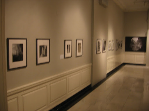
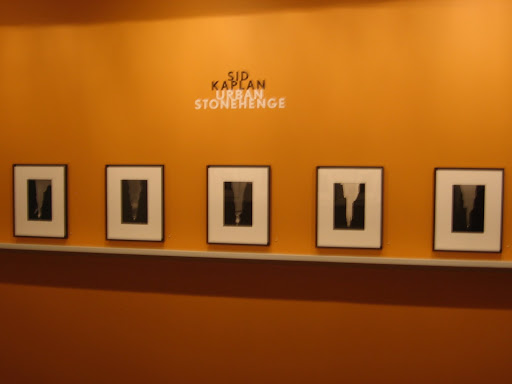
 JTF (just the facts): A total of 36 images from 19 different photographers, primarily in black and white (only 3 color prints), hung in a single hallway gallery on the second floor of the museum. Most of the works are displayed in brushed gray metal frames with white mats, against light grey walls. The images were taken between 1910 and 1998, the majority coming from the 1930s. (Blurry installation shots at right.)
The following photographers have been included in the exhibit, with the number of images on display in parentheses:
Berenice Abbott (2)
Andreas Feininger (3)
Sigurd Fischer (2)
Samuel Gotscho (5)
Karen Halverson (1)
Stephen Harmon (1)
Andrew Herman (1)
Steve Martin (1)
Benn Mitchell (2)
Arnold Murai (1)
Aaron Rose (2)
Arthur Rothstein (2)
Sherril Schell (5)
Robert Sherwin (1)
Rudolph Simmon (1)
Aaron Siskind (2)
Edward Steichen (2)
Christian Truempling (1)
Unknown (1)
Comments/Context: Since much of the city/industrial genre of our collection could easily be loosely recategorized as “urban abstraction”, this was an exhibit that matched our natural affinities quite well. Using the bridges, buildings, night time lights, and city streets as fragments of line and form, the eclectic group of photographers included in this small show have all found ways to play with angles and edges, squares and curves, to create geometric patterns and circular designs, some dense with reflection and refraction.
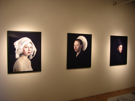
 While the Steichens, Siskinds, and Abbotts are all excellent, the stand out images of this show were those taken by the under appreciated Sherril Schell. Schell made a strong body of Modernist city images in the 1930s, but has somehow not gotten the same level of attention as many of his more well regarded contemporaries. The works on view here show Schell at his best: jagged edges, patterned shadows, and flattened planes of intersecting lines. (Blurry image at right of three Schells hung together.)
Given the venue, this story of urban abstraction is by definition a limited one (only New York), and therefore many spectacular works from other locations have not been included, leaving the show slightly uneven and particularly soft in its later years. That said, there are a handful of terrific images on view, certainly worth a quick detour after visiting Dutch Seen on the first floor.
Collector’s POV: There were quite a few tempting images in this show that would fit well into our collection. I liked the anonymous Brooklyn Bridge, as well as the variant Steichen of the George Washington Bridge and Feininger’s car hood reflection. One of the Siskinds on view is already in our collection (here). The Schells were a strong reminder that we certainly would like to add one of his images to our collection at some point. Unfortunately, his work is not much available, and only a few images have come up at auction in the past several years (generally selling in a range between $9000 and $15000).
Rating: * (one star) GOOD (rating system described here)
Transit Hub:
- Sherril Schell: Unknown Modernist, 2006 @MCNY (here)
Urban Abstractions: Photographs from the Collection
Through August 2nd
Museum of the City of New York
1220 Fifth Avenue
New York, NY 10029


