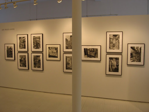
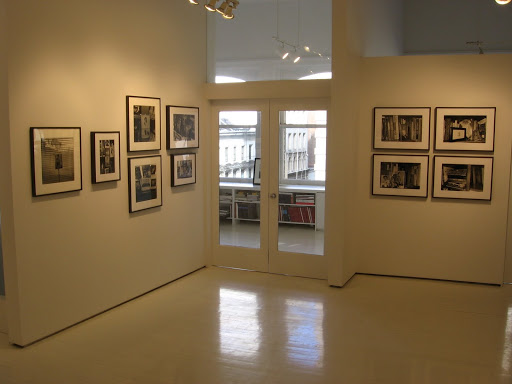
 JTF (just the facts): Published in 2010 by Aperture (here). 320 pages, with 162 color and black and white images by 11 different photographers. Includes a foreword by Lothar Schirmer, an essay by Stefan Gronert, and summary biographies, exhibition lists and bibliographies for each of the artists. The German version of the book is being published by Schirmer/Mosel (here). (Cover shot at right, via Amazon.)
The photographers included/discussed are:
Bernd & Hilla Becher
Laurenz Berges
Elger Esser
Andreas Gursky
Candida Höfer
Axel Hütte
Simone Nieweg
Thomas Ruff
Jörg Sasse
Thomas Struth
Petra Wunderlich
Comments/Context: The Düsseldorf school of photography is probably the largest topic in contemporary photography that has yet to receive the kind of in-depth scholarly treatment we would expect for such an important and influential artistic movement. While I’m sure there have been quite a few masters and Ph.D. theses that have been written about the Bechers and their students, until the publication of this book, there have been effectively no survey style volumes brought to market with the broader public in mind. Given the many monographs and exhibition catalogues that have been written about these photographers individually, the gathering of a representative sample of the various artists’ work is the lesser of the challenges here; the real test falls to the essay and how coherently and insightfully it ties together what heretofore have been generally separate but parallel narratives. We have all been searching for someone to help connect the dots and fill in the gaps; I’m happy to report that this book is certainly a good start.
One important semantic definition is required before we get to the analysis: what is it we mean by the term the “school”? In general, I think there are two possible answers as applied to artistic movements: the narrow – the education derived from a specific set of teachings/learnings (i.e. the how/what of the curriculum at the Düsseldorf Kunstakademie or the Yale School of Art and how it was absorbed by specific students), and the broad – the larger geographic and temporal phenomenon (i.e. Düsseldorf or Helsinki as the umbrella term for a common style of working).
This volume (and its keystone essay) has chosen to focus on the Düsseldorf school in the broad sense, looking for the larger commonalities seen in its most successful and best known adherents. It lays at the feet of the Bechers the “emancipation of photography”: the critical artistic mindset that photography was fully equal to painting, the results of which are embodied in the downstream success of the students who wholeheartedly embraced this unorthodox-at-the-time concept. It also implies an amorphous teaching by osmosis approach, where the Bechers were effectively leading by example: off doing their own highly stringent and objective documentary work, using the series and typology as modes for working and comparison, all underneath a rigid conceptual framework, with the students watching and absorbing some or all of what they saw as they saw fit. The narrative is thus one of commonality rather than causation: the students all started from a generally similar location; as they grew and matured as artists and selectively incorporated the Bechers‘ teachings over time, they went off in different but often parallel directions.
While there are some anecdotal comparisons and back and forth between the artists, in general, the book follows each photographer down his or her own particular evolutionary path, often starting prior to their involvement with the Bechers, and running to the present, now decades after the teacher/student relationship has ended. Each photographer gets a short biographical analysis, often through the lens of the Düsseldorf similarities. We see some exploring the limits of conceptual ideas (Ruff, Hütte, Esser, Struth, Sasse), while others have consistently worked in subject matter based series (Höfer, Wunderlich, Nieweg, Struth); over time, many have experimented with the use of large formats and prints (Höfer, Hütte, Nieweg, Struth, Berges, Ruff, Esser, Gursky). The challenge here is that most of these artists have worked through a handful of different projects over their careers to date, moving back and forth between working styles and approaches – the Düsseldorf narrative is therefore circular and cyclical rather than strictly linear, the Bechers‘ influence waxing and waning as the artists continually evolve and reinvent themselves.
As such, the story of the Düsseldorf school is not nearly as neat and tidy as one might expect from the rigid Germans; the Bechers put down some foundation concepts, but their students have long since moved beyond those initial ideas. Perhaps it is the mark of great teachers that they imparted their wisdom and experience about successful methods for discovering one’s artistic voice through photography, without imposing their own specific vision too strongly.
While this book provides the satisfying summary and overview I have outlined, I found myself still wishing for more specifics; perhaps the next scholarly book on the Düsseldorf school needs to limit its scope to the period when the photographers were actually studying with the Bechers, and needs to cover in more detail how the curriculum was embodied in the early pictures. I’d also like to see more work from a broader range of the students (not just the “winners”) to see how the teachings got applied in different ways. Similarly, I think some commentary from the artists themselves on what they took away from the Becher experience would be enlightening. Clearly, all of these photographers have long since moved beyond their early education, but I for one would be interested to hear what if anything they still find of value.
Overall, this book fills a gaping hole in the history of photography. It provides a well-selected sampler of the work of the best known members of the Düsseldorf school and offers a readable explanation of how it all fits together. While I have an insatiable appetite for more on this group of photographers, this volume certainly delivers a solid and thoughtful introduction to one of the most important movements in contemporary photography.
Collector’s POV: In many ways, there isn’t much “new” information to be found in this book on the best known photographers in the group. It was therefore the sections on Petra Wunderlich, Simone Nieweg, Jörg Sasse, and Laurenz Berges that were the eye openers for me, in terms of exposing me more fully to some of the other students who are a little further out of spotlight. I also think the essay was helpful in clarifying my rudimentary understanding of the evolution of both Axel Hütte and Elger Esser, neither of which I have felt particularly comfortable with in the past.
Transit Hub:
- Review: Conscientious (here)
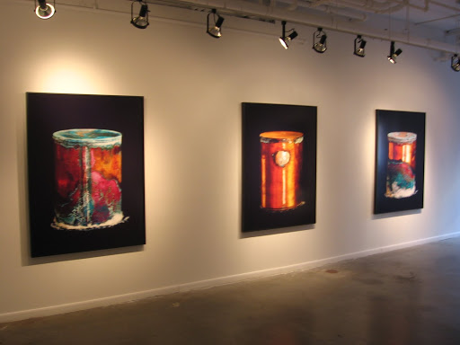
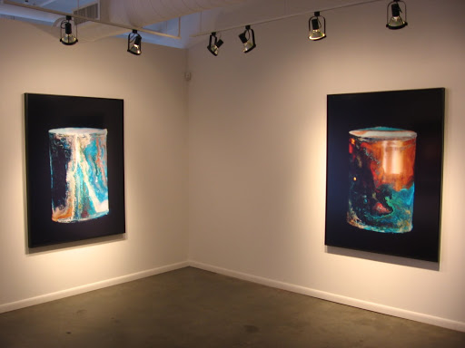
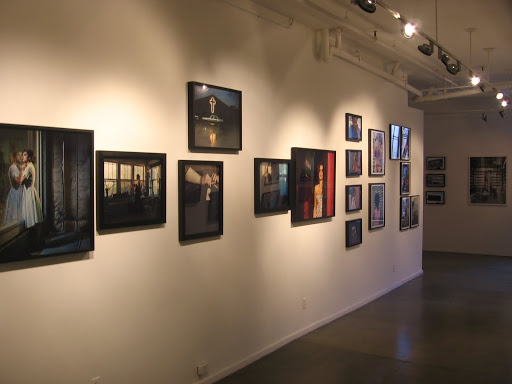
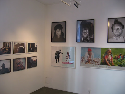
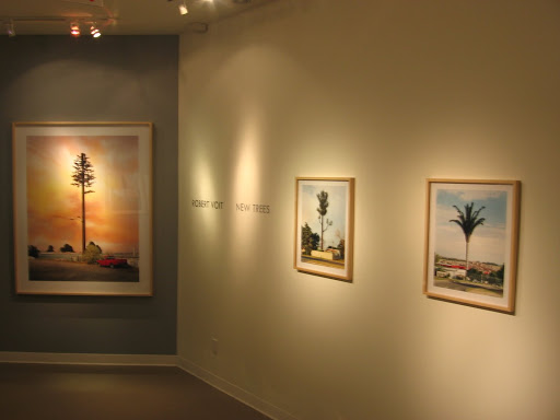 JTF (just the facts): A total of 17 color images, framed in blond natural wood with no mat, and hung against cream and grey walls in the main gallery spaces. The c-prints are available in two sizes: 60×50, in editions of 6, and 24×20, in editions of 4. There are 5 large prints and 12 small prints in the exhibit. The images were taken in various locations around the world between 2004 and 2009. A monograph of this body of work is being published by Steidl (here). (Installation shots at right.)
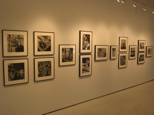
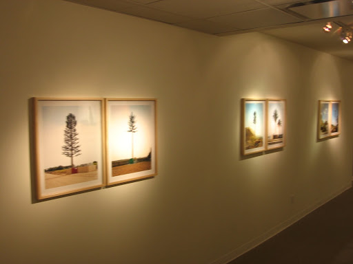 German photographer Robert Voit has spent the past several years scouring the globe, making pictures of these cell tower trees. Voit trained in Düsseldorf under Thomas Ruff, and so has absorbed many of the conceptual lessons passed down from the Bechers. Each image is rigorously composed, with the tower centered in the frame, using consistent portions of land and sky and generally similar scale. Given the diversity of examples in the series, the various towers can be hung together in pairs and typologies to get at the underlying themes and variations in the artificial decorations.
 Stylistically, while the debt to the Bechers is obvious, Voit has clearly taken some of the foundation concepts and adapted them to his own artistic approach. In contrast to the meticulously uniform backgrounds employed by his predecessors, Voit allows a wide spectrum of colors to float behind his subjects, from washed out whites to deep blues with puffy clouds (there’s even a painterly pink and orange sunset). He’s also allowed more locally specific context into the frame, showing the base station buildings and more of the surrounding natural environment; several of the images juxtapose the fake cell tower tree with a real tree or two standing nearby. Finally, while the works are conceptual, there is an element of subtle humor and satire in these pictures that dissolves away the cool detachment that is the hallmark of many of his mentors and classmates.


