Todd Hido: Fragmented Narratives @Silverstein

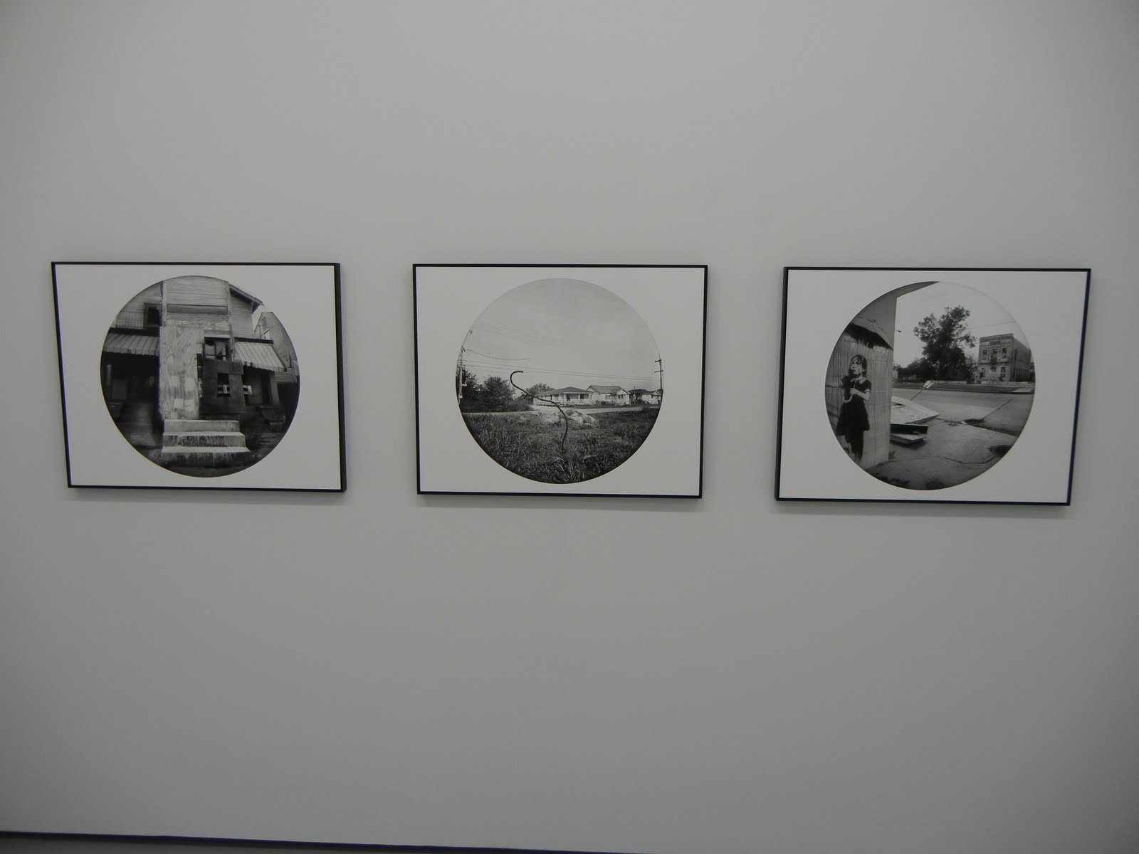
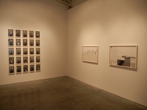
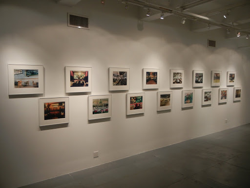
JTF (just the facts): A total of 28 color images, framed in black with no mat, and hung in the entry area, front room, and main gallery spaces. The chromogenic prints come in three sizes (or reverse): 20×24 (in editions of 10+3AP), 30×38 (in editions of 5+1AP) and 38×48 (in editions of 3+1AP). The images were taken between 1995 and 2010. (Installation shots at right.)

Comments/Context: Todd Hido’s new show is in many ways a mini-retrospective: it takes a handful of fresh new images and mixes them together with selections from a variety of older projects, going back to the mid 1990s. What is special here is that instead of being displayed in traditional chronological order, the pictures have been sequenced and sifted into clusters and groups, creating enigmatic, unknowable narratives from combinations and juxtapositions of misty wet landscapes, quiet interiors, shadowy female nudes, and night lit houses.

Hido’s careful recontextualization of his work links single images into implied settings and cinematic stories, where a trailer, a barren road, and an austere nude can come together to create a lonely, introspective atmosphere. A similar combination of nocturnal houses with glowing windows, a vacant room or two, and a vulnerable, expressionless woman are woven into somber, open-ended suburban vignettes, where the viewer provides both the connections and the ultimate meaning.

Taken together, the works go beyond documentation of dreary physical surroundings to map deeper layers of emotional and psychological terrain, where snowy tracks, a crumpled pillow, and an unguarded pose are the clues to a personal mystery. While many of the images can stand well enough on their own as individual narrative threads, I was struck by how powerful and resonant they became when they were knit into a fabric. What is evident from this show is that Hido’s projects from the past decade are all infused with a common underlying spirit, and that each distinct subject matter genre provides a different entry point into the larger tonal environment he is so tenderly exploring.

Collector’s POV: The prices for Hido’s work have inched up slightly since his last gallery show here in 2009. As a reminder, the prints come in three sizes, with new prices: $3650 for the 20×24 works, $6000 for the 30×38 works, and $9200, $9800, 0r $11800 for the 38×48 works. Examples of Hido’s work have become more common at auction in recent years, finding buyers between $2000 and $24000.
There were actually several images in this show that I liked quite a bit. If forced to choose, I would likely select the empty blue bedroom (#3878, second from right in the third installation shot from the top), for its rich muted palette and its melancholy mood.
.
Rating: ** (two stars) VERY GOOD (rating system described here)
.
Transit Hub:
  • Artist site (here)
  • A Road Divided @Silverstein, 2009 (DLK COLLECTION review here)
Through February 12th
Bruce Silverstein Gallery
535 West 24th Street
New York, NY 10011

Richard Misrach: Graecism Portfolio @Richardson

JTF (just the facts): A total of 6 color photographs, framed in white and matted, and hung in the small Project Gallery in the back. All of the prints are vintage dye transfer prints, each roughly 16×20, drawn from a portfolio of 12 images that was published by Grapestake Gallery in an edition of 25. The images were taken between 1978 and 1981. This exhibit supports a larger show of Mars scenes by Kahn & Selesnick on view in the main gallery. (Installation shots at right.)

Comments/Context: Richard Misrach’s Graecism portfolio chronologically falls between his flash lit nighttime Hawaiian jungles and his Desert Cantos. Stylistically, the works follow in the footsteps of the jungle pictures, using a similar strobe lighting/long exposure technique to add bright light to the foreground of otherwise dark outdoor scenes, but in this case, his subjects are the ruins of Greece and Rome: temples, columns, and weathered fallen stone.

The ideas I found exciting in the Hawaiian landscapes (their departure from traditional rules of landscape) can also be seen in some of these architectural pictures. Instead of taking the obvious postcard views in the serenity of the sunset/twilight, Misrach has broken up the picture plane with columns that have been bleached white by the flash, making them jump out of the surrounding and encroaching shadows. Another image documents the nothingness of a bare dirt patio looking out into blackness. For the most part, he resists the temptation to do what has been done before by tourists across the ages, and instead explores the unexpected and often jarring contrasts of color and light introduced by the strobe.

Prior to seeing this show, I hadn’t ever encountered images from this project, so this small exhibit provided a nice gap filler for my understanding of Misrach’s history.

Collector’s POV: The six images in this show are being sold separately (rather than as a portfolio), each at $5000. Misrach is officially represented in New York by Pace/MacGill Gallery (here) and in San Francisco by Fraenkel Gallery (here). Misrach’s works are generally available in the secondary markets, especially his desert images; these have typically ranged from $2000 to $12000, with a few outliers even higher. His newer works of more significant size have also begun to enter the auction markets; these have generally ranged between $40000 and $80000.
My favorite image in the show was Athena, Nike (column), 1979; it’s the image on the far right in the bottom installation shot. I like the way the brightly lit column cuts directly through the center of the frame, breaking up the view of the temple in the background.
.
Rating: * (one star) GOOD (rating system described here)

Transit Hub:
  • Recent 2010 show @PaceWildenstein (DLK COLLECTION review here)
Richard Misrach: Graecism Portfolio
Through February 19th

535 West 22nd Street
New York, NY 10011

Deborah Luster, Tooth For An Eye @Shainman

JTF (just the facts): A total of 35 individual black and white works, along with 1 diptych, 1 pair of videos, and 1 table and cabinet installation, displayed in the entry gallery and the main divided space in the back. All of the photographs are toned gelatin silver prints mounted on Dibond, made between 2008 and 2010. 30 of the images are sized 24×30, and come in editions of 3+1. 5 of the images are printed larger, either 49×61 (in editions of 2+1) or 55×55 (in editions of 1+1); the diptych is a pair of 49×61 prints (in an edition of 2+1). A pair of videos run on iPads with cast aluminum frames, in an edition of 5+1. The table and cabinet installation includes 6 bound ledgers, with three of the ledgers open and on display; these books include smaller prints from the same series. A monograph of this body of work is forthcoming from Twin Palms (here). (Installation shots at right.).

.
Comments/Context: I first encountered the work of Deborah Luster a few years ago in connection with her massive portraiture project documenting inmates in Louisiana’s prisons. Part of what resonated most strongly with those images was the sense that photographs could be used to ward off forgetting, to ensure that individuals who were invisible were somehow remembered. This same sense of elusive and disappearing history is at the heart of Luster’s newest pictures, which capture locations in New Orleans where violent homicides have taken place.

Luster’s round black and white images create the impression of looking through a keyhole, where a small degree of curvature and distortion surrounds the central location. The pictures are a taxonomy of overlooked non-places: grimy sidewalks, overgrown alleys, empty street corners, abandoned buildings, quiet train tracks and graffiti covered passageways. Both lacking in people and any visible evidence which could be used to pinpoint the spot of the crimes (chalk circles, blood stains or the like), it is impossible to actually see what happened in these specific locations; the violence has long disappeared from view (whether recent or decades past), and yet it lingers over the grey scenes like a heavy cloud. Notes chronicle the spectrum of horrors, often with multiple incidents occurring at the same site: drive by shooting, stabbing, found in a ditch, shot in the head, beaten with baseball bat, wrapped in a carpet and shot, run over.

Luster’s investigation of the nature of memory as applied to a place recalls work as diverse as Angela Strassheim’s black light crime scene interiors, Mark Klett’s rephotography and Sally Mann’s corpses, where places and objects provide clues to a forgotten history, where time has eroded part of the narrative but left remnants behind for viewers to use to imagine both the past and future. Luster’s images in particular ask questions about the downstream reverberations of violence, and about how the cycle of homicides and victims can be broken. In her works, a forgettable garbage area or a motel balcony has been infused with the concealed imprint of a remembered incident; how or whether these places can escape their history and begin again is unknown.

I think this work displays an unusual inversion of strength, where the backstory and conceptual framework is much stronger than the individual images themselves would be on their own; often the deserted sidewalk or vacant lot is just that, framed in a formal, documentary manner, and made whole by the knowledge of the murder that is conspicuously absent. As such, I think these photographs will work best in book form, where the relentless piling on of location after location that will come with the flipping of the pages will help to reinforce the scale and immensity of the invisible history; a single image, separated from this larger narrative will likely be somewhat less powerful, especially to those who blow by the wall text and don’t understand what the scene represents. That said, Luster’s project is a thorough and mature investigation of a complicated and ultimately unphotographable subject – the effects of painful human memory on a weary and indifferent landscape of concrete and brick.

Collector’s POV: The works in this show are priced as follows. The smaller 24×30 prints are $5000 each, while the larger prints are either $14000 (46×61) or $16000 (55×55). The photographic diptych is $25000, while the pair of videos is $12000. The table/cabinet installation is $85000. Luster’s work has little or no auction history, so gallery retail is likely the only option for interested collectors at this point.

My favorite image in the exhibit was Tooth For An Eye, Ledger 03-04, Location: 1100 Block North Prieur, Date(s): Feb 27, 2007, Name(s) Herbert Preston (19), Notes: Recently returned Katrina evacuee. Gunshots to head and body. 2008-2010. It’s the image on the left in the group of three below. I liked the interwoven geometries of the plywood boards, the awnings, and the paint dripped stairs.
.
Rating: * (one star) GOOD (rating system described here)
Transit Hub:
  • Review: Times-Picayune (here)
  • One Big Self: Prison Photography (here)
Through February 5th

513 West 20th Street
New York, NY 10011

Paul McDonough, New York City, 1973-1978 @Sasha Wolf

JTF (just the facts): A total of 21 black and white photographs, framed in silver and matted, and hung in the single room gallery space. All of the prints are modern gelatin silver prints, made from negatives taken between 1973 and 1978. 20 of the prints on view are 16×20, available in editions of 15; there is a single larger print over the reception desk (30×40), in an edition of 7. A monograph of this body of work has recently been published by Umbrage Books (here) and is available from the gallery for $45. (Installation shots at right.)

Comments/Context: Paul McDonough’s 1970’s New York street photography fits neatly into the broad category so famously defined by Winogrand, Friedlander, Levitt, Meyerowitz and many others. While we’ve seen a mountain of this kind of work before (going back to Cartier-Bresson) and can pick out plenty of visual echoes and influences in this show, it doesn’t diminish the fact that McDonough was consistently able to select and compose surprising moments of memorable warmth from the barrage of foot traffic on the city’s sidewalks.
.
This genre of photography lives and dies on the whims of synchronicity – that ability to see a composition resolving itself as it happens, and the subsequent skill in framing and capturing that fleeting moment to highlight its transient juxtapositions, relationships and details. McDonough does it again and again in this selection of pictures: a passing handful of women all in fur coats, two men watching a parade perched on standpipes, a young couple with matching midair forks, three kids climbing on the same bent tree branch, a collection of people playing flutes and drinking from straws. His ironies are subtly amusing rather than aggressively harsh or biting, where short-lived gestures and glances tie a picture together without being too obvious. There is a terrific image of a disheveled artist with a bushy beard (a dead ringer for Hagrid of Harry Potter fame) earnestly measuring the chin of an ancient bust at the Met while wrestling with a large sketchpad; the visual back and forth of the similar faces is endearingly clear without being overly jokey.
.
I’ll admit that when I walked in, I was thinking I would bored by this show. And at first glance, McDonough’s street photographs don’t have a vivid or immediately recognizable signature style like those of Winogrand or Friedlander; instead, they have a cleverness that grows on you, as you investigate and unpack their everyday instants of wonder. In the end, although his work is not as well known as many of his contemporaries, there are too many well constructed pictures here to discount his talent as repeated accident. So instead, chalk this show up to yet another rediscovery of hidden excellence, buried in forgotten flat files for far too many decades, now ready to reemerge and fill in the gaps of an important period in recent photographic history.
Collector’s POV: The works on view are priced as follows. The 16×20 prints are $2500 each, while the 30×40 print is $4500. McDonough’s prints (vintage or modern) have little auction history in recent years, so gallery retail is likely the only option for interested collectors at this point.
My favorite image in the show is Three Car Salesman, 1973; it’s second from the left in the top installation picture. The three men in suits stand together, each with one shoe poised on the window sill, underneath a sales sign shouting “450 cars to choose from”; beyond the visual echo of their three bodies, it’s like a scene out of Glengarry Glen Ross.
.
Rating: * (one star) GOOD (rating system described here)
Transit Hub:
  • Reviews: New Yorker (here), Wall Street Journal (here)
  • Features: Lens (here), Paris Review (here)
Extended through January 29th
528 West 28th Street
New York, NY 10001

Nathan Harger @Hasted Kraeutler

JTF (just the facts): A total of 16 individual photographs and 2 grids (25 and 20 prints each), framed in white with no mats, and hung in the entry and the first two rooms of the gallery space. All of the works are digital c-prints mounted to Plexiglas, made between 2008 and 2010; most are printed in high contrast black and white. Dimensions range from 25×26 to 34×53, with many at 42×28 or reverse; all are available in editions of 7. The two grids are sized 65×43 and 70×62 respectively. (Installation shots at right.)

Comments/Context: Nathan Harger’s photographs of city and industrial architecture take the idea of a monochrome silhouette to its logical extreme. Most of his images strip out the intermediate gray scale tones, leaving behind a flattened exercise in black and white, almost like an intricate ink or charcoal drawing. Cranes and power lines, silos and billboards become bold abstract outlines.

While this type of subject matter has already been thoroughly covered by many of the masters of photography (particularly the ID photographers from 1950s Chicago), Harger’s images have a striking sense of the polarized maximum, where skies are pure blinding white, and process tanks and subway overpasses are richly black, almost tactile and velvety. He has bumped up against the point where photography intersects with graphic design, as his blocked out forms and delicate traceries lose their sense of photographic detail and are transformed into stylized representations.

For me, the works have surprising parallels in look and feel to James Welling’s formal abstractions made from strips of simple black paper. Or maybe Harger is somewhere in between, almost like a NeoPrecisionist (channeling and reinterpreting Sheeler, Demuth, Crawford and others), exploring the linearity of recognizable imagery, albeit with the tools of pared down monochrome photography.

Collector’s POV: The images in this show are generally priced based on size. The smallest individual prints are $2500, the medium 42×28 prints are $4500 and the largest prints are $5000. The two grids are $9000 and $7500. Harger’s work is not consistently available in the secondary markets, so gallery retail is likely the only option for interested collectors at this point.

My favorite image in the show was Untitled (Crane 2), New York, NY, 2008; it’s the picture on the right in the installation shot below. I like the geometric patterns of the vertical lines and angled cross beams, and the unbalanced composition set off by the bold black dot.

Rating: * (one star) GOOD (rating system described here)

Transit Hub:
  • Artist site (here)
Through January 29th

537 West 24th Street
New York, NY 10011

Wijnanda Deroo: Inside New York Eateries @Mann

JTF (just the facts): A total of 23 color photographs, framed in white and hung throughout the main gallery space. The chromogenic dye coupler prints come in three sizes: 16×29, 36×43, and 48×57, each in editions of 10. There are 16 in the small size (matted) and 7 in the medium size (unmatted) on display. All of the images were taken in 2009. (Installation shots at right.)

Comments/Context: Wijnanda Deroo’s images of New York restaurants are a short-hand catalog of the diversity of this great city: its traditions and routines, its ethnicities and neighborhoods, its celebrations and memories. Her quiet, unpeopled interiors capture the essence of the dining experience at each individual place, from table settings and surrounding decorations, to exuberant colors or muted light, running the gamut from down-and-dirty to over-the-top extravagant.

Deroo’s pictures document these rooms on a human scale, at eye level, often looking straight at a geometrically balanced group of tables, or down a long bar or counter. Many seem to have been taken in the purity of the morning, when the light is bright and the tables are neatly set. Her photographs are like formal portraits of these spaces, rich in color and texture, some “personalities” crisp and starched, others worn and smooth. The Russian Tea Room and 21 Club are darkly opulent, while Milon and Papaya Dog have ebullient effervescence to spare.
When taken as a series, the works provide a historical (sometimes almost nostalgic) snapshot of the nature of dining in New York; as restaurants age and mature, or come and go, they reflect the aspirations, moods, and tastes of those they serve. Deroo’s formal compositions etch these quintessential places in memory, removing the cacophony of the babbling customers, leaving behind silent, studied environments and surfaces, each patiently waiting for its next jolt of life.

Collector’s POV: The works in this show are priced as follows. The small 16×20 prints are $3500 each; the medium 36×43 prints are $5000 each; and the large 48×57 prints are $8500 each. Very little of Deroo’s work has appeared in the secondary markets, so gallery retail is likely the only option for interested collectors at this point.

My favorite image in this exhibit was Jerry’s, 90 Chambers Street, 2009; it’s the coffee shop image on the left in the group of three at right. I like the breaking up of the picture plane and the way the light falls on the red leather of the booth.
Rating: * (one star) GOOD (rating system described here)
Transit Hub:
  • Artist site (here)
  • Review: Wall Street Journal (here)
Through January 29th

210 Eleventh Avenue
New York, NY 10001

Antonio Caballero, Las Rutas de la Pasión, Mexico 1960’s -1970’s @Sikkema Jenkins

JTF (just the facts): A total of 19 individual black and white images and 1 group of 28 black and white images as a single work, hung in the entry, the main gallery space and two side rooms. All of the prints are modern gelatin silver prints (made between 2005 and 2010) made from negatives taken between 1960 and 1980. There are 7 smaller 24×20 prints on view in the entry, framed in white and matted, in editions of 6. There are also 12 larger prints on view in the other rooms, each 40×40, framed in white and not matted, in editions of 6. An intact portion of a fotonovela is displayed as 28 images hung edge to edge, pinned directly to the wall in a long line, each print 7×7 unframed, the entire set in an edition of 3. (Installation shots at right.).

Comments/Context: During the 1960s and 1970s, Antonio Caballero was a prolific maker of Mexican fotonovelas, a kind of photography-based graphic novel form, filled with soap opera-style narratives of love and betrayal. By taking them out of their original sequenced context and blowing them up to large scale, this show takes these dated pop culture images and recharacterizes them, highlighting their entertaining retro-melodrama.
The images on view are full of big sculpted hair, exaggerated expressions, and staged moments of intrigue: a man cradles a slumped woman in the street, a young woman looks on in horror as she discovers a stolen kiss, a dead woman lies face down on the stairs as another woman looks on with barely concealed glee, two stylish women exchange secrets on a train platform. The scenes are theatrical and exaggerated, with plenty of opportunities for good looking people to pose with fashionable glamour.
While these confections are simple and diverting, I don’t think they deliver much more than a dose of outlandish fun with a sliver of muted irony. They are the kind of stills that Cindy Sherman re-enacted and dissected by adding an underlayer of conceptual rigor. As such, they are the original article: their artificiality pleasingly amusing, but ultimately empty of deeper ideas.
.
Collector’s POV: The smaller 24×20 works are priced at $4500 each, while the larger 40×40 prints are $8500 each. Caballero’s work has little or no secondary market history, so gallery retail is likely the only option for interested collectors at this point.
.
Rating: * (one star) GOOD (rating system described here)Transit Hub:

  • Review: New Yorker (here)
Through January 22nd
Sikkema Jenkins & Co.
530 West 22nd Street
New York, NY 10011

Top 10 Photobooks of 2010

Back in November, Photo-Eye graciously asked me to participate in their annual roundup of Top 10 lists of photobooks. These diverse lists have been published today and can be found here.

My first reaction to the Photo-Eye invitation was that it was a kind of challenge; to be included with such an esteemed group of photobook experts and working photographers was both flattering and somewhat problematic. Regular readers here will know that while I review photobooks quite regularly, I don’t limit myself in any way by a book’s publication date; I am equally happy to review books from this year or a decade ago, based on any number of quirky collector-driven reasons. I don’t really think about photobooks in “vintages”, nor have I ever done a “best of” gathering for photobooks. To submit a list I could stand behind, I would have to think hard about what had really risen to the top in the past year, something it had heretofore never once occurred to me to do.

As I have said elsewhere before (here), as a photography collector (which is something entirely different than being a photobook collector by the way), I primarily measure photobooks by their use as reference and by their ability to provide meaningful and lasting ideas and education. In my view, the best books of the year are those that will get used, that will be pulled down from the shelves over and over again, for repeated reviewing and rereading. As such, most of my choices for 2010 are meaty monographs, retrospectives, or exhibition catalogues, with insightful essays and detailed background material. They are anchor books for any photography library, and I expect to wear them thin in the coming years.

I’ve listed below the details of each of these books (in alphabetical order by photographer or show title), with links to their publishers. For a short and snappy rationale for why I included each book, please visit (and patronize) Photo-Eye (here). I’ve also included links to my previous more in-depth reviews of these books or the related exhibits, as appropriate.

Uta Barth, The Long Now, Gregory R. Miller & Co.
.
Henri Cartier-Bresson, The Modern Century, Peter Galassi, Museum of Modern Art
(exhibit review here)

Lee Friedlander, America By Car, Fraenkel Gallery/DAP
(exhibit review here)

Moholy-Nagy, The Photograms, Catalogue Raisonne, Renate Heyne, Hatje Cantz

Zwelethu Mthethwa, Aperture
(book review here)

Helios: Eadweard Muybridge in a Time of Change, Philip Brookman, Steidl/Corcoran Gallery of Art

Framing the West: The Survey Photographs of Timothy O’Sullivan, Toby Jurovics, Library of Congress and Smithsonian American Art Museum

From Here to There: Alec Soth’s America, Siri Engberg, Walker Art Center
(book review here)

Starburst: Color Photography in America 1970-1980, Kevin Moore, Hatje Cantz
(exhibit review here)

Paul Strand in Mexico, James Krippner, Aperture
(exhibit review here)

Since I provided this list long before the overall results were gathered and posted, I haven’t had the chance to see whether my choices as a collector have any correlation to those of the other experts polled; my guess is that my list won’t overlap much with those of the rest of the judges. What I can say with conviction is that each and every one of these books took me deeper into a thoughtful exploration of the work at hand, inspired and instigated new seeing and thinking, and richly rewarded the investment of my time.

Patti Smith, Just Kids

JTF (just the facts): Published in 2010 by HarperCollins/Ecco (here). 308 pages, with 37 black and white photographs, 4 reproductions of drawings, and 2 reproductions of poems. (Cover shot at right, via Amazon.)
.
Comments/Context: Patti Smith’s much acclaimed memoir came wrapped in tissue paper on Christmas morning, and I finished it several days before we rang in the New Year – I just couldn’t put it down. While it’s easy to pile on the praise after a book has been so universally celebrated, this story is really something special, much more than just the shared tale of two famous artists.

Patti Smith’s story of her life with Robert Mapplethorpe is perhaps the best description of the elusive process of creating a life in art that I have ever encountered. It is told with a quiet, matter-of-fact romanticism, her words restrained and tender, tinged with innocence and a surprising lack of bravado. It is a narrative full of difficult times, unglamorous poverty, and optimistic serendipity, their lives rooted in an understated and serious mutual commitment to relentlessly trying, to figuring it out along the way and to never giving up.

Given Mapplethorpe’s later career in photography, it is fascinating to see him struggling with beads and jewelry, making altarpieces out of found objects and collaged images from skin magazines, and generally looking for his artistic voice while hustling to make ends meet. Smith similarly wanders from drawing to poetry, working at bookstores to pay the bills, finally finding rock music as her outlet. They build a solid support structure out of their evolving personal relationship, and find a sense of community in the eccentric bohemian tenants of the Chelsea Hotel. Their dedication to each other and to their art is honest and unwavering.

While there are plenty of quirky anecdotes and star sightings to spice up the 1970s New York story line, I think it is Smith’s pared down, purity of prose that makes this book so memorable. It dives into truth and genuine emotion with youthful sensitivity, finding goodness and selflessness in a gawky, gritty world. Her view of Mapplethorpe is affectionate and devoted, even when the situation gets complicated. In the end, they both find their own successful paths forward, but the artistic road to getting there is anything but direct or easy for either of them.

My favorite part of the book is Smith’s memory of Mapplethorpe singling out a specific image and saying “That’s the one with the magic.” It’s a tiny moment, but for me, it gets to the essence of what art is all about: the search for a view of the world where the mundane is transformed into the magnetic, where an unknown original voice shows us something we haven’t seen anywhere before. So whatever you do, don’t miss the chance to live vicariously through these two as they struggle to find themselves; it’s a subtly spellbinding story of making a life in art.

Transit Hub:

  • 2010 National Book Award Winner, Nonfiction (here)
  • Reviews: NY Times (here), Washington Post (here), Village Voice (here), Guardian (here)

A Grab Bag of Holiday Photobooks

Over the holidays, I was lucky enough to receive a handful of photobooks, both old and new, as gifts. Rather than embark on full reviews for them all, I’ve added a few thoughts and reactions to each below:


Thomas Ruff, Surfaces, Depths, Kunstahalle Wien, 2009.
.
I first saw this book on a display shelf at David Zwirner, during Ruff’s show there last spring (review here). What is striking about this book is that although it is bound like a regular retrospective catalogue, inside it is printed on newsprint, giving the pages a more fragile feel. This presentation totally recontextualizes many of his older projects, especially those that appropriate black and white imagery. The book is the first place I have found that publishes his new Cassini and Zycles works, and it also includes stereo photographs, interiors, newspaper images, and “portraits” of Herzog & De Meuron buildings that I had never seen before. All in, an unexpectedly terrific addition to the discussion of Ruff’s work.
.
Barbara Crane: Chicago Loop, LaSalle Bank, N.A., 2001. (here)
.
Kim Bourus of Higher Pictures (which represents Crane) showed me this book a year or so ago, and I have been wanting a copy for our library ever since. It gathers together a group of black and white images that Crane made of the Chicago Loop between 1976 and 1978, and the works could hardly be a better fit for our particular collecting affinities. Each is a textural mix of geometric layers, where grids of windows and edges of skyscrapers are deftly juxtaposed and flattened into intricate patterns and abstractions. It’s a spectacular exercise in compositional control.
.
Irving Penn, Still Life, Bullfinch Press, 2001.
.
I’m not exactly sure why we’ve never acquired a copy of this Penn standard, but I was nevertheless glad to see it emerge from under the tree on Christmas morning. I was most excited to see some of the less familiar images that are mixed in among the greatest hits, and for the first time, I started to understand Penn’s still life work within a stronger sense of chronology, starting in the late 1940s and moving back and forth between commercial and more personal work through the decades.
.
William Abranowicz, Hellas, Hudson Hills Press, 2010.
.
Abranowicz‘ new images of modern Greece are filled with warmth and affection. Elderly men and women tend goats and sheep or idle in the streets and cafes, while still lifes of fish and tomatoes pop with mouth-watering exuberance. The enveloping blue of the Mediterranean is rarely far from view, and cloudless skies range from washed out pastel to almost purple. What keeps these pictures from becoming a travel brochure is their subtle mixing of the modern and ancient: religious icons, church spires and island landscapes are juxtaposed with kisses on the beach in Mykonos, tourist postcards, and active nightlife. The story keeps shifting, with moments of subtle realism poking through the veil of obvious expectations.

2010 Photography Auction Summary

2010 was a year of rebounding in the auction markets for photography, with most of the major statistical indicators trending upward, some significantly.

As regular readers know, we write preview and results posts for most of the major photography auctions around the world, including both stand alone photography auctions, and contemporary art and other auctions that contain a meaningful amount of photography. Additionally, we report on photobook auctions, and sales that offer both photographs and photobooks. Last year, we covered 71 individual auctions, from 13 different auction houses.

The auctions we have covered have taken place in Dollars, Euros and Pounds; for the purposes of these calculations, we have converted everything into Dollars (where 1 Euro = 1.33 Dollars and 1 Pound = 1.55 Dollars; statistical purists might argue for specific exchange rates at the time of each sale, but I don’t think using a single summary rate moves the numbers meaningfully). Also, it is clear that photographs and photobooks were offered for sale in many more auctions than we have covered here, perhaps in smaller houses (particularly in Europe), in secondary and tertiary markets, or in antiques and collectibles sales. As such, I think this data likely captures 80-85% or more of the actual public transactions, but certainly not everything.

Across the photography auction market for the entire year, the total sale proceeds taken together were $136,948,680, up by more than 83% from last year’s total of $74,612,997. These numbers were driven by both higher average selling prices and better sell through.

Here’s how the sale proceeds for photography (including premium) were divided up by auction house in the past year:

Christie’s: $49,550,246 (up from $21,231,561 in 2009)

Sotheby’s: $47,476,113 (up from $25,428,318 in 2009)
Phillips De Pury: $27,589,516 (up from $15,957,910 in 2009)
Swann: $3,977,848 (down from $4,061,690 in 2009)
Lempertz: $2,233,602 (up from $989,540 in 2009)
Bonhams: $1,610,648
Villa Grisebach: $1,300,100
Van Ham: $1,176,106

Heritage: $901,518

Bloomsbury: $737,897
Yann Le Mouel: $395,090

The top three houses all increased their gross sales by meaningful amounts, with Christie’s more than doubling its total from the previous year. For those of you who like to do quick math, take roughly 20% or 25% of the numbers above, and you’ll get the approximate amount of total premium that the houses earned as fees on these sales.

These dollar figures can then be turned into dollar-based market share numbers, tabulating the percentage of the photography proceeds in the market which fell to each house. I have added the actual number of individual sales that took place in parentheses as background.

Christie’s (19): 36.18%
Sotheby’s (12): 34.67%
Phillips De Pury (18): 20.15%
Swann (5): 2.90%
Lempertz (2): 1.63%
Bonhams (4): 1.18%
Villa Grisebach (2): 0.95%

Van Ham (2): 0.86%
Heritage (2): 0.66%

Bloomsbury (4): 0.54%
Yann Le Mouel (1): 0.29%

Christie’s increased its dollar share of the photography market by more than 7.7%, while its main rivals stayed relatively flat. 90.99% of the photography market in 2010 was held by the top three houses (Sotheby’s, Christie’s, and Phillips De Pury), with Swann the only other house to capture more than 2.00% of the market.

There were a total of 10,296 photography lots on offer this year across the market, roughly flat with last year’s total of 10,530. (The Top 10 photography lots of the year can be found here.) 6,622 of these sold, while 3,677 failed to sell, making the industry-wide buy-in rate 35.71%, up from 41.28% in 2009. The data below shows the house by house overall buy-in rate, compiled from all the sales at that house. I have added the total number of lots on offer for each house in parentheses as background.

Christie’s (1807): 23.02% (1495 lots and 28.29% in 2009)
Sotheby’s (1509): 23.06% (1100 lots and 38.00% in 2009)

Villa Grisebach (378): 30.42%
Heritage (398): 32.41%

Swann (1420): 38.31%

Phillips De Pury (2162): 39.37% (1619 lots and 36.75% in 2009)

Yann Le Mouel (250): 42.40%

Bonhams (529): 44.42%

Lempertz (481): 45.11%

Van Ham (702): 49.72%

Bloomsbury (660): 55.91%

Another intriguing statistic is the $ per lot sold. One might call this an average selling price, for those lots that actually sold. Across the market, the average selling price for a photograph at auction in 2010 was $20,681.

Sotheby’s: $40,892 (up from $37,285 in 2009)
Christie’s: $35,596 (up from $19,806 in 2009)
Phillips De Pury: $21,013 (up from $15,584 in 2009)

Lempertz: $8,397 (up from $3,974 in 2009)
Bonhams: $5,478

Villa Grisebach: $4,943

Swann: $4,541

Heritage: $3,351

Van Ham: $3,332

Yann Le Mouel: $2,744

Bloomsbury: $2,536

While most of the major auctions houses provide both a low and high estimate for each lot, not every house does this, so it is impossible to tabulate industry-wide data for estimates. For those houses that do provide both a low and a high estimate for every lot, only Christie’s was able to bring in total proceeds (across all sales) higher than the total of the high estimates. Sotheby’s, Phillips de Pury and Villa Grisebach were each able to cover the total of the low estimates on an aggregate basis. Statistics for the big three are below:

Christie’s:
Total Low Estimate: $33,892,395
Total High Estimate: $49,376,225
Total Proceeds: $49,550,246

Sotheby’s:
Total Low Estimate: $33,609,844
Total High Estimate: $49,135,639
Total Proceeds: $47,476113

Phillips de Pury:
Total Low Estimate: $25,746,758
Total High Estimate: $36,853,838
Total Proceeds: $27,589,516

Overall, in a year of stabilization and renewed growth, Christie’s seems to have taken it to its competitors a bit. The house doubled its total sale proceeds for photography from the previous year, dramatically increased its average selling price per lot (even when diluted by a sale of lower priced photobooks), and took share from the market.

Looking forward, if the economic environment continues to slowly but steadily improve, I think we can expect that 2011 will be another solid year at auction. Big numbers are driven by the quality of material that is consigned and the overall confidence in the marketplace; 2010 had the landmark Penn, Avedon, and Polaroid sales (among others) and the beginnings of forward looking optimism. For 2011 to top 2010, we’ll need to see more superlative material come out into the markets, particularly in the realm of photography that is classified as contemporary art, and we’ll have to see a continued positive outlook from collectors.

A Sincere Plug for our 2010 Sponsors

I’d like to end this year with a sincere plug for the 2010 sponsors of DLK COLLECTION. Given that the vast majority of our readers subscribe to the feed (rather than arriving directly to the site), many of you may not even realize that we have sponsors. In fact we do, and their banners fly proudly along the sidebar.

As a friendly reminder, although we don’t have non-profit status, being a photography critic/blogger is undeniably a money losing proposition. It’s also a massive time sink, and if it wasn’t such an amazingly gratifying and challenging labor of love, a rational person would give it up right away.

Our sponsors provide something extremely valuable that our mostly silent readers, followers, and intermittent anonymous visitors don’t: they provide a public vote of confidence for what we are doing. With their dollars and their brands, they support the grand idea of a multitude of hopefully intelligent voices engaging in thoughtful discussion about photography of all kinds.

But let’s not be confused however. While counting the number of click throughs or page views of a banner is mildly entertaining, the point of sponsoring this site is to get bodies in the door, to add subscribers (for the magazines), and to generate tangible sales. If we can reliably connect the dots between reading reviews on this site and buying photographs in the real world, then we’re doing much more than just shouting into the void.

While each and every one of our 2010 sponsors is deserving of my heartfelt thanks and your disposable income, I would particularly like to highlight the support of Janet Borden Inc. (here). Janet’s gallery has been an anchor sponsor of this site for the entire year, taking the top banner slot month after month. She has been tirelessly enthusiastic about the evolution of this blog, and has been quick to point out my delusions and misguided opinions with her biting wit. Her persistent encouragement, even when her show of the moment didn’t get 3 STARS, has been invaluable. If you find enjoyment in what we are doing here, I urge you to reward Janet for giving her support when it wasn’t even remotely obvious. Get down to Soho and buy that Lee Friedlander, Tina Barney, Martin Parr (or whoever) that you have been coveting, and tell Janet that one of the reasons you are there with your dollars out is that you read DLK COLLECTION. You can thank me by thanking her.

Our other monthly sponsors also deserve your attention and your patronage. They have chosen to stand and be counted as well, so open your wallets folks and show them you value their commitment to independent photography writing:

Amador Gallery (here)
ClampArt (here)
Robert Koch Gallery (here)
Lee Gallery (here)
Photograph magazine (here)
Von Lintel Gallery (here)

Finally, I’d like to send out an authentic thank you to the many sponsors (past, present and future) of other photography blogs. This is a vibrant and collegial community and the dollars that are spent in support of Joerg Colberg or AD Coleman, Marc Feustel or Andy Adams, or countless other important voices are critical to keeping them on the air. I know from experience: don’t underestimate what a small amount of support will do for the confidence of a writer wondering if they can feed the beast with something intelligent for yet another day. And by the way, their daily traffic of targeted, photography-loving visitors is likely larger than the entire client database of most galleries.

This is the last post of 2010. We’ll be back in January, starting with the posts that didn’t get done this week: the 2010 Auction Summary, the Top 10 Photobooks of 2010, and hopefully some reviews of books that came out from under the tree. Happy Holidays!

Sign up for our weekly email newsletter

This field is required.