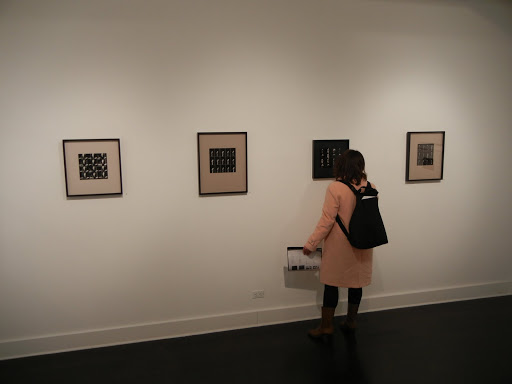
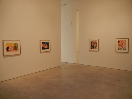
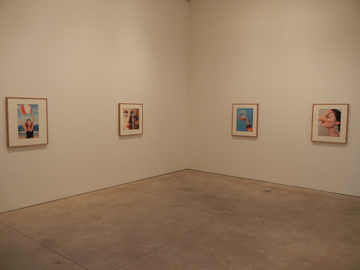
Before I get too far into my comments on my personal experience at the VIP Art Fair (here), I want to go on the record and say that I think this kind of endeavor is something that makes complete sense and should be welcomed and embraced by collectors. As a group, we’re perfectly used to seeing thumbnail sized works in auction catalogs and gallery emails, and expanding that communication method to a smoother computer-based interface for an art fair experience is entirely logical. It was only a matter of time before someone aggregated the critical mass of the world’s best contemporary art galleries into this kind of online venture, and I look forward to seeing this kind of venue evolve and succeed in the future.
I’ve actually been busy traveling this week, so I only had a brief moment to check into the site on Tuesday. I visited a gallery or two, saw the interface of images on virtual walls, thought it looked fine, and decided to come back later when I had more time to browse around. That free time didn’t actually materialize until Thursday afternoon, when I again logged in and hoped to dig around. I’m deeply sorry to report that this visit was an unfortunate bust. For better or worse, I am a PC user, with Internet Explorer as my browser. Apparently some time between Tuesday and Thursday, it was determined that Internet Explorer was not going to be supported anymore, and so when I logged in, I was urged to download an alternate browser. Having no time or inclination to do this, I went ahead anyway, knowing that this wasn’t likely to be successful, and found that I was now unable to access any of the booths. I clicked through to Pace/MacGill for example, it seemed to load, and then gave me nothing but a grey screen – no silhouetted man, no artworks on the white wall, nothing. This was true for every single gallery in the entire fair, which was discouraging.
The only way I could see any images at all was to use the search capability. So I filtered for “Photograph” and was given a series of lists not dissimilar from an online auction catalog: thumbnail image, title, date, other details, and the gallery name. When I clicked through to see a larger image, I was sent to the gallery booth, which was of course, as I’ve already explained, a grey void. And although I had paid for the VIP privilege of seeing prices, I couldn’t actually get any specific prices (since they were in the booths I assume); all I could do was sort the lists by price buckets (i.e. $100K – $250K). Any normal person would now have given up in exasperation or gone back and downloaded an alternate browser as instructed, but I persevered a bit longer to try and get a cursory handle on what photography was on offer, regardless of the failures of the interface I was using.
The show itself is divided into four sections: Premier Large, Premier Medium, Focus, and Emerging. I was able to use the sorting capabilities to determine that there were the following number of photographs on offer in each section:
Premier Large: 206 (out of 1017 total works available)
Premier Medium: 76/472
Focus: 65/169
Emerging: 38/214
Add that up and take a percentage and you’ll find that a solid 20.57% of the fair was photography.
The pricing system cut the works into 9 buckets. I’ve tallied the number of photographic works in each bucket across the four gallery sections and placed those numbers in parentheses:
$1 million + (0)
$500K to $1 million (3)
$250K to $500K (15)
$100K to $250K (33)
$50K to $100K (58)
$25K to $50K (88)
$10K to $25K (108)
$5K to $10K (86)
$0 to $5K (18)
Statistical minded folks will realize that these numbers don’t add up to the same total as the ones in the section above, diced by gallery section. I have no idea why the system doesn’t true up; my guess is that somewhere the totals got hard coded and then the galleries switched in new pieces as the fair progressed, misaligning the totals.
Since there were so few high end lots, I’ve decided to outline them in summary here, in order by artist’s name, with their gallery locations:
$500K to $1 million
1 Gursky @Spruth Magers
1 Gursky @Gagosian
1 Prince @Gladstone
$250K to $500K
1 Abramovic @Kelly
1 Arbus @Pace/MacGill
1 Rodney Graham @Donald Young
1 Nixon (Brown sisters) @Pace/MacGill
1 Penn (cigarette) @Fraenkel
1 Prince @Sadie Coles
1 Sherman @Metro
1 Sherman @Spruth Magers
1 Sugimoto (theater) @Fraenkel
1 Sugimoto (theater) @Koyanagi
1 Sugimoto (theater) @Pace
1 Sugimoto (seascape) @Pace
1 Sugimoto (drive-in) @Pace/MacGill
1 Wall @Marian Goodman
$100K to $250K
1 Abramovic @Lia Rumma
1 Aitken @Eva Pressenhuber
1 Avedon (American West) @Fraenkel
1 Avedon (Francis Bacon) @Pace/MacGill
1 Matthew Barney @Gladstone
1 Hai Bo @Pace/MacGill
1 Bochner @Fraenkel
1 Close @Pace/MacGill
1 Crewdson @Luhring Augustine
1 Demand @Spruth Magers
1 Eliasson @i8
1 Frank @Pace/MacGill
1 Gilbert & George @Bernier Eliades
3 Rodney Graham @Donald Young
1 Horn @Hauser & Wirth
1 Isaac Julien @Victoria Miro
1 Rafael Lozano-Hemmer @OMR
1 Maier–Aichen @Gagosian
1 Mapplethorpe (calla) @Xavier Hufkens
1 Mikhailov @Pace/MacGill
1 Neshat @ Gladstone
1 Roman Opalka @Yvon Lambert
1 Ruff @Lia Rumma
3 Ruff @Mai 36
1 Ruff (substrat) @Zwirner
1 Struth @Hyundai
1 Struth @Marian Goodman
1 Hank Willis Thomas @Shainman
1 Hannah Wilke @Alison Jacques
In general, while many of the major contemporary art galleries were represented here, only three photography specialist galleries were in attendance that I could see: Pace/MacGill, Fraenkel, and Yancey Richardson.
So I’m afraid this is all the information I can provide, given my limited visit to the fair. As a result, my takeaways on the VIP Art Fair are more in the vain of “what might have been”. The concept seems entirely valid and workable, especially for photography, and the brief glimpse I saw of the full interface earlier in the week gave me hope that such a model could work effectively; with roughly 400+ lots of photography on offer, it’s the semi-equivalent of one extra large, high end auction catalog. The execution this first time was more than a bit spotty, but I hope this doesn’t deter the organizers from improving the glitches for next year. As collectors, we’re absolutely ready for such an online fair, if the backend mechanics can run more smoothly.
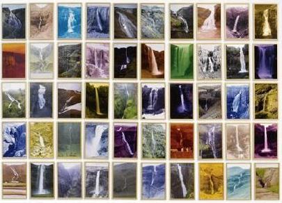 It’s a fresh start for everyone as Sotheby’s begins the 2011 auction season for photography with its Contemporary Art Evening and Day sales on the 15th and 16th in London. The top photography lots include work by Sherman, Gursky, Gilbert & George, Sugimoto, and Struth. Overall, there are a total of 28 photo lots available across the two sales, with a Total High Estimate of £2967000.
 The top lot by High estimate is lot 3, Cindy Sherman, Untitled #87, 1981, at £400000-600000. (Image at right, middle, via Sotheby’s.)
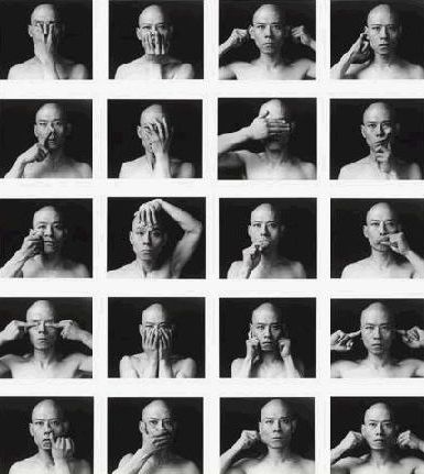 The complete lot by lot catalogs can be found here (Evening) and here (Day).


