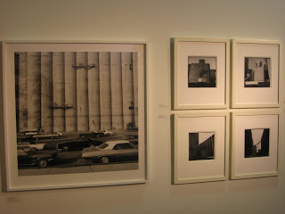
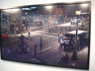
Howard Greenberg Gallery: This booth is packed to the gills with world class images. Frank Gohlke (5) (below first) four small vintage images and one large recent print; these Gohlke grain elevators are tremendous; we have two and would like to own several more; prices have risen to $9000 each for the vintage ones. Edward Steichen (3) including a vintage Gloria Swanson ($375000) which is great to see close up. Diane Arbus (4, priced $38000 to $85000), Saul Leiter (3) color images, Bill Owens (6), William Eggleston (1) the famous “red ceiling”, priced at $275000, Helmut Newton (6), Miroslav Tichy (5), William Klein (2), Edward Weston (1, below second, a small print of Tina Modotti, for $95000), Man Ray (1) a vintage rayograph at $265000, Sarah Moon (2), Rudy Burckhardt (1), Annie Liebovitz (1) John and Yoko at $55000, Bruce Davidson (9). The density of superlative imagery in this small booth is spectacular.
Daniel Templon: Hiroshi Sugimoto (2) mechanical forms.
Leonard Hutton Galleries: Taiji Matsue (4). I liked this array of abstract Matsue landscapes; they reminded me of Sommer’s desert studies.
 Springer & Winkler Gallery:
 Andy Goldsworthy (3 sets of works). We like Goldsworthy, and all of the images here are good ones: ice, snow, and stones.
Laurence Miller Gallery: Stephane Couturier (2), Fan Ho (3), Yasumisa Morimura (8), Burk Uzzle (1), Sanne Sannes (6), Ray Metzker (6, below), Bruce Wrighton (10). This booth has a grab bag of random work, but the Metzkers are definitely worth a look.
Studio La Citta: Gabriele Basilico (4), Vincenzo Castella (5). The Basilicos are terrific, a pair of black and white abstract cityscapes, and 2 wider shots from his color San Francisco series.
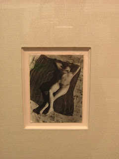
Robert Koch Gallery: Koch has gone for the “one of each” method in this booth: Jaromir Funke (1), Frantisek Drtikol (1, below), Dora Maar (1), Irving Penn (1), Michael Wolf (2), Any Stein (1), Nadav Kander (1), Shai Kremer (1), Florence Henri (1), Aleksandr Rodchenko (3), Josef Koudelka (2), Brothers Bragaglia (1). I very much like the Drtikol; it looks like one he showed us a few years ago. Perhaps it is the same one or another similar print. I like this particular image, as the nude is less Art Deco crazy than many of his other nudes.
Julie Saul Gallery: I didn’t count all the images in Julie Saul’s booth, because it is a tiny booth, packed floor to ceiling with images, many from her color show last summer.
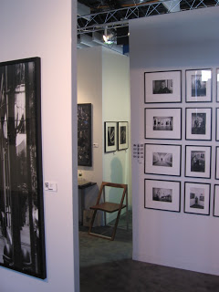
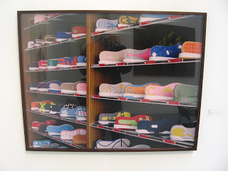
Keith De Lellis Gallery: I also didn’t count all the images in Keith De Lellis’ maze of a booth (below). With all the extra wall surfaces, there are pictures everywhere. A few of the artists represented are: Paul Himmel, Weegee, Nino Migliori, George Platt-Lynes, Louise Dahl-Wolfe, Paul Wolff, Willy Zielke, Hein Gorny, Rudy Burckhardt, Herbert Matter, Marcelo Gepetti, Mottke Weisman.
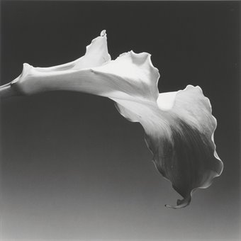
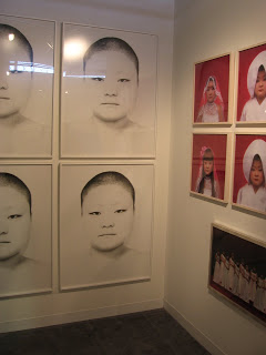
Alan Koppel Gallery: This booth had a small but well edited group of pictures: Vera Lutter (1) Rockefeller Center, Dorothea Lange (2) Migrant Mother, and an oversized Road West, Walker Evans (1) vintage Penny Picture Gallery, Robert Frank (1), Diane Arbus (2), Robert Mapplethorpe (1) black and white flower.
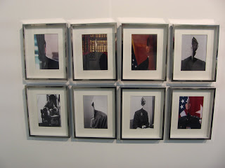
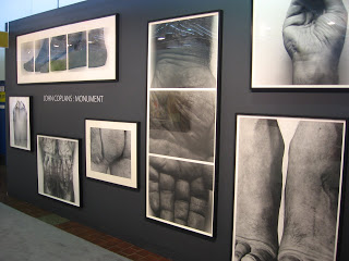
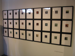
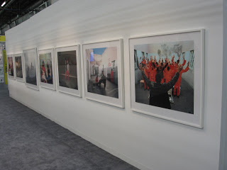
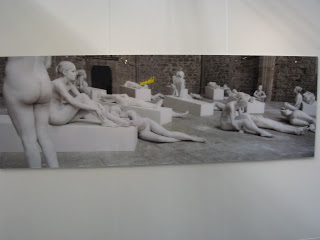
Bruce Silverstein Gallery: This booth had many attractions. First, there was the large wall of John Coplans nudes (below, first). These big works were great to see all in one place together. Second, there was an array of excellent Andre Kertesz color Polaroids (below, second). Other highlights included a small Aaron Siskind room (mostly tar pictures), a wall of Frank Paulin images, and a terrific Andy Warhol stitched photograph. Beyond these, there were: Diane Arbus (1), Robert Frank (5), Shinichi Maruyama (2), Maria Antoinetta Mameli (5), Joel-Peter Witkin (4), Todd Hido (3) and a room of vintage work including Man Ray, Outerbridge, Mapplethorpe, Hoppe, Weston, Doisneau, Lange, Lartigue, Drtikol, Weegee, and Henry Moore.
Bonni Benrubi Gallery: Josef Hoflehner (2), Abelardo Morell (2), Simon Norfolk (1), Matthew Pillsbury (3), LeRoy Grannis (2) Massimo Vitali (1) a huge pulsing picture, and a grid of 9 black and white fashion images.
Yancey Richardson Gallery: Sharon Core (3), Kenneth Josephson (7, below), Eve Sussman (1), Andrew Moore (1), Hellen van Meene (3) portraits, Victor Sambymaris (1). It was nice to see a group of solid Josephsons all hung together.
Yossi Milo Gallery: Loretta Lux (2) portraits, Pieter Hugo (1) from Hyena Men, Sze Tsung Leong (3) cities, Simen Johan (1), Kohei Yoshiyuki (6), Myong Ho Lee (3). If you have never seen one of Hugo’s massive, startling portraits of men with their hyenas, make a detour to this booth to check this one out.
Ben Brown Fine Arts: Candida Hofer (2), Matthais Schaller (3). Schaller’s dark interiors seem closely related to Hofers.
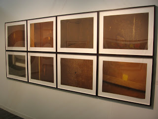
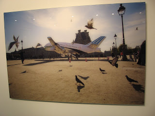
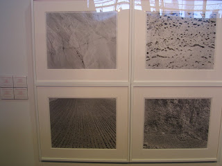
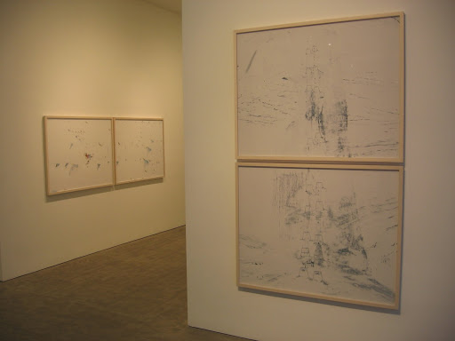
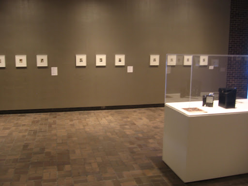
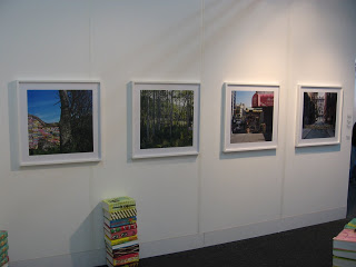
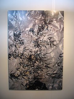
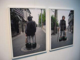
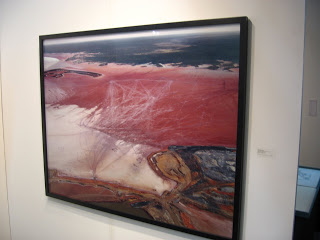
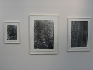
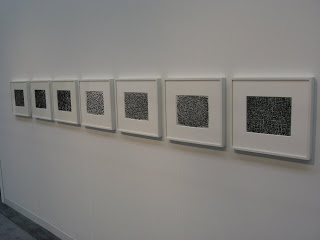
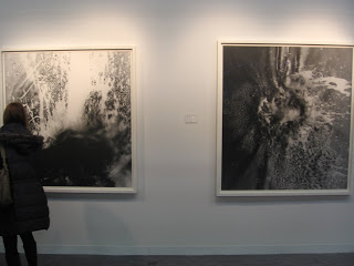
 JTF (just the facts): This show includes three different sets of new work. In the entry room, 3 wall sized silver prints with hand coloring are displayed, framed in black, all from 2007. In the main room, 3 color landscapes are shown, in two sizes (40×48 and 70×80), framed in blond wood, C-prints on Diasec, all from 2008. In the far left room, there are 9 black and white heliogravure landscapes, each 48×54, framed in black, all from 2008. (Installation shots at right.)
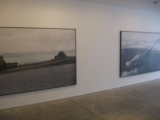 There are a few images in the new show at Sonnabend that continue in this same “yellow” direction, combinations of painterly sky and water, from beaches or valleys or picturesque wetlands, often with a subtle 20th century intrusion. While Esser did his studies with the Bechers in Dusseldorf, his work seems to have evolved away from their deadpan objectivity to a warmer, more subjective reality in his picture making.
 Collector’s POV: The large silver prints with hand coloring are priced at $50000 each. The color landscapes are either $10000 or $30000 based on size. The heliogravures are $8000 each, in editions of 12. Esser’s work has generally been available at auction in recent years, typically ranging between $25000 and $75000 (with a few outliers).


 With the arrival of the first Spring season auction catalogues, we’re now headed into a busy month of sales,
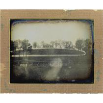


 Victoria Miro: William Eggleston (1), Alex Hartley (1).