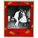
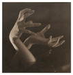
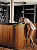
Ruud van Empel, Moon World Venus

JTF (just the facts): Ruud van Empel, Moon World Venus, published in 2006, in conjunction with an exhibit at the Museum Het Valkhom, Nijmegen. 151 pages. In English and Dutch. (World #11, 2005 at right.)

Comments/Context: When I saw this book in a museum bookshop recently, I knew we had to have it for our library. Even though we don’t collect portraits, we’ve been interested in the Dutch artist’s work since we were introduced to it a few years ago. His large format portraits really jump off the wall at you, full of saturated color and mystery. When looking back a few decades from now, I think we will think of the 2000s as a time when digital manipulation first came into widespread use and photographers really began to use the new tools to actually rethink the practice of picture making, rather than for quick and cheap visual trickery.

van Empel’s work seems to reference and echo the art historial past in interesting ways. It is hard for me to look at his work and not be reminded of both the paintings of Henri Rousseau (see The Dream, 1910, below left) and the photographs of Mike Disfarmer (see Little Blond Girl, below right)

The van Empel potraits are very painterly, with lush, high precision tableaux set behind the figure. And yet the figures themselves are very straightforward. The combination lends the pictures as sense of impossibility, or innocence, or contrast, or an aura of sinister trouble awaiting. They’re definitely not boring, and not anything that could have been done before the advent of the new technology.
The monograph has a complete set of all of van Empel’s work to date, so the evolution and refinement of his ideas can be seen more clearly.

Collector’s POV: I think these images are going to hold up well over time. (Moon #1, 2005 at right.) They can also be paired/contrasted with the work of the German photographer Loretta Lux (her site is here), who is perhaps slightly better known here in the US and riffing on a similar theme. The work of both artists has begun to appear on the secondary market. The value of Lux’ work has been strong, consistently running in the $10000-20000 range, with quite a bit of material coming up for sale. There has been less of van Empel’s work in the auction market, so I’m not sure where the prices are shaking out, but my impression is that his prices are somewhat higher and rising fast.

Ruud van Empel’s artist site is here. He is represented in the US by Stux Gallery.

Polaroids: Mapplethorpe @Whitney

JTF (just the facts): 90 small black and white images, all approximately 3 1/2 x 4 1/2 (or the reverse), displayed in two rows, two images high, in white frames, in one room. Found in the hard to get to Mezzanine gallery (up to the top floor, through the permanent collection, down the back stairs by the Calders). Mostly portraits and self-portraits, with a mixture of other subjects as well. (Untitled (Self Portrait) 1973 at right. Copyright held by artist.)

Comments/Context: All of the images in this exhibition are from the period between 1970 and 1975, when Mapplethorpe was experimenting and learning how to be a photographer. Not surprisingly, there are many “exercises” in form, camera angle, framing, and the usage of light. The subject matter is the stuff of his everyday life: his friends, their apartments, their things. The images are intimate, personal, and sometimes lovely. (Untitled (Catherine Tennant’s House, London) 1973 at right. Copyright held by artist.) You can also see how Mapplethorpe was beginning to think about paring down an image, to get at its essence, even if that image was therefore a bit more staged.
As I walked through the show, I kept coming back to the similarities between this early work and the work of Francesca Woodman. (There was an excellent show of her work at Marian Goodman last fall.) Her photographs also have an experimental feel, with a personal, and feminine, point of view. It would be fascinating to see these two shown together.
Collectors POV: As collectors of floral/botanical images, Mapplethorpe is clearly a core artist for us, and adding one of the florals from this early work would help show the evolution of his style of image making. Nearly all the images in the exhibition are held by the Robert Mapplethorpe Foundation (website here), although a few Polaroids can be found out in the marketplace as well. Given Mapplethorpe’s popularity, there are a large number of galleries and dealers who carry his work (42 on artnet); we have had success working with Sean Kelly and Alison Jacques. At auction in the past few years, the Polaroids have been a relative bargain (compared to the iconic work), running in the $3000-7000 range.
Sylvia Wolf and the Whitney put out a nice monograph of the Polaroids in conjunction with the exhibition. While Mapplethorpe and The Complete Flowers would be Essential Reference on Mapplethorpe, this book is clearly POTS (Part of the Story) and therefore worth adding to your library.

Rating: * (1 star) GOOD (rating system defined here)
.
Polaroids: Mapplethorpe
Through September 7th

Whitney Museum of American Art
945 Madison Avenue
New York, NY 10021

Frank Gohlke: Where We Live – Queens, New York 2003-2004 @Greenberg

JTF (just the facts): 20 images of Queens, New York, in the main gallery. (See image at right, copyright held by artist.) Images are 20×24 (or the reverse), in editions of 15, most taken in 2003 and printed in 2008. A group of vintage material from the 1970s and 80s, entitled Frank Gohlke: Houses, is found in the smaller gallery with bookshelves. There are 11 images in this gallery.

Comments/Context: Going into this show, I was really primed to like it. We have been fans of Gohlke’s work for many years now and have two images from the 1970’s grain elevator series in our collection (see here). I had actually stuck the opening announcement card up on a bulletin board in our house, so as not to forget to see the exhibit.

So it was surprise for me to find, after wandering around the gallery a time or two, that I was underwhelmed. The introductory wall text (written by Gohlke) referred to the idea of “urban tomography”, where an image of the city would be assembled “in slices” (like the medical instrument does). This seemed to me to be another example of obtuse, overly analytical artist-speak. So I looked carefully again and again, hoping one or more images would jump off the wall at me. But they just stayed there, showing me quiet moments, of semi-suburban houses and street corners (with very few people, if any) in mixed neighborhoods. These are very well made pictures, with precise framing and meticulous printing, but I couldn’t, in the moment of seeing them for the first time, get my head around why this point of view mattered, and whether it had already been done before.

It seems this project was a commission by Queens College, where Gohlke and his friend Joel Sternfeld made a proposal to work in conjunction (where and when Sternfeld’s views of these same streets will surface isn’t known by me). So later that night, I started to think more about where I might have seen this work “before” (especially since he was a member of the original New Topographics exhibit) and where it might fit into a more historical context. After a quick dash over the bookshelves at home, I came up with half a dozen potentials to compare with the recent Queens work:

  • Robert Adams, 1970s images of Colorado from The New West: Adams’ images are much harder, with much more comment built in on the harshness of suburbanization. Gohlke’s Queens pictures are softer and more assimilating. Not a great match.
  • Lewis Baltz, late 1960s/early 1970s images from Tract Houses: Baltz‘ work is also harder, with more geometry and fragmentation. Gohlke’s images are more inclusive and less about pattern (although a few have fencing/latticework that provides visual interest). Not a great match.
  • John Divola, contemporary images from Isolated Houses: Divola’s large color images speak very much to isolation (hence their title I’m sure). Gohlke’s work seems to be more community-oriented. Not a great match.
  • Joel Sternfeld, early 1980s images from American Prospects: Sternfeld’s work has much more narrative going on, with people carefully placed and a edge of wry humor. The narrative in Gohlke’s work is much more subtle. Not a great match.
  • Lee Friedlander, contemporary images from Sticks and Stones: While there are some somewhat comparable images in this group, no one would ever mistake Friedlander’s flattened picture planes and patterns for the Gohlke work. Not a great match.
  • Henry Wessel, 1990s images from Real Estate Photographs: Wessel’s images of homes in Richmond, CA, taken with a straight forward approach seem to be closer in terms of noting how a community evolves its own look and feel. But they lack the tenderness that Gohlke has brought to the Queens pictures. Closer, but still not a great match.
  • Stephen Shore, mid 1970s images from Uncommon Places: Shore’s work of houses in this series, although in color, was the closest I could find in terms of aesthetic approach and overall tone.

So I found myself, standing in the living room, having exhausted my avenues of exploration (who did I miss?), slowing coming to the conclusion that there may have been more to these Gohlke pictures of Queens than I originally gave them credit for. While they fit into a larger context of work about suburbanization, assimilation, and Americanization, they are quieter (less showy), with more emphasis on community, and more generally positive than any of the other work I have identified. Certainly, they make sense in the context of the rest of his career. And maybe this “urban tomography” idea wasn’t so ridiculous after all. These images, taken together, provide an interesting window into Queens (and into America more generally), even if they aren’t as earth shaking in my view when taken as individual images.

So go and see this show before it closes. And don’t to the hit-and-run flyby we are all apt to do once in a while. Take the time to be patient with the work and allow it to bring you in.

Collector’s POV: Gohlke is generally under appreciated by collectors I think. The new images in this exhibit are retailing for $4000, with the vintage material in the other room ranging from $4000-7500. At auction in the past few years, Gohlke’s pictures have found their way to a range of about $3000-6000, although there haven’t been too many sold, and not many were his best images, so perhaps it is hard to plot a line from so few data points. The travelling retrospective of his work Accommodating Nature currently at the CCP, having started at the Amon Carter Museum, will likely increase the interest in his work.

The catalog from this retrospective show should go on your Essential Reference list, as should Measure of Emptiness, which focuses on the grain elevators.

Rating: * (1 star) GOOD (rating system defined here)

Frank Gohlke: Where We Live
Through August 22nd

Howard Greenberg Gallery
41 East 57th Street
New York, NY 10022

Bernd and Hilla Becher: Landscape/Typology @ MoMA

JTF (just the facts): 14 typologies, totalling 186 individual images, displayed in the temporary exhibit space (1 large room with a dividing wall) adjacent to the series of rooms showing selections from the permanent collection of photography. 10 3×3 typologies, 2 3×10 typologies, and 2 3×6 typologies, covering most of the Bechers’ major subject matter groups: water towers, winding towers, coal tipples, blast furnaces, coal bunkers, gas tanks (Gas Tanks, 1971-1997 at right, copyright held by artist), cooling towers, and industrial landscapes. Most of the individual images are 14×11, except the industrial landscapes, which are 20×24.

Comments/Context: This is a terrific exhibit. Since the Bechers’ work has crossed over into the world of Contemporary Art (capitalized), it seems to me that you tend to see a single typology example of their work, set among a variety of other contemporary art (not photography). Rarely is such a large group of typologies assembled, which makes it all the more visually arresting. Much of the commentary on the Bechers’ work is full of words like systematic, functionalist, conceptual, pattern, forms, details and the like. And while these words do tell the story of the work, I came away with a few other ideas from this show.
The first is that the typologies are a profound exercise in theme and variation, in an almost musical sense. Much like Bach’s Art of the Fugue or Goldberg Variations, I found myself looking at these works as beginning with a melody line, and then each succeeding image adding a variation on that melody or harmony. (Water Towers 1966-1989 at left, copyright held by artist.) I also began to wonder whether my eye was actually traversing these typologies in a manner different than any other art, moving from left to right and down and back again to compare and contrast different images and forms.
The second idea was brought home by the Industrial Landscapes in the middle of the room. Virtually all of the Bechers work has the same dead-pan look: flat light, same camera angle, same framing, no people etc. They are devoid of context, omitting any information about their relationship to their environment. The Industrial Landscapes pan back and take in the whole setting of the structures. In many ways, I think these images are less successful than the frontal views, as the theme and variation idea breaks down quickly due to a lack of comparability. I do think however that by showing this work, which is fully “in context”, side by side with the “out of context” work, it makes the contrast more thought provoking.
The third idea was that I became more interested to know more about how the Bechers have taught photography at the Dusseldorf Art Academy (in contrast to methods used anywhere else in the world). With such esteemed pupils as Andreas Gursky, Thomas Ruff, Thomas Struth, Candida Hofer, and many others, I found myself wondering about the details of how they ran their classes, and whether there are more obvious or literal remnants/influences of their teachings in the work of the students. Their school is one of the most important sources of photography innovation in the last few decades: where is the exhibition tying all these folks together coherently?

Collector’s POV: The market for the Bechers’ work seems to be divided into three ranges: a low end range, where offset prints, mostly of diptychs, in large editions are available in the $1000-2000 range (all prices at auction); a mid range, which includes larger format gelatin silver prints of individual structures, small gelatin silver print diptychs, and other small gelatin silver print typologies, in the range of $15000-50000; and a high end range, with larger scale, iconic typologies of multiple images, at $75000 and up into six figures. (Series of Winding Tower and Coal Tipple typologies at right, copyright held by artist.)
We have been looking for just the right image from the Bechers to add to our collection for a while now, realizing that an amazing large typology doesn’t work for us for many reasons (size, cost, etc.). Our ideal would be to find a small, early gelatin silver diptych (typology on one side, single image on the other) that was well priced (ha!). This has been next to impossible so far, given the strong interest in the Bechers’ work. We thought we had found a good substitute this spring in the auction at Villa Grisebach, where a small working page diptypch (contact prints with glue and notations all over) from the Framework House series was available at a low estimate. Unfortunately, the image went for 5 times the high estimate, before the buyer’s premium! And in Euros as well. Ouch.
The Bechers are represented by Sonnabend Gallery and Fraenkel Gallery among others.
There is a series of excellent monographs put out by the MIT Press on the various Becher subject matter groups. Essential reference for your photo library.
Rating: ** (2 stars) VERY GOOD (rating system described here)
Through August 25th
11 West 53rd Street
New York, NY 10019

Notes on the Link Lists

A few background comments on the various links we’re recommending on the right:

Galleries/Dealers: While we have met with and purchased from a wide variety of galleries and dealers from around the world over the years, the ones on the right have consistently provided us with both great material and great service. The best of these have spent time getting to know our collection and our aesthetic taste and have proactively introduced us to work that fits our point of view. They have truly acted like partners in the process of collection building and have become friends. More broadly, these galleries and private dealers put on excellent exhibitions, publish high quality catalogues and are a tremendous source of expertise and learning.

Auction Houses: All of the houses at right have semiannual (or more often) sales dedicated to photography and we have purchased from each of them at one point or another. Auction previews have been a great opportunity for us to see (and touch) a wide variety of world class work and to learn first hand from the specialists.

The houses in Europe offer a different slice of material than the US based houses, and provide excellent packing and shipping services to make it easy for foreign collectors to buy and sell. Many other smaller houses around the world are getting tuned into photography, so the market is getting broader.

Museums: These museums consistently offer thought provoking and challenging photography exhibitions (even the ones that don’t have a full time photography mandate). For the ones in our home city, we are members of the museum or at least visit often; for those out of town, we make a detour when we can.

Magazines/Newsletters: We read and subscribe to all the publications listed on the right. They each provide interesting/valuable insight into the world of photography and are worth your time/money.

Blogs: There are a multitude of blogs out there that have something interesting to say from time to time, so many that one can get lost just trying to keep up with them all. We find these blogs to be on a short list of those consistently worth checking out.

Let us know what we’ve missed in each category!

Sign up for our weekly email newsletter

This field is required.