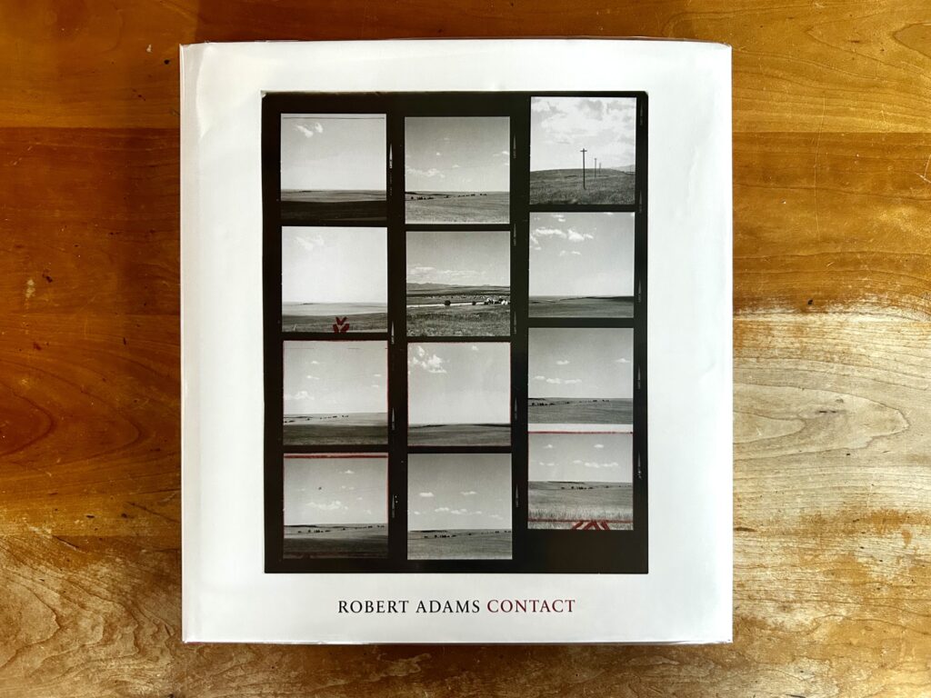
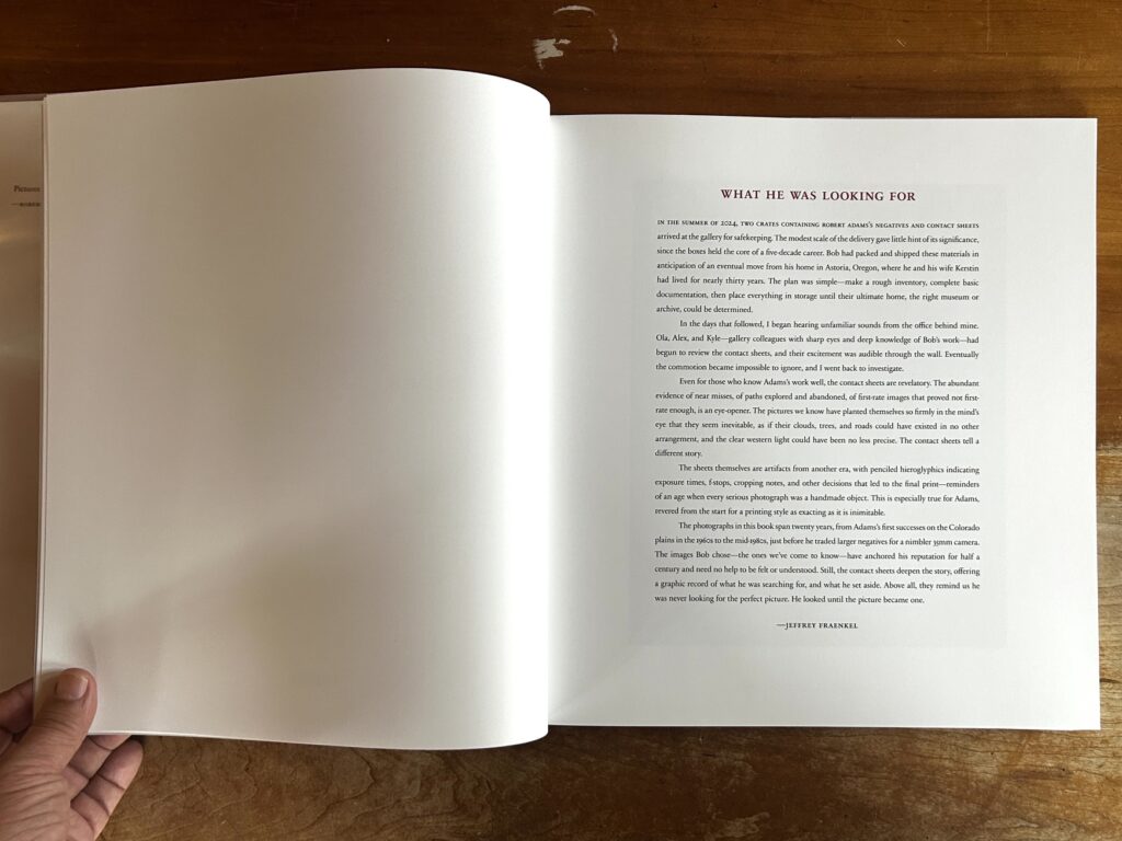
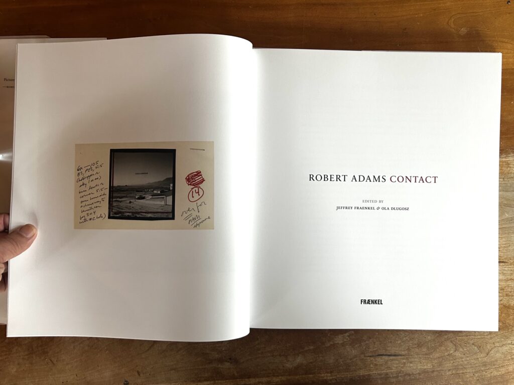
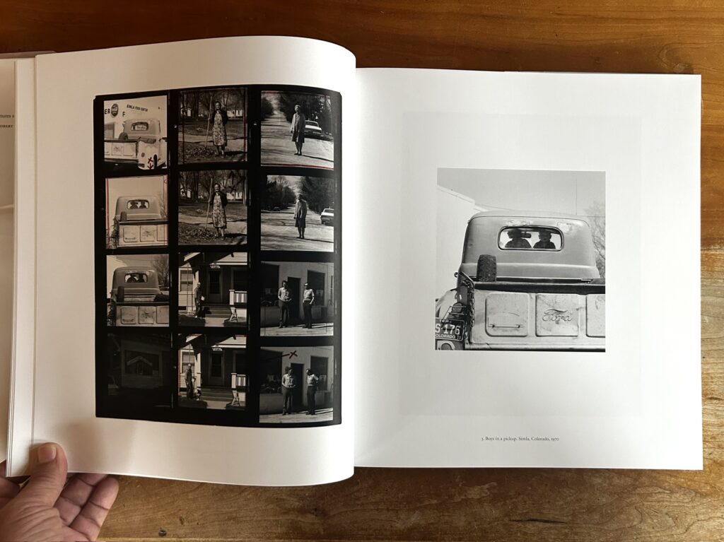
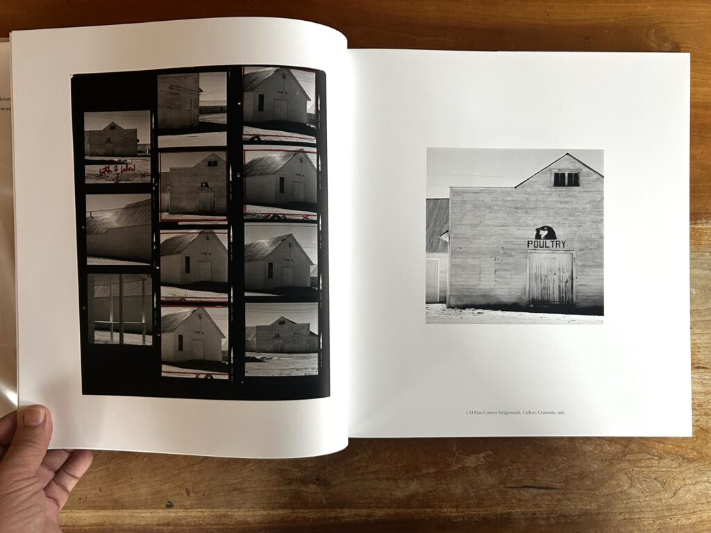
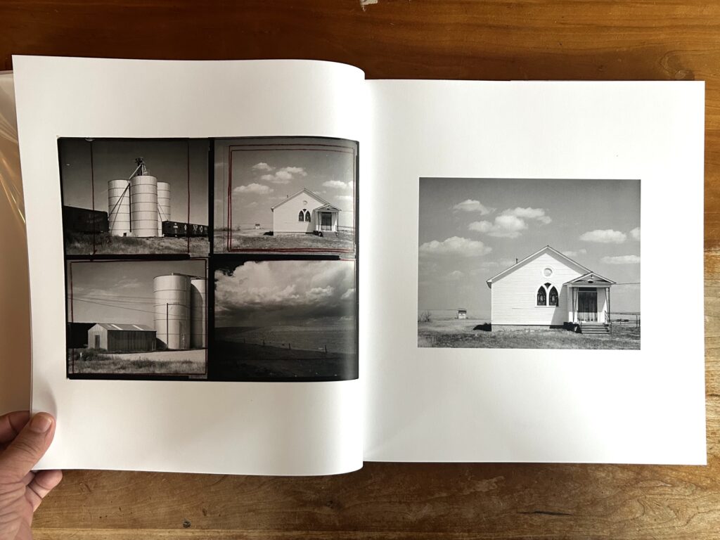
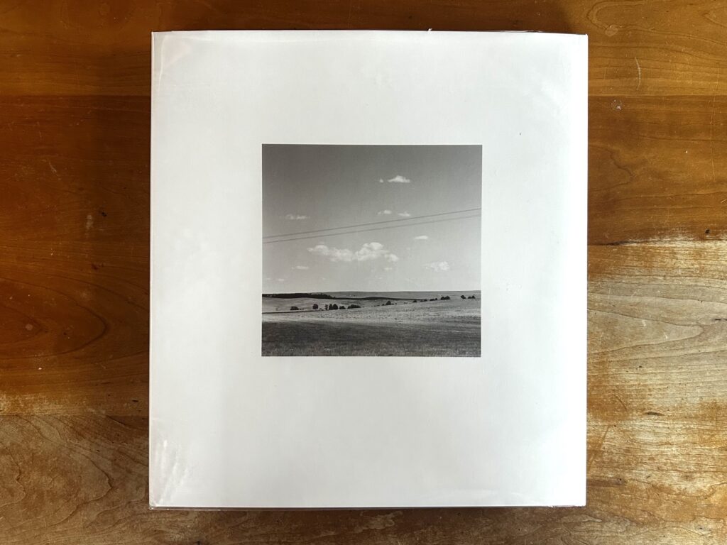
JTF (just the facts): Published in 2026 by Fraenkel Gallery (here). Clothbound hardcover with dust jacket, 13×12 inches, 108 pages, with 50 tritone and 52 color illustrations. Includes an essay by Jeffrey Fraenkel. (Cover and spread shots below.)
Published in conjunction with the exhibition Contact (here) at Fraenkel Gallery in San Francisco, October 29th – December 19th, 2026.
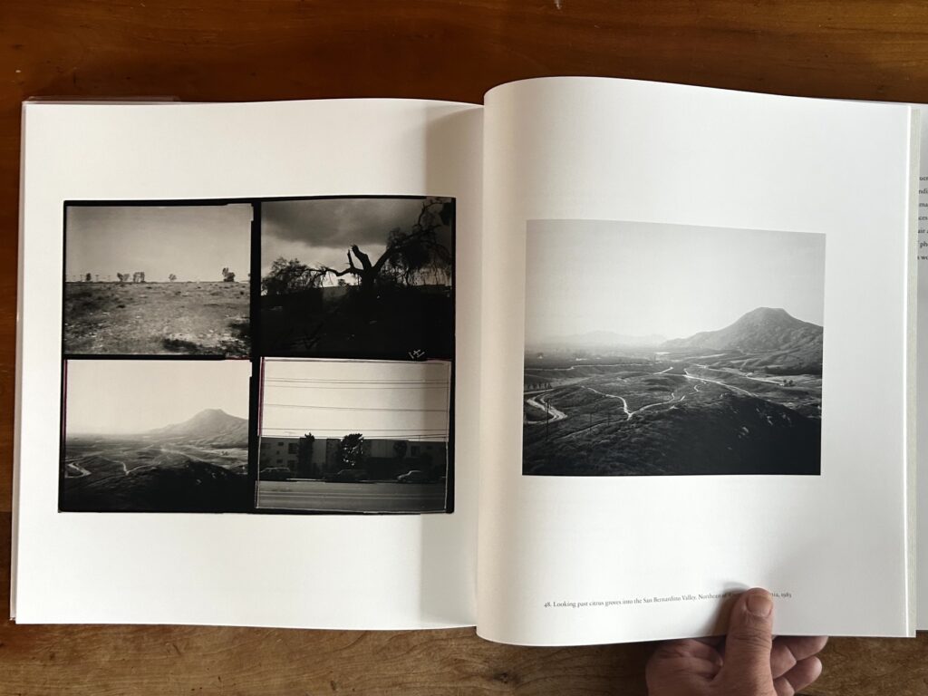
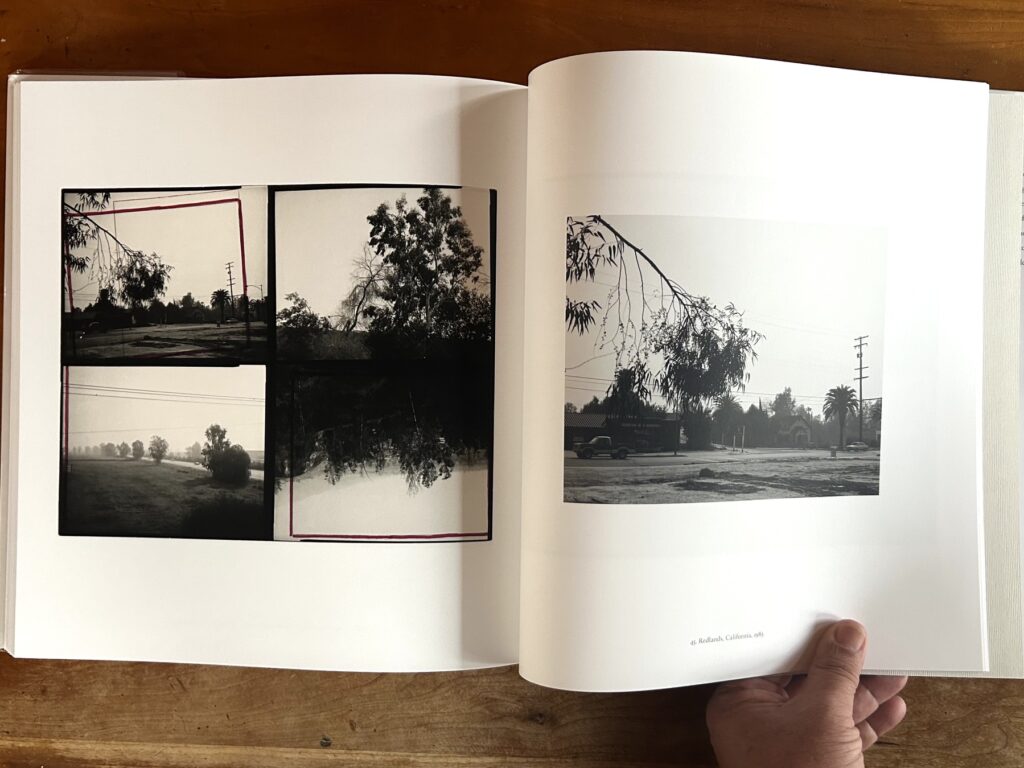
Comments/Context: One of my favorite pictures by Robert Adams comes from his monograph Los Angeles Spring. It shows a vacant lot in Redlands, California, in 1983, not far from the university where Adams earned his English degree a quarter century earlier. As with many of his photographs from the period, the focus of attention is hard to determine. Palm trees, utility poles, a highway sign, and Mission Revival buildings line the far side of a narrow road. Two cars idle by slowly in the middle distance. A tree branch obscures the upper left of the frame, while the right side is a blank void expanding out of the frame. Ho hum, just another weatherless day in Orange County.
Even by the prosaic standard of the “New Topographics” movement—which Adams had helped to establish a few years before taking this photograph—the scene seems utterly banal. What drew his attention? What made him stop and set up the camera? Is the photograph a statement about suburban malaise? A commentary on seasonal light, or the joys of morning walks? Is it verdict on car culture, the pastoral muse of a strident naturalist? Maybe it was simply that Adams hadn’t taken photo in a while, and he felt the itch? The Redlands scene raises many questions, and provides few answers. “Pictures should look like they are easily taken,” is one of Adams’ guiding principles, and this one supports the premise. Beyond that, its meaning is obtuse.
The mystery deepens when we consider the contact sheet surrounding this exposure. There are four pictures from that morning, filling the corners of a single 8×10 gang sheet. All were shot with a 4×5 view camera, and printed full-frame with black borders intact. The photo in question is in the upper left. Adams has zeroed in on the frame to mark his intended cropping with a red rectangle. In a peculiar twist, the crop marks are rotated 10 degrees counterclockwise, to straighten up the original verticals. It seems that somehow—even during an unhurried morning spent walking and contemplating—Adams had captured the scene stilted. Hmm, maybe this picture was not as easy to take as it seems? If so, it’s no problem. Time spent later with the proof sheet allowed Adams to hone the composition.
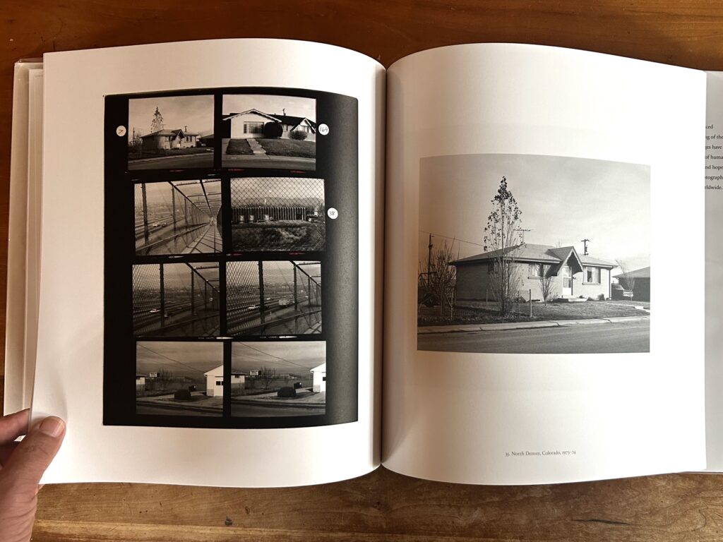
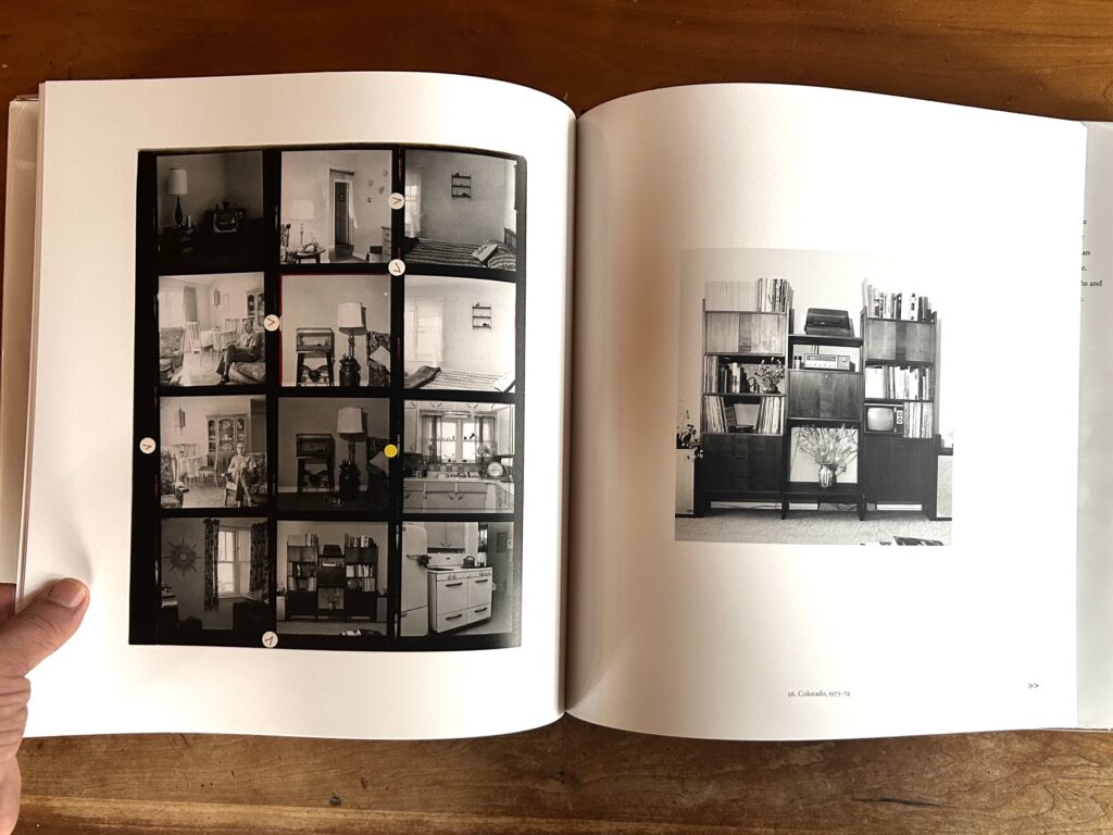
This example is one of fifty pairings in the latest photobook by Robert Adams. Each matches an original contact sheet with its final print, often juxtaposed across a double spread. The book is called Contact, a title which hints at traditional darkroom methodology and also the artist’s tactile instinct for unvarnished detail. Published in conjunction with an exhibition at Fraenkel Gallery, this body of work comes none too soon. Adams is 89, and presumably closer to the end than the beginning. Over a career spanning more than 60 years, he’s earned his role as an elder statesman of American photography, dispensing wisdom like leaves in the breeze. He has published more than forty photography monographs and several books of essays. But until this latest offering, he had kept his contacts to himself, and kept scholars guessing. A glance at those sheets might serve as an x-ray guide to his visual thinking, or so we might have hoped or imagined.
With a nudge from Jeffrey Fraenkel (his gallerist in San Francisco), Adams is finally ready to share the goods. As Fraenkel explains in the book’s introduction, Adams’ physical archive was stored until recently in his Oregon home. In 2024, with an eye toward posterity, he shipped the whole works in two crates to Fraenkel Gallery for safekeeping. “In the days that followed,” Fraenkel writes, “I began hearing unfamiliar sounds from the office behind mine…Eventually the commotion became impossible to ignore, and I went back to investigate.”
The contact sheets which most excited Fraenkel and his assistants begin around 1965 and continue through the early 1980s. This was an active period for Adams, during which he published a series of knockout photobooks including The New West, Denver, From the Missouri West, Summer Nights (reviewed in exhibition form here), and Los Angeles Spring. Sandwiched around the New Topographics exhibition in 1975, they gradually established his international reputation.
Adams has always been a photographer’s photographer, with a visual approach which is reserved and unassuming. Unlike his namesake Ansel, few of Robert’s images can be classified as iconic. To the extent that any of his photographs or known outside the photo community, many are found in The New West. Several images from that 1974 book are represented in Contact. For serious scholars and casual fans alike, those images alone may be enough to justify the purchase price.
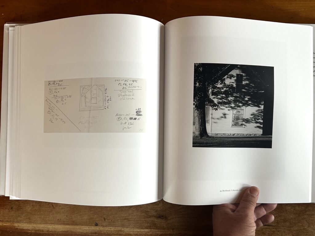
Adams’ silhouetted window woman from Colorado Springs, 1968, for example, is accompanied by a single-frame contact pasted on a page with handwritten enlargement notes. His musings may not tell us much about his editing process, but the opportunity to peek over Adams’ shoulder in the darkroom feels like a private tour. Hold sunlight ground 1, burn sky and roof 4…Check. Rarely have simple enlargement instructions felt so tantalizing.
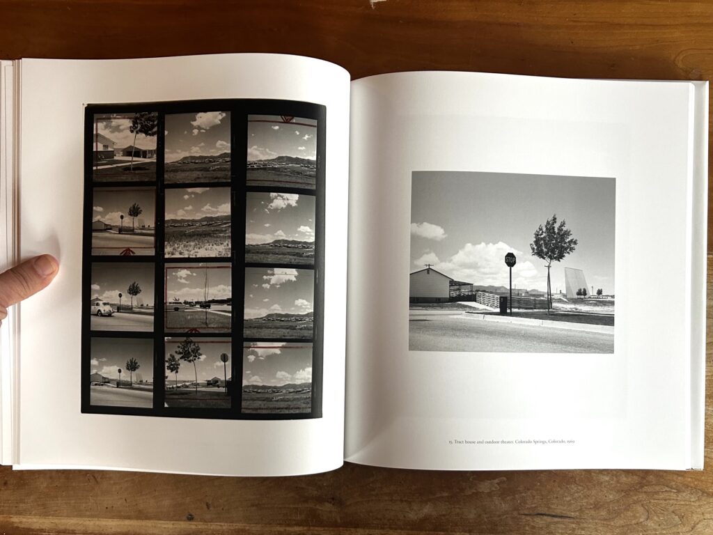
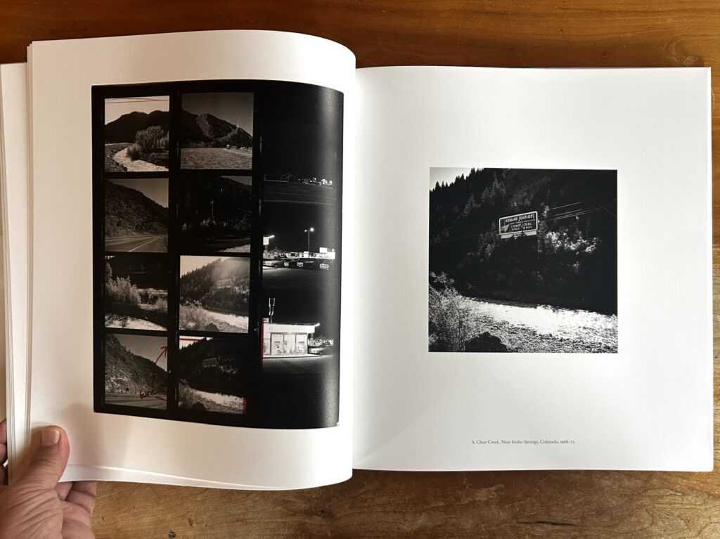
Adams was primarily using a square format camera in this period. On occasion he would crop his negatives into rectangular frames to resemble the 4×5 aspect of a view camera. With Contact in hand, we can see that he used this method on his photo of a Colorado Springs tract house and outdoor theatre from 1969. He applied a similar treatment to an arid highway photographed in Clear Creek Canyon, removing a seemingly insignificant strip of sky from the square frame’s upper margin. His exact reasoning is ineffable. But it sure is fun to get a glimpse behind the scenes. Later in his career—the book is generally sequenced chronologically—Adams transitioned from square format to 6×9 and then 4×5. Adams cropped liberally and often, and it’s often difficult to assign his final prints to any certain camera. But by looking at his contacts we can see which exactly tool was used for which photographs.
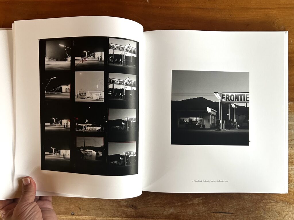
These are minor insights into his technical process. But for me the chief joy of contact sheets runs deeper. They allow the reader to take the editing wheel for a moment. You are presented with a stark choice. Which frame should you choose and why? Consider Adams’ 1969 Frontier Gas Station photograph from Pike’s Peak for example. This one appears in the book opposite a full roll of 12 square frames. Hmm. Which one is the winner? Maybe the figures standing under a bright lamp? Or the mountain backdrop? Adams followed his own proclivities and that’s fine. But why in the world did he favor the frame which awkwardly crops the “FRONTIE-“ sign? Was it an homage to imperfection? A strike against commercialism? A hint of his dusky proclivities to follow in Summer Nights? This contact comes with no handwritten hints, and readers are free to speculate.
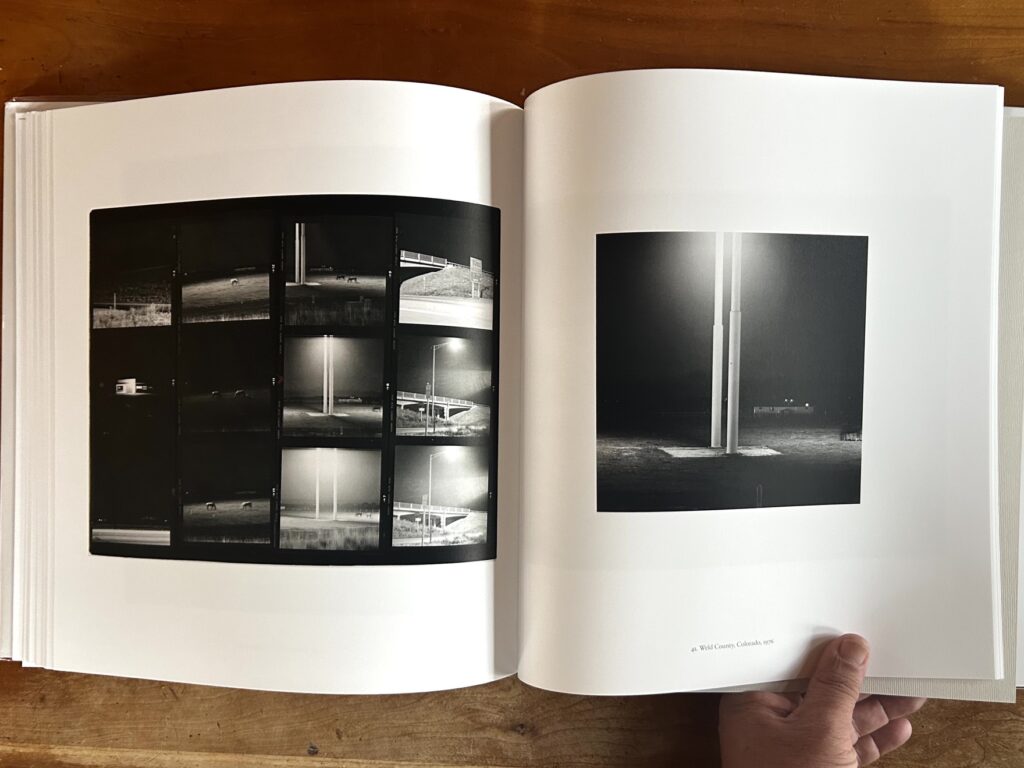
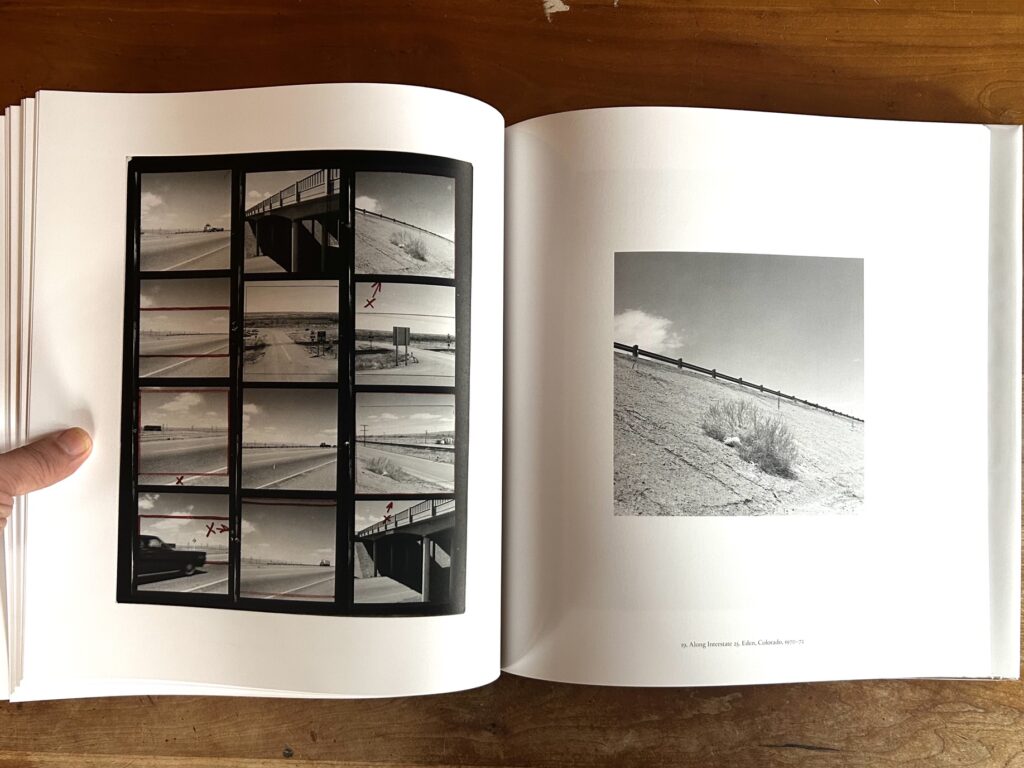
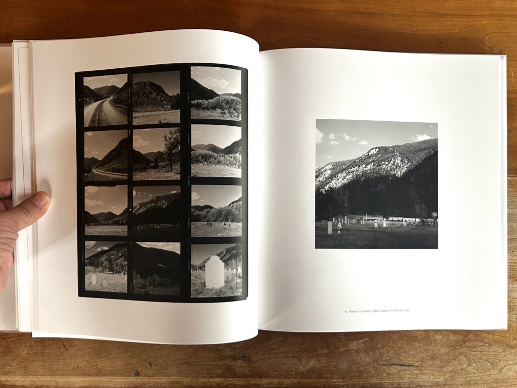
A photograph taken along Interstate 25 near Eden, Colorado is just as puzzling. The contact’s twelve frames explore a lonely freeway near an overpass, poking around pavement, cars, and sky. Not much is happening to begin with. But Adams has made the final scene even more desolate by choosing the bleakest picture on the roll. It’s a diagonal guardrail separating a bush and a distant cloud. Why photograph this embankment, and why choose this one to print? Did it harken a daydream or a feeling? “No place is boring,” he has written, “if you’ve had a good night’s sleep and have a pocket full of unexposed film.”
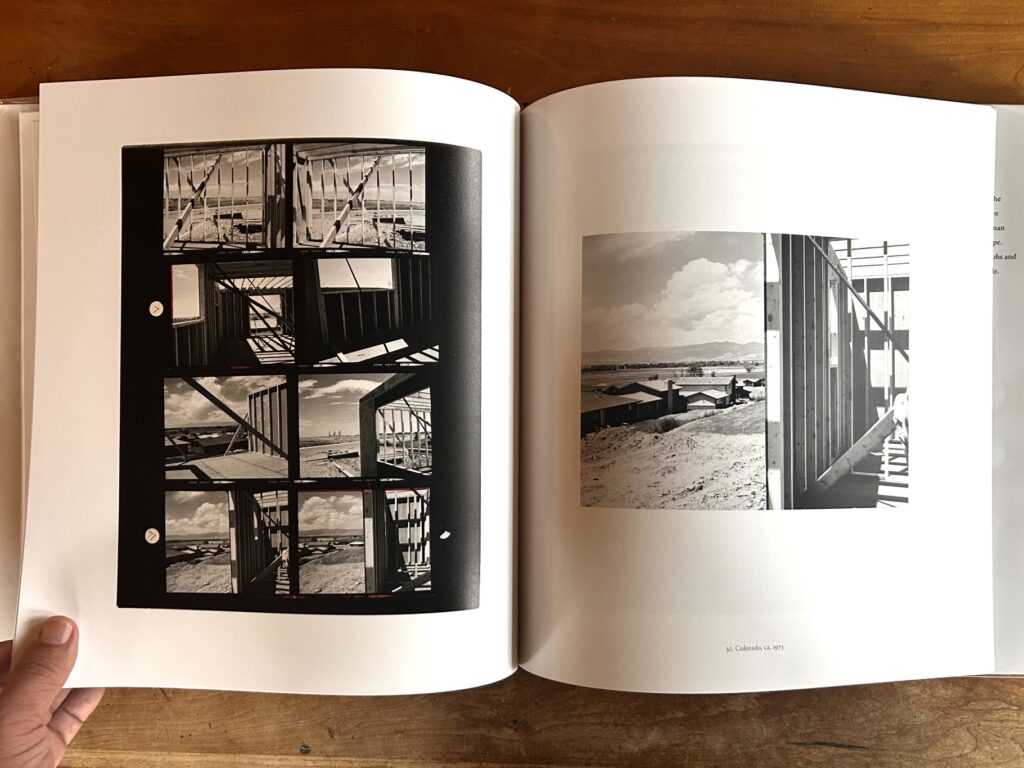
Fair enough. We can’t tell from this book how Adams slept or what bored him. But through his contacts we can see something of how he approached a scene, and how he moved through the world in his prime. Investigating a home construction site in Colorado in 1973, the resulting sheet of eight frames narrates his arrival at just the right split-frame composition. The chosen shot—with atypically deceptive layering—feels like a clear winner to me. This might be as close as Adams comes in the book to a “decisive moment.” But since he does not shoot many people or action scenes, his process rarely peaks with this much clarity. Instead it’s usually just him, poking around. Follow this path for 60+ years and you cover some territory.
Adams has been at this a while, and he’s written a ton about photography. It would’ve been nice if he’d contribute an essay to Contact, but it includes no author statement. Perhaps he didn’t feel the need to add to what’s already out there? He once explained his selection process this way: “The photographer walks a few steps and peers, rather comically, into the camera; to the exasperation of family and friends, he inventories what seems an endless number of angles; he explains, if asked, that he is trying for effective composition, but hesitates to define it. What he means is that a photographer wants form, an unarguably right relationship of shapes, a visual stability in which all components are equally important. The photographer hopes, in brief, to discover a tension so exact that it is peace.” This paragraph might apply to the act of exposure, or to the act of selecting pictures from a contact sheet.
By Fraenkel’s reckoning, Contact casts a new filter of understanding on Adams’ existing ouevre. “The pictures we know have planted themselves so firmly in the mind’s eye that they seem inevitable,” he writes. “The contact sheets tell a different story.” This may be true for some images in the book. But for most others, the story still feels wide open. These old contacts provide a wealth of information and context. But for me they raise more questions than they answer. Adams was ruthless with his red pen, marking out frames with few restraints. In some of his contact sheets, nearly every negative is cropped into one potential alteration or another. Clearly he was engaged and active while pouring over them. But the book is mute about his selection process. Why did he choose this image rather than that one? That’s up to readers to guess. If there no reasoning is articulated, perhaps it’s because Adams himself doesn’t know. Whether in the field or on the editing table, he trusted gut impulse more than logic.
The result is a book which feels like a career supplement. If you own some of Adams’ books already, especially from his heyday in the 1970s and early 1980s, Contact will provide a good study guide. You can revisit certain photographs and see how they were shot, selected, and cropped. It’s fun to put yourself behind the editing wheel, and gain some insight into Adams’ visual process. But even with this book in hand, it’s likely he’ll remain a cypher. On a certain level, these contact prints are inscrutable, and every bit as mysterious as any fact clearly described.
In terms of production standards, Contact is up there with the best of Adams’ monographs. Fraenkel Gallery has pulled out all the stops, with tightly bound cloth casing, thick pages, and gorgeous reproductions. It’s ironic to confer such treatment on draft materials never meant for public consumption. But in this case it works. For those like me who cannot visit the exhibition in person, the book is a close substitute.
It comes to us in a mini-glut of similar books. MACK has published two books of photographer contact sheets in the past year, exploring the oeuvres of Peter Hujar (reviewed here, as a museum exhibition) and David Armstrong respectively. Deadbeat Club is about to publish a calendar of Todd Hido’s contacts. William Klein’s Painted Contacts was published a few years back, while Newsha Tavakolian’s They Laughed At Me (reviewed here) blended her pictures with old contact sheets.
On the one hand, this is a continuation of past trends. Contact sheets have appeared here and there with some regularity, in various shows and books (for example, here and here). But the uptick in recent titles may signal a new zeitgeist. The digital revolution seems to be driving analog nostalgia, and a fascination with printed ephemera. The boomer generation of film shooters is approaching late careers, prime age for archive diving and recontextualization. Robert Adams’ Contact arrives at the confluence of these currents.
Collector’s POV: Robert Adams is represented by Fraenkel Gallery in San Francisco (here), Matthew Marks Gallery in New York (here), and Zander Galerie in Cologne (here). Adams’ photographs have become consistently available in the secondary markets in the past decade, with recent prices ranging between roughly $3000 and $330000.