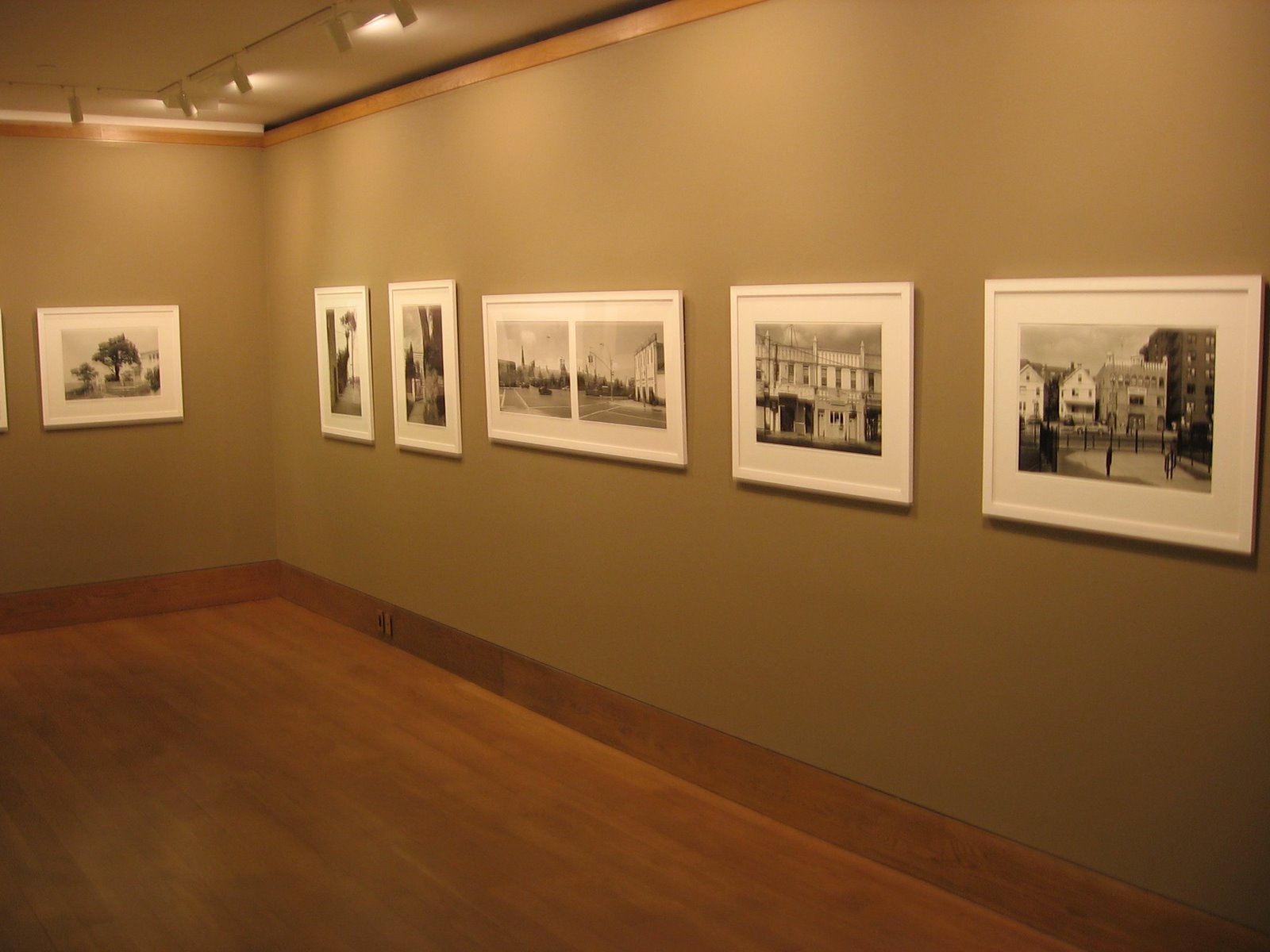
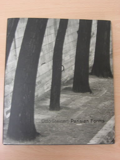
 JTF (just the facts): 20 images of Queens, New York, in the main gallery. (See image at right, copyright held by artist.) Images are 20×24 (or the reverse), in editions of 15, most taken in 2003 and printed in 2008. A group of vintage material from the 1970s and 80s, entitled Frank Gohlke: Houses, is found in the smaller gallery with bookshelves. There are 11 images in this gallery.
Comments/Context: Going into this show, I was really primed to like it. We have been fans of Gohlke’s work for many years now and have two images from the 1970’s grain elevator series in our collection (see here). I had actually stuck the opening announcement card up on a bulletin board in our house, so as not to forget to see the exhibit.
So it was surprise for me to find, after wandering around the gallery a time or two, that I was underwhelmed. The introductory wall text (written by Gohlke) referred to the idea of “urban tomography”, where an image of the city would be assembled “in slices” (like the medical instrument does). This seemed to me to be another example of obtuse, overly analytical artist-speak. So I looked carefully again and again, hoping one or more images would jump off the wall at me. But they just stayed there, showing me quiet moments, of semi-suburban houses and street corners (with very few people, if any) in mixed neighborhoods. These are very well made pictures, with precise framing and meticulous printing, but I couldn’t, in the moment of seeing them for the first time, get my head around why this point of view mattered, and whether it had already been done before.
It seems this project was a commission by Queens College, where Gohlke and his friend Joel Sternfeld made a proposal to work in conjunction (where and when Sternfeld’s views of these same streets will surface isn’t known by me). So later that night, I started to think more about where I might have seen this work “before” (especially since he was a member of the original New Topographics exhibit) and where it might fit into a more historical context. After a quick dash over the bookshelves at home, I came up with half a dozen potentials to compare with the recent Queens work:
- Robert Adams, 1970s images of Colorado from The New West: Adams’ images are much harder, with much more comment built in on the harshness of suburbanization. Gohlke’s Queens pictures are softer and more assimilating. Not a great match.
- Lewis Baltz, late 1960s/early 1970s images from Tract Houses: Baltz‘ work is also harder, with more geometry and fragmentation. Gohlke’s images are more inclusive and less about pattern (although a few have fencing/latticework that provides visual interest). Not a great match.
- John Divola, contemporary images from Isolated Houses: Divola’s large color images speak very much to isolation (hence their title I’m sure). Gohlke’s work seems to be more community-oriented. Not a great match.
- Joel Sternfeld, early 1980s images from American Prospects: Sternfeld’s work has much more narrative going on, with people carefully placed and a edge of wry humor. The narrative in Gohlke’s work is much more subtle. Not a great match.
- Lee Friedlander, contemporary images from Sticks and Stones: While there are some somewhat comparable images in this group, no one would ever mistake Friedlander’s flattened picture planes and patterns for the Gohlke work. Not a great match.
- Henry Wessel, 1990s images from Real Estate Photographs: Wessel’s images of homes in Richmond, CA, taken with a straight forward approach seem to be closer in terms of noting how a community evolves its own look and feel. But they lack the tenderness that Gohlke has brought to the Queens pictures. Closer, but still not a great match.
- Stephen Shore, mid 1970s images from Uncommon Places: Shore’s work of houses in this series, although in color, was the closest I could find in terms of aesthetic approach and overall tone.
So I found myself, standing in the living room, having exhausted my avenues of exploration (who did I miss?), slowing coming to the conclusion that there may have been more to these Gohlke pictures of Queens than I originally gave them credit for. While they fit into a larger context of work about suburbanization, assimilation, and Americanization, they are quieter (less showy), with more emphasis on community, and more generally positive than any of the other work I have identified. Certainly, they make sense in the context of the rest of his career. And maybe this “urban tomography” idea wasn’t so ridiculous after all. These images, taken together, provide an interesting window into Queens (and into America more generally), even if they aren’t as earth shaking in my view when taken as individual images.
So go and see this show before it closes. And don’t to the hit-and-run flyby we are all apt to do once in a while. Take the time to be patient with the work and allow it to bring you in.
Collector’s POV: Gohlke is generally under appreciated by collectors I think. The new images in this exhibit are retailing for $4000, with the vintage material in the other room ranging from $4000-7500. At auction in the past few years, Gohlke’s pictures have found their way to a range of about $3000-6000, although there haven’t been too many sold, and not many were his best images, so perhaps it is hard to plot a line from so few data points. The travelling retrospective of his work Accommodating Nature currently at the CCP, having started at the Amon Carter Museum, will likely increase the interest in his work.
The catalog from this retrospective show should go on your Essential Reference list, as should Measure of Emptiness, which focuses on the grain elevators.
Rating: * (1 star) GOOD (rating system defined here)
Frank Gohlke: Where We Live
Through August 22nd
Howard Greenberg Gallery
41 East 57th Street
New York, NY 10022
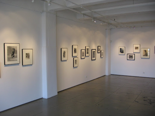 JTF (just the facts): Total of 53 images, all black and white, none larger than 20×24, spanning a period from the mid 1920s to the mid 1960s, with most clustered in the 1930s and 40s. Hung in one large gallery space with plenty of natural light.
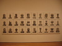
 Care the in crafting of this show was also clearly taken in the installation of the images themselves (see above and particularly to the right). Notice how the images drift up and down (like a musical score or a wave). While it’s hard to see from these small digital images, the linear sequencing of the images introduces one subject matter theme for 2 or 3 pictures, moves to another idea, and then reintroduces the original theme 10 or 12 pictures down the line, again and again, around the room. The effect works and the whole exhibit “hangs together” well.


 n to compare and contrast different images and forms.