Comment, Curate and Promote: The Art Blog Triangle

Rather than post a second book review this afternoon (which would be normal for us on a Wednesday), I thought it might be worthwhile to get a little abstract, with a blog post about blogs (particularly photography and art blogs).

Recently I’ve spent some time reflecting on what we are doing with this blog and how to make it better and more relevant for our particular readers. As background to this thought process, I have been diligently reading the blogs listed on our sidebar (via an RSS reader), as well as adding another 15 to 20 that I found via blog rolls and have been trialing for a month or so in the hopes of finding additional voices of interest. What has become apparent to me during this process is that all photography blogs (and likely all art blogs in general) seem to be made up of some combination of three primal instincts: to comment, to curate, and to promote. Here’s what I mean by each:

COMMENT: This represents the process of reacting and responding to the art and photography that we encounter. It includes everything from raw journalistic reportage to reviews, commentaries, essays and criticism. This is generally a text heavy approach, driven largely by a blogger’s ideas and opinions.

CURATE: This represents a need to make sense of the polyvalent, multivariate mix that is the both the art world and the Internet. Here bloggers are selecting what they find of interest from the overwhelming wave of information floating around and presenting a neat package for viewers to digest more easily. Most often, this is a link or image list, but sometimes the links include a short snippet of background or context.

PROMOTE: This represents the need to get the word out about what a blogger thinks is important. Most often, this is his/her own work (if they are photographers or artists), but this approach is regularly used by galleries, museums, book publishers and others who want to put their stuff front and center.

So thus the simple diagram below which began on a scratch pad and tries to provide a “map” for understanding where blogs fit in relation to each other. (Sorry for the bad screen captures.)

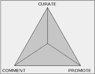
Imagine that there are three strong magnets at each vertex of the triangle, pulling blogs toward the three poles. Each author then makes conscious or unconscious choices about how to balance these three forces as they make their posts day after day.

And now for the death defying part. At the risk of alienating a number of writers and artists whose work I enjoy and respect, I have taken the liberty of placing all of the blogs from our sidebar into this framework, based on my own personal view of how they approach their craft. I think the results are quite intriguing.

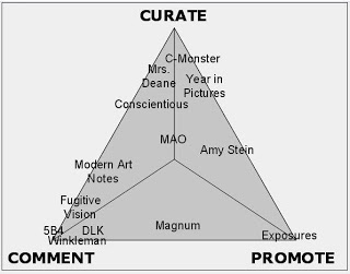
So before you start asking questions, let me make a few explanatory remarks. Let’s start with the cluster of blogs near the COMMENT corner. Edward Winkleman is the purest player here, with a consistent stream of well crafted thoughts and ideas about the art world. The blog is placed just to the right of center, as he does post a promotional message about his gallery’s offerings from time to time, but this is generally not his focus. 5B4 is also a pure player, offering critical reviews and essays about photo books, with a scholar’s eye for publishing details. There is virtually no promotion in this blog, and only a minute dose of curating, in the overall concept that some books are chosen to be reviewed and others are not. Our blog, DLK COLLECTION, and Fugitive Vision are nearly right on top of each other in terms of our criticism heavy approaches, although our rating system is a kind of sideways promotional system (thus putting us nearer PROMOTE, while Fugitive Vision is marginally closer to CURATE). Modern Art Notes is also drawn closest to COMMENT, with a strong daily dose of art reporting and insightful commentary. I have placed it somewhat nearer to CURATE than the others, as link lists are also an important part of what is done on this blog.

In the CURATE corner, C-Monster is the purest player, with a significant emphasis on eclectic link lists. Conscientious is also near to this corner, consistently unearthing new photographers of merit and other interesting photo tidbits, with an evenhanded but light dose of commentary and a minimum of promotion. The Year in Pictures and Mrs. Deane are also in close proximity with Conscientious, The Year in Pictures having a slightly heavier hand with publicity.

Near the PROMOTE corner, we have Aperture’s Exposures blog, which is basically a recasting of press releases about books and events. Most artist blogs are centered near this pole, as are the majority of museum blogs (three blogs I have been trialing from SFMOMA, LACMA, and the Walker Art Center all would live in this neighborhood.) Amy Stein’s blog can be a proxy for many artist sites where promotion of the photographer’s work is placed into a mix of other recommendations and items of personal interest (her blog is thus placed between PROMOTE and CURATE). Given the unspoken rule that all artists promote each other, there is virtually no criticism in any of the blogs in this area of the map.

The two remaining blogs, Magnum’s blog and Modern Art Obsession, are outliers. Magnum is doing something quite unusual, in that they are putting forth complex ideas and commentary, within the underlying framework of promoting their artists. And MAO is the only blog I have read that successfully balances all three forces. I believe this is due to the strong and distinctive voice that the blog has, regardless of whether it is reviewing a show, linking to something of interest, or promoting someone. Most blogs can’t survive in the no-man’s land of the middle.

So while no framework is perfect, I hope that this little map can provide some insight into what we are all doing and how we are approaching the task of writing about photography (and art more generally). I offer it with only the best of intentions and respect for all of the other bloggers, and without judgments about the relative values of any particular location on the diagram. For subscribers and readers out there, it is my strong conclusion that to get a full picture of the world of photography (or the larger art world), we will all be required to read from a mix of blog styles, with representatives from each corner (and those in between) bringing different (and sometimes conflicting) viewpoints to help paint the complete picture.

One other aside. I believe that those near CURATE (those who gather up content from a variety of places, sift it and aggregate it) tend to dominate in terms of traffic volume, thus making them powerful middlemen for those in other locations on the diagram. While I think the art/photo blogosphere is mostly driven by a sense of camaraderie, I think these forces and a blog’s spatial relationships to other blogs in the diagram may also tell us something about likely “collaborators” and “competitors”.

I very much like the idea of opening up conversations with other blogs, so I hope this post will catalyze some new thinking.

UPDATE: Some additonal thoughts on this triangle can be found here.

Iwao Yamawaki

JTF (just the facts): Published in 1999 by Edition 7L at Steidl. Unpaginated, with 62 black and white plates, a short essay by Ingrid Sischy, and a biography. Slip covered in cardboard, with a partially transparent dust jacket. (Poor cover shot at right.)

Comments/Context: The odds are pretty good that most collectors don’t recognize the name of Japanese photographer Iwao Yamawaki. Yamawaki was an architect by training and profession who made up his mind that he wanted to study at the Bauhaus. So in 1930, he took a leave of absence from his job, packed up his wife, and moved to Dessau, where he took classes from Josef Albers, Wassily Kandinsky, Walter Peterhans and Kurt Kranz among others, and developed a strong interest in making photographs.
During the period from 1930 to about 1933, Yamawaki focused his camera on architectural studies (both interior and exterior), portraits, and still lifes, making straight images, dominated by contrasts of line and form, often taken from unexpected steep angles and viewpoints (reminiscent of Moholy-Nagy or Rodchenko). His work is perfectly representative of the theories being taught at the Bauhaus, emphasizing simple, sculptural forms. The pictures themselves are well composed, stylish and elegant, brimming with the confidence of modernism. After his time in Germany, Yamawaki returned to Japan and restarted his career as an architect, and while he continued his interest in the teachings of the Bauhaus, his work as a photographer came to an end. That said, his short career with a camera produced some superior images.
This monograph was made with attention to detail, with excellent reproductions on luxurious paper, exquisitely matched to the richness and refinement of the pictures.
Collector’s POV: We were first introduced to Yamawaki’s work last year, when several of his images came up at various auctions. (We know, we’re a decade behind most of you.) While we didn’t know much about the photographer, we were drawn to the prints we saw, given they were strong, vintage Bauhaus images, offered at reasonable prices. Going back into the auction records, very few Yamawaki images have come up for sale in the past few years, most selling in a range between $3000 and $7000. At retail, Howard Greenberg Gallery (here) appears to have a good selection of Yamawaki inventory on its website.

Huachen Auctions, Beijing

I’ve gotten quite a bit of good information about Chinese photography via email as a result of some of the posts from the past few weeks.

One email of particular interest included a pointer to the photography auctions being held by Huachen Auctions in Beijing, which were entirely unknown to us. This house is offering twice a year sales of Chinese photography, with lots of images from all periods.

The site is a hybrid of English and Chinese, so you’ll have to do a little work to find images that fit your collection (unless you read Mandarin), and I have no idea what might be required to actually be a foreign buyer at one of their sales. That said, the lists of images are great as an educational resource.

The site is here. Go to Auction Results to find the catalogues from the past few sales and dig around.

Huachen Auctions
Flat A 23
North Ring Centre
No.18 Yumin Road
Xicheng District
Beijing 100029

Auction Previews: London Contemporary Art Roundup

The Contemporary Art auction season in London began last week and continues this week, with day and evening sales at Sotheby’s, Christie’s and Phillips. Since there are so few photographs up for sale across the board, it seemed better to put them all together into one larger post covering all six sales. Taken as one group, a total of 78 lots are on offer, with a total high estimate of £4038000.

Sotheby’s

Sotheby’s sales actually occurred last week, February 5 and 6, so we’re a little bit late in reviewing what’s available. In the evening sale, there are 5 lots of photography (broadly defined): 2 by Gilbert & George, and 1 each by John Baldessari, Andreas Gursky, and Rashid Rana (an artist we are not familiar with). The day sale includes 24 photographs, with a sampling of the usual suspects: Cindy Sherman, Hiroshi Sugimoto, Thomas Ruff, Vik Muniz, Andreas Gursky, and Philip-Lorca DiCorcia among others. Some of the more unexpected names include Tracey Emin, Sam Taylor-Wood, Gregor Schneider, Wim Delvoye, and Roni Horn.

Sotheby’s Contemporary Art London evening sale here.
Sotheby’s Contemporary Art London day sale here.

Christie’s

Christie’s has its Contemporary Art sales on February 11 and 12. There are only two photographs in the evening sale, one by Richard Prince and the other by Andreas Gursky. It is also a thin showing in the day sale, with only 8 photographs up for auction: 3 Hiroshi Sugimotos, and 1 each from Andres Serrano, Richard Prince, Ai Weiwei, John Baldessari and Vanessa Beecroft.

Christie’s Contemporary Art King Street evening sale here.
Christie’s Contemporary Art King Street day sale here.

Phillips De Pury and Company

Phillips has its two sales on February 12 and 13. There are 9 lots of photography in the evening sale, a broad spectrum from the standbys (Sherman, Prince, Gilbert & George, Gursky, Struth, Crewdson, Tillmans) to a few surprises (Rashid Rana and Florian MaierAichen). The day sale has 30 photographs up for sale, from 27 different artists. It’s truly an international crowd, a bit more on the edge, as is Phillips’ style. While there are a handful of familiar names, there are quite a few unusual inclusions and lesser known photographers; the list is below for your entertainment:

Afrika (Sergei Bugaev)
Halim Al-Karim
Darren Almond
Sergey Bratkov
Balthasar Burkhard
Sophie Calle
Edgar Cleijne
Gregory Crewdson
Wim Delvoye
Lalla Essaydi
Elger Esser
Roland Fischer
Ilkka Halso
Mustafa Hulusi
Vera Lutter
Florian MaierAichen
Miao Xiaochun
Youssef Nabil
Ugo Rondinone
Alfred Seiland
Jalal Sepehr
Eliezer Sonnenschein
San Taylor-Wood
Xing Danwen
Catherine Yass
Zhang Huan (his Family Tree which we talked about recently here is up for sale)
Zhang Peng

Phillips’ Contemporary Art London evening sale here.
Phillips’ Contemporary Art London day sale here.

In general, given that the estimates seem more realistic across the board and the offerings are more tightly edited, I think many of these works will perform just fine, with the caveat that the more adventurous work at Phillips is less predictable.

Auction House Lineup Changes

Given that the season is just getting started, we haven’t been paying too much attention to the auction houses during the past few months. In gathering some information for a roundup of the photography being offered in the London Contemporary Art sales (which we’ll post later today), we saw that both Christie’s and Phillips had made some changes to their specialist teams (there have been no changes at Sotheby’s or Swann that we can discern). These kinds of changes don’t tend to be trumpeted in press releases, but are actually meaningful for collectors.

At Christie’s, Matthieu Humery is no longer on the team. (UPDATE: according to Christie’s, apparently I was wrong about this; Humery is still on the team but somehow fell off the website, which will be fixed soon. My apologies for the confusion.) Jamie Krass appears to have slid over and joined the Photographs department, with a dual title including 20th Century Art (which isn’t actually a department, so I’m not entirely sure what that means). This leaves the Christie’s Photography department as follows:

London
Phillippe Garner
Yuka Yamaji
Penelope Malakates

New York
Joshua Holdeman
Jamie Krass
Matthieu Humery
Stuart Alexander
Laura Paterson
Sarah Shepard

At Phillips, both New York director Joseph Kraeutler and London director Genevieve Janvrin are gone. Kelly Padden is a new addition to the London team. Charlie Scheips is now in charge of the entire department. The smaller Phillips Photography team is therefore the following:

Charlie Scheips
Vanessa Kramer
Kelly Padden

As collectors, continuity of the specialists at an auction house means we can develop more personal relationships, making it easier and more fun to benefit from their knowledge and expertise. While we didn’t have interaction with everyone who is now gone, we are particularly sorry to see Genny Janvrin go, as she helped us many times over the years, was friendly and responsive to our questions and requests for condition reports, and was an early supporter of our efforts on this blog. We wish her well in whatever her next steps may be.

ANOTHER UPDATE: I have been reminded that for the sake of completeness, I should probably note that Andra Russek left Sotheby’s last year to work freelance and to collaborate with her parents, the dealers Scheinbaum & Russek in New Mexico. Since then, Lauren Mang has joined the Sotheby’s team, and she actually helped me look at some prints last season.

Alec Soth, The Last Days of W. @Gagosian

JTF (just the facts): A total of 42 color images, taken between 2000 and 2008, framed in blond wood frames, and displayed in a chopped up maze of five galleries, a hallway, and a reception area. Prints are either chromogenic or archival pigment prints, and come in a range of sizes from 16×20 to 50×40, with several intermediate formats as well. Most are in editions of eight, with a few in smaller (5) or larger (15) edition sizes. Gagosian Gallery does not allow photography in the exhibit rooms, so we have no installation shots for this review.

Comments/Context: Satirizing the now former President Bush has become so widespread, so common, and in some cases, so virulent over the past several years that it has almost become a cliche, the exaggerated jokes and astonishing truths mixing together to make a potent cocktail. Alec Soth has bypassed the easy potshots and obvious put downs in chronicling the last eight years, and has focused his lens on the more subtle and tenuous moments of recent history where the legacy of the Bush administration has spread like a dusty film over the lives of everyday Americans.

Soth burst onto the photography scene in 2004 with his book, Sleeping by the Mississippi, and has since published several more bodies of work and mixed in a full plate of commissioned projects as a member of Magnum. To our eye, Soth has successfully resisted categorization by pointing his camera at a wide variety of subjects (interiors, exteriors, portraits, still lifes, landscapes etc.) and by working in a style that is neither pure documentary nor overtly personal, but wandering between the two poles based on the demands of any particular picture. Some pictures are a generally straight look at an unexpected moment he has discovered; others have a stronger undercurrent of emotion or irony, suggesting he is drawn to subjects which have more of a specific story to tell.
The pictures in this show turn on a few common themes: the militarization of our world, a heavier sense of loneliness and exhaustion, the neglect and decay that have become commonplace, and the overall melancholy that has pervaded our society as a result of the changes around us. Home Environment, Billings, MT, 2008, (at right, above) with its toy Humvee winning first prize shows just how far these new behaviors have invaded our daily lives.
Soth also picks up on the remnants of fear, a turning inward and building up of defenses against all comers, including our friends and neighbors. Not only are we not triumphant conquerors, we have become more afraid of each other, closed and tired. His image of an empty room, with the shades drawn (Northfield, Minnesota, 2001 at right, middle) seems entirely emblematic of an entirely too common worldview now among us.
Soth’s Avenue Theater, Dallas, TX, 2006 (at right, bottom) was particularly prescient about the coming economic troubles, showing a theater converted into a pawn shop, with plenty of worn out lawn mowers and bicycles arrayed out front, ready for an offer. While I have selected three images that perhaps highlight the unwanted lingering effects of these past years, there are also plenty of moments of wry humor and irony in this show, spotlights placed on situations that contains a mix of emotions. In some ways, it is hard not to think about Robert Frank, William Eggleston, and Joel Sternfeld when walking though this exhibit; there are pieces of each to be found here, from Frank’s incisive commentary, to Eggleston’s play with color, to Sternfeld’s deadpan wit. Soth seems to have channelled them all and added his own perspective to the mix to generate these memorable images.
Overall, I very much appreciate Soth’s ability to wade into the public discourse on a controversial topic and come out having added something to the discussion rather than just piling on. There are many outstanding images here, and each has mysteries to unfold if given the chance. In some ways, this show is an exercise in depression and disillusionment, but I came away surprisingly excited by the potential of art to make us see the world around us with new eyes.
The artist’s website can be found here. His page at Magnum Photos can be found here. There is a also self published, tabloid style newspaper produced in conjunction with the exhibit available.
Collector’s POV: The images in this show are priced between $3500 and $13000. Soth’s work began to appear in the secondary markets in 2006, and the number of images up for sale has been growing slowly but steadily. Auction prices have ranged from approximately $4000 on the low end to nearly $20000 at the top. This is an artist with a bright future, so perhaps now is the time to add one his images to your collection, before his work vaults into the stratosphere.
Rating: ** (two stars) VERY GOOD (rating system described here)
980 Madison Avenue
New York, NY 10021

Frank Gohlke and Joel Sternfeld @Queens College, CUNY

JTF (just the facts): A total of 58 images, taken in 2003 and 2004, framed in blond frames, hung throughout the 3 floors and basement of Hortense Powdermaker Hall (the main classroom building at Queens College). Images are printed in two different sizes: large (approximately 4×5 feet) and small (approximately 8×10 inches). The total group seems to be divided generally equally between the two artists. Gohlke’s works are gelatin silver prints; Sternfeld’s are C-prints. The entire exhibit was commissioned by the college. (Various installation shots at right.)

Comments/Context: With the kids and their mother packed off for an afternoon at the grandparent’s house, I found myself with a few free hours this weekend and decided to head down to Queens to see the Gohlke/Sternfeld show at Queens College. After parking my car and finding my way through campus to Powdermaker Hall, I was ready to see the combined effort of these two great photographers, part of which I had already seen at the Gohlke show at Howard Greenberg last summer (original review here).
I pulled one of the side doors open and wandered into the building, hoping to find a sign or some other pointer to where the images were hung. No such luck. The building was completely and entirely empty, not a single person anywhere (a few classrooms were inhabited but no random people hanging out), the linoleum echoing as I clicked down the hallways. Powdermaker Hall is roughly shaped like a fork, with three tines, and I finally found my way to the center where I discovered a lone security guard. Along the way, I had spied a couple of photographs, hung in puzzling locations, often by themselves, and indeed these were part of the exhibition. I told the guard that I was here to see the photography show and inquired about where the images were, if there was a map or other literature etc. She looked at me like I had just asked her when the next shuttle to the moon was leaving. Finally she just laughed and said that the pictures were all over the building and that I should start up on the third floor and work my way down.
So I trudged up the stairwell and worked my way down to the end of one long hall to what I thought seemed like a good place to start. Again, there were no other people there. It was completely deserted, the white press board walls lit with buzzing fluorescent lights (eerie installation shot at right), the epitome of soul sapping institutional architecture. I felt like I had a stepped into a Haruki Murakami novel; who knew when some odd person might arrive and lead me to another dimension.
So to be clear, this is not an “exhibition” in the normal sense of the word. The works are spread all over this massive classroom building, sometimes alone, often in pairs or groups, but without any pattern to their display. You often need to walk a good distance (perhaps a minute or two of steady walking) between pictures. Seeing the entire show is like going on a scavenger hunt. I found 56 of the 58 works that are supposedly in the show; where the other two are remains a mystery, as I think I did a pretty systematic search. Probably three quarters of the wall labels have been removed by vandals (a few business cards have been stuck in as replacements), so while you can tell who made the images (black and white = Gohlke, color = Sternfeld), there often isn’t any other information available. The discouraging state of this exhibit is exemplified by the image at right: an amazing Gohlke photograph, with the glass broken and the wall label gone.
So far I have spent the entire body of this review talking about the environment and not the art, and unfortunately, the staging of these works is so distracting that it is hard to get any complete view of the commission. With so much space between the works, the interrelationships and patterns are hard to discern (was this Sternfeld like a Gohlke I saw up on the third floor? What does this large Sternfeld have to do with the small ones in the basement? etc.). I truly wonder what any student, blowing by on the way to class, can gather from these photographs given the way they are installed.
That said, Gohlke has focused his camera primarily on single family homes and snippets of nature, finding patterns in fences and ironwork, door frames and brick. His images are angled, standing outside, looking in at an evolving neighborhood. The front door portraits that have been enlarged to the big print size are striking, crisp in detail and dense with information.
Sternfeld’s images are much more interested in the cultural melting pot that is Queens. All of his works are straight, frontal shots, accenting bold colors, multilingual signage and unusual building styles, often populated with a diverse set of locals staring directly into the lens. Koreans, Bolivians, Muslims and a variety of other ethnicities, nationalities, and religions are represented and mashed together, often with his signature subtle hint of irony hiding underneath. Again, the large prints hold their own better in this environment. (Large print near the elevators at right.)
Together, the works of Gohlke and Sternfeld tell a surprisingly rich and successful picture of Queens. If these works were hung in a museum, they would likely expose many more contrasts than they do here in these empty halls.

Frank Gohlke’s artist site is here. He is represented by Howard Greeenberg Gallery (here).
Joel Sternfeld is represented by Luhring Augustine (here).
.
Collector’s POV: While I was bit slow in coming to understand and appreciate these Gohlke images, evidenced by my struggles with the Greenberg show, given some time and a second look, I think many of the images of homes and their barriers are quite strong. This was my first look at the Sternfeld body of work, and I believe there are a handful of excellent pictures here as well, especially if printed in the large format, where the complexities of the color relationships are more apparent. While the work in this show merits at least two stars, the Where’s Waldo installation makes this a show for only the most devoted fans.
.
Rating: * (one star) GOOD (rating system described here)
Frank Gohlke and Joel Sternfeld
(permanent commission)
65-30 Kissena Boulevard
Flushing, NY 11367

Contradictions in Black and White @Hasted Hunt

JTF (just the facts): A group show, displaying a total of 25 works (including one triptych and one grid of 25 pictures), representing 10 different artists, exhibited throughout the gallery. (Imperfect installation shots at right.)

The following photographers are included (with the number of works in parentheses):
Margaret Bourke-White (4)
Harry Callahan (2)
Michael Flomen (3)
Adam Fuss (1)
Nathan Harger (3)
Idris Khan (1)
Vera Lutter (2)
Raymond K. Metzker (6)
Irving Penn (1)
Horacio Salinas (2)
.
Comments/Context: While the dominance of color as the primary mode of expression for current contemporary photography is unchallenged, there is something to be said for reacquainting ourselves with the pleasures of black and white. Perhaps there is an unconscious desire to see something different from show after show of relentless saturated colors, or maybe it is simply a reflection of a more somber mood imposed by the current economic situation. In any case, the current show on view at Hasted Hunt gathers together a well selected mix of vintage gems and emerging artists, and creates some thoughtful juxtapositions along the way.
The challenge for contemporary artists working in black and white is straightforward: create images that don’t look like they were made in the 1930s, or 1950s, or 1970s – use the medium to show us something different, not just a knock-off of an idea that was done well decades earlier. This is actually harder than it sounds, as the tonal qualities of black and white lend themselves to contrasts of line, form, and pattern, subjects that have been explored deeply by a wide variety of artists. All of the pictures in this show (regardless of time period) lean toward abstraction, even if their subject matter is recognizable; there are no portraits or landscapes or documentary images.
In one sense, you can see this show as a battle: on one side stand Bourke-White, Callahan, Metzker, and Penn, titans of the medium, represented by solid works that seem to throw down the gauntlet to the younger generation and offer them the challenge to match their greatness. On the other side stand a new generation of artists happily employing black and white in new ways: Fuss, Lutter, Flomen and Khan, with the newcomers Harger and Salinas joining the fight.
While I would have never predicted that the contemporary work would stand up to the test of the masters, the battle is closer to a draw than you might expect. There are great works by all four of the older generation in this show, particularly Metzker; both his composite and double frame images are superlative. Both Fuss and Lutter show new directions with their photograms (although the Lutters are not her best), and Flomen and Khan offer ethereal, indeterminate abstractions that are wholly different from the historical work, without treading into the realm of camera club cheesy. Harger and Salinas show that old ideas (wires, cranes, still life) can indeed be reworked in fresh ways. While the show is a bit uneven across the board, it is a successful reminder that black and white is still relevant.
Collector’s POV: The prints in this show run the gamut in terms of price, ranging from $2000 to $75000. For our collection, one of the Metzkers would be our first pick, closely followed by one of the Bourke-Whites. We actually own a print of one of the Callahans (here).
Rating: * (one star) GOOD (rating system described here)
Through February 28
529 West 20th Street
New York, NY 10011
More on this show at Fugitive Vision here.

Shinichi Maruyama, Kusho @Silverstein

JTF (just the facts): 10 large scale (most are 60×40 or reverse) pigment prints, framed in white and arrayed in the front gallery. All of the images are from 2006, in editions of 10.

Comments/Context: Underlying the history of photography is the never ending march of new technology, with recent advances enabling artists to make pictures in ways that had been heretofore impossible. Following in the footsteps of stop motion scientist Harold Edgerton, Japanese photographer Shinichi Maruyama uses high tech strobe lights to make exposures in one 7500th of a second.

Maruyama uses these new tools to make expressive images of colliding waves of black ink and water, caught in mid air against white backgrounds. His pictures capture the gestural qualities of the drips, splashes, washes and sprays, in the split second before they merge into a muddy puddle. The resulting abstract swirls are clearly reminiscent of Japanese calligraphy and ink drawing, but with an undertone of energetic chaos.

Collector’s POV: The images in this small show are priced between $7500 and $15000, mostly based on size it seems (the one that reminds me of the old Lucent logo being the highest priced). In walking through the gallery, I thought of the watery photograms of Susan Derges and Adam Fuss, but Maruyama’s works are wholly different, with a strong Japanese aesthetic of simplicity, imperfection and elegance. This is a solid first New York showing.

Rating: * (one star) GOOD (rating system described here)

Through February 21

535 West 24th Street
New York, NY 10011

Osamu Kanemura, My Name is Shockhammer

JTF (just the facts): A large format, tabloid style booklet, published by Osiris in 2007. Produced in conjunction with an exhibit at the Port Gallery in Osaka. 16 pages, with 15 black and white images. (Poor cover shot at right.)

Comments/Context: If the name Osamu Kanemura is familiar to collectors in the United States, it is likely due to his inclusion in the New Photo exhibit (number 12) at the MoMA in 1996. We actually became aware of Kanemura much later, with the introduction of his body of work known as Spider’s Strategy several years ago (we saw the exhibition at Cohen Amador and bought the book for our library). This thin pamphlet brings us up to speed with what he has been working on lately, and it seems to be a direct extension and continuation of the ideas that underlay Spider’s Strategy.

The most obvious and common stereotype about Tokyo is that it is an overcrowded, chaotic mess. Kanemura has pointed his camera at this complexity and selected densely fragmented slices of the environment around him. His images recall some of Lee Friedlander’s work, packed with information and overlapping patterns, reduced to a two dimensional cluster of interlaced electric wires, buildings, bicycles, and shop billboards. The pictures are often bewildering in their richness, provoking the same wide eyed visual overload of the new visitor to the city.

While there are often random pedestrians in his images, Kanemura’s work doesn’t seem to be about any particular narrative, but about the complexities of this built environment and the social relationships that have emerged out of the closeness. The images are dark, and often claustrophobic, with nets of wires, street signs, and blinking lights falling down from the nearly obliterated sky. While there are only a small number of works in this booklet, his unique view of the city comes through hauntingly.

Collector’s POV: Truth be told, we have been thinking about adding a Kanemura to our collection since we saw the original Spider’s Strategy show, and every time we visit Cohen Amador (Kanemura’s gallery in New York, site here), we are reminded of just how much we would like to add one of his images to our city scene genre. While the retail prices are reasonable (I believe they are around $3000 each, in editions of 5), we just haven’t gotten focused enough on any single image to get to the finish line. There is no secondary market for his work at the moment. So going forward, we’ll need to do some more legwork and look at some more images to find a representative picture that jumps out at us, full of crazy intersecting wires.

Hiroh Kikai, Asakusa Portraits

JTF (just the facts): Published in 2008 by ICP and Steidl. 264 pages, with 231 full page black and white images, essays by Christopher Phillips, Hiromichi Hosoma, and Hiroh Kikai, and an interview with the artist by Noriko Fuku. (Cover image at right.)

.
Comments/Context: Japanese photographer Hiroh Kikai has been making unassuming portraits of the patrons of the Sensoji Temple in Asakusa for nearly thirty years. We first saw Kikai’s work in the Heavy Light group show of Japanese photography at the ICP last year (review here) and then followed up with a visit to a small show of his Tokyo city scenes at Yancey Richardson (review here). This book is a thick catalogue of the Asakusa portraits, with enough girth to give you a full measure of this project.
The set up of the each of the portraits is virtually identical: a three quarter black and white shot, against the vermilion walls of the temple, in natural light, generally unposed and informal. These are comfortable pictures, respectful and attentive to the sitters, patient and sometimes poignant. (A maintenance man for commercial dishwashers, 2002, at right.)
Kikai comes at his art from the humanist perspective, valuing the individuality of his subjects and trying to quietly uncover their singular stories, essential traits, and personalities. He has said that he was initially influenced by the work of Diane Arbus, and some of Arbus‘ willingness to meet her subjects on their own terms can be found in Kikai’s images as well. (A performer of Butoh dance, 2001, at right below.)

Kikai has also been a writer in his career, and the titles to his images read like sparse poetry. I’ve selected a group of image titles from the book and repeated them below. Read them slowly, with a pause after each one:

An old man wearing woolen long johns
A man who asked me if I’d buy a watch
A woman who said she bought lottery tickets
A man who came a long way to eat eel
A woman who often suffers from heartburn
A maker of traditional Japanese confectionery
A woman who said her eyes were dry
A man wearing four watches

A man playing a tune he composed himself
A man who said he’d just had a drunken quarrel
A retired craftsman who said that when he goes out he blackens his hair with indelible ink
A driver who can’t work as he once caused a traffic accident
An old man using a wooden sword as a walking stick
A man who’d had a dream at daybreak, for the first time in ages
A man raising tropical fish
An old man who was speaking to a doll while he was walking
A man sweating under layers of women’s clothing
A man who asked if I knew Humphrey Bogart
A factory worker who said that dancing in amateur variety halls was what gave his life meaning
A man who dresses his cat in lace
A man who said he used to be a carpenter, but not a good one
A man in a coat he said was made from the pelts of twenty-eight raccoons
A man who used to act in crowd scenes in samurai movies
A polite young man who powders his hands
A man with a python skin wallet
A woman who told me her son was the number one barber in Japan
There are, of course, hundreds more in the book, but I think the list above gives you a feel for his approach. What is perhaps most surprising is that while all of the people in the pictures are Japanese, the portraits seem to transcend their nationality or ethnicity; they are simply portraits of people, and insightful and memorable ones at that. Taken as a whole, this body of work is a tremendous success, and one that should help to bring his artistic accomplishments out of relative obscurity.
Collector’s POV: Kikai is represented in New York by Yancey Richardson (here), in a relatively new relationship I believe. His work is to date unavailable in the secondary markets.
This book was selected as one of the Best Books of 2008 by Conscientious (here).

Malick Sidibé, Photographs

JTF (just the facts): Published in 2003 by Steidl and the Hasselblad Center, in conjunction with the artist’s receipt of the 2003 Hasselblad Award. 108 pages, including 65 black and white plates. Essays by Gunilla Knape and Manthia Diawara, with a conversation with Sidibé recorded by Andre Magnin. (Cover shot at right.)

Comments/Context: Malian photographer Malick Sidibé has been on our list of artists to get better acquainted with for quite a while now. We have seen a few of his captivating portraits in group shows or at auction previews over the years, but until now, we hadn’t spent the time to look carefully at the entire body of his work. This monograph is an excellent first resource primer on Sidibé for those who want to educate themselves about this important African photographer.
Sidibé’s best pictures come from the 1960s and 1970s, when he made staged studio portraits and looser documentary shots of the youth culture of Bamako. In these post-colonial years, traditional Malian culture was being challenged by the modernizing influences of the West. So while Sidibé did make many traditional portraits of people in African dress, with elaborate hairstyles and symbolic poses, his images of energetic young people, full of freedom and enthusiasm, have the most interesting stories to tell. (Young man with bell bottoms, bag, and watch, 1977 at right.)

There is an amazing purity and innocence in these pictures. There are kids dressed in their best funky James Brown suits, holding record albums, strutting and showing off. There are crazy sunglasses, big watches, and shiny shoes. There are motorcycles and scooters brought into the studio, for posing and looking cool. Sidibé let each of his subjects create their own narrative with his many props and objects, and what emerged were pictures full of style and attitude and rock and roll infused pride. One of the things I find most intriguing about these portraits is Sidibé‘s use of clashing patterns, background and floor drops with bold stripes, checks, and polka dots, mixed together with the patterns in his subjects’ clothing. It makes for some high octane visual stimulation. (The whole family on a motorcycle, 1962, at right.)

It is clear that there were some powerful culture and generational conflicts and shifts going on during these times, and the young people were at the center of the revolt. Sidibé also made some memorable pictures of kids at parties and dance clubs (called grins), showing off their best moves and imitating their favorite stars. These too have a sense of unabashed happiness; it’s hard not to smile when you see them.
In recent years, Sidibé has been busy on the awards circuit, picking up the 2003 Hasselblad Award, the Golden Lion for lifetime achievement at the 2007 Venice Bienniale, and most recently, the 2008 ICP Infinity Award, also for lifetime achievement. All this from an artist who was virtually unknown outside Africa a decade or two ago.
Collector’s POV: If you are a portrait collector, Sidibé needs to be in your collection. In our opinion, his are images that you will stand the test of time well, without becoming tired.
Virtually all of Sidibé’s photographs that can be found in the secondary market are later prints, made in the late 1990s or early 2000s. These images have been selling in the $2000 to $5000 range at auction, but there haven’t been many in the past five years, so it’s hard to draw much of a pattern from so few data points.
.
Sidibé is represented in New York by Jack Shainman Gallery, site here. There was a 2005 solo show there, complete with images surrounded by elaborately painted glass frames.

Sign up for our weekly email newsletter

This field is required.