E.O. Hoppé, Early London Photographs, 1910-1939 @Silverstein

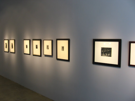
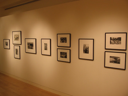
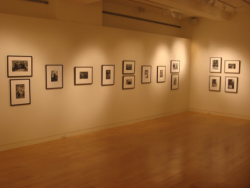
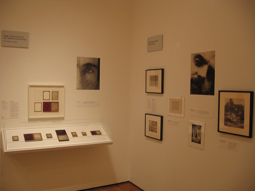
JTF (just the facts): A total of 31 vintage gelatin silver prints, framed in brown wood and matted, and hung in one large room. The prints are generally small, mostly 4×5, some as large as 9×7. The images were taken between 1910 and 1939. (Installation shots at right.)

Comments/Context: Perhaps the best way to characterize the work of E.O. Hoppé is to call it proto-modernist. His images chronicle the early part of the 20th century, just at the cusp of time when modernism began to take hold. As a result, his images are a kind of bridge between straightforward vernacular city scenes and the new modernist aesthetic (Strand, Stieglitz et al.)
While Hoppé made portraits as well as images in America and other places, this show chronicles his work in London, his adopted hometown. There are city and street scenes, top hats, dockyards and gardens, as well as plenty of architectural images of bridges, churches, and other London landmarks. The small size of the prints encourages intimate viewing. Given Hoppé’s transitional aesthetic, the show is a mixed bag of more routine historical shots, with a handful of stand out compositions here and there.

The estate website can be found here.

Collector’s POV: Hoppé is still in the process of being rediscovered and absorbed into the broader narrative of the history of photography, so his relative place in the hierarchy of early modernist work is still a bit fluid. The images in this show are priced between $7500 and $20000. His work has slowly begun to find its way into the auction markets, but very few prints have come up for sale in the past few years, so it is hard to draw any pricing pattern. In general, Hoppé’s images would fit into our city genre; I enjoyed Cannon Street Station, London, 1916, the most, with its dark black square sign.
Rating: * (one star) GOOD (rating system described here)
Through April 25th
Silverstein Photography
535 West 24th Street
New York, NY 10011

Cloud 9: Imogen Cunningham, Alfred Stieglitz, Edward Weston @Silverstein

JTF (just the facts): A total of 9 vintage gelatin silver prints (thus the clever show title): 2 by Imogen Cunningham, 4 by Alfred Stieglitz, and 3 by Edward Weston, all small prints, variously framed and hung on one blue wall in the front gallery. All of the images are from the 1920s and 1930s. (Installation shot at right.)

Comments/Context: Virtually every human being has at some point in their lives looked up into the sky and seen meaning in the clouds, even if it was simply a cluster of wisps that looked momentarily (to us) like a rabbit or a dog. Master photographers are no different, and this small amuse-bouche of a show gathers together a handful of examples of what three of them found when they pointed their cameras skywards.
The most recognizable images in the show are the four Stieglitz Equivalents, images of diaphanous clouds, designed to evoke emotional states. Stieglitz made many of these images over his career; most are printed in the same small size, requiring intimate attention. The Weston clouds have more form to them; in one, the thin clouds are transformed into energetic fingers of fire. The Cunningham clouds were a surprise to me, as we had never seen cloud images made by her before. Her choice of puffy, cotton ball clouds gave her more freedom to play with negative and positive space.

Collector’s POV: The Stieglitz images are priced between $55000 and $65000 (though not all are for sale), the Weston prints are between $25000 and $75000, and the Cunninghams are $20000 each. While clouds are not a part of our particular collection, I like the idea of having a small appetizer show in the front of the gallery that can explore a smaller theme in thoughtful detail, as a warm up for larger exhibit(s) in the back.

Rating: * (one star) GOOD (rating system described here)

Through April 25th

535 West 24th Street
New York, NY 10011

A Collector’s Thoughts on Transparency in Pricing

This afternoon’s post is primarily aimed at gallery owners or private dealers specializing in secondary market photography, but has some applicability for primary market players as well. I’d like to make a reasoned appeal to you in favor of increased transparency in your pricing, as this is an issue that has been quietly bothering me for quite some time.

The argument I’d like to make is that your ultimate goal (it seems to me) is to develop long term, profitable relationships with collectors (and museums) who will come back as repeat customers, who will buy again and again over time. Building these kinds of relationships requires having the kind of material that a collector is interested in and treating that collector fairly, with respect and openness, during the sales process. Trust gets built over the period of multiple transactions. Positive feelings lead to more sales.

There is a wide spectrum of transparency in pricing to be found in New York. As background, let me describe the variety of pricing realities that I have encountered recently at established, mainstream galleries. (Since waiting lists and “access” are not really part of this particular market, as they are in the primary contemporary art markets, I have left these issues aside; in this market, it is generally the case that your money will buy the available work, whoever you are.) Here are the four major pricing approaches:

  • Prices are visible on the wall next to the art, or readily available in a printed price list (multiple copies prominently placed on the desk or elsewhere).
  • A price list exists, but it is hidden away behind the desk. It will only be produced if you ask for it.
  • No price list is available, but if you ask, someone will rattle off the prices (or ranges of prices), so clearly they have been set in advance, just not published on paper anywhere.
  • No price list is available, and if you ask, a Director or sales person will be called from the back room to talk with you.

Anecdotally, I’d say about 6 out of 10 galleries I visit use the first approach, with the rest doing one of the other three, so approximately 40% of the galleries out there are not being as direct as we would like in their pricing. AIPAD member dealers are in theory supposed to be transparent in their pricing (using the first method above), but I have not found this to be universally the case.

The misdirection of the second and third approaches is often defended by gallery owners on the grounds that the gallery doesn’t want to distract the viewer (i.e. buyer) from the artistic merits of the work by making the commercial aspects of the transaction more prominent. i.e. a viewer will focus on the fact that it is priced at $25K, not that it is an excellent piece. While I understand the idea of putting the art front and center, I still see this practice as a not-so-subtle form of salesmanship. The only logical reason to hide the prices is if there is evidence that buyers will pay more when presented with art in this manner. Is it really the case that my perception of the work will be so much more powerful in the authoritative “museum-like” setting (no prices) that I will be willing to pay a higher price when I am eventually presented with the facts (versus if the price had been on the wall from the beginning)? I don’t believe this is the case for serious collectors, and even if it is true in some cases, the marginal benefit to the dealer will be negated when the buyer figures out he/she overpaid. And for more spontaneous collectors and visitors, I think hiding the prices mostly drives potential buyers away, not the other way around.

The fourth approach I find most distasteful, as it gives me the impression that prices are entirely fluid, and the salesperson is merely coming out to size me up and decide the highest price I might be willing to pay (hopefully I am a naïve, price insensitive hedge fund manager). It reminds me of the elaborate social ritual of buying a carpet from a Moroccan rug merchant: equal parts flattery, education, and hard nosed negotiation, all wrapped in pleasantries and tea. The additional problem with this exchange is the real asymmetry of information: the dealer knows everything about the piece, including historical price comparisons and any issues, while the collector knows very little, unless significant background work has been done ahead of the visit. So the collector is often at a distinct disadvantage in this encounter.

Having seen this movie so many times before, when I see that the prices are not posted, I inevitably wave off the visit by the Director and just give up, even when I have some meaningful interest in the piece. Most times, I just don’t want to go through the hassle of the hard sell conversation to get at the price information; all I really wanted was the price to put into my own calculus of relative value before potentially entering into a deeper discussion. Perhaps this has been just the point – to weed out those who are not fully committed, but this seems to be the exactly the wrong reaction you would want from a prospective collector, especially if you are trying to build relationships. While some might argue that this sales process creates opportunities for conversations, I believe posting the prices would be a more effective way to catalyze real discussions, as collectors will naturally self select based on their own budgets.

As an aside, while we are always looking for prices that we feel are fair and choose/favor dealers based on our view of their pricing fairness, this appeal has nothing to do with the actual size of the prices a gallery or dealer decides to charge. I understand well the issues relating to the fixed overhead costs of running a prominent gallery (rent, staff, promotions etc.) and am not surprised when a retail gallery has a higher price for work than a private dealer who has less overhead. It seems to me that for the entire system to work, everyone in the food chain needs to profit, so we’re not put off by higher margins at retail galleries. We also know that galleries and dealers have widely divergent discounting policies; some stick to the list prices, others are willing to bring the prices down substantially. All of these pricing plans are fine, and we adapt our approach based on the way the galleries tend to work.

We also agree that this market is illiquid, and that some vintage pieces have significant scarcity value; we completely understand and agree with this – it should be incorporated into the setting of the prices. “Price on request” is just a euphemism for a secret evolving price (generally high) based on current conditions. If the price is $100K or 200K or whatever, that’s fine; just say so publicly. If the price changes/goes up based on new information, that’s fine too; just change the published amount. And while we generally have thick skin in terms of pricing, the only price I truly dislike is the one which insults my intelligence – unrealistically high in a simple effort to dupe me, assuming I am ignorant of the underlying value of the work being discussed. Unfortunately, this happens much more often than we would like; we tend to laugh it off, proceeding with more caution on a going forward basis (the trust-o-meter now broken).

So what I am passionately advocating is universal adoption of transparent pricing. Many of you will likely consider this idea a poor fit for the market realities as you perceive them, but I truly believe it is in your best interests to be more direct. Move to a new mode of operating where you always post the prices on the wall (and on the Internet), or make them readily available without asking. Collectors of all kinds can handle the truth (even if it means large numbers), and will value being treated in an up front manner. Dispense with the games and obfuscation and let the published prices speak for themselves. And if the prices can’t handle the scrutiny, then they’re the wrong prices.

Charlotte Cotton, The Photograph as Contemporary Art

JTF (just the facts): Published in 2004 by Thames & Hudson. 224 pages, with 222 illustrations. Cotton is now the head of the photography department at LACMA. (Cover image at right.)

Comments/Context: Given the rising popularity of contemporary photography, it is somewhat surprising how few good surveys of recent activity in the medium are available. While a biennial catalog or collection summary can perhaps provide an overview of current trends, these picture books often lack any sort of underlying framework, needed to make sense of the dizzying array of work being made.
Charlotte Cotton wades into this chaotic mess and does an admirable job of creating some structure. The backbone of this small volume is a group of seven themes she has used to classify the many different styles and types of work, which then become the chapters of the book. These buckets are the following:
  • If This Is Art: events or circumstances preconceived/created for the purpose of making an image (in contrast to the “decisive moment”)
  • Once Upon a Time: narrative photography, including the staged tableau/scene
  • Deadpan: objective, cool aesthetic
  • Something and Nothing: still life and interior/exterior architecture photography
  • Intimate Life: storytelling in the context of domestic/personal relationships
  • Moments in History: aftermath imagery, mixing social/documentary practices
  • Revived and Remade: Postmodernist appropriation and reworking
Each section is made up of a string on one paragraph summaries of photographers working in that particular mode, complete with small representative images. While one might quibble with the definitions of the categories or the reductive nature of choosing a single image to represent an artist’s approach, overall, the taxonomy works quite well. The book covers lot of ground and helpful lists of photographers working in related styles can be derived from the text.
Collector’s POV: While there is a thin narrative thread that ties this book together, I’m certain that a reader could just as easily open to any page, encyclopedia style, and read the paragraph about a specific artist and find value. As such, it is an easily browsable reference book of relatively current photography (5 years old at this point).
As a collector, the book’s primary worth is in its grouping of like artists. If we enjoy the work of photographer A, this book is successful in referring to the work by photographers B, C, and D, who have a similar aesthetic but might not have been known to us previously. As such, we can develop a hit list of promising new artists to explore. Given the diversity of work being produced today, having a short, well curated list to tackle is well worth the price of the book.

Henri Cartier-Bresson, Early Prints @Houk

JTF (just the facts): A total of 49 vintage/early gelatin silver prints, framed in black and matted, and hung in the main gallery space. The prints range in size from 7×9 and 8×10 to oversized exhibition prints at approximately 14×22. The images come from the period 1931 to 1961, and were taken in far flung locations all over the world. (Installation shots at right.)

Comments/Context: The photography of Henri Cartier-Bresson has been so thoroughly studied and documented, it seems unlikely that there are many new paths for exploration of his art open for adventurous souls. Cartier-Bresson is of course known as the master of the hand-held camera (a 35mm Leica) and perhaps the father of photojournalism. He was the founder of Magnum Photos and the coiner of the now hackneyed (but still relevant) phrase “the decisive moment”. His influence on photographers downstream from him has been nothing short of immense.

So the show of early prints at Edwynn Houk doesn’t even try to add to the mountain of pre-existing Cartier-Bresson scholarship (there is no wall text, no chronological grouping, no narrative or curatorial viewpoint), and seems satisfied to have simply gathered such a remarkable group of greatest hits. Given the scarcity of vintage prints of any of his images, much less the most famous images from his entire career, this exhibit must have required many years of relentless legwork to put together.

The durability of Cartier-Bresson’s images is the primary takeaway for me from this show. Many of these pictures have become so famous that they have become almost overexposed, like a song you’ve heard too many times. And yet, seeing many of these old favorites again in this show, many with the soft patina of age, they still seem fresh and alive, regardless of when they were taken. The second highlight (given the structure of this show) is of course his remarkable consistency. Across decades of time and vast differences in geography and subject matter, he repeatedly captured pictures of people that continue to resonate as being somehow both universal and unique at the same time. Wandering through this gallery is like coming upon a group of old friends, each one still a joy, and with news to tell.

The Fondation Henri Cartier-Bresson website can be found here. His page at Magnum Photos is here.

Collector’s POV: The images in this show are priced between $9500 and $90000, with two prints “price on request”. Cartier-Bresson’s prints are ubiquitous at auction (literally hundreds in any given year), but nearly all are later prints, and many are of more random documentary subjects, beyond his most famous pictures. While Cartier-Bresson’s pictures don’t fit into our particular collecting framework, it seems unlikely that so many superior quality prints will be brought together in one place again for a very long time, so put this show on your list to see before it closes.

Rating: ** (two stars) VERY GOOD (rating system described here)

Henri Cartier-Bresson, Early Prints
Through May 2nd

745 Fifth Avenue
New York, NY 10151
ADMINISTRATIVE NOTE: There will be no posts tomorrow (Wednesday, 4/8). Back to normal on Thursday.

Auction Results: Photographs and Photographic Editions, New York, April 2, 2009 @Bloomsbury

There aren’t many easy ways to sugar coat the results at Bloomsbury last week – it was a rough outing. Whether this was due to the material they collected, their place last in line after an exhausting run of AIPAD and the other auctions, the general economic malaise, or some combination of all three, the results were a dose of reality after a glimmer of optimism coming out of the big crowds at AIPAD. When half the lots fail to sell, it’s a splash of very cold water.

The summary statistics are below:

Total Lots: 140
Pre Sale Low Total Estimate: $559900
Pre Sale High Total Estimate: $832200
Total Lots Sold: 70
Total Lots Bought In: 70
Buy In %: 50.00%
Total Sale Proceeds: $333304

Here is the breakdown (using the Low, Mid, and High definitions from the preview post, here):

Low Total Lots: 132
Low Sold: 67
Low Bought In: 65
Buy In %: 49.24%
Total Low Estimate: $695200
Total Low Sold: $291214

Mid Total Lots: 8
Mid Sold: 3
Mid Bought In: 5
Buy In %: 62.50%
Total Mid Estimate: $137000
Total Mid Sold: $42090

High Total Lots: 0
High Sold: NA
High Bought In: NA
Buy In %: NA
Total High Estimate: NA
Total High Sold: NA

84.29% of the lots that sold had proceeds in or above the estimate range. While there were both photographs and photo books in this sale, they generally performed at about the same rate in terms of sell through. There were no surprises (defined as having proceeds of at least double the high estimate) in this sale.

Complete lot by lot results can be found here.

Bloomsbury Auctions
6 West 48th Street
New York, NY 10036

Tanyth Berkeley, Grace @Danziger

JTF (just the facts): A total of 11 color images, framed to the edge in either black or white, with no mat, displayed in the single room gallery space. Sizes range from 24×20 to 63×28 (full body size), and are printed in editions of 5. (Marginal installation shots at right.)

Comments/Context: I was first exposed to the work of Tanyth Berkeley at the New Photography 2007 exhibit at the MoMA, where her portraits had an electricity that monopolized the available attention. Continuing a line of thinking drawn back through Diane Arbus and Lisette Model, Berkeley makes realist portraits of unusual people with a sense of intimate care and genuine curiosity. She has pointed her camera at transgendered people, people with albinism, and a whole range of folks who fall outside society’s normal definitions of beauty, finding unique stories to tell in each and every one.
.
In the show at the MoMA, while there were plenty of startling full body portraits, I remember being completely awestruck by a smaller image of a woman named Grace, seated by a window with an ethereal light coming from behind, as though she was glowing. It was like a Renaissance portrait of a saint or angel, at the very moment of some kind of spiritual ecstasy. (Grace in Window, 2006, at right.) It struck me then, as it does now, as one of the best contemporary portraits I’ve seen in a very long time, likely to age well and remain inspiring over many years. As an aside, a print of this image went into the MoMA’s permanent collection.

This image is on display at Danziger Projects as part of larger body of Berkeley’s recent work focused on this woman. Grace Longoria’s albinism makes her skin and hair radiantly white, and she is often photographed with her eyes closed, due to her increased intolerance of bright light. The images in the show find her in different poses and clothes, but always with the same delicacy and fragility. Not all of the images rise to the same lofty heights as her portrait by the window, but clearly, the artist and muse have found a working relationship that allows them to take some risks.

Collector’s POV: The images in the show are reasonably priced between $2800 and $6800. Berkeley’s work doesn’t even remotely fit into our particular collection; contemporary color portraits are about as far from our specific genres as one could imagine.
But I can say with some conviction that I believe Grace in Window will end up being among the hallmark contemporary portraits of this decade. (Stop and digest that comment for a moment, as it’s a real whopper.) Since there is only one left, priced at $6800, if we were contemporary photography collectors looking for signature images from these times, I’d pick up the phone right now and put in on hold before it vanishes.
Rating: * (one star) GOOD (rating system described here)
Through April 25th
534 West 24th Street
New York, NY 10011

Izima Kaoru, New Work @Von Lintel

JTF (just the facts): A total of 8 color works on display: 7 large scale c-prints, framed in blond wood without mats, and 1 group of 4 smaller prints, mounted to plexiglass but not framed. The larger c-prints are approximately 70×94 or 70×60 and come in editions of 5. The smaller images are 20×26. (Installation shots at right.)

Comments/Context: Japanese photographer Izima Kaoru has been making images in his series Landscapes with a Corpse for a decade now. In each series, a famous Japanese actress or model imagines her perfect fantasy “death”, complete with the designer clothes she would be wearing at the time. Kaoru then creates the elaborate settings and makes pictures from a variety of cinematic distances: the close-up (eyes open), medium range images, and far away wide angle shots. The effect is an extremely elegant crime scene, the opposite of the grittiness of Weegee’s real life corpses in the gutter.

I first saw an image from this series several years ago, a huge print of a woman “dead” on the floor of a pachinko parlor, surrounded by neon pink chairs and fallen amidst a sea of silvery balls. I was taken aback by its over-the-top glamour and the lushness of its eye-popping colors. Nearly every review of Kaoru’s work is riddled with words like shocking and disturbing, morbid and repulsive. And yet, my reaction was and still is just the opposite. These images are, in my view, nothing more than an adult version of the play acting and dress up games of childhood, complete with couture gowns and lavish locations. I’m not sure these new works, which lack any visible signs of injury, would even be classified as unsettling.

In this small show, I particularly enjoyed the series of images called Sakai Maki wears Jil Sander, 2008, where a woman in a sheer salmon colored dress and sky blue shoes lies in a room full of white flowers. These works are dreamlike and calm, with a quirky surreal and conceptual feel that reminded me of Magritte. The other works on display are more straightforward in their settings, but equally serene and peaceful.

For Western audiences who have no familiarity with these Japanese actresses and models (like me), the individual people become more like beautiful mannequins (they’re supposed to be dead after all) in a carefully styled fashion shoot. I think if Julia Roberts or Kate Moss (or someone else equally recognizable here) were inserted instead of the Japanese women, I think the images might have a very different resonance.

Collector’s POV: The large images in the show are priced at either $22500 or $27000; the group of smaller images is $14000. In the secondary markets, Kaoru’s work has only just become available at auction in the last year, so there isn’t enough data to form any meaningful pricing pattern. While not every image in Kaoru’s large and growing project is a winner, a handful of stand out pictures can be found that would fit well in most contemporary collections.

Rating: * (one star) GOOD (rating system described here)

Izima Kaoru, New Work
Through April 25th

Von Lintel Gallery
555 West 25th Street
New York, NY 10001

Auction Results: Photographs, New York, April 1, 2009 @Phillips

Given the challenging times, the spring Photographs sale at Phillips De Pury & Company in New York performed surprisingly well. The total proceeds just missed the pre sale total Low estimate, coming much closer than either Sotheby’s or Christie’s had in the previous days. The larger number of lots of offer and the generally decent sell through rate vaulted Phillips into the second place spot for total proceeds this season.

The summary statistics are below:

Total Lots: 279
Pre Sale Low Total Estimate: $1995100
Pre Sale High Total Estimate: $2908000

Total Lots Sold: 187
Total Lots Bought In: 92
Buy In %: 32.97%
Total Sale Proceeds: $1890876

Here is the breakdown (using the Low, Mid, and High definitions from the preview post, here):

Low Total Lots: 204
Low Sold: 134
Low Bought In: 70
Buy In %: 34.31%
Total Low Estimate: $1061000
Total Low Sold: $708001

Mid Total Lots: 70
Mid Sold: 49
Mid Bought In: 21
Buy In %: 30.00%
Total Mid Estimate: $1347000
Total Mid Sold: $825625

High Total Lots: 5
High Sold: 4
High Bought In: 1
Buy In %: 20.00%
Total High Estimate: $500000
Total High Sold: $357250

A stunning 95.72% of the lots that sold had proceeds in or above the estimate range (with 32.62% above). Phillips clearly figured out the formula for setting estimates that were both enticing and generally on target in this more conservative economic environment.

There were plenty of surprises (defined as having proceeds of at least double the high estimate) in this sale: a total of 9 lots generated some bidding heat, although most were lower priced lots. Here’s the list: lot 4, Henri Cartier-Bresson, Island of Siphnos, Greece, 1961/later at $18750, lot 75, Bruce Weber, Zor and Zor’s Back, 1982, at $2500, lot 76, Bruce Weber, Matt, Marine from Mideast, 1983, at $2750, lot 82, Flip Schulke, Muhammad Ali boxing underwater, 1961/later at $12500, lot 116, David Drebin, Movie Star, 2004, at $16250, lot 178 Tina Modotti, Woman with Flag, Mexico City, 1928/posthumous 1992 at $9375, lot 183, Ernst Haas, Homecoming Prisoner, Vienna, 1946/later at $2750, lot 198, Cindy Sherman, Untitled (Madonna), 1975/later at $6250, and lot 215, Michael Kenna, Wind Swept Beach, Calais, France, 1999, at $6875.

Complete lot by lot results can be found here.

Phillips De Pury & Company
450 West 15th Street
New York, NY 10011

Myoung Ho Lee, Tree @Yossi Milo

JTF (just the facts): 8 color images, in various sizes, framed in blond wood with no mat and hung in the single main gallery space. The negatives are from the period 2005 to 2008. The prints are archival inkjet prints, in editions of 3. (Installation shots at right.)

Comments/Context: Traditional subject matter is a mine field for a young photographer; it is extremely difficult to make pictures that aren’t derivative or boring, given how many great photographers have walked the same road in the past. It is therefore exciting (and generally unexpected) when an emerging artist finds a new way into an old genre (trees, in this case), turning agreed upon conventions on their head and making us look at the subject with fresh eyes. The history of photography is brimming with great images of trees, going all the way back to the birth of the medium, but South Korean photographer Myoung Ho Lee has given us something different in his first solo show in the US, on view now at Yossi Milo.

Lee’s insight comes in the form of the simple white backdrop (think Richard Avedon) common to portraiture. Just as the blank canvas focuses our attention on the face of a portrait sitter, it has the same effect here when placed behind the graceful form of a tree – it sharpens our view of its shape, its texture, and its form. Lee has added a surprising conceptual twist to this idea by hanging the white sheeting in the context of the landscape that surrounds the tree, at once separating the tree from its normal environment, while at the same time giving the viewer some peripheral information about its usual context. Distracting wires and ropes are Photoshopped out later, leaving the sheet hanging strangely untethered in nature. The effect is a tunnel like vision of the isolated tree, highlighting its quirky individual personality, normally lost in the larger world around it.

The most striking image in the show is a large panorama of a single red Japanese maple (Tree #5, 2007, no longer available) against an expansive empty landscape, but nearly all of the works are visually intriguing, like stately still life portraits of weathered elders and younger up-and-comers.

Collector’s POV: Images in the show are priced between $3500 and $14000. While Lee’s conceptual twist made me think of Rodney Graham’s upside down trees, I think this straightforward idea (the neutral backdrop in nature) has some legs in terms of opening up a wide avenue for the artist to explore more fully. These images are easy to like and should go down well with collectors.

Rating: * (one star) GOOD (rating system described here)

Through April 18th

525 West 25th Street
New York, NY 10001

The Printed Picture @MoMA

JTF (just the facts): Several hundred objects, including framed and unframed works, fragments, color separations, and magnifications, displayed in multiple layers floor to ceiling in 5 rooms (with two partitions) on the third floor of the museum. The exhibit is organized chronologically, with each printing process explained via wall text and a handful of images. A reference volume, also entitled The Printed Picture, has been published in conjunction with the show. (Installation shots at right.)

Comments/Context: When I was a kid, from time to time, I would get it into my head that it would be a good idea to read our encyclopedia. So I would pull down a volume at random (say M) and start to read the entries. While the text itself was generally friendly and approachable in tone, it was so densely packed with information that I would soon be unable to absorb much more. I would then begin to skim the entries, working faster and catching only the high points. This too would eventually run out of momentum, and I would be reduced to flipping the pages and looking at the pictures, not internalizing much of anything. Finally, I would just give up and put the book back on the shelf until the next time.

This progression is an exact replica of my experience visiting The Printed Picture exhibit at the MoMA. The exhibit and accompanying book were conceived of and designed by Richard Benson, former Dean of the Yale University School of Art, and represent a lifetime of meticulous work documenting the changing technology and processes of printing. In many ways, this show is more like the kind you might find in a natural history or science & technology museum; it is unabashedly educational, the information delivered in an objective and practical manner, well ordered and comprehensive. Academically speaking, it is certainly one of the finest reviews of the process of printing across the ages that has ever been put forth.

The problem is that as an exhibition it is completely overwhelming. As a collector, I am particularly interested in the minutiae of various photographic processes, and I came into the exhibit especially focused on getting some answers to questions I have about recent color processes (digital inkjet prints) and their relationship to better known color methods of the 1970s (c-prints and dye transfer prints). But I started in the first room with my old encyclopedia reading method and was soon bogged down in too much information. By the time I got through daguerreotype, tintype, salt paper, woodburytype, gum bichromate, carbon, and albumen prints, my eyes were already starting to glass over, and I had just gotten started. On through blueprint (somehow not called cyanotype for some reason), gelatin silver, platinum, palladium, and Polaroid and over to the realms of color: autochrome, carbo, color carbon, chromogenic, dye transfer, Kodacolor, and early inkjet. After this group, I had reached my full point and had to sit down.

Unfortunately, the rest of the exhibit was a complete blur; I had moved on past skimming to outright page flipping, unable to absorb any more information. There is whole room devoted to magazine and book printing processes, including photogravure, etching, halftone, duotone, collotype, and offset lithography. The last room was the one I actually had come to see, but was too exhausted to enjoy by the time I got there; this was the room with the in depth discussion of digital chromogenic, pigmented inkjet, iris, dye sublimation, and laser writer color prints (among many others).

Benson has done an admirable job of making what could be a pretty dry subject more engaging, particularly through the use of the large magnifications, which show how the different technologies and approaches were used to generate tonal range. He shows relationships between current technologies and their predecessors, and presents each process in an even handed, matter of fact way. My conclusion is that this show is not much about art, but more about printing; the art objects used as examples are taken out of their context as art and placed into a more academic view of the processes, where the prints are examined for their grains and dots, not their composition or emotional quality. The nuances of printing have been explored in full here, and those who have a deep interest will likely revel in the exhaustive detail presented.

Collector’s POV: In my view, great exhibits are exciting and thought provoking, so much so that your brain sizzles for quite a while after your visit, replaying the wonders that were found there. Unfortunately, this exhibit, while utterly comprehensive and impressive, didn’t make my mind tingle; in fact, it was just the opposite – I was left worn, weary, and utterly defeated. So while the content of this show clearly deserves our highest rating, the show itself merits a lower grade in my subjective view, as the overall experience left me a walking zombie. I think the answer is to buy the book, and enjoy it for the well researched, useful reference tool that it is.
Rating: * (one star) GOOD (rating system described here)
Through July 13th

11 West 53rd Street
New York, NY 10019

Naoya Hatakeyama, Lime Works

JTF (just the facts): Published in 2008 by Seigensha Art Publishing. First edition by Seigensha, third edition overall. 120 pages, with 70 color plates. Includes a short essay by the artist. The images were taken in various locations all over Japan between 1986 and 1994.

Comments/Context: A little known fact about Japan is that it is one of the world’s largest suppliers of limestone, dug from quarries that dot the landscape up and down the archipelago. The rock is cut from the hillsides, and then pulverized into thick white dust that becomes a key component in cement and concrete. Most of the dense urban sprawl that is the stereotype of futuristic Japan is made from this cement.

Japanese photographer Naoya Hatakeyama spent many years traveling to distant limestone quarries all over the islands, making pictures of the landscape and the huge industrial structures built to process the material. The book begins with images of the chaotic aluminum buildings, covered with a staggering array of rusting conveyor belts, pipes, tubes and silos, and often coated with a soft frosting of white lime dust. Many are taken at twilight, when the colored lights are starting to come on and the sky is turning unexpected colors. His images then step back to take in a broader view of the land, with miniature trucks engulfed by the huge swaths of road and emptiness, gargantuan holes in the ground or terraced hillsides with stagnant pools of adjacent water. The last few images are highly textured pictures of natural outcroppings of jagged limestone. Together, they are a deadpan portrait of the transformations going on, void of any people.

Over the past few months, I have spent time with this book and have become more and more impressed with the pictures it contains. Given our affinity for industrial photography, it is perhaps not surprising that we would enjoy the vast images of factories, with their geometric forms and intersecting lines, particularly some of the ones that are detailed shots of abstract machinery encrusted in white. Beyond these, I have also come to appreciate the poignancy of the wider angle shots of the topographical changes at the quarries. Edward Burtynsky (among others) has elaborated on these ideas, but Hatakeyama’s images are somehow less harsh, often taken in the warm glow of the late afternoon.

There is a superb short video on the work of Naoya Hatakeyama (narrated by the artist himself), entitled The Skin of the City, at the JGS Forward Thinking Museum (here). It is well worth a few moments of your time. To find it, enter via the elevator and find the FTM Theater on the navigation device. Go there and look for the film, among the many available for viewing.

Collector’s POV: I can absolutely imagine adding work by Hatakeyama to our collection, given the terrific images in this book. The artist is represented in Japan by Taka Ishii Gallery (here); there was a show of his new work called “Maquettes/Light” on view in their Kyoto gallery (here) this past March. His work has only recently begun to be available sporadically in the secondary markets here in the US. Clearly, we will need to add more of Hatakeyama’s books to our library to further educate ourselves about this important photographer.

Sign up for our weekly email newsletter

This field is required.