Many years ago when I was just out of college, I worked in a start-up software company on Shattuck Avenue in Berkeley, CA. As a break from the action, I would often take a walk up the hill toward campus to see what was on view at the Berkeley Art Museum. The quiet of the museum was a welcome respite from the frenetic craziness of entrepreneurship.
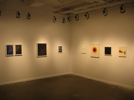
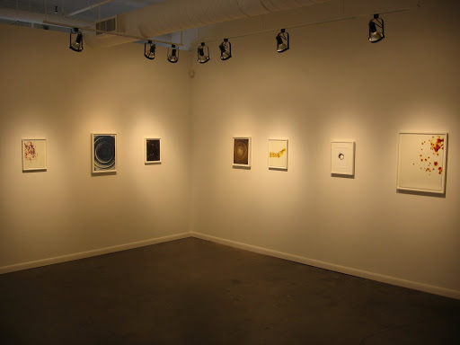
 Founded in 1963 as part of the University of California at Berkeley, the Berkeley Art Museum and Pacific Film Archive (website here) remains a vibrant location for art viewing in the Bay area. And like many museums, it is in the middle of its own transformations; a new building by Japanese architect Toyo Ito is scheduled to open in 2013 (background on the project here; take a virtual tour of the spectacular building here), the eerie poured concrete walls and ramps of the current galleries (installation shot at right, from the museum website) to become a distant memory.
Currently, the Berkeley Art Museum holds approximately 3600 photographs, with a solid mix of all periods of the medium (14% pre-1900, 70% 1900-1980, 16% post-1980). Much of the collection is up on the website and can be easily searched (here). Highlights include large bodies of work by Lewis Callaghan, W. Eugene Smith, Ant Farm, Bruce Connor (Mabuhay Gardens punk series) and Andy Warhol (part of the Photographic Legacy gift program). Jan Leonard and Jerrold Peil gave a major gift of photography to the museum in 2002 -a total of 848 vintage prints from across the medium’s history. Overall, the design of the collection is centered on Bay area photography, Conceptual art documentation, and 19th century travel and portrait photography. The museum does not have a full time photography curator, so photography is bundled under the larger collections department.
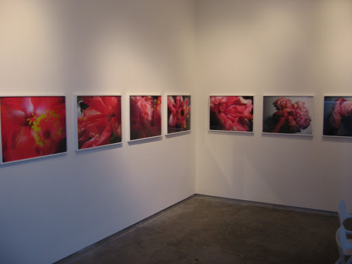
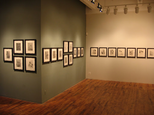
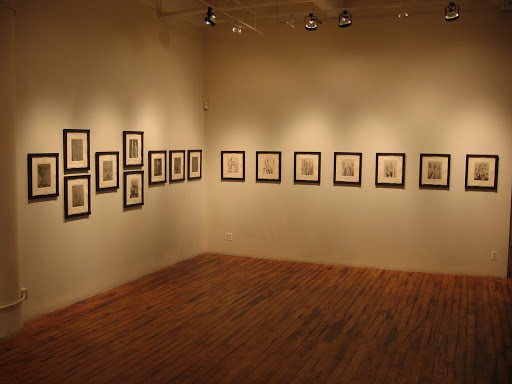
While portions of the permanent collection of photography are not always on view at BAM, the exhibitions calendar has always had a solid share of photography. Recent photography exhibitions have included:
- Bruce Connor: Mabuhay Gardens (2008) (here)
- David Goldblatt: Intersections (2007) (here)
- Abbas Kiarostami: Image Maker (2007) (here)
- Time’s Shadow (2004) (here)
- Roger Ballen (2004) (here) (his first museum show in the US)
Approximately 100 photographs enter the collection each year, with more than 1600 coming in since 2001. This is quite an accomplishment given that there is no dedicated acquisitions budget for photography; all works are acquired via donation or through battling it out for the general acquisition funds.
Unfortunately, collectors can’t easily access the museum’s collections at this point (perhaps this will change in the new facility). Researchers/students with an academic project can contact the BAM/PFA Academic Liaison to arrange a viewing session, but there isn’t currently any viewing room or other space that can be reserved by appointment for the general public.
Overall, BAM remains a surprisingly good place to see photography given its broad mandate, and will likely become even more so with the construction of the elegant new space.
2626 Bancroft Way
Berkeley, CA 94720