Our one year anniversary will occur next week, so I thought this would be a good time to take stock of what we’ve accomplished in our first year of writing about collecting photography. Since you are all stakeholders in the success of this venture, I thought I would provide a transparent view of the actual statistical data that we’ve collected along the way. I think it provides a good snapshot of what has happened, showing both the strengths and weaknesses of our performance.
Posts
Total posts: 396
Exhibit/show reviews: 139
Photo book reviews: 89
Auction previews: 58
I think this data shows that we’ve done a solid job of covering the things we think collectors care about. I believe the auction coverage has been pretty comprehensive. Books have been a mixed bag; there are so many books to talk about and we are constantly discovering books that were published years ago but that are new to us. I think we will try to be a bit more current in our book reviews in the coming year. As for exhibits and shows, I think we’ve covered most of what was important, but I’d like to expand our coverage even more to get out on the fringes even further. I’d also like to add more reviews from non New York locales, perhaps from guest commentators. I’d also like to do better coverage of fairs and festivals around the world, even if we’re not attending ourselves.
Summary Traffic Numbers (Feedburner and Sitemeter data)
Total subscribers (as of 8/7): 280 subscribers
Average daily visitors (as of 8/7): ~150 visitors
Total visits: ~30000 visits
Total page views ~52000 page views
We began our efforts from a standing start last August (no subscribers and no visitors) with an introductory email to about 30 people. The first six months were very slow; at the end of January, we had approximately 55 subscribers and another 35 or so daily visitors. The past six months has seen a more rapid, accelerating growth in our subscriber and visitor base. If you try to strip out the double counting of repeat visits and visits by subscribers, I’d say we have a consistent daily reach of about 400 people at this point. I know from discussions with specific people that we have a strong representation of collectors, gallery owners and staff, museum curators, auction house specialists, press/critics, and artists/photographers among our consistent readership. But we’re still very, very small.
I’d like to say a few words of thanks to the many folks who have linked to us and shared their readers with us. Aside from the sharing of posts via Facebook, Twitter and the like by our own readers (which is becoming more active), Conscientious (here) has been far and away our biggest supporter in terms of visitors directed to our site. Others who have consistently brought us readers via repeatedly linking to us or putting us in their blogrolls include Gallery Hopper (here), Exposure Compensation (here), Edward Winkleman (here), Amy Stein (here), Modern Art Obsession (here), and Eyecurious (here); sincere thanks to everyone who has linked to us (listed above and not), regardless of how many readers we received as a result; the link is what matters, as it shows we have earned your confidence in recommending us.
Interesting Statistics (Sitemeter data)
Single longest visit: 2 hours, 42 minutes
Most page views in a single visit: 99 pages
Average page views per visit: 1.8 pages
Average visit length: ~2 minutes, 30 seconds
Total countries represented: 106 countries
One of the statistics I watch most closely is page views per visit. We have been hovering around 1.8 for most of the life of the site, and I’d like to find a way to get it up above 2. This statistic is I think a gauge of whether visitors are simply coming for a single post, or are being enticed to dig around and find other items of interest. Many, many visitors arrive via a Google search, read the post they were linked to and leave. But quite a few others visit and spend 5, 10, 15, or 30 minutes exploring. I’d like to find more ways to encourage this branching out behavior. The average visit length is another indicator of readers getting engaged with the content. It’s been steadily rising through the life of the site. This stat is a little misleading however, as it doesn’t capture the behavior of feed readers who see the content in their readers, not on the blog itself; so we really don’t know how long our entire audience is spending with us.
I’m also amazed to see that we have had visitors from so many countries. While the majority of our traffic is coming from the United States, I’m pleased to see that we have a strong contingent of other nationalities that are consistently represented: the UK, Canada, France, Germany, the Netherlands, China, Japan, Italy, Australia, and Spain routinely make up our top ten.
All in all, it’s been a terrific year, and we feel like we have learned an enormous amount about the world of photography by forcing ourselves to write something each day of the work week. We’re excited about the progress we’ve made with the site and look forward to Year 2 and expanding our efforts in multiple directions. As always, your comments will help us focus our attention on the right things.
With that, we’re going to take a much needed vacation. Starting now, there will be no new posts until Monday, August 17th. Think of it as a time to dig through the archives.
Another way to think about this hiatus is that it is similar to a public radio membership drive; the content you want is annoyingly not available, replaced by entreaties to contribute your support. But our effort is decidedly old school. We don’t want your money, nor do we want your volunteer time. Here’s what we’d like you to do, if you feel in the mood for giving.
Spend 30 seconds thinking of the people you know that are the most passionate about photography: perhaps they are collectors, museum trustees, accession committee members, curators, gallery owners, or artists. Then think about which of these people is least likely to be a reader of this blog: perhaps they are extremely busy, or powerful, or don’t use the Internet much. Now choose ONE. Not 500 of your closest Facebook friends or 1000 of your Twitter followers. ONE. Spend the next 30 seconds writing this person a 3 to 4 sentence email introducing them to DLK COLLECTION (don’t forget the link!), telling them why you read this blog regularly and what you find of value. Press send. You’re done. You’ve earned guilt free reading for an entire year, with little effort and no downside.
In my view, the world of photography collecting is a very small place. Earlier this week, we made an argument that there might be 10000 collectors in total around the world. If we add in all the museum curators and staff, gallery owners and staff, art critics and press, book publishers, fair organizers, and serious artists/ photographers, perhaps we can double the number to 20000. Our site is aimed at this narrow group of people. Our goal is to get more and more of you as subscribers or regular readers; whether the general population of causal photo enthusiasts comes for a visit from time to time is much less important.
I like to think of our current reader base as the “pioneers”. You read our site when it wasn’t obvious, when we made daily mistakes and worked to figure out what we were really doing. You have endured the hardships of typos, bad grammar, and ideas that missed the mark. But I’d like to think we’ve ironed out many of those kinks at this point, and that we’re getting better with age. It’s time for you to be the tastemakers that you are, and tell the more conservative “settlers” that’s it really pretty safe out here. Each one of the people you connect to with your emails deepens our reach, and if we could conceivably convert them to regular readers, we’d double our subscriber base, adding just those people who fit our narrow slice of the world, making the whole community that much stronger. The more connected our collecting community gets, the more interesting the discussions can become.
Thanks once again to everyone for your amazing support, past, present, and future, and we’ll see you again, rested and refreshed, later this month.
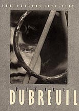
 JTF (just the facts): Published in 1993 by Éditions Créaphis/Ministère de la Culture, France, in conjunction with an exhibition held at the Palais de Tokyo. Unpaginated with 60 black and white images. Includes essays in French by Marie-Loup Sougez and Sophie Rochard, with a bibliography and exhibition list. (Cover shot at right.)