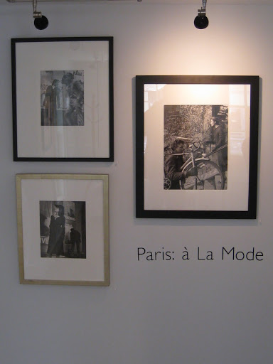
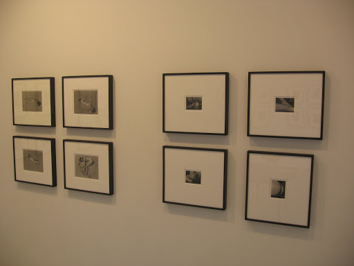
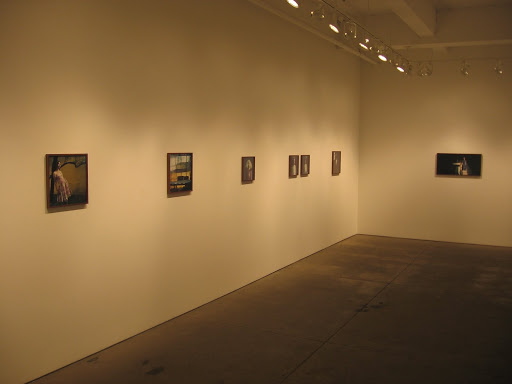
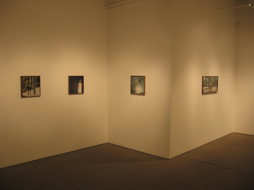
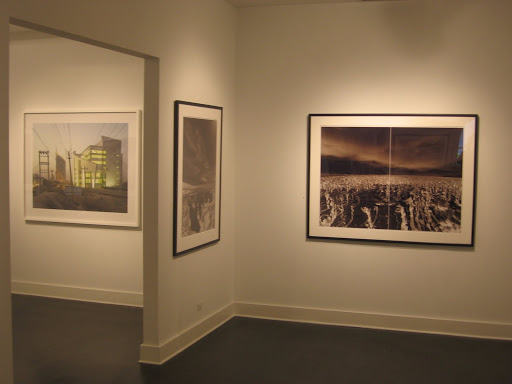
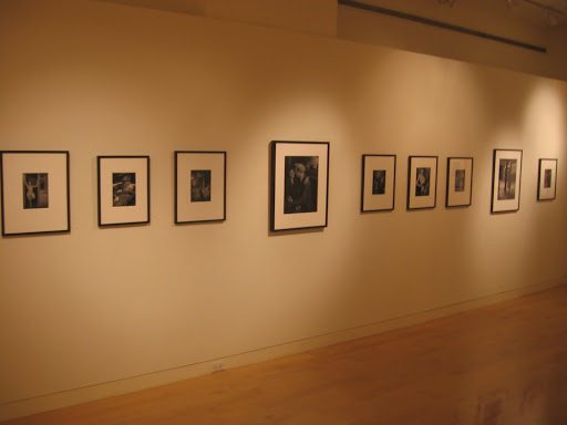
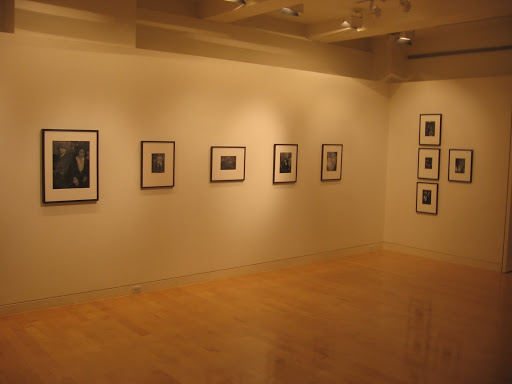
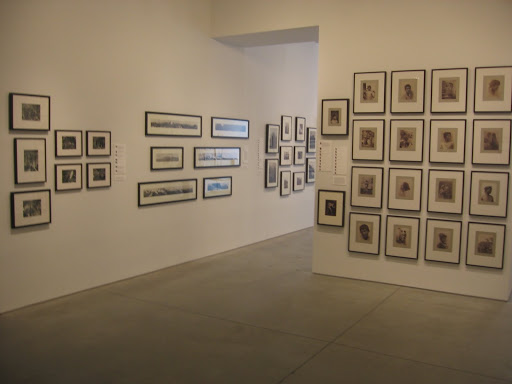
Auction Previews: Contemporary Art Evening and Day Sales, May 12 and 13, 2009 @Sotheby’s

With the photography auctions for the most part on the move to the European spring season (save Swann and Bonhams coming in mid May), the focus has shifted in New York to the top end Contemporary Art sales. Sotheby’s is up first, with its Evening sale on May 12, followed by the Day sale May 13. While there are only 2 photographs in the Evening sale (Jeff Wall and Gilbert & George), there are a total of 52 lots of photography on offer across the two days, with a massive total High estimate of $5337000 on these lots alone. (Evening sale catalog cover, top, Day sale catalog cover, bottom, at right.)

Here’s the breakdown:
Total Low lots (high estimate $10000 or lower): 0
Total Low estimate (sum of high estimates of Low lots): NA
Total Mid lots (high estimate between $10000 and $50000): 29
Total Mid estimate: $877000
Total High lots (high estimate over $50000): 23
Total High estimate: $4460000
The fact that there are zero lots in the Low range is a strong reminder of just how different this section of the market is from the overall photography market.
Below is a list of the photographers who are represented by more than one lot in the two sales (with the total number of prints for sale in parentheses):
Cindy Sherman (5)
Thomas Ruff (3)
Gregory Crewdson (2)
Fischli & Weiss (2)
Tom Friedman (2)
Barbara Kruger (2)
David LaChapelle (2)
Louise Lawler (2)
Florian MaierAichen (2)
Vik Muniz (2)
Richard Prince (2)
Andres Serrano (2)
Jeff Wall (2)

To our eye, the lots in this sale are solid but generally not superlative pieces, so just how well the sale will do on the whole is hard to predict. The two Jeff Wall lightboxes, Sunken Area (lot 10) and Diagonal Composition No. 3 (lot 371) are our particular favorites of what is on offer.

May 12, 2009
May 13, 2009
1334 York Avenue
New York, NY 10021

Danny Lyon’s Defeated Demo Driver

Once in a while, a newspaper picture will stop me in my tracks, and this image from an article about Danny Lyon in the New York Times this past Sunday (here) did just that. It’s called Defeated Demo Driver:


The targets painted on the door, the chain and duct tape holding the door shut, the skull tattoo on his wrist, the mashed up car in the background, and his dejected stare all come together to make a memorable image. The article is well worth a read too.

Auction Results: Saturday @Phillips, New York, April 25, 2009

While the idea behind the Saturday @Phillips sales is to target a set of collectors different than those who frequent the specialist sales (typically newer/younger collectors at lower prices), the photographs offered in the midst of the other material in this particular sale performed almost exactly in line with the general trends we are seeing in the rest of secondary market for photography: a forty percent buy in rate, total proceeds below the total low estimate, and some softness as prices move into the Mid range and higher.

The summary statistics are below:

Total Photography Lots: 86
Pre Sale Low Total Estimate: $220400
Pre Sale High Total Estimate: $310300

Total Lots Sold: 50
Total Lots Bought In: 36
Buy In %: 41.86%
Total Sale Proceeds: $132376

Here is the breakdown (using the Low, Mid, and High definitions from the preview post, here):

Low Total Lots: 81
Low Sold: 47
Low Bought In: 34
Buy In %: 41.98%
Total Low Estimate: $235300
Total Low Sold: $104251

Mid Total Lots: 5
Mid Sold: 3
Mid Bought In: 2
Buy In %: 40.00%
Total Mid Estimate: $75000
Total Mid Sold: $28125

High Total Lots: 0
High Sold: NA
High Bought In: NA
Buy In %: NA
Total High Estimate: $0
Total High Sold: NA

80.00% of the lots that sold had proceeds in or above the estimate range (with 28.00% above). There were three surprises (defined as having proceeds of at least double the high estimate) amongst the photography in this sale: lot 41, Catherine Opie, Mike and Sky, 1993 at $5625; lot 257, Vanessa Beecroft, Five works: Untitled, 1999 at $4750; and lot 266, Barney Kulok, Pantone 1788 (Church Door), 2006 at $1625.

Complete lot by lot results can be found here.

Phillips De Pury & Company
450 West 15th Street
New York, NY 10011

Paul Graham, Photographs 1981-2006 @Greenberg Van Doren

JTF (just the facts): A total of 12 works, 10 single images, and 2 series, variously matted and framed, hung in the entry and main gallery spaces. The images are from the period 1988 to 2007, many from the 1990s. The prints range in size from approximately 16×20 for the small series images, all the way up to wall sized 70×90. (Installation shots at right.)

Comments/Context: After enjoying Graham’s current show on view at the MoMA (review here) and having quite a few follow-up discussions with various folks who helped educate me a bit further on Graham’s work, I was eager to see how Greenberg Van Doren would present a broader array of his images, mini-retrospective style. The gallery has opted for the “appetizer sampler” approach: two or three images from a handful of different projects, served together, with the assumption that after trying each of them, we’ll know what to order next time.

The first room has a grab bag of images: one from Empty Heaven of a Japanese woman about to cover her mouth (1992), one from New Europe of a suited man’s knees (1988), and one of an amputated tree painted white (2005), from a shimmer of possibility. Each has its merits, but it’s hard to draw much of a pattern from these three as group.

The main gallery has some of the same series from a shimmer of possibility that were presented at the MoMA clustered on opposite walls, and upon a second viewing, they’re still excellent. Also in this room are a pair of large profile mug shot portraits of teenagers (1997) from End of An Age. These images are vaguely reminiscent of Thomas Ruff’s deadpan frontal portraits from the 1980s, with a bit more adolescent angst thrown in for good measure. Three images from the Painting series (1999) share this wall; they are close up, color field like works of graffiti scratched walls, and they reminded me tangentially of Brassäi.

My favorites in the show were the two massive images from American Night (one 1998, one 2002). The first depicts a seemingly downtrodden man with an eye patch, standing in a darkened alley, near a graffiti covered corrugated steel security pull down and an array of gumball machines. The second shows a lone man standing in an empty parking lot in a pupil-dilating field of white brightness. Both of these works take what at first glance is a simple documentary image and make it something altogether more powerful. We’ll certainly go in search of more images from this particular project to get a wider view of the whole effort.

Overall, this show is a bit uneven, but it certainly worth a visit as further background on the evolution of Graham’s career.

Collector’s POV: The series images from a shimmer of possibility are $35000 and $40000. The pictures from the Painting series are $17500 or $25000. The American Night images are priced at $40000, while the various images in the entry gallery are between $15000 and $20000. The two portraits from End of An Age are not for sale. All the prints are made in editions of 3, 5, or 6. Paul Graham’s photographs have been virtually unavailable at auction, although the MoMA show will likely shake some loose in the coming seasons I would imagine. As a collector, I came away from this show with a deeper appreciation for both the American Night works, as well as those from a shimmer of possibility.

Rating: * (1 star) GOOD (rating system described here)

Transit Hub:
  • Paul Graham Archive (here)
  • 2009 Deutsche Borse Prize (here)
  • 2009 Interview with PDN (here)
  • American Night (here)
Paul Graham, Photographs 1981-2006
Through May 2nd

730 5th Avenue
New York, NY 10019

Into the Sunset: Photography’s Image of the American West @MoMA

JTF (just the facts): A total of 165 photographs, from over 70 photographers, variously matted and framed, hung in a single long gallery, loosely divided into six spaces, on the 3rd floor. All of the works are hung thematically (rather than chronologically), in pairs, groups and grids. One space also includes a single glass case displaying two folding panoramas. The images in the exhibit range from the 1850s to the present. The show was curated by Eva Respini, and an accompanying book is available for $45. No installation pictures (beyond the title text at right) were allowed.

Comments/Context: The American West has always had a special place in the collective psyche of the nation. Its massive skies, huge open spaces, and unparalleled diversity of natural beauty have made it a constant source of mythology: of frontiers to be settled, of limitless opportunities, of mavericks and risk takers who made their fortunes out in the wilderness. This current exhibit at the MoMA takes stock of how photographers since the birth of the medium have seen and documented the West, in both its grandeur and its reality.

The story starts with the staggering documentary efforts of Watkins, Muybridge, Jackson, O’Sullivan and others, who ventured out into the vast untamed lands with their glass plates and chemistry tents to explore the new territories, bringing back astonishing images to share with the nation. In many ways, this narrative remains the largely same all the way through Ansel Adams, who tasked himself with capturing the romantic natural beauty of the West, as part of a larger effort to convince the powers that be that we ought to protect and cherish these lands.

Another version of the history of the West runs in parallel with this “nature” story, and tells the tale of entrepreneurship, cowboys and settlers, industrial growth, mining, and rapid expansion. This is the tale of how we as a people set out from the East, moved West, and scratched out a new way of life, taking full advantage of what the land had to offer; it is a narrative about how people “fought” and “tamed” the land, how new opportunities were available for the taking. While many photographs were taken of this activity, this particular show generally skips over much of this early history (I did enjoy the Kinsey logging image which fits in this category), in favor of a heavier dose of imagery of what came after, as cities and towns grew into suburbs and sprawl.

The overall disillusioned tone of this exhibit is drawn most clearly from a large number of images that focus on the aftermath of growth and the downside of our collective movement West, almost a “before” and “after” kind of portrait. Gas stations, billboards and mind numbing tract housing now distract us from the open roads and endless skies. William Garnett, Ed Ruscha, and Robert Adams all expose the ravages of endless “planned communities” of suburban development. Lewis Baltz’ grid of San Quentin Point images is especially harsh, filled with littered close ups of abandoned detritus. And the lives of the people now living in these wastelands (captured by Robert Frank, Bill Owens, Joel Sternfeld, Larry Sultan, Henry Wessel and others) is depicted as dreary, marginal, and potentially deviant, a woeful collection of losers, a far cry from our original optimistic hopes and heroes. Images by Cindy Sherman and Richard Prince turn these dreams into caricatures. And while these are all fair characterizations of the reality, together, they form a pretty depressing view of our ability to build a meaningful life.

While this exhibit is truly brimming with exceptional photography (from all periods) and effectively holds up a mirror to how we have seen ourselves over the past decades, I think the show missed the chance to tell a more complicated, multi-faceted story about the West and its continuing evolution. Here are some of the topics or subjects I found either altogether missing or underreported by this show:

  • Silicon Valley
  • Hollywood
  • The borderlands of the Southwest
  • The farmlands of the California Central Valley
  • Hispanic culture in general
  • Las Vegas
  • The Pacific Northwest
  • San Francisco counter culture
  • The importance of water
  • Modern ranching

It’s clear that to cover all of these would require lots more gallery space; editing was required to synthesize the narrative down to its essence, and many of these likely ended up on the cutting room floor. That said, I don’t think the show is as even handed as it could have been in its presentation of the artistic facts.

In many ways, given the deep historical roots of the country on the East coast, the West has always been defined in contrast to the East. Having lived a good portion of my life out West, this show, both in its individual examples and its overall feel, has an undertone of East coast dominance, a view of the West by distant observers who are looking down from a position of perceived superiority and offering mostly sarcastic judgments. There is plenty of excitement and positive activity in the West, much of it running counter to the conventional wisdom and traditions of the East, and I think this exhibit misses it entirely. Perhaps the point was to dispel the historical mythology, but America is a nation that constantly reinvents itself, and that reinvention is often more vital and active in the West.

Overall, despite the flaws outlined above, this is a very thought provoking if less than flattering show, with superlative photography on view, ably curated into small groups of pictures that resonate with each other in unusual ways. The Ansel Adams versus Stephen Shore, and Ansel Adams versus Joel Sternfeld, John Divola, and Richard Misrach wall combinations are particularly striking. Find a time to see the show on off hours, as it was nearly overrun with visitors when I went.

Collector’s POV: As a collector, I was most struck by the geometric purity of William Garnett’s aerial pictures in this show. These would fit extremely well into our city/industrial genre. We’re also still on the lookout for just the right Robert Adams work; many of his images are excellent, but only a few would fit well into our current mix of pictures. And as a random aside, I’ve enjoyed some of the modern cowboy/ranch portraits made by Kurt Markus; they might have been a good inclusion in a variant of this show.

Rating: ** (two stars) VERY GOOD (rating system described here)

Transit Hub:

  • Reviews: NY Times (here), Village Voice (here), Cowboylands (here)

Into the Sunset: Photography’s Image of the American West
Through June 8th

Museum of Modern Art
11 West 53rd Street
New York, NY 10019

Lisa Kereszi, Fantasies @Yancey Richardson

JTF (just the facts): A total of 6 color images, all mounted to board and not framed, hung in the smaller project gallery in the back. All of the images are 20×24, in editions of 5. The negatives are from the period 2000-2003. (Installation shots at right.)

Comments/Context: First published in 1976, Susan MeiselasCarnival Strippers pulled back the curtain on the lives of the women who worked at strip shows, and the men who came to watch them. It was a compelling portrait of vulnerable lives in a tired, alienated existence, and it became a classic in the history of photography. Part of what was unusual about this project was that it had several viewpoints: the men watching the women, the women performing and watching the men, and Meiselas watching them both.
Several decades later, Lisa Kereszi has taken a walk down the same road, and found that not much has changed in the intervening decades. Her work is split between off stage views of strippers and burlesque performers and empty views of worn clubs and theaters. While Meiselas often focused on the interaction between performer and voyeur, Kereszi has chosen quieter shadowy moments, where the racy peep show fantasy has been exposed as a fraud – a dancer mundanely changing her shoes, or a tawdry stage with plywood walls and a cheap mirrored disco ball. While the pictures are well made, when the lights are on, 1980s chic is pretty dreary and uninspiring.Collector’s POV: The prints in the show are priced between $2100 and $2600. Since this show is so small (6 pictures), it’s hard to draw a conclusion about the overall nature of the work, since some of the images are fragmented interior shots, while others are more emotionally charged documentary portraits. Perhaps the book is a better vehicle for a more deep and nuanced narrative.
.

Rating: * (1 star) GOOD (rating system described here)
Transit Hub:
  • The artist’s website (here)
  • Video of Kereszi on Governor’s Island (here)
  • Review of Fantasies at 5B4 (here)
  • 50 States Project (here)
  • Dikeou Collection (here)
Lisa Kereszi, Fantasies
Through May 9th
535 West 22nd Street
New York, NY 10011

Masato Seto, Binran @Yancey Richardson

JTF (just the facts): A total of 9 color images, framed in black with no mat, hung in the main gallery space. The prints come in two sizes, 30×40 or 40×50, in editions of 8 and 6 respectively. The negatives are from 2006 and 2007. (Installation shots at right.)

Comments/Context: Masato Seto’s images of Taiwanese betel nut kiosks are dazzling and exotic, falling into a more general category of anthropological studies of remarkable foreign subcultures. In these pictures, Seto has made flash-lit night images of outlandish roadside binran shops. In each work, a scantily clad but bored female attendant (often sitting on a stool) stares out from a surreal glass cage reminiscent of a window display or an aquarium. Each pod is glowing with bright colors and harsh glare, literally “framed” by neon or fluorescent lines and swirls of light around the edges of the enclosure.

An initial reaction to these pictures might be that they are exposing overt exploitation, and perhaps in some way they are. But when many of these images are shown together (as they are here), any trace of specific personality or story seems to melt away, and the pictures become an exercise in theme and variation (almost like a set of Becher water towers), where the outrageous architectural details (including the doll-like women who are part of the scene) become the focal points.

Collector’s POV: The smaller prints in this show are priced at $4000; the larger ones are $6250. A signed monograph of the Binran work, published by Little More, is available from the gallery for $30; this book is well worth flipping through or buying, as seeing another 20 or 30 of these images (beyond those in the show) makes the breadth of the project and the diversity of shop styles more apparent.

Rating: * (1 star) GOOD (rating system described here)

Transit Hub:
  • The artist’s website (here)
  • 2008 Interview: The Sweet Allure of Betel Nut Beauties (here)
  • Concurrent show at Jackson Fine Art, Atlanta (here)
  • Silent Mode (here)
Masato Seto, Binran
Through May 9th

Yancey Richardson Gallery
535 West 22nd Street
New York, NY 10011

Andreas Gursky, Werke Works 80-08

JTF (just the facts): Published in 2008 by Kunstmuseen Krefeld, Moderna Museet Stockholm, Vancouver Art Gallery, and Hatje Cantz. 272 pages, with 155 color images. Includes an essay by Martin Hentschel. (Cover image at right.)

Comments/Context: We already own two Gursky monographs: one from the 1998 Kunsthalle Dusseldorf show and another from the 2001 MoMA show. So why do we need another, you might ask? The reason is that this smaller volume is trying to do something different. Instead of being a large format, coffee table sized book with big, beautiful pictures, this monograph is the size of a hardback novel, and the pictures are printed much smaller; what’s interesting is that there are many more of them, nearly twice as many as in either of the other books. While this isn’t a catalog raissoné, and many of the thumbnail images fail to evoke the grandeur of their mural sized cousins, the deeper dive into Gursky’s archives helps to tell a much fuller and more varied story about his evolution as an artist.

For quite a while now I have been wondering about the early work of the Becher students and how it shows the influence of their teaching style. An oversimplified definition of the Becher formula is as follows: 1.) choose a large subject, with lots of different potential examples, 2.) choose a consistent approach to picture making, 3.) take lots of pictures in this manner, and 4.) display some of them together (the “typology”) to get at the underlying essence of the subject. How Gursky internalized this teaching (and how he eventually evolved it into his own personal vision) is clearly shown in this book. His first subjects were interiors of restaurants, and he soon moved on to desk attendants (pairs). If you’ve never seen these images, they have all the Becher hallmarks: cool detached, frontal viewpoint, uniform and meticulous view camera picture making. It’s in Gursky’s next series, the Sunday Walkers, where the rigidity of the formula starts to break down; the pictures are more fluid, still using a common theme, but allowing for more flexibility of vision.

In the next few years, Gursky started to make his first bird’s eye view images, with tiny ant-like people dwarfed by the immense scale of their surroundings, the images still rigorous in their style, but now much less cookie cutter. By the time you get to the early 1990s, the Gursky that took the art world by storm is now in top form: extra large sized prints of far flung locales, where hotels, office buildings, industrial warehouses, raves and stock exchanges become metaphors for the spectacle of our anonymous contemporary lifestyle, minimalism and conceptualism merging (with the help of some digital manipulation) into something altogether new.

The reason I like this book is that many more patterns emerge when you see a larger sample of Gursky’s images. Since most of his recent works are printed mural sized and have become so expensive, one hardly gets a chance to see more than one or two at any one time these days; it’s hard to plot much of a line with only a couple of points. If you’re interested in the broader trajectory of Gursky’s career and want to place the themes and approaches he has come back to again and again in a larger context, this is a good book for your library. The exhibition should also be well worth a visit.

Collector’s POV: Andreas Gursky is represented by Matthew Marks Gallery in New York (here). Gursky’s large prints tend to be made in editions of 4, 5, or 6, and are routinely sold above $100000, ranging all the way up into the low millions of dollars. Smaller prints are often made in editions of 12, 25, 30 or even 60, which generally drives the prices down to a zone between $5000 and $50000.

Transit Hub:

  • The complete list of Gursky’s contemporaries while studying with the Bechers: Candida Höfer, Axel Hütte, Tata Ronkholz, Thomas Ruff, Thomas Struth, and Petra Wunderlich
  • 2001 MoMA exhibition (here)
  • Jerry Saltz: It’s Boring at the Top, New York magazine, 2007 (here)
  • Video of Gursky exhibit at Kunstmuseum Basel (here)
  • 2008 Matthew Marks show (DLK COLLECTION review here)
  • Upcoming 2009 Vancouver Art Gallery exhibit, in conjunction with this book (here)

Slide Show, The Color Photographs of Helen Levitt

JTF (just the facts): Published in 2005 by powerHouse Books (here). 120 pages, with 110 color images. Includes a foreword by John Szarkowski.

Comments/Context: I don’t think it was until we moved back to New York that I really started to resonate with Helen Levitt’s work. Her 1930s and 1940s black and white images of children in the streets, while undoubtedly well crafted, somehow didn’t grab my attention; I was more drawn to the architectural transformations documented by Berenice Abbott from the same period.

But it is her color work from the 1960s and 1970s that has made me change my mind a bit on Levitt’s rightful place in the history books. How’s this for a statement: of the great black and white photographers working prior to the 1950s, Levitt was the most successful at embracing color photography and making a superlative body of color work in her later career. The only other “old school” photographers I can come up with who made the transition to decent color work are Harry Callahan (his later dye transfers), Andre Kertesz (Polaroids) and Walker Evans (Polaroids). If I’ve missed some glaring great example, leave it in the comments, but I think the statement stands – Levitt did something that almost no one else did.

The images in this book perfectly capture the feeling of New York in the summer (no wonder her work is often labeled “social realism”). Virtually all the pictures are of people, not straight on portraits, but people in the context of their lives: on street corners, with pets, near parked cars, sitting on stoops, smoking, waiting, taking a break. Her compositions often capture the world slightly off-kilter, with spontaneous secondary stories playing out on the periphery, just like they do in real life. On first glance, these images look like snapshots; upon further review, they turn out to be tiny vignettes of everyday life, somehow optimistic amidst generally poor living conditions and plenty of old age. Her use of color isn’t self-conscious; she doesn’t use super-saturated attention grabbing color. Instead, color is used as just one of many tools that can make a picture resolve into something interesting, the hood or a car, or a dress, or a door frame suddenly providing a visual contrast. And even though there are a few dated fashions and hairstyles, these pictures have a timeless quality to them, as though you could step into the street in parts of New York in August and see these exact same stories playing out all over again.
.
Collector’s POV: Levitt’s vintage silver prints from the 1930s and 1940s come up at auction from time to time, ranging in price from $10000 to $60000. Later prints from these same negatives are typically priced between $2000 and $6000. Her dye transfer prints have been much more scarce: only a handful of prints (some vintage, some printed in the 1990s) at auction in the past five years, selling for between $2000 and $12000. Levitt is represented by Laurence Miller Gallery (here) in New York, Fraenkel Gallery (here) in San Francisco, and Robert Klein Gallery (here) in Boston. While these images don’t neatly fit into our city/industrial genre (too many people), they are growing on me over time, so perhaps there will be a place in our collection for one or more of these prints at some point in the future.

Transit Hub:

  • NY Times obituary (here)
  • Interviews: NPR 2002 (here) and WNYC 2001 (here)
  • James Agee’s forward to A Way of Seeing (here)
  • Crosstown (here)
  • Helen Levitt – In the street @FOAM, Oct 2008-Jan 2009 (here, in Dutch)

Connectors, Grazing and Transit Hubs

In recent weeks, I’ve been thinking a bit more about exactly what it is that we as photography collectors are actually doing, and how this site might be reconsidered so that it has more relevance to those activities, both for ourselves and for our readers.

After mulling this over for some time, I’ve come to the simple conclusion that for most people, collecting is a search for meaning, a process of finding items that have some underlying significance or importance for them, or that somehow make a real connection to their lives. For some, it is the ongoing pleasure derived from owning the objects; for others, it is the action and education in support the search that is the source of repeated interest.

When we go to a gallery or museum show, read a photography book, or flip through an auction catalog, what we are doing is looking for connections: those pieces that seem to have a bright light shining on them – objects that stand out from the crowd, that resonate with our own personal world view (and we all know them immediately when we see them, like a lightning strike, even if they are wildly different from person to person). Education generally increases the likelihood of understanding and appreciating a work, so artists, dealers, museum curators and auction house specialists can all be sources of information that lead to a deeper appreciation of a photograph.

In the process of our often manic “hunting and gathering”, each collector has his or her own calculus going on behind the scenes that determines which pictures are worth paying attention to: perhaps it is those that have some sense of beauty in our eyes, or those that are challenging and knock us out of our numbness. Some of us see patterns and relationships between pictures and artists, others respond to overt or subtle emotional qualities. While collectors come in all shapes and sizes, from intuitive to structured, in the end, we are all doing the same thing: connecting with images. So maybe we should start calling ourselves “connectors”, focusing on those elusive qualities in a photograph that make our eyes (and brain) light up, rather than the acquisitions that are the end result of the larger process.

If we follow this train of thought, where collecting is really just a euphemism for connecting, then what is a site like this good for? What does the form itself provide, and what should we be trying to accomplish within the confines of its structure, if we are trying to optimize “connecting”?

From our own experience on this site, it is clear that the blog (as a form) is not well suited to long, reasoned arguments, complex reporting, or deeply historical/analytical essays. Print publications like weekly and monthly magazines (ArtForum or The New Yorker) and daily newspapers (The New York Times) are still a better venue for this kind of writing, regardless of whether it is scholarly in tone or more conversational. Ideas that require a complicated exposition don’t seem to fare as well when scrolling down endless pages; while we might have visions of writing these kinds of more in depth articles, reading them at significant length on any kind of screen can be tedious.

Blogs seem to be best suited to the 500 word summary (5 or 6 paragraphs at most): long enough to provide a handful of meaningful thoughts and ideas, short enough to be easily digestible in a few minutes. (This post is an example of a post that is too long; I expect many will give up before getting to the end.) Given the real time nature of our connected world, blog posts are also excellent for up-to-the-minute, time-based factual reporting (something that printed media does not do particularly well, and has largely migrated to online bretheren). A third important structural feature of blogs is their informal connectivity: the ease with which large amounts of external information (especially background material like long articles, images, and video) can be linked into the body of the text to enhance the reader’s experience (again, something that print media does poorly). So instead of trying to replicate the successes of other media in this new form, we should be focused on trying to exploit these strengths to create new experiences.

When we are jumping around from blog to blog and site to site, mixing our RSS reader feeds with Google searches, looking for “connections”, we are grazing. While this type of reading has its parallels in reading a newspaper and jumping from one article to another, Internet grazing is a bit more like following a trail of breadcrumbs. I think a good portion of our readers come to our site in search of something specific: a review of the recent Walker Evans show, details on an upcoming auction, or more information on Osamu Kanemura. Many come directly from a search engine (where they have searched for this specific item), or perhaps they already know about us, and come to the site knowing that what they are looking for might be here. However they arrive, they are generally looking for a succinct dose of precise information and we need to tailor our site to meet those demands.

What I have come to conclude is that once a reader/collector is here, we have an opportunity to use the strengths of this format to not only deliver our own appropriate content, but to help make a timely, relevant and useful connection to something else (the next breadcrumb). Often this will be another recent post or perhaps one from the archive. But it could just as easily be something outside this destination, that we as collectors already know has some relevance to the subject at hand. This neatly leads to the idea of the site as both a destination and a transit hub.

While some folks are interested in a continuing conversation with us (reading our reporting or hearing our voice/opinions in particular), most are just grazing, and need to make a new connection, to follow a new link, once they have finished with the ideas found here. I’ve come to realize that the single collector/critic, omniscient view of photography (or the art world for that matter) is no longer valid; it’s just an old, inward-looking and outdated way of thinking. I now think that our job (and challenge) is to embrace the polyvalent mixture of interdisciplinary ideas and information swirling around out there in the void and use our experience and judgment as collectors to make sense of the inputs, with the ultimate goal of making connections that increase our readers’ (and our own) sense of meaning in the art around us. If we can help you get connected to something that really catches your attention, we’ve been successful.

Our intention then is to evolve our approach and make this site more of a place of transit, or terminal of sorts, where our role is to provide both our own viewpoint/reporting as well as a synthesized subset of easily and rapidly transferable ideas for further exploration. We must force ourselves to learn to leverage others who provide complementary (and contradictory) perspectives, including those that are beyond the obvious mainstream, out on the edges a bit. So from now on, all of our exhibit/show and book reviews will have a new section at the end (called Transit Hub), which will provide some additional, potentially serendipitous roads to travel down.

This whole endeavor to open up the process of photography collecting continues to be a work in progress, and many of you have provided feedback that was helpful in tuning our direction along the way. A final strength of this blog format is its facility for direct interaction with readers. As such, your comments on this and other topics are always welcome.

Auction Results: Vintage & Contemporary Photography, April 18, 2009 @Heritage

The Photography sale at Heritage last week in Dallas was brutal evidence of just how soft the lower end of the market can be in this environment, especially when mid range collectors fail to show up for the more expensive lots. In general, the buying was soft all the way down to the $2000 minimum bid level, below which things seemed to sell more readily. More specifically, this is the first time since we have been covering auctions in detail that we have witnessed a complete washout: all 18 of the Mid range lots failed to sell (and there were no High end lots in the sale). 0 for 18 is a drubbing that isn’t easily forgotten.

The summary statistics are below:

Total Lots: 293
Pre Sale Total Minimum Price: $648500

Total Lots Sold: 125
Total Lots Bought In: 168
Buy In %: 57.34%
Total Sale Proceeds: $203304

Here is the breakdown (using the Low, Mid, and High definitions from the preview post, here):

Low Total Lots: 275
Low Sold: 125
Low Bought In: 150
Buy In %: 54.55%
Total Low Minimum Price: $476500
Total Low Sold: $203304

Mid Total Lots: 18
Mid Sold: 0
Mid Bought In: 18
Buy In %: 100.00%
Total Mid Minimum Price: $181000
Total Mid Sold: $0

High Total Lots: 0
High Sold: NA
High Bought In: NA
Buy In %: NA
Total High Estimate: NA
Total High Sold: NA

Since we didn’t have estimates to tally (given the way Heritage presented the information), we don’t have any statistical data on percentages above, in and below the estimate range or on surprise lots. That said, the best outcome of the sale was lot 75028 Pierre Dubreuil, Black Cat Cigarettes, 1930, which sold for $15525 against a minimum bid of $6000.

Complete lot by lot results can be found here. Lots available for post auction purchase can be found here.

Heritage Auction Galleries
3500 Maple Avenue
17th Floor
Dallas, TX 75219

Edward Steichen, 1915-1923 @Greenberg

JTF (just the facts): A total of 46 prints: 31 vintage images in the main gallery space, 8 fashion images in the small side gallery, and 7 later prints (city/bridges and fashion) in one of the viewing rooms. All of the images in the main room are from the period 1915 to 1923. Various printing processes were used by Steichen during this period: gum over platinum, toned/regular palladium, palladium and ferroprussiate, and toned/regular gelatin silver. (Installation shots at right.)

Comments/Context: Concurrent with the big show now on at the ICP chronicling Steichen’s Condé Nast years (here), Howard Greenberg is showing a group of images from Steichen’s transitional period (1915-1923) just prior to joining the world of fashion and publishing. In these prints, Steichen was moving away from soft focus Pictorialism and experimenting with the sharper style of Modernism, borrowing portions from both in a satisfying combination.

This exhibit includes some truly astounding prints, several shown as pairs (the same negative using alternate printing processes, producing markedly different results). Most of the prints combine a simple, spare composition (often a still life) with a lovely warm toned patina (a holdover from Pictorialism).
Nearly all of the works in this show have strong formal qualities: round pears artfully composed on a plate, ribs and seeds of a sunflower, windows and fire escapes of a brick building, arched petals of white flowers against dark backgrounds, head shot portraits, hands and arms among long grasses. Up close, the prints have a tactile, object quality. For those interested in fine gradations of print tonality, these are prints not to be missed.
Collector’s POV: There were no prices on the information sheet for the main show (a pet peeve of mine, discussed here). This reality was not however particularly surprising, given the rarity of these prints and their undeniably sky high prices. That said, we have not seen a gathering of such beautiful prints of flowers in a very long time (there are seven staggering images, hung together in a group, at right); congratulations to the folks at Greenberg for scouring up such a strong group. The White Clymitis, 1921, and Lotus, 1915, were our two favorites, fitting snugly into our flower genre. As an aside, the later prints in the viewing room are priced at $3000 each.
.
While I think this show missed an opportunity to tie the entire Steichen narrative together more crisply and with a bit more scholarship, there are some sublime prints here, well worth savoring.
Rating: ** (two stars) VERY GOOD (rating system defined here)

Edward Steichen, 1915-1923
Through May 16th
Howard Greenberg Gallery
41 East 57th Street
Suite 1406
New York, NY 10022

Sign up for our weekly email newsletter

This field is required.