Tina Modotti: Under the Mexican Sky @Throckmorton

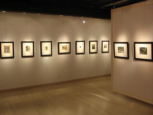
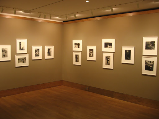
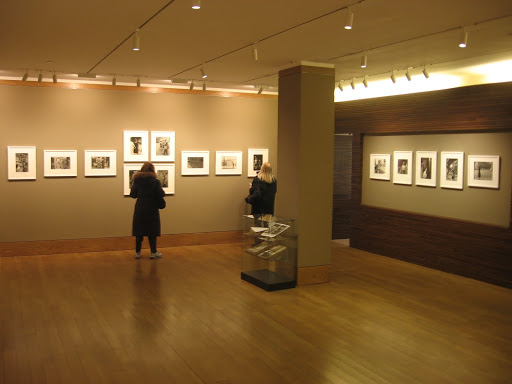
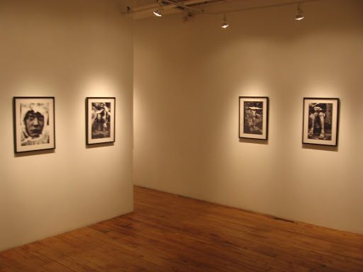
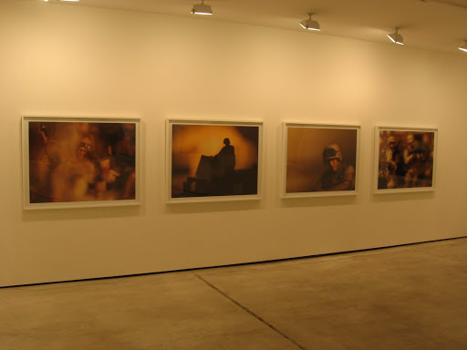
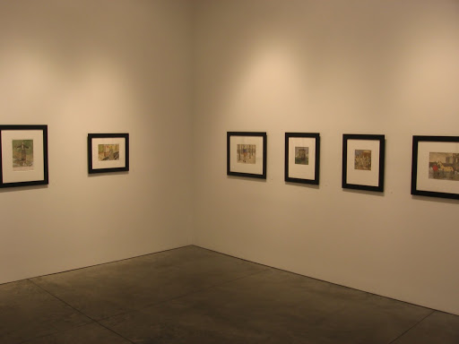
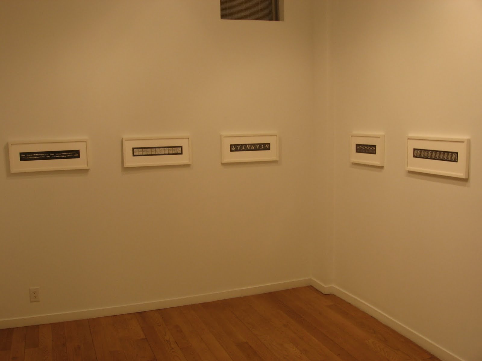
JTF (just the facts): A total of 45 black and white images, framed in black with white mats, and hung in the main gallery space (divided by a several interior partitions) and the elevator lobby. All of the works were taken between 1923 and 1930, and most of the prints on display are vintage gelatin silver or platinum prints. A selection of posthumous platinum prints by Manuel Alvarez Bravo (late 1970s) and Ava Vargas (1990s, a portfolio of 15 images, printed in editions 20) are also on view. All of the prints range in size from 4×3 to 13×10 or reverse. There is also one image by Edward Weston included in the exhibit (a portrait of Tina from 1924). (Installation shots at right.)

Comments/Context: In the history of photography, Tina Modotti is one of the standout personalities, whose romantic and exciting life story often overshadows her work as photographer. She was a well known communist activist, entrenched in the revolutionary politics of Mexico and mixing with the larger than life figures of the day (Diego Rivera et al), while also being the muse/lover of Edward Weston during his years there.

This excellent show is as close as to a museum retrospective of her photography as one is likely to encounter in a gallery setting. It brings together iconic still lifes (complete with sickle, bandoliers, corn cobs, guitars and the like), images of painted murals, head shot portraits and close-ups of hands, florals, cultural and religious artifacts, and a wide variety of heroic views of the everyday lives of Mexican workers and peasants. Taken together, the show gives a comprehensive view of her aesthetic approach, highlighting her combination of a Modernist sensibility and a deep and genuine interest in and respect for the cultural heritage and people of Mexico.

While many of the images/genres on display will be familiar to most collectors, it was the strength of some of Modotti’s lesser known portraits in this exhibit that was most surprising to me. Their pared down simplicity gives the works a combination of power and warmth that now seems emblematic of the struggles of the period. Certainly her still life compositions of communist symbols or workers/mothers in the streets are her most recognizable images, but I came away from this show with a renewed respect for her ability to capture the bold confidence and unwavering commitment that seemed to flow from the people around her.

According to the gallery, it took nearly 20 years of sustained effort to gather all of these images together. Don’t miss your chance to see them all in one place, before they are scattered to the winds once more.

Collector’s POV: The prints in this exhibit range in price from $4500 to $75000, with 5 additional works price on request; several of the images were already marked SOLD. Given the relatively small amount of her work that is not already held in museums, Modotti’s prints come up for auction fairly consistently, with a handful of works coming to market seemingly every year. Recent prices have ranged between $5000 and $215000, with forgettable images of mural details on the low end and rare vintage prints of her best known images at the top. For our collection, one of Modotti’s floral still lifes would be the best match; vintage prints of these images fetch well into six figures, so our only real option would be to go after one of the later platinum prints.

Rating: ** (two stars) VERY GOOD (rating system described here)

Transit Hub:

  • Mexico as Muse @SFMOMA, 2006 (here)
  • Tina Modotti: Between Art and Revolution (here)

Tina Modotti: Under the Mexican Sky
Through March 6th

Throckmorton Fine Art
145 East 57th Street
New York, NY 10022

Barbara Crane: Repeats @Higher Pictures

JTF (just the facts): A total of 13 black and white images, framed in white and matted, and hung in the small single room gallery space. All of the works in the show are vintage gelatin silver prints, in editions of 3 to 5, taken between 1969 and 1975. The images are generally elongated horizontal rectangles, ranging in size from 1 to 9 inches in height and 10 to 22 inches in length. (Installation shots at right.)

Comments/Context: At first glance, Barbara Crane’s Repeats look like regular film strips or contact sheets, multiple similar images one after another. But upon closer inspection, something altogether different and more complicated is revealed, taking the resulting works much deeper into the realm of abstraction. In each image, small pictures have been meticulously selected and laid out, often in exact copies or subtle variants/series, and printed in strips that are arranged in several layers (on top of each other, upside down, mirrored etc.).
The effect is that the shapes and forms found in each small image are transformed into intimate patterns and delicate repetitions. Tar spills on a roadway become paper dolls with linked hands, swooping highway flyovers become a swirling psychedelic optical wiggle, and straight tree trunks in the snow become a zipper. Metal rowboats, laundry on a clothesline, shadows of leaves and branches, and even a traditional mountain vista are all painstakingly transformed into contrasty fugues of theme and variation.
We can go all the way back to Muybridge’s 19th century locomotion studies or Grand Tour multiple image panoramas of famous ports and cities to give these works some historical context; the idea of using multiple frames to construct a larger narrative goes back to the beginnings of the medium. Crane’s studies at the ID in Chicago under Callahan, Siskind, and others were also clearly influential in the development of the ideas that underlie these particular works; there is marked resemblance/debt to both Siskind’s abstractions and Callahan’s multiple exposure images, although taken in a new direction by Crane and refined into a different mode of seeing.
.
What I like best is that the prints work at two different distances: from afar, they are entirely abstract exercises; up close, they resolve into specific content that is only discovered after investing effort in really looking. (This is show that works extremely well in a small space, as each work requires one-on-one, eyes to the frame inspection.) While Crane’s images were made in the analog 1970s, I think the foundation concepts that form the framework for her approach here have significant relevance to the digital age, where multiple images can now be stitched together with much more ease. All in, this show is worth a visit, for both the luscious craftsmanship and conceptual ideas embedded in the artworks on display, and also as a directional signpost for areas of potential exploration in the contemporary digital world.
.
Collector’s POV: Each of the vintage prints in the show is priced at $4000. Crane’s work has not been widely available in the secondary markets in recent years; very few of her prints have come up for sale, and therefore, there is little credible price history for collectors to reference. Barbara Crane is also represented by Stephen Daiter Gallery in Chicago (here).
While these works aren’t a direct fit for our particular collection, I certainly enjoyed Dan Ryan Expressway, Chicago, 1975, and can imagine a thought provoking pairing with a few of Catherine Opie’s California freeways.
Rating: * (one star) GOOD (rating system described here)
Transit Hub:
  • Artist site (here)
  • Review: John Haber (here)
  • Amon Carter Museum retrospective, 2009 (here)
Through January 30th
764 Madison Avenue
New York, NY 10065

Photography Collecting and Twitter

I’ve been pondering for quite a while now the relative strengths of the blog and Twitter formats. Given that our posts try to be rich in content and analysis regardless of their underlying topic, Twitter didn’t initially seem to offer much that would be relevant to our efforts to engage in useful discussions about photography collecting; there just isn’t enough room in 140 characters to dive into much depth or critical thinking.

But as the posts have piled up and this site has evolved, I’ve come around to thinking that Twitter can play an important role in broadening the reach of fine art photography. One of the dangers of a site like ours is that it gets too insular, that we end up talking mostly to ourselves and failing to get outside the bubble of insider thinking (and linking). One of the ongoing goals of our efforts here (one might call it a mission) is to grow the number of photography collectors actually out there and buying work; we want to encourage readers to become collectors. To do this, we need to reach more people who aren’t already thinking of themselves as collectors, but have an intense or growing interest in photography; maybe they are contemporary art collectors who haven’t yet bridged to photography, or maybe they are folks who have always wanted to buy a photograph, but haven’t yet felt comfortable enough. While Google search and user to user recommendations have been excellent methods for introducing people to our blog, I think that Twitter might also be a viable alternative for giving a wider audience a glimpse of what goes on here.

Not all of our content can be boiled down to a pithy, one sentence remark, but after considering it carefully, a surprising amount of what we write can be delivered in a useful, condensed form. Museums and gallery reviews are where we have decided to begin, since they seem to be the most popular with the largest number of readers. Starting last week, we began to post a Twitter version of our reviews after the main blog post was published. The Twitter version has the artist’s name and venue, the number of stars the show received (1, 2, or 3), a short description, comment, or summary, and a link to the main blog post for those who want more. That’s it. (Given our use of the @ symbol as part of the titling convention for our blog posts, the first few tweets have some inadvertent random links; we’re smarter now and have eliminated the @ in the titles.) These tweets are not auto generated somehow, but hand crafted by us to try and retain the feel of our voice. Hopefully, they capture the essence of the exhibit, while enticing readers to come over for a closer examination. Perhaps some galleries and museums may also find these tweets of use in communicating with their existing clients.

When auction season kicks back into full gear, summary auction results and top lots will also fit well into the Twitter format. For the moment, we’ve decided against summarizing our book reviews and longer magazine style opinion pieces and essays, as we just don’t think they translate particularly well. That said, there may be other topics that we haven’t found a good way to cover on the blog (note taking at openings or lectures, fair booths, etc.) that might work even better as tweets, so we may do some experimenting. We will not, however, ever force you to endure the minuscule details and random thoughts of our daily lives. We will only ever tweet about topics relevant to photography, art and collectors.

You can find our Twitter feed at http://twitter.com/DLKCOLLECTION. Please follow us and share our tweets liberally, especially with those who might not already be active collectors.

By the way, we are currently following zero other Twitter feeds, entirely due to ignorance of where the quality really lies in the cacophony of voices. Please help us to find a small but carefully edited list of relevant feeds that are focused on photography, contemporary art and collecting, by adding your recommendations in the comments.

Shomei Tomatsu, Stories @Greenberg

JTF (just the facts): A total of 12 black and white images, framed in dark brown and matted, and hung against cream colored walls in the book alcove (also known as the South Gallery). The works range in size from 7×9 to 11×15. Most of the images were taken in the 1960s, with most of the prints from the 1970s; the exhibit is therefore a mix of vintage and generally early prints. Nearly all of the images were taken from either Chewing Gum and Chocolate or 11:02 Nagasaki. (Installation shot at right.)

Comments/Context: Coming from the exhibit of 1940s street scenes by Homer Page in the larger adjacent gallery, the works by Shomei Tomatsu on view near the photobooks are like a jarring slap in the face or a splash of cold water. Tomatsu’s images of the harrowing effects of war and the menace of rampant Americanization are full of raw, harsh emotion (the burned face of a bomb survivor, the scorn of a GI, a howl juxtaposed with a Coke bottle). His combination of experimental camera angles and expressive subject matter generates complex pictures with a heavy dose of the hauntingly surreal. The works capture the clash of cultures and the trade-offs of modernization, and ask hard questions about how the influences from abroad have created uncertainty and unease in the everyday life of postwar Japan.

While there are quite a few memorable images in this small show, the exhibit itself suffers from a general lack of purpose; it seems to be nothing more than a gathering of Tomatsu prints brought out from a box in the back room, without much in the way of structure or point of view. Given how infrequently Tomatsu’s work is shown in the US (even with the retrospective of a few years ago, linked below), I think a chance was missed to edit these images with a tighter hand and tell a crisper story about a subset of his career.

Collector’s POV: The prints in this show are priced between $30000 and $46000. Given Tomatsu’s importance in the history of Japanese photography, it is altogether surprising how little of his work can be found in the secondary markets; his prints have hardly any price history. While many of his photobooks can be found regularly in auctions, very few of his best prints have come up for sale in the past decade.

Rating: * (one star) GOOD (rating system described here)

Transit Hub:

  • Shomei Tomatsu: Skin of the Nation @ SFMOMA, 2006 (here), exhibition catalogue (here)
  • Features: NY Times (here), Washington Post (here)

Shomei Tomatsu, Stories
Through February 20th

Howard Greenberg Gallery
41 East 57th Street
New York, NY 10022

Homer Page, In Between: New York, 1949 @Greenberg

JTF (just the facts): A total of 38 black and white images, framed in white and matted, and hung against light brown walls in a single room gallery space. All of the prints are vintage gelatin silver prints, and were made in 1949; most are sized 11×14 or reverse, although a few are slightly smaller (13×9, 11×11, 12×10). A glass case contains two unpublished book maquettes. A monograph of this work by Keith Davis was published by Yale University Press in 2009 (here). The side galleries and viewing rooms hold smaller mini-exhibits in support of the main Page show: 8 images by Dorothea Lange, 7 images by Robert Frank, and 8 images from a variety of photographers who were included in The Family of Man exhibit. (Installation shots at right.)

Comments/Context: The second half of the 1940s (post World War II) was a time of transition for American photography. Prior to the war, the FSA/WPA photographers made pictures that mixed straightforward reporting (with remnants of spare Modernist compositions) with a more humanistic, socially conscious approach to image making. By the beginning of the 1950s, a more personal view of America was coming through. Abstract Expressionism was taking hold, and documentary photography became less formal, expanding into darker, wittier, more ironic, and more subjective modes of image making. While this general line of history is now well known and agreed upon, a puzzling set of questions remain: what happened during the transition? who were the important photographers who were in the middle? while we can easily put Dorothea Lange on one side and Robert Frank on the other, who goes in between?
This exhibit (and an accompanying monograph) seeks to put the heretofore largely unknown and recently rediscovered Homer Page in this empty space (some might argue that Helen Levitt and Lisette Model successfully fill this area already). The works in the show are drawn from Page’s photographs of New York during a Guggenheim Fellowship in 1949-1950. Most of the images on view are stolen moments on the streets of the city: men in hats and suits, women in formal clothes on street corners, hot dog carts, cigar smoking, newsstands and men reading racing forms, heads taken from below with the silhouettes of the skyscrapers in the background. There are subtle gestures and stances, small movements and poses. The works capture the mixture of New York in the 1940s: the melting pot of American humanity and the beginning of advertising age. And unlike the photography of the 1930s, the life of the city is no longer adorned with romantic optimism or empathetic concern; there is a more diverse and authentic view of reality in these images, with small doses of cynicism and satire. A very thin layer of sarcastic banter (with equal measures of imperfection and absurdity) is hiding under the surface of many of Page’s pictures.
.
There is no doubt that there are quite a few strong works here, and that they capture a point in photographic history where the dominant documentary aesthetic was in flux. But the challenge with inserting an unknown figure back into the pages of history and changing the narrative on a forward looking basis is that there doesn’t seem to be a lot of evidence that Page was a downstream influence on Frank (or Klein, Arbus, Winogrand, Friedlander or others). So while Page may indeed have been working on similar ideas prior to or contemporaneously with others, I think he needs to be seen more in isolation rather than as part of a continuum. (One could make a similar argument about the early color work of Saul Leiter and its reintroduction into the narrative of the history of color photography.) As an example, Page’s New York heads bear a clear resemblance to Harry Callahan’s Chicago heads of the early 1950s; but if Callahan never saw Page’s work, what conclusions can we draw? Only that there were certain ideas percolating around the artistic community and various artists “invented” a new style at the same time, independent of each other. Page was clearly part of the overall period, but I’m not sure he can be characterized as any kind of a leader.
If we look at Page’s photographs simply based on their own merits (without the “missing link” narrative), there are many well crafted and memorable works in this project that resonate well with the work of the better known photographers both before and after him. Stylistically, he was experimenting with some intriguing and innovative ideas; it is too bad he didn’t continue his explorations further, as perhaps then Page would have turned out to be something much more than a historical footnote.

Collector’s POV: All of the vintage prints in this show are priced at $7500. Since Page’s work was recently rediscovered, no secondary market history exists for this work; as such, the gallery prices here seem to have been set with a mind to establish a market in Page’s work anchored at a price point within shouting distance of his better known contemporaries. The images in the side galleries are priced as follows: Dorothea Lange – $7000-19000, Robert Frank – all “price on request”, selections from The Family of Man – $6000-25000. While Page’s works aren’t quite geometric or abstract enough for our city genre, I did like the image of a dapper man leaning against the long brick facade of a building. (New York, May 28, 1949).

Rating: * (one star) GOOD (rating system described here)
Transit Hub:
  • The Photographs of Homer Page @Nelson-Atkins Museum, 2009 (here)
  • Features: Modern Art Notes (here), Looking Around (here)
  • Book review: PDN (here)
Homer Page, In Between: New York, 1949
Through February 20th
Howard Greenberg Gallery
41 East 57th Street
New York, NY 10022

Sharon Lockhart, Lunch Break @Gladstone

JTF (just the facts): A total of 11 photographic works (made up of 18 prints) and 1 video, framed in black with no mat, and hung in a series of 5 chopped up gallery spaces (reception, main, project, back and corridor), including a darkened viewing room. The photographs on view can be organized into three groups:

  • Lunch box still lifes: There are 5 still life works, each consisting of 2 or 3 chromogenic prints. Each individual print is 24×30, and all of the images were made in 2008. The works are titled by the owner’s name and job function. No information about edition sizes was readily available.
  • Snack shops: There are 5 images of worker-run snack shops. All of the photographs are 40×50 chromogenic prints, made in 2008.
  • Workers eating: There is one larger image of workers eating at a metal picnic table. This photograph is a 48×68 chromogenic print from 2008.

The video, entitled Lunch Break, is 83 minutes long, from 2008. (Installation shots at right.)

Comments/Context: In our fast paced, attention starved world, Sharon Lockhart’s films and photographs are a remarkable example of what is to be discovered when even the most mundane of subjects is given in-depth consideration and acute study. In these works, Lockhart has meticulously observed the daily routines at the Bath Ironworks in Maine, capturing the minute human details and overlooked nuances of a wearying life of labor.

The cornerstone of this exhibit is the film, Lunch Break, where the camera moves at an agonizingly slow pace down a long, narrow passageway, lined with aging metal lockers and benches, surrounded by the ambient hum and growl of the machines. Workers sit alone or in pairs, quietly eating, reading a book, or talking. The relentless closing in of the camera is so drawn out that each and every tiny movement is given full attention; if you think you’ve ever really watched someone eat a sandwich, think again – in this film, the action is so deliberate that every gesture and fidget is highlighted. The effect is meditative, but also sadly melancholy; even though these people have found small moments of personal time, their feelings of isolation, boredom, repetition, and fatigue are palpable.

The still photographs on display in the exhibit take these themes and expand them in varying directions. Still life images of the workers’ lunch containers have been taken in an objective commercial fashion; the battered metal pails, dirty picnic baskets, and plastic personal coolers sit against blank backgrounds, often opened up to display the contents. Each is a small vignette of a single life: the decorative stickers, a sandwich in tinfoil, a pack of cigarettes, bottles of medications, newspapers, they all tell the story of a unique person, toiling in obscurity in this factory. A second group of photographs depicts the improvised snack carts and coffee stands run by the employees. Friendly hand lettered signs announce Dirty Don’s Delicious Dogs or John’s Java Hut, with candy and donuts arrayed on battered tables and folding work benches, unruly wires trailing down from the ceiling; each is a small attempt to make this monotonous place more personal. A final image of a group of workers clustered around a metal lunch table tells the hidden stories of subtle social relationships, hierarchies and connections amidst what appears (from the outside) to be one large, uniform group of faceless workers.

Overall, although the work has a conceptual bent, Lockhart finds a way to inject a feeling of anthropological fascination and genuine concern into a dreary and depressing subject, uncovering surprisingly poignant moments of humanity in the everyday rituals and objects of ordinary people.

Collector’s POV: Although I didn’t get a look at an actual detailed price list, I was told the works in this show ranged in price between $9000 and $30000; I’m not sure if that spectrum that includes the video itself. Lockhart’s photographs have been intermittently available in the secondary markets in the past five years or so, selling between $5000 and $35000. Blum & Poe is her West coast representative, and recently had an exhibition of this same body of work (here).

Rating: * (one star) GOOD (rating system described here)

Transit Hub:

  • Reviews: Artforum (here), Artslant (here)

Sharon Lockhart, Lunch Break
Through January 30th

515 West 24th Street
New York, NY 10011
ADMINISTRATIVE NOTE: There will be no posts on Monday, due to the MLK holiday in the US. Back Tuesday.

Shirin Neshat on a Taxi

The plastic tents on the top of New York city taxis are usually reserved for instantly forgettable ads for travel destinations, movies, and strip clubs. But if you look closely these days, you just might catch a glimpse of some fine art photography. Having kept my eyes peeled for days, I finally saw the images by Shirin Neshat on a cab today.


I had to run out into the middle of the street to get a picture of the other side of the banner; the people in the throng of cars and trucks waiting nearby must have thought I was completely insane.

More background can be found in the NY Times here.

Margaret de Lange, Daughters @Foley

JTF (just the facts): A total of 13 black and white images, framed in black and not matted, and hung in the single room gallery. All of the prints in the show are chromogenic prints, made between 1994 and 2004, in editions of 10. Most of the prints are 18×24 or reverse, with a few sized 20×20 or 24×24. A monograph of this project has recently been published by Trolley Books (here). (Installation shots at right.)

Comments/Context: Sally Mann’s provocative photographs of her children have cast an amazingly long shadow across the the subject matter of childhood, particularly that of young girls. I almost didn’t come to to see this show because the announcement showed an image of two scantily clothed girls playing in the forest, and my first reaction was “Sally Mann derivative”. This was entirely unfair and ignorant on my part, but nonetheless, I was surprised to be confronted by just how strongly Mann’s work has created the playing field on which others now have to play.
Margaret de Lange’s black and white photographs of her daughters travel over some of the same childhood terrain that Mann’s images did, but with a much grittier and wilder feel. The images are dark and grainy, with deep shadows and contrasts that make the summertime setting seem that much more feral and unruly. The girls make the most of the warm days in the woods by creating their own imaginary games and outdoor adventures, using animal skins, wildflowers, a feather headdress, discarded nylons, a swing, and an old window screen as props. A dead squirrel is hung by a string, while a black dog seems to have been rescued from the water’s edge. Dirty feet, skinned knees, and a casual disregard for clothing are the norm. The fur wolf hoods give the entire scene a Where the Wild Things Are authenticity, just on the edge between fun and little animalistic and out of control.
.
One of the main criticisms of Mann’s work was that it was potentially exploitative, a bit too stagy and posed; as a result, some found some of the nudes altogether too explicit and confrontational. De Lange has avoided this trap in two important ways. First, while there are a handful of images where her daughters stare right into the camera (a few that are quite startling and mezmerizing), for the most part, the pictures are indirect glances and sideways views, where the girls have been captured in play without undue influence or obvious direction. Second, de Lange refrained from publishing the work until she could get the assent of her now grown daughters, who could do so with the adult knowledge of what the display of the pictures might mean. So while there are nudes on view here, the idea that the girls have been misused in some inappropriate way is entirely (and thankfully) absent.
Overall, these pictures seem like illustrations from a modern day Scandinavian folktale of growing up: two girls wander out into the forest to play, survive a series of exciting and harrowing adventures (large and small), and emerge on the other side as strong, confident, grown women.
Collector’s POV: The prints in the show are reasonably priced at $1800 each. De Lange’s work has no history in the secondary markets, so interested collectors will need to follow up at retail. While these works don’t fit into our particular collection, I think de Lange’s images would form a nice foil to Mann’s work (an intriguing back and forth could be set up via some smart pairings) and would obviously fit more broadly into collections of childhood/portraits.
Rating: * (one star) GOOD (rating system described here)

Transit Hub:

  • Artist site (here)
  • Reviews: British Journal of Photography (here), Examiner.com (here)
Margaret de Lange, Daughters
Through January 30th
Foley Gallery
547 West 27th Street
New York, NY 10001

A Few Thoughts on Herb and Dorothy

This past weekend, we watched the terrific documentary Herb & Dorothy (here), about the legendary art collectors, Herb and Dorothy Vogel. I came away with quite a few conclusions and lessons about collecting from hearing their story once again (we had of course heard about them before seeing this movie):

1.) Even when the walls of your house look full, there really is room to jam in much more.

2.) If you don’t have kids, you can go to a lot of midweek art openings and become happily embedded in the community.

3.) If you don’t have kids, there is more disposable income available in your budget for purchasing art.

4.) Collecting as a husband and wife team makes the collecting much more fun. (We already knew this.)

5.) Picking an out of favor (or “emerging”) area to collect makes the collecting easier and cheaper (for them it was conceptual and minimal art). The artists who are unknown or under appreciated will be particularly glad to see you.

6.) Buying directly from artists (who become your friends) gets you a better pick of the best of what’s available and makes your money go substantially farther. (It will also almost certainly anger the dealers who you are going around.) Coming cash in hand makes the process much smoother.

7.) If you build a huge collection (the Vogels had 4000 pieces), even an institution like the National Gallery cannot (and will not) absorb it all. Better to develop a back-up plan for the ultimate resting place of the artworks just in case. (After the NGA took 1000 works off the top, the Vogels developed the 50×50 plan, where every state in the union gets 50 works from their collection.)

8.) The whole narrative that the Vogels are “unlikely” collectors seems a little insulting/condescending I think. Collectors of all kinds are driven by the wonder of seeing; the Vogels are no different. That they successfully maximized the buying power of their limited budget over a long period of time is a testament to their determination as collectors.

All in, even though it is not photography per se, the film is certainly worth putting in your Netflix queue.

David Levinthal, I.E.D.: War in Afghanistan and Iraq @Stellan Holm

JTF (just the facts): A total of 18 color images, framed in white with no mat, and hung in the front and back gallery spaces. All of the works are archival pigment prints on polyester film, sized 43×56, made in 2008 and printed in editions of 10. All of the images are untitled. A monograph of this project has recently been published by powerHouse books (here). (Installation shots at right.)

Comments/Context: After a number of years of full time conflict in both Iraq and Afghanistan, we have all become accustomed to (some might say overloaded by and numb to) images of war; they appear daily on our television screens, on the Internet, and in newspapers and magazines. Pictures of troops in desert fatigues, toting machine guns, and fighting from Humvees in dusty barren lands or rubble strewn cities and towns have become uncomfortably commonplace, as have the reports of bomb blasts and casualties.
David Levinthal’s images of these wars were not made as an embedded reporter, perilously riding along with a front-line army battalion; on the contrary, they were made in the safety of his studio using the toy soldiers produced as patriotic merchandise for children. His fictional images are however hauntingly similar in look and feel to the works made by our most celebrated photojournalists and war correspondents, creating a powerful sense of dissonance when standing in the white walled gallery.
.
Levinthal has been making images using toys for decades now, so he has clearly mastered the use of cropping, camera angles, shadow and blur to mimic the hectic action and movement he wants to recreate. Most of the images in the show are wrapped in a choking yellow/orange haze, dusty and atmospheric. Within this sandstorm, the fragments and details of war – a bloody head, a car on fire, leaders yelling, a set of goggles perched on a helmet, a group of soldiers piling out of a Humvee ready for a house to house fight, the barrel of a machine gun – are singled out and used to build small, tense, open-ended narratives. A second set of images use the spooky green glow of night vision to pick out the close-up movements of a tank, the silhouette of a rocket launcher, or a disorienting battle in the dark. Squint your eyes and you’re watching CNN.

A scholarly reading of this work might focus on the “disassembly” or “deconstruction” of photojournalism, and on how the ubiquity of media imagery has changed the way we see and process war-time images; indeed, these pictures can certainly be seen as a kind of satire of photojournalism. But I think a related way to read these pictures is to see them as a reminder that fiction can be just as powerful as truth in shaping our emotions and reactions. Sure, these are simplistic and imaginary constructions, but they are oddly successful in tapping into real “memories”. What I like best about these works is that they take the age old argument about truth in photography and turn it on its head; fact and fiction have been satisfyingly muddled, and we are forced to step back and reconsider how the images around us construct our view of reality.
Collector’s POV: The works in this show are priced at $25000 each, which to be honest seems pretty high. Levinthal’s photographs have been intermittently available in the secondary markets of late, with a handful of lots selling each year, ranging in price from $1000 to $10000. Levinthal is officially represented in New York by Gering & López Gallery (here). While these works don’t fit into our particular collection, they will certainly find strong resonance and interplay with other images of the wars in Iraq and Afghanistan.
Rating: * (one star) GOOD (rating system described here)
Transit Hub:
  • Artist site (here)
  • Bad Barbie @John McWhinnie, 2009 (here)
David Levinthal, I.E.D.: War in Afghanistan and Iraq
Through February 13th
524 West 24th Street
New York, NY 10011

Who Printed For Whom?

At the end of last year, many of you might remember a lively discussion that we had about digital craftsmanship and how we might go about evaluating it (original post here). At many points during the course of that conversation and the subsequent comments, names of people who printed for various photographers (or who were key darkroom assistants, apprentices, outsourced commercial labs and the like) came up in the context of the separation and specialization of different skill sets.

For quite a while now, Lorraine Davis has been working on a thorough updating of the 1979 classic The Photograph Collector’s Guide by Lee Witkin and Barbara London, to be published by Marquand Books. When she noticed that this topic of who printed for whom was coming up tangentially, she contacted me to see whether she could seek help from our readers to gather more detailed printing data on a larger list of photographers/studios.

Below is an edited list of photographers (a subset of all the artists who will be included in the revised guide) that she would like to get better information on, in terms of who assisted with printing, either during the photographer’s lifetime or posthumously. She has added a few comments to some of the names to guide the search. Should you know definitively who helped out with printing, have a more uncertain idea of who might have lent a hand (that she can then follow up and confirm elsewhere), know for sure that there were NO assistants, or know that something here is clearly wrong, please add the information to the comments, or email Lorraine directly at lorraine@lorrainedavis.com. I have no idea why some names are on this list and not others; take that issue (and any other objections or criticisms you might have) up with Lorraine directly if you must. Think of this as an experiment/exercise in photographic crowd-sourcing, that might be of interest to us all along the way.

Aarons, Jules
Adams, Shelby Lee commercial lab digital large prints/2009
Adams, Robert
Adams, Ansel John Sexton (?) Alan Ross
Alvarez Bravo, Manuel Lola?
Araki, Nobuyoshi
Arbus, Diane Posthumous: Neil Selkirk
Arnold, Eve
Avedon, Richard Laura Wilson (dates?)
Baldessari, John
Becher, Bernd & Hilla
Bellocq, E.J. Posthumous: Lee Friedlander
Bernhard, Ruth Michael Kenna
Bourke-White, Margaret Posthumous by estate (who)
Brandt, Bill
Brassaï
Breitenbach, Josef
Burtynsky, Edward
Capa, Cornell
Capa, Robert
Cartier-Bresson, Henri
Clark, Larry
Clergue, Lucien
Close, Chuck
Coplans, John Postumous edition
Crane, Barbara
Cravo Neto, Mario
Crewdson, Gregory
Cunningham, Imogen
Davidson, Bruce
diCorcia, Philip-Lorca
Disfarmer, Mike vintage: local labs in Heber Springs Posthumous prints?
Divola, John
Doisneau, Robert
Drtikol, Frantisek Posthumous: Suzanne Pastor
Eggleston, William Commerical dye-transfer printer?
Erwitt, Elliott
Essaydi, Lalla
Evans, Walker Digital enlargements by ?
Faurer, Louis
Fontcuberta, Joan
Franck, Martine
Frank, Robert Sid Kaplan (dates?)
Friedlander, Lee
Funke, Jaromír Posthumous portfolio, Suzanne Pastor
Fuss, Adam
Garduño, Flor Platinum from digitized analog negs?
Gerlovina/Gerlovin, Rimma and Valeriy Commercial
Giacomelli, Mario
Gibson, Ralph
Gohlke, Frank
Goldin, Nan Commercial (?)
Gonzalez Palma, Luis
Graham, Paul
Gursky, Andreas
Halsman, Philippe Studio
Heath, Dave
Hine, Lewis W. Late lifetime and posthumous, Walter Rosenblum, Strand (?)
Ho, Fan
Hockney, David Commercial (?)
Höfer, Candida
Hosoe, Eikoh
Ishimoto, Yasuhiro
Iturbide, Graciela
Jackson, William Henry
Kahn/Selesnick
Karsh, Yousuf Studio – who?
Keetman, Peter
Keita, Seydou
Kertész, André Robert Gurbo
Klein, William
Klett, Mark
LaChapelle, David Commercial
Lange, Dorothea
Lartigue, Jacques-Henri Late prints?
Leibovitz, Annie Studio – who?
Levinson, Joel
Levitt, Helen
Lux, Loretta Commerical?
Lyon, Danny
Lyons, Nathan
Man Ray Berenice Abbott
Mapplethorpe, Robert Martin Axon, Tom Baril
Mark, Mary Ellen
Matta-Clark, Gordon
Meiselas, Susan
Metzker Ray K.
Meyerowitz, Joel Studio/Commercial?
Michals, Duane
Ming, DoDo Jin
Minkkinen, Arno Rafael
Misrach, Richard
Model, Lisette Aperture
Modica, Andrea
Modotti, Tina Manuel Alvarez Bravo
Morath, Inge
Morell, Abelardo
Morgan, Barbara
Muniz, Vik
Munkacsi, Martin
Newman, Arnold
Newton, Helmut
Nicosia, Nic
Nixon, Nicholas
Orkin, Ruth
Outerbridge, Paul
Papageorge, Tod
ParkeHarrison, Robert & Shana
Parks, Gordon
Parr, Martin
Penn, Irving
Plachy, Sylvia
Polidori, Robert
Porter, Eliot
Prince, Richard
Ray-Jones, Tony
Renger-Patzsch, Albert
Riboud, Marc
Richards, Eugene
Rio Branco, Miguel
Ritts, Herb
Rogovin, Milton
Ross, Richard
Rubinstein, Eva
Ruff, Thomas
Ruscha, Ed
Salgado, Sebastião
Samaras, Lucas
Sander, August Postumous Gunther/Gerd Sander
Schneider, Gary
Serrano, Andres
Sherman, Cindy
Shore, Stephen
Smith, W. Eugene
Solomon, Rosalind
Sommer, Frederick
Soth, Alec
Starn, Doug and Mike
Steichen, Edward late prints?
Strand, Paul Jon Goodman gravures, Richard Benson
Struth, Thomas
Sugimoto, Hiroshi
Sultan, Larry
Tseng Kwong Chi
Uelsmann, Jerry
VanDerZee, James
Vishniac, Roman
Walker, Todd
Wall, Jeff
Waplington, Nick
Weems, Carrie Mae
Wegman, William
Weston, Edward Posthumous prints: Brett and Cole (dates?)
Weston, Brett
Winogrand, Garry Posthumous
Witkin, Joel-Peter 21st century
Yavno, Max

Paolo Ventura, Winter Stories @Hasted Hunt Kraeutler

JTF (just the facts): A total of 13 color photographs, 13 drawings in watercolor/ink, and 1 glass case containing a variety of miniature props, displayed in the entry and first two gallery spaces. The photographs are digital c-prints, framed in black and not matted, and were made between 2007 and 2009. The prints come in two sizes: 30×40 in editions of 10, and 40×50 in editions of 5. The watercolor/ink drawings are framed in black and matted, and were all made in 2007. Each one is unique; they range in size from 8×8 to 16×12. While in many cases there is both a preparatory watercolor and a final photograph of a particular scene in the show, there is not a perfect 1-to-1 correlation in the pairings and some of each are shown without their match. A monograph of this body of work has recently been published by Aperture (here). (Installation shots at right.)

Comments/Context: Recently, I’ve been thinking quite a bit about the applicability of various labels for different categories of photography. Two of the terms I have been considering most carefully have been “fiction” and “non-fiction”, as they are used to characterize the printed word. Without going into the full explication of why I think these labels might be of use in understanding the broad sweep of photography (we’ll leave that for another day), let it suffice to say that Paolo Ventura’s Winter Stories images are a perfect example of the genre of photographic “fiction”, fitting neatly into the traditions of Italo Calvino and other Italian writers, painters, and filmmakers of the 20th century.
One of the basic tenets of literary fiction is the idea of using real memory as raw material that is then used to construct an original (and fictional) narrative. This conversion from memory to “reality” allows for the artist’s imagination to evolve the content in new and unexpected ways, often paring down the events to their most elemental forms and evocative emotions. We’ve talked about this idea before (most recently in the context of the photography of Amy Stein); Paolo Ventura’s work also follows an overtly painterly path, beginning with a watercolor and ink drawing, which is then transformed into a meticulous three dimensional tabletop diorama (complete with strict attention to the tiniest of details) and ultimately thoughtfully photographed to produce his large prints.
Watching the various videos linked below and hearing Ventura talk about his process, it becomes clear that photography is really the end point of his creative cycle. The watercolors are like a sketchbook of ideas that capture moods, ideas and the framework of potential vignettes and stories. After the miniature sets are painstakingly built, the “characters” experiment with different poses and compositions, as if they were actors on a tiny stage. Only after a variety of subtly different installations have been tried does a final image get taken.
In this body of work, Ventura has recreated the magical and melancholy world of the wintertime carnivals and traveling circuses that set up on the outskirts of Italian cities and towns during his childhood. Tiger tamers, jugglers, clowns, fire eaters, and sword swallowers wearily display their skills for thin (or non-existant) crowds, standing in the cold slush under grey skies. While the images are in color, the palette has been meaningfully toned down; muted and worn colors dominate, creating a darker and earthier nostalgic feeling. And yet there are mysterious moments of magical wonder and surreal amazement taking place, or just about to: a bird man appears, a man is lifted into the air by a jumble of colorful balloons, two men in polka-dot horse costume make an entrance, as does a man with a drum on his back; what might happen next (or why) is left to our imagination.
Ventura’s images show us both the gritty, dirty “truth” of these pedestrian fairs, and also give us the sense that something special and unknowable might be going on. Together, each of the small vignettes helps to construct a well-rounded and surprisingly believable and timeless story (an entire world really), made with equal parts strange fairy tale and personal history. In the end, these are successful works of photographic fiction, with echoes of the books and paintings that transport us somewhere else in space and time and take us on a journey outside our own mundane reality.
Collector’s POV: The photographs in the exhibit are available in two sizes, and thus, two prices: the 30×40 prints are $4500 and the 40×50 prints are $7500. The watercolor/ink drawings are $5000 each. Ventura’s work has really only entered the secondary markets in the past year or two, and only a few lots have come up for sale. Prices have ranged between approximately $4500 to $16000, although with so few data points, it is hard to chart a reliable line.
While these works don’t fit into our particular collecting genres, I was impressed with both the overall craftsmanship of all the steps in Ventura’s artistic process and the ultimate ability of many of the images to suspend my disbelief and draw me into their dreamlike story.
Rating: * (one star) GOOD (rating system described here)
Transit Hub:
  • Artist site (here)
  • Art in America, Jean Dykstra, 2008 (here)
  • Videos: Aperture (here and here), Conscientious (here)
Through January 23rd
537 West 24th Street
New York, NY 10011

Sign up for our weekly email newsletter

This field is required.