Simon Norfolk: Burke + Norfolk @Benrubi

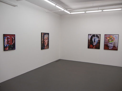
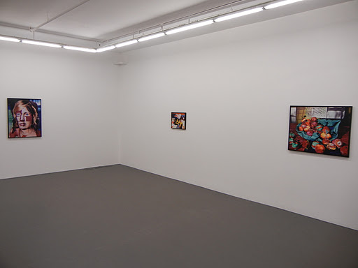
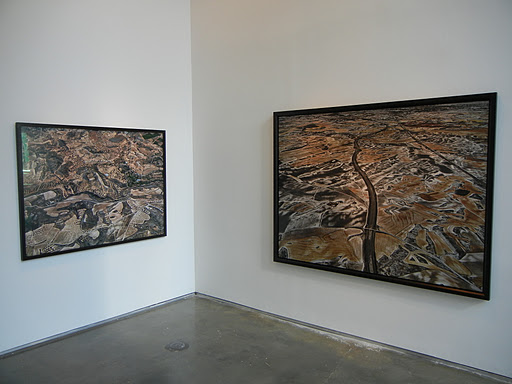
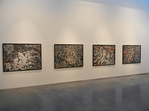
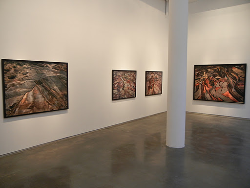
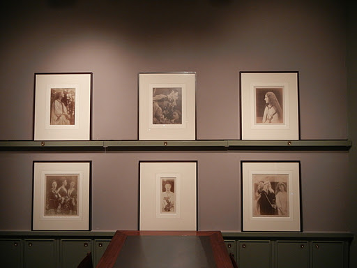
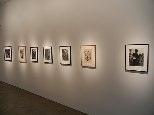
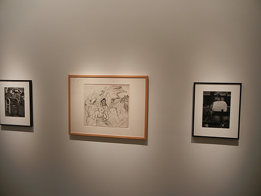
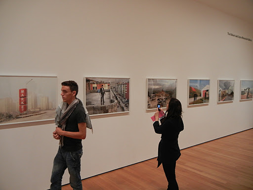
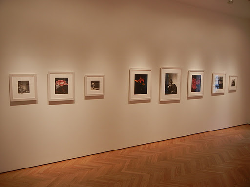
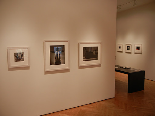
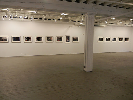
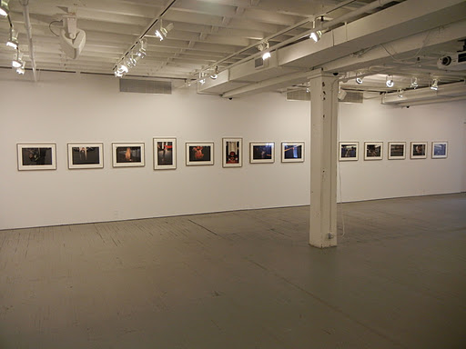
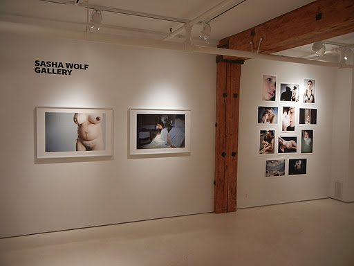
JTF (just the facts): A total of 14 color photographs, hung in the tight entry hallway and the main gallery space. 7 of the works are archival pigment ink prints, framed in black and matted, each 20×24, in editions of 7+2AP. The other 7 works are also archival pigment ink prints, but framed in black and unmatted, each 40×53, also in editions of 7+2AP. All of the images were taken in Afghanistan in 2010. A monograph of this body of work entitled Burke + Norfolk, Photographs from the War in Afghanistan by John Burke and Simon Norfolk was published by Dewi Lewis in 2011 (here); it is available from the gallery for $80. (Installation shots at right.)

Comments/Context: Simon Norfolk’s recent photographs of contemporary Afghanistan remind us that while the daily news might give us momentary examples of both apparent progress and discouraging set backs, there is a repetitive timelessness to the struggle that stretches back centuries. Using John Burke’s 19th century photographs of the Second Anglo-Afghan War (1878-1880) as a source of inspiration and dialogue, Norfolk has responded with two sets of images that document the situation on the ground in complementary ways.
.

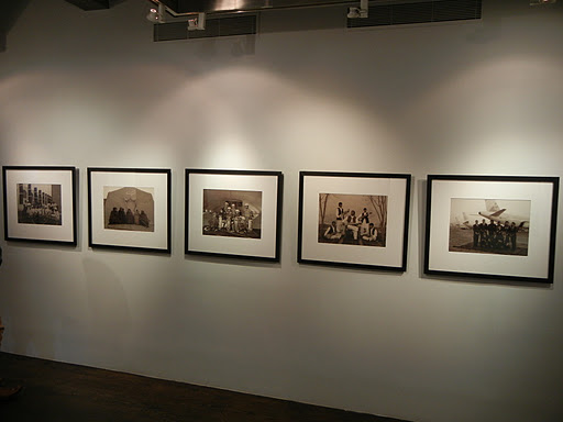
The first group of pictures reference the traditions and expectations of 19th century group portraiture, with rows of assembled peoples arranged and photographed with rigid stone-faced formality. While the subjects are locked in an ageless sepia-toned patina, there is evidence of change and modernization hiding within the dated visual vocabulary: a head-scarfed women’s basketball team, young girls at an indoor skate park, the staff from a new Afghan airline, a group of high tech mine sweepers, and American marines paired with Afghan police trainees. Mixed in with shots of traditional musicians and Taliban sympathizers in dark robes, Norfolk highlights the contrasts of new and old, grounding his observed changes in the slow evolution of the society as a whole.

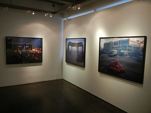
The second group of works are large scale color cityscapes, often taken in the light of the early morning or the twilit evening when the sky is misty and purple. These images explore the two sides of simultaneous modernization and war-torn destruction: a homeless family standing in the hazy, crumbled ruins of the old Presidential Palace, an optimistic pizza restaurant flanked by a massive pile of rusting bus carcasses, red bags of fresh apples piled amidst the frenetic motion of the traffic, and clumps of bamboo construction poles and ladders echoed by the surveillance towers on the dusty hills in the background. Norfolk’s photographs capture the essence of the everyday struggle of the locals, where the details of the Western occupation coexist with the remnants of the endlessly beaten down city.

While there are no actual prints by Burke in this show for handy side by side comparison, the mix of ideas between the two seems to have been an effective way for Norfolk to catalyze new visual approaches to the subject matter. Both sets of new images feel very rooted in and mindful of the past, where if we look carefully, the events of today are an updated repetition of those from long ago.
.
Collector’s POV: The prints in this show are priced as follows: the 20×24 prints are £2500 and the 40×53 prints are £6000 (note the prices are in British pounds). Norfolk’s work has begun to slowly enter the secondary markets in recent years, with prices at auction ranging between roughly $6000 and $26000.

Rating: * (one star) GOOD (rating system described here)

Transit Hub:
  • Artist page (here)
  • Reviews: New Yorker (here), LA Times (here)
  • Features: Wayne Ford (here), Guardian (here)
  • Exhibit: Tate Modern (here)

Simon Norfolk: Burke + Norfolk
Through December 3rd

Bonni Benrubi Gallery
41 East 57th Street
New York, NY 10022

Sharon Core: 1606-1907 @Yancey Richardson

JTF (just the facts): A total of 12 color photographs, framed in white and unmatted, and hung in the main gallery space. All of the prints are archival pigment prints, available in editions of 7, made in 2011. Physical dimensions range from 18×15 to 30×23 (or reverse). (Installation shots at right.)

Comments/Context: Sharon Core’s brand of image appropriation is wholly different than a commonplace cut and paste or an easy lift and recontextualize. In previous works, her meticulous process has included baking cakes and pies, growing vegetables, and scouring flea markets in search of period ceramics and tableware, all in the name of painstakingly recreating paintings via photography, with an eye for exacting detail.

In her newest works, Core has immersed herself in the genre of the floral still life, exploring the subtleties of how explosions of riotous color and delicate bouquets have been captured across three centuries of artistic activity. In each case, from an Dutch master from the early 1600s or a Modernist arrangement from the early 1900s, she has faithfully documented the conventions and idiosyncrasies of how flowers were presented, cultivating her own blossoms in her greenhouse to ensure period authenticity. Her images display a kind of technical accuracy that is thoroughly impressive, where backdrops, tabletop accessories (like shells and insects), and even the angle and strength of the light are controlled with precise perfection. Tulips, peonies, roses, and dozens of other varieties have never looked so good.

While there is a certain awe inspiring wonder that comes from standing in front of these fastidious pictures, even though we are flower collectors, I was surprisingly less than moved by the conceptual inversion being explored. I can imagine one of these pictures hanging in a collector’s home, and having that person trick visitors with the image, gleefully explaining that it’s not a painting but a photograph, and everyone nodding their heads in respectful, smiling amazement, putting their faces right up close to inspect the details. Or it seems likely that a museum might hang one directly next to a period painting to show the similarities and differences (see the link below). Either way, this of course dives directly into the idea of what truth means in photography, and into the evolution of approaches to “natural” picture making across various time periods. But somehow, while I was obviously struck by the technical mastery of these photographs, they made less of an overall impression than I was expecting. When the “gee whiz” factor wears off, we’re still looking at beautiful floral compositions we’ve seen before (albeit in a different medium); I realize that this is the point, but if I tell the truth, while these are pictures I should love, they somehow left me with a sense of being slightly underwhelmed.

Collector’s POV: The works in this show are priced between $7000 and $9500, based on size. Core’s work has slowly begun to enter the secondary markets in recent years, with prices at auction ranging between $8000 and $81000. The images from her series of Thiebaud cake recreations have been routinely at the top end of that range.

Rating: * (one star) GOOD (rating system described here)

Transit Hub:

  • Feature: Minneapolis Institute of Arts blog (here)

Sharon Core: 1606-1907
Through December 23rd

Yancey Richardson Gallery
535 West 22nd Street
New York, NY 10011

Daniel Gordon: Still Lifes, Portraits & Parts @Wallspace

JTF (just the facts): A total of 13 color photographs, framed in black and unmatted, and hung in the main gallery space, the smaller back room, and the office area. The prints are chromogenic prints, ranging in size from 16×20 to 46×36 (or reverse), available in editions of 3, from 2010/2011. (Installation shots at right.)

Comments/Context: When I was first exposed to the work of Daniel Gordon at the 2009 version of MoMA’s New Photography show (here), I remember thinking that the images were somewhat grotesque and off-putting, with a psychological roughness that made them hard to get close to. In the intervening years since that exhibit, I’m not sure whether Gordon’s work has become slightly more refined or whether my interest in photography that is challenging and unexpected has increased (or both), but I certainly found his newest batch of pictures to be rich and exciting.

As a reminder, Gordon’s process is both elaborate and resolutely physical. He starts with appropriated digital imagery (both sharp and pixelated/distorted), which is then printed out onto actual paper. These prints are then collaged together into three dimensional tabletop sculptures, with torn edges, fishing line, and dollops of glue left bare as evidence. The final constructed results are then photographed using a view camera, providing extra clarity and detail.
Gordon’s portraits reuse elements of Cubism in a modern way: his faces are made of disassembled, mismatched scraps of features, which are then reconstructed and layered in non-obvious ways, mixing male and female, hard and soft, and often employing multiple conflicting angles. His newest portraits seem tighter than the ones I saw a few years ago, less jolting for the sake of shock value and more nuanced and interconnected. His still lifes of flowers and fruit take a well-worn genre and introduce combinations of texture and color that upend expectations: a vase is simultaneously crumpled and out of focus, peaches are both pink and blue, their roundness both flat and crinkled. And a third group of pictures moves more toward crafty sculptural abstraction, with Dada-like side silhouetted faces that cast shadows across intermediate spaces.
What I like about these photographs is that there are some risks being taken. The images are proof of a constant process of reuse and reformulation, less in the hackneyed digital sense, but more in the manner of fragmentation and reassembly, of seeing photographs as open-ended, malleable raw material to be employed in more complex and original visual descriptions.
Collector’s POV: The prints in this show are priced between $3500 and $6500, based on size. Gordon’s work is not yet widely available in the secondary markets, so gallery retail is likely the only real option for interested collectors at this point.
By the way, this show was hung quite sparsely, with large expanses of empty white wall in between the prints. To my eye, the rooms could have held a few more images, which assuming they were available, would have made for a more powerful overall impression of Gordon’s recent work.
Rating: ** (two stars) VERY GOOD (rating system described here)
Transit Hub:
  • Artist site (here)

Through December 17th

Wallspace
619 West 27th Street
New York, NY 10011

Uta Barth @Bonakdar

JTF (just the facts): This show contains a pairing of recent projects, displayed in separate rooms. The main gallery contains works from the project … and to draw a bright white line with light from 2011. There are 10 works on view, each made up of one to three 38×56 panels. The prints are inkjet prints face mounted against matte acrylic, framed in white and unmatted, in editions of 6+2AP. The back gallery contains works from the project Compositions of Light on White, also from 2011. There are 8 single panel works on view, ranging in size from 24×23 to 41×48. The prints are inkjet prints in white lacquered wooden frames, in editions of 6+2AP. (Installation shots at right.)

Comments/Context: Uta Barth’s newest works explore the idea of using focused light as a drawing mechanism. Her pictures turn luminous lines and areas of white brightness into a discrete medium, like ink or paint, that can be carefully controlled by the hand of the artist, not in the sense of a photogram or a darkroom manipulation, but in the context of straight photographic image making. In two separate projects, she has used curtains and window blinds to direct the incoming light, creating ethereal shapes and forms that are projected onto different underlying surfaces.

The walls of the main gallery space are covered by works that chart the passing of time across an afternoon. A thin white line of sunlight streams in through gauzy textured curtains, creating a wiggly, heartbeat-like form projected through the undulations of the transparent fabric, reminiscent of Minor White’s Windowsill Daydreaming (here). This white line slowly expands into a wide ribbon as the time passes, in the end becoming a thick stripe of sinuous diffusing light, almost like waves on a seashore or Morris Louis’ washes of watery paint. It’s an extremely simple construct that provides a graceful and meditative view of the abstract movement of time.

I found the images in the back room to have more complexity and visual punch. In these works, Barth uses the blinds to generate squares and rectangles of radiant projected sunlight, which are then directed onto flat white closet doors and arrays of drawers. The black cracks along the edges of the storage areas create linear geometries, which are then covered in additional layers of brilliant white shapes, creating flattened planes of Mondrian-like abstraction. Barth subtly changes the camera angle from image to image, bringing in more or less of the perspective of the drawers, in a few allowing the view down the hallway to become a dark stripe along the edge of the frame. These are quiet, intellectual pictures, playing with reference points and internal geometries, examining shimmering light as a defining overlayer.

As always, there is a calmness to Barth’s heady explorations. She continues to probe the edges of perception and visual recognition with a meticulous sense of restraint, in this case, proving that elemental light can be an inventive medium in and of itself.

Collector’s POV: The prices of the prints from … and to draw a bright white line with light are dependent on the number of panels in the work: 1 panel at $26000, 2 panels at $36000, or 3 panels at $46000. The prices of the prints from Compositions of Light on White are based on size, ranging from $18000 to $26000. Barth’s photographs have become more available in the secondary markets in recent years, with auction prices ranging between $3000 and $38000.

Rating: * (one star) GOOD (rating system described here)

Transit Hub:
  • Prior Exhibit: Art Institute of Chicago, 2011 (here)
  • Feature: Daily Beast (here)

Uta Barth
Through December 22nd

521 West 21st Street
New York, NY 10011

Edward Burtynsky: Dryland Farming @Bryce Wolkowitz

JTF (just the facts): A total of 12 large scale color photographs, framed in black and not matted, and hung in the entry area and the main gallery space in the back. All of the works are chromogenic color prints, taken in 2010. The images are shown in three different sizes (with a fourth smaller size not on display): 39×52 (in editions of 9), 48×64 (in editions of 6), and 60×80 (in editions of 3). There are 2 images in the 39×52 size, 6 images in the 48×64 size, and 4 images in the 60×80 size on view. A concurrent show of Burtynsky’s earlier work is on view at Howard Greenberg Gallery (here). (Installation shots at right.)

Comments/Context: Edward Burtynsky’s photographs have routinely posed nuanced questions about how certain human actions have potentially far reaching and often unseen implications for the planet. At massive industrial sites criss-crossing the globe, he has documented both the rigid order and the decaying chaos of open pit mines, Chinese factories, ship salvage yards, and stone quarries, finding abstract beauty amid the expansive work environments. In his previous project on the end-to-end influence of oil, he took a broader look at the upstream causes and downstream effects of the entire industry, connecting the dots to consequences that weren’t immediately obvious. His most recent pictures are part of a new project on water, presumably investigating how the increasing scarcity of yet another vital resource is changing the way we live.

All of the photographs in this show were taken in the dusty hills of northern Spain, where water has been in short supply for generations. Looking down from a helicopter, Burtynsky has captured the endless stripes and striations carved into the dirty foothills, flattening out the landscape into an abstract puzzle of fingered, terraced fields. The visual patterns are a shocking echo of the dense paintings of Jean Dubuffet (an example, here), where the land has become a patchwork of squiggly quilted parcels, cross hatched by irrigation, mowing and thin, intervening roads. The undulating topography has been condensed into subtle geometries and graphic forms, the hand of man writ large on the rocky terrain.

There is virtually no green in the palette of these images (save a few olive trees as dots); instead, the land is painted in beige and rust, grey and black, with a dusting of drifted white snow. These subdued colors highlight the desolation and desperation in farming this country, accenting the sense of scratching an existence out of land that is indifferent and uncooperative. The pictures ask tough questions about how our agricultural needs will evolve as water sources become more and more depleted, and to what lengths we will be required to remake the land to adapt to this new reality. While there is an uncanny, frenetic elegance to these muted landscapes, their message is surprisingly dark and ominous.

In general, I think these images have moved Burtynsky back towards a more painterly kind of photography, where landscapes are transformed into expressive gestures. At the same time, I think his vision of how photography can influence the direction of the collective conversation is getting broader; with each successive project, he is taking on larger and more complicated issues. The worldwide water situation will only become more tense and strategic in the coming years, so Burtynsky’s artistic exploration of this subject may well be an important starting point for raising the awareness of what we’re up against.
 
Collector’s POV: The prices for the works in this show are as follows: the 39×52 prints are $16500, the 48×64 prints are $24000, and the 60×80 prints are $42000 (I didn’t get the price for the smallest size not on view). Burtynsky’s photographs have slowly become more available in the secondary markets over the past few years, with prices at auction ranging between roughly $5000 and $48000.

Rating: ** (two stars) VERY GOOD (rating system described here)

Transit Hub:

  • Artist site (here)
  • Article: NY Times (here)
  • Reviews: Time LightBox (here)

Edward Burtynsky: Dryland Farming

Through December 10th

Bryce Wolkowitz Gallery
505 West 24th Street

New York, NY 10011

Julia Margaret Cameron @Hans Kraus

JTF (just the facts): A total of 24 photographs, framed in brown wood and matted, and hung against grey walls in the entry, main gallery space and back viewing alcove. The prints are a mix of albumen prints from wet collodion negatives and carbon prints (with one photogram on a side wall), all made between 1858 and 1873. An in-depth scholarly catalogue of the show (Sun Pictures 20) is available from the gallery for $40. (Installation shots at right.)

Comments/Context: This ample show of Julia Margaret Cameron’s 19th century portraiture is almost certainly the best near term opportunity to see a large group of her photographs outside a major museum. Like a mini-retrospective, it covers her more standard portraits of sitters both known and unknown, as well as her more romanticized staged scenes, along with a couple of portraits of the artist herself and a surprising photogram of ferns. It’s a well-edited sampler, providing a comprehensive picture of what made her such a standout in 19th century photography.

While Cameron’s ethereal images of Shakespearean stories, Arthurian legends, and allegorical religious scenes are certainly representative of a particular kind of Victorian mind set, with surprising regularity, she was also able to make straight portraits that are jaw-droppingly, shockingly modern, even today some 150 years later. These are the kind of portraits that stare out from the walls with penetrating strength or shimmering grace, that jump out at you and grab your attention with a level of confrontation and confidence unusual for their times. They are tactile pictures to get lost in, where you stand astonished, making an eye to eye connection across time and space, life and death. Both Stella and A Beautiful Vision have this uncanny ability to throttle you from afar, to stop you in your tracks and emphatically require a deeper engagement.

So while there are plenty of bushy beards, formal suits, flowing hairstyles and lilting gauzy frocks on view here, watch out for the few portraits that go beyond the simply elegant, the soberly rich or the mythically uplifting to make a time warp jump to boldly look you in the eye and choke off your air supply.

Collector’s POV: The prints in the show range in price from $8000 to $90000, with most above $20000. Cameron’s work is often available in the secondary markets, with recent prices ranging between $1000 and $108000.
.
Rating: ** (two stars) VERY GOOD (rating system described here)
.
Transit Hub:
  • Reviews: iPhotoCentral (here), WSJ (here), Bullett Media (here)

Julia Margaret Cameron
Through November 18th

Hans P. Kraus, Jr. Fine Photographs
962 Park Avenue
New York, NY 10028

Self Reflections: The Expressionist Origins of Lisette Model @Silverstein

JTF (just the facts): A total of 36 black and white photographs, framed in black and matted, and hung together with 10 works in other media, framed in blond wood and matted, together displayed in the entry area, front room, main gallery space and back room. All of the photographs are vintage or early gelatin silver prints, taken between 1933 and 1961. Physical dimensions range from roughly 13×10 to 34×27 or reverse, with most roughly 14×11 or reverse. (Installation shots at right.)

The following other artists have been included in the show, with number of works on view and image details in parentheses:

  • Max Beckmann (1 drypoint, 1918)
  • Otto Dix (2 lithographs, both 1923)
  • Lyonel Feininger (1 woodcut, 1920)
  • George Grosz (2 color offset prints on cream Velin paper, 1919 and 1921)
  • Karl Hubbuch (1 brush and lithograph chalk on wove paper, 1930-1931)
  • Ernst Kirchner (1 lithograph, 1912)
  • Jeanne Mammen (1 pen and ink on paper, 1933)
  • Bruno Voigt (1 watercolor, pencil and ink on paper, 1933)

Comments/Context: Bruce Silverstein is quietly making a name for himself as the go-to advocate for the estates of master photographers. After countless others have pawed through the storage boxes and picked out the saleable gems, he has repeatedly come in, brought fresh eyes to the remnants, and made compelling arguments for the importance of what was left behind, in the process doing a respectable job of buffing up the reputations of many who were arguably in danger of being forgotten amidst the ever more frantic search for the new.

Silverstein has recently taken on the estate of Lisette Model, and this show is nothing short of a complete reinterpretation of her place in art history. Many might characterize Model as a classic New York photographer, a friend and contemporary of Abbott, and the respected teacher of Arbus, Hujar, Solomon and others, all of which she certainly was. But this exhibit takes us back to her roots in Vienna, and makes a strong argument for placing her photography in the context of German and Austrian Expressionism. Through a series of side-by-side juxtapositions, the influences of the Expressionist style and mindset on Model’s artistic approach come through as real and meaningful.

The images in the front rooms gather Model’s layered shop window reflections, her shadow silhouettes, and her telescoping pictures of legs at sidewalk-level, which are then smartly paired with Feininger’s chaotic black and white buildings, Grosz’ mix of street caricatures, and Kirchner’s leggy dancers. The main room contains mostly portraits by Model, some verging on the grotesque and the ugly, often with a knack for biting social critique.The visual echoes between these photographs and the works by Dix, Hubbuch, Voight, and Grosz are startling: bulging faces are twisted in similar ways, bodies are distorted and framed with matching poses, and bald heads take on a sinister quality. The back room contains Model’s images of cafe life, punctuated by Arnold Schoenberg’s Pierrot Lunaire playing in the background. The high pitched squeaks and throaty yells in the music are shrill and dissonant, matching Model’s severe camera angles. The pairing of Model’s famous Cafe Metropole with Mammen’s The Fat Singer is an inspired one, making Model’s exuberantly odd image seem not like an outlier in photographic history but more like a direct descendant from the artistic movements of her past.

Given this new context, Model’s relationship to Expressionism seems so obvious that it is a wonder that this story hasn’t been told more fully before. This is a well researched, carefully sequenced, and thoughtful show, brimming with new ideas and unexpected connections (i.e. should we now link Arbus to German Expressionism more explicitly?) Model’s photography seems so much fresher and more innovative when seen through this lens, so don’t miss this chance to reconsider your preconceived notions of what her art might mean.

Collector’s POV: The prices for the Model prints in this show range from $9500 to $45000, with many intermediate prices. Model’s work is generally available in the secondary markets, with roughly a dozen or so lots up for sale in any given year. Recent prices at auction have ranged between $2000 and $62000.

The other artworks in the show are priced as follows:

  • Max Beckmann: $35000
  • Otto Dix: $100000 and $25000
  • Lyonel Feininger: $24000
  • George Grosz: $3000 each
  • Karl Hubbuch: NFS
  • Ernst Kirchner: $50000
  • Jeanne Mammen: $20000
  • Bruno Voigt: $8000

Rating: *** (three stars) EXCELLENT (rating system described here)
.
Transit Hub:

  • Reviews: NY Times (here), New Yorker (here), La Lettre de la Photographie (here), Speaking in Tongues (here)
Through November 12th

Bruce Silverstein Gallery
535 West 24th Street
New York, NY 10011

New Photography 2011 @MoMA

JTF (just the facts): A group show of the work of six contemporary photographers, variously framed and matted, and hung in a two room divided gallery on the 3rd floor. The exhibit was curated by Dan Leers. (Installation shots at right.)

The following photographers have been included in the show, with the number of works on view and image details in parentheses:

  • Moyra Davey (2 works, consisting of grids of 25 and 16 c-prints respectively, unframed and pinned directly to the wall, from 2010-2011)
  • George Georgiou (8 pigmented inkjet prints, framed in white and unmatted, from 2006-2007)
  • Deana Lawson (7 pigmented inkjet prints, framed in white and unmatted, from 2007-2010)
  • Doug Rickard (8 pigmented inkjet prints, framed in white and unmatted, from 2009-2011)
  • Viviane Sassen (8 pigmented inkjet prints, variously framed and unmatted, various sizes, from 2006-2010)
  • Zhang Dali (20 gelatin silver prints, with photomechanical reproductions and type written text, framed in white and matted, from 2003-2011)

Comments/Context: There’s a little bit of everything in this year’s New Photography exhibit at the MoMA, making it much broader and more inclusive than other recent incarnations of this annual survey. Rather than highlighting a particular theme or grouping similar/contrasting approaches, this show runs the gamut from documentary to digital appropriation, with relatively equal measures of conceptual and straight photography, offering us diversity and divergence as opposed to a particular institutional point of view. The implication is that the medium is expanding and extending in so many directions that it’s impossible to use any one narrow definition anymore, and there’s quality and innovation to be found in a plethora of styles and working methods.

In terms of sheer visual elegance, Viviane Sassen’s photographs are far and away the most successful. Her pictures have a perplexing, mesmerizing magic, where simple forms and odd compositional angles create an atmosphere of the unexpected. Orange soda is poured into a hole in the sidewalk, a boy lies tipped over in a blue plastic chair, a paper bursts into flames in front of a subject’s face, and a woman’s body lies draped in a light blue sheet. Seemingly normal subjects take on an air of confusing mystery, and decoding some kind of plausible narrative becomes tricky, pushing the viewer back into an exploration of the lines, color, and space of the formal elements of the pictures. The enigmatic, unknowable secrets of the images give them a power that goes far beyond their straightforward appearance.

I think the opposite wall pairing of Doug Rickard and Zhang Dali was an inspired connection of related ideas, where elusive photographic truth and power-driven propaganda mix with surveillance, privacy, and the omniscience of the digital Internet. Rickard’s photographs are full of thorny conceptual questions, from how they were made (appropriated from Google Street View and then selected/cropped/reframed) to what they might represent (the digital embodiment of “everything”, the intrusion on the edges of personal freedoms, and the details of suburban decline which they so clearly document). All of the works look downward from the all-seeing robot cameras, finding a depressing array of rusting cars, muddy lots, wayward youths, and poverty stricken streets, unvarnished and exposed to the eyes of the Internet. Zhang’s pictures are proof positive of deliberate photographic censorship and alteration in a more political sense, where history and collective memory get changed by airbrushing out undesirables. Photo ops of Chairman Mao are retouched and enhanced, simplifying the visual story, collaging together separate parts, or cropping out distractions to get to a new kind of truth. Both sets of work consider the nature of documentatio, manipulation and archival memory, and standing between them, the resonance of interchangeable ideas is very strong.
.

The remaining works by Moyra Davey, Deana Lawson, and George Georgiou are all accomplished in their own ways (although slightly less exciting to my eye/brain), ranging from voyeuristic portraiture to documentary photography capturing the dichotomies of old/new, returning all the way back to a pleasingly retro, analog dip into the tangible. Davey’s intellectual taxonomies of bare bulb light fixtures and book bindings/empty coffee cups are much better in grid form than in the long around-the-room hang of her last gallery show; the visual echoes and repeated patterns of tape are much more apparent.

All in, this show has a something-for-everyone safety that makes it approachable, while still educating viewers about the complex heterogeneity of the contemporary photographic world. In the future, I think this incarnation of the New Photography series will be remembered as a coming out party for Viviane Sassen, and as a further validation of the artistic white space created by Internet driven digital imagery, as embodied by the work of Doug Rickard.

Collector’s POV: Given this is a museum show, there are of course no prices. The photographers in the show are represented by the following galleries:

  • Moyra Davey: Murray Guy (here)
  • George Georgiou: unknown
  • Deana Lawson: unknown
  • Doug Rickard: Yossi Milo (here)
  • Viviane Sassen: Motive (here), Stevenson (here)
  • Zhang Dali: Eli Klein (here)

None of these artists has any significant secondary market track record, so gallery retail will likely be the only option for acquiring their work in the short term.

Rating: * (one star) GOOD (rating system described here)

Transit Hub:

  • Exhibition site (here)
  • Reviews: NY Times (here), New Yorker (here), Time LightBox (here), PhotoBooth (here)
  • George Georgiou artist site (here)
  • Deana Lawson artist site (here)
  • Doug Rickard artist site (here)
  • Viviane Sassen artist site (here)

New Photography 2011
Through January 16th

Museum of Modern Art
11 West 53rd Street
New York, NY 10019

Horst P. Horst, Works from the Estate @Stellan Holm

JTF (just the facts): A total of 20 black and white and 5 color photographs, framed in white and matted, and hung in the single room space. There are 17 gelatin silver prints, 3 platinum palladium prints, and 5 c-prints in the show. Physical dimensions range from 10×8 to 20×16 or reverse, with no edition information available. The images were made between 1933 and 1990. (Installation shots at right.)

Comments/Context: This selection of Horst’s work passes over his best known photographs and dives deeper into the storage boxes, unearthing more secondary and lesser known images, both in black and white and in color. The show gathers together a few early portraits and fashion shots from the 1930s and 1940s, and pairs them with male nudes from the 1950s and florals from later in his life. The result is a broader view of his artistic approach and his influences on contemporary photographers.

The connection between Horst and Robert Mapplethorpe is particularly obvious in this group of pictures. Horst’s male nudes are classically staged, seated sculpturally on pedestals or lying on flat tables, spotlit to accent the lines of symmetrical musculature. The nudes are pared down and formal, but alive with power and grace. Horst’s flowers are often placed together with classical busts, or arranged in vases to highlight their sculptural forms and saturated extravagant colors. There is a sense of elegant, meticulous control in both subjects that is unmistakably echoed by Mapplethorpe, a commonality of vision and aesthetic between the two artists that is made clear by these more obscure works from the archives.

Perhaps it has already been done, but this exhibit made me think there is an amazing show to be organzied which would authoritatively match stylistically similar pairs of images by Horst and Mapplethorpe. I’m guessing that the parallels would be fascinating, and the side-by-side comparison would crispen our understanding of their subtle differences.

Collector’s POV: The prints in this show range in price from $8000 to $30500. Horst’s work is widely available in the secondary markets, with dozens of prints available at auction each year. Recent prices have ranged between $2000 and nearly $300000 (for a vintage Mainbocher Corset).

Rating: * (one star) GOOD (rating system described here)
.
Transit Hub:

  • Estate site (here)

Horst P. Horst, Works from the Estate
Through November 12th

Stellan Holm Gallery
1018 Madison Avenue
New York, NY 10075

Lars Tunbjörk @Amador

JTF (just the facts): A total of 23 color photographs, variously framed and matted, and hung in the main gallery space. The works come from three distinct projects: Landet Utom Sig (1988-1991), Home (1991-2001), and Office (1996-1999), each of which resulted in a monograph. There are 8 images on display from Landet Utom Sig, all vintage c-prints, framed in white and matted, each 20×24, uneditioned. There are 6 images from Home, all c-prints, framed in blond wood and unmatted, each 21×25, in editions of 20. And there are 9 images from Office, framed in white and unmatted, each 23×27, in editions of 12. (Installation shots at right.)

Comments/Context: Swedish photographer Lars Tunbjörk’s pictures have a sharp eye for the quietly absurd, his visual moods ranging from dry and witty to a slightly darker brand of caustic skepticism. This show provides a neat sampler of three of Tunbjörk’s recent projects, capturing the idiosyncrasies of suburban Sweden and anonymous office work with a flair for overlooked human oddity.

Splashes of bright color punctuate Tunbjörk’s Landet Utom Sig series, where something slightly strange is often taking place: a man plays an accordion outside a red van, a pair of people sit under matching yellow umbrellas on a grassy expanse, a father drives a tiny children’s car while being watched ominously by Santa Claus, and a man tips over while sitting at a table submerged in the warm Midsummer water. The Home series has the same sense of the surreal, but without the human presence; striped awnings, white fences, flashy red tulips, and lots of white siding find the earnest ridiculousness hiding in the suburban experience.

Moving farther afield, Tunbjörk’s Office project takes us into the international world of cloth covered cubicles and fluorescent lighting, where adventurous leggy plants strain toward the light and elevators get caught between floors. In these pictures, the everyday of the business world is seen through the eyes of an outsider: why on earth would a man get his shoes shined in his office or would a lawyer sit under a conference room table drowning in a sea of papers? The ordinary office environment is somehow exposed for its weirdness in these pictures, the unusual behaviors captured in an understated anthropological deadpan.

All in, this is a show that proves that there is comedy to be found in the mundane, where a subtle turn of perspective turns the commonplace into the peculiar
.

Collector’s POV: All of the prints in this show are priced at $4000 each, regardless of project or date. Tunbjörk’s work has not been widely available in the secondary markets, so gallery retail is likely the only option for interested collectors at this point.

Rating: * (one star) GOOD (rating system described here)

Transit Hub:
  • Review: Photo Booth (here)
  • Agence Vu page (here)
Through November 19th

41 East 57th Street
New York, NY 10022

Bruce Davidson: Subway @Aperture

JTF (just the facts): A total of 47 color photographs, framed in brown wood and matted, and hung in a single line around the large gallery space. The show is extremely light on detailed information, with no wall labels or other identifiers apart from a mention that the prints came from the collection of Susan Steinhauser and David Greenberg. A bit of detective work upon coming back from the gallery led me to the conclusion that these prints are not vintage, but from a portfolio published in 2006 by Howard Greenberg Gallery (here) and Rose Gallery (here). This portfolio contains 47 dye transfer prints, each 15×23 or reverse, in an edition of 6. The exhibit also includes a single glass case, with copies of Subway from 1986, 2003 and 2011; the show coincides with the reissue of the monograph from Aperture (here). (Installation shots at right.)

Comments/Context: Even though Bruce Davidson’s Subway has already cemented its revered place in the march of photographic history, I tried to force myself to see this “victory lap” show with fresh eyes, and to consider carefully how this body of work has aged over the thirty years since its making. Is it merely a masterful visual document of a certain place and time, namely New York City in the more violent and dodgy early 1980s? Or does it transcend its period and continue to deliver messages that are more broad and universal?

Circling the gallery, I saw these photographs in a much more technical light than I ever had before, particularly in Davidson’s observation of color and in his framing and composition. While the overall palette is often dark and shadowy (with moments of intense flash-lit brightness), bold, saturated color jumps out from these pictures: an orange door echoed by orange pants, the red outfit of a gun-to-the-head robber, a stripe of yellow light across a platform, drips of black graffiti near a red hat, a pink headscarf. Davidson then pairs these interior blocks of color and texture with a spectrum of light (and season) coming through the subway car windows: soft snowy whiteness, springtime flowers, crackled broken glass, honeyed evening light on a platform, the Twin Towers at sunset, the Wonder Wheel lit up in blue twilight. While there are of course plenty of personal stories here, I was most struck by the juxtapositions and angles that Davidson used to create the compositional interactions between the passengers, the subway car, and their larger surroundings: some make an up-close declaration, while others play layers of space against each other, creating unexpected combinations and ironies.

While it is impossible to avoid a sense of datedness in pictures from so many years ago, this doesn’t come across as a nostalgic patina; in fact, the images remain brilliantly vibrant and energetic, colors bursting from the darkness. I certainly came away from this show with a better sense of how this work fits into the narrative of late 1970s color photography, in addition to its well deserved place in the history of New York photography. So while we have all seen this work before, it was surprisingly refreshing and thought provoking to see it unearthed once again.

Collector’s POV: Since this is a not-for-sale show, there are, of course, no prices. As a proxy for the secondary market for these images, a complete copy of this Subway portfolio sold at the Berman sale at Christie’s a year or two ago, fetching $146500.

Rating: ** (two stars) VERY GOOD (rating system described here)

Transit Hub:

  • Magnum Photos page (here)
  • Reviews: New Yorker (here), Art in America (here)

Bruce Davidson: Subway
Through October 29th

Aperture Gallery
547 West 27th Street
New York, NY 10001

Elinor Carucci: Born @Sasha Wolf

JTF (just the facts): A total of 21 color photographs, framed in white and unmatted or unframed and pinned directly to the wall, and hung in the single room gallery space. All of the prints are archival pigment prints, made between 2004 and 2008. The prints are either 17×22 or 30×44/36×44 (or reverse), both in editions of 8. There are 14 prints in the small size and 7 prints in the large size on display. (Installation shots at right.)

Comments/Context: Elinor Carucci’s images of her life as a young mother have an unadorned bluntness that is alternately tender and disconcerting. The harsh realities of her pregnancy, birth, breast feeding, and early motherhood have an honest intensity that is often uncomfortable to watch, her private struggles splashed across the gallery with startling vulnerability. The pictures often center on physical skin to skin touches between herself and her children, getting up close and personal in capturing small moments of intimacy.Given a few emotion-heavy pictures of her twins with runny noses, bruised lips and crying eyes, I can see how some have drawn a superficial parallel between this work and that of Sally Mann. But I think that’s a significant misreading of what’s going on. These pictures are almost entirely about the mother; even the images which only show the kids are really indirect portraits of Carucci and how she is feeling and reacting, examining her perspective of being stretched to the breaking point. We travel the entire road from her bulging belly and hospital gown to the c-section scars and the breast feeding harness, and her acute closeness and protectiveness as a mother is reflected in every gesture and touch, even when the sense of being exhausted and overwhelmed takes over.These photographs have a potency and extremity that will be too much for some; Carucci’s directness certainly has the ability to stun and agitate. But this high-strung reality is what makes the pictures so successful; she’s crossed into territory where the truth is laid bare, where its tough combination of boundless love and draining weariness is exposed. You may decide that an image of her belly after giving birth isn’t something you want to hang on your wall, but the authenticity of her experience is joltingly memorable.
.

Collector’s POV: The prints on view are priced based on size, with the smaller 17×22 prints at $3000 each and the larger 30×44/36×44 prints at $5500 each. Carucci’s work has very little secondary market history, so gallery retail is likely the only option for interested collectors at this point.

Rating: ** (two stars) VERY GOOD (rating system described here)
.
Transit Hub:
Through November 5th
.
528 West 28th Street
New York, NY 10001

Sign up for our weekly email newsletter

This field is required.