Henri Cartier-Bresson and the Art and Photography of Paris @Art Institute of Chicago

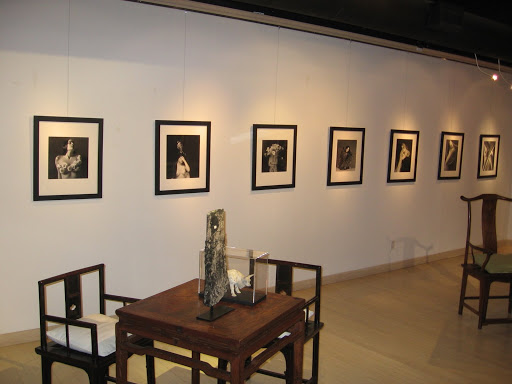
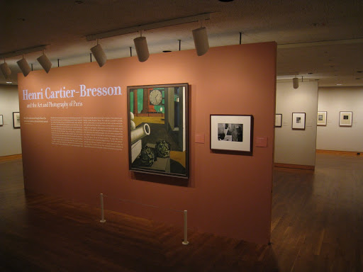
JTF (just the facts): A total of 42 photographs, 5 paintings, and 9 etchings/drawings, displayed in a single gallery on the lower level of the museum. In addition to the 14 images by Cartier-Bresson, photographs by Atget (1 image), Brassai (7 images), Kertesz (16 images), Bing (3 images), and Seuphor (1 image) are shown. The other artworks in the exhibit are by Lhote (Cartier-Bresson’s painting teacher), de Chirico, Mondrian, Dali, Picasso, and Matisse. All of the pieces in the exhibit are from the late 1920s and 1930s. (Installation shot at right.)

Comments/Context: During the holidays, we visited family in Chicago and were able to sneak off one morning for a quick visit to the Art Institute to see the two photo shows on view. So while Chicago is not our usual territory, we’ll cover both exhibits in today’s posts.

We’re all familiar with Cartier-Bresson’s “decisive moment”, where the contents in his frame would resolve themselves into an amazing composition for only a fleeting instant, which he would capture with his camera. Many people have commented that Cartier-Bresson’s genius was not so much capturing this decisive moment, but in fact being ready, with his camera pointed in the right direction and pre-focused, before the decisive moment happened. This exhibition (in honor of the centennial of his birth) takes that concept a step further, where we see a complex mix of artistic and cultural influences that were boiling around in Cartier-Bresson’s mind and that helped to shape his photographic vision.

The exhibit is organized thematically by subject matter, where carefully selected groups of related images are juxtaposed. On one wall, Kertesz nude distortions and Brassai etched nudes are paired with Picasso and Matisse nude etchings. On another, a classic Mondrian painting is flanked by two Bing geometric Eiffel Tower images and a handful of more abstract Kertesz images. There is a trio of sea scenes (Bing, Cartier-Bresson, and Lhote), as well as groups of bicycles, faces, portraits, and intertwined bodies. All are meticulously selected and hung to show their similarities.

The major takeaway for us was the idea that Cartier-Bresson, indeed all the artists of that place and time, seemed to be liberally exchanging compositional ideas. The echoes and parallels that are seen in these pairings are too exact to be random; they had to be seeing each other’s work, thinking and talking about it, and internalizing it to such a point that the ideas were then reformed and reused. It says that the worlds of painting and photography in Paris were intertwined communities, learning from and referencing each other. Disparate ideas from surrealism, abstraction, modernism, and humanism were all borrowed and merged into Cartier-Bresson’s approach. In many ways, this exhibit seems less about CarteirBresson in specific (there are actually more Kertesz images in this show than Cartier-Bressons), but more about the overall artistic melting pot of the period.

As an aside, since Cartier-Bresson gave up photography in his later life and returned to drawing and painting, it would be interesting in a future exhibit to see a few of these later works juxtaposed with the images from this period to see how his vision continued to evolve.

Collector’s POV: Cartier-Bresson’s work is ubiquitous at auction, with later prints available in nearly every sale. Vintage prints from 1920s and 1930s Paris (like those in this exhibit) are much harder to come by and range from perhaps $50000 to well into six figures for more iconic pictures, assuming you could find them. Ironically, the prints from this exhibit (and this period in general one might suppose) aren’t particularly strong in terms of craftsmanship. Overall, while we don’t have any Cartier-Bresson images in our collection at the moment, we certainly came away from this show with an increased appreciation for his early work.

There were also several splendid early Kertesz images of Paris in this exhibit that we had not seen before; additionally, there was a Bing image that we have in our collection up on the wall (here). In general, this Paris period is full of tremendous photography by a variety of artists.

As background, the Cartier-Bresson Foundation site can be found here.

Rating: * (one star) GOOD (rating system described here)

Henri Cartier-Bresson and the Art and Photography of Paris
Through January 4th (unfortunately closed yesterday we realise)

Art Institute of Chicago
111 South Michigan Avenue
Chicago, IL 60603

Happy Holidays!

In our image saturated world, the photographic holiday card is yet another ritualistic way that people exchange pictures. What’s interesting about these cards is that they often come from people that we don’t see at all during the regular year, and so this is their one chance to give us a glimpse of their lives from afar.

As we have somewhat young children in our house, our card bowl is overflowing with shots of other people’s kids: in perfectly posed and matching outfits, in costumes, in exotic locales, and in one particularly odd example this year, underwater. Adults are never seen in these images, unless it is a “family photo” (i.e. the one staged shot taken during the entire year when all of the family got into the frame, likely at some family gathering/reunion or taken by some random stranger passing by at just the right moment).

A decade ago, these pictures would have been actual film pictures, stuck onto the outside or tucked into the fold of the card. With the advent of digital technology, only the Luddites are still doing this. (I say this knowing that we did indeed send out actual printed pictures this year, as we went with a snappy letter press card.) Most folks have migrated to an online source (Shutterfly or the like), where their digital picture is merged into a template and printed together as one piece on card stock. To our eyes, while these cards might be “produced” better, they seem to have lost some of the craftiness and personality of the old kind. They all look the same, even when the photos are of people we know.

Artists and photographers have long sent holiday cards as well, usually not of their kids, but actual mini art objects. Our favorite is the one below:

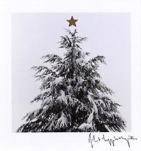
Mapplethorpe got it just right. (Christmas Tree, 1987, above.) Simple, elegant, and somehow entirely festive at the same time.

This post will be our last of 2008, so there is no need to come back and check for something new in the remaining days of this year – there won’t be anything, we promise. We will back with passionate, daily posting on January 5th.

We have thoroughly enjoyed the process of writing this blog in the past months and thank you wholeheartedly for taking the time to listen. If you are feeling particularly generous this year, introduce our blog to a handful of other collectors or photo enthusiasts that you know. There’s nothing like a personal referral from a taste maker to get people interested in something new, and we will do our best to live up to your recommendation.

Overall, we look forward with great optimism and anticipation to new shows, new auctions, new books, and stunning photography of all kinds in 2009. Best wishes.

Top Photography Shows of 2008 (Abbreviated)

Since just about every other news source and art critic on the planet has already weighed in with his/her “Top 10” list, it seems only fitting that we should offer our own view of what was noteworthy in the world of photography in 2008. While there was of course a major rebalancing of prices in the photography market in line with the larger economy (and this is of meaningful interest to collectors), in the end, it’s the art itself that matters most, so that’s where we’ll focus our remarks.

Since we have only been writing this blog since mid-August of this year, our commentary is limited to the time period since then (thus “abbreviated” in the title). Our general pace would have us visiting approximately 100 photography shows in galleries and museums in any given year; the blog has a total of 43 reviews for the past four and a half months. Next year, assuming we keep the same pace up, we’ll be even more comprehensive.

There were a grand total of six shows that received our top rating of three stars during this year. They were, in alphabetical order by artist’s name:

William Eggleston @Whitney Museum
(original review here)

Susan Meiselas @ICP
(original review here)

Catherine Opie @Guggenheim Museum
(original review here)

Cindy Sherman @Metro Pictures
(original review here)

Hiroshi Sugimoto @Gagosian Gallery
(original review here)

Minor White @Howard Greenberg Gallery
(original review here)

In our minds, great shows inspire us, move us, force us to think in new ways, and most of all educate us, about the artists and their work, and hopefully about ourselves in some degree as a byproduct. Every single one of the listed shows significantly increased our understanding of these photographers, convinced us of their importance in the overall history of the medium, and produced staggering moments when we were struck dumb by the sheer grandeur of the art on view.

In a world where we are constantly bombarded by images and “stuff”, we are constantly on the lookout for the memorable, for the event or outing that will rise above the noise and somehow make a more lasting and meaningful impression. These shows meet that standard. I can in my mind’s eye easily recreate each and every one of them: the sublime Sugimoto black room, the brooding and empty Meiselas images of Kurdistan, the pitch perfect satire of Cindy Sherman, Opie’s intense and beautiful self portraits, the unexpected compositions and color of William Eggleston, and the quiet meditations of Minor White. Perhaps the common thread among these shows (and the key to their ultimate success and longevity) is that they were each overflowing not just with compelling pictures, but with compelling ideas.

Flor Garduño, Mujeres Fantasticas @Throckmorton

JTF (just the facts): A total of 26 black and white images, displayed in wide black frames, throughout the gallery. Most of the works are 20×16 inches, although there are a handful in a larger size (approximately 40×30 inches). Negatives range from the late 1980s to the present. (Installation shot at right.)

Comments/Context: Looking at the work of Mexican photographer Flor Garduño, you would never, ever, mistake her work for that made by a man. Indeed, Garduño’s images are among the most overtly “female” pictures we have seen.
Nearly all of Garduño’s pictures have a sensual female form/nude staged together with symbols from the natural world (fruit, leaves, flowers, feathers etc.). Her compositions have an earthy mythology to them, an almost dream-like or magical quality that seems drawn from the long history of Latin America. In her early days, Garduño was an assistant to Manuel Alvarez Bravo, and she seems to have absorbed the same love of the uniquely Mexican culture, as well as the ability to structure images with poetic simplicity. She is also a master printer; all of her works are printed with an astounding and meticulous attention to dark and light. This show mixes a few new pieces with a variety of other works from the past decade or two, so there is some ability to see how her approach and aesthetic has been refined over time.
Collector’s POV: For us, while Garduño’s work is always made with an original point of view and with thoughtful care, the results are often hit or miss. When it works, the images are stunning; when it doesn’t, the works feel a bit contrived and odd. The works in this show are priced between $2500 and $9000, dependent mostly on size it seems. We actually already own an excellent nude by Garduño (Los Limones, 1998, found here and also on display in this exhibit), which we bought a few years ago from Andrew Smith (gallery site here) when we were living on the West coast. In addition to prints found in the retail market, Garduño’s work has become more available at reasonable prices in the secondary market in the past few years.

Rating: * (one star) GOOD (rating system described here)

Flor Garduño, Mujeres Fantasticas
Through January 9th

145 East 57th Street
New York, NY 10022

Auction Results: Swann (December) and Christie’s (Constantiner)

The final two photography sales of the year were at Swann, with its combo book and photo sale, and at Christie’s, with the fashion and glamour images of the Constantiner collection. The results are below (all results include the buyer’s premium):

Swann Galleries

Total Lots: 401
Pre Sale Low Total Estimate: $854000
Pre Sale High Total Estimate: $1233650

Total Lots Sold: 243
Total Lots Bought In: 158
Buy In %: 39.40%
Total Sale Proceeds: $442741

This sale had two distinct sections that performed differently: the photo books accounted for approximately 73% of the lots, and delivered 57% of the proceeds with a buy-in rate of 35.40%, while the photography accounted for approximately 27% of the lots, and delivered 43% of the proceeds with a buy in rate of 50.00%. Thus, as a group, the lower priced books did “better” than the more expensive photography.

Here is the breakdown (using the Low, Mid, and High definitions from the preview post, here):

Low Total Lots: 384
Low Sold: 236
Low Bought In: 148
Buy In %: 38.54%
Total Low Estimate: $878650
Total Low Sold: $334741

Mid Total Lots: 15
Mid Sold: 6
Mid Bought In: 9
Buy In %: 60.00%
Total Mid Estimate: $280000
Total Mid Sold: $84000

High Total Lots: 2
High Sold: 1
High Bought In: 1
Buy In %: 50.00%
Total High Estimate: $75000
Total High Sold: $24000

The lot by lot results can be found here.

Overall, another generally solid outing for Swann in these volatile economic times.

Christie’s – Constantiner

Total Lots: 320
Pre Sale Low Total Estimate: $7472500
Pre Sale High Total Estimate: $11020500

Total Lots Sold: 281
Total Lots Bought In: 39
Buy In %: 12.19%
Total Sale Proceeds: $7721875

This sale seems to have performed almost exactly to expectations: it did well across the board, but would likely have delivered a meaningfully bigger outcome under more optimistic economic conditions. That said, Christie’s brought in proceeds above the Total Low Estimate, which was a rarity this auction season.

Here is the breakdown (using the Low, Mid, and High definitions from the preview post, here):

Low Total Lots: 146
Low Sold: 135
Low Bought In: 11
Buy In %: 7.53%
Total Low Estimate: $784500
Total Low Sold: $738625

Mid Total Lots: 127
Mid Sold: 106
Mid Bought In: 21
Buy In %: 16.54%
Total Mid Estimate: $2816000
Total Mid Sold: $1881000

High Total Lots: 47
High Sold: 41
High Bought In: 6
Buy In %: 12.77%
Total High Estimate: $7420000
Total High Sold: $5102250

The lot by lot results can be found here.

The Low end was quite strong here, but the quality of the material led to a good performance across the board. The low buy in rate for the High lots was impressive, but the dollar figures lot by lot for these same High lots were a bit soft. Chalk this one up to poor timing for an otherwise strong collection.

William Eggleston: Democratic Camera, Photographs and Video, 1968-2008 @Whitney

JTF (just the facts): A total of 159 images (134 color and 25 black and white), along with 2 videos, and 4 cases of miscellaneous materials (books, catalogs, album covers etc.), hung in a series of 10 divided spaces, covering the entire third floor of the museum. (Memphis, 1971, at right.)

Comments/Context: So much has been written about William Eggleston’s original 1976 show at the MoMA (scandalous! boring! notorious! ground breaking!) and its subsequent impact on several generations of color photographers that it has taken on a legendary aura. So it is somewhat surprising that it has taken more than 30 years for any New York museum to give him another solo show. The comprehensive retrospective now on view at the Whitney covers the entire span of his career, from his early black and white images, through the famous William Eggleston’s Guide project/show, and on through a number of other strong bodies of work, up to the present.

Over the years, the never ending mantra on Eggleston has been his amazing use of color. Ah, the color! Lush color, subtle color, saturated color, color tuned by warm light, glorious color (and a staggering number of bad puns and word games using color: “local color”, “living color” etc.). In seeing all this work together for the first time, I came to see the color as part of a larger puzzle, where the real genius of Eggleston lies in composition, in the most mundane of questions about where to put the camera. I imagine his artist’s brain working something like this: out on a random walk, shooting pictures, his eye catches a glimpse of a breathtaking (insert color here – green, for example, as in the picture above right). The harder question then becomes, how to turn this mundane, ordinary subject (albeit with a graceful set of colors) into something interesting? Eggleston’s vision took him even a step further, where these commonplace scenes (primarily of the rural South) are somehow filled with an intensity of emotion, a Faulkner-esque dread in many cases. While not every image Eggleston has taken is a winner, there are far too many iconic compositions in this show for it to be luck. And while his work is often labeled as having a “snapshot aesthetic”, the consistency of his approach, across the years and in work that is lesser known, is the stunning takeaway for me from this exhibit.

All of Eggleston’s “greatest hits” are on view here: the tricycle, the red ceiling (Untitled, 1973 at right), the dog licking the puddle, the peaches sign, most of them displayed in the entry or in the cavernous central room (where images from the Guide, the 14 Pictures portfolio and the Troubled Waters portfolio are intermingled). The three galleries on the right side were of the most interest to me. In the first room, Eggleston’s early black and white images from the early 1960s are shown. In these pictures, you can see Eggleston experimenting with composition and exploring the everyday American subjects around him (diners, drive-ins, cars), as he refined his approach to the medium. The middle room on the right holds 20 pictures from the Los Alamos series, along with some other ephemera in cases. There were unexpectedly many more tremendous images in this group that I had remembered. In the far right room, Eggleston’s black and white video Stranded in Canton is shown on four stations, along with some less than remarkable large scale black and white portraits. The video is a wild, boozy, almost surreal vision of nightlife, fast food and other general weirdness. The scenes near the end of a rowdy group of men biting the heads off of chickens (the heads drop, the headless bodies jerk and twitch) are creepy and unsettling.

The rooms on the left side and back of the exhibit trace a variety of projects and commissions, picking representative samples and highlights from each. There are works from the Carter commission project, the Graceland commission, the Dust Bells portfolio, the Southern Suite, the Morals of Vision portfolio, the Democratic Vision portfolio, the True Stories project, a selection of new works (printed larger than anything else in the show) and a few portraits. There are winners buried here as well, although in lesser numbers and with lesser overall intensity somehow.

Beyond the work, a few comments on the staging of the exhibit are in order. In general, the structure and architecture of this show are weak, and make the work seem less inspiring than it is. While there is a general chronology at play, it is hidden and needed to be much more explicit. An opportunity to tell a much more linear narrative of the evolution of Eggleston’s art was missed. While there are some interesting juxtaposition of images, the scale of the rooms and the expanses of space in the middle tend to encourage scanning the images from 20 feet, rather than getting up close to engage them more intimately, so these interrelationships are lost. There is an aimless, wandering style to this exhibit, and a tendency to see your favorites from afar and “check them off”, thus all the works from various time periods wash together and lose definition. And why the Whitney didn’t do an audio guide, taking advantage of Eggleston’s marvelous gravelly Southern drawl is beyond me (there is a short video of Eggleston on the Whitney website however, linked below).

But putting these distractions and detractors aside, the work in this exhibit is forceful, novel, and memorable, and the retrospective format does a good job of covering all Eggleston’s periods of work. Simply put, it is a must-see show of a masterful career.

Collector’s POV: The recent auction of the Berman collection of Eggleston images at Christie’s is the best proxy for current market conditions for Eggleston’s work (preview post here, results post here). In general, demand and prices are both high and consistently strong. At retail, Eggleston is represented by Cheim & Read (site here), although there are 26 galleries listed on artnet that claim to have Eggleston inventory, so his work is spread around the market a bit. Beyond the original color dye transfers, some new digital prints are now available. The Eggleston Trust website can be found here.

Rating: *** (three stars) EXCELLENT (rating system described here)

William Eggleston: Democratic Camera, Photographs and Video, 1968-2008
Through January 25th

Whitney Museum of American Art
945 Madison Avenue
New York, NY 10021

Richard Avedon: Performance @Pace/MacGill

JTF (just the facts): A total of 55 images of various formats and sizes, all portraits, shown against dark grey walls, throughout the entire skylit gallery. Negatives from five decades, beginning in 1940s.

Comments/Context: Richard Avedon’s minimalist frontal portraits against white or grey backgrounds have a style and intimacy unlike most anything else in the history of photography; a high contrast Avedon portrait is hardly ever mistaken for that of another artist. In this show, a slice of his work has been pulled together under the common theme of “performers”, and includes portraits of famous and not-so-famous artists, actors, writers, musicians, dancers, and singers. (Marian Anderson, contralto, New York, June 30, 1955, at right.)
This exhibition has few surprises in terms of undiscovered or “new” images. Most will seem like familiar friends as you tour the gallery. There is however an interesting set of contact prints from a 1949 session with Truman Capote hung back behind the main wall that shows part of the editing process Avedon went through after the film was developed. Otherwise, it’s an excellent (if well-known) parade of Marilyn, the Beatles, Dylan, and Charlie Chaplin. Our particular favorite was the image of Nureyev’s foot from 1967.
Collector’s POV: The images in this show are a mixture of vintage and later prints, priced between $11000 on the low end and $850000 at the top. There is a large amount of Avedon’s work consistently available in the secondary market, as many of his most famous images were made in editions and portfolios of 50, 75, 100, and even 200 prints (Natassja Kinski and the Serpent as an example of the largest of edition size). A new book, Richard Avedon: Performance, is also available (image at right). The Richard Avedon Foundation website can be found here.
Rating: * (one star) GOOD (rating system described here)
Through January 3rd
545 West 22nd Street
New York, NY 10011

Catherine Opie: American Photographer @Guggenheim

JTF (just the facts): A total of 177 works, shown in four of the Annex galleries (Levels 2, 4, 5, and 7) adjacent to the main rotunda: 54 panoramic black and white gelatin silver and platinum images of urban architecture on Level 2, 45 color images (primarily portraits, but also interior domestic scenes and house exteriors) through a series of galleries on Level 4, 28 color images (ice houses and surfers) in one room on Level 5, and 50 color images in two galleries (domestic scenes, community images, and television Polaroids in one room, and large scale portraits in the other) on Level 7.

Comments/Context: Catherine Opie’s mid-career retrospective at the Guggenheim tells the story of an artist who is consistently and intensely interested in human communities: in how we gather together in temporary and permanent groups, how we associate with and identify each other, how we find company and a sense of place from relations with others, and how we organize and structure the world around us to hold these communities. Her body of work spans portraiture, landscape, city/architectural images, and even a kind of social documentary, and is organized into a number of projects or series that are held together as differing strands of the larger exploration she is interested in. Taken individually, they cross a dazzling variety of genres and types, and show an artist experimenting with different ways to approach and explain the world around her.

The exhibition itself is chopped up into four different sections on the different floors and is grouped somewhat thematically rather than chronologically, so there is a little jumping around that happens if you are trying to follow her progression through time. The Level 2 galleries house her various projects depicting urban architecture. The Freeways series from 1994-1995 are intimate platinum prints of Los Angeles freeway overpasses, accenting their monumental scale and intersecting sculptural forms, absent cars or people or humanity of any kind. (Untitled #40, 1994-1995, at right.) These images contrast the stereotype of Los Angeles freeways as congested, smog ridden, dens of frustration with the surprisingly sublime beauty of these engineered structures. These are stunning works, taken with the loving care of a local. The Mini Malls series from 1997-1998 finds Opie out on Sunday mornings, capturing empty moments in transitional neighborhoods, where the architecture itself shows the cultural transformations and mixings going on around her. These large panoramas, shot from the street level, show the changing dynamics of communities inside Los Angeles, even when these subcultures may not be otherwise apparent from the outside. The more recent Wall Street and Chicago projects use this same large format panorama to tackle other cities and architectural identities with somewhat less success (the Wall Street works echo Thomas Struth’s slightly smaller images of similar empty downtown streets).

The works on Level 4 include many of Opie’s best known images. Her Being and Having and Portraits series are portraits of her friends in the gay, lesbian and transgender communities, against saturated color backgrounds. Opie has acknowledged the influence of 16th century Northern Renaissance portraitist Hans Holbein the Younger on these works, and the photographs (some full size, others 3/4 or torso) have a simple rigor and formality that enhance the beauty of the subjects. There is a warmth in these pictures that distances them from Arbus‘ “freaks”; as you wander through these galleries, these are not specimens from some anthropological exercise – they are people whose triumphant individuality (and human vulnerability) is on display in a way that makes you want to meet and know them.

Opie’s three self portraits (done as part of this series) are among the most powerful works in the show. One shows her with a kindergarten stick figure image of a family with two moms carved into her back (Self-Portrait, 1993 at right), one shows her with a leather hood, arms covered in piercing needles, and the word “Pervert” carved into her chest, and the last shows her nursing her baby son. Together, they ask all sorts of questions about what it means to have a traditional family, what it is to live a life outside the “acceptable” mainstream, and how our common humanity brings us together, regardless of these differences. These are beautifully crafted works of art, full of hard and real emotion.

Two more projects are found on this floor, Domestic and Houses. The Domestic series chronicles the everyday lives of lesbian families from across America, taken by Opie while out on the road in an RV. While these images have a snapshot quality to them (even though she uses a view camera), there are tensions underneath and they are asking some underlying questions about what “family” means (especially when it isn’t a “traditional” family). The Houses images are frontal shots of mansions in Bel Air, where the gates and architectural ornaments have interesting parallels with the tattoos and body piercings of the previous rooms.

On Level 5, a single gallery houses two sets of work, Ice Houses and Surfers, hung on opposite walls facing each other. (Untitled #6, 2003, at right.) Both projects explore the formation of temporary communities (one, fishermen during the short season when the lakes are frozen, and the other, the surfers, clustered together in the expanse of the sea, waiting for the next set of waves). Both groups employ a Sugimoto-like bisecting of the images at the horizon, and the large images dwarf the subjects in the vastness of the environment, the people/shacks often becoming lost or fragmented in the flatness of the fog. Opie has called this combination her Rothko chapel, and together, these works create a meditative environment, where there is quiet waiting and isolation and longing.

On Level 7, Opie’s scenes from her family life, In and Around Home, chronicle her own environment, her home, children and family, and the people and storefronts that make up her multi-racial Los Angeles community. These pictures are interspersed with sets of Polaroids taken directly from her television, mostly of President Bush during the 2004 election season. These are subtler pictures, that aren’t as directly powerful as some of her other work, but perhaps can be thought of as an evolution in her exploration of gender and community, now from the new angle of parent. In the last room are a series of monumental (larger than life size) Polaroid portraits of performance artist Ron Athey. These are spectacular pictures, that draw on martyrdom images from the ages, shown through the modern lens of body modification and pain. There is a jaw-dropping grace and composure in these pictures, where lush textures intermingle with harsh realities.

If there is any single take away from this tremendous show, I think it must center on Opie’s careful and considered approach to her art. All of her work is crisp in detail, formally strong and compositionally meticulous. Like many artists, her subject matter is brought forth from the emotions of her own life and from her own struggles to understand herself and her world. As you look through the body of work she has assembled thus far, the common note is a real and genuine attention to and compassion for those around her, particularly for their attempts to be themselves regardless of what the society around them deems “normal”. In sum, this is without a doubt one the best shows of the year. And don’t miss the audio guide commentary given by Opie herself, as her thoughtful and grounded approach shines through.

Collector’s POV: For our specific collection, we have always thought that a pair or group of the Freeways would fit well and still be representative of her artistic approach. Opie is represented by Gladstone Gallery (here) and Regen Projects (here), and a small amount of her work, from various projects, has been available in the secondary market in the past five years or so.

Rating: *** (three stars) EXCELLENT (rating system described here)

Catherine Opie: American Photographer
Through January 7th

Solomon R. Guggenheim Museum
1071 Fifth Avenue
New York, NY 10128

Luigi Ghirri: It’s Beautiful Here, Isn’t It… @Aperture and Bloomsbury

JTF (just the facts): 88 color prints (and one wall sized montage) with white frames, arrayed in the main gallery space at Aperture. An additional 16 images shown in the entry and near the reception desk at Bloomsbury. The combined exhibition is a mixture of vintage C-prints and Polaroids and modern pigment prints. All of the images are from the 1970s and 1980s. (Installation shot of Aperture show at right.)

Comments/Context: Even within the short history of photography, there seem to be plenty of high quality photographers who get lost for one reason or another. The Italian photographer Luigi Ghirri was one of these misplaced artists who, having been virtually unknown in the United States his entire career, has recently been “rediscovered”. This pair of shows is the first major exhibition of Ghirri’s work in America, and coincides with a new monograph being published by Aperture.
Ghirri is now being positioned as a trail blazer in color photography, placing him in the same category and time period as 1970s Eggleston, Shore, Christenberry, and Sternfeld. And yet, his aesthetic, as evidenced by the works in these shows, was markedly different from these American photographers, and seems more clearly derived from European threads of photography.
The first thing that struck me about these images was Ghirri’s palette. All of the images have a washed out, sunny coloring, full of soft pastels and light colors; there are no crisp blacks or high contrasts in any of these pictures. The colors are far less saturated than any of his American contemporaries, softening any harshness and making the images somehow more friendly and welcoming.
Beyond the color sensations, the works clearly extend many of the ideas of Surrealism, in a magical, playful, Italo Calvinoesque way. There is an “edge of reality” feeling throughout Ghirri’s work, and experiments with collage and montage, as well as eclectic camera angles and conceptual stagings, are explored and delivered as simple and subtle surprises. There doesn’t seem to be one dominant set of ideas here, but more a series of related explorations, and the works seem to alternate between a quiet, contemplative mood and one with a little more zest and humor. The fact that he was doing all of this within the new confines of color makes the pictures all the more intriguing.
The exhibit itself needs some editing; there are a few too many pictures and the whole show feels a bit flabby as a result. 10-15 less pictures would have made the argument that much tighter and would have minimized the fatigue; by the end, all the faded colors were starting to blend for me. The overflow pictures shown at Bloomsbury didn’t add anything to what I had already seen at Aperture, so these are likely a pass, unless you are a die hard Ghirri fan and want to see every last image on view.
Collector’s POV: I particularly enjoyed Ghirri’s series of images from Morandi’s studio, and few of his more painterly topographic-style images of walls and doors. None of the images in either of these exhibitions is directly for sale, but when I inquired, I was eagerly told to make a list of images I was interested in and someone would get back to me, so perhaps some are potentially available (at what price I don’t know). The Ghirri estate is represented by Julie Saul Gallery.
Rating: * (one star) GOOD (rating system described here)
Through January 29th (at Aperture)
Through January 8th (at Bloomsbury)
547 West 27th Street
New York, NY 10001
6 West 48th Street
New York, NY 10036

Auction Previews: Heritage, Millon, and Bloomsbury

Here are three more upcoming photography auctions that are worth a look. We won’t have time to do the usual thorough analysis of these sales, but wanted to provide links just the same:

Heritage Auctions
Vintage & Contemporary Photography
December 12

348 lots of photography.

Millon & Associes
Photographie Contemporaine
December 13

113 lots of contemporary photography in a sale also offering design/furniture.

Bloomsbury Auctions
20th Century Arts, New York
December 17

118 lots of photography in a sale also offering prints/multiples.

Cindy Sherman, History Portraits @Skarstedt

JTF (just the facts): 18 color portraits, all larger than life sized, negatives from 1988 through 1990, displayed in 3 separate rooms on the first and second floors of the gallery. The works are made in editions of 6. (Installation shot at right.)

Comments/Context: It’s been nearly 20 years since Cindy Sherman first displayed prints from her History Portraits series and much has been written about these popular works. As a reminder, in these images, she took the conventions and mannerisms from several centuries of European painting and expanded her process of self transformation to create a rogues gallery of madonnas, aristocrats, salon ladies, artists, and priests (both male and female, with nearly equal success). Each image is a self contained art history spoof, with her costumes, wigs, elaborate makeup and prosthetics (noses and breasts being the most common) clearly visible and part of the joke.
Seeing these works again reminded me that they were made in the age of photography before the advent of digital technology. These images were not Photoshopped together and touched up; every last detail was elaborately and carefully staged, including all the props and backdrops, and photographed in one shot. As a group, the images are just as funny and mind bending as before; only now, I was even more impressed with the craft of picture making that underlies the art. In addition, these images now present an interesting bridge to Sherman’s new work (currently on view at Metro Pictures, review here) where she has begun to use the digital tools now available to make her incisive portraits.

Collector’s POV: The History Portraits have aged very well and have been available from time to time in the secondary market in the range of approximately $25000 to $250000 (matching most of the Film Stills), with a marked run up in prices in the past few years. I didn’t ask about prices while I was in the gallery, so you’ll have to visit the show to find out what the going retail rates are. Perhaps with the softer market, these prices will stabilize a bit. Overall, this is a terrific show of work that continues to surprise and entertain.

Rating: ** (two stars) VERY GOOD (rating system described here)

Through December 20th

20 East 79th Street
New York, NY 10075

Auction Results: Bassenge, Van Ham, and Lempertz

Three additional German auction houses had their photography sales last week: Galerie Bassenge (Berlin), Van Ham Kunstauktionen (Cologne) and Kunsthaus Lempertz (Cologne). In general, the outcomes were comparable to the rest of the season around the world. The results are below (all results include the buyer’s premium):

Galerie Bassenge

Total Lots: 662
Pre Sale High Total Estimate: 549140 Euros

Total Lots Sold: 427
Total Lots Bought In: 235
Buy In %: 35.50%
Total Sale Proceeds: 428900 Euros

The buy-in rate in this sale is artificially high, as the the photo book lots all sold well at very low prices, which made the numbers for the sale as a whole look better.

Here is the breakdown (using the Low, Mid, and High definitions from the preview post, here):

Low Total Lots: 660
Low Sold: 426
Low Bought In: 234
Buy In %: 35.45%
Total Low Estimate: 530140 Euros
Total Low Sold: 420780 Euros

Mid Total Lots: 2
Mid Sold: 1
Mid Bought In: 1
Buy In %: 50.00%
Total Mid Estimate: 19000 Euros
Total Mid Sold: 8120 Euros

High Total Lots: 0
High Sold: 0
High Bought In: 0
Buy In %: NA
Total High Estimate: 0
Total High Sold: 0

All in, this sale earned Bassenge a second place finish among the German houses, behind Villa Grisebach.

Van Ham Kunstauktionen

Total Lots: 422
Pre Sale High Total Estimate: 738440 Euros

Total Lots Sold: 179
Total Lots Bought In: 243
Buy In %: 57.58%
Total Sale Proceeds: 381844 Euros

Not much to say here, just a disappointing outing in a tough market.

Here is the breakdown (using the Low, Mid, and High definitions from the preview post, here):

Low Total Lots: 409
Low Sold: 174
Low Bought In: 235
Buy In %: 57.46%
Total Low Estimate: 542440 Euros
Total Low Sold: 260469 Euros

Mid Total Lots: 12
Mid Sold: 4
Mid Bought In: 8
Buy In %: 66.67%
Total Mid Estimate: 146000 Euros
Total Mid Sold: 61375 Euros

High Total Lots: 1
High Sold: 1
High Bought In: 0
Buy In %: 00.00%
Total High Estimate: 50000 Euros
Total High Sold: 60000 Euros

Kunsthaus Lempertz

Total Lots: 220
Pre Sale High Total Estimate: 315300 Euros

Total Lots Sold: 73
Total Lots Bought In: 147
Buy In %: 66.82%
Total Sale Proceeds: 181932 Euros

With only approximately 30000 Euros of premium, this sale likely didn’t break even against its costs. It was the worst outcome of the season (just nosing out Sotheby’s London).

The photography lots in the Contemporary Art sale the same day brought in additional proceeds of 117960 Euros (against an estimate of 315300 Euros, with a 61.22% buy-in rate).

Here is the breakdown of photography sale only (using the Low, Mid, and High definitions from the preview post, here):

Low Total Lots: 214
Low Sold: 71
Low Bought In: 143
Buy In %: 57.46%
Total Low Estimate: 366150 Euros
Total Low Sold: 134172 Euros

Mid Total Lots: 6
Mid Sold: 2
Mid Bought In: 4
Buy In %: 66.67%
Total Mid Estimate: 52000 Euros
Total Mid Sold: 47760 Euros

High Total Lots: 0
High Sold: 0
High Bought In: 0
Buy In %: NA
Total High Estimate: 0 Euros
Total High Sold: 0 Euros

Overall, the German fall season was surprisingly weak, and was likely hindered by falling at the end of the run of sales. With potential buyers being much more careful and picky, there just wasn’t enough quality material in these sales to generate real interest.

Sign up for our weekly email newsletter

This field is required.