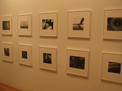
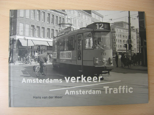
 JTF (just the facts): Published in 2000 by De Verbeelding. 72 pages, with 33 black and white images. Each image is a 2 page panorama. Includes an essay by the artist. (Cover shot at right.)
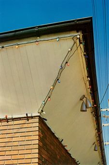
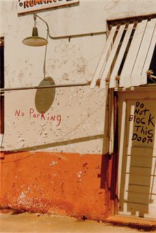
Comments/Context: In a photography world full of overly precious, self-conscious conceptual projects, it’s refreshing to come across a simple, self contained body of work that succinctly and successfully tells its story without an excess of baggage. A few years ago, Dutch photographer Hans van der Meer was set with a straight forward commission by some local arts organizations: photograph traffic situations in the city center of Amsterdam.
The streets of Amsterdam, as most people know, are a chaotic brew of cars, motorcycles, delivery trucks, trams, bicycles, and people on foot, winding along canals and between old buildings, over narrow bridges and down cobbled lanes under construction. Van der Meer’s panoramic shots of intersections capture the momentary clashes, conflicts, and almost accidents that happen everyday, as the competing parties jostle for space. Each image allows multiple stories to play out simultaneously, as people in their individual bubbles are suddenly joined with their neighbors by the convergence of activity. The more crowded the city becomes, the more frequently these collisions (real and metaphorical) occur.
What I like about these pictures is that they capture the reality of life in the city with such economy; this small thin volume tells a remarkably full story of a complex and diverse city in just a few understated pages. And each time I come back to the images and look closely again, I seem to discover more layers of interaction amidst the chaos.
.
.
Collector’s POV: Hans van der Meer is represented by Galerie Van Kranendonk in Den Haag (here). His work has yet to show up in the secondary markets in New York or London, so interested collectors will need to follow up directly in the Netherlands.
Transit Hub: