JTF (just the facts): A total of 7 color photographs and 6 paintings, framed in white/unmatted or unframed, and hung against white walls in the two room gallery space. (Installation shots below.)
The following works are included in the show:
- 7 c-prints, 2017, 2025, sized roughly 22×30, 30×22, 30×26, 53×50 inches, unique
- 4 acrylic on aluminum, 2026, sized 126×96, 60×48, 24×18 inches, unique
- 1 acrylic on wood panel, 2026, sized roughly 45×61 inches, unique
- 1 acrylic on canvas, 2026, sized roughly 61×63 inches, unique
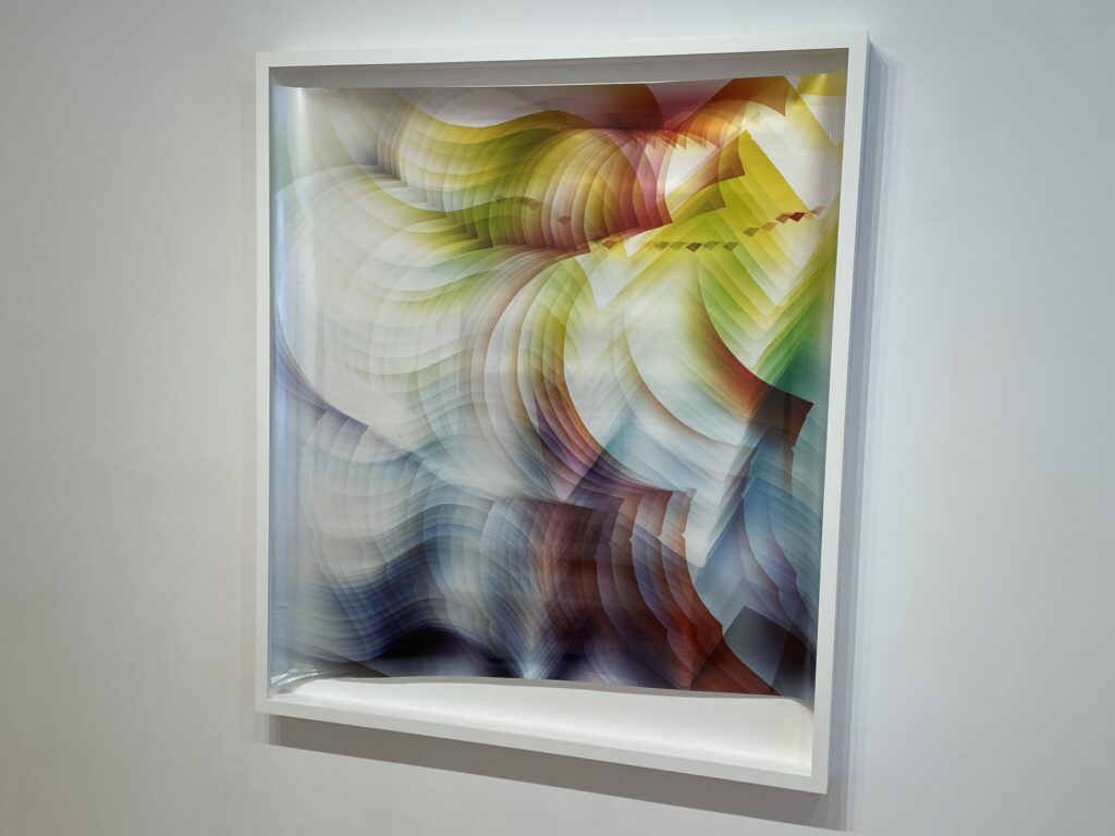
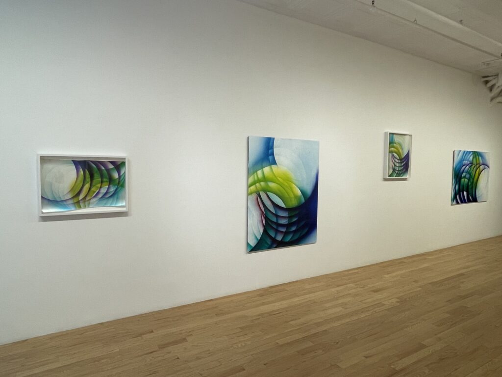
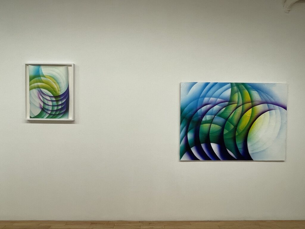
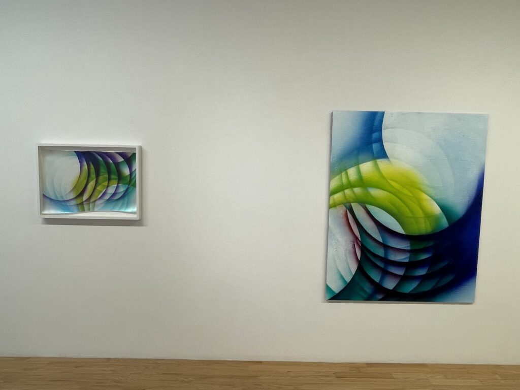
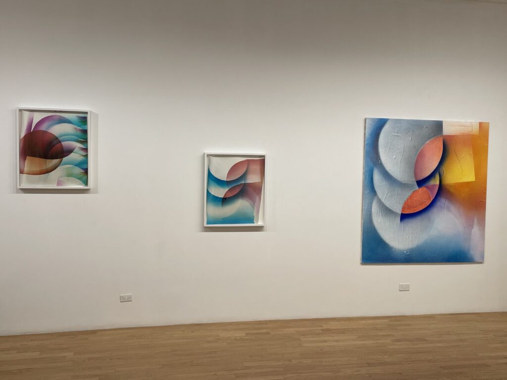
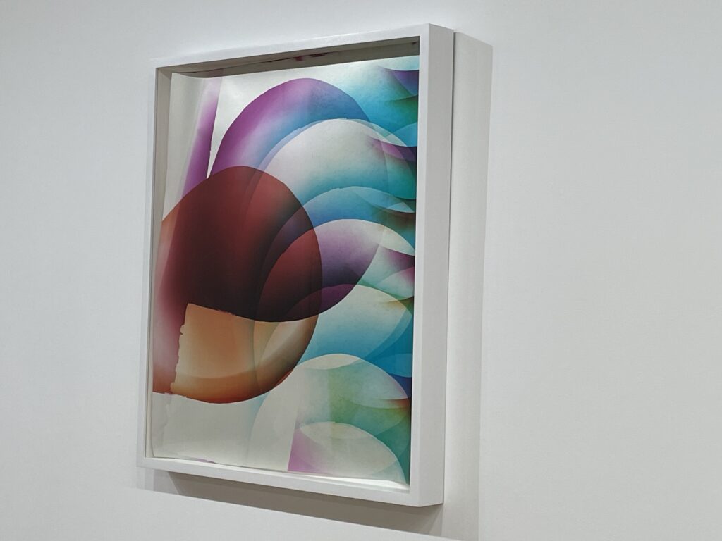
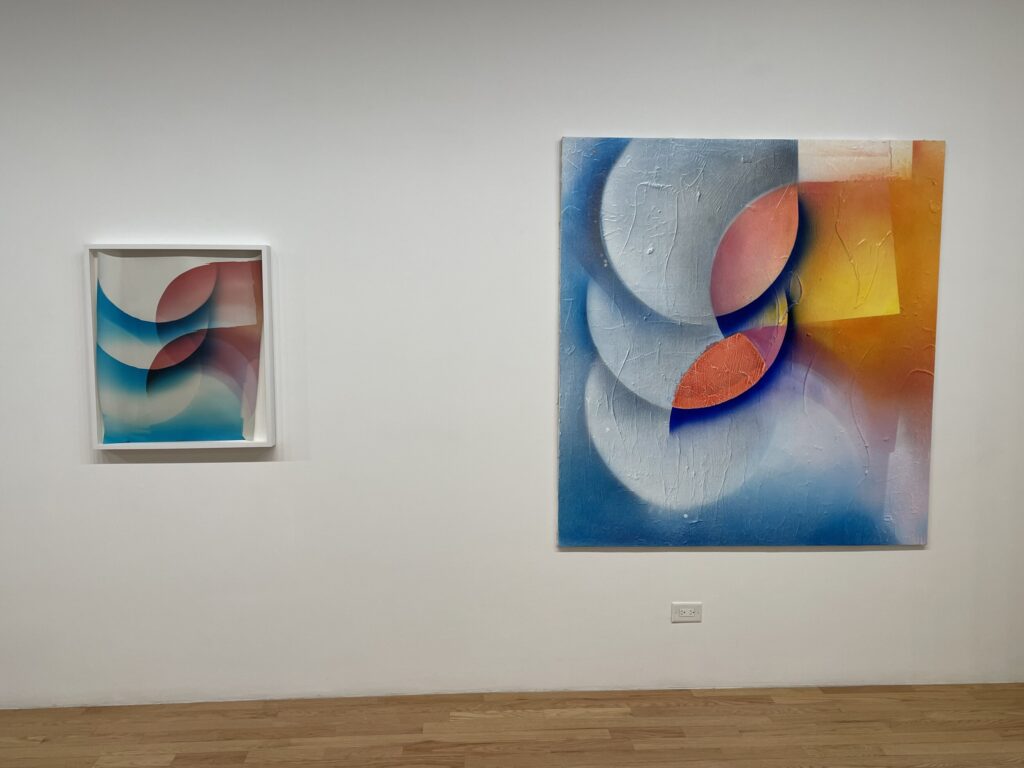
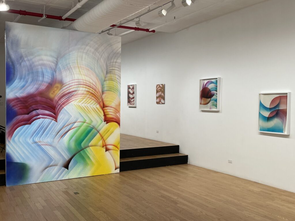
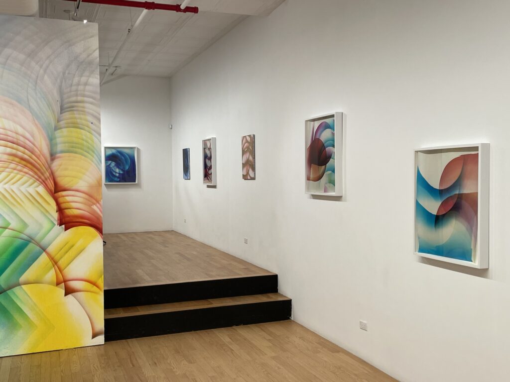
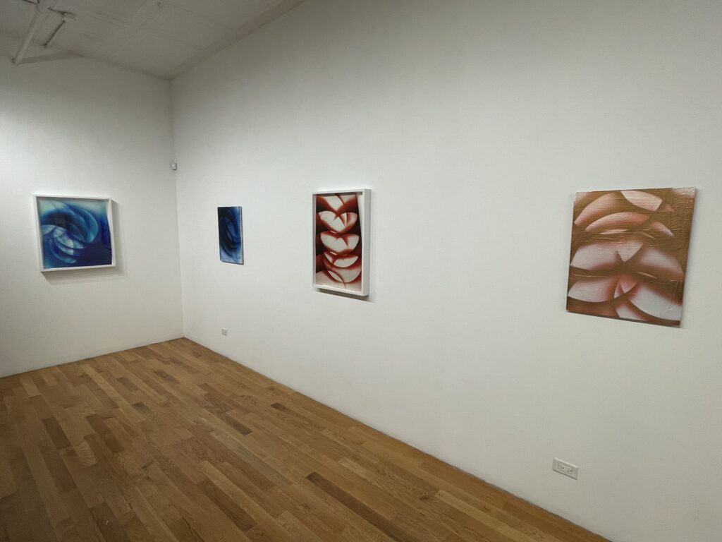
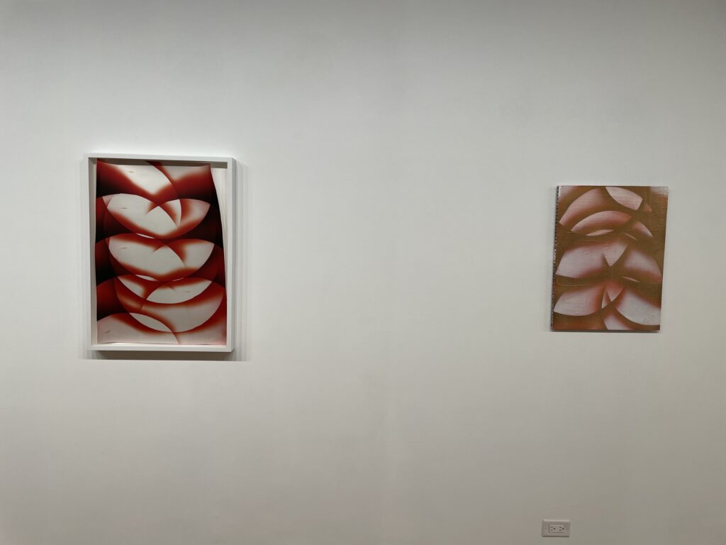
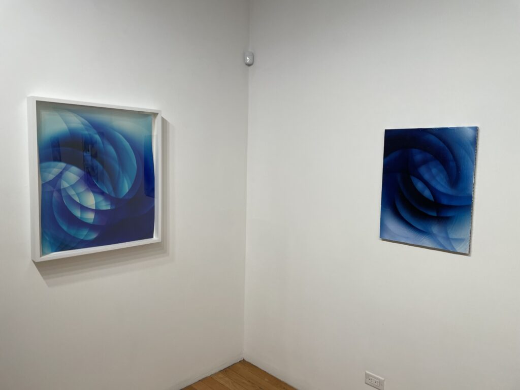
Comments/Context: I’ll admit that the title of Mariah Robertson’s new show “Portraits” caused me some initial confusion. As I strolled through the gallery space, what I saw was a fresh selection of Robertson’s darkroom-based color experiments, along with a handful of paintings of similarly abstract subject matter. Where the portraits might be hiding was a mystery, until I realized that the paintings were actually “portraits” of Robertson’s own darkroom works, albeit in different sizes and orientations. In this manner, the show is a set of pairings, with a darkroom work matched by its resulting “portrait”, often hung side by side or at least relatively nearby to encourage back-and-forth comparison of the before-and-after artistic translation that has taken place.
Robertson’s photographic practice has included painterly elements since we first came across her work nearly two decades ago now (in 2009). Right from the start, Robertson was experimenting with ways to bring improvisational motion and chance into the darkroom, with gestural splashes of chemicals sprayed, dripped, and splattered in various directions. As the years have passed, she has tried out enlarged patterns, long rolls of paper, repeated multiple exposure masks, flares of color and shadow, sculptural layering of torn sheets, fish scale-like interleaving, and even a few shaped frames, but loose painterliness has always been central to her visual vocabulary. In this way, her decision to cross over and actually use paint to re-interpret her own photographic compositions isn’t actually so unexpected.
Robertson’s new photographic works are filled with repetitions of masked shapes, with curved and square corners stuttering and piling up in quick succession as they travel across her compositions. Transparent colors then shift above and below these planes of whiteness, creating drifts, overlaps, and intersections of soft pastels, electric neons, and moody blues, in a mode that has kinship with some of her works from a decade ago (as seen in her 2016 and 2017 gallery shows, reviewed here and here.) When she uses circular forms, her pictures recall the expanding ripples in a pond or the turning phases of the moon, and when the patterns are nested together more tightly, they shift like the ebb and flow of textured waves. Her new pictures feel like a continued reworking and evolution of her original ideas, the process repeated again and again until innovation and chance help lead things in subtly new directions.
One story we might tell ourselves is that Robertson somehow reached the end of the creative road with this particular line of thinking, and decided to take the big risk of jumping out of her own lane and into the realm of painting to see where the ideas might go given the freedom of another context. Not only did she have to translate the color aesthetics of her photographs into paint (seemingly using techniques like diffusion and airbrushing), but she also had the opportunity to reconsider scale, cropping, and orientation, often exploring larger possibilities (with one four panel work expanded to nearly the height of the gallery ceiling).
Compositionally, a little rudimentary detective work between the photographs and the “portraits” will readily reveal the parent/child connections, and for the most part, Robertson has stayed surprisingly faithful to the original images, aside from turning them upside down in a few cases. What changes most in the transformation from one medium to the other is the wall presence of the works, with the paintings feeling bolder and heftier than their more delicate photographic counterparts in frames. In painted form, the sense of movement is even stronger and more energetic, recalling the implied speed of the early 20th century Futurism of Giacomo Balla.
Robertson’s pairings intentionally make the discrete dividing line between the two mediums more permeable than usual, and conceptually, that’s an idea worth wrestling with some more, given that the activating force of photography (light) isn’t as central to the process of painting. In replicating her photographs in paint, she’s approximating that elusive light activation, translating it into a representation with different properties of flatness, depth, and color nuance. Like translating poems from one language to another, something of the original is inevitably lost in the process, but there is simultaneously the possibility of finding new words that capture similar emotions and new audiences to respond to them. Whether Robertson is a “good” painter is therefore the wrong question. Instead, we should be asking whether these new interpretations of her photographs add any richness to their original message. There are enough flashes of unexpected textural and spatial insight here to make the answer to that question yes, and it won’t surprise me if Robertson’s next iteration digs deeper into the messy translation zone, mixing the properties of paint and photography even more inextricably.
Collector’s POV: The photographs in this show are priced between $10000 and $22000, based on size. Robertson’s work has little secondary market history at this point, so gallery retail likely remains the best option for those collectors interested in following up.



state of art and photography market
Intriguing to see such a complex back and forth of ideas between the paintings and photographs.