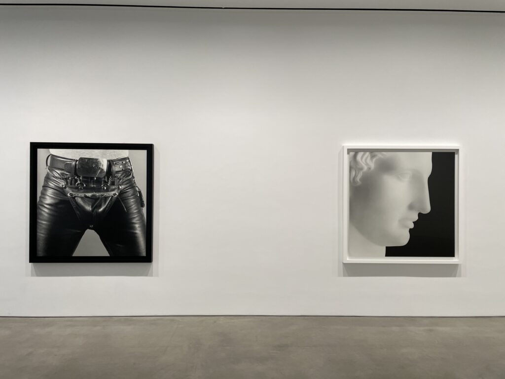
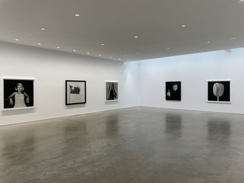
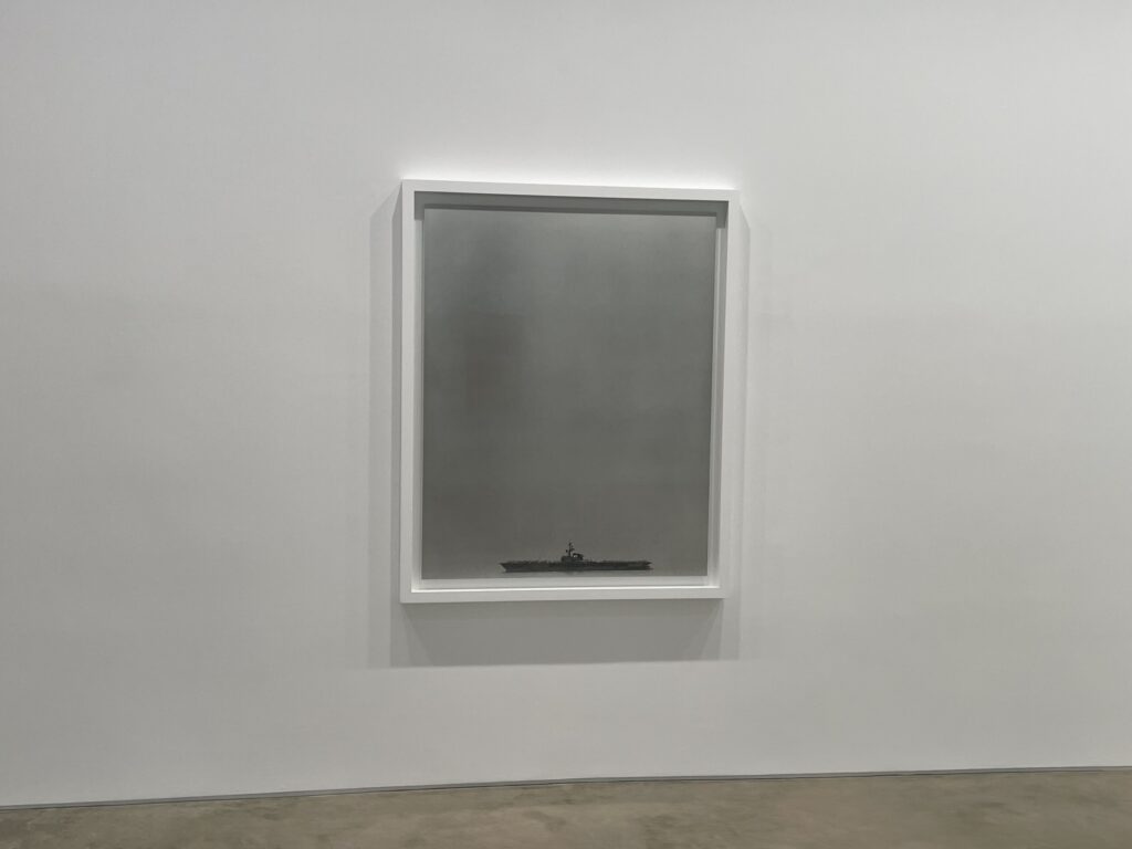
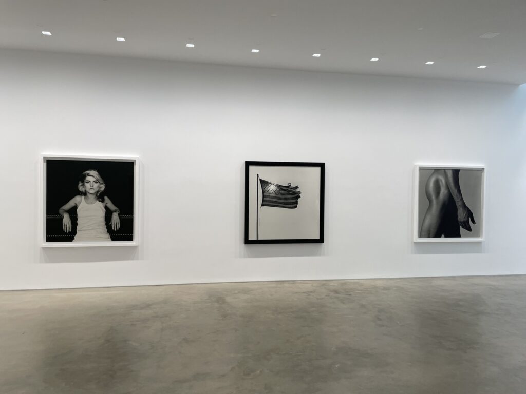
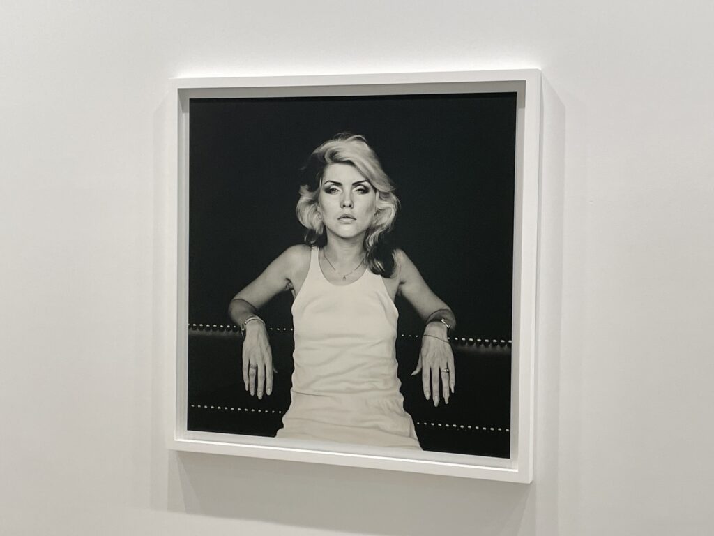
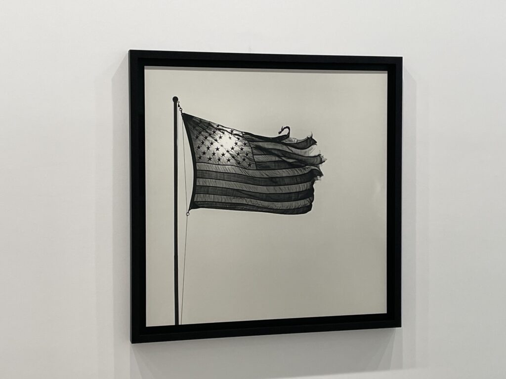
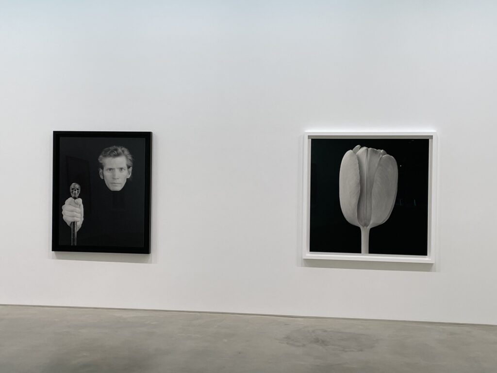
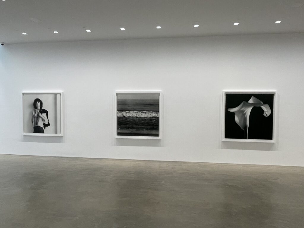
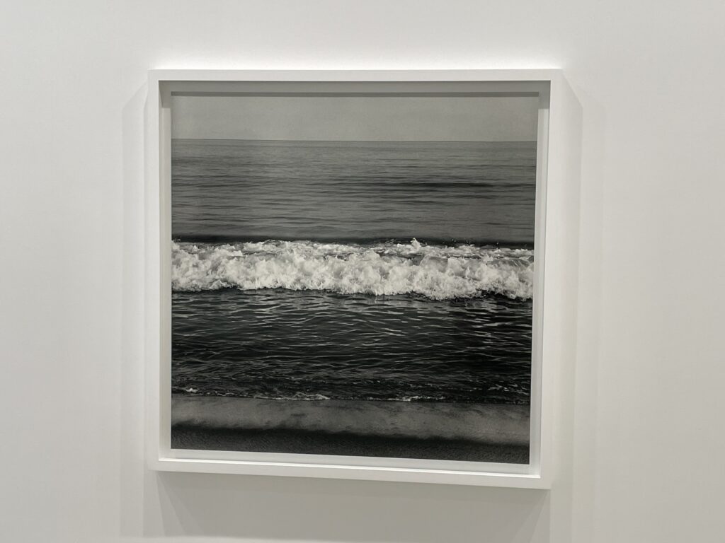
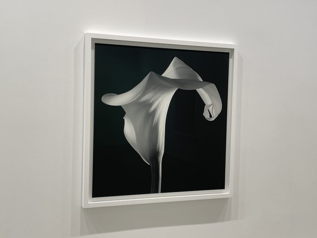
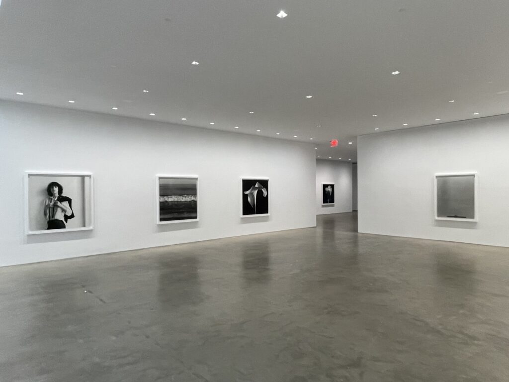
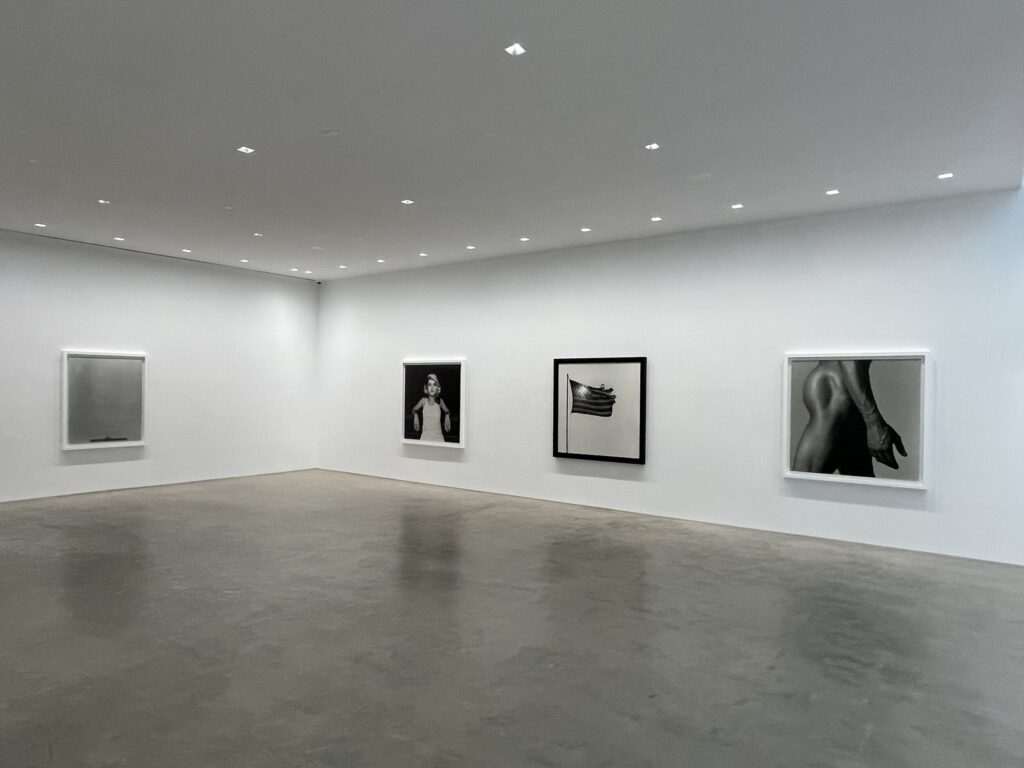
JTF (just the facts): A total of 14 black-and-white photographs, framed in white/black and unmatted, and hung against white walls in a pair of connected gallery spaces. All of the works are gelatin silver prints, made in 1975, 1977, 1978, 1980, 1981, 1983, 1986, 1987, 1988 and printed recently (posthumously). The prints are generally sized at roughly 60×60 inches, with selected prints at 51×60, 60×49, and 60×51 inches, and all of the images are available in editions of 5+1AP. Two additional works (a double tulip and a portrait of Grace Jones) are not included in the show, but have also been printed in this large scale. (Installation shots below.)

Comments/Context: Printing photographs at large scale costs real money. And for most photographers, even those who have become well established and are generously supported by their galleries, they just don’t have the available capital to fund extra large prints. So they don’t make them, even if they are curious about how their images might function in a more expansive size.
This was particularly true in the 1970s and early 1980s, before the arrival of the disruptively large scale works of the Düsseldorf photographers (Andreas Gursky, Thomas Struth, Thomas Ruff, and others), Helmut Newton’s “Big Nudes”, and some of Richard Prince’s early large scale appropriations. Since then, massive photographs (to rival the scale of the largest paintings) have become more widely made, but they are still expensive to produce, and are generally only made even now by those select contemporary photographers with strong established reputations (and the associated confidence that they can sell the big prints).
Many photographers from the period before the move to larger scale have of course wondered what might have been had they been able to print their works bigger. Probably the most famous recent example of a retroactive experiment with photographic scale came in 2012, with William Eggleston’s auction sale of new prints of 1970s negatives at 60×44 inches (or the reverse) – not huge, but certainly much bigger than his original dye transfers, and generally thoughtfully selected to reflect those particular compositions that would benefit most from larger scale. Other artists of that same generation, like Joel Sternfeld, Stephen Shore, and Nan Goldin, among others, have also experimented with some bigger prints of older negatives, and with larger prints of their recent works. All of these artists are still alive, so they have been inherently part of the process of deciding how to apply the available possibilities of larger scale to works from the past.
Robert Mapplethorpe died in 1989, but I think it’s fair to say that had he lived longer, he’d likely have tried out larger prints at some point (assuming he could afford it). The crisp precision and elemental presence of his pared down aesthetics naturally lends itself to enlargement (and bold symbol making), that is, with two decently obvious possible failure modes. The first is essentially technical – some of his negatives likely aren’t sharp or uniform enough to tolerate enlargement without becoming way too grainy or blurred. And the second is a more subtle question of taste – some of Mapplethorpe’s more explicit subject matter probably becomes too provocative at wall-filling larger-than-life-sized scale, likely trading its sense of controlled nuance and illicit seduction for something far too overblown and swaggering.
Where that line of intention lies is really only a question for the artist himself, which leads us into the murkier territory of making posthumous prints. Mapplethorpe isn’t here to choose which images should be enlarged (or to what exact size), and without explicit written notes or instructions (of which there are few), we don’t know at all whether the images selected for enlargement by the team of the estate and the gallery (and on view in this show) are the ones the artist would have chosen himself. Might Mapplethorpe have decided to push harder and take more risks? Might he have chosen different images entirely (i.e. this flower instead of that one)? He often used external expert technicians to make his prints, so having others make these big prints (and having the estate “sign” them) isn’t exactly the concern. The issue is that there is almost no way to answer the very real aesthetic questions of the artist’s intent in making these “new” works.
Given the iconic nature of so many Mapplethorpe photographs (as seen in his 2019 survey at the Guggenheim, reviewed here, and in a 2021 gallery show, reviewed here), choosing just a total of 16 images to enlarge can’t have been easy or even straightforward. The resulting selections offer a solid cross section of Mapplethorpe’s best work, including portraits and self-portraits, flowers, nudes (male and female), leather/fetish, and a few other subjects. It’s an appropriately safe but respectfully representative gathering, that will appeal to a broad swath of viewers/collectors, with a particular eye for images that try to take advantage of the large scale.
As I wandered through the spaciously installed galleries (and these prints definitely need some distance to breathe), my main question as I faced each image was “does this picture perform better at this unexpectedly large scale?” Of course, such answers are subjective, but my conclusions were mixed. For the self-portraits, the 1980 cigarette self-portrait benefits from the enveloping dark bigness, while the 1988 skull head cane version isn’t particularly better extra large. Patti Smith doesn’t need to be big (in fact, she’s more intimate and vulnerable when small), but Debbie Harry is a surprise knockout in the huge size. The double tulip (not on view) is actually the strongest of the flowers, with the side view “Calla Lily” and the “Tulip” both fine but predictable; the front view “Calla Lily” is less obvious. The male nude of Alistair Butler is solid (but quietly nonthreatening), while the female nude of Lydia Cheng is better smaller (and I’m not sure I like the additional grain in this one). The American flag is an undeniable powerhouse at large scale, as is the “Leather Crotch”, while the “Waves” are much better than I might have guessed (and a bit like a Gursky), and the sculptural face of “Ermes” is perhaps better big than small but now more subtle. And the unbalanced battleship composition “Coral Sea” was already great small, but it’s also pretty terrific large, and the one print where the extra grain of the enlargement really works in its favor. Your mileage may vary, but from a market perspective, I expect that all of these prints will ultimately find ready buyers – a massive Mapplethorpe print is the kind of emphatic visual statement that many collectors (and institutions) will find hard to resist.
Given the pricing of these prints (detailed below), this large print project has the potential to gross something like $20M to be shared by the gallery and the estate, given rising prices in the editions and the eventual sale of all the APs. While that might feel like a cash grab to some, the Mapplethorpe foundation does so much consistent good in supporting exhibits and artists of all kinds (when no one is looking) that a major windfall to refill its coffers still feels like a very real positive for the larger world of photography. While this show is certainly a reminder that photography can be a big business, I do think Mapplethorpe would have reveled in seeing many of these images at such impressively transformative scale. For the pictures that can handle it, the amplifying power of scale is undeniable.
Collector’s POV: The prints in this show are priced between $200000 and $350000, based on the place in the edition. Mapplethorpe’s prints are routinely available in the secondary markets, with dozens of images up for sale every year. Recent auction prices have generally ranged between roughly $5000 for his lesser known works to more than $700000 for his most rare and iconic vintage prints.




Thank you for your wonderful perspective in to Robert Mapplethorpe’s art. Do you by any chance know who printed these photographs on view at Gladstone?
I believe it was Griffin (under the supervision of the estate and Gladstone), but I have not confirmed that.