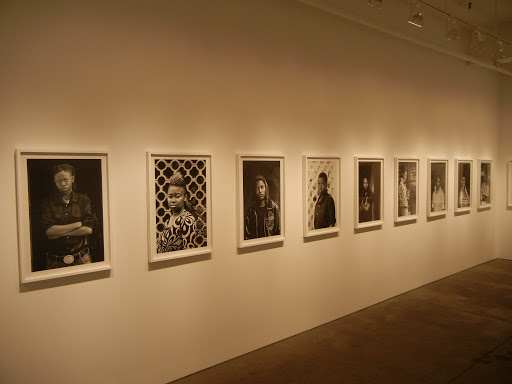
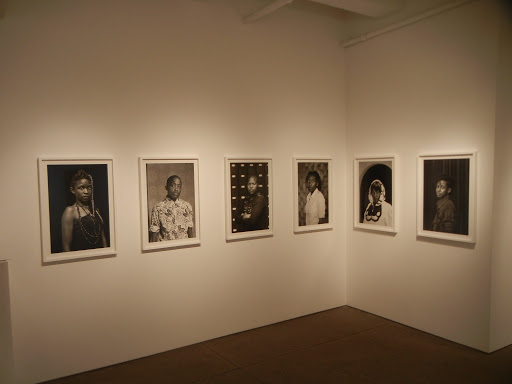
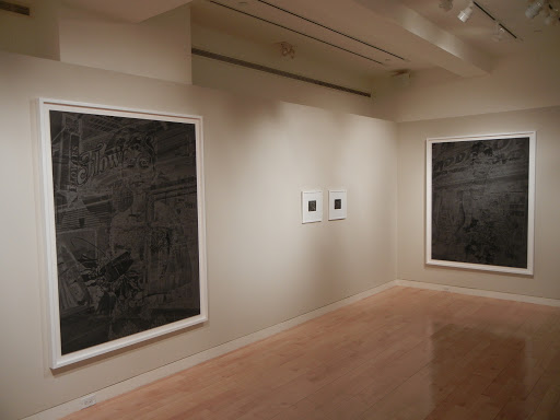
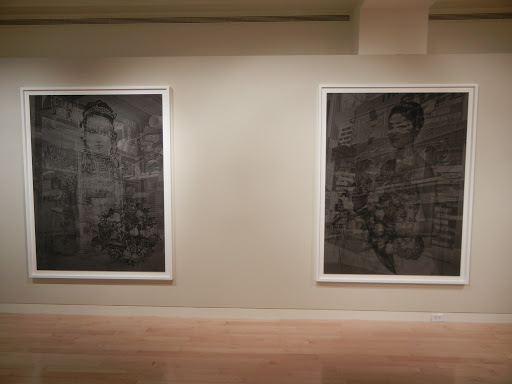
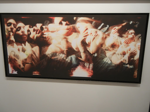
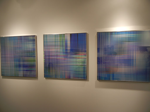
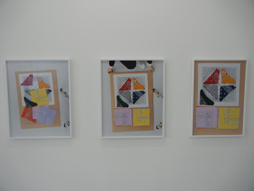
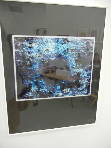
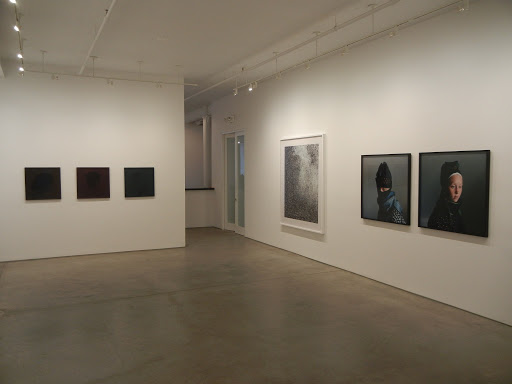
 JTF (just the facts): A total of 35 photographic works, variously framed and matted, and hung against white walls throughout the front room/entry, the main gallery space, and the smaller back room. The show mixes individual works by Nicolai Howalt (14) and Trine Søndergaard (10) and includes collaborations by the two artists together (11). The works span the period from 1997 to 2012. (Installation shots at right.)
Howalt
3 analog c-prints, 17×20 or 26×35, editions of 5+2AP, 1998-1999
3 analog c-print diptychs, each panel 24×19 or 55×47, editions of 3+2AP, 2001
1 digital c-print mounted to aluminum, 71×87, edition of 5+2AP, 2009
1 set 6 digital c-prints, each 26×32, edition of 5+2AP, 2009
4 digital c-prints, each 12×15, editions of 5+1AP, 2010
1 pigment print, 24×29, edition of 5+2AP, 2011
1 digital c-print, 70×61, edition of 5+2AP, 2011
 Søndergaard
2 analog c-prints, each 19×19, editions of 5+2AP, 1997-2000
1 analog c-print diptych, each panel 19×19, editions of 5+2AP, 2003
1 chromogenic print mounted to dibond, 59×59, edition of 3+2AP, 2008
2 chromogenic prints, each 39×39, editions of 5+2AP, 2008-2009
1 pigment print, 2 digital c-prints, each 23×23, editions of 5+2AP, 2009
1 archival inkjet print, 59×59, edition of 5+2AP, 2012
Howalt and Søndergaard
3 photogravures, each 21×18, editions of 18+2AP, 2005-2010
5 digital c-prints, variously sized from 19×14 to 38×30, editions of 5+2AP, 2007
2 digital c-prints, each 62×78, editions of 3+2AP, 2010
1 silkscreen print, 55×39, edition of 5+2AP, 2012
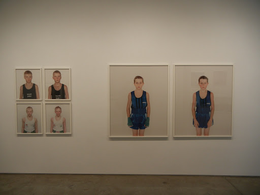
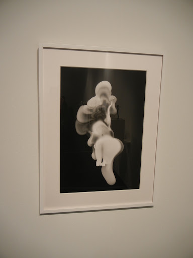
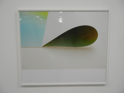
Even a decade later, Howalt’s before and after boxers remain sharp and incisive. Angelic young faces become bloodied, sweaty, flushed and exhausted, the boys passing through a ritual trial, emerging roughed up but knowing. The artist’s more recent remnants of car crash violence and Danish border landscapes continue this study of edges and transitions, culminating in new nearly abstract images of cremation remains (the ultimate crossing point). What might sound dreary is in fact swirling and textural, with flecks of contrast mixed into the white and black powdery undulations.
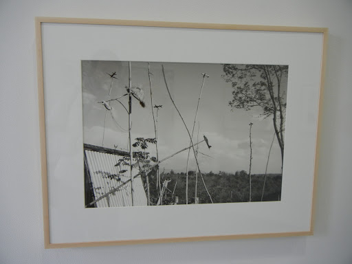
 Their collaborative work over the years seems to weave their two separate perspectives into one seamless set of ideas. Silhouettes of crumpled birds shot midair, portraits of solitary trees fighting for existence in snow bound high altitudes, and composite scenes of hunting rituals (full of men, dogs, beaters, birds, and snowy forests) all mix portraiture with the fragility of life. Their recent screenprints of the gnarled, tactile forms of a 1500 year old tree continue this thinking, combining the rough texture of layered bark with the enduring puzzle of relentless, persistent growth.I think what I liked best about this show as the sense that the artists were idea people first, and that their art was an evolving visual manifestation of their experiments with those ideas. I suppose this same thing might be said of all artists to some degree, but for me, there was a very real feeling of tracing their individual/mutual paths of ideas here. The sampler organization of the show provides the photographic bread crumbs to follow, allowing viewers not just to see the fresh, new pictures made recently, but also to place them into a larger, more comprehensive intellectual context.
 Collector’s POV: The prices in this show span a wide range, seemingly different for every single piece on view. Howalt’s works range from $3000 to $30000, while Søndergaard’s works range from $6300 to $19100 (with 1 NFS and 1 POR); their collaborations start at $1725 and rise up to $23000. While prints from both of the artists and their partnership have recently found their way into the secondary markets, there have been so few transactions that any kind of historical pattern is difficult to discern. As such, gallery retail likely remains the best option for those collectors interested in following up.