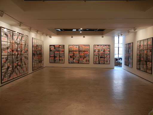
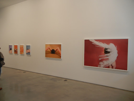
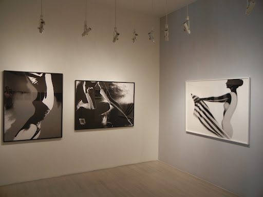
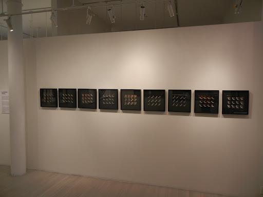
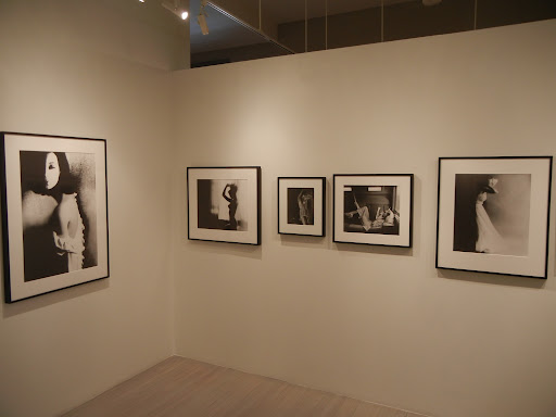
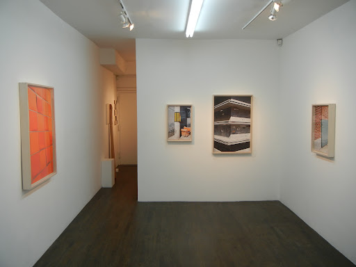
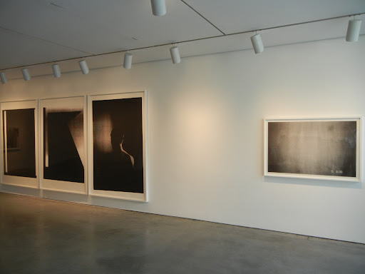
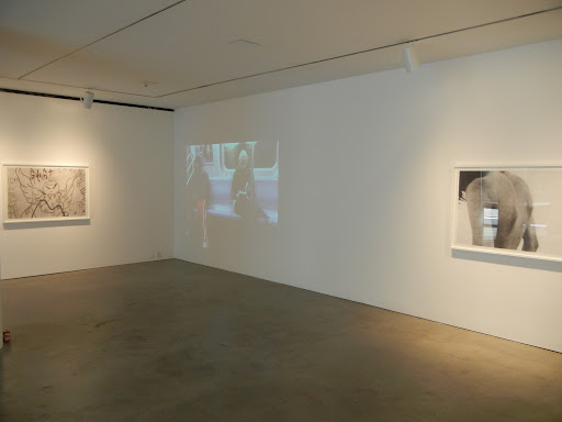
Henry Wessel, Vintage Photographs @Pace/MacGill

JTF (just the facts): A total of 30 black and white photographs, framed in white and matted, and hung against orange and almond colored walls in the main rooms of the gallery. All of the photographs are vintage gelatin silver prints, made between 1968 and 1987. Image dimensions range from 6×9 to 11×16 or reverse; no edition information was available. There is no photography allowed in the gallery, so the installation shots at right are via the Pace/MacGill website.

Comments/Context: When we look at all the stars of 1970s American photography, from the emerging color giants to the New Topographics photographers to a handful of other greats, I suppose it’s not surprising that an artist like Henry Wessel has gotten a bit overlooked. His quirky pictures document the quintessential idiosyncrasies of life in California and the West, and capture those moments with a harsh bright whiteness that is wholly his own. I’ve always thought his work was a bit under appreciated, so I’m glad to see a well-selected group of his vintage pictures swing back through New York.

Well placed humor is rare in photography, but Wessel consistently finds flashes of wry visual wit hidden among seemingly ordinary situations: a woman drinking from a glass amid a riot of clashing bedding patterns, a solitary ice advertisement in the rocky desert, a heart shaped cactus, a weirdly groomed poodle, a single telephone pole in an expanse of dry land. He also has an eye for the strange absurdities of the California experience, from the muscled man in sunglasses in front of the Ocean Sands and the man watching a flock of pigeons taking off, to a thicket of grasses blocking the front of a house and the baton twirlers in white go-go boots. An over-manicured evergreen, a man staring at the desert between two houses, the blinding whiteness of vernacular architecture, it all has an undercurrent of the oddly surreal, as if something slightly off kilter was going on in this world of suburban bungalows and beaches.
 
I think Wessel’s dry one-liners and visual eccentricities deserve more attention and acclaim that they have heretofore received. This show is an excellent sampler of Wessel’s work and should provide a compelling introduction for those who have inadvertently passed him over chasing the more famous names of the 1970s.

Collector’s POV: The photographs in this show are priced between $1000 and $20000. Wessel’s prints are intermittently available in the secondary markets, with prices at auction ranging between $3000 and $16000 in recent years

My favorite image in the show was actually a series of four images hung together; they’re in the center of the middle installation shot. It starts with the back of woman’s platinum blond head, followed by the back of a suited man on the beach, followed by two sculpturally rounded front yard evergreens, followed by a woman in a bikini, once again from the back. Together, they create a whimsical, peculiar rhythm.

Rating: ** (two stars) VERY GOOD (rating system described here)

Transit Hub:

  • Feature: PDN Photo of the Day (here)
  • Exhibit: SFMOMA, 2007 (here)
  • Book: Five Books from Steidl (here)

Henry Wessel: Vintage Photographs
Through July 8th

Pace/MacGill Gallery
32 East 57th Street
New York, NY 10022 .

Shen Wei, Chinese Sentiment @Cooney

JTF (just the facts): A total of 19 color photographs, unmatted and framed in black, and hung in the single room gallery space. All of the works are digital c-prints, taken between 2008 and 2010. The prints come in two sizes: 16×20 (in editions of 8) and 24×30 (in editions of 3). The show includes 17 pictures in the smaller size and 2 in the larger size. A monograph of this body of work has recently been published by Charles Lane Press (here). (Installation shots at right.)

Comments/Context: Shen Wei’s recent images of China fly in the face of the now familiar energetic, economic boom narrative that dominates the our media-saturated view of the Eastern giant. Whether his subject is a landscape, a still life, or a portrait, his images have a consistent emotional tenor, a formal sense of solitary, introspective reserve. There are no pictures of overcrowded chaotic streets filled with noisy bicycles here; instead Shen provides a sense of melancholy distance, where small moments of uncertain peace occur in the muted tones of a grey morning.
.
Shen’s portraits capture his sitters alone in their rooms or in fleeting glimpses of thoughtful repose; they are at once intimate and unknowable, buried in private stillness. His landscapes find a similar mood: the enveloping mist of a fountain, the rain splattered surface of an ornamental pond, a single figure watching a red paddle boat disappear under a bridge, or the head of a ticket booth attendant in the dark of the early evening. Even his still lifes have a sense of dull ache: the gooey leftovers of a sugar candy stick, an unopened plastic bag of noodle soup on a window sill, or the box of fancy pears in protective sheaths bought for a special occasion. Seen together, the different compositional forms coalesce into an overall sensitivity to the subtle action on the periphery of life, an awareness of the shifts that happen just outside the norwal sweep of our gaze.
.

Overall, I liked the sense of understatement and restraint that Shen shows across this body of work. He successfully holds back from courting the obvious, and instead, dives deeper for something more durable and resonant.

Collector’s POV: The prints in this exhibit are priced as follows: the 16×20 prints are $1500 each and the 24×30 prints are $2500 each. Shen’s work has effectively no secondary market history, so gallery retail is likely the only option for interested collectors at this point. 20×200 (here) also has some of his work for sale.
.

My favorite image in the show was Tingwei, Shangahi, 2010; it’s on the far left in the bottom installation shot and is also on the cover of the monograph. I like the quietly innocent, eyes-closed expression on her face and the way her hair spreads out on the long green grass; the image has a calm serenity, like the edge of a dream.

Rating: * (one star) GOOD (rating system described here)

.
Transit Hub:

  • Artist site (here) and blog (here)
  • Interview: Conscientious (here)

Shen Wei, Chinese Sentiment
Through June 4th

Daniel Cooney Fine Art
511 West 25th Street
New York, NY 10001

Auction Previews: Contemporary Art Evening and Day Sales, May 10 and 11, 2011 @Sotheby’s

Sotheby’s is up first in the Spring Contemporary Art season in New York next week, with Evening and Day auctions Tuesday and Wednesday. With over $10 million dollars of photographic value on offer, it’s clear that consignments are way up, in both number and value. Led by a pair of top end Gurskys, there are more high end photographic lots in this set of sales (33) than in any auction in recent memory. All in, there are a total of 58 lots of photography available across the two sales, with a total High estimate for photography of $10114000.

Here’s the statistical breakdown:

Total Low Lots (high estimate up to and including $10000): 0
Total Low Estimate (sum of high estimates of Low lots): NA

Total Mid Lots (high estimate between $10000 and $50000): 25
Total Mid Estimate: $744000
.
Total High Lots (high estimate above $50000): 33
Total High Estimate: $9370000
.

The top photography lot by High estimate is lot 9, Andreas Gursky, Rhein I, 1996, at $1000000-1500000. (Image at right, top, via Sotheby’s.)

Here’s the list of photographers represented by three or more lots in the two sales (with the number of lots in parentheses):

John Baldessari (4)
Andreas Gursky (4)
Vik Muniz (4)
Cindy Sherman (4)
Elger Esser (3)
Thomas Ruff (3)
Andres Serrano (3)
Hiroshi Sugimoto (3)

(Lot 563, Vik Muniz, Jackies (In Ketchup), 1999, at $150000-200000, image at right, middle, and lot 578, Olafur Eliasson, The Path Series, 1999, at $60000-80000, image at right, bottom, both via Sotheby’s.)

The complete lot by lot catalogs can be found here (Evening) and here (Day).

Contemporary Art, Evening Sale
May 10th
.
Contemporary Art, Day Sale
May 11th
.
Sotheby’s
1334 York Avenue
New York, NY 10021

Auction Preview: L’Essential Heinz Hajek-Halke, May 10, 2011 @Sotheby’s Paris

Preceding its various owner photographs sale in Paris next week, Sotheby’s has a single artist sale of the work of German photographer Heinz Hajek-Halke on offer. Most of the works in the auction are experimental photomontages and avante-garde multiple negative images, with a heavy dose of double/layered nudes and portraits, most made between the late 1920s and the 1950s. Overall, there are a total of 78 lots available, all by Hajek-Halke, with a Total High Estimate of 625000€.
.
Here’s the breakdown:

Total Low Lots (high estimate up to and including 7500€): 56
Total Low Estimate (sum of high estimates of Low lots): 309000€

Total Mid Lots (high estimate between 7500€ and 35000€): 22
Total Mid Estimate: 316000€

Total High Lots (high estimate above 35000€): 0
Total High Estimate: NA

The top lot by High estimate is tied between two lots: lot 76, Heinz Hajek-Halke, Sans Titre, 1930-1936, and lot 77, Heinz Hajek-Halke, Sans Titre, 1930-1936, image at right middle, via Sotheby’s, both at 20000-30000€.

(Lot 34, Heinz Hajek-Halke, Sans Titre, 1927, at 5000-7000€, image at right, top, and lot 52, Heinz Hajek-Halke, Das Mauerlied, 1955, at 2000-

4000€, image at right, bottom, both via Sotheby’s.)

The complete lot by lot catalog can be found here.

L’Essentiel Heinz Hajek-Halke
May 10th

Sotheby’s
76, Rue Du Faubourg Saint-Honoré
75008 Paris

Auction Preview: Photographies, May 10, 2011 @Sotheby’s Paris

Sotheby’s Paris has a various owner photographs sale scheduled for next week, headlined by a number of prints by Man Ray and Josef Sudek. It’s a pretty straightforward selection, with few unexpected finds. Overall, there are a total of 83 lots on offer, with a Total High Estimate of 1537000€.
.
Here’s the breakdown:

Total Low Lots (high estimate up to and including 7500€): 22
Total Low Estimate (sum of high estimates of Low lots): 127000€

Total Mid Lots (high estimate between 7500€ and 35000€): 52
Total Mid Estimate: 760000€

Total High Lots (high estimate above 35000€): 9
Total High Estimate: 650000€

The top lot by High estimate is lot 119, Man Ray, Sans Titre, Rayogramme, 1924, at 120000-150000€. (Image at right, top, via Sotheby’s.)

Here is a short list of the photographers who are represented by four or more lots in the sale (with the number of lots in parentheses):

Josef Sudek (7)
Man Ray (6)
Heinrich Kühn (5)
Eugène Atget (4)
Valérie Belin (4)
Daido Moriyama (4)
Shirin Neshat (4)
.

(Lot 152, Irving Penn, Single Oriental Poppy, 1968/1987, at 40000-60000€, image at right, middle, and lot 182, Valérie Belin, Sans Titre (de la série Modèles), 2006, at 7000-10000€, image at right, bottom, both via Sotheby’s.)

The complete lot by lot catalog can be found here.

Photographies
May 10th
.
Sotheby’s
76, Rue Du Faubourg Saint-Honoré
75008 Paris

Georges Dambier: Who’s That Girl? @Benrubi

JTF (just the facts): A total of 24 black and white and color photographs, framed in black with white mats, and hung in the main gallery space. The 8 black and white works are gelatin silver prints, made between 1953 and 1959. They are all 16×20 or reverse, printed in editions of 25. The 16 color works are archival pigment prints, made between 1953 and 1961. They are either 16×20, 20×20, or 20×24 (or reverse), also printed in editions of 25. All of the works on view are modern prints from restored negatives. (Installation shots at right.)

Comments/Context: French fashion photographer Georges Dambier made his mark working for Elle in the 1950s, taking famous models out of the studio and placing them in the streets. This small show is a mini retrospective of sorts, where solid examples in both black and white and color have been gathered together, showing Dambier’s particular knack for the jaunty staged scene and his masterful use of splashes of bold color.

Dambier’s black and white work is filled with posed scenes and feminine flourishes: a model nose to nose with a hackney horse, another daintily paying a gas station attendant, a third buying a goldfish in plastic bag. Broad fur collars, cigarette holders, and white gloves complement slyly exaggerated faces and dramatic gestures, in ways we have come to associate with 1950s fashion photography.

I found Dambier’s color work to be far more striking. In three pictures, he captures Suzy Parker with flowers: one with an armload of bright yellow daffodils, a second with a pastel pink hydrangea bouquet that matches the ribbon on her white hat, and a third with a bunch of salmon pink tulips that echoes the flounce of her floppy pink brim; all three have an energy that is contagious. Other images on display have this same electricity: a red and white striped top paired with a huge blue surfboard, striped beach coverups in blue and orange, a red hat and red gloves flanked by the big red blob in a painting by Miro. Red coats and suits paired with matching red hats similarly stand out against the anonymous movement of the city in the background. In all of these these works, color has become the compositional anchor, rather than subject or form, and bright areas of saturated color grab your eye.

While many of the works on display seem like well-executed examples of a certain type from a certain time, a few of the color pictures are really quite timelessly stunning. So even if fashion photography isn’t your passion, there are a couple of dazzling color photographs on view here that are worth a quick detour.

Collector’s POV: The prints in this show are priced as follows: the 16×20 and 20×20 prints range in price from $2800 to $9500, based on the place in the edition; the single 20×24 print on view is $4000 (rising to $5000 as the edition sells). Dambier’s work hasn’t reached the secondary markets with any regularity, so gallery retail is likely the only option for interested collectors at this point.
 
My favorite image in the show was The Bikini Girl on the Boardwalk, pour Jour de France, Deauville, 1959; it’s on the far left in the middle installation shot. This is the kind of image that should be used to illustrate the power of primary colors in photography. The crisp white polka dots on the blue bathing suit and the echo of matching yellow between the umbrella and the glass of juice really make this picture pop. Paired with the model’s mischievous smile, the vibrant color turns a simple fashion scene into something sensational.

Rating: * (one star) GOOD (rating system described here)

Transit Hub:

  • Artist page (here)
  • Features: NOWNESS (here), On the Runway (here), La Lettre de la Photographie (here)

Georges Dambier: Who’s That Girl?
Through May 27th

Bonni Benrubi Gallery
41 East 57th Street
New York, NY 10022

Night Vision: Photography After Dark @Met

JTF (just the facts): A group show consisting of 44 photographic works from 34 different photographers, generally framed in black and matted, and hung spotlit against dark blue walls in a series of three small connecting rooms. The prints were made between 1896 and 2000, mostly using the gelatin silver process. A glass case in the second room holds two bound volumes. (Installation shots at right.)
.
The following photographers have been included in the exhibit, with the number of images on view and their dates in parentheses:

First Room

Berenice Abbott (1, 1932)
Frances Allen (1, 1899)
Bill Brandt (1, 1936)
Brassai (1, 1932/1960)
Alvin Langdon Coburn (1, 1910)
John Cohen (1, 1960)
Gordon Coster (1, 1932)
Patrick Faigenbaum (1, 1977)
Knud Lonberg-Holm (2, 1923, 1924)
Edward Steichen (1, 1899)
Josef Sudek (1, 1948-1964)
Werner Mantz (1, 1928)

Second Room
Marcel Bovis (2, 1928, 1932)
Bill Brandt (1, 1942)
Brassai (2, 1931, 1934)
Louis Faurer (1, 1951)
Robert Frank (2, 1952, 1958)
Lewis Hine (1, 1906-1907)
William Klein (1, 1954)
Paul Martin (1 book, 1896 in glass case)
Otto Steinert (1, 1950)
Alfred Stieglitz (1 photogravure, 1897 in glass case)
Weegee (1, 1940)

Third Room

Robert Adams (1, 1981)
Guiseppe Albergamo (2, 1939)
Diane Arbus (3, 1958)
Bill Brandt (1, 1930s)
Gordon Coster (1, 1932)
David Deutsch (1 group of 16, 2000)
Sid Grossman (1, 1948)
Peter Hujar (1, 1981)
Andre Kertesz (1, 1940s)
Daido Moriyama (1, 1978)
Hiroshi Sugimoto (1, 1990)
Stephen Tourlentes (1, 1997)
Pim Van Os (1, 1950)
Garry Winogrand (1, 1955)
Kohei Yoshiyuki (1, 1971)
.
Comments/Context: The Met’s eclectic new survey of night photography is a budget-friendly drawn-from-the-collection whirlwind, covering a century of work in the span of a few small darkened rooms. By definition, such a show cannot be comprehensive (as the Met cannot own everything of importance in every genre), and night photography doesn’t appear to have been a particular collecting focus over the years. As a result, this show feels less like a directed scholarly argument about the important trends in night photography over time, and more like a higher-level gathering of like work culled from the storage boxes.

The exhibit begins with a selection of turn of the century Pictorialist night images, followed quickly by a larger sample of between the wars work from some of the usual nighttime masters and a few well chosen lesser knowns: Abbott’s iconic New York, Brandt’s darkened London, Brassai’s foggy Paris, Mantz’ German architecture etc. From here, the story gets more diffuse, mixing Weegee’s grisly severed head with Frank’s lyrical Coney Island beach sleeper, Arbus’ carnival goers, and Winogrand’s top-hatted socialites. Post 1960, the connecting narrative is lost entirely, jumping from Yoshiyuki’s park couplings, to a Sugimoto night seascape, to Deutsch’s terrific series of aerial views of LA homes lit by the intrusive glare of a police spotlight.

My point here is not that this exhibit isn’t well selected or sequenced; in fact, from picture to picture along the wall, there are plenty of subtle visual connections that are evidence of curatorial care. I think it just tries to do too much with too little. Perhaps this idea should have been split into two shows, one before 1960 and one after (as an aside, there isn’t a single color picture in this entire show, and there are many worthy candidates for inclusion, from Misrach to Ruff to many, many others). It might also have benefited from tighter subject matter grouping, from architectural views, to landscapes, to social life, to movie marquees and light abstractions, over time and photographic styles. The whole subject of surveillance is hardly touched upon.

I actually think the overall concept of a smart show about night photography is a really good one. The challenge is that this exhibit needed either much more breadth or a much tighter focus to make a scholarly contribution to the history of this photographic subgenre; its survey in-betweenness makes for some uneven transitions and a waning of coherent momentum, especially in the latter parts of the show. Instead, I think this show takes the easier path of a tasty night photography appetizer, with some diverting randomness and non-obvious choices to keep things lively; if you visit the show looking for a little slice of the unexpected, you’ll probably come away satisfied.

Collector’s POV: Given this is a museum show, there are obviously no posted prices for the works on display.

My favorite work in the show was George Coster’s Impressions of Chicago – The Lights of Grant Park, 1932; it’s not actually in any of the installation shots. I like the way the multiple angled lines of circular lights overlap to create an abstract impression of energy and movement. I also enjoyed the Kertesz skyscraper multiple from the 1940s, with its glowing bands of intersecting geometric light.
.
Rating: * (one star) GOOD (rating system described here)

Transit Hub:

  • Reviews: NY Times (here), Village Voice (here)

Night Vision: Photography After Dark
Through September 18th

Metropolitan Museum of Art
1000 Fifth Avenue
New York, NY 10028

Chris Marker: PASSENGERS @Peter Blum Chelsea

JTF (just the facts): A total of 136 color photographs, hung unframed in an up and down pattern throughout the four rooms of the gallery space. All of the works are digital pigment prints mounted on white Sintra, taken between 2008 and 2010 and printed in 2011. Physical dimensions range from roughly 13×16 to 13×21, and all of the images have been printed in editions of 3. A monograph of this body of work has recently been published by the gallery (priced at $95) and a companion exhibit of additional works is now on view at the gallery’s Soho space. (Installation shots at right.)

Comments/Context: Between 1938 and 1941, Walker Evans made hundreds of images of passengers in the New York subways, using a hidden camera concealed in his coat. These images were later edited and sequenced into the famous book Many Are Called, with an introduction provided by James Agee. The project was ground-breaking for several reasons: it introduced an element of chance into the idea of portraiture, his sitters were caught unaware and therefore had no opportunity to put on a persona or otherwise compose themselves, and it created a collective snapshot of the diversity of the city at that time. The dark images of blank faces mix the up-close intimacy of the voyeur with the social distance of the stranger.

Celebrated French filmmaker Chris Marker has essentially made a remake of Evans’ classic series in his new work PASSENGERS. He’s substituted a watch camera, the Paris Metro, and the 21st century, but otherwise, the concept is exactly the same: make images of commuters on the train without their knowledge, catching them in those fleeting inward moments of privacy in a public place. Marker’s pictures find the present world more crowded, more casual, and a more complicated melting pot of ethnicities and cultures (with a seemingly higher percentage of women). But even with the addition of the isolation inducing headphones of an iPod, we still behave in much the same manner as Evans’ passengers did decades earlier: unfocused empty stares, careful silent distraction, looking away, or down, or off into the distance, in a kind of bored, personal reverie.

Stylistically, Marker has taken these rudimentary subway snapshots and then subtly reworked them in Photoshop, using filters of blurring and pixelation, creating a more impressionistic feeling. Some figures have an added aura of faint color, while others exhibit an exaggerated brightness or a slight fuzziness that feels like motion. These are not all-over effects, but localized splashes that take away photographic crispness and add an element of painterly texture or smudging, where a flash of red hair, the energy of a blue scarf, or the pattern of a dress becomes more moody or electric.

I’m not sure that many of these images can really stand on their own as individual photographs of durable merit. But when you see them displayed in massive groups, or gathered together in book form, the specific moments and anonymous individuals fade away, and Marker’s pictures become a hypnotic, cinematic impression of both the commonality of our shared experience and the real separations and differences to be found in our jammed together overlapping lives. In this remake, the formality and honesty of Evans has been replaced by something altogether more fluid and chaotic.


Collector’s POV: The works in this show are priced as follows. The first two prints from the edition are priced at $2800 and $3500 respectively, with the third print reserved to be sold as a full set. A group of 4 prints is also available in a larger size (I didn’t get the dimensions) for $5800 each. Marker’s work is not widely available at auction, so gallery retail is likely the only option for interested collectors at this point.

Rating: * (one star) GOOD (rating system described here)

Transit Hub:

  • Reviews: Flavorwire (here), Art Fag City (here), NY Photo Review (here), Spread Art Culture (here)

Through June 4th

Peter Blum Gallery
526 West 29th Street
New York, NY 10001

Yuki Onodera @Milo

JTF (just the facts): A total of 16 black and white photographs, alternately framed in black and blond wood and unmatted, and hung in the main gallery space and back alcove. All of the works are gelatin silver prints. The 8 images in the front room are from the Transvest series and were made between 2002 and 2009; these works range in size from 65×50 to 78×50, and have been printed in editions of either 5+3AP or 7+4AP. The other 8 images in the back are from the Eleventh Finger series and were made between 2006 and 2008; these works range in size from 24×24 to 69×48, and have been printed in editions of 7+3AP. Works from the Transvest series were collected in a monograph published by Nazraeli Press in 2004 (here). (Installation shots at right.)

Comments/Context: Japanese photographer Yuki Onodera’s accomplished first solo show in the US brings together works from two recent projects and thoughtfully explores questions of identity via layers of intricate process. In both series, a straightforward idea is made more complex and nuanced by the introduction of an inversion, where what we expect is subtly undermined.

In the Transvest project, life-sized black silhouettes hover against lit grey backgrounds, offering easily identifiable stereotypes and clues: the cowboy, the sexy young girl, the mother and daughter, the urban youth, even Fred Astaire. From afar, they look like simple cut-outs of familiar outlines, but up-close, it becomes clear that each person is covered in mottled, shifting pinpricks of light. Get right next to the print and you can often identify a swirling mass of shadowy appropriated imagery, covering the bodies like dissolving tattoos: architectural interiors, flowers, a waterfall, trees, a chandelier, even a skeleton. It becomes clear that these figures are not types, but individuals with broader, more complicated stories made up of surprising component parts, many facets of their personalities hidden just on the edge of visual comprehension.

My first reaction to the works from the Eleventh Finger series in the back viewing area was that there was a strong echo of Baldessari in them, as both employ figures made anonymous by obscuring their faces with an unexpected, out of context blob, almost like a thought bubble. The difference here is that Onodera has used elaborate cut paper photograms that resemble lacy doilies to do her covering: intricate, graceful patterns of fish, flowers, and vaguely Asian geometric dots and dashes that subtly match their wearers. There’s also an interesting contrast of textures going on, with the pure flatness of the cutouts juxtaposed with the graininess of the black and white photographs. What may sound like an odd combination is actually quite effective and elegant.

In both projects, it felt like Onodera was starting with images of empty human vessels and then filling and altering them with details introduced via various photographic processes. I liked this connection between the two series, even though they were executed in remarkably different ways. To me this is evidence of mature forethought, of starting with the underlying ideas and then developing original ways to articulate them, without regard to a common aesthetic framework. All in, I came away wanting to see more.

Collector’s POV: The works in this show are priced as follows. The prints from the Transvest series are all $24000 each, although several are marked NA on the checklist. The prints from the Eleventh Finger series are either $7500, $9500, or $17500, based on size. A sprinkling of Onodera’s prints have reached the secondary markets in the past decade, fetching prices between $1000 and $7000, but I wouldn’t say this data is particularly representative of her more recent work. As such, I think gallery retail is likely the only option for interested collectors at this point.

My favorite image in the show was Rosa, 2009; it’s the middle image in the middle installation shot. In this image, the sparkly details on the body are a bit more identifiable, with a string of riverfront lights and bunches of exotic jungle leaves running across her silhouette. I also thought it might be fun to pair one of these with a similar sized Robert Longo.

Rating: * (one star) GOOD (rating system described here)

Transit Hub:

  • Feature: Lens Culture (here)

Yuki Onodera
Through May 28th

Yossi Milo Gallery
525 West 25th Street
New York, NY 10001

Jo Ractliffe: As Terras do Fim do Mundo @Walther Collection

JTF (just the facts): A total of 55 black and white works, generally framed in blond wood and not matted, and hung in the main gallery space and the side book alcove. 52 of the images are platinum prints, taken in 2009 and 2010 and printed in 2011; while no dimensions were available, the prints look to be roughly 11×14, and they have been printed as a portfolio of 60 in an edition of 1 for the Walther Collection. The other three images come from an earlier series (Terreno Ocupado) and were taken in 2007 and printed in 2011; they are gelatin silver prints, roughly 20×30 in size, hanging on one side of a dividing panel in the center of the gallery space. Monographs of these two bodies of work have been separately published by Warren Siebrits and Michael Stevenson. (Installation shots at right.)

Comments/Context: If there is any single theme underlying my efforts on this site, it is that the informed voice of the typically silent private collector can actually be a valid one (not just an exercise in puffery and ego stroking), and that we collectors can make real and important contributions to the dialogue around contemporary art (particularly photography) if we find ways to insert those ideas into the larger discussion going on around us. So it was with much anticipation that I visited the new Walther Collection Project Space in Chelsea, where collector Artur Walther has opened a bright new gallery and inaugurated it with a solid show of recent work by South African photographer Jo Ratcliffe. Walther is particularly interested in African and Asian photography, two areas that are often overlooked and/or misunderstood in the normal flow of art through New York, and so this space promises to be a place where high quality, out of the mainstream visual ideas will be on view. It is exactly the kind of thing I wish more major collectors would do, so before we get to the work itself, a hearty standing ovation from me for the spirit of collector activism that this new venue represents.

Ratcliffe’s images of the aftermath of the Angolan civil war employ a familiar technique from Greek tragedy, where most of the action actually happens off screen, and we are therefore left to primarily confront the effects and consequences of events that took place at another time, perhaps years in the past. Photographers as diverse as David Goldblatt, Robert Adams, and most recently Deborah Luster, have all used this approach to consider how tiny clues left in the landscape can lead us back to an understanding of failures and atrocities that still resonate profoundly in the present.

Ratcliffe’s photographs have a silent emptiness to them, where the rocky desert and scrub forest stand mute in the face of history. Her pictures document mass graves, minefields, abandoned crops, ambush sites, improvised memorials, trench systems, and dusty battlefields, singling out some small marker or piece of evidence in the otherwise indifferent landscape. Her platinum prints further soften the harshness of the environment, their tonalities more gentle and forgiving; stands of swaying long grass hide a minefield, pockmarked murals lurk in quiet buildings, or lines of white stones call out the edges of a missle bunker.

While not every one of these images is eye-catchingly memorable, the aggregate effect of their dull weight is surprisingly heavy. The flat land does give up its secrets if you know where to look, and what is left behind is both powerful and ephemeral, an absence and a presence at the same time. These subtle pictures allow our imaginations to fill in the blanks, rather than pounding us over the head with the horrors of war. Instead, they highlight the traces that remain and the stories we pass down, reminding us that these imperfect memories are an integral part of who we are and who we can become.

Collector’s POV: Since this is a non-commercial space, no prices were available for the works on view. Jo Ratcliffe is represented by Michael Stevenson Gallery in Cape Town and Johannesburg (here). Ratcliffe’s work has not yet reached the secondary markets, so gallery retail is likely the only option for interested collectors at this point.

My favorite image in the show was On the road to Cuito Cuanavale I, 2009; it’s on the far left of the right hand group of prints in the third installation shot from the top. I like the spindly angular form created by the intersection of the long sticks emerging from the carcass of a hulking armored vehicle.

Rating: * (one star) GOOD (rating system described here)

Transit Hub:

  • Review: La Lettre de la Photographie (here)
  • Features: ArtInfo (here), Artnet (here), Snapshots (here)

Jo Ratcliffe: As Terras do Fim do Mundo

Through July 15th

The Walther Collection
526 West 26th Street
Suite 718
New York, NY 10001

Ray Mortenson: Full Scale / Meadowland Still Lifes @Janet Borden

JTF (just the facts): A total of 9 large scale black and white works, framed in black and not matted, and hung against white walls in the main gallery space. All of the works are gelatin silver prints (with thin black borders) and were made between 2002 and 2003. The prints come in two sizes: 40×50 or 50×60, both in editions of 2; there are 2 images in the large size and 7 images in the small size on display. (Installation shots at right.)

Comments/Context: I’ll bet if you did a quick study of the visitors to Ray Mortenson’s new show, a decent percentage would exhibit the following behavior: drift in, scan the walls in one continuous circular movement (like being on a moving walkway), and then exit without registering much more than a cursory summary: big pictures of middle grey garbage. The reason I think this is happening is that these images defy a quick ADD reading, and only reveal themselves after slow, elemental looking, when this unruly mess of hard, dirty ugliness is quietly transformed into something astoundingly beautiful.

I found the scale of these works to be the key to their originality. Mortenson has carefully controlled the depth of field, choosing cross sections of decaying strata, all in generally the same plane so that everything is in crisp focus. He has then enlarged the images to make the objects life sized; a rusted shovel head, rubber tire, or soda can is shown in normal one-to-one proportions. As a result, the compositions have the feel of excavations, where layers of natural and manmade refuse are mixed into a dense bog of junk: railroad ties, rebar, the cover of an old oil drum, tree trunks, girders, a broken fan, pipes, roots, a ripped car seat, plastic bags, and scraggly weeds are deposited like sediments, in chaotic, messy, almost abstract formations. These gatherings of forgettable stuff are then photographed in a palette of muted grey, with very few contrasts of pure white, bringing juxtapositions of textures and surfaces to the forefront.

Given their large scale, the viewer is enveloped by this environment, and each image offers details to be deliberately unpacked and discovered. These specifics move at the pace of a geological dig: look over here between the vertical stripes of an old iron fence, brush away some dirt to see a slippery bag, prod further to get beneath the strands of weeds. It’s easy to get lost in the small pieces, traversing the face of the pictures, seeing the fragments of a dark hole in a boiler or a pile of concrete chunks. This is one of the most consistent shows I have seen in quite a long time; every single image offers a surprisingly lyrical view of this swampland of gritty detritus.

I suppose this show will appeal most to that ever shrinking tribe of purists who find enchantment in the lushness of a masterfully executed gelatin silver print. But these pictures aren’t a throwback to the 1970s. Their combination of scale and detail is altogether contemporary, but if you fail to invest the time in really looking at them, all you’ll see is a heap of trash.
.

Collector’s POV: The works in this show have two prices: the larger 50×60 prints are $11000 each and the smaller 40×50 prints are $9500 each. Mortenson’s work is largely absent from the secondary markets, so gallery retail is likely the only real option for interested collectors.

While I liked almost all of the images in this show, my favorite was UNTITLED (Chain Link), 2002; it’s on the far right in the middle installation shot. I liked the waves of twisted chain link fence, punctuated by slashes of angled pipe, a line of rubber wire, and a shredded plastic bag. The fencing is furrowed and wiggled, like a thicket of manmade bushes.

Rating: ** (two stars) VERY GOOD (rating system described here)

Transit Hub:

  • Review: NY Photo Review (here)
Ray Mortenson: Full Scale / Meadowland Still Lifes
Through May 27th
.
560 Broadway
New York, NY 10012

Ruud van Empel, Wonder @Stux

JTF (just the facts): A total of 11 large scale color works, hung unframed in the entry, the two main gallery spaces, and the upper viewing area in the back of the gallery. All of the works are chromogenic prints mounted to Dibond and Plexiglas. Physical dimensions range from 33×24 to 49×130 (yes, wider than 10 feet); the larger images are printed in editions of 7+2AP, and the smaller images are printed in editions of 10+2AP. All of the works on view were made in 2010. A catalog of the exhibition is available from the gallery. (Installation shots at right.)
.
Comments/Context: This show gathers together a variety of fresh work from the Dutch photographer Ruud van Empel, and finds him both continuing down old paths and evolving new but related ones to explore. Process-wise, we are still in the realm of elaborate composite images, where thousands of visual fragments have been Photoshopped together into van Empel’s signature otherworldly hyper-reality, full of unnerving children portrayed in a combination of perfect detail and odd flatness.

Three of the images on view extend his popular World series, where black kids sit submerged in verdant, idealized pools (complete with lily pads and tropical flowers), or stand in plaid sport coats and party dresses amidst the clean, leafy eden. His Generation series of children in the rigid rows of a traditional school picture also has a new member; this time the risers are populated with a majority of Jewish kids. Other new works seem to riff on existing ideas, but expand them in new directions. The Theatre series takes the night time palette of the Moon series and applies it to dark, wooded scenes (almost like the forbidden forest of fairy tales), thick with tree trunks edge to edge. Connection seems to jump off from the Dawn series, but in an up-close panorama format, while Wonder seems descended from the Generation pictures, but is exploded outward to cram faces together in a crowded all-over pattern of childhood diversity. Brothers & Sisters takes some of the formality of the paired portraits of World, and adds the simple idea of family resemblance.

As a result, this show has the feeling of something altogether familiar, of van Empel subtly tuning and editing, but not changing the overall formula much; if you liked his prior work, you’ll probably like these images as well, and if you didn’t, you’ll probably feel like these are more of the same. These recent pictures are not radical, frame-breaking experiments, but more a consolidation of the artist’s complex visual toolkit, or perhaps better, a lively sprinkling of nuanced iterations.

Collector’s POV: The works in this show are priced between $25000 and $98000, depending on size and on the location in the edition. In the past year or so, Van Empel’s prints have found secondary market buyers between roughly $16000 and $35000.

My favorite image in the show was Brothers and Sisters 3, 2010; it’s the picture on the left in the bottom installation shot. I like the idea of moving away from the consciously exotic; here van Empel has traded the lush, succulent jungle of the World series for the Northern forest in spring, placing two pale skinned, red haired children in 3/4 pose among the leaves. Even with the dated turtleneck sweater, it has an almost Victorian quality to it that I found intriguing.

Rating: * (one star) GOOD (rating system described here)

Transit Hub:

  • Artist site (here)

Ruud van Empel, Wonder
Through May 14th
.
Stefan Stux Gallery
530 West 25th Street
New York, NY 10001

Sign up for our weekly email newsletter

This field is required.