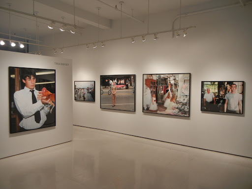
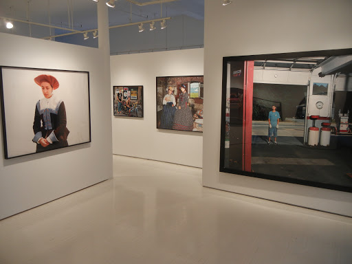
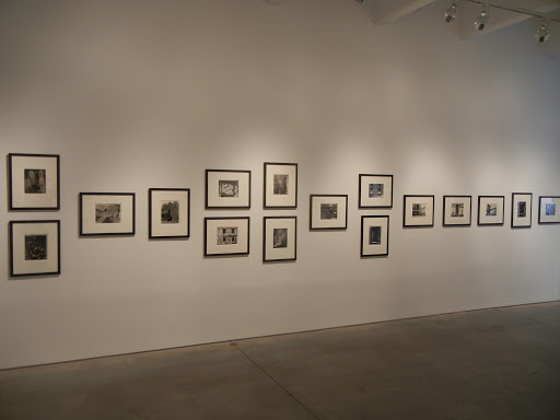
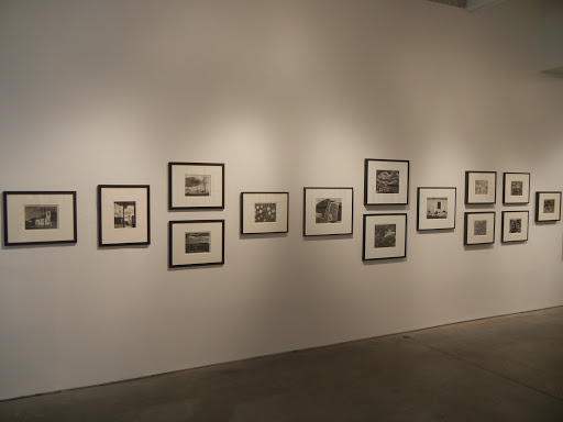
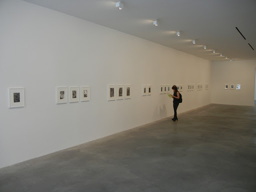
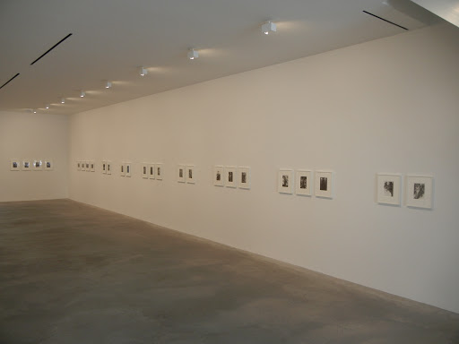
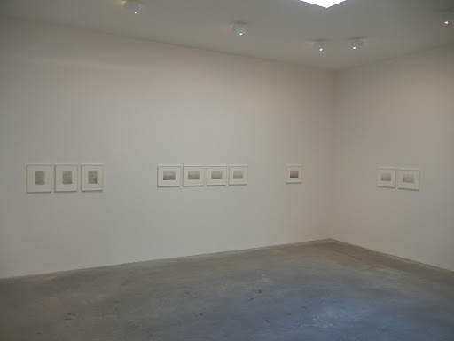
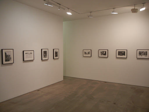
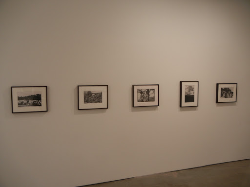
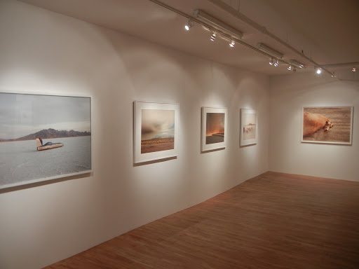
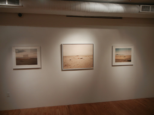
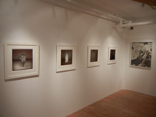
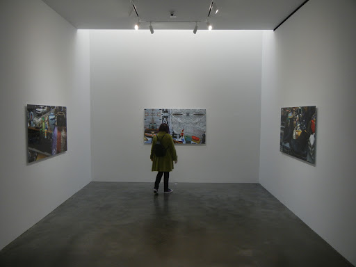
Merry Christmas from Lee Friedlander @Janet Borden

JTF (just the facts): A total of 48 black and white photographs, framed in dark grey and matted, and hung in the main gallery space. All of the prints are gelatin silver prints, printed 16×20 or reverse for both 35mm and square format images. The works were taken between 1963 and 2010, and the prints were made between 2003 and 2011. Friedlander does not edition his prints, so there are no edition sizes/numbers. (Installation shots at right.)

Comments/Context: Given how prolific Lee Friedlander has been over his long career, it isn’t particularly surprising that he can dig back into his archives and unearth groups of pictures that turn on a common theme. Just pick a visual motif, a geography, a time period, or a specific subject matter, sort out the 50 or so best or most representative, and voila, it’s the makings of another book. This show uses this approach to paint an offbeat portrait of the Christmas season, gathering pictures made over five decades into a sampler of Friedlander’s signature visual devices, each with a holiday twist.

While there is an entire review to be written here about rotting garlands, tired paper window decorations, insanely over-the-top front lawns, broken roadsigns, and snowless dirty holiday cheer, and about what Friedlander might be pointing out about our uniquely American Christmas celebrations (wryly cynical or understatedly optimistic?), I was actually struck more by Friedlander’s toolbox of photographic techniques than by his underlying commentary. Fresh from his Whitney show, there are Santas framed by rental car interiors and decorated with side mirror picture-in-picture reflections. Another set of photographs uses the empty beds of pickup trucks as a spatial device, adding angles and distance to decorations in windows and on middle distance house fronts. Telephone poles (complete with imitation greenery on top) make repeated appearances, dividing compositions. Storefront window displays enable multiple layers of refractions, mixing the staged scenes of the items for sale (look for the S&M Santa) with echoes of nearby street decor. Even chain link fence dividers and shadow self portraits are thrown in with oddly fashionable nativity scenes and West Texas holiday sidewalks.
Sure, there is something off kilter or quietly strange about each of these Christmas adornments; but there is more here than found tinsel, trashy blow-up lawn ornaments, wreaths on solar panels, and audaciously pedestrian baubles and gewgaws. These are extremely well made photographs that capture a tiny bit of Christmas spirit in the midst of making a much more complicated and mature artistic statement. Only Lee Friedlander takes a street scene covered in fuzzy faux trees, interrupts it with a telephone pole, and uses the pane of a phone booth to frame the people on the far corner, or uses skewed iron railings, front stoop stairs, and overflowing garbage cans to tell a chaotic visual story about Christmas in Brooklyn. Every single picture has visual pyrotechnics and hidden Christmas jokes to unpack, so take your time and savor these holiday eccentricities.

Collector’s POV: The prints in this show are priced at $8500 each. Friedlander’s work is routinely available in the secondary markets, with prices at auction ranging from approximately $2000 to as much as $80000 in recent years.

Rating: ** (two stars) VERY GOOD (rating system described here)

Transit Hub:

  • Reviews: WSJ (here), Time LightBox (here)

Merry Christmas from Lee Friedlander
Through December 31st

Janet Borden, Inc.
560 Broadway
New York, NY 10012

Richard Mosse, Infra @Shainman

JTF (just the facts): A total of 26 large scale color photographs, framed in grey and unmatted, and hung in the entry area, the large back divided gallery, and two smaller side rooms. All of the works are digital c-prints, made in 2010 or 2011. Each image is generally available in a small and large size; smaller sizes include 20×24, 28×35, and 40×50 (or reverse), all in editions of 5+1, and larger sizes include 48×60, 72×90, and 72×106 (or reverse), in editions of 2+1. A monograph of this body of work is being published by Aperture (here). (Installation shots at right.)

Comments/Context: Richard Mosse’s new images of the conflict in the eastern Congo push the definitional edges of photojournalism in both clever and confrontational ways. His photographs simultaneously operate on intertwined levels of documentary truth and artistic interpretation, mixing a reporter’s eye for the facts of the story and an artist’s eye for the mood.

Stripped of their color, Mosse’s pictures would seem similar to images of war and rebellion that we see everyday: charismatic rebel leaders in fatigues surrounded by rag tag bunches of soldiers, the fight slipping in and out of the jungle, ravaging the countryside and then disappearing like a wisp of smoke. But the challenge is to get beyond these semi-posed units, the makeshift camps, and the military marches through the undergrowth to capture the disorienting, emotional landscape of the shifting alliances, the wins and losses, the destructive impact on the local people and the land itself, and the general inexplicable gruesomeness of it all. Like Conrad’s The Heart of Darkness, Mosse’s body of work takes the real and makes it exaggerated and surreal.

What is so obviously different and shockingly new here is Mosse’ palette. Using discontinued Kodak Aerochrome infrared film, he has transformed dense pockets of jungle greenery and wide pastoral hillsides into a topsy-turvy Dr. Seuss world, where pink and red have become the dominant colors. River valleys, steep rock slides and undulating pastures are seemingly covered with bushes of cotton candy and hills of bubblegum. Soldiers wear pink berets and stand in towering undergrowth reminiscent of bright red Christmas pointsettas. The photographs are both joltingly wrong and quite beautiful, forcing the viewer to look again and again, trying to make sense of what is being presented. And this, of course, is the point; it’s impossible to go down the rabbit hole of the Congo and have the situation seem normal or comprehensible. Even simple grazing cows look alien and out of place.
.

While I admire the eye-popping, memorable distinctiveness of these images, I think Mosse’s expansion of his photojournalistic boundaries is even more important. He has used unexpected color reversal as a metaphorical device, a method for providing a sense of the place that goes beyond the visual details caught on film. While his war-time compositions may look familiar, the entire aesthetic experience is unsettling and perplexing, undermining our ability to derive answers or draw conclusions. The wild palette tells us that we have entered an alternate reality of some kind, and that things are not what they seem. In the end, this inversion seems both highly appropriate and durably original, and I am confident that these images will continue to stand out for many years to come, instantly recognizable as the uncertainty of rebel warfare, stunningly turned on its head.
.

Collector’s POV: The prints in this show are priced based on size. Here’s the breakdown: 20×24 – $5500, 28×35 – $6500, 40×50 – $9500, 48×60 – $16000, 72×90 – $20000, 72×106 – $25000. Mosse’s work is not readily available in the secondary markets, so gallery retail is really the only option for interested collectors at this point.
.
Rating: ** (two stars) VERY GOOD (rating system described here)
.
Transit Hub:
  • Artist site (here)
  • Interview: Conscientious (here)
  • Feature: Flavorwire (here)

Richard Mosse, Infra
Through December 23rd

513 West 20th Street
New York, NY 10011

Andreas Gursky @Gagosian

JTF (just the facts): A total of 13 large scale color works, framed in brown wood and unmatted, and hung in a pair of divided gallery spaces. There are 6 works from the Bangkok series in the left hand gallery. These are inkjet prints, each sized 121×89 or 121×93, printed in editions of 6, and made in 2011. There are 7 works from the Oceans series in the right hand gallery. These are c-prints, sized 134×98, 137×98, or 96×179 (or reverse), also printed in editions of 6, and made in 2010. A catalog is available from the Gagosian shop for $120 (here). No photography is allowed in the galleries, so the installation shots at right come from the Gagosian website.
.
Comments/Context: Since I have a significant amount of respect for the outstanding and innovative work of the German photographer Andreas Gursky, the easiest thing to do in this review would be to fall in line with the rest of the sycophantic, fawning critics and tell you that these new works are equally as astonishing and groundbreaking as many of his true and undeniable masterpieces. But the fact is, they are not. There, I’ve said it: the emperor (and he is undeniably the emperor of contemporary photography) has no clothes, at least at the moment.

Of the two new bodies of work on view in this show, the Oceans series has more to recommend it. Using satellite imagery, Gursky has stitched together omniscient view, weather-less composite images of the world’s oceans, large expanses of blue with fragments of more recognizable continents and land masses intruding on the edges. These works are printed at such a gargantuan scale that they envelop the viewer, drawing us into the depths of the wide seas. I like the conceptual inversion going on here, where Gursky is capturing the negative space of the globe, upending our education about what the continents are supposed to look like. If someone asked me “what is the shape of South America?”, I could immediately bring a decently accurate image to my mind’s eye; ask me “what is the shape of the Pacific Ocean?”, and I’d be a bit stumped. Gurksy’s photographs flatten out the roundness of the globe, tweaking the distortions for broadening effect; the oceans are huge, engulfing, and somehow new. That said, the major innovation here is the monumental scale; if these pictures were 20×24, we’d all say ho hum and think they were intriguing if forgettable scientific shots from National Geographic. And so while this explosion of size does change our perception of the content, the whole group comes off a bit flat for me (no pun intended), especially when seen as a series; perhaps staged as a single image dwarfing a low ceilinged room of other art, one of these Oceans might be a bit more powerful.

Gursky’s newest series of Bangkok water abstractions is, I’m very sorry to report, simply dreadful; the folks at Gagosian must have cringed when they saw that this was the work that would inaugurate their new representation relationship. The works are dark bodies of reflected water, where the refractions shatter into abstract fragments of light. More than a few have heavy-handed gestural references to the AbEx masters (Newman and Still are seen repeatedly), with zips and flames dancing through the blackness. These oil slick reflections are interrupted by small pieces of digital debris: clumps of greenery, plastic shampoo bottles, and other snippets of trash and pollution that float into the painterly abstractions, mixing a kind of real world truth into the swaths of energetic pigment. While I intellectually understand the conceptual dichotomy Gursky is going for (beauty and ugliness intertwined), the fact is that photographic reflections on water have been done endlessly; recently by artists like Jessica Backhaus (Venice canals), but also by every amateur photographer in the world (including myself). Once again, excessive scale is the only thing that changes the game here; not only are these pictures visually lifeless, they don’t tell us anything new. I expect much more from Gursky, and to say I was underwhelmed by these images is a significant understatement; mostly I was just bored.

On its visual merits alone, this show could have conceivably earned my first zero star review in the history of this site, which pains me severely given my love for Gursky’s previous work. That said, after much reflection, I think it jumps just barely to the one star category, mostly because I would recommend seeing this work to consider for yourself how one of our most shining stars could swing and miss so egregiously.

Collector’s POV: The prints from the Bangkok series are priced at 400000 Euros each, while the prints from the Oceans series are generally 450000 Euros, with the exception of the largest panoramic work which is 500000 Euros. Gursky’s works are routinely among the most expensive photographs available in the secondary markets, consistently fetching upwards of $1 million dollars at auction. His Rhein II recently broke the record for the most expensive photograph ever sold at auction, topping $4.3 million.

Rating: * (one star) GOOD (rating system described here)
.
Transit Hub:
  • Reviews: Artforum (here), New Yorker (here), New York (here)

Andreas Gursky
Through December 17th

Gagosian Gallery
522 West 21st Street
New York, NY 10011

Terry Richardson, Mom & Dad @Half

JTF (just the facts): A total of 51 color photographs, unframed and thumbtacked directly to the walls, and hung in the small, single room gallery space. The show checklist was very sparse on details, so there is no definitive information on printing process used or specific image dates. Physical dimensions range from 8×10 to 20×24, with most sized 11×14; all are available in editions of 5+2AP. A single video is also part of the installation, but no information was included on the checklist. The floor of the gallery is covered with loose prints, which have become crumpled and smashed by the foot traffic. A monograph of this body of work was recently published by Morel Books (here). (Installation shots at right.)

Comments/Context: I’m not sure whether Terry Richardson is better known for his ubiquitous fashion and celebrity photographs or for his infamously inappropriate behavior in taking some of those pictures. Either way, his most recent show asks the viewer to step beyond these overly obvious characterizations and to examine his photographs of his parents in the context of art.
.

The premise and organization of this exhibit is unpretentiously simple: take images of his two parents (who were separated early in his life), and intermix them on the walls, with images of his childhood (school portraits with bushy hair and the like) strewn across the floor. His flash-lit, snapshot aesthetic makes for pictures that seem casual and honest, with an immediacy that is sometimes too close for comfort. His mother is captured as an ecstatic free spirit, constantly laughing or mischievously smiling, smoking or giving the camera the finger in eccentric joy. His father tends toward more gloomy, downbeat moods, often staring directly into the camera, exposing his scarred wrists, or offering a posed but seemingly unadorned look into his soul. His all capitals marker scrawls all over the house and in notebooks range from the upsetting (HARD TO SWALLOW – FEEL LIKE I’M CHOKING) to the dreary (SHIT STILL IN TOILET) to the authentically poignant (I AM VERY PROUD TO BE YOUR DAD). All of the works combine wince-inducing harsh reality with a genuine, personal tenderness that ensures the pictures don’t drift into mockery.
.

I’m not sure that all of these pictures qualify as great or durable photographs or that many of them are particularly enjoyable to look at, but I give Richardson credit for exposing some raw truth in these images. There are a handful of shots in this bunch that sensitively document the complicated, emotional relationships between a parent and son, and do so with frankness, candor, and quiet affection. In the end, my guess is that these photographs will ultimately function best in book form, where deliberate sequencing will allow for a richer, intermingled family narrative whose power will stretch beyond any one individual image. These are tough, sometimes gritty pictures, that simultaneously drive you to look away, but pull you back in with their unsightly, unadorned closeness.
.

Collector’s POV: The works in the show are priced between $2500 and $5000, based on size. Richardson’s photographs have been intermittently available in the secondary markets in recent years, with prices ranging from $1000 to $16000. That said, given the small number of lots that have come up for sale at auction, gallery retail is still likely the best option for collectors interested in following up.

Rating: * (one star) GOOD (rating system described here)

Transit Hub:
  • Artist blog (here)
  • Opening night shots (here)

Terry Richardson, Mom & Dad
Through December 4th

Half Gallery
208 Forsyth Street
New York, NY 10002

Erwin Blumenfeld: Vintage Fashion @Houk

JTF (just the facts): A total of 30 black and white photographs, framed in black and matted, and hung in the main gallery space. All of the works are vintage gelatin silver enlargement prints, made between 1937 and 1962. Physical dimensions range between 12×8 and 20×16 (or reverse). A wall of Blumenfeld’s Vogue covers is on display in the entry area. (Installation shots at right.)
 
Comments/Context: Erwin Blumenfeld’s fashion photography takes many of the visual motifs from Surrealism and Dada and mixes them together with stylish glamour in a manner driven by risk-taking experimentation. While his covers and spreads are full of the usual array of striking models in elegant designer clothing, it is his use of unexpected and unorthodox methods and manipulations that makes his images durably exciting.

This show is a parade of staged devices and darkroom machinations: multiple exposures layered and composited, mirrors used to multiply sitters, transparent screens used to veil bisected models, sideways and overhead camera angles, shadows and light in linear forms, and prints made extra graphic and contrasty. His ravishing silhouettes alternate between black and white like dancers in a line, and pure faces peer at each other or echo like matched twins, swaddled in folds of silk and loose jewels. Moments of classicism are simultaneously enhanced and undercut by Blumenfeld’s twists on the usual; even the cliched cross hatched bars of the Eiffel Tower become fresh when paired with the billowy plaid patterns of a long dress blowing in the wind.

All of these images have the sense of the unconventional, of taking the agreed upon fashion formula and changing it up, pushing the edges of what the audience will find acceptable. The works also provide evidence for the beginning of an advertising-driven attention deficit (even in the 1940s and 1950s), of images that are trying hard to grab the viewer with something visually new, reacting against the noise in the background. As such, Blumenfeld’s many striking innovations provide a bridge between the graceful beginnings of fashion photography and the explosion of extreme aesthetics that we now take for granted.

Collector’s POV: The works in the show are priced between $22000 and $40000, with one print marked POR. Blumenfeld’s photographs are often available in the secondary markets, with recent prices at auction ranging from $2000 to $58000.

Rating: * (one star) GOOD (rating system described here)

Transit Hub:

  • Features: Trendland (here), T Magazine (here)

Erwin Blumenfeld: Vintage Fashion
Through January 7th

Edwynn Houk Gallery
745 Fifth Avenue
New York, NY 10151

Photographic Treasures from the Collection of Alfred Stieglitz @Met

JTF (just the facts): A group show consisting of 47 photographic works from 35 different photographers, generally framed in black and matted, and hung spotlit against dark blue walls in a series of three small connecting rooms on the second floor of the museum. The prints were made between 1890 and 1912, using a variety of processes, including gum bichromate, carbon, platinum, and photogravure. (Installation shots at right.)

The following photographers have been included in the exhibit, with the number of images on view and their dates in parentheses:

James Craig Annan (2, 1890-1893)
Anne Brigman (2, 1905-1908)
Alvin Langdon Coburn (5, 1902-1908)
F. Holland Day (6 plus 1 group of 7, 1896-1899)
Baron Adolf De Meyer (3, 1906-1912)
Frank Eugene (2, 1898-1907)
Frederick Evans (1, 1909)
Gertrude Käsebier (4, 1899-1910)
Joseph Keiley (1, 1898)
Heinrich Kühn (2, 1908-1909)
George Seely (2, 1904-1906)
Edward Steichen (8, 1901-1906)
Pierre Troubetzkoy (1, 1904)
Clarence White (6, 1898-1906)
Clarence White/Alfred Stieglitz (2, 1907)

This exhibit is a companion show for the larger Stieglitz and His Artists: Matisse to O’Keeffe exhibit, on view through January 2nd (here). The photographs included in this broader show are mostly portraits of Stieglitz or other artists with work on view. Details on the photographers and photographs included follow below (not including the large photographic images laminated to the walls):

Alvin Langdon Coburn (2, 1903-1907)
Frank Eugene (1, 1907)
Heinrich Kühn (1, 1904)
Edward Steichen (7, 1901-1915)
Alfred Stieglitz (13, 1893-1933)
Paul Strand (1, 1929)

Comments/Context: It’s probably hard to underestimate the influence of Alfred Stieglitz on fine art photography of the early 1900s. As both an artist and gallery owner, he made choices and supported aesthetic ideas that set the standard for the medium, almost single handedly pushing tastes toward (and then away from) what is now known as Pictorialism. The show is strong reflection of what Stieglitz valued, showed, bought, saved, and ultimately donated; both before and after his death, he made important gifts of key photographic prints to the Met, forming the foundation of the museum’s outstanding photography collection.

The works on display here were drawn entirely from Stieglitz’ personal collection, and together they provide a one-stop master class in Pictorialism, covering the major technical processes/innovations and including gems from virtually all of the important figures of the period. There are portraits and nudes, allegories and religious subjects, classical maidens and dreamlike children, all executed with a meticulous, tactile craftsmanship and a reverence for expressive emotion. De Meyer’s The Shadows on the Wall – Chrysanthemums from 1906 turns simple blossoms in a vase into a soft-focus silhouette, clearly influenced by the asymmetry of Japanese wood block prints and reminiscent of amorphous jellyfish in a shadowy sea. Clarence White’s Morning – The Bathroom from 1906 shows a woman in a bathtub, wearing a flowy, transparent gown and bathed in the delicate, tranquil light streaming in through the window. And Edward Steichen’s Cyclamen – Mrs. Philip Lydig from 1905 pairs an evocative society portrait (with a steely-eyed stare) with wispy strands of almost abstract flowers that jut out across the picture plane.

Given that this kind of work quickly went out of favor with the arrival of straight photography, the exhibit has a kind of time capsule feeling, where we marvel at unearthed items that now seem woefully dated. But while it might be easy to be dismissive of these photographs, there is a consistency of expert skill on view here that is hard to overlook. We may have moved on from the overly evocative, painterly impressionism that these turn of the century photographers found exciting, but even a century later, the mastery of their craft as evidenced by these images is no less impressive.

Collector’s POV: Given this is a museum show, there are obviously no posted prices for the works on display.
Rating: * (one star) GOOD (rating system described here)

Transit Hub:

  • Reviews: NY Times (here), NY Photo Review (here), Bullett Media (here)

Photographic Treasures from the Collection of Alfred Stieglitz
Through February 26th

Metropolitan Museum of Art
1000 Fifth Avenue
New York, NY 10028

Edward Burtynsky @Howard Greenberg

JTF (just the facts): A total of 13 large scale color photographs, framed in black and not matted, and hung in the entry area and the main gallery space. All of the works are chromogenic color prints, in one of four sizes: 24×28 (in editions of 15), 34×41 (in editions of 10), 39×52 (in editions of 9) or 48×60/48×64 (in editions of 6). The images were taken between 1985 and 2010. A second group of 8 works from Burtynsky’s Pentimento portfolio are displayed in the book alcove, also framed in black and not matted. All of these works are chromogenic color prints, each 20×24, from a portfolio containing 10 prints, in an edition of 30. These images were taken in 2000. A concurrent show of Burtynsky’s newest work is on view at Bryce Wolkowitz Gallery (here). (Installation shots at right.)

Comments/Context: This is Edward Burtynsky’s first show at Howard Greenberg Gallery since changing gallery representation, and while Burtynsky’s most recent works adorn the large Chelsea walls of partner Bryce Wolkowitz Gallery (review linked below), the Greenberg show is a mini-retrospective of sorts, offering a sampler from the Canadian photographer’s entire career, displayed in smaller, more intimate print sizes. Perhaps another way to think about this show is that it provides a succinct introduction to Burtynsky for the vast Greenberg collector database, many of whom might be more accustomed to vintage work.

The selections on view and their sequencing provide a summary view of Burtynsky’s fascination with the scale of industrial sites and their upstream and downstream impacts. There are immense Chinese factories, flanked by cargo containers and endless apartment complexes, quarries and mines near railway infrastructure cut directly through steep rocky mountainsides, and oil wells responding to staggering piles of discarded tires and concrete ribbons of intersecting freeway. New aerial images from the oil spill in the Gulf of Mexico track greasy brown and black oil slicks as they creep across pure expanses of blue and green. And the book alcove contains images from Burtynsky’s series on tidal shipbreaking in Bangladesh; the prints are executed in contrasty black and white with rough edges and chance drips, connecting the steel carcasses and towering hull silhouettes to 19th century industrial photography.

Seeing these prints in the smaller sizes, I was reminded of just how powerful many of Burtynsky’s works are when printed at more monumental scale; some of the staggering destructive scale of these places is somewhat lost when seen more up close. That said, I think this show does a respectable job of providing a taste of Burtynsky’s visual ideas, thoughtfully packaged to fit the constraints of the available wall space and the expectations of the audience.
.

Collector’s POV: The prices for the works in this show are as follows: the 24×28 prints are $6200, the 34×41 prints are $10000, 39×52 prints are $16500, the 48×64 prints are $24000. Burtynsky’s photographs have slowly become more available in the secondary markets over the past few years, with prices at auction ranging between roughly $5000 and $48000.

Rating: * (one star) GOOD (rating system described here)

Transit Hub:
  • Artist site (here)
  • DLK COLLECTION review of concurrent Wolkowitz show (here)

Edward Burtynsky
Through December 10th

Howard Greenberg Gallery
41 East 57th Street
New York, NY 10022

Nan Goldin: Scopophilia @Marks

JTF (just the facts): A total of 47 photographs, framed in black without mats, and hung against white, grey and yellow walls in four interconnected gallery spaces, with 1 video projection, shown in a darkened viewing room. All of the works are chromogenic prints, made between 1993 and 2011, displayed as single images, diptychs, or grids of up to 16 component images. Physical dimensions range from 20×15 to 45×67; the grids and diptychs are available in editions of 3, while the single images are available in editions of 15. The 25-minute video projection, which mimics the behavior of a slide show, is available in an edition of 5, and contains images from 1977-2010. (Installation shots at right.)

Comments/Context: It takes a certain amount of confidence to pair a life’s worth of intimate photographs with the treasures of one of the world’s great art museums; if the work can’t hold its own, the entire enterprise has the potential to look like a shockingly self-centered and arrogant stunt. Nan Goldin’s mixing of art history, life and “the love of looking” (using examples from the Louvre) walks this dangerous, thin line, but actually finds a way to tell us something unexpectedly new, not about the paintings and sculptures found in the Paris museum, but about the timeless gestures captured via Goldin’s snapshot aesthetic; she uses the images from the museum to successfully reinterpret her own personal and artistic history.

The video installation is the real centerpiece of this show, with the still photographs on display in the rest of the gallery acting like a supporting apparatus, repeating themes that run through the video in a more rigid and fixed medium. The slide show format (one image projected after another in serial fashion), complete with sparse commentary by Goldin and soaring choral voices, lends itself to rhythmic timing, leading the viewer back and forth between Goldin’s photographs and fragments of the museum’s collection with a natural pace that allows for stylistic comparison and thoughtful echoes. While I have long admired the rough, vulnerable realism and lush color in her photographs, the video forced me to get beyond those more obvious merits and see the underlying structure of Goldin’s compositions more clearly, something I had heretofore completely overlooked. Pairings of like poses wash away the blunt harshness of Goldin’s life stories, leaving behind the tenderness and grace of her portraits and human forms. Translucent skin is followed by luscious white marble, kisses rebound between iconic paintings and stolen moments, long hair cascades over and over, and nudes (both female and male) jump from casual to formal and back again. Her choices from the Louvre are steeped in the “mythology of romance”, making her own photographs of private desire and elemental longing seem more universal and timeless, even though they clearly come from a very specific time and place. The gritty destructiveness that lays within many of Goldin’s photographs is trumped here by the honest truth of sensual bodies and eternal relationships.

After watching the video, the still photographs seem a little less engaging, although the simpler diptychs of paired naps and embraces are more successful than the larger grids of odalisques, backs, and water drenched bodies; I think when the gestures get multiplied out into typologies, the “see they match” message gets more heavy handed, almost too obvious. The rounded room in the back pairs frontal portraits, capturing commonalities of expression across the ages; penetrating stares and authentic looks haven’t changed much over the centuries, even if roles and classes certainly have.

The reason this show merits my highest rating is that it forced me to reappraise Goldin’s photography, to see beyond the edgy bedroom scenes and the candidly intense situations and to discover the classic lines of her work. It was a way of approaching her pictures that I had never tried (it had never even occurred to me), and I was astounded by the controlled power and refinement in her compositions once I went looking for it. After seeing these juxtapositions, my impression of her many talents has been permanently altered. One might argue this is an “old wine in a new bottle” show, but there are moments of sublime finesse and subtle poetry to be found here (particularly in the video) and the chance to fundamentally transform your opinion of one of the masters of the medium doesn’t come along very often.

Collector’s POV: The prices for the works in this show are as follows: the grids and diptychs are priced between $20000 and $60000, while the single images range between $6000 and $15000; I did not get a price for the video installation. Goldin’s work is routinely available in the secondary markets, with dozens of images available at auction every year; recent prices have generally ranged between $2000 and $34000.

Rating: *** (three stars) EXCELLENT (rating system described here)

Transit Hub:

  • Features/Reviews: Hyperallergic (here), Huffington Post (here),  NY Times Lens (here)

Nan Goldin: Scopophilia
Through December 23rd

Matthew Marks Gallery
522 West 22nd Street
New York, NY 10011

Jessica Eaton, Cubes for Albers and LeWitt @Higher Pictures

JTF (just the facts): A total of 11 color photographs, framed in black and unmatted, and hung in the small single room gallery space and the adjacent viewing alcove. All of the works are archival pigment prints, made in 2010 or 2011. The images have been printed in one of two sizes: 40×32 (in editions of 3) or 20×16 (in editions of 5); there are 5 in the large size and 6 in the small size on view. (Installation shots at right.)

Comments/Context: Jessica Eaton’s layered, experimental geometries and additive color studies delve into the deep artistic traditions of the elemental cube and square, using complex photographic techniques to echo and reinterpret visual motifs from the masters of minimalist/abstract painting and sculpture. Her works reconsider nested Albers squares and stacked LeWitt cubes using the tools of multiple exposure photography, generating compositions with new degrees of aesthetic freedom.

Using simple painted cubes of different sizes and an array of primary colored filters, Eaton is able to mix and match to create interlocking planes and transparent stratifications, pushing from obvious recreations and homages to more chaotic sets of angles and colors. The best of the images explore theoretical boundaries, where three dimensionality and flatness intersect in unexpected ways, sometimes producing a blurred optical buzzing that shimmers and shifts.

While Ion Zupcu has explored some of the same visual territory (albeit in a monochrome palette), I think Eaton’s successes are found her ability to extend the abstractions beyond a simple series of cubes, to let the ghosted forms intermingle and unravel a bit, and where the color theory gets more complicated and contradictory. While there is certainly technical mastery evident in her photographic recreation of an Albers, I was most excited to see Eaton’s original point of view come through more clearly in the highly splintered and deconstructed forms.

Collector’s POV: The prints in this show have ratcheting prices, based on the place in the edition. The 40×32 prints range from $3500 to $5500, while the 20×16 prints range from $2500 to $3500. Eaton’s work has not yet made it to the secondary markets in any meaningful manner, so gallery retail is likely the only option for interested collectors at this point.

Rating: * (one star) GOOD (rating system described here)

Transit Hub:

  • Artist tumblr (here)

Jessica Eaton, Cubes for Albers and LeWitt
Through December 17th

Higher Pictures
764 Madison Avenue
New York, NY 10065

Hiroshi Sugimoto: Lake Superior @Pace/MacGill

JTF (just the facts): A total of 12 black and white photographs, framed in black wood and matted, and hung against grey and dark grey colored walls in the main rooms of the gallery. All of the photographs are gelatin silver prints mounted to board, made in either 1995 or 2003. Each mounted image is 20×24; no edition information was available. There is no photography allowed in the gallery, so the installation shots at right are via the Pace/MacGill website.

Comments/Context: Hiroshi Sugimoto’s photographic seascapes have become so iconic that at this point, I’m ashamed to say that I think I take them a bit for granted. This isn’t to say that I adore or admire them any less, it’s just that my brain uses some kind of mental shorthand that assumes I’ve already absorbed most of what they have to offer, and thereby often skips over them in search of something else. In the past few years, Sugimoto’s seascapes have been shown at monumental scale in New York gallery shows, and at that size, their largeness becomes enveloping and almost spiritual. In contrast, this show gathers together images taken of Lake Superior and displays them in the smaller size, forcing the viewer into an entirely different and much more intimate, one-on-one interaction.

The sequencing of this show is important to notice, as there is a careful progression along a spectrum of color and mood. The first image the visitor encounters when coming out of the elevators is an almost pure white on white picture (the best in the show, in my opinion), which is then followed around the wall by whites that become more foggy and unstable, and waves and undulations that become more noticeable. As the viewer passes into the adjoining room, the bisected images become more contrasty, the water darker, sometimes grey and soft, sometimes smooth, sometimes crisp and almost sharp against the featureless sky, ending with a single night seascape with its tonalities of light and dark reversed. Seen together at this size, the changing weather conditions generate forward motion through the gallery, and the subtle gradation enables a meditative flow of muted emotion.
.
Sugimoto’s seascapes are a tremendous reminder of the power of pared down, photographic simplicity. His views of the water offer endless variations, combining both a cerebral quality of conceptual thinking and a deeply human sense of timeless, elemental purity. Even if you’re sure you’ve seen them before, they undeniably merit a second (or third, or fourth) look.
.

Collector’s POV: The photographs in this show are priced at $35000 each. Sugimoto’s work is routinely available in the secondary markets, in various sizes and at various price points. Images of equivalent size (20×24) as those on display here (seascapes, as well as other subjects/projects) have generally been available at auction at prices ranging between $10000 and $90000.
Rating: ** (two stars) VERY GOOD (rating system described here)
Transit Hub:
  • Artist site (here)

Hiroshi Sugimoto: Lake Superior
Through December 3rd

Pace/MacGill Gallery
32 East 57th Street
New York, NY 10022

Simon Norfolk: Burke + Norfolk @Benrubi

JTF (just the facts): A total of 14 color photographs, hung in the tight entry hallway and the main gallery space. 7 of the works are archival pigment ink prints, framed in black and matted, each 20×24, in editions of 7+2AP. The other 7 works are also archival pigment ink prints, but framed in black and unmatted, each 40×53, also in editions of 7+2AP. All of the images were taken in Afghanistan in 2010. A monograph of this body of work entitled Burke + Norfolk, Photographs from the War in Afghanistan by John Burke and Simon Norfolk was published by Dewi Lewis in 2011 (here); it is available from the gallery for $80. (Installation shots at right.)

Comments/Context: Simon Norfolk’s recent photographs of contemporary Afghanistan remind us that while the daily news might give us momentary examples of both apparent progress and discouraging set backs, there is a repetitive timelessness to the struggle that stretches back centuries. Using John Burke’s 19th century photographs of the Second Anglo-Afghan War (1878-1880) as a source of inspiration and dialogue, Norfolk has responded with two sets of images that document the situation on the ground in complementary ways.
.

The first group of pictures reference the traditions and expectations of 19th century group portraiture, with rows of assembled peoples arranged and photographed with rigid stone-faced formality. While the subjects are locked in an ageless sepia-toned patina, there is evidence of change and modernization hiding within the dated visual vocabulary: a head-scarfed women’s basketball team, young girls at an indoor skate park, the staff from a new Afghan airline, a group of high tech mine sweepers, and American marines paired with Afghan police trainees. Mixed in with shots of traditional musicians and Taliban sympathizers in dark robes, Norfolk highlights the contrasts of new and old, grounding his observed changes in the slow evolution of the society as a whole.

The second group of works are large scale color cityscapes, often taken in the light of the early morning or the twilit evening when the sky is misty and purple. These images explore the two sides of simultaneous modernization and war-torn destruction: a homeless family standing in the hazy, crumbled ruins of the old Presidential Palace, an optimistic pizza restaurant flanked by a massive pile of rusting bus carcasses, red bags of fresh apples piled amidst the frenetic motion of the traffic, and clumps of bamboo construction poles and ladders echoed by the surveillance towers on the dusty hills in the background. Norfolk’s photographs capture the essence of the everyday struggle of the locals, where the details of the Western occupation coexist with the remnants of the endlessly beaten down city.

While there are no actual prints by Burke in this show for handy side by side comparison, the mix of ideas between the two seems to have been an effective way for Norfolk to catalyze new visual approaches to the subject matter. Both sets of new images feel very rooted in and mindful of the past, where if we look carefully, the events of today are an updated repetition of those from long ago.
.
Collector’s POV: The prints in this show are priced as follows: the 20×24 prints are £2500 and the 40×53 prints are £6000 (note the prices are in British pounds). Norfolk’s work has begun to slowly enter the secondary markets in recent years, with prices at auction ranging between roughly $6000 and $26000.

Rating: * (one star) GOOD (rating system described here)

Transit Hub:
  • Artist page (here)
  • Reviews: New Yorker (here), LA Times (here)
  • Features: Wayne Ford (here), Guardian (here)
  • Exhibit: Tate Modern (here)

Simon Norfolk: Burke + Norfolk
Through December 3rd

Bonni Benrubi Gallery
41 East 57th Street
New York, NY 10022

Sharon Core: 1606-1907 @Yancey Richardson

JTF (just the facts): A total of 12 color photographs, framed in white and unmatted, and hung in the main gallery space. All of the prints are archival pigment prints, available in editions of 7, made in 2011. Physical dimensions range from 18×15 to 30×23 (or reverse). (Installation shots at right.)

Comments/Context: Sharon Core’s brand of image appropriation is wholly different than a commonplace cut and paste or an easy lift and recontextualize. In previous works, her meticulous process has included baking cakes and pies, growing vegetables, and scouring flea markets in search of period ceramics and tableware, all in the name of painstakingly recreating paintings via photography, with an eye for exacting detail.

In her newest works, Core has immersed herself in the genre of the floral still life, exploring the subtleties of how explosions of riotous color and delicate bouquets have been captured across three centuries of artistic activity. In each case, from an Dutch master from the early 1600s or a Modernist arrangement from the early 1900s, she has faithfully documented the conventions and idiosyncrasies of how flowers were presented, cultivating her own blossoms in her greenhouse to ensure period authenticity. Her images display a kind of technical accuracy that is thoroughly impressive, where backdrops, tabletop accessories (like shells and insects), and even the angle and strength of the light are controlled with precise perfection. Tulips, peonies, roses, and dozens of other varieties have never looked so good.

While there is a certain awe inspiring wonder that comes from standing in front of these fastidious pictures, even though we are flower collectors, I was surprisingly less than moved by the conceptual inversion being explored. I can imagine one of these pictures hanging in a collector’s home, and having that person trick visitors with the image, gleefully explaining that it’s not a painting but a photograph, and everyone nodding their heads in respectful, smiling amazement, putting their faces right up close to inspect the details. Or it seems likely that a museum might hang one directly next to a period painting to show the similarities and differences (see the link below). Either way, this of course dives directly into the idea of what truth means in photography, and into the evolution of approaches to “natural” picture making across various time periods. But somehow, while I was obviously struck by the technical mastery of these photographs, they made less of an overall impression than I was expecting. When the “gee whiz” factor wears off, we’re still looking at beautiful floral compositions we’ve seen before (albeit in a different medium); I realize that this is the point, but if I tell the truth, while these are pictures I should love, they somehow left me with a sense of being slightly underwhelmed.

Collector’s POV: The works in this show are priced between $7000 and $9500, based on size. Core’s work has slowly begun to enter the secondary markets in recent years, with prices at auction ranging between $8000 and $81000. The images from her series of Thiebaud cake recreations have been routinely at the top end of that range.

Rating: * (one star) GOOD (rating system described here)

Transit Hub:

  • Feature: Minneapolis Institute of Arts blog (here)

Sharon Core: 1606-1907
Through December 23rd

Yancey Richardson Gallery
535 West 22nd Street
New York, NY 10011

Sign up for our weekly email newsletter

This field is required.