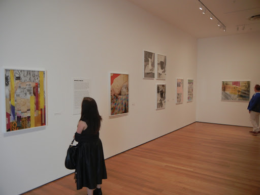
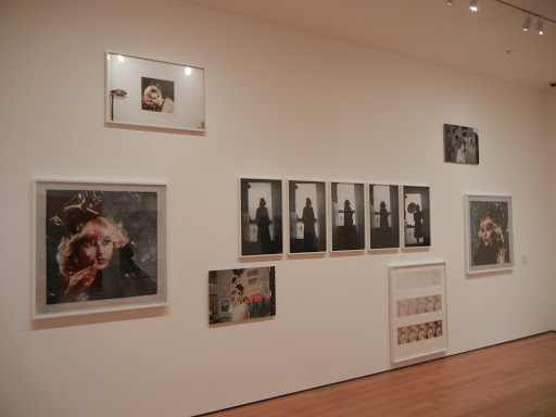
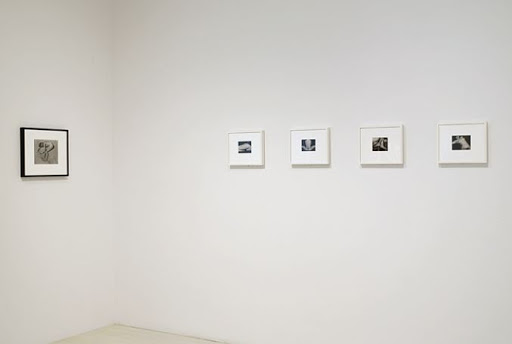
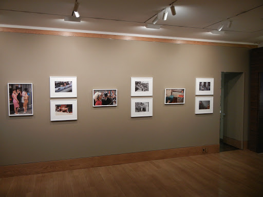
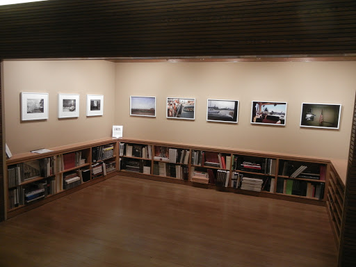
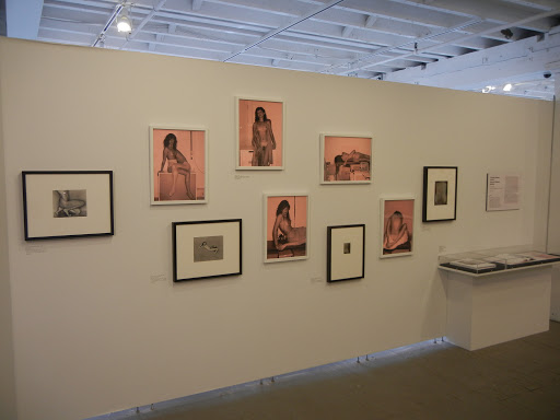
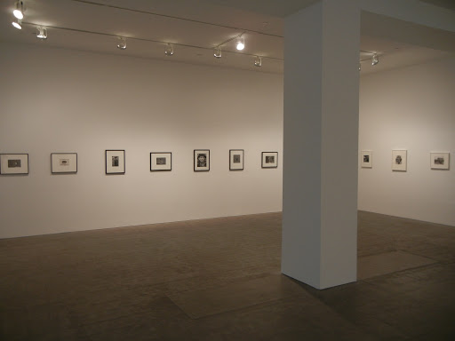
 JTF (just the facts): A total of 74 black and white photographs, framed in white/black and matted, and hung against white and grey walls in the large two room gallery space. The 56 prints by Lee Friedlander are all modern gelatin silver prints, taken between 1977 and 1991. The works are sized either 11×14 or 16×20 and are uneditioned. The 9 works by Bill Brandt are vintage gelatin silver prints, each sized roughly 9×8, and taken between 1947 and 1959. The 9 works by Edward Weston are vintage gelatin silver prints, sized either 4×5 or 8×10, and taken between 1933 and 1936. (Installation shots at right. There is no photography allowed in the gallery, so the images are courtesy of the Pace/MacGill website.)
 Comments/Context: For many years after first seeing Lee Friedlander’s nudes, I had a hard time enjoying them. As I look back now, I’m not sure I ever really even saw them in some sense. They were just too hairy, too confrontationally real in a way that I found unsettling, and as a result, I didn’t engage them enough. It wasn’t that they were excessively aggressive or explicit exactly, but more that they seemed to fly in the face of everything I thought I knew (and valued) about the elegant photographic nude. That joltingly contrarian book (Lee Friedlander Nudes) sitting on our shelves was somehow radioactive, bursting with an energy that was too far out of control for me. I would take it down and look at it from time to time with the trepidation of handling a ticking time bomb, quickly flipping through it and putting it back before it could explode.
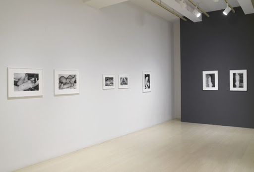 This show brings together a selection of these challenging Friedlander nudes and places them on equal footing with works by the two most important and influential photographers of the nude from the 20th century, Edward Weston and Bill Brandt. A side room plays host to this brilliant juxtaposition, teasing out the visual ideas and motifs that tie Friedlander to his predecessors. Weston’s nudes turn on close in framing to create unexpected body abstractions and employ plenty of elongated lounging forms (on the famous sand) built on sinuous lines. Brandt’s early pictures use shadowy interiors to host mysterious models in chairs, while later images create their magic with the bold, fragmented distortion of curves and overexposed whites. With these two sets of images as a historical backdrop and artistic foil, it’s possible to carefully follow the aesthetic connections and pathways between the photographers and to pinpoint Friedlander’s new and original innovations.
 While the often disorienting twisting and turning of bodies in Friedlander’s nudes certainly has parallels in both Weston and Brandt, Friedlander’s approach is neither sculpted perfection nor full force abstraction. His pictures are rooted in the mundane and the everyday, in real individuals rather than dreamy ideals. Young bodies sprawl on couches and chairs with effortless ease, spread across messy beds and bent over crumpled blankets, not far from cluttered coffee tables filled with cosmetics and ashtrays. The camera spins and looms, often lingering from above or cropping out the head. His flash creates brash highlights that bounce off up-close hips, breasts and flanks, with dark hairy armpits and crotches offset by the dated patterns of woven upholstery and fringed pillows. Just when you’ve been distracted by the intrusion of a clip-on lamp, the interruption of a protruding window frame, or the swirl of a floral patterned bedsheet, Friedlander delivers an unexpectedly graceful curve or arched arm that takes your breath away; his nudes move back and forth between direct, honest, small apartment realism and compositionally complex formal exercises. In every picture, the casual and ordinary have been transformed into something striking, a jumble of overlapping female limbs, crowded and serenely chaotic rather than merely pared down.
What’s most important about this exhibit is how it so successfully shows both Friedlander’s respect for the past and his own one-of-a-kind rule breaking vision. There are obvious echoes of Weston and Brandt here, but those influences have been thoroughly digested, incorporated by Friedlander and then evolved in his own direction for several more iterative generations. The result is a body of work that is at once familiar and foreign, reverent and shockingly irreverent. All in, this is a show worth making a detour for. It finally led me to get over my own preconceived notions and prejudices about what the photographic nude is supposed to be, and to embrace Friedlander’s nudes for the genius that they are.
 Collector’s POV: The prints in this show are generally priced based on size, with the 11×14 prints at $6800 each and the 16×20 prints at $8500 each. Outliers from this overall price pattern include the 11×14 image from the cover of the original Lee Friedlander Nudes book (at $7400) and the 16×20 images of Madonna (at $9500). Friedlander’s work is routinely available in the secondary markets, with recent prices at auction ranging from roughly $2000 on the low end to as much as $80000 for his most iconic vintage prints. The Brandts (from David Dechman’s collection) and Westons (from MoMA) are not for sale.
Rating: *** (three stars) EXCELLENT (rating system described here)
Transit Hub:
Lee Friedlander: Nudes
Through December 22nd
Pace Gallery
32 East 57th Street
New York, NY 10022
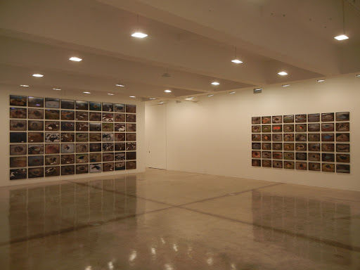


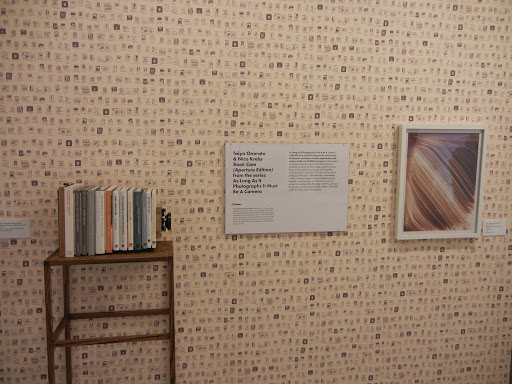


 JTF (just the facts): A total of 30 black and white photographs, framed in white and matted, and hung against white walls in the front and back gallery spaces. All of the works are gelatin silver prints, made between 2005 and 2009. Each of the prints is sized 8×10 and is available in an edition of 6. The exhibit also includes two glass cases containing notebooks and maquettes, and a pair of large darkroom bulletin boards covered edge to edge in ephemera. A monograph of this body of work was recently published by Phaidon (
 Many of Lyon’s images capture the rough, griminess of people-intensive industrial work: coal miners in a communal bath, railway workers swinging pickaxes and laying track, grubby mechanics fixing broken vehicles, and truck drivers lingering waiting for the next load. The rocky roads are bumpy and cracked, the leftover coal must be hand gleaned from the track side, and smokestacks loom in the distance. Circus performers and opera singers provide animated distractions from the exhaustion and tedium, but most folks seem to opt for simpler pleasures: playing cards, chatting and/or smoking in a tea house, flying a kite. The economic boom of the cities has obviously failed to reach this area; dusty antiques, magazines in plastic bags, and fireworks are all that is for sale.
 Collector’s POV: Each of the prints in this show is priced at $6000. Lyon’s work is consistently available in the secondary markets, with recent single image prices at auction ranging between $1000 and $15000.

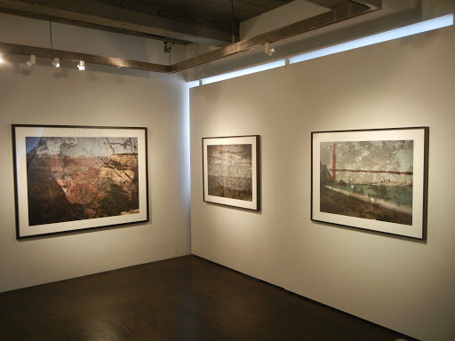

 Collector’s POV: The prints in this show are priced as follows. The color works are $11000 each (24×30), $17000 each (30×40) or $24000 each (50×60); the black and white works are $5000 each (24×30), $9000 each (30×40) or $16000 each (50×60). Morell’s work has become more consistently available in the secondary markets in recent years, with prices at auction ranging between $2000 and $17000.