JTF (just the facts): A group show consisting of roughly 212 photographic works made by 126 different photographers, variously framed and matted, and hung (or displayed in cases) in a series of five connecting rooms on the museum’s second floor. The works span the period from 1846 to 1993. The exhibit was curated by Mia Fineman, and a catalog of the exhibit has been published by the museum (here). Unfortunately, no photography was allowed inside the exhibit and the Met press office was unable to provide any installation shots, so there are no installation images for this show.
The exhibit is divided into sections with the following titles:
Picture Perfect
Artifice In the Name of Art
Politics and Persuasion
Novelties and Amusements
Pictures in Print
Mind’s Eye
Protoshop
The following photographers/artists have been included in the exhibit, with the number of images on view and details in parentheses:
Exterior Walls
William Henry Jackson (1 gelatin silver print with applied media, 1913)
John Paul Pennebaker (1 gelatin silver print, 1933)
Grete Stern (1 gelatin silver print, 1949)
Carleton Watkins (2 albumen prints, 1867)
Unidentified (1 salter paper print, 1865)
Unidentified (1 gelatin silver print with applied color, 1915)
Unidentified (1 gelatin silver print, 1920)
Unidentified (1 gelatin silver print, 1930)
Unidentified (2 gelatin silver prints, 1956-1957)
Room 1
Owen Angel (1 album in case, 2 albumen prints displayed, 1880)
James William Bailey (9 albumen prints, 1880s)
Edouard Baldus (2 salted paper prints, 1851, 1855, 1 waxed paper negative, 1851)
Matthew Brady/George Barnard (1 albumen print, 1865)
Andre Adolphe Eugene Disderi (1 albumen print, 1866)
Levin Corbin Handy (1 gelatin silver print, 1902)
William Henry Jackson (3 albumen prints, 1881, 1906)
Robert Johnson (in case, 2 books, 1913, 1930)
Calvert Richard Jones (1 paper negative and 1 salted paper print, 1846)
Gustave Le Gray (3 albumen prints, 1856-1857)
John Murray (1 waxed paper negative with applied media and 1 albumen print, 1862-1864)
Charles Negre (1 salted paper print, 1850s)
William Notman (4 albumen prints, 1877, 1880, 1881, 1888)
Paolo Salviati (1 albumen print with applied color, 1880s)
Albert Sands Southworth (1 daguerreotype with applied color, 1850)
Albert Sands Southworth/Josiah Johnson Hawes (1 daguerreotype, 1850s)
Raimund von Stillfried/Kusakabe Kimbei (1 albumen print with applied color, 1870s)
Unidentified (in case, 1 ambrotype with applied color, 1860)
Unidentified (2 albumen prints, 1861-1865)
Unidentified (1 albumen print with applied color, 1870)
Robert H. Vance (in case, 1 ambrotype with applied color, 1855)
J.I. Williamson (1 salted paper print with applied color, 1882)
George Washington Wilson (1 albumen print, 1857)
Room 2
Ernest Eugene Appert (4 albumen prints, 1871)
Dimitry Baltermans (1 gelatin silver print, 1942)
Arthur Batut (5 albumen prints, 1885-1887)
Anne W. Brigman (1 gelatin silver print, 1912)
F. Holland Day (1 platinum print, 1907)
Louis Ducod du Hauron (2 albumen prints, 1888-1889)
Francis Galton (2 albumen prints, 1877, 1883)
John Heartfield (1 gelatin silver print collage, 1935, 1 photogravure, 1935)
Lewis Hine (1 gelatin silver print, 1913)
Heinrich Hoffman (2 gelatin silver prints, 1937)
John L. Lovell (2 albumen prints, 1887)
Barbara Morgan (1 gelatin silver print, 1937)
Francis James Mortimer (1 carbon print, 1917)
Herbert George Ponting (4 gelatin silver prints, 1927)
Mikhail Razulevich (1 gelatin silver print, 1933)
Oscar Gustave Rejlander (1 carbon print, 1851, 1 albumen print, 1860)
Henry Peach Robinson (3 albumen prints, 1857, 1858, 1860)
Camille Silvy (2 albumen prints, 1858, 1858-1980)
Edward Steichen (1 gum bichromate print, 1902, 1 platinum print with applied color, 1904)
Unidentified (1 gelatin silver print, 1914)
Unidentified (1 gelatin silver print, 1916)
Unidentified (1 gelatin silver print, 1949)
Unidentified (1 gelatin silver print, 1964)
Weegee (1 gelatin silver print, 1968)
Alexsandr Zhitomirsky (1 gelatin silver pribnt, 1941)
Room 3
Richard Avedon (1 gelatin silver print collage, 1967)
Ralph Bartholomew Jr. (1 carbro print, 1957)
Barthelemy (1 albumen print, 1870)
Erwin Blumenfeld (1 gelatin silver print with applied color, 1949, 1 magazine lithograph, 1950)
William Robert Bowles (1 gelatin silver print, 1900)
Claude A. Bromley (1 book, 1941)
Frank Roy Fraprie/Walter E. Woodbury (1 book, 1931)
Maurice Guibert (1 gelatin silver print, 1900)
J. Halstead (1 albumen print, 1865-1877)
Edwin T. Hamilton/Ralph Sommer (1 book, 1938)
J.C. Higgins & Son (1 albumen print, 1870)
K. Himmelreich (1 gelatin silver print, 1910s)
Albert A. Hopkins (1 book, 1897)
Amos Mallen (1 gelatin silver print, 1865-1870)
William H. Martin/George B. Cornish (9 gelatin silver prints/chromolithographs, 1910s)
Richard C. Miller (1 carbro print, 1941, 1 magazine lithograph, 1941)
William H. Mumler (6 albumen prints, 1862-1875)
Horace W. Nicholls (3 gelatin silver prints, 1906)
Howard S. Redell (1 gelatin silver print, 1930)
Oscar Gustave Rejlander (1 albumen print, 1871)
Unidentified (1 daguerreotype, 1855)
Unidentified (in case, 1 stereoscopic albumen print, 1856)
Unidentified (1 tintype with applied color, 1865)
Unidentified (1 albumen print collage, 1870)
Unidentified (1 albumen print with applied color, 1875)
Unidentified (1 albumen print, 1880)
Unidentified (1 albumen print, 1880s)
Unidentified (1 cyanotype, 1890)
Unidentified (1 gelatin silver print, 1899)
Unidentified (1 gelatin silver print, 1903)
Unidentified (2 gelatin silver prints, 1905)
Unidentified (in case, 1 gelatin silver print, 1907)
Unidentified (1 gelatin silver print, 1910s)
Unidentified (1 gelatin silver print, 1910s)
Unidentified (8 gelatin silver print postcards, 1910s)
Unidentified (1 gelatin silver print, 1920)
Unidentified (1 gelatin silver print, 1930)
Unidentified (1 gelatin silver print, 1949)
Unidentified (1 gelatin silver print, 1950)
Unidentified (1 gelatin silver print, 1953)
Unidentified (1 gelatin silver print, 1954)
Unidentified (1 gelatin silver print, 1960)
Weegee (2 gelatin silver prints, 1952-1959, 1959)
Weegee/Gerry Speck (1 book, 1964)
John Wolters (1 gelatin silver print, 1936)
Room 4
John Baldessari (1 set of 4 gelatin silver prints, 1976)
Herbert Bayer (1 gelatin silver print, 1932)
Bill Brandt (1 gelatin silver print, 1956)
Claude Cahun (1 gelatin silver print, 1929)
Will Connell (1 gelatin silver print, 1937)
Yves Klein/Harry Shrunk/Janos Kender (1 gelatin silver print, 1960, 1 newspaper, 1960)
Clarence John Laughlin (1 gelatin silver print, 1947)
George Platt Lynes (1 gelatin silver print, 1935)
Frank Majore (1 inkjet print, 1987)
Angus McBean (1 gelatin silver print, 1949)
Duane Michals (1 set of 7 gelatin silver prints, 1968)
William Mortensen (2 gelatin silver prints, 1930, 1932)
Dora Maar (2 gelatin silver prints, 1936, 1940)
Ann Rhoney (1 gelatin silver print with applied color, 1982)
Martha Rosler (1 chromogenic print, 1967-1972)
Jim Shaw (4 gelatin silver prints, 1978)
Frederick Sommer (1 gelatin silver print, 1946)
Grete Stern (1 gelatin silver print, 1948)
Maurice Tabard (1 gelatin silver print, 1930)
Jerry Uelsmann (2 gelatin silver prints, 1969, 1976)
Oliver Wasow (1 dye transfer print, 1987)
Wanda Wulz (1 gelatin silver print, 1932)
Room 5
Kathy Grove (3 gelatin silver prints, 1989-1990, 1990-1992, 1993)
Boris Mikhailov (1 gelatin silver print with applied color, 1975)
William Wegman (1 set of 6 gelatin silver prints, 1972)
Comments/Context: In the past twenty years, and with the continuing ascendance of digital technologies, we have come to reluctantly accept the notion that photographs of all kinds are routinely manipulated. This slow change in cultural mindset has been an extremely rough road, and even today, we are still fooled (and therefore outraged) by our trust in the truth of the photographic image. We have grudgingly learned to know better, and many of us have become savvier consumers of media, but that doesn’t mean we are entirely happy about the rules of the new world we live in.
Part of the sense of violation that manipulated photographs seem to embody comes from the fact that they are contrary to everything we have been taught that is right and good about photography; they’re cheating somehow, and we’re not so secretly angry that folks aren’t coloring inside the lines. This is why Mia Fineman’s thoughtful show is so important – it’s a kind of watershed moment of revisionist history. Looking back from our knowing perch of manipulation run amok, she has picked out the overgrown trail of fakery and fabrication that reaches all the way back to the origins of the medium. It’s been there all along, of course, but it just didn’t fit the rigidly orthodox view of straight photography as the be all and end all, and was therefore marginalized and largely forgotten. In a certain way, this show is the anti-Beaumont Newhall, a history of photography where manipulation is just as valid and creative as straight photography, and extra crisp “truth” is just one of many styles that a camera-toting artist might decide to employ.
While this exhibit is roughly chronological in flow, it’s structure is mostly driven by a succession of answers to the question of why photographers were modifying their pictures; it’s a rational analysis, not out to score points, but designed to provide a logical, step-by-step progression of justification and proof. The first answer to why is largely a technical one – photographers resorted to manipulation when the existing tools failed them in one way or another. Overexposed skies were a common problem: Carleton Watkins and Gustave Le Gray both combined negatives to get the right clouds above the right land/sea scapes, while John Murray simply blacked the sky out with India ink and Edouard Baldus painted the clouds in or jigsawed negatives together. Group portraits also posed difficulties – multiple negatives allowed missing participants to be added in later or separate details to be combined; in one portrait, Ulysses Grant, a horse, and a background battle scene are combined into a single heroic image. Given a lack of color, many photographers also resorted to hand coloring or painted extras to give their images a more realistic or pleasing look.
The next answer to why seems to have been a more purely artistic one. Oscar Rejlander and Henry Peach Robinson created wholly staged/combined tableaux, following their own interests in allegorical scenes and controlled emotional settings. Simple retouching and painting in soon gave way to full blown Pictorialism and its emphasis on hand crafted modifications; two examples from Edward Steichen show the pinnacle of this kind of hand applied finishing. In the same room, a third manipulation answer is proposed: political propaganda and falsification. This collection of images includes anti-Fascism collages, Lenin and Stalin retouched, Chairman Mao smoothed to perfection, and composite views looking for the “essence” of criminal faces, diseased bodies and French regional groups.
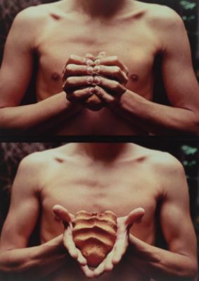
The next room contains perhaps the simplest and most obvious answer to why photographers altered their images: to entertain. There are several copies of the same man in a single image, lots of severed heads, a woman riding a moth, plenty of ghosts and spirits, and various fantasies, from oversized produce to Times Square under water to the stork bringing a baby and the Mona Lisa frowning. These outright fabrications then give way to more journalistic/advertising examples, executed in halftone printing: derby crowds in the rain collaged together, a dirigible parked at the tip of the Empire State building, mushroom clouds, a woman in a champagne glass, and doctored Saturday Evening Post covers of Thanksgiving dinner. Richard Avedon even gets in on the action, with a fashion shot of Audrey Hepburn with five heads. Crossing into the next gallery, Surrealism comes to the forefront, with Dora Maar’s curved floor, Wanda Wulz’ cat face, and William Mortensen’s fingers driven into eye sockets. In these images, nothing is as expected, from a two headed Claude Cahun to a multi-armed Brandt nude.
Inexplicably, the rigor and logic that held the preceding thematic sections together so tightly falls apart at the end of this show. In the final rooms, manipulated photographs from roughly 1950 to 1990 are left to roam freely, without so much as a whisper of a connecting framework. Yves Klein jumping into the void is mixed with Jim Shaw’s before and after aliens, while Martha Rosler’s soldiers in the kitchen compete with Jerry Uelsmann’s mysterious levitating trees. Boris Mikhailov’s garish May Day Parade sits across from Kathy Grove’s erased Satiric Dancer, their relationship completely unfathomable. I sorely missed some kind of clear parsing and unpacking of this later period; it felt like a monumental missed opportunity to chart a path through more recent (and arguably more complex and conceptual) manipulation strategies.
If this show had ended with Surrealism, I would have almost certainly given it my highest rating, as it takes some risks and teaches us something new. As hung, however, I am forced to take it down one notch. Fineman does an admirable job of reconsidering photographic history and explaining the whys of early photographic manipulation, but the last gallery or two left me wanting something more in terms of a continuing analytical thread. I hate to say it, but once again, a comprehensive, thoughtful, well researched Met photography show has lost its way after 1950. I’m not sure if this is a function of the balance of permanent collection or the mindset of the curators, but it’s happened too many times not to be some kind of pattern.
But I quibble. Overall, congratulations are in very much in order for bucking the established orthodoxy and offering a credible alternate history of the medium. Photographic manipulation clearly has a long and storied history, and Fineman has deftly provided us with a plausible framework for connecting the ever more complicated fabrications of the present with the long arm of the past. More work is needed to clarify recent developments, but I’m certain this will end up being a first choice reference baseline for future investigations.
Collector’s POV: Since this is a museum show, there are obviously no posted prices for the works on display. As such, I will dispense with the usual discussion of prices and secondary market history for this review.
Rating: ** (two stars) VERY GOOD (rating system described here)
Transit Hub:
- Features/Reviews: NY Times (here), Wall Street Journal (here), New York Review of Books (here), Time LightBox (here)
Faking It: Manipulated Photography Before Photoshop
Through January 27th
Metropolitan Museum of Art
1000 Fifth Avenue
New York, NY 10028
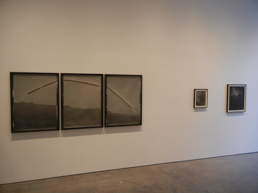 JTF (just the facts): A total of 21 black and white photographic works, framed in black and unmatted, and hung against white walls in the East and West gallery spaces. All of the works are made up of gelatin silver print paper negatives, consisting of between one and thirteen panels. Individual panels range in size from 5×4 to 40×30, and each of the works is unique. The images were taken between 2009 and 2012. A monograph of this body of work was recently published by Candela Books (here). (Installation shots at right.)
 McCaw’s works have the feel of experiments, starting with a calculated journey to some far off locale and ending with a trial of endurance between the artist and the sun. Depending on the location, the camera angle, and the special event (equinox, eclipse, etc.), the solar movements manifest themselves as variations of arcs and curves slashing across the sky, grounded by ghosts of mountain ranges or softly reflecting seascapes. At the equator, the sun streak is completely vertical; up above the Arctic Circle, the 24 hour line follows an undulatingly perfect up and down sine curve. When McCaw opts for intermittent exposures rather than continuous ones, the sun becomes a series of dots, like a string of ping pong balls following a controlled mathematical trajectory.
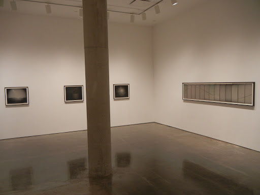 Collector’s POV: The works in this show were priced between $5000 and $42000, roughly based on size and number of panels. I use the past tense since nearly all of the works were already sold when I visited the gallery. McCaw’s work has not yet reached the secondary markets, so gallery retail is the best option for those collectors interested in following up.

 JTF (just the facts): A total of 84 black and white photographs, framed in black and matted, and hung against grey walls in two separate hallway galleries on the third floor of the library. All of the works are gelatin silver prints, made between 1967 and 1983. No physical dimensions or edition information was available on the wall labels. The exhibit also includes a wooden case containing four of Trager’s photobooks. (Installation shots at right.)
 The photographs in this show span a wide range of subject matter, from Connecticut towns and New York city landmarks, to cactus abstractions, intimate nudes, and architectural details from Paris, Barcelona, and San Francisco. Mansions in Norwalk, row houses in New Haven, and downtown buildings in Hartford are all seen with a familiar frontal Modernism, tracking repeated geometries, flanking trees, and salt box simplicity. Trager’s New York pictures capture icons like the Guggenheim, the Flatiron building, and the Cathedral of St. John the Divine with measured grace, and close in on overlooked city details, like a swirl of stone steps, a series of vaulted arches, and a group of zig zag of fire escapes under a Chock Full o’ Nuts sign. His fascination with the nuances of architecture extends into the 1980s, where he tackled the stately campus of Wesleyan University and the linear strata of Frank Lloyd Wright’s houses.
 Collector’s POV: Since this is effectively a museum show, there are no posted prices for the works on display. Trager’s work has very little secondary market history, so gallery retail likely remains the best option for those collectors interested in following up. The artist is represented by Fahey-Klein in Los Angeles (
 JTF (just the facts): A group show consisting of 85 photographic/video works made by 20 different photographers/artists, variously framed and matted, and hung against white walls in a single room divided space on the museum’s second floor. The works span the period from 1982 to 2010. Physical dimensions and edition information were not provided on the wall labels. (Installation shots at right.)
 Beate Gutschow (1 chromogenic print, 2000)
 In many ways, the modern answer to the question of why manipulate is breathtakingly simple: “why not, when we can do so so easily?” This starts with works as seeminngly straightforward as Robert Pollidori’s image of Varanasi, where stitched together digital negatives allow the artist to pack more information into a single, still plausibly truthful frame, and ends with countless imagination stretching digital fictions, like Filip Dujardin’s impossible architecture and Beate Gutschow’s fabricated landscapes. Digital composites are a recurring theme here, running the gamut from Nancy Burson’s facial composite of 1980s era world leaders based on their nation’s percentage of warheads to Jason Salavon’s visual average of every portrait by Frans Hals. The Internet-based appropriation trend is represented by a pixelated nude by Thomas Ruff and a series of flared suns drawn from Google Street View by Matthew Jensen. And others are using the new tools to upend our expectations in more subtle and unexpected ways, like Kelli Connell’s doppelganger double portraits and Debbie Grossman’s all female remixing of Russell Lee.
 Collector’s POV: Since this is a museum show, there are obviously no posted prices for the works on display. As such, I will dispense with the usual discussion of prices, secondary market history, and gallery representation for this review.
 JTF (just the facts): A group show consisting of roughly 212 photographic works made by 126 different photographers, variously framed and matted, and hung (or displayed in cases) in a series of five connecting rooms on the museum’s second floor. The works span the period from 1846 to 1993. The exhibit was curated by Mia Fineman, and a catalog of the exhibit has been published by the museum (