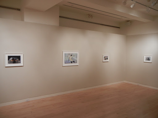
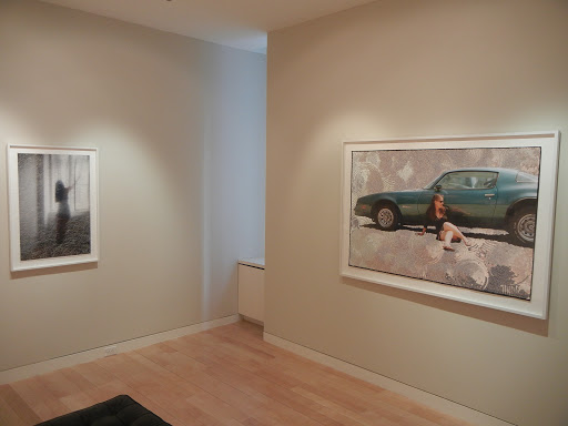
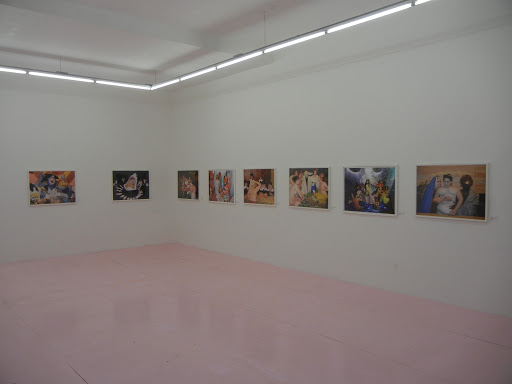
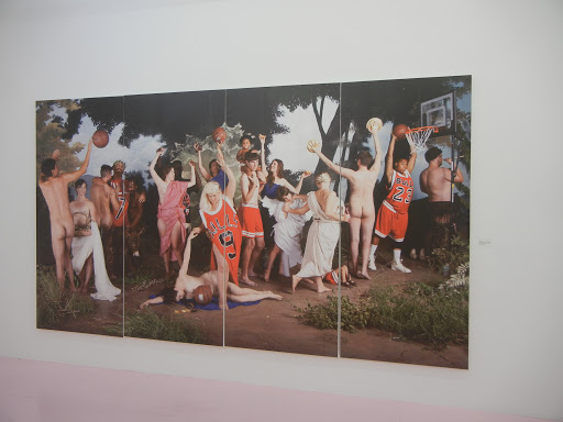
Mark Ruwedel, Records @Yossi Milo

JTF (just the facts): A total of 32 black and white works (including single images, diptychs, and groups), framed in white and matted, and hung in the front and back galleries. All of the works are gelatin silver prints, taken between 2005 and 2011. (Installation shots at right.)

The works in the show come from the following projects/series. For each, the number of images on view is followed by the print details:

  • Neighbors: 3 gelatin silver diptychs, each print 11×14 mounted on archival rag board, in editions of 5+2AP, from 2008-2011
  • Desert Houses: 14 gelatin silver prints, either 15×19 or 8×10, each print mounted on archival rag board, both sizes in editions of 10+2AP, from 2005-2011
  • Dusk: 10 gelatin silver prints, each print 11×14 mounted on archival rag board, in editions of 5+2AP, from 2006-2011
  • Built/Not Built: The Smithson Panorama: 2 sets of 8 gelatin silver prints, each print 8×10, mounted  together as a single work on archival rag board, in an edition of 5+2AP, from 2010
  • Records: 12 gelatin silver prints, each print 8×10 mounted on archival rag board, hung together as a single work, in an edition of 3+2AP, from 2009-2011
  • 1212 Palms: 9 gelatin silver prints, each print 11×14 mounted on archival rag board, hung together as a single work, in an edition of 5+2AP, from 2006-2007
  • Bomb Craters: 9 gelatin silver prints, each print 10×13 mounted on archival rag board, hung together as a single work, in an edition of 5+2AP, from 2008
  • Splitting: 1 gelatin silver diptych, each print 11×14 mounted on archival rag board, in editions of 5+2AP, from 2009
Comments/Context: Mark Ruwedel’s photographs provide an answer to one of the most complicated questions facing contemporary American land (not necessarily landscape) photography: how do we thoughtfully engage photographic history? His last major project, Westward the Course of Empire, documented the path of the railway system, in conceptual dialogue with 19th century greats like Watkins, O’Sullivan, and others. His newest pictures take on the sprawling beast of the New Topographics. The problem of how to move forward visually and conceptually given the lasting influence of this stylistic juggernaut isn’t by any means a simple one. Walking too close to the past generates work that is either plainly derivative (“stuck in the 70s”) or calmly reverential. What I like best about Ruwedel’s new pictures is that they aren’t afraid of this history. Instead, each project or series is like a crisp, cerebral, insider conversation, referencing bodies of work that have come before (including various strains of conceptual art as well as Land/Earth Art) but asking new questions and providing contemporary answers.
.
A walk through the broader and taller galleries at Yossi Milo’s new space is like a series of call and response discussions. Free standing houses alone in the desert (both in daylight and at dusk, taken with deadpan quiet formality) connect to any number of predecessors: John Divola, Robert Adams, and once again the Bechers. Other projects are more one-to-one: palm trees with Ed Rusha, split houses with Gordon Matta-Clark, warped vinyl LPs in the desert dirt with Lewis Baltz, and elegant salt encrusted bomb craters with scientific photography from the Manhattan Project. His investigation of Robert Smithson inverts The Spiral Jetty into a 360 degree panoramic view outward, and considers another location where a Smithson work was never built. Each series reprises characteristic motifs and styles, but unpacks them and pares them down further. The underlying ideas about land use, the built environment, reuse and waste, visual patterning and repetition, are all a continuation of the original concepts, but an extension and refinement rather than a hackneyed copy.
In a world where the typology format has spread like a disease, I came away impressed that these pictures didn’t seem tired. Most of the subjects here are decayed, abandoned, falling down, or hollowed out, but there is an elemental beauty to the shapes and geometries, the mirror images and echoes; roof lines, wood framing, blackened windows and flat expanses of scrubby desert provide plenty of raw material for theme and variation exercises and tonal gradation. But my main takeaway was that Ruwedel has absorbed the lessons of the relevant photographic past, but not let them prevent him from carefully and critically thinking about those ideas further. Mindful of the many traps, he seems to have avoided them, and in the process, expanded the conversation.

Collector’s POV: The prints in this show are priced based as follows, based on the project/series.

  • Neighbors: $7500 each
  • Desert Houses: $4500 or $2500, based on size
  • Dusk: $6500 or $4500
  • Built/Not Built: The Smithson Panorama: $20000
  • Records: $25000
  • 1212 Palms: $22000
  • Bomb Craters: $18000
  • Splitting: $9000

Ruwedel’s work has very little secondary market history, so gallery retail is likely the best option for interested collectors at this point.

Rating: * (one star) GOOD (rating system described here)

Transit Hub:

  • Review: Artefuse (here)
  • Exhibit: Peabody Essex Museum, 2010 (here)
Through April 7th
245 Tenth Avenue
New York, NY 10001

Photography at the 2012 Armory Show

In previous years, my review of the photography at the Armory Show has required a handful of posts, breaking the fair up into smaller, more easily digestible chunks, since there was so much to write about. This year, I have collapsed all of the data into one single mega-post, the entire experience boiled down to something you can read in a few minutes. The reason I have chosen this approach is that for the first time in my many years of attending this fair, I was generally underwhelmed by what I saw on offer.

Taking pot shots at art fairs is far too easy to be any fun, and I have long been one of the few hold outs who actually enjoys the process of wandering through the bazaar, poking my head into booth after booth in search of something exciting hiding on an interior side wall. Perhaps it is because I already see so much here in New York that I felt that a spark was somehow missing this time; I bounced along the hallways, dutifully making my notes, but mostly nodding my head and moving along rather than digging in to engage the gallery owners. The fact that I could systematically cover the entire fair (both Piers) in just under two and half hours is proof that I didn’t stop much to inquire more. I would hate to feel like I’d seen it all before, but that was certainly part of my reaction this year.

The second part of my conclusion was that I saw much more clearly a focus on what was sellable. For many of the non-photography specialist venues, I think the mantra was, when in doubt, put up a Cindy Sherman. From an economic standpoint, this makes complete sense – cover the walls of your booth with art that will sell (and sell for high prices) to ensure that you cover your costs of renting the space and doing all the work the fair entails; hopefully you’ll sell a few pieces, meet some new collectors/clients, and come out ahead. The challenge is that if every gallery operates in this same manner, the fair takes on a quality of sameness that becomes dull. The richness of a fair comes in its diversity and risk taking, which is potentially at odds with maximizing profits. As I traveled the crowded halls, I felt the pressure of this commercial push and pull much more acutely than I had before. Of course, none of this is news, I just noticed it more than usual this year.

In any case, my notes from the fair are below, grouped by Pier and arranged by my path through the halls. For each booth, a list of photographers has been provided, with the number of works on display in parentheses. Additional commentary, prices, and pictures of the installation are also included as appropriate.

Pier 94

Galerie Anhava (here): Hreinn Fridfinnsson (1 set of 6)

NoPlace (here): Ingvild Langgård (1), Kjetil Berge (2), Kristine Jakobsen (2), Tommy Høvik
(3)

Galleri Christian Torp (here): Marianne Hurum (1)

V1 Gallery (here): Peter Funch (1 triptych)

Christian Larsen Gallery (here): Charlotte Gyllenhammer (1), Joakim Eneroth (1). I liked the crisp abstract geometries of this series of red Swedish buildings by Eneroth. A monograph of the work is being published by Steidl. The print was priced at $10000.

Gallery Niklas Belenius (here): Leif Elggren (1 set of 18), Miriam Bäckström (2). There were two of these circular portraits by Bäckström in this booth. I was told the subjects are famous theater actors, but what I found intriguing was the heavy mirrored framing, tinted to match the photograph. The works were priced at $40000 each.

ELASTIC (here): Per Mårtensson (1 set of 8), Maria Hedlund (1 triptych, 1)

CRYSTAL (here): Julia Peirone (1 triptych, 1)

Galerie nächst St. Stephan Rosemarie Schwarzwälder (here): James Welling (1)

Galerie Nathalie Obadia (here): Youssef Nabil (1 diptych)

Whitechapel Gallery (here): Susan Hiller (1), Richard Wentworth (1), Paul Graham (1), Thomas Struth (1), Zarina Bhimji (1), Franz West (1), John Baldessari (1)

Richard Heller Gallery (here): Corey Arnold (4)

Howard Greenberg Gallery (here): Saul Leiter (6, plus 6 gouaches), Aaron Siskind (9), Charles Jones (4), Edward Burtynsky (1 diptych, 1), Vivian Maier (6), Weegee (5), Bruce Davidson (3), Robert Mapplethorpe (1), William Klein (1). I continue to enjoy Leiter’s color work, and a grid of Siskind divers is always a high contrast visual statement.

Cardi Black Box (here): Shirana Shahbazi (1 diptych). I have been hearing more about this Iranian photographer’s work lately, but haven’t actually seen much of it in person. This diptych was priced at 25000€.

Upstream Gallery (here): Jeroen Jongeleen (1)

Bruce Silverstein Gallery (here): Shinichi Maruyama (3), Andre Kertesz (grid of 20, 1), Trine Sondergaard (2), Silvio Wolf (1), John Wood (1), Frederick Sommer (1 collage), Edward Weston (1), Constantin Brancusi (1), Robert Frank (1), Michael Wolf (1), Aaron Siskind (grid of 36), Todd Hido (2), Keith Smith (1 book), Zoe Strauss (grid of 12). There were several strong grids of work in this booth: the Kertesz distortions, the Siskind rock walls, and the Strauss color images on the outside wall.

Yossi Milo Gallery (here): Tim Hetherington (3), Matthew Brandt (1), Alison Rossiter (4 diptychs, 1), Simen Johan (1), Chris McCaw (1 diptych, 1), Sze Tsung Leong (1), Pieter Hugo (2)

Angles Gallery (here): Soo Kim (2), Ori Gersht (1 diptych), Augusta Wood (1), Judy Fiskin (2)

Frederic Snitzer Gallery (here): Kehinde Wiley (1), Sean Dack (1)

Galeria Senda (here): Ola Kolehmainen (1)

Galerie Crone (here): Rosemarie Trockel (2), Adrien Missika (4)

Michael Kohn Gallery (here): Simmons & Burke (5)

Rhona Hoffman Gallery (here): Robert Heinecken (1 triptych, 1 set of 6), Luis Gispert (1)

Galerie Parisa Kind (here): Mike Bouchet (1)

Peter Blum Gallery (here): Su-Mei Tse (1), John Beech (2)

Sprüth Magers (here): Louise Lawler (1), Cindy Sherman (3), Peter Fischli and David Weiss (3), Andreas Gursky (1), Barbara Kruger (1). I thought these perilously staged sculptural images by Fischli/Weiss were the best thing I saw at the fair. They were priced at 55000€ each.

Galleria Continua (here): Shilpa Gupta (1)

Mai 36 Galerie (here): John Baldessari (1 triptych, 1 diptych), Lugi Ghirri (1), Thomas Ruff (1), Robert Mapplethorpe (2). Hard to beat a monumental Ruff head shot portrait for being eye-catching and imposing.

Corvi-Mora (here): Anne Collier (1)

Kukje Gallery (here): Candida Höfer (1), Yeondoo Jung (1)

Corkin Gallery (here): Barbara Astman (1 group of 6, 6), Brett Weston (1), Marjorie Content (1), Berenice Abbott (1), Garry Winogrand (2), Robert Frank (1), Margaret Bourke-White (1), Herbert Bayer (1), Walker Evans (1), George Platt Lynes (2), Andre Kertesz (1), Guy Bourdin (1), Francesco Scavullo (3), Thaddeus Holownia (16), Frank Madler (4), Ian Baxter (1)

Galeria Filomena Soares (here): Joao Penalva (1), Carlos Motta (21), Helena Almeida (1), Vasco Araujo (1)

Dirimart (here): O Zhang (1)

Kalfayan Galleries (here): Hrair Sarkissian (3), Breda Beban (3)

Ai Kowada Gallery (here): Hiroshi Sugimoto (3)

moniquemeloche (here): Aaron Siskind (2), Laszlo Moholy-Nagy (1)

BISCHOFF/WEISS (here): Michael Reisch (3)

Ratio 3 (here): Geof Oppenheimer (3), Matthew Hale (1)

Cherry and Martin (here): Robert Heinecken (1 triptych, 1 set of 5), Amanda Ross-Ho (1)

Jack Shainman Gallery (here): Hank Willis Thomas (1), Gauri Gill (1)

González y González (here): Patrick Hamilton (3), Jota Castro (2)

Carolina Nitsch (here): Cindy Sherman (1), EV Day (1), Carsten Holler (5), Vera Lutter (1)

Galeria Nara Roesler (here): Lucia Koch (2), Marcos Chaves (1)

Galerie Georg Kargl (here): Cindy Sherman (1)

Galerie Bob van Orsouw (here): Nobuyoshi Araki (16), Shirana Shahbazi (2). This wall of Araki images from the 1960s/1970s was looser and less staged than his later, more recognizable work.

Lisson Gallery (here): James Casebere (1), Gerald Byre (1 set of 16), Tim Lee (1)

Max Wigram Gallery (here): Mustafa Hulusi (2)

Ingleby Gallery (here): Peter Liversidge (1), Garry Fabian Miller (1)

Bryce Wolkowitz Gallery (here): Pertti Kekarainen (2), Ola Kolehmainen (4), Jorma Puranen (4), Susanna Majuri (2), Niko Luoma (4)

Other Criteria (here): Polly Borland (2)

Parkett Publishers (here): Zoe Leonard (1), Tracy Emin (1)

Mary Ryan Gallery (here): Sangbin Im (1 dipytch, 1)

Poligrafa Obra Grafica (here): Tony Oursler (1)

Galerie Anne de Villepoix (here): Sam Samore (1)

Kavi Gupta (here): Roe Ethridge (3)

Edward Tyler Nahem Fine Art (here): Andres Serrano (13). An entire booth of bold silhouetted toys and action figures, derivative of David Levinthal I thought.

Andréhn-Schiptjenko (here): Matts Leiderstam (14)

Victoria Miro (here): William Eggleston (1), Stan Douglas (1), Issac Julien (1), Francesca Woodman (3), Alex Hartley (1 diptych), Doug Aitken (1 lightbox)

Sean Kelly Gallery (here): James Casebere (2), Frank Thiel (1), Idris Khan (3), Robert Mapplethorpe (2), Alec Soth (3). These new images of London landmarks by Khan seem less ridigly conceptual than his earlier works, while still employing the ghostly multiple overlayed exposure technique. This print was priced at £35000. The Soth images were from his series of goth girls.

Leo Koenig Inc. (here): Gerhard Richter (3), Sigmar Polke (1)

Mendes Wood (here): Paolo Nazareth (7)

ONE AND J. Gallery (here): Kang Hong-Goo (6, 1 triptych, 1 wall installation)

On Stellar Rays (here): Clifford Owens (1 wall installation)

Henrique Faria Fine Art (here): Marta Minujin (6), Alessandro Balteo Yazbeck (1), Pedro Teran (2), Anna Bella Geiger (1 set of 18)

Galerie Forsblom (here): Chen Jiagang (1), Ola Kolehmainen (1). I haven’t seen images by Chen this large before; it appeared to be in three integrated panels. The work was priced at $60000.

Luciana Brito Galeria (here): Caio Reisewitz (1)

Galerie Daniel Templon (here): James Casebere (1)

BLAIN/SOUTHERN (here): Mat Collinshaw (1), Wim Wenders (4)

Marianne Boesky Gallery (here): Anthony Pearson (5)

Baro Galleria (here): Claudia Jaguaribe (2)

Pier 92

Vivian Horan Fine Art (here): Cindy Sherman (2), John Baldessari (1), Elger Esser (1)

Springer & Winckler Galerie (here): Hiroshi Sugimoto (1), Arnold Odermatt (3 color, 6 black and white), Georges Rousse (1), Andy Goldsworthy (1), Bernd and Hilla Becher (1 set of 4). I think these black and white Odermatt car crashes are wonderfully formal; while I’ve seen many of them before, they continue to grow on me. They were priced between $4000 and $8000 each.

Galerie Thomas (here): Thomas Struth (1)

Galerie Sho Contemporary Art (here): Helmut Newton (1)

Wetterling Gallery (here): Nathalia Edenmont (2), Mike and Doug Starn (2)

HackelBury Fine Art (here): Garry Fabian Miller (4, 1 set of 11), Mike and Doug Starn (5)

Senior & Shopmaker Gallery (here): Jan Dibbets (1), Richard Long (1)

Mireille Mosler Ltd. (here): Ed Van Der Elsken (1), Philip-Lorca diCorcia (1), Cindy Sherman (8), William Wegman (1 diptych). I really enjoy the clever absurdity of Wegman’s early 1970s conceptual work. This work is entitled Which Tube Attracts the Dog?; Wegman holds a tiny tube on the left and a massive one on the right. The dog’s head peeks in from the left in the right panel. The work was priced at $30000.

Marc Selwyn Fine Art (here): Robert Heinecken (3), Matt Lipps (1), Richard Misrach (1)

Alan Koppel Gallery (here): Walker Evans (1), August Sander (1), Hiroshi Sugimoto (4), Diane Arbus (1), Yves Klein (1). For our particular collection, this tiny Walker Evans was the best fit at the fair. I have always coveted the few images from this series of train tracks he did in the late 1920s, and this is one of the best I’ve seen. It was priced at $20000.

James Barron Art (here): Luigi Ghirri (3)

Chowaiki & Co. (here): Marilyn Minter (2), Cindy Sherman (1), Gregory Crewdson (1), Nobuyoshi Araki (1 diptych), Shirin Nehsat (1)

Gerald Peters Gallery (here): Alfred Steiglitz (2), J. Henry Fair (2), Craig Varjabedlan (3). The two O’Keeffe nudes by Stielglitz were on a side wall.

Robert Klein Gallery (here): Francesca Woodman (7), Mario Giacomelli (4), Edward Burtynsky (1), Irving Penn (10), Bill Jacobsen (3)

Yancey Richardson Gallery (here): Jitka Hanzlova (6), Andrew Moore (1), Sharon Core (5), Rachel Perry Welty (2), Bryan Graf (3), Olivo Barbieri (1), Sebastiao Salgado (1), Victoria Samburnaris (1), Bernd and Hilla Becher (1 set of 9), Kenneth Josephson (1)

Ricco Maresca Gallery (here): Tim Freccia (4)

Carl Hammer Gallery (here): Blythe Bohnen (3)

Auction Results: Photographic Masterworks by William Eggleston Sold to Benefit the Eggleston Artistic Trust, March 12, 2012 @Christie’s

As expected, the results of the Eggleston sale last night at Christie’s were tremendously positive. It was a white glove sale (all the lots found buyers), and the Total Sale Proceeds topped the high end of the estimate range by more than $2.5M.

The summary statistics are below (all results include the buyer’s premium):

Total Lots: 36
Pre Sale Low Total Estimate: $2230000
Pre Sale High Total Estimate: $3350000
Total Lots Sold: 36
Total Lots Bought In: 0
Buy In %: 0.00%
Total Sale Proceeds: $5903250

Here is the breakdown (using the Low, Mid, and High definitions from the preview post, here):

Low Total Lots: 0
Low Sold: NA
Low Bought In: NA
Buy In %: NA
Total Low Estimate: NA
Total Low Sold: NA

Mid Total Lots: 7
Mid Sold: 7
Mid Bought In: 0
Buy In %: 0.00%
Total Mid Estimate: $350000
Total Mid Sold: $367750

High Total Lots: 29
High Sold: 29
High Bought In: 0
Buy In %: 0.00%
Total High Estimate: $3000000
Total High Sold: $5535500

The top photography lot by High estimate was lot 24, William Eggleston, Untitled, 1970, at $200000-300000. (This is the tricycle.) It was also the top outcome of the sale at $578500, apparently a new record for a single Eggleston image.

97.22% of the lots that sold had proceeds in or above the estimate range. There were 6 lots that had proceeds of at least double the high estimate, and 2 more which had proceeds of at least triple the high estimate (the drink on the airplane tray table and the blue convertible on the cover of the catalogue).

Complete lot by lot results can be found here.

Christie’s
20 Rockefeller Plaza
New York, NY 10020

Photography at the 2012 ADAA Art Show

The more art fairs I go to, the more I am coming around to measuring their “success” on just how many times I see something surprising or unexpected, rather than the usual mind numbing parade of work I’ve seen elsewhere. My overall impression of this year’s ADAA Art Show is that there was more interesting/new photography to see than in past years. As usual, the booths were either solo shows or thematic groups of work, displayed with careful editing and meticulous attention to detail.

My notes from the fair are below, arranged alphabetically by gallery name. For each booth, a list of photographers has been provided, with the number of works on display in parentheses. Additional commentary, prices, and pictures of the installation are also included as appropriate.

Cheim & Read (here): Adam Fuss (4). These brand new works are much larger than Fuss’ last series of entrail photograms and the colors are much brighter and more psychedelic (generally pink and purple). They’re eye poppingly gestural and swirly. (priced at $65000 each).

James Cohan Gallery (here): Yinka Shonibare (1)
CRG Gallery (here): Ori Gersht (7). These exploding florals are huge and enveloping. Apparently, the bouquets are flash frozen so the petals shatter when they are detonated. There were 4 large prints (97×73) and 3 smaller prints (16×12) on view; the large prints were $50000 and the small ones were $8500.
Crown Point Press (here): Darren Almond (5)
Tibor de Nagy Gallery (here): Rudy Burckhardt (27, plus 3 sets of 4 and 1 video showing 8 films). This was an entire booth of Burckhardt’s work. One wall was covered with portraits of painters in their studios (De Kooning, Pollock, Mitchell etc.). I enjoyed these two prints best – the starburst dress ($7000) and the dress with circles echoing the circles on the sidewalk ($6000).
Fraenkel Gallery (here): Lee Friedlander (8), paired with paintings by Mel Bochner. I didn’t find this pairing to be particularly compelling.
Marian Goodman Gallery (here): Francesca Woodman (20 gelatin silver prints, 2 diazotypes). The Francesca Woodman frenzy has begun, with the Guggenheim retrospective opening up later this week. I’m fascinated by these large diazotype prints (images printed on blueprint paper) which have started to surface; I think their texture and soft tonality make them something special. This print was priced at $200000, but already sold; the standard gelatin silver prints were $32000 each.
Nicole Klagsbrun Gallery (here): Xaviera Simmons (3). I really liked these bodies covered in pictures, fabrics, and all kinds of thematically arranged collaged items; they were both sculptural and rebus-like. (priced at $12000 each).
Michael Kohn Gallery (here): Bruce Conner (1), Charles Brittin (1)
L&M Arts (here): John Baldessari (1 diptych, 1 set of 10, 1 set of 6, 1 set of 8, 1 set of 22). This entire booth was full of mid 1970s Baldessari conceptual works. In the image below, figures walking in various directions are led by overpainted red arrows indicating which way they are going. I thought it was fantastic. (priced at $725000).
Margo Leavin Gallery (here): William Leavitt (2 triptychs)
Lehmann Maupin (here): Mickalene Thomas (12 collaged photos)
Galerie Lelong (here): Catherine Yass (1), Rosemary Laing (1), Ana Mendieta (1 set of 6)
Jeffrey H. Loria & Co. (no website): Robert Mapplethorpe (1)
Luhring Augustine (here): Elad Lassry (5, plus 1 set of 3 and 1 sculpture)
McKee Gallery (here): Richard Learoyd (1)
Metro Pictures (here): Cindy Sherman (8 sets of 3, 1 set of 4, 2 sets of 6). This booth was entitled Cindy Sherman’s Murder Mystery and gathered together a series of early cut-out collaged works. This was the kind of work I wanted to see more of in the MoMA retrospective. The little interconnected vignettes are quirky and melodramatic, with Sherman playing all the parts. (the sets of 3, 4, or 6 prints priced between $200000 and $400000).
Laurence Miller Gallery (here): Ray Metzker (15 composites). This booth was filled with an excellent range of Metzker composites (nudes, city/street scenes, abstractions, in various sizes). The image below is from a recent (2007) photogram series of florals, which I had never seen before, using interlocked strips; it was priced at $35000.
PPOW (here): David Wojnarowicz (1 set of 44, plus 3 on the outer wall)
Pace/MacGill Gallery (here): Robert Adams (1), Richard Misrach (2), Diane Arbus (1), Lee Friedlander (2), Paul Graham (1), William Eggleston (1), Alfred Stieglitz (3), Henry Wessel (2), Harry Callahan (1), Susan Paulsen (1), JoAnn Verburg (1). This booth was an ode to clouds.
Regen Projects (here): Elliott Hundley (8)
Skarstedt Gallery (here): Cindy Sherman (2)
Leslie Tonkonow Artworks + Projects (here): Laurel Nakadate (1), Agnes Denes (1 group of 28 mounted together), Kunie Sugiura (1)

Donald Young Gallery (here): Rodney Graham (1), Moyra Davey (4)

Auction Preview: Photographic Masterworks by William Eggleston Sold to Benefit the Eggleston Artistic Trust, March 12, 2012 @Christie’s

Regular readers here will know that starting last summer I moved away from comprehensive reporting on worldwide photography and contemporary art auctions to spend more time on reviews of gallery and museum shows. Just because I wasn’t analyzing the sales doesn’t mean that I wasn’t following them as closely or actively as ever; I just concluded that I needed to focus my available writing time on the reviews. This decision wasn’t ever meant to be a hard and fast one, and today, I’ll be jumping back into the auction fray to talk about the Eggleston sale later tonight, and I’ll follow up later this week to report on the results.

The reason this particular sale caught my attention is that I think it represents some topics worth talking about further. For those unfamiliar with what is going on here, this sale is an offering of extra large, recently made pigment prints (44×60 or reverse, in editions of 2), never before available in the market. Overall, there are a total of 36 lots available, with a total High estimate of $3350000. So not only do we have a process that Eggleston has never used before, we have an unprecedented use of scale, applied to a selection of images, both greatest hits and lesser known works. In addition, Eggleston is using the Damien Hirst model of direct to the collector via an auction house, bypassing the normal gallery route for new work.

My first reaction to both the idea of extra large, poster sized modern prints, as well as to the distribution model was one of extreme skepticism. Having not seen the prints, it seemed like a cashing-in, making big prints for the sake of being big and selling them for big prices to big collectors. While I certainly don’t begrudge artists for finding creative ways for making money, the premise here seemed a bit commercial I must say. But I withheld judgment until I could go and see the prints for myself, which I did last week during the preview. (Installation shots from the preview at right.)

Aside from a couple of prints which suffer from over enlargement graininess and fuzziness in certain spots, I was surprised to find that the prints are pretty terrific, in some cases downright spectacular. The colors are saturated and vibrant, with a thick, richness that I wasn’t expecting. While the tricycle, the red ceiling, the green shower, and the peaches sign are, of course, all here, the really smart and unexpected aspect of these particular prints is that Eggleston seems to have thought carefully about which lesser known images would benefit most from increased scale. I’d say roughly half of the works for sale use this scale change for maximum effect. The low angle, worm’s eye views are especially strong, as are the top down views of car hoods and trunks. The shiny brass doorknob is something altogether different in this larger size. And a huge front tire, with Eggleston himself reflected in the silvery chrome of the bumper, was my favorite of the non-obvious choices.

So my revised conclusion is that while I’m still wary of the feeling of a sell-out, I expect these well-made prints are going to do very well indeed, with some of the iconic images running up much higher than the estimates might foretell.

Here’s the simple statistical breakdown:

Total Low Lots (high estimate up to and including $10000): 0
Total Low Estimate (sum of high estimates of Low lots): NA

Total Mid Lots (high estimate between $10000 and $50000): 7
Total Mid Estimate: $350000

Total High Lots (high estimate above $50000): 29
Total High Estimate: $3000000

The top photography lot by High estimate is lot 24, William Eggleston, Untitled, 1970, at $200000-300000. (This is the tricycle.)

The complete lot by lot catalog can be found here. The eCatalogue is here.

Photographic Masterworks by William Eggleston Sold to Benefit the Eggleston Artistic Trust
March 12th

Christie’s
20 Rockefeller Plaza
New York, NY 10020

Cindy Sherman @MoMA

JTF (just the facts): A total of 171 photographic works (including 1 short film), variously framed and matted, and hung against both white and colored walls in a series of 11 rooms and the entry foyer on the 6th floor of the museum. The exhibit was curated by Eva Respini and Lucy Gallun. A catalog of the exhibition was recently published by MoMA (here). (Installation views at right, courtesy MoMA, © 2012 Cindy Sherman.)

For each section of the show, I’ve outlined the number of images on display, the processes, and the dates. There are no actual titles to these sections/rooms, so the names in parentheses are my placeholder subjects.

Entry (title/mural)
1 pigment print on PhotoTex adhesive fabric, 2010

Room 1 (introduction)
1 set of 23 hand colored gelatin silver prints, 1975
5 gelatin silver prints, 1975
4 chromogenic color prints, 1983, 1985, 1992, 2008

Room 2 (untitled film stills)
70 gelatin silver prints, 1977-1980

Room 3 (fashion)
8 chromogenic color prints, 1983, 1984, 1993, 1994, 2007-2008, 2011

Room 4 (centerfolds)
12 chromogenic color prints, 1981

Room 5 (backdrops)
8 chromogenic color prints, 1980, 2002, 2003, 2004, 2007-2008, 2008

Room 6 (grotesque)
7 chromogenic color prints (including 1 diptych) 1986, 1987, 1989, 1992

Room 7 (history portraits)
22 chromogenic color prints, 1988, 1989, 1990

Room 8 (headshots)
13 chromogenic color prints, 2000

Room 9 (fairy tale/carnival)
8 chromogenic color prints (including 1 diptych), 1985, 1994, 2003, 2004

Room 10 (society portraits)
6 chromogenic color prints, 2008

Room 11 (multiple figures)
1 16mm film, 1975
2 cut-out gelatin silver prints mounted on board, 1976
3 chromogenic color prints, 2004, 2007-2008, 2008

Comments/Context: I’m probably the last of the photography critics to weigh in on the spectacle that is Cindy Sherman, now on view at the MoMA. In the past two weeks since the show opened, the press coverage has been a veritable deluge of uninterrupted and well deserved praise for Sherman, a re-coronation of one of the now generally undisputed greats in American artistic history. But let me say at the outset that I think there are two different topics worth discussing here: Cindy Sherman (the artist) and Cindy Sherman (the exhibit), and their paths diverge quite quickly I’m afraid.

As I wandered through the winding rooms of this show, I came to the distinct and strongly held conclusion that Cindy Sherman has hardly made any uninspired work in her entire career, which of course isn’t probably true on the margin, but certainly seemed so in these galleries. Surprisingly, I found myself thinking this not because of the three unparalleled rooms that hold respectively the entire Untitled Film Stills, the entire set of centerfolds, and a deep collection of the history portraits. These three rooms are simply a walk off home run, a stand up and cheer celebration, a jubilant, ecstatic, jaw dropping, crowd pleaser. Seeing them in this level of completion, as fully formed series, they shine and sparkle with incandescent originality, even decades later.

When I took a moment to breathe and recenter myself after immersing myself in these treasures, what really impressed me were the lesser known works and the in-between periods, and this is where the exhibit unfortunately flies off the rails. More than half of the rooms in the show are thematic groups, mixing images from various projects and connecting them via content, style, or approach. While I certainly understand the desire to use something other than a standard, chronological structure (in the hopes of bringing a new perspective to work which is clearly already well known and loved), in this case, I think it was a major mistake. These thematic bunches, from loosely gathered fashion related works to those that use different kinds of backdrops, and from the grotesque (broadly defined) to those containing multiple figures, fail to be thought provoking or illuminating, and they bind this retrospective in ways that prevent a bigger, more robust, and more complete reading of her entire career. Sherman has always worked in series format, and I am mystified as to the logic behind pulling images from different series into separate, unconnected thoughts – it just feels like there are clowns everywhere. I carefully pored over the catalogue essays in the hopes of finding a set of defendable reasons for this framework, but alas, there is no such coherent or lucid argument presented.

The reason a comprehensive chronological approach is of paramount importance for Sherman is that we need to see the subtle progression in both ideas and technique that was happening from project to project. Her student work gets scant attention, a couple of pieces in the first room and a couple more at the very end. I actually think there’s probably an entire stand alone exhibit to be done on these pictures that pre-date the film stills. I was fascinated by the stop motion doll clothes film, the repetitive collages, many of the seeds of the future there to be seen.

I have a similar complaint about the period of the 1980s and 1990s, after the centerfolds and bookending the history portraits. There were only a handful of images from this entire period, with some entire series overlooked altogether. I would have loved to see several more rooms of the harsh, ugly, and still engrossing photographs she made then, and to see them as distinct, separate projects, rather than all jumbled together. Many of these are hard, perhaps unpopular pictures I realize, but these were the ones that I wish there were more of, as they show Sherman extending her aesthetic and challenging her limits. Without the benefit of strict chronological context, we can’t see the patterns of when she started using prosthetics, or when she removed herself from the images altogether, or when she experimented with projected backdrops (a couple of which are stuffed into a side room). I found this lack of order befuddling, even though I was starved for more of Sherman’s work from these missing years.

Sherman’s headshots from the early 2000s were so much better than I remembered that they were like a new discovery for me. I suddenly saw the beginnings of the ideas that ultimately manifested themselves in the recent society portraits (there is a specificity to these headshot characters that is more aspirational and personal than what came before). These kind of connections are what retrospectives are all about. A single room of clowns should have come next, instead of spreading them all around the exhibit to continually unsettle visitors with their creepiness. The reason this would have been critically important is that this series signalled the beginning of Sherman’s use of digital technology. Placing these in front of the scathingly perceptive society portraits (which are also digital) would have given us the ability to see how she was refining her technique and mastering the new tools. Then the progression to her newest work (buried in the fashion room) and the huge murals in the entry would have made more sense. In these monumental pictures, Sherman has begun to digitally manipulate her own features as well as expanding her notion of painterly background, turning more knobs and opening up new possibilities.

My ultimate reaction to this exuberant show was a kind of maddening schizophrenia, where I was truly awestruck by certain rooms, only to be disappointed by the ones that followed. This reaction had nothing to do with the quality of the photography and everything to do with the chain of thinking that was being presented; it just didn’t hold water for me. That said, I did come away with genuine respect for Sherman’s craft across the years (especially in the age before Photoshop where her staged constructions were all done by hand), and for her unique ability to hold up a mirror to ourselves. For nearly 40 years, she has consistently and unflinchingly shown us our stereotypes and roles, our categories and cliches, our delusional hopes and shattered dreams. For those who are passionate about photography, this exhibit is not an optional excursion; it’s on the required three star syllabus, and for many, its parade of undeniable greatest hits will be more than enough to happily fill an afternoon. For me, I left the galleries torn: on one hand, gleefully glowing from the reflected brilliance of all that I had seen, and on the other, muttering over the lingering whiff of the superlative retrospective that had somehow slipped away.

Collector’s POV: Given this is a museum show, there are, of course, no prices. Sherman’s works are ubiquitous in both the secondary markets for contemporary art and photography, so much so that a sale can hardly happen without a Sherman picture as an anchor or cover lot, with dozens more available in every season. Recent prices have ranged from as low as roughly $2000 (for one of her large edition prints) to as high as nearly $4 million for her iconic vintage works (at the time in 2011, this $3.89 million price was the largest amount ever paid for a photograph, only to be subsequently eclipsed by Gursky).

Rating: *** (three stars) EXCELLENT (rating system described here)

Transit Hub:

  • Special exhibition site (here)
  • Features/Reviews: New Yorker (here), NY Times (here), Wall Street Journal (here and here)

Cindy Sherman
Through June 11th

Museum of Modern Art
11 West 53rd Street
New York, NY 10019

Peripheral Visions: Italian Photography in Context, 1950s-Present @Hunter College Art Galleries

JTF (just the facts): A group show of the work of 22 Italian photographers, variously framed and matted, and hung in the entry areas and a series of three small gallery spaces. The works were made between 1953 and 2011. The show was curated by Maria Antoinella Pelizzari. A catalog of the exhibition has been published by Charta (here). (Installation shots at right.)

The following photographers were included in the exhibit, with the number of works on view, dates, and processes in parentheses:
.

Marina Ballo Charmet (2 gelatin silver prints, 1 DVD, 1993/1994, 1995, 1996)
Olivo Barbieri (2 chromogenic prints, 1 archival pigment print, 1985, 2009)
Gabriele Basilico (4 gelatin silver print, 1 book, 1979/1980, 1981, 2006)
Gianni Berengo Gardin (1 gelatin silver print, 1970)
Mario Carrieri (4 gelatin silver prints, 1 book, 1957-1959)
Vincenzo Castella (1 chromogenic print, 1 video, 2009)
Cesare Colombo (1 gelatin silver print, 1961)
Mario Cresci (1 group of 3 prints, 2 lithographs, 1 book, 1975, 1978, 1979)
Paola Di Bello (1 digital chromogenic print on diasec, 1 c-print mounted on diasec, 1997, 1999/2001)
Luigi Ghirri (6 chromogenic prints, 3 books, 1973, 1974, 1975, 1976, 1978, 1984, 1985, 1991)
Guidi Guidi (3 chromogenic prints, 1989, 1991, 2000)
Alessandro Imbriaco (4 inkjet prints, 2007-2011)
Francesco Jodice (1 digital print on Hahnemuhle paper, 1996)
Mimmo Jodice (1 gelatin silver print, 1977)
Armin Linke (1 accordion book of 16 chromogenic prints, 1999/2008)
Maurizio Montagna (1 group of 8 gelatin silver prints, 2004/2006)
Paolo Monti (2 gelatin silver prints, 1953-1956, 1959)
Ugo Mulas (1 gelatin silver print contact sheet, 1969)
Walter Niedermayr (1 chromogenic diptych, 1999)
Franco Vaccari (1 8mm film, 1 collage of 2 chromogenic prints, 1971, 1972)
Massimo Vitali (1 c-print diptych on Dibond, 2004)

Comments/Context: While a handful of contemporary Italian photographers have clearly established themselves in the global art conversation, I’ve often thought that what has been missing was a wider survey of recent Italian photography to provide some deeper national context for their approaches, choices, and influences. Spanning roughly sixty years and using the “little of each” sampler approach, this exhibit fills in some yawning historical gaps and places key figures amid lesser known artists (at least here in the US), offering a smoother continuum of related aesthetic ideas.

If there is a common theme to this work produced since the 1950s, it is an interest in topographical changes in the land, and the influx of urban sprawl on Italian life. There are no pictures of ornate churches, grand palazzos, historical treasures, or tourist sites included here. These images study the effects of hulking apartment blocks, office buildings, and dense concrete compression, often looking at the edges and intersections of old and new. This skeptical investigation has parallels to similar photographs made in America in the 1970s, exploring the complicated results of our own rapid suburban and industrial expansion.

Through the eyes of Paolo Monti, 1950s Milan was a grubby, alienating place: torn chain link fence, smoky skies, rubble strewn vacant lots. Gabriele Basilico picks up some of this same emotion, albeit in a much more rigorous and formal way, with architectural images from the late 1970s and a more recent monumental portrait of the smog covered expanse of urban Naples. Closer looks at details of buildings range from Luigi Ghirri’s intimate and atmospheric color works to Guido Guidi’s angular construction sites and sheds. Decades apart, Mario Cresci and Paola Di Bello take on similar city-centric subjects with a more conceptual bent. Even the glossy contemporary works by Massimo Vitali and Walter Niedermayr brush up against the encroaching ugliness: a chugging nuclear power plant looms in the distance behind one of Vitali’s blinding beach scenes, and an overstuffed auto graveyard abuts a busy highway as seen from Niedermayr’s signature bird’s eye view.

All in, this is a smartly edited summary that offers multiple artistic viewpoints and interpretations of the dominant societal trend in Italy in the past half century: the tremendous, ever expanding growth of its cities. The space itself makes this show feel a bit cramped and chaotic, but with some visual patience, the choices here provide a thoughtful progression, both through time and across evolving photographic ideas.

Collector’s POV: Since this is a museum exhibit, there are, of course, no posted prices. For those interested in following up on examples of recent Italian photography, a succinct companion show called An Italian Perspective is now on view in Howard Greenberg Gallery’s new second space (here), through March 13th. It includes 12 images by Luigi Ghirri ($12000 or $13500 each), 6 images by Gabriele Basilico (ranging from $8000 to $19000 each), 1 image by Massimo Vitali ($39700), and 5 works by Vincenzo Castella (4 single images at $16000 or $28000 each, based on size, 1 diptych at $15000).

Rating: * (one star) GOOD (rating system described here)

Transit Hub:
  • Features/Reviews: New Yorker (here), Village Voice (here)

Peripheral Visions: Italian Photography in Context, 1950s-Present
Through April 28th

Hunter College Art Galleries
Hunter West Building
(southwest corner of 68th Street and Lexington Avenue)
New York, NY 10065

Yinka Shonibare: Addio del Passato @James Cohan

JTF (just the facts): A total of 5 large scale color photographs, framed in gold-edged black with no mat, and hung in the main gallery space. All of the works are digital chromogenic prints, sized between 59×71 and 59×78 (or reverse), each available in editions of 5. All of the works were made in 2011. The show also includes 2 costumes in glass cases, 1 video (17 minutes, in an edition of 6) on display an adjacent viewing room, and 3 sculptures on view in the front room. (Installation shots at right.)

Comments/Context: Staged photographic recreations of scenes from paintings are nothing particularly new in contemporary photography. Cindy Sherman famously reinterpreted a variety of characters from the pantheon of art history in her late 1980s “History” portraits, and more recently Sharon Core has made exacting reproductions of everything from Wayne Thiebaud’s luscious cakes to exuberant 18th century Dutch floral still lifes. Yinka Shonibare’s new photographs also employ this aesthetic device, taking the framework and structure of famous death scenes from centuries past and reimagining them with a wholly different cast of characters.

British hero Lord Nelson (complete with a white wig) takes center stage in these photographs, outfitted not in a standard naval uniform, but in one crafted entirely out of brightly colored patterned fabrics: a flashy ensemble consisting of a yellow overcoat, an orange shirt, blue pants and orange leggings. Shonibare has used these Dutch wax pattern textiles time and again in his work to signify the distinctiveness of African cultural identity. Along with a group of actors of contrasting races, these changes in costumes and staging give the pictures an incongruous metaphorical tone: a symbol of the British Empire lays dying, clothed in the unexpected trappings of colonialism. The effect is even stronger when the death is so obviously a suicide (a limp wrist holding a gun, a dagger thrust at the stomach, an empty pill bottle on the floor); the decline of the great power was self inflicted.

The Fake Death Pictures are surrounded by a number of other sculptural objects and a video, giving them the feel of a larger, integrated ensemble installation. But in the end, I was focused on the photographs. Shonibare’s visual inversions (both eye-popping and more subtle) are relatively straightforward one-for-one replacements, but they are still remarkably effective in disrupting the dramatic balance of the original scenes. He hijacks these stories and rebuilds them with his own theatrical narrative, calling attention not only to an alternate view of history, but also to the many symbolic parallels in current times: the once powerful empires are decaying, challenged by the continuing rise of the once underestimated.

Collector’s POV: The photographs in this show are priced at £25000 each, including the artist’s frame. Shonibare’s works have very little history in the secondary markets for photography, so discerning any kind of pricing pattern from so few data points is difficult. As such, gallery retail is likely the best option for interested collectors at this point.

Rating: * (one star) GOOD (rating system described here)
.
Transit Hub:
  • Artist site (here)
  • Features/Reviews: Artcritical (here), ARTINFO (here), TimeOut New York (here)
  • Interview: Whitehot (here)

Through March 24th

James Cohan Gallery
533 West 26th Street

New York, NY 10001

Paul Graham: The Present @Pace

JTF (just the facts): A total of 16 color works, framed in black and unmatted, and displayed in the entry and a winding series of three large rooms. There are 14 diptychs and 2 triptychs in the show, many hung very near the floor. All of the prints are pigment prints mounted on Dibond, with individual panels sized either 28×38 or 56×74. The works were made between 2009 and 2011, and are all available in editions of 3+2AP. The images are titled precisely by location, date, and exact time of day, down to the second. A monograph of this body of work is being published by Mack Books (here). (Installation shots at right.)
.

Comments/Context: Paul Graham’s new street photographs are undeniably the most thoughtful body of new photography I have seen this year. I use the word thoughtful with special care in this case, in that there is a sense of deep, persistent, historically-aware thought that lies as a backdrop to these images. Graham has taken the traditions of the genre of street photography and systematically and meticulously destroyed them. This disassembly exercise is not a rebellious, thumbing his noise at history stunt, but instead a cerebral investigation of and meditation on the true nature of street photography. These pictures break every rule about what masters like Winogrand, Callahan, Meyerowitz, Friedlander and others have trained us to expect, and thus require a kind of mental rebooting to get into them. But once inside, there is a strong sense of Graham innovating within the confines of photography, rather than trying to show that he can go somewhere else. He is firmly rooted in the nature of straight photographic seeing, but he continues to ask questions about its limits.

My first reaction to these pictures was a profound sense of being entirely underwhelmed. The images are extremely unassuming, stepped back in space, with subjects basically centered, with a narrow band of focus positioned on the main figure. People walk past on sidewalks, exit from banks and fast food restaurants, cross streets, and linger outside landmarks like Penn Station. Aside from one woman who trips and falls, there is a singular lack of noteworthy action. Unlike every other street photograph you have ever seen, there is no coalescing of something dramatic, no juxtaposition of something ironic, no lucky matching of something happening. Most notably, there is no obvious narrative, no succinct, lucid story being neatly told in a single frame. In fact, nothing happens at all – people pass and move on; the flow of time continues.

Using pairs and triplets of images taken in the span of a few seconds, Graham shifts our attention away from traditional storytelling, making us see how his eye has wandered. His focus moves from one figure to the next, or to one in the foreground or background, quickly shifting and darting from moment to moment. A woman eating a banana traverses a crosswalk; a fraction of a second later, a blind man with a cane is right behind her. In the span of three frames, his focus moves from an apparently homeless man, a man with a plastic shopping bag, and a woman with a poodle, a bunch of tourists getting a sidewalk pitch from a tour salesman lingering in the blurry periphery. There is no clever connecting theme, no visual thread to unravel. Graham is exploring both the nature of eye movement and the compressing and expanding of time. Let me be clear, this is not cinematic. It is a jumpy, erratic progression, elusive and imperfect.

This is not to say that these selections are void of wit. Some of the pairings are quietly tricky: a man with an eye patch followed by a man winking, a woman with bright orange hair followed by another drinking orange soda, a man in a dapper suit followed by his alter ego in rags (in exactly the same spot), a policeman leaving a drugstore followed moments later by a mailman. Graham’s powers of observation are clearly on high. But he has refused to follow the agreed upon rules. His pictures are about the interaction of time and photography, and about the uncertainty of selective focus. It’s as though there is a “normal” street photograph to be had in all these fragmentary scenes, and yet Graham has opted instead for its alter ego, its negative.

For those who would claim that everything has been done in a genre like street photography, Graham’s work is proof positive that there is always room for frame-breaking, original innovation. His images are both an homage and a deconstruction, an appreciation and a rejection. In some ways, they aren’t about the images at all, but about capturing the in-the-moment present tense of the street that swirls and changes continually around us without ever being actively noticed. The only reason I can’t find my way to three well-deserved stars for this show is that I find the pictures so disposable and boring. Of course, I know, this is exactly and entirely the point, but my mind is hard wired to seeing in the old way, and I need some more time to get my head around experiencing the world as gaps and absences. But without a doubt, the ideas here are revolutionary, and they merit a robust, public airing, if only to show that we can still coherently parse this ever-changing medium. This is the kind of show we should be talking about, folks, not the packaged-for-easy-consumption art with which we are all too familiar.

Collector’s POV: The works in this show are priced as follows. The smaller “stacked” diptychs (28×38 panels) are $35000 each. The larger diptychs (56×74 panels) are $65000 each. The triptychs are $80000 each. Graham’s images (from all periods of his career) have been remarkably absent from the secondary markets for photography, so gallery retail is still likely the best option for interested collectors at this point.
.

Rating: ** (two stars) VERY GOOD (rating system described here)
.

Transit Hub:
  • Artist site (here)
  • The Unreasonable Apple essay (here)
  • Artforum 500 words (here),
  • Reviews/Features: Financial Times (here), LPV (here)

Paul Graham: The Present
Through April 21st

The Pace Gallery
545 West 22nd Street

New York, NY 10011

Olivo Barbieri: The Dolomites Project @Yancey Richardson

JTF (just the facts): A total of 7 large scale color photographs, framed in white with no mat, and hung in the main gallery space. All of the works are archival pigment prints, sized either 65×85 or 45×59, each available in editions of 6+3AP. All of the works were made in 2010. A monograph of this body of work was published by Damiani (here) and is available from the gallery for $40. (Installation shots at right.)

Comments/Context: Olivo Barbieri’s aerial images of the Dolomites follow in the hallowed tradition of Ansel Adams’ photographs of Yosemite: pictures made to convince others of the grandeur of a place to ensure its protection for future generations. With the goal of helping to secure a World Heritage Site designation for the northern Italian region, Barbieri took to a helicopter and made crisp view camera images hovering over the towering rocky crags and crumbling rugged mountainsides.

These landscape photographs are out of the ordinary in several ways. Instead of using his usual tilt/shift approach of selective focusing and flattening, Barbieri has instead gone for selective coloration, playing with positive and negative values and tonalities to create dissonant landscape concoctions. These effects are not universally employed across all parts of an image, but in small areas and regions, often set off by the natural breaks and watersheds in the land. These manipulations mix together hyper-real and surreal, tweaked and inverted, stitching them together in unnatural, layered carpets of jagged cliffs and eroded surfaces. Tiny figures stand on outcroppings and resting points like figures from a romantic landscape painting, showing off the immense, imposing scale of the setting. And the prints themselves are monumental in size, enveloping the viewer in the expansive, all-encompassing detail of the dramatic scenes.

Given the off kilter coloration, the scale, and the looking down viewpoint, I had a few Niedermayr and Maier-Aichen moments in these photographs. In general, I very much like the idea of experimental manipulation, and of using new digital techniques to expand the boundaries of the landscape genre, but the overall impression I took away from these photographs was something more like a feeling of over reaching. What I mean is that the raw land in these images is already astonishing and breathtaking (especially from the air), but these pictures amplify this awestruck impressiveness to the point of subtle searching distraction; I found myself scanning for the visual trickery, rather than enjoying the whole experience. The land has clearly been interpreted by Barbieri in a clever new way here, but I found myself wondering whether his manipulations were diverting attention away from the authentic spectacle of the mountains themselves.

Collector’s POV: The works in this show are priced as follows. The 65×85 prints are either $25000 or $40000, and the single 45×59 print is $20000. Barbieri’s photographs have very little secondary market history to date, so gallery retail is likely the only option for interested collectors at this point.

Rating: * (one star) GOOD (rating system described here)

Transit Hub:

  • Artist site (here)
  • Feature: NY Times The Sixth Floor (here)

Olivo Barbieri: The Dolomites Project
Through March 31st

Yancey Richardson Gallery
535 West 22nd Street
New York, NY 10011

Jan Groover, Formalism is Everything @Janet Borden

JTF (just the facts): A total of 37 photographic works (32 single images, 2 diptychs and 3 triptychs), variously framed and matted, and hung in the main gallery space with a dividing wall. The vintage prints use a mix of gelatin silver (2), chromogenic (15), platinum palladium (18) and inkjet (2) processes. Physical dimensions range from 2×3 to 30×40, and proposed edition sizes include 1 (unique), 3, 5, 10, or 15, depending on the work. The images were taken between 1973 and 2003. A short documentary film on Groover, entitled Tilting at Space (produced by Tina Barney), is on view in the back gallery. (Installation shots at right.)

Comments/Context: Jan Groover passed away earlier this year, and while this show was already on the gallery’s exhibition calendar, it now has the feeling of a memorial tribute or a summing up. Taking the form of a loose retrospective, it gathers together superlative work from four decades and examines Groover’s evolving sense of photographic formalism. As I walked into the gallery, I had the immediate feeling of a weight being lifted off my shoulders, as if the sea of endless artistic mediocrity that I had been trudging through had fallen away. Here, at last, were a group of photographs made by someone who knew what she was doing.

While the show isn’t organized chronologically, the earliest pictures on view come from the mid 1970s, when Groover’s work was rigidly conceptual. Using sign posts and light poles to bisect the picture plane, she captured truck trailers and cars at the exact moment when the passing vehicles met the vertical element, creating flat rectangles of space or witty dollops of red, yellow and blue. They poke and prod at elements of elapsed time, visual structure, and two-dimensional composition.

Groover’s kitchen sink still lifes from the late 1970s are perhaps her best known works, and they haven’t lost one iota of their ability to astound some thirty years later. Whether in silvery tactile platinum or seductive color, they explore the essence of form, where the tines of a fork, the edge of a bowl, the scallop of a cake tin, and the flatness of a knife are carefully arranged to intersect and react, creating both reflections and areas of negative space that bring harmony to the compositions. The addition of a chambered nautilus, glass bowls, and whorled, undulating green peppers gave her even more shapes and volumes to play with, leading to overlapping lines and voids of grace and sophistication. Part of me is completely flabbergasted that these bravura kitchen images are still floating around; they should all be in museums by now.

The images from the early 1980s go back outside, applying lessons of formal structure to industrial buildings (reminiscent of Renger-Patzsch), picnic table arrangements, and even intertwined legs and arms, all in luminescent platinum. Her seemingly simple images of folded knees and elbows are intricately layered and sublimely elegant. In the late 1980s, Groover moved into the studio once again, playing with the scale of her still life objects (smaller), their surfaces (glossy or matte), and their interrelationships and orientations. While the color is more boldly operatic here, the forms lead back to Morandi, albeit with more depth of space. A few more recent images made digitally swing back to severity, removing the backdrops altogether and opting for deep blackness, her painted bottles and jugs piled in more clustered groups. It seems that the potential for innovative formal exercises never ceased.

While this show isn’t a comprehensive scholarly statement on Groover’s long and productive career, it is undeniably a powerful sampler of control and craft. It deftly combines wow moments, unexpected treasures, and deservedly iconic images into an impressively heady mix. In the end, her work is an attention-grabbing reminder for me that words like meticulous, restrained, precise, ordered, and disciplined still have a central place in the vocabulary of photography.

Collector’s POV: The prints in this show range in price from $9000 to $35000, based on age and scarcity. Groover’s work is not routinely available in the secondary markets, and auction outcomes in recent years (between $1000 and $13000) may not be entirely representative of the market for her best images.
.

Rating: ** (two stars) VERY GOOD (rating system described here)

Transit Hub:

  • Obituaries: NY Times (here), Wall Street Journal (here)
  • Review: New Yorker (here)

Jan Groover, Formalism is Everything
Through March 17th

Janet Borden, Inc.
560 Broadway
New York, NY 10012

Melanie Willhide: to Adrian Rodriguez, with love @Von Lintel

JTF (just the facts): A total of 10 color and black and white photographs, framed in white and unmatted, and hung in the single room gallery. All of the works are inkjet prints, each sized 30×28 and available in editions of 5. The images were made in 2011. There are 6 color photographs and 4 black and white photographs in the show. (Installation shots at right.)

Comments/Context: The idea of allowing for chance in a photographer’s artistic approach is certainly nothing new. In the nearly bygone era of physical film, this has usually meant one of two things: the chance (and mostly fortuitous) alignment of subjects and compositions in front of the camera, creating Cartier-Bresson’s famous “decisive moment”, and the chance alchemy of the darkroom, where chemical spills, random drips and photogram oddities have led to unexpected, sometimes painterly, modifications of underlying images. Both approaches have been thoroughly and expertly mined by dozens of photographers over recent decades. But the idea of digital chance is one that we are just beginning to investigate, and Melanie Willhide’s new work digs into some of the unexpected possibilities provided by soured computer storage. Armed with a laptop full of reconstructed and corrupted image files, she embraced the visual artifacts left behind by the unintended destruction, uncovering a new kind of hard-edged digital abstraction.

Most of the works here start with recognizable imagery: male and female nudes (either new or appropriated), along with a series of pictures taken in a Palm Springs swimming pool. From there, the digital breakdown begins. In many of the images, there is a skittering, skipping effect, where slices of the image are repeated in endless loops, stacking up and taking over the available space. Rows and rows of identical lip and torso fragments spin out of control. In other pictures, digital gremlins and greebles crawl across the surface of the images in thin lines, obscuring the content underneath, creating tiny stripes and striations. In both groups, the colors have been kicked out of whack, sometimes creating all over tints or layered screens, in others, an eye-popping, day-glo psychedelia. The overall feel is mechanistic and computational rather than gestural or expressionistic.

While I can easily pick out a couple of winners here (the nude on the far right of middle installation shot being my favorite in the show), to me this show feels more like a hopeful beginning than an end. Willhide needs to run with this seam of originality, let it get much weirder and wilder, and push the concept further. Simple repetitions, inversions and kaleidoscope effects are a good start, but I think she should encourage the digital chaos to come through more strongly and allow the chance decay to reduce the legibility of the subject matter even more. The path of mixing human images and the unintelligible soul of the machine seems ripe for deeper aesthetic exploration and examination.
.

Collector’s POV: The photographs in this show are priced at $3800 each. Willhide’s work has very little secondary market history, so gallery retail likely remains the best option for collectors interested in following up.

Rating: * (one star) GOOD (rating system described here)
.
Transit Hub:
  • Artist site (here)
  • Features/Reviews: New Yorker PhotoBooth (here), LA Times Culture Monster (here)

Through March 24th

Von Lintel Gallery

520 West 23rd Street
New York, NY 10011

Sign up for our weekly email newsletter

This field is required.