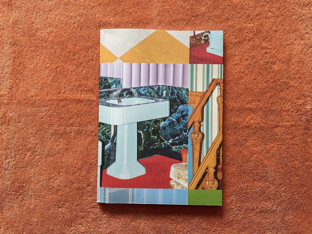
JTF (just the facts): Published in 2025 by RVB Books (here). Softcover (22×31 cm), 180 pages, with 94 color photographs. Includes an essay by Grégoire Prangé (in French/English.) Design by Alice Monguzzi and RVB Books. (Cover and spread shots below.)
Comments/Context: Once in while, the design and construction of a photobook actually catches my eye before the photographs themselves. This doesn’t happen all that often, mostly because I tend to be looking at the pictures first, and then only somewhat later turning my attention to how they are presented. And while Letizia Le Fur’s photographs certainly merit some discussion, which I’ll get to in a minute, the design of Le Crépuscule des Lieux drew me in right away, so much so that when I got home after purchasing the book at the recent New York Art Book Fair, I got out my tape measure so I could understand how its proportions were being managed. Bear with me as I dig into the math for just a second.
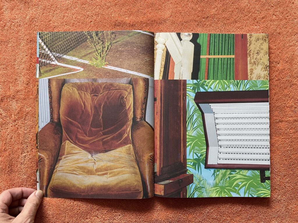
Le Fur’s photographs are square format, reproduced here in full at roughly 8 1/2 inches on each side (apologies to those who prefer the metric system). The photobook is roughly 8 1/2 inches wide by 12 inches tall, so the images fill the pages edge to edge on the left and right sides, printed full bleed with no border. This leaves roughly 3 1/2 inches that isn’t covered by the featured image on any given page. The design accommodates this gap in three ways: all 3 1/2 inches on top, above the featured image; all 3 1/2 inches on the bottom, below the featured image; or evenly divided, 1 3/4 inches both above and below the image.
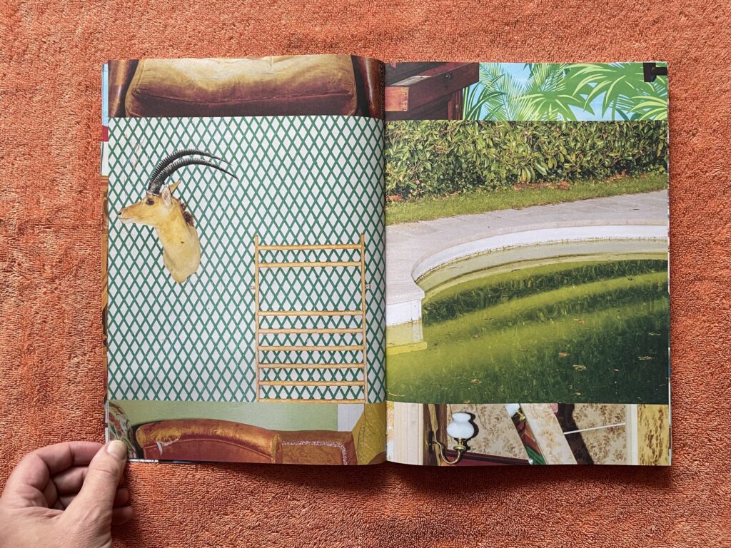
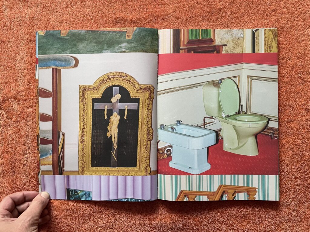
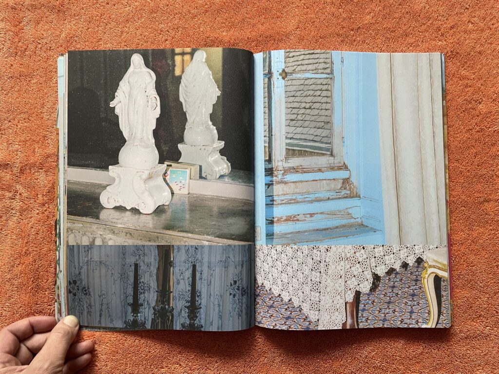
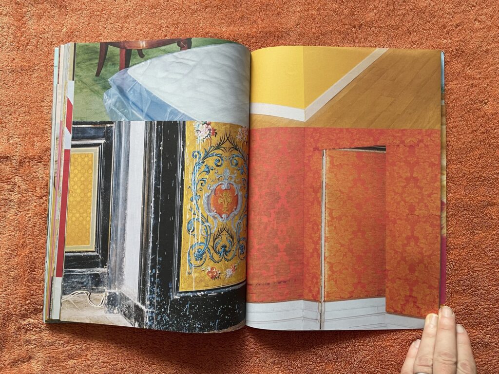
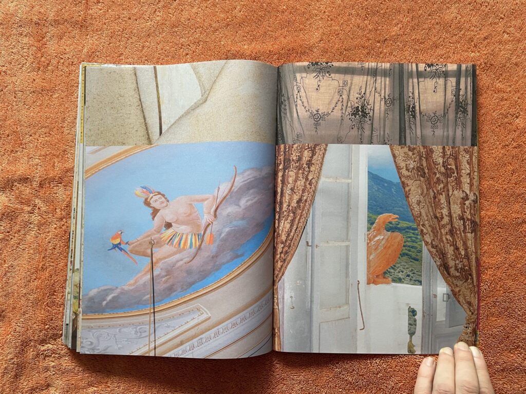
While this may not seem that intriguing, what’s fascinating about Le Crépuscule des Lieux is how the images are sequenced. It’s helpful to imagine Le Fur’s images connected one after another vertically, with the bottom edge of one picture adjacent to the top edge of the next, and so on, like a vertical film strip or contact sheet, but with no gaps or edges. The way this book is constructed is that all the images on left-hand pages are on one continuous strip, and all the images on the right-hand pages are on another separate strip. And while they are in lock step, meaning that two full pictures are always squared up to each other on a facing spread, each side is essentially traveling vertically on each page turn. And this is where the extra space gap comes into play – the additional area is filled by the images above and below the featured image, creating slices of imagery that get repeated as the page turns (one left side to the next, etc.)
The result is spreads with two featured images and either two or four other image fragments that add to the visual complexity. Turning the pages is like watching two mechanistic wheels turning in synch, but stuttering and repeating here and there, like the gears are slipping just a bit. The effect of this design is to turn the top and bottom edges of the featured image into precisely drawn horizontal lines that match its neighbors in a rigidly geometric way, highlighting the way adjacent images abut each other and playing with the visual possibilities of juxtaposition; this happens in the same way across the spread, creating grid-like connections between all the squared off images.
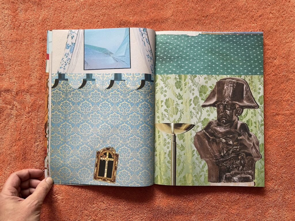
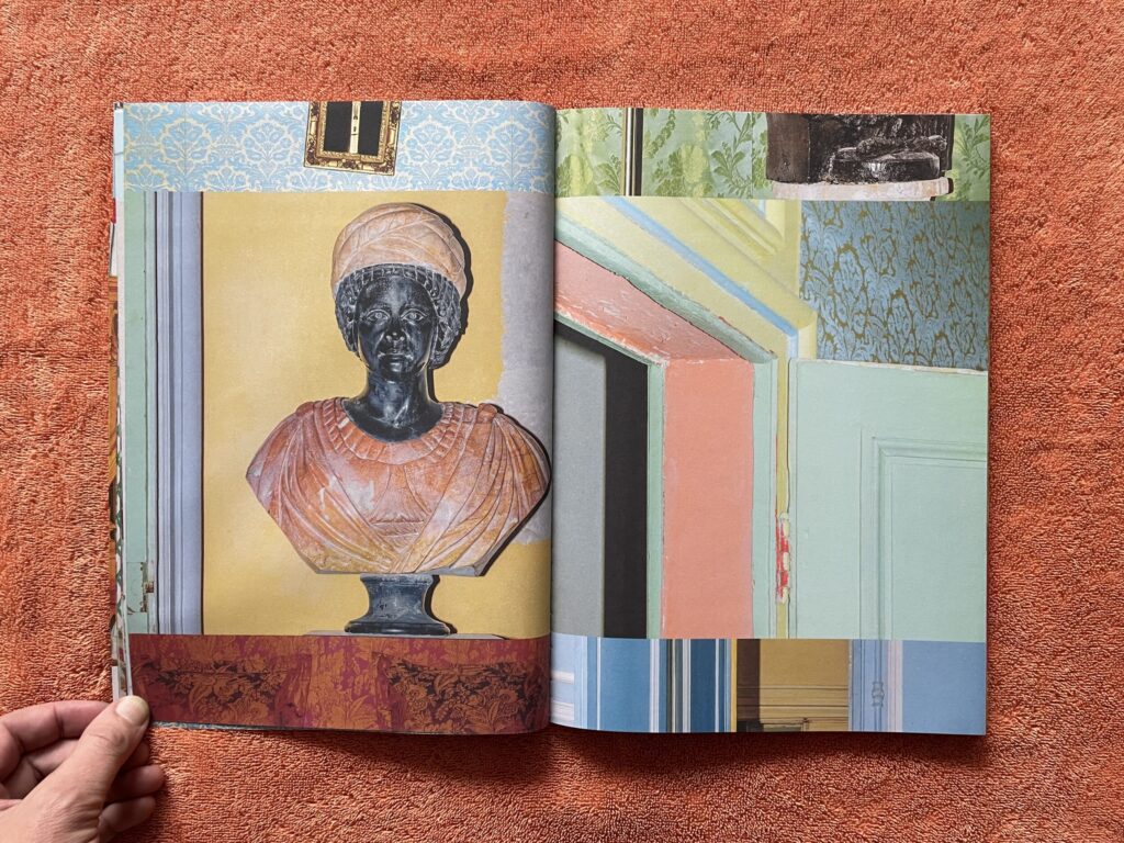
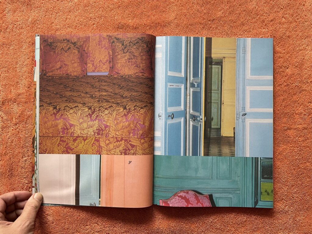
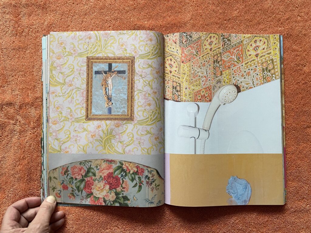
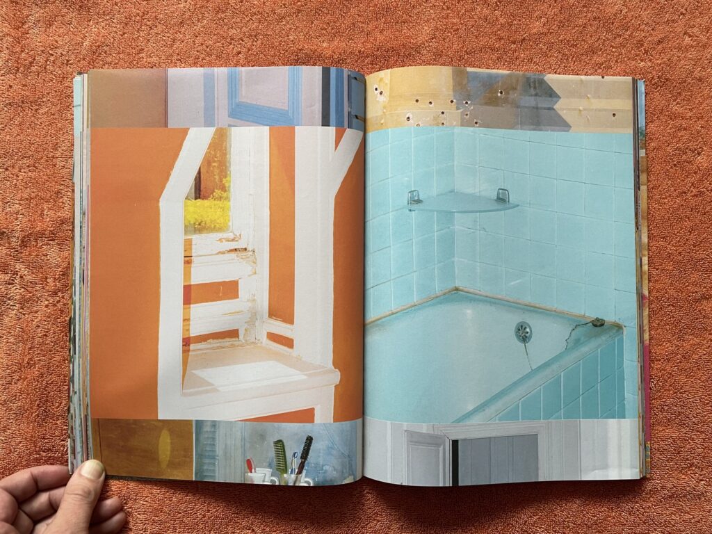
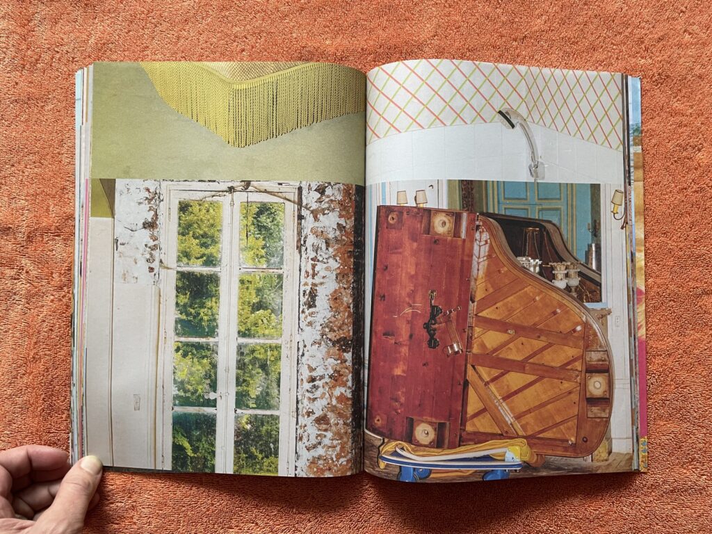
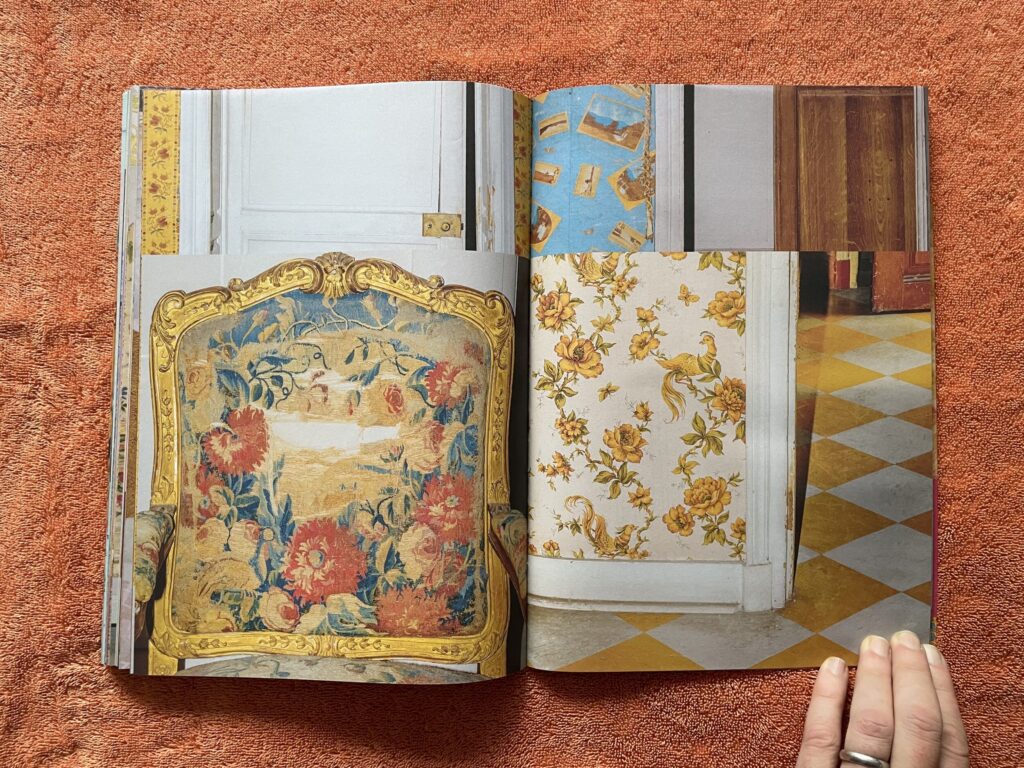
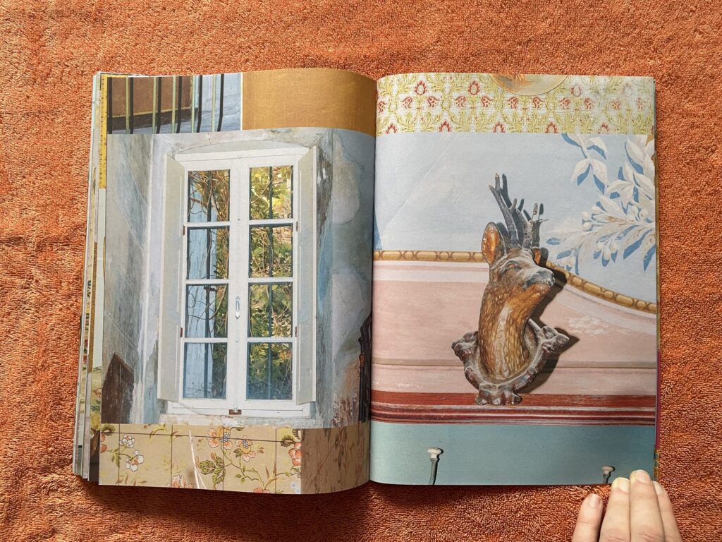
This innovative approach is particularly well suited to Le Fur’s imagery, as her photographs are filled with flattened geometries of rooms, doors, walls, and other architectural and decorative elements that play off the structure of the photobook itself. With a nod to photographers like Robert Polidori and Michael Eastman, who have lovingly pored over architectural ruins of various kinds, Le Fur points her camera at the spaces inside abandoned châteaux and other ornate castles and country houses left to decay. The title Le Crépuscule des Lieux translates from French to English as something like “The Twilight of Places”, and Le Fur’s photographs have plenty of worn surfaces, peeling paint, and threadbare furniture, with cracks, seepages, and other vestiges of age appearing on nearly every page – these places are not yet ruins exactly, but they have undeniably entered their twilight years.
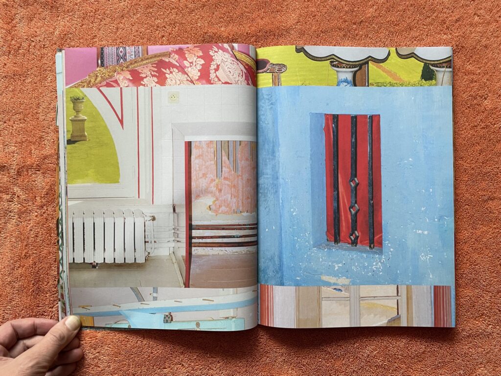
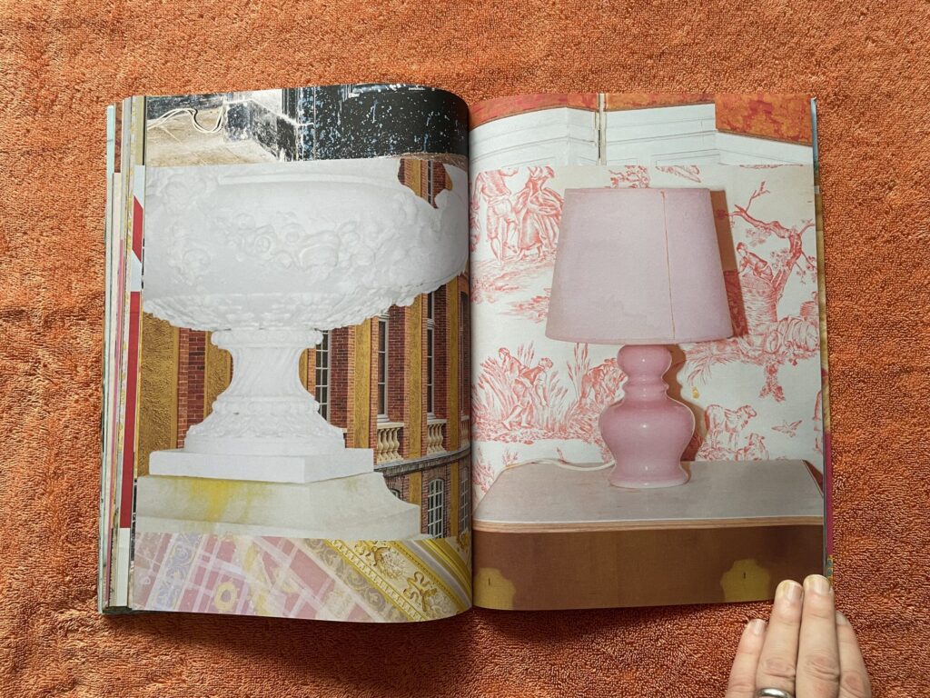
Prompted to describe the decor at such houses, we might reasonably start with expectations for heavy furniture, gold and gilding, boldly patterned jacquard wallpaper, thick curtains, and above all a musty, smoky, shadowy darkness, in between the portraits of kings and hounds and horses on the hunt. But Le Fur’s pictures push back against those easy stereotypes, with eye-popping pastel colors, patterns, and tricks of painted trompe l’oeil that seem to jump from the pages. Her palette is wildly brash and bold, using flash to brighten corners and whiten paint colors, leading to a parade of seductively light colors, like creamy sherbets or macarons, that cover walls, floors, and tiled bathrooms. Inking such bold colors on two sides of a page likely led to the choice of Japanese fold binding (where the pages are bound with the open edge into the spine, leaving the foredge closed with a fold), which prevents the colors from showing through across page turns. When paired with the photobook’s strip-like design, the result is a visual experience that bursts with tangy energy.
For all their photographic ordering, Le Fur’s pictures might just as fittingly be called painterly, and given that she was initially trained as painter at the École des Beaux-Arts in Tours, that aesthetic might not be altogether surprising. Her compositions are cropped down and tight, centering our attention on her unexpected finds and unlikely juxtapositions, with layers of interactions of form and color matched by flattened volumes and angled lines. Her eye isn’t particularly sentimental for the glories of the past, seeing a weedy tennis court or an algae choked pool in formal terms, and highlighting the heightened strangeness found in hints of past grandeur, like chandeliers, religious icons, hunting trophies, and decorative busts. These worlds feel lived in, even though they are now silent, and Le Fur revels in the personal touch of crushed cushions, nicked paint, scuffed linoleum, a packed piano, faded walls, an off kilter lampshade, or a dangling tub stopper. Most of her images have a feeling of putting one thing with another, of seeing nearby contrasts and contradictions, which creates deliberate visual friction that is then multiplied out across adjacent images on the spreads.
Seen together, there is an eerie vivacity to this work that feels fresh and new, especially when presented as an intermingled and reshuffled image catalog in book form. The clever design of Le Crépuscule des Lieux amplifies its charms, encouraging us to walk through the hidden doorway in the wall and to discover a Willy Wonka world of chaotic color hiding inside.
Collector’s POV: Letizia Le Fur is represented by Galerie Julie Caredda in Paris (here), where this body of work was shown in 2024 (here); the images were printed on silk handkerchiefs. Le Fur’s work has little secondary market history at this point, so gallery retail likely remains the best option for those collectors interested in following up.


