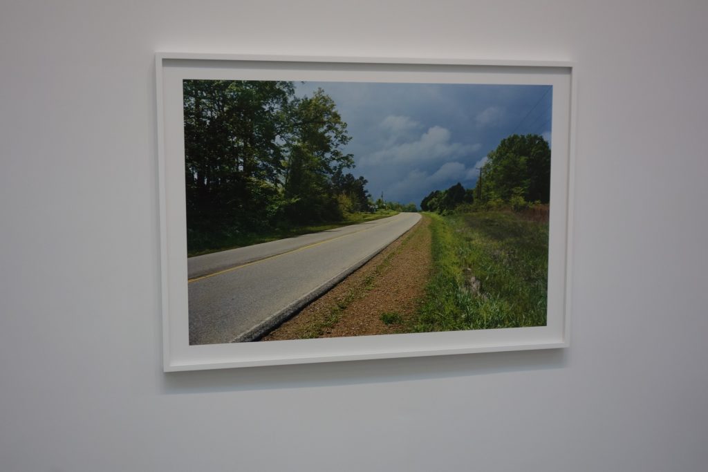
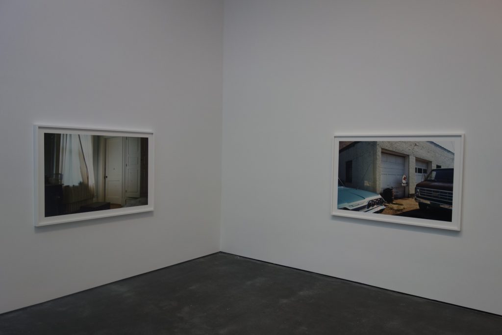
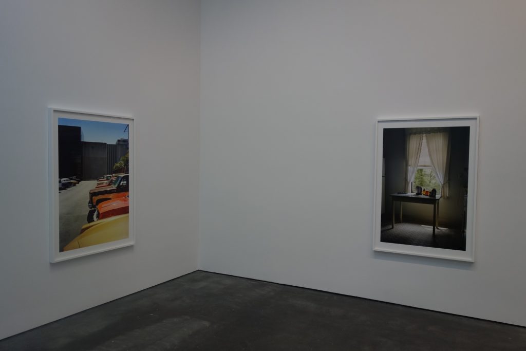
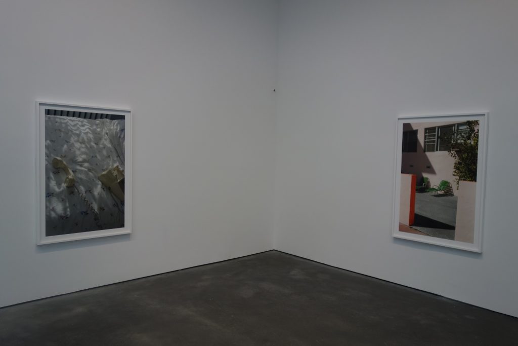
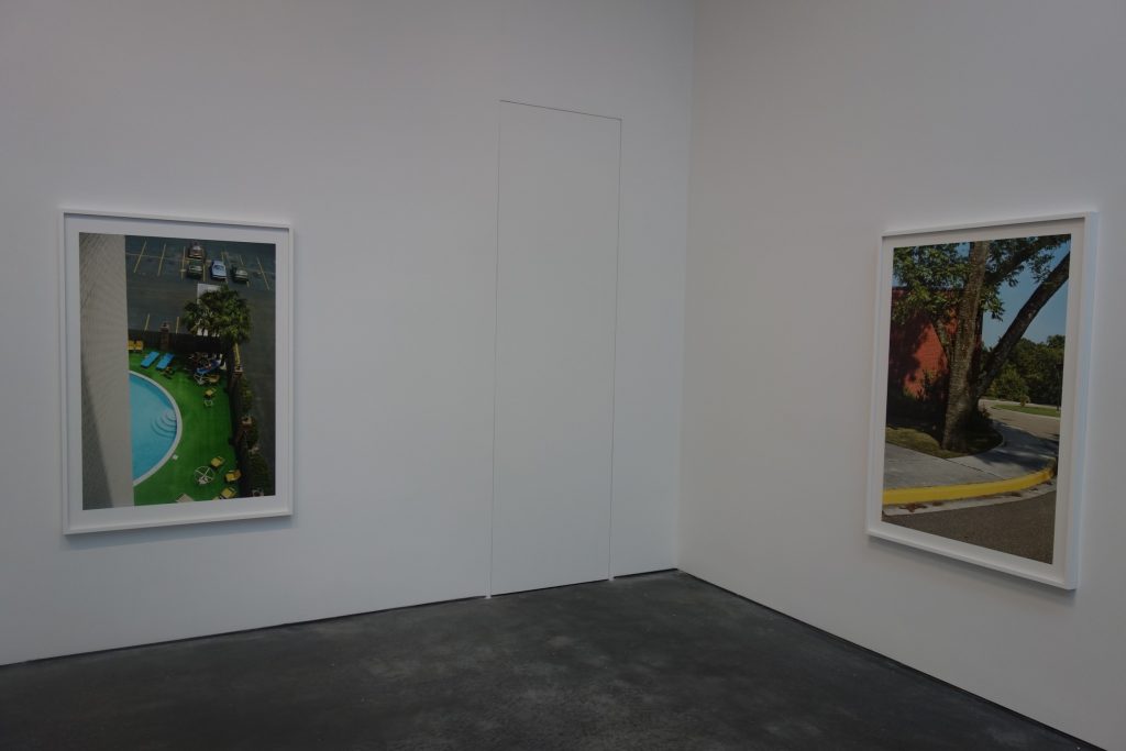
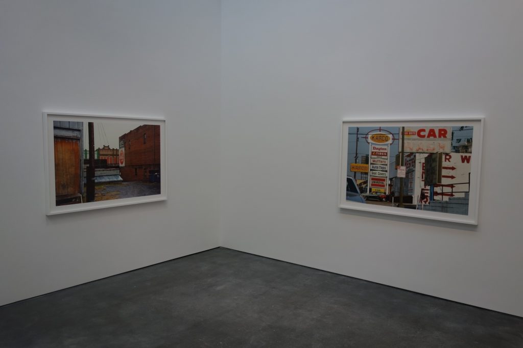
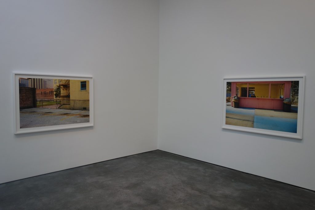
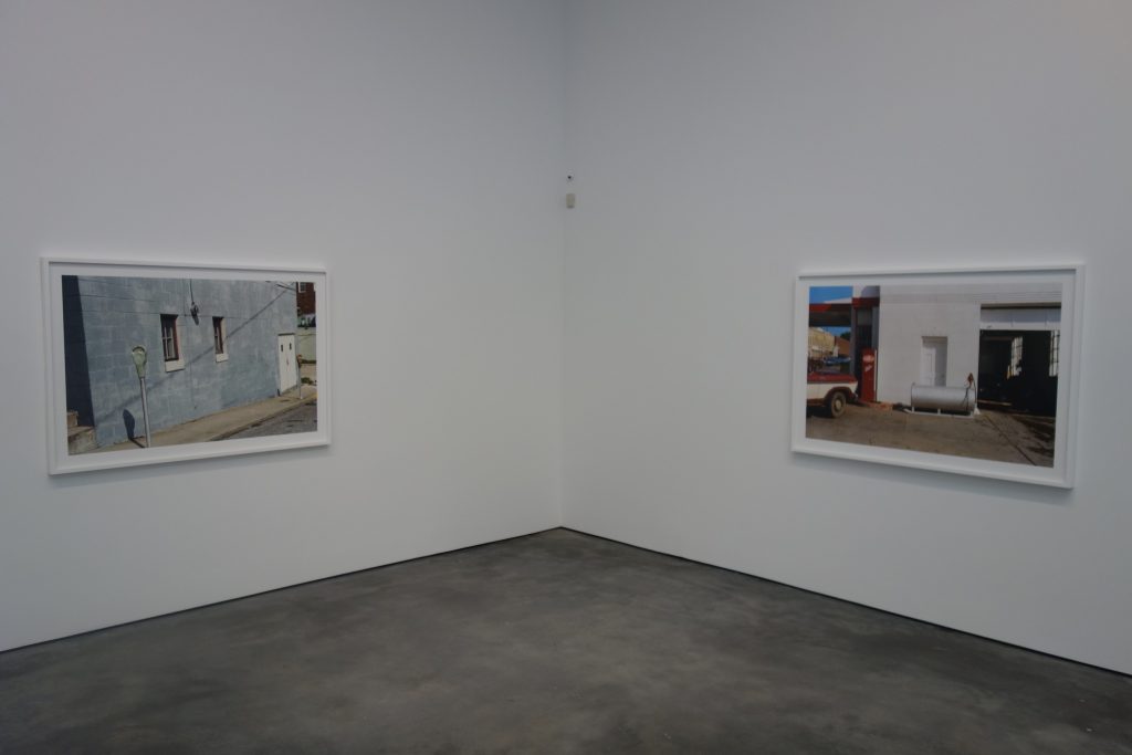
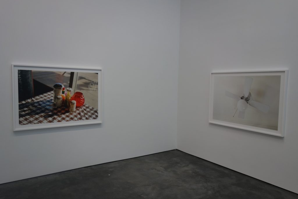
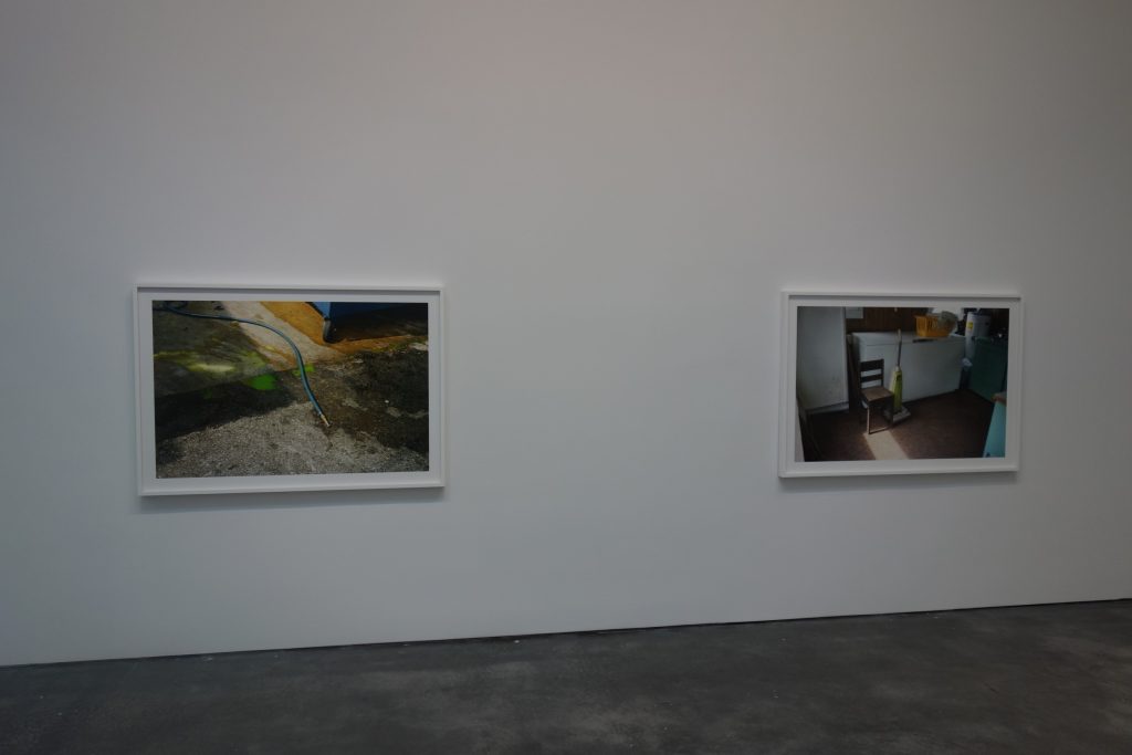
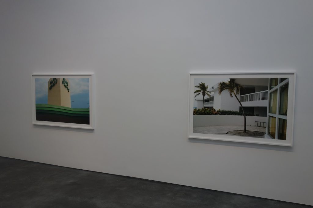
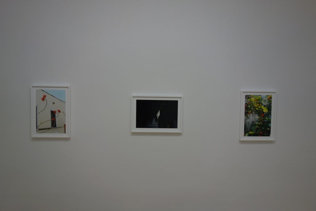
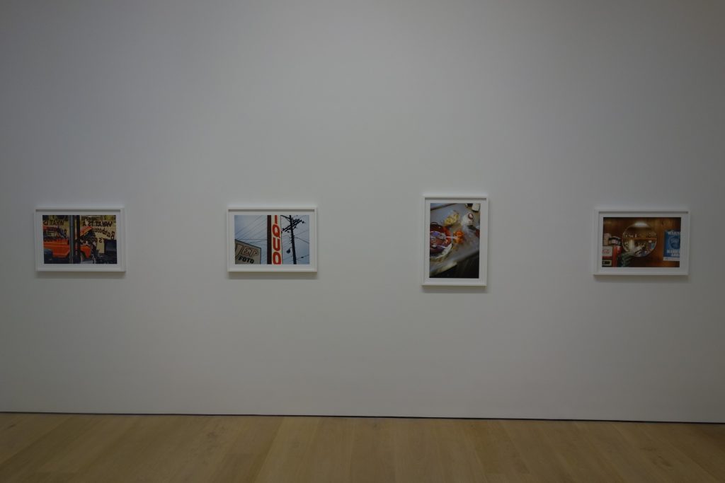
JTF (just the fact): A total of 42 color photographs, framed in white and unmatted, and hung against white walls in a series of 4 connected rooms and a smaller 5th room nearby. All of the works are pigment prints made between 1983-1986 and printed recently. 30 of the prints are sized roughly 45×65 (or reverse) and are available in editions of 2+2AP. The remaining 12 prints are sized roughly 21×29 (or reverse), and are available in editions of 5+2AP. (Installation shots below.)
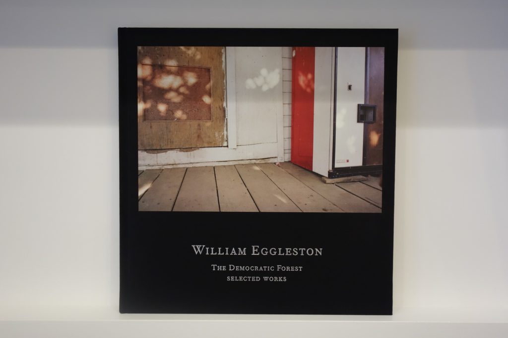
A selection of images from this body of work (150 images) was originally published by Doubleday in 1989. A ten-volume monograph of this body of work was republished by Steidl in 2015 (here). And a smaller catalog of the work was published in 2016 by David Zwirner Books/Steidl (here) in conjunction with the exhibit.


Comments/Context: For critics and arts writers, the arrival of a major exhibit by a recognized master offers the rare opportunity to roll out some effusive superlatives and to draw some expansive conclusions about the reach of someone so universally well regarded. This heaping of praise often escalates into an arms race of sorts, with critics effectively vying with each other via elegant turns of phrase and able metaphors, each searching for that perfectly apt and cleverly insightful description which captures the very essence of one so great. Mixed in with all the unfiltered public relations hype, the words surrounding such a show can often become an unending wave of positives echoing inside an enclosed bubble, so much so that active critical thinking can often get lost in the shuffle.
When reading over many of the essays and reviews surrounding William Eggleston’s new show and publication The Democratic Forest and then seeing the prints on view for myself, I had the very distinct reaction that our very best writers seem to have gotten lost in their own connection-making and hagiography-writing regarding Eggleston, to the point that many seem to have wandered away from the pictures themselves. Eggleston made the images from this series in the mid-1980s, and his prodigious output was originally made into a 1989 book of the same name, edited by Mark Holborn. The images were more recently corralled by Holborn into a sprawling ten-volume set of books published by Steidl, and then further re-edited down into the more manageable selection that is presented in both book and gallery show form at David Zwirner. In short, this is a body of photography that has been worked and reworked, pored over again and again, shown now with the benefit of decades of reconsideration.
If you dig into the words applied to these pictures (and Eggleston’s art more broadly), you’ll find many different readings, a few perhaps even encouraged by Eggleston himself at one point or another. Some see Eggleston documenting the elemental (and perhaps autobiographical) truths of America, particularly in the South and other rural, small town areas of the nation. Others see him following in the decisive moment footsteps of Henri Cartier-Bresson. Many celebrate him as the first and last word in American color photography. Still others see him as a kind of evangelist of the mundane and the everyday. And beyond these, there are those that see his pictures as the epitome of deliberate nothingness, where emptiness is the subject itself.
But based on the photographs on display here, it seems far fetched to ascribe those intentions to Eggleston before he took the pictures; it is certainly possible that certain lines of thinking and analysis made sense afterward, but the idea that when Eggleston was out shooting, he had in his his head that these pictures were “about” any of the theories retroactively applied to the images feels like a stretch. When I look at these photographs, I see something both simpler and ultimately more sophisticated than all of that.
If there is one word that might very well have been percolating around in Eggleston’s brain when he was working on these specific 1980s photographs, it is “democratic”. It’s no accident that this word found it’s way into the title of the book and show. What it represents is the simple idea that the camera doesn’t pick favorites – it objectively flattens the subject placed before it into one single plane, the lens ensuring that no one portion of the picture is privileged over another. Every photography student knows this truth, and yet, as a concept, especially for Eggleston, it is remarkably profound.
For Eggleston, this democracy of vision meant that he could go anywhere, shoot almost anything, and continue to find an endless stream of puzzles for his artistic mind to process. This eventually results in the “everyday” and “nothingness” claims that are placed at his feet, but I think the idea actually starts elsewhere – in the pointing of the camera and the framing of the individual scenes. This is where the Egglestonian magic happens, and why his picture making is justifiably revered.
If you look back at Eggleston’s 1970s work, from his famous 1976 show/book William Eggleston’s Guide for example, and then compare those pictures to the decade-later images from The Democratic Forest, what you’ll see is a restlessly evolving interest in photographic composition. While much of the reaction to his groundbreaking MoMA show centered on the radical looseness of his so-called “snapshot” aesthetic, Eggleston’s photographs from the 1980s are much more tightly controlled, with less overt implications of narrative, at least in the selections presented in this show. His subjects continue to be full of “anywhere” and “nothing”, but his eye has become more relentlessly interested in the angles of compositional form, where line and shape dominate the picture plane and light and color create visual energy. While his found scenes are of course just that (I don’t believe he moved the garden hose or the parked car so that they were just so), it is his precise alignment in organizing them that is the real force to be considered. In my mind, this framing is the star of the show and the aspect of the photographs that what we should be paying most attention to, as it forms that basis of the vitality of nearly every picture in the exhibit.
They key to Eggleston’s eye for structure is that he never falls into the trap of soulless rigor – his pictures are never squared off and frontal, or organized in ways that feel harshly geometric or monotonously machined. He always sees off-kilter warmth, even in the scruffiest of in-between areas. His eye brings together patterns and repetitions of form and then he stands in a particular place that allows him to coalesce those details into something more than a document. This happens so often and with such consistent beauty that we can only watch with appreciative satisfaction. The roundness of the turquoise picnic table swoops gently into the curve of the fake grass. The brick wall of the hotel cuts the swimming pool below into a perfect semicircle, the fencing separating the swimming area from the parking lot becoming a neat rectangle. The freezers and washing machines in a empty work room become flattened cubes and polygons that joust with the planes of a chair, an upright vacuum cleaner, and a rectangle of cast sunlight. The bottom edge of a soda machine balances with the repeating lines of the deck boards, the thinner slats of the siding in the background, and the rough plywood of an unpainted door nearby. And the luminescent shiny gold of the back of a car is set off by a bright pink cushion, the silvery frame of the back window, and an interrupting antenna that juts through the frame. None of this arrangement is luck or accident. It’s just that he’s gotten even better at covering his tracks – the compositions are more tight and taut than ever before (there are less people, too), each one optimized to find that place where naturalism meets order.
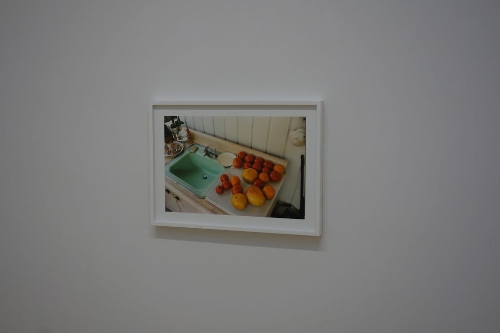
Lest we spend too much time admiring the compositional scaffolding of these pictures, color remains an important organizing tool for Eggleston as well, and his intuitively expert use of it has become more painterly in some cases. Car hoods in a parking lot build up into a yellow, orange, brown, and red spectrum. Layers of decorative green edging line the roof of a commercial building like graded stripes. Two isolated telephone booths shine with a burnished yellow glow. Plastic red tables and chairs pop in a diner, balanced by a blue car outside the window. Green lounge chairs sit against a pale pink wall, flanked by orange edge paint. And succulent red tomatoes on a counter set off the lime green sink nearby. In each case, the underlying structure of the picture is already there, and then the color explodes in our eyes, creating its own weights and balances that add to the visual mix.
But in the end, these photographs don’t seem like pre-visualized exercises in finding “America” or purposefully teasing us with “emptiness” – that seems far too academic. They seem like the restless looking of an artist whose vision has become honed to sharpness over the intervening years, who now (in the 1980s) finds unexpected interest of his own creation in even the humblest of circumstances. What we have evidence of here is a very sophisticated and continually evolving compositional talent applying his craft to whatever might be at hand. It’s not important what these photographs “mean” or what conclusions we can draw – what is important is the unequaled mastery of photographic seeing that is so thrillingly on display.
Collector’s POV: The prints in this show are priced as follows. The 45×65 prints are $185000 each, while the 21×29 prints are $45000 each. Eggleston’s prints are ubiquitous in the secondary markets, but the only real comparable for these large modern prints can be found in a 2012 sale at Christie’s (preview here, results here), and in an exhibit of cloud images in 2013 at Gagosian (reviewed here). Pigment prints offered in the public sale (in the roughly same physical dimensions and edition sizes as these works) found buyers at prices between $24000 and $580000.


Excellent review. There’s been a long, slow rise in phoney intellectualism in photography over time as it’s been incorporated into the mainstream arts. But while philosophers and lawyers can spin and sustain a rich logical thread the same rigour is lacking when it comes to ‘notions’ about art photography – one of the key words that has been mined to exhaustion.
I agree with Loring, Eggleston is about off-beat composition, colour and subject matter.
As the decades have past and his style has been emulated by a generation it’s hard to see afresh the uniqueness of what he was doing, and how extraordinarily well he did it.
As for the mis-reading and over elaborated contextualising (another fave word) the motive behind pictures, well described in the early part of the review, it can happen to anyone. I remember Martin Parr leading a walk-through of a retrospective at the Barbican, London. We stopped at ‘Sumner, Mississippi, Cassidy Bayou in Background’, (where beside a car with an open door a black man in a white jacket and a black man in a white jacket stand with their hands in pockets). I think it was a ‘faux-Parr’ for Martin to state this was a scathing indictment of racism in the American South. Which was odd considering that none of other photographs surrounding us were what could be called ‘socially concerned documentary photography’. File under ‘theories retroactively applied’, perhaps.
Loring Knoblauch has nailed Eggleston’s chronological trajectory perfectly. We do find extra “things” in the DF photographs: beautiful cars, interesting signage, the “old” emphasis on color, and especially textures. But it is the composition that rules. The frame is very frequently filled with a central “trunk” with vertical branches (often symmetrical, as occurs with streets) usually going up. The Pittsburgh photos show this most clearly, image after image. Eggleston has turned Pittsburgh into his Confederate States flag. Meanwhile, in the more maligned Berlin photographs, it is all about the tricolor flag with the vertical stripes (horizontal stripes can be made vertical by flipping the image on its side). Triplets are everywhere, while not infrequently one finds slopes. Even the Florida “shots” can be organized using the central or slightly off center vertical structure as first site viewed in a photograph. So, the forest is explained by the trees; the “democratic” seems to be the imposition of humanmade objects on landscapes (hidden or still exposed), which the artist then shows to have (sometimes inadvertently) followed basic patterns. Let me propose that our own personal interest in Eggleston could follow a similar timeline as his own development: it will be love at first sight for his chromographic period, but in the end, it will be the “framing” that is “the star of the show” that will give us a deeper and richer satisfaction, because nothing else has been discarded along the way, only more subtly emphasized and enhanced.