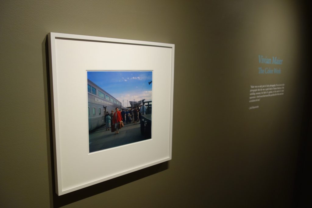
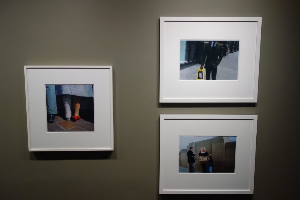
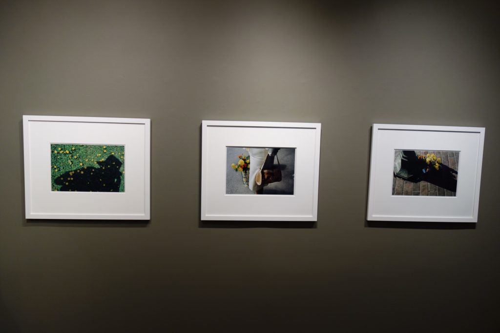
JTF (just the facts): A total of 23 color photographs, framed in white and matted, and hung against dark green walls in the second gallery space. All of the works are chromogenic prints, made between 1956 and 1979 and printed posthumously. Physical sizes are either 12×12 or 10×15 (or reverse), and the prints are available in editions of 15. (Installation shots below.)
A monograph of this body of work was published in 2018 by HarperCollins Harper Design (here).


Comments/Context: We’re just over ten years into the engaging rediscovery story of Vivian Maier. In the decade since her work was found at an auction in Chicago, there have been gallery and museum exhibits around the world, a handful of monographs, and a documentary film that earned an Academy Award nomination, each a small step in bringing her photographs to a wider audience and defining (and building) her artistic reputation.
To date, the Maier mystery has been a black-and-white street photography story, with her enigmatic life as a nanny and the more than 150,000 unedited images she left behind as the major tent poles of the narrative. This small exhibit, and the concurrently-released (and much larger) monograph, opens up a new direction in the study of her massive archive – the introduction of color.
Maier’s color work includes some 40,000 Ektachrome slides, so questions about the editing of the archive (and the posthumous prints made from these slides) continue to be relevant. The selections here provide a cross section of the kinds of pictures she made in color, from clever self portraits and images built with wry visual humor to street scenes and observations enlivened by a pop of color, giving us a flavor of how she saw differently when color became part of her aesthetic calculus.
Given that most of Maier’s color photographs were made between roughly the late 1950s and the late 1970s, if her work had been known at the time, she would have found herself chronologically smack in the middle of the American color movement with Eggleston, Shore, Meyerowitz and others as her contemporaries. And while she may (or may not) have been aware of some of that work, her pictures are evidence of the transition that many primarily black-and-white photographers went through when they started to employ color – they had to make photographs in color before they could begin to evolve toward making photographs of or about color.
Maier’s self-portraits are deservedly well-regarded, and her ability to inventively double herself in shop windows, mirrors, and other reflective surfaces feels even more modern when executed in color. Here she captures herself at the center of energetic dots of light, as a silhouette on the train platform (intruding over a poster for the film Heaven Can Wait), tripled in a jittery double layer reflection of glass, and reflected in a tiny mirror placed on the sidewalk with a bundle of flowers. Two other self portraits use her dark shadow (with hat) as a personal stand in, one overlaid across a grassy area dotted with sunny yellow flowers, the other seeming to look at a discarded plastic bag with the message Here’s a Real Eye Opener tucked inside. It seems she had endless reserves of these kinds of smart personal depictions.
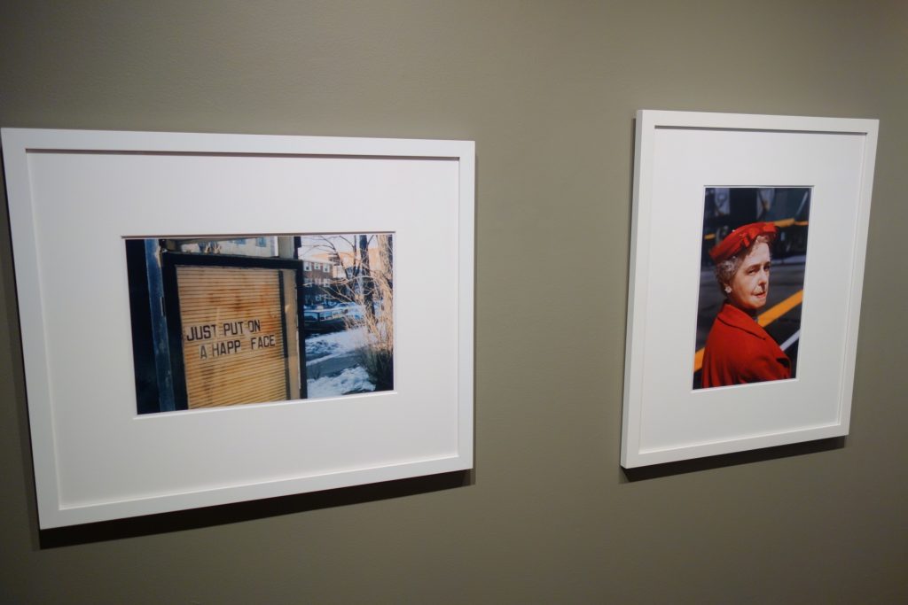
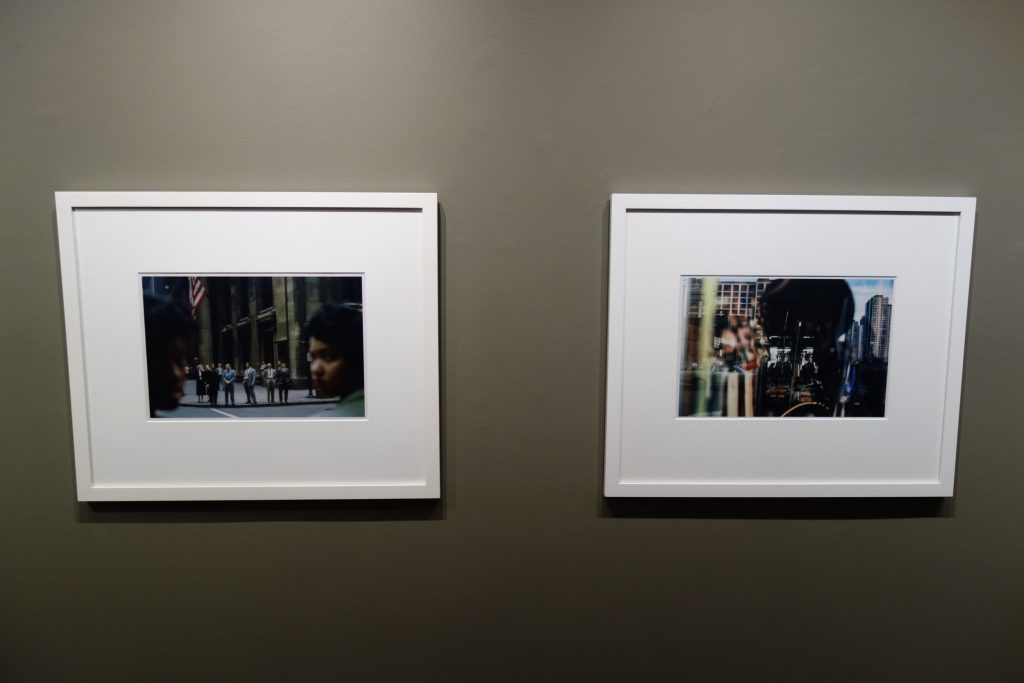
Maier’s dry visual comedy also animates plenty of images without her hovering presence. She captures a vendor of papal paraphernalia with a picture of the pope perfectly set in front of his face, a man perplexingly walking straight through a tall green hedge, and a sign with the message Just Put on a Happ Face (the important letter y having disappeared). Less overtly funny but even more powerful is a street scene framed by the faces of two black women, their blurred heads bookending a group of suited white men on the opposite corner – made in 1959, it shows that Maier was certainly aware of and attuned to the racial realities to be found on the streets of Chicago.
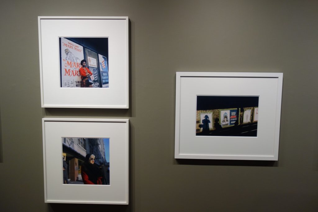
Even in some of Maier’s earliest color compositions from the late 1950s and early 1960s, we can see her evolving toward overtly using color as a compositional tool. The pop of a woman’s red coat enlivens a scene with a streamlined train, while another red coat (this time with matching hat) interrupts angled yellow and white lines painted on the street. In other other images, a frilly pink hat tops a fur coated pedestrian, a red sweater is worn by a woman standing near advertising posters, and a single red shoe is matched by the other foot in a cast, its jaunty brightness sparkling in the sun. But in each, we also feel an undercurrent of isolation and separation, the mood not entirely without reserve or wariness.
By the 1970s, Maier’s eye for color had become more nuanced and sophisticated. A splash of daisies sits in the back of a convertible, the red leather seats and dashboard creating a foil for the optimistic whiteness of the flowers. The corner of a red newspaper box anchors the bottom of a window scene filled with squares and lines, its insistent geometries balancing a face at work inside. And a woman carries a bouquet of yellow and orange marigolds in a satchel, her handbag (in the other hand) decorated with a similar floral motif. In these pictures, Maier isn’t just noticing the vibrancy of a green shirt collar or a yellow flyer, she’s re-architecting the proportions of the frame to make the color arrangements function more effectively.
If this sample of work is representative of the larger whole of her color output (which is a very dangerous and potentially false assumption in my mind), then my conclusion is that Maier was slightly more effective in black and white than she was in color, at least until later in her artistic career. Many of the key features of her best work come through in these color images, but her control over color seems somewhat less than entirely confident. But perhaps this is simply a function of this first edit, and as more images are seen, we will further recalibrate her place in the color hierarchy.
Collector’s POV: The prints in this show are priced at $2500, $3500, $4500, or $6500 each. Maier’s work has little secondary market history, so gallery retail remains the best option for those collectors interested in following up.