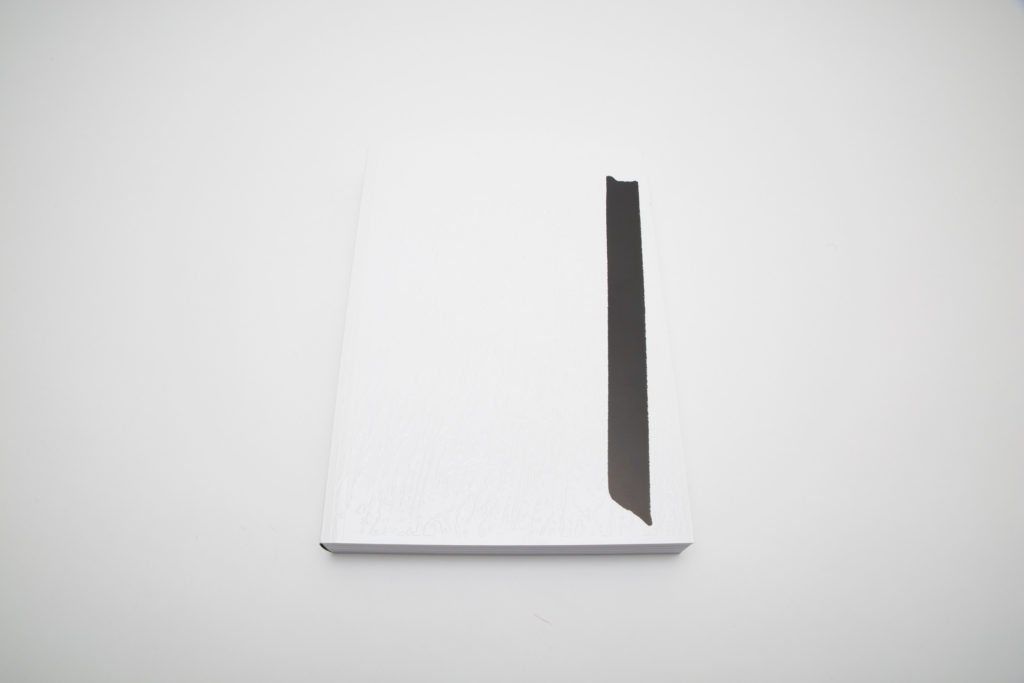
JTF (just the facts): Published by Fw:Books in 2017 (here). Softcover, 400 pages, with roughly 400 black and white and color photographs. In an edition of 500 copies. (Cover and spread shots below.)
Flat Finish is also available in a special edition (here). This deluxe version (in an edition of 25) comes in a box with two prints: (1) laserprint on 80 gr silver Chromolux and (2) offset prints on 250 gr Chromolux (21×29,7 cm). Signed and numbered.


Comments/Context: In the past few years, the Dutch visual artist Stephan Keppel has become increasingly well known for his studies of cities and urban spaces. His book Entre Entree (from 2014) offers a disorienting look at Paris and its outskirts, while his earlier effort Reprinting the City (from 2012) captures the Dutch harbor city of Den Helder. His most recent photobook, entitled Flat Finish, applies a similar approach to the tactile surfaces of New York.
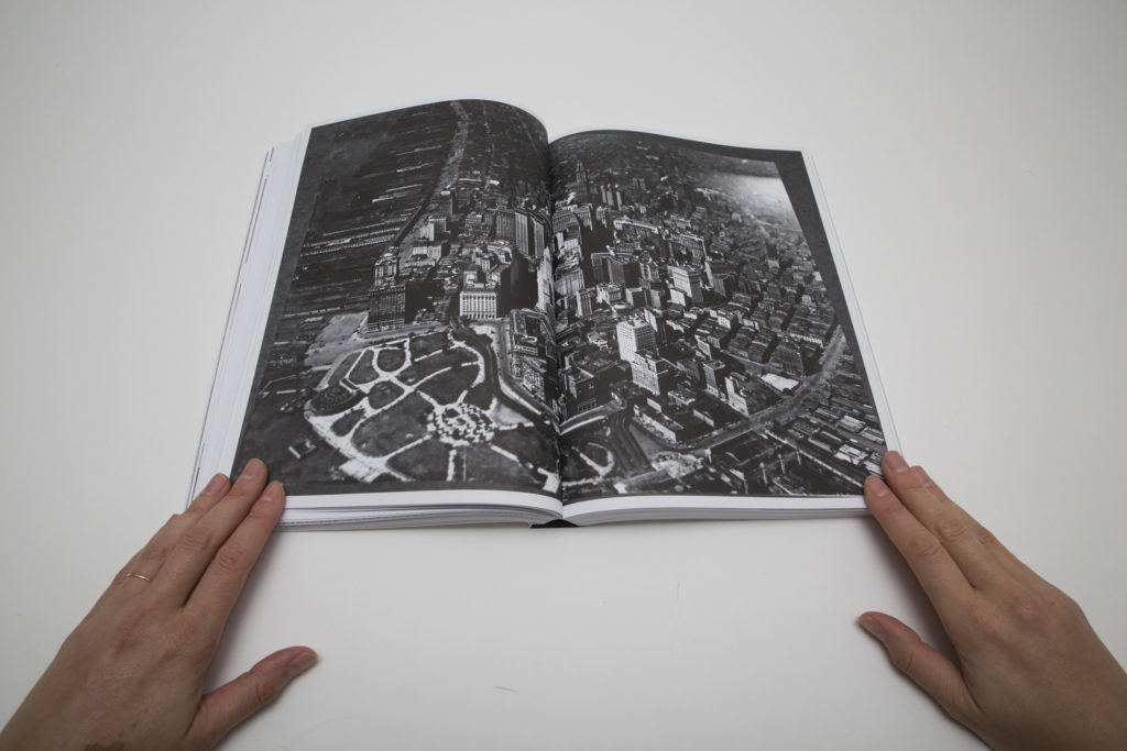
Most of the pictures in Flat Finish were taken during Keppel’s trips to the city between 2015 and 2017, but a key element in Keppel’s artistic vision is the idea of recycling and reproducing imagery. So the book mixes his own first hand observations with images taken during a visit to the New York stage set at the studios of Paramount Pictures in Los Angeles (playing with the idea of how the city is represented) as well as archival materials from the Canadian Centre for Architecture (which holds a large collection of images of New York). Keppel has also included reproductions of his own images and various installation shots for exhibits, putting the aggregation of images through yet another functional cycle.
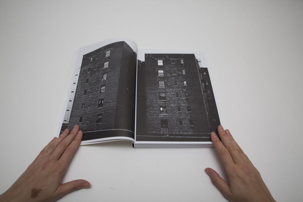
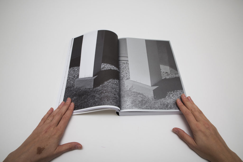
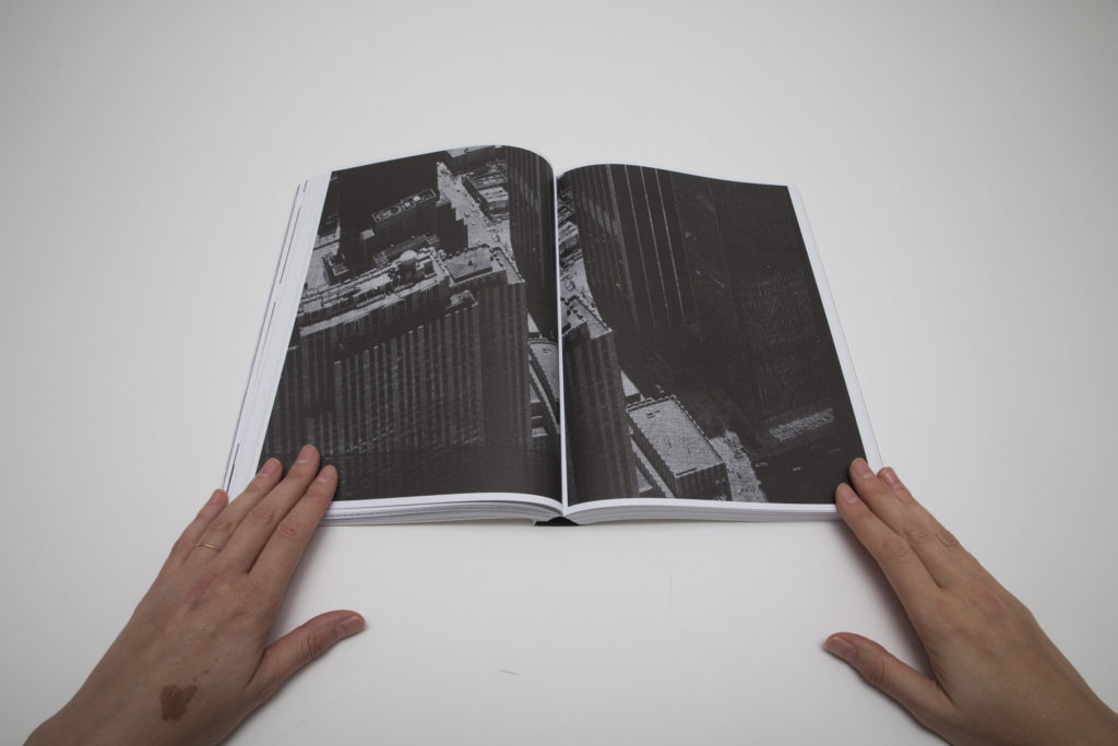
There is no doubt Keppel spent endless hours walking around New York City, looking around and capturing details with the trained eye of a sharp observer. The project is rooted in patiently moving through the city, exploring and observing its textures and forms. Keppel’s impressive visual archive of the city’s public landscape focuses on its structures, surfaces, shapes, and lines, and given Manhattan’s grid system, the patterns of geometries fit together snugly.
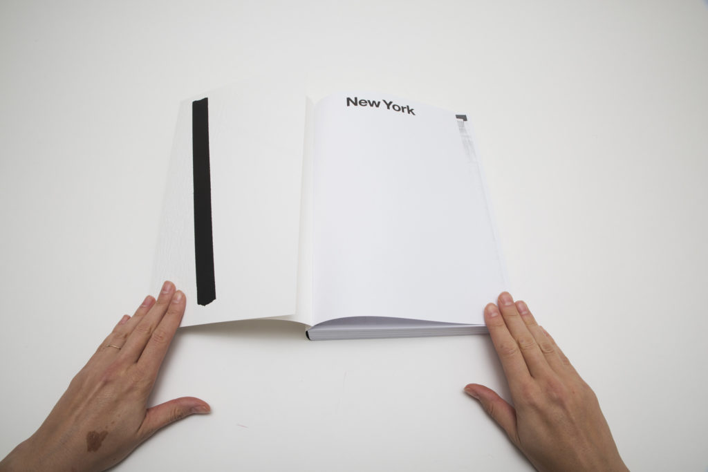
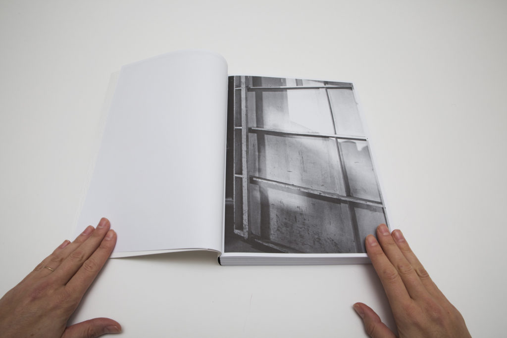
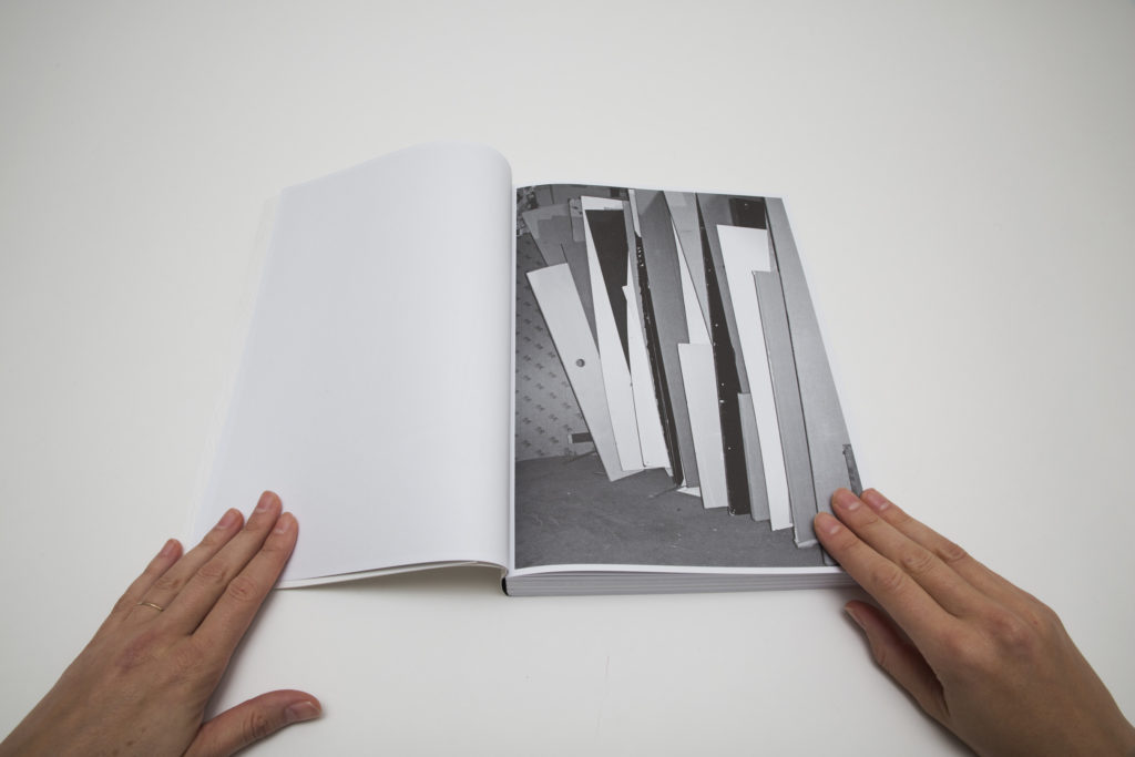
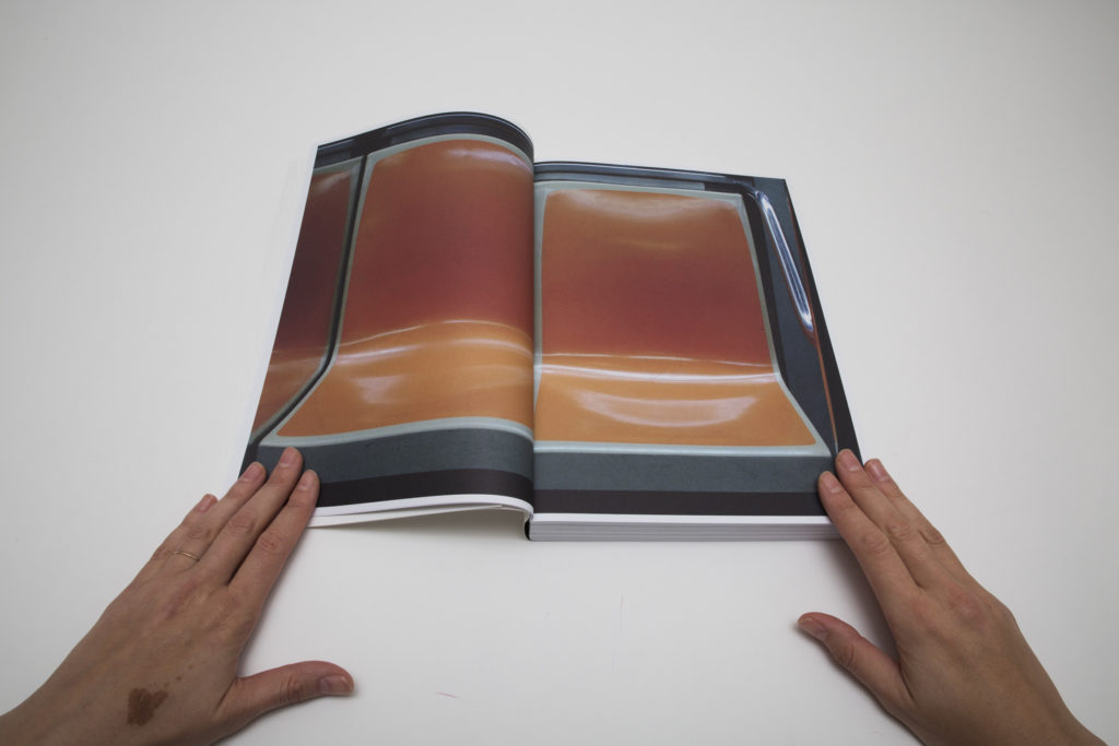
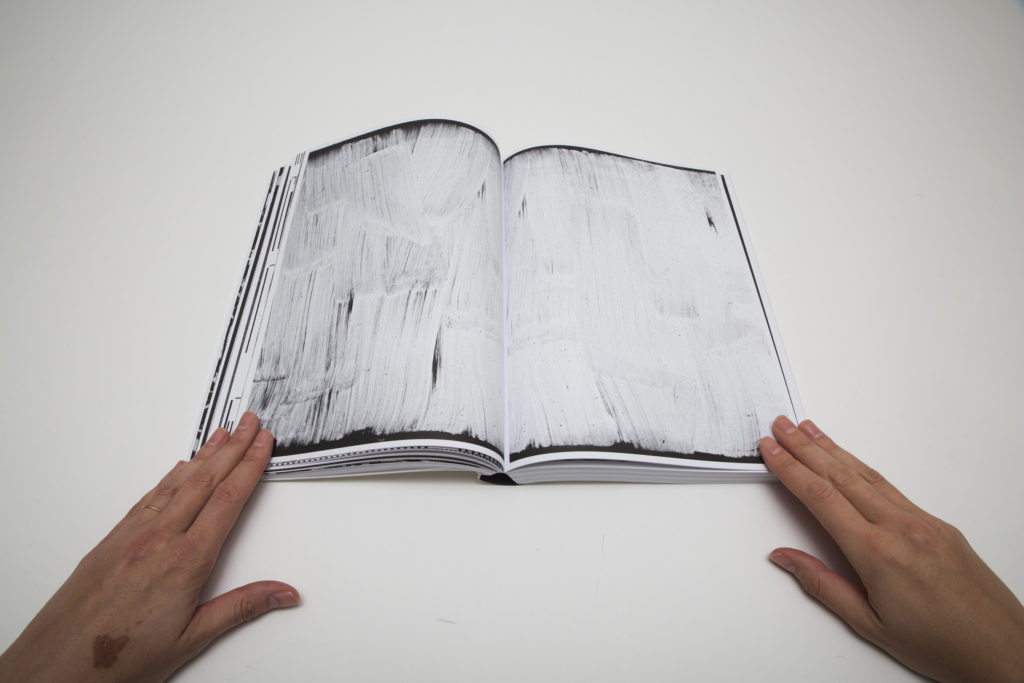
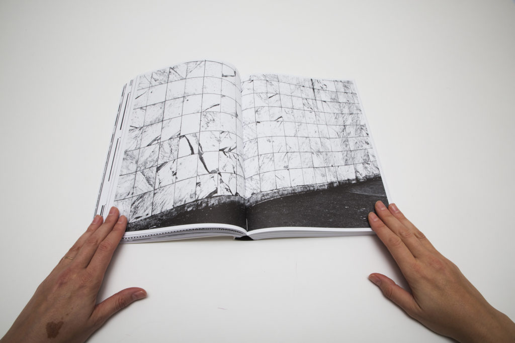
As the book opens, the word “New York” appears at the top of the first page, using a simple design element to set the context for the visual flow – there are no other texts, captions, or page numbers. The very first image shows us a city wall roughly painted over multiple times in white, perhaps offering a double metaphor for a constantly changing city and Keppel’s own process of reuse. After this beginning, photographs of piled up and stacked cabinets, boards, and door frames serve as a rhythmic introduction to the layers and geometries we will find in the book. They are followed by a full color spread of the immediately recognizable curved orange seats of a New York subway car, and this shifting between known and unknown sets the dynamic of the book, inviting us to immerse ourselves in an alternative vision of the familiar city.
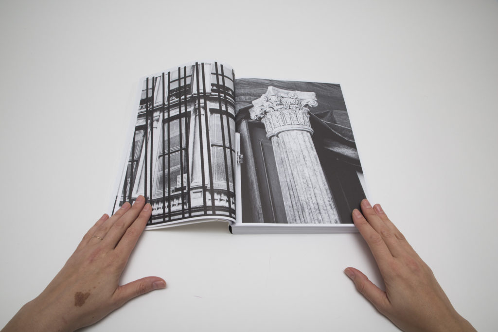
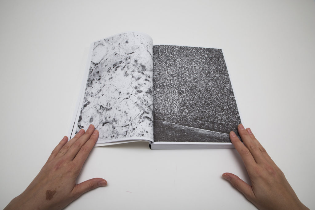
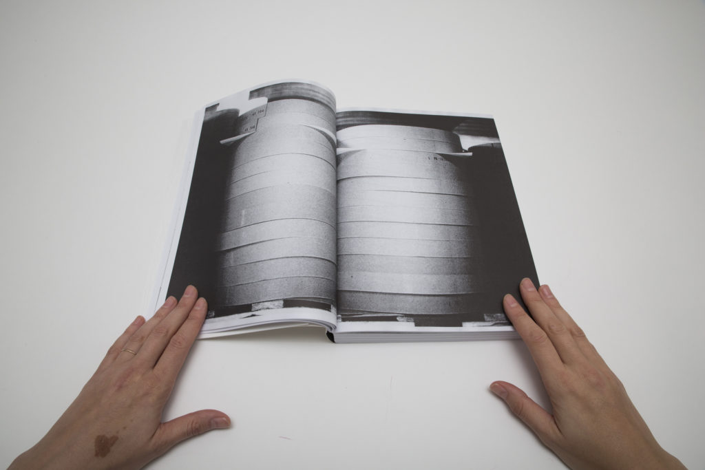
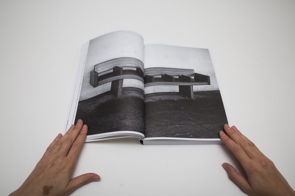
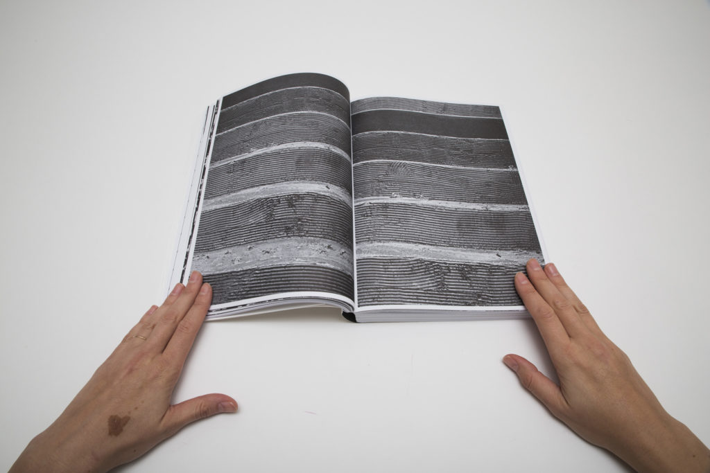
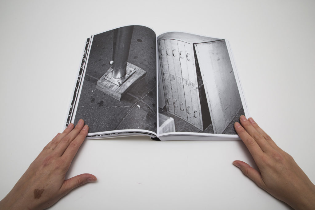
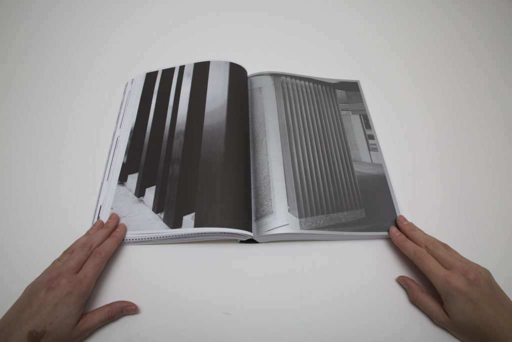
Like an architecture student ticking off examples of building materials in use, Keppel captures lots of columns, structural details, wall textures, pavement surfaces, and endless piles and rows of objects, as if he wanted to document all the of elements from which the city is made. The edit pays particular attention to form and rhythm, using close ups and tight framing to highlight roughness, linear striping, and patterns of windows, repeating these themes throughout the book. Keppel’s study of the city is stripped of the physical representation of people, yet the human presence is felt in the gritty walls, peeling paint, and dirty floors, and in the decisions that led to functional subway benches and ornate court house pillars.
Where Keppel separates himself from the countless others who have been fascinated by the abstracted surfaces of New York is in his approach to bookmaking. The book form and printing process(es) are central to Keppel’s work as he experiments with printing and the idea of image representation and function.
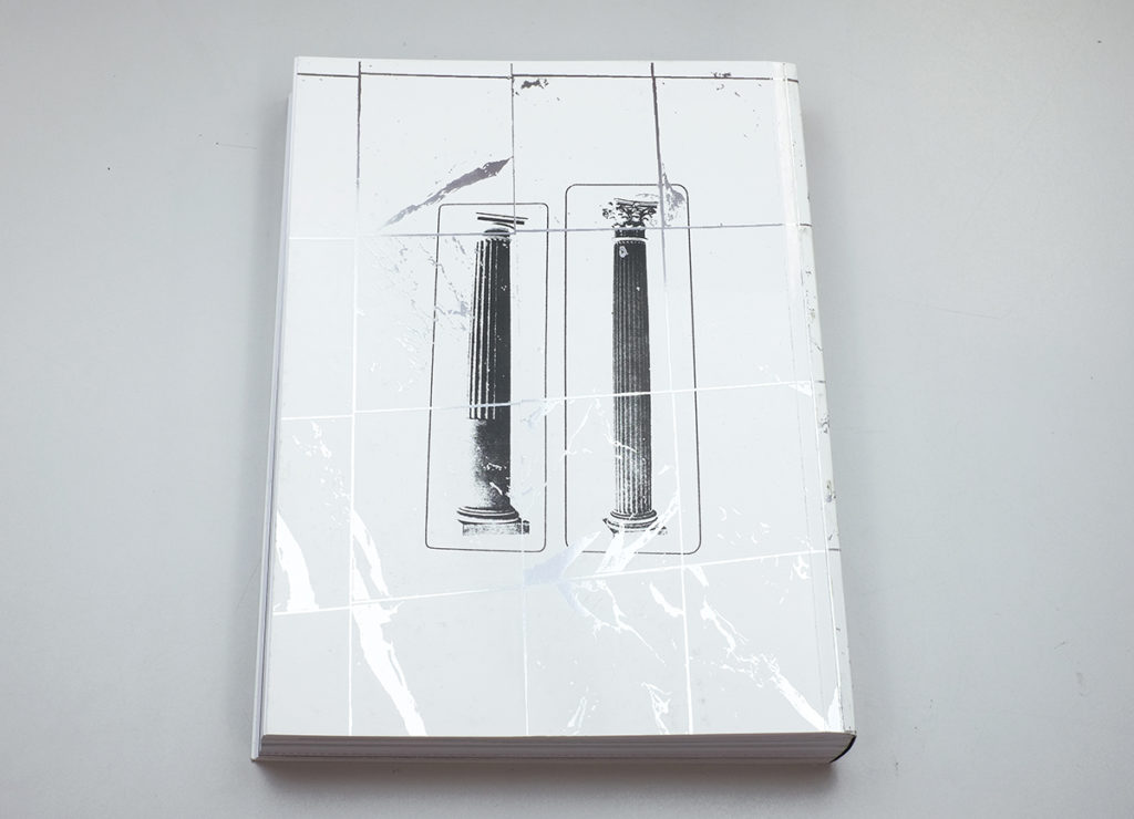
Flat Finish is a thick softcover book filled with hundreds of pages. Its snow white cover with slightly raised parts has a surprising sense of texture and dimension, almost like some of the building materials depicted inside. The black vertical line over it looks like a strip made with a paint brush.
The images in the book feel like photocopies, confusing primary impressions and secondary reproductions. Keppel also employs various types of paper, and a number of images are printed in fluorescent colors and metallic inks, adding further layering and rework to the heft of the book. A sequence of six very similar images capturing part of an ordinary white column gets interesting as one of the pages is printed on a different paper, one side of which is executed in silver ink. These are then followed by photographs of columns with more elaborate decoration, setting up a vivid contrast.
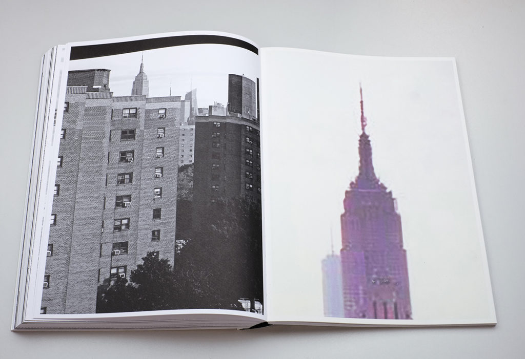
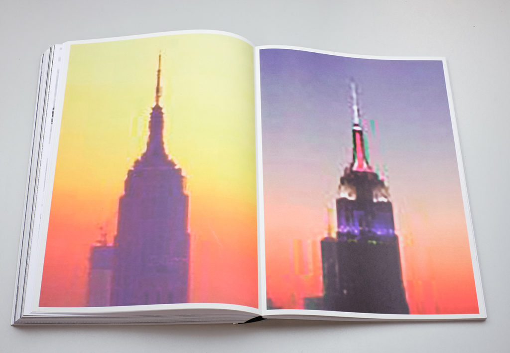
Even the iconic Empire State Building gets Keppel’s attention, as he reworks the classic form into blurry shadows. A sequence of eight photos is printed in color on a lighter paper, yet remains recognizable through its shape and its colorful tower lights. Once again, he is playing with visual memory and the recirculation of images.
In the end, even though it travels down sidewalks we have visited before, Flat Finish is far from a conventional representation of New York. It tells a story of perception and of looking, and of taking those observations and transforming them into echoes of themselves. While some of the individual photographs might seem predictable, assembled together in a book form and reprocessed by Keppel, they capture the urban landscape in a fresh way, stripping it of immediately recognizable elements and exploring the space between the hidden and the seen.
Collector’s POV: Stephan Keppel does not appear to have gallery representation at this time. As such, interested collectors should likely follow up directly with the artist via his website (linked in the sidebar).