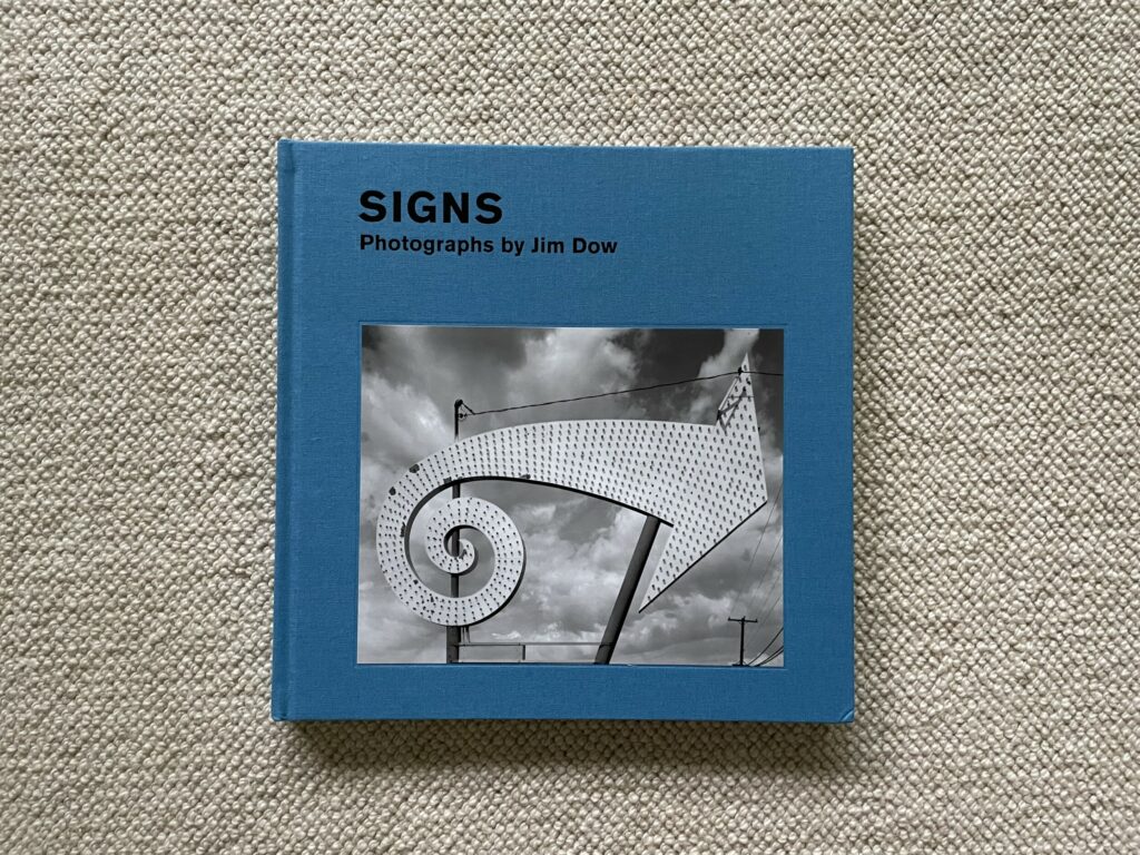
JTF (just the facts): Published in 2022 by the Nelson-Atkins Museum of Art (here) and distributed by Yale University Press (here), in conjunction with an exhibition at the museum (from May 7, 2022 to October 9, 2022, here). Hardcover (11×11 inches), 120 pages, with 68 black-and-white and 8 color reproductions. Includes essays by April Watson and the artist. (Cover and spread shots below.)


Comments/Context: The combination of America’s vast wide open spaces and its burgeoning car culture came together to make the open-ended cross country automobile trip a mid 20th century cultural rite of passage. And with the arrival of the interstate highways starting in the late 1950s, our collective national wanderlust became even more wide ranging and exploratory. Cameras were of course often faithful companions on these journeys, and plenty of notable photographers across the decades (both foreign and American) have set out on the road to take the pulse of this country, to document its roadside quirks and regional eccentricities, or to artistically search for themselves. Many haven’t known what exactly they were looking for, at least when they started out, but for the most part still found it, with the discoveries, adventures, and interactions along the way generally proving more important than the eventual destinations.
This catalog (and the museum exhibit it accompanies) takes stock of the photographs Jim Dow made on a series of cross country trips in the decade between 1967 and 1977. And while Dow would go on to become well known for his precisely seen color images of vernacular America (and elsewhere), this show turns back to the beginning of his career, when he was still finding his photographic footing.
Dow studied graphic design at the Rhode Island School of Design (graduating in 1965), then returned to RISD to do his MFA in photography with Harry Callahan (graduating in 1968), and later developed a close relationship with Walker Evans, whose work he had come to admire. So when Dow took to the road, shooting in black and white with a large format 8×10 camera, he was still trying to synthesize the influences of Callahan and Evans into a photographic voice he could call his own.
As seen in these pictures, Dow internalized from his two mentors a profound respect for the straightforward visual honesty of a clearly seen photograph. Coming out of the swirling cultural moment of the late 1960s and early 1970s in America, such a reserved artistic mindset wasn’t at all obvious, but perhaps Dow’s measured stance provided a way to make some sense of the chaotic world around him. These early photographs are filled with the clarity of deliberate patience, of looking slowly at the remnants of American mass culture that were whipping past his windshield and then isolating particular fragments of those vernacular artifacts and symbols that felt representative of a rapidly disappearing slice of national identity. His results are rigorously attentive without layering in either sentimentality or wry irony, essentially taking these found objects at face value and crisply amplifying their legibility; if anything, these photographs are infused with a subtle sense of the open eyed American optimism that was embedded in the fading 1950s culture of the road at that time.
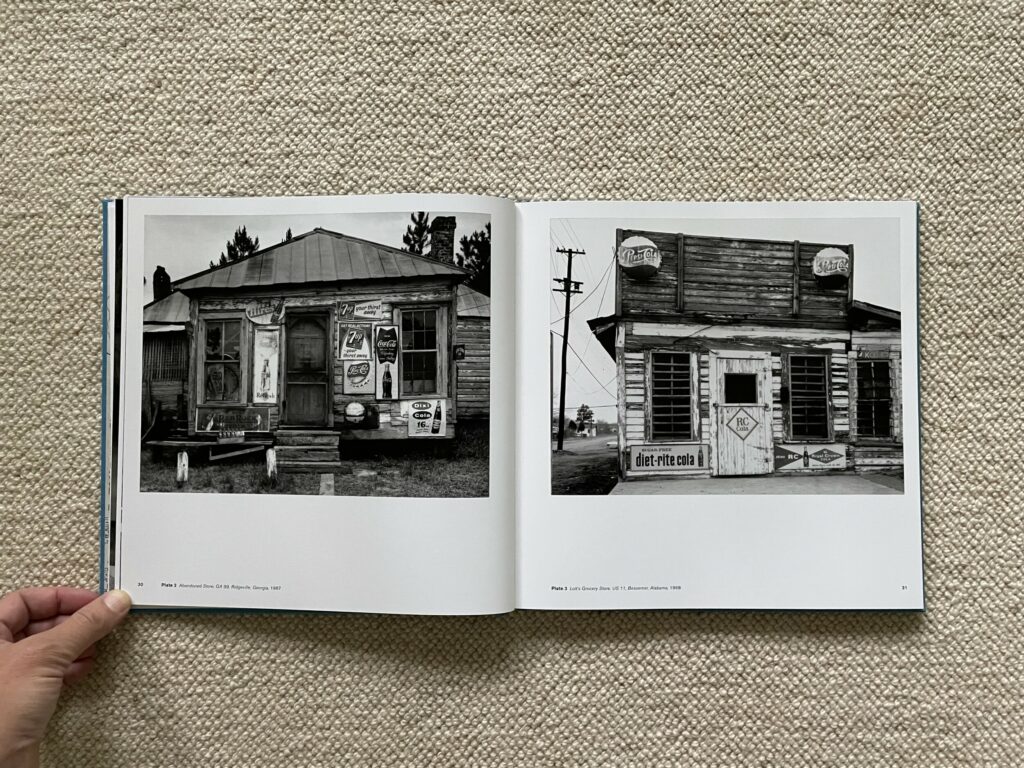
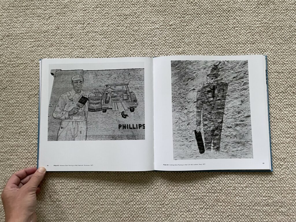
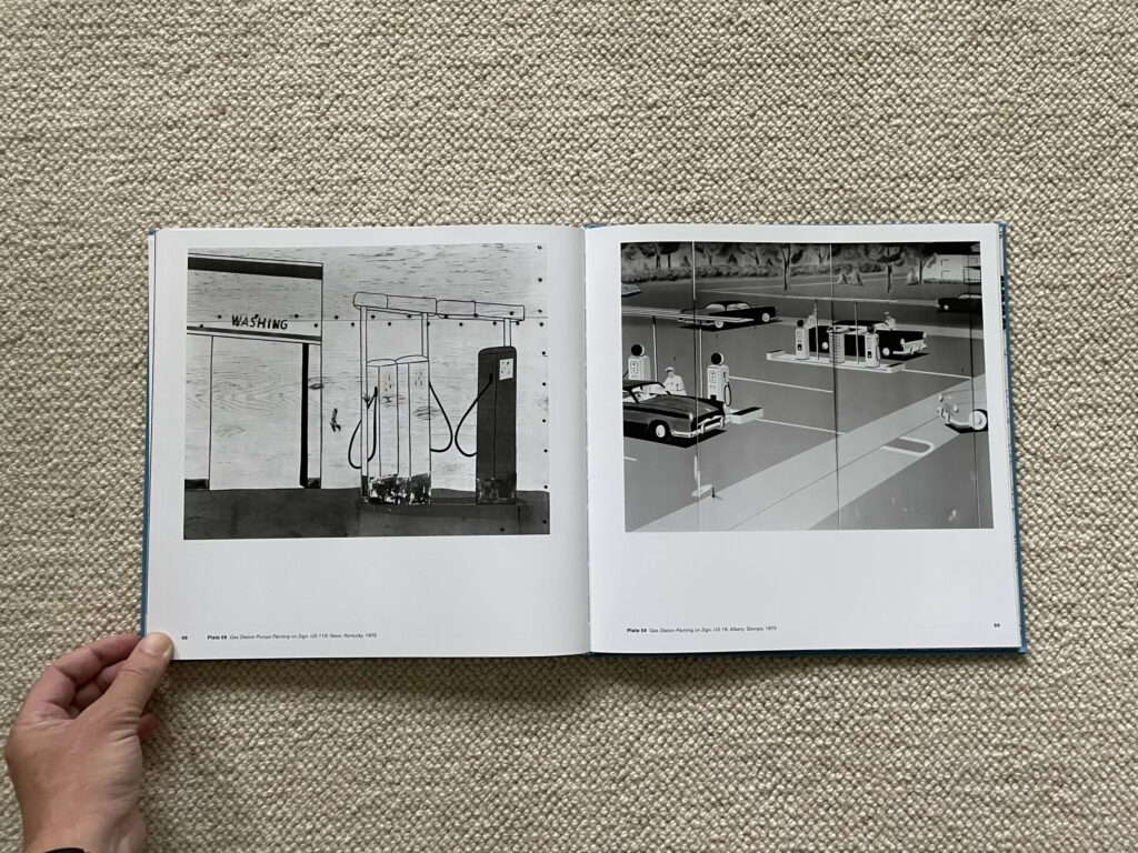
A few of Dow’s earliest efforts (from the late 1960s), capturing the signage and architectural detail of roadside grocery stores and framework houses, show a clear debt to the sparse frontal framing of Evans, but this approach ultimately gave way to an even tighter compositional eye that largely (with a few exceptions) pulls in closer to its subjects. Dow’s training in graphic design feels like an important driver in the evolution of this style, in that he uses the power of his camera to examine, isolate, and document particularly potent examples of vernacular design (in the form of roadside objects and attractions, the typography of signage, and the cropped down highlights of painted murals), and then once isolated, these observations of design become untethered from their original context, in a sense opening them up to broader interpretation.
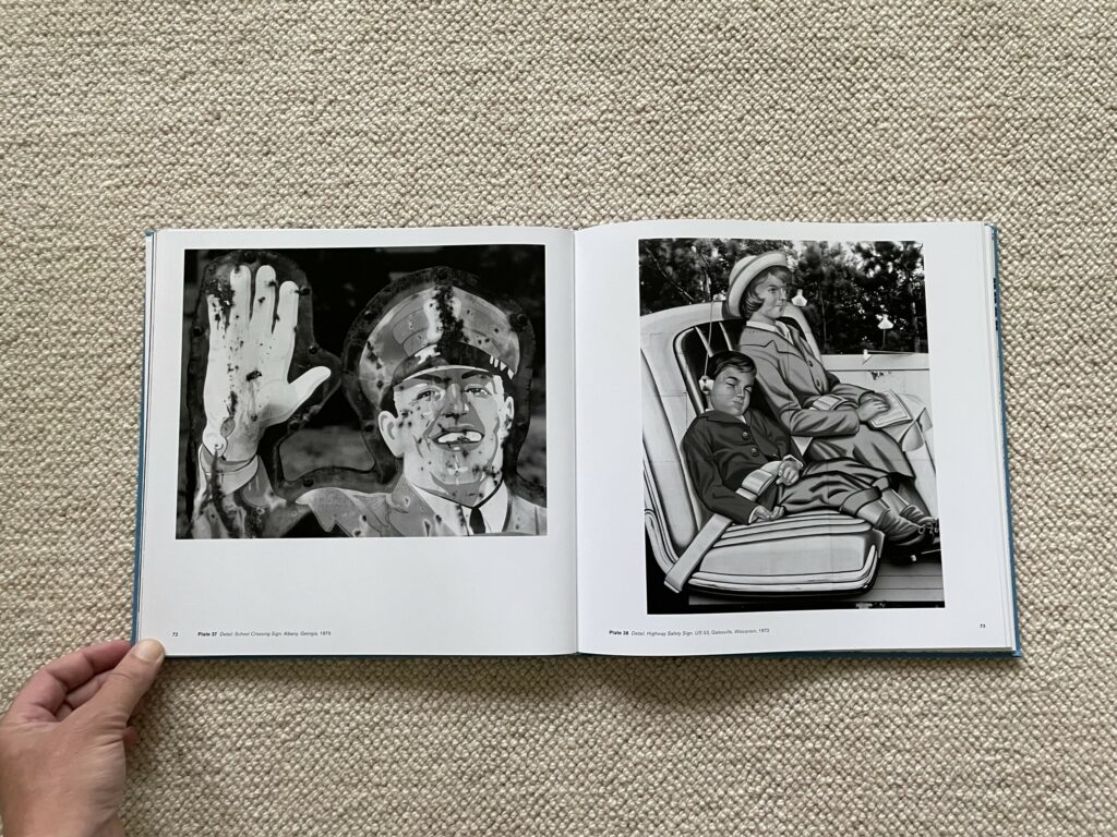
If we honor such roadside graphic design with the term art, then what Dow was doing was using his camera to reinterpret the art of other (anonymous) artists, employing various framing techniques to highlight and reconsider the potential meaning and impact of their imagery. Cropping out the context of gas station murals leaves out the reality of grubby, aging stations for the clean futuristic visions of a streamlined age, and other transportation themed images remind us of the positive public safety messages of wearing seatbelts or obeying friendly school crossing guards; even the trailer parks seem inviting when happy swimsuited families are seen playing with beach balls in front of their shiny Airstream trailers.
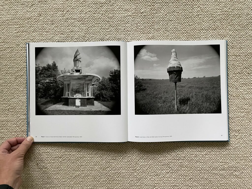
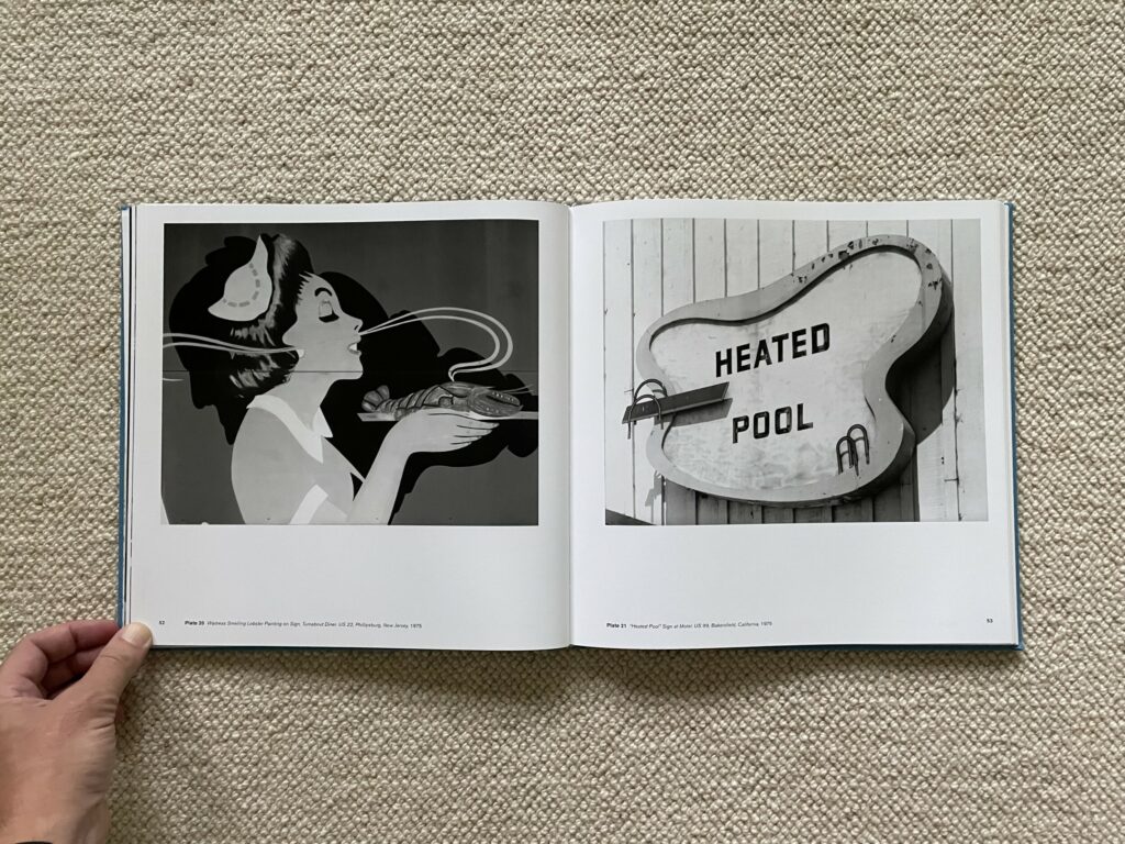
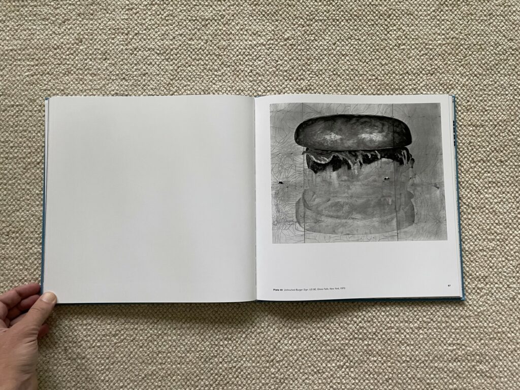
The need for nourishment along the road is generally reduced to a simple symbolic message, often writ large – we have something good here worth stopping for. That food specialty might be coffee (supposedly “at its best”), a burger (although the mural is unfinished and looks half eaten), fragrant steamed lobster, or various kinds of soft serve ice cream (typically advertised with an image of the product in bold neon or an extra large sculptural form visible from afar). Quality is also implied by the welcoming image of a chef ready to take your order.
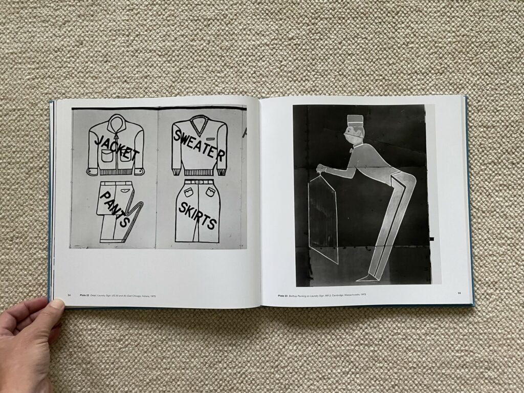
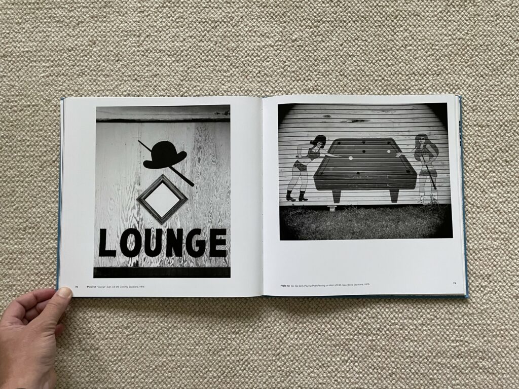
Dow sees similar visual invitations in the amenities offered by motels. Smiling attentive bellhops are ready to attend to unspoken needs, particularly laundry, while accommodations with swimming seem keen to advertise their best features, from heated pools and soaring divers to welcoming arrangements of patio furniture. Some even offer lounges, complete with pool tables and friendly women in shorts, crop tops, and boots.
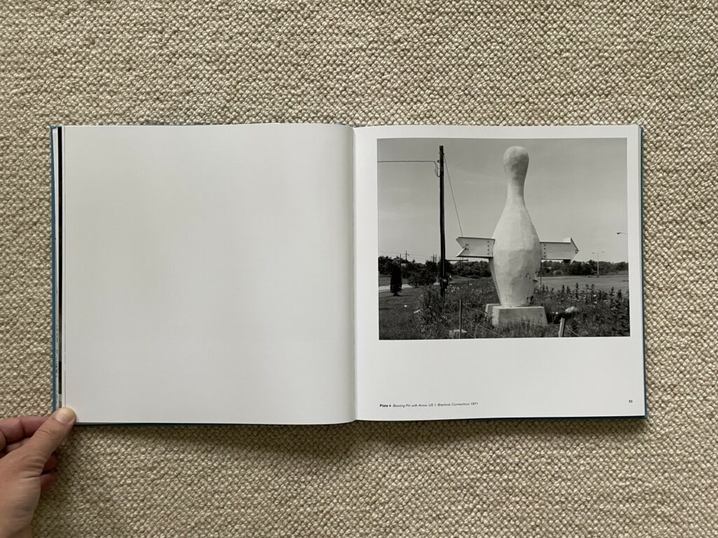
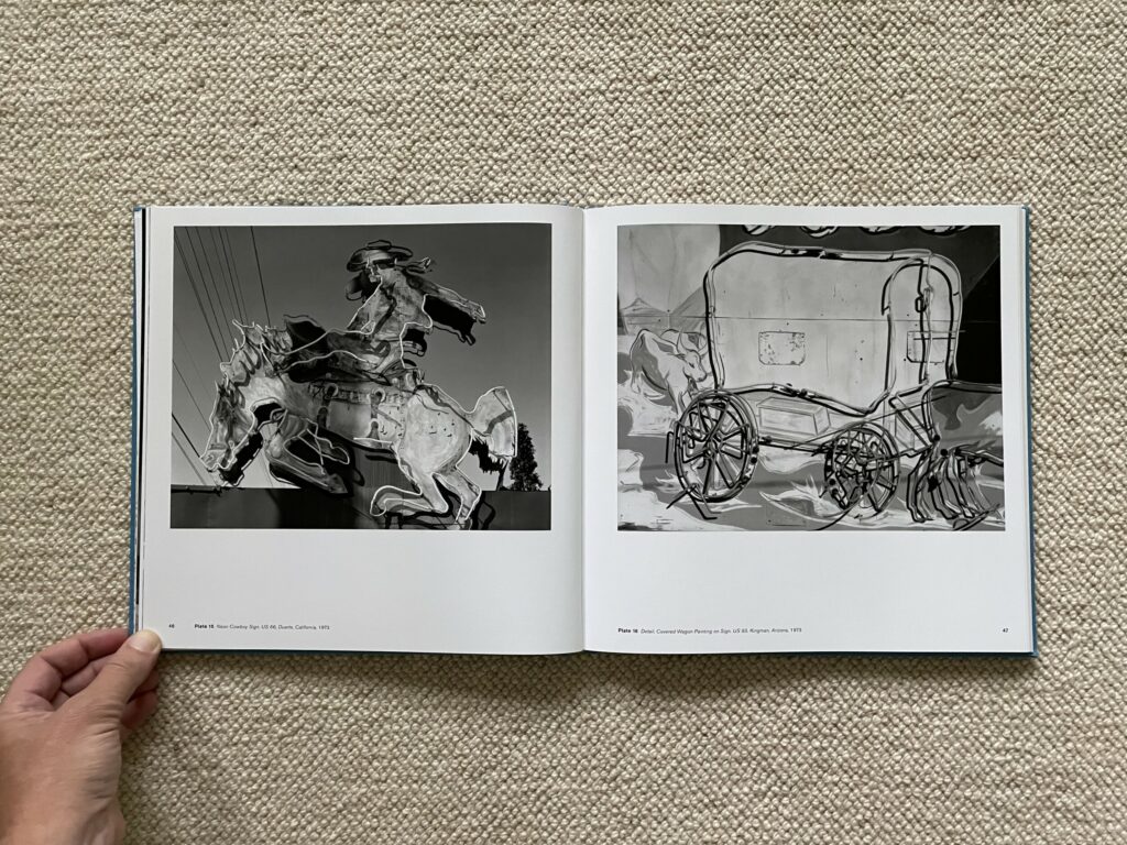
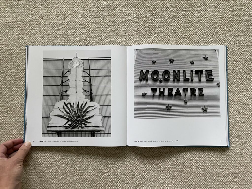
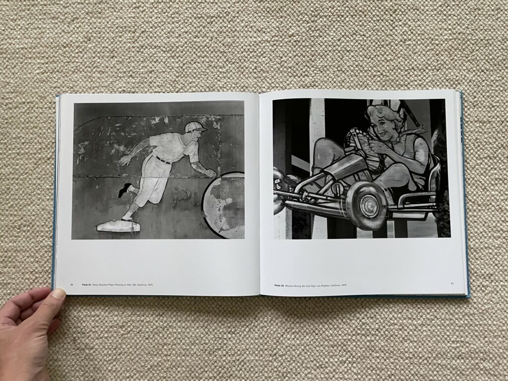
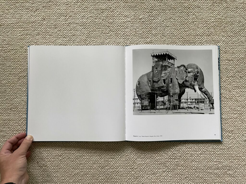
Roadside attractions have to work even harder to generate enough attention to merit a pull off the highway, and Dow’s images collect a range of possible entertainments, each representative symbol or graphic element infused with a splash of good time fun. Literal symbols are pumped up with energy, like a bowling pin with a jaunty arrow and a roller skate with wings, while activities like baseball, go karting, and shopping for Western wear are all done with resolutely smiling faces. Dow seems to have had a particular interest in theaters and drive-in movie houses and their eye-catching graphic design, from the Yucca Drive-In’s succulent plant with a neon blossom to the Moonlite Theater and its field of stars motif; as seen in Dow’s notes to the catalog, he actually returned to the Moonlite several times, capturing the signage as it weathered over the years.
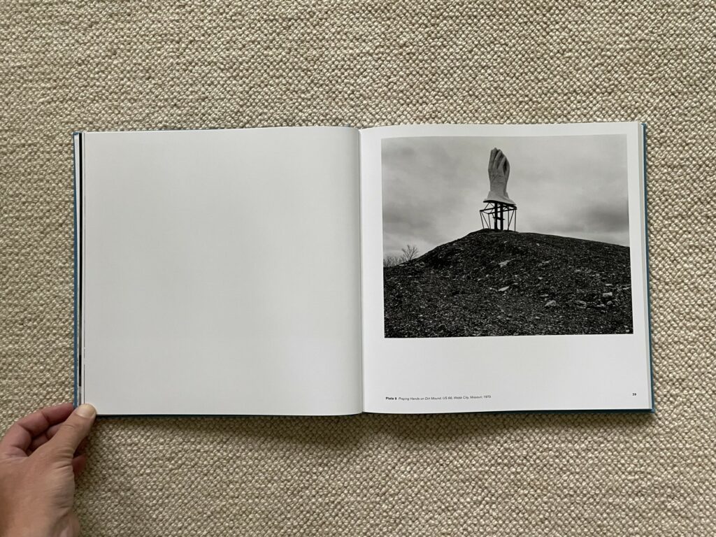
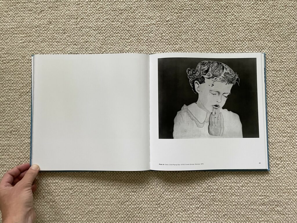
Perhaps as a corrective to the rampant commercialism of the American road, religious images and exhortations also seem to dot the landscape. Sculptural praying hands reappear in several large scale forms, one set perched atop a rocky hill as though reaching to the heavens. Another mural captures a young girl with closed eyes fervently praying, while a heart-shaped road sign reminds us that “Jesus is Coming Soon”. In the event such messages aren’t what we might be looking for, Dow matches an image of carved praying hands with the hand-up sign of a fortune teller, the echo of the hand forms making the gestures almost interchangeable.
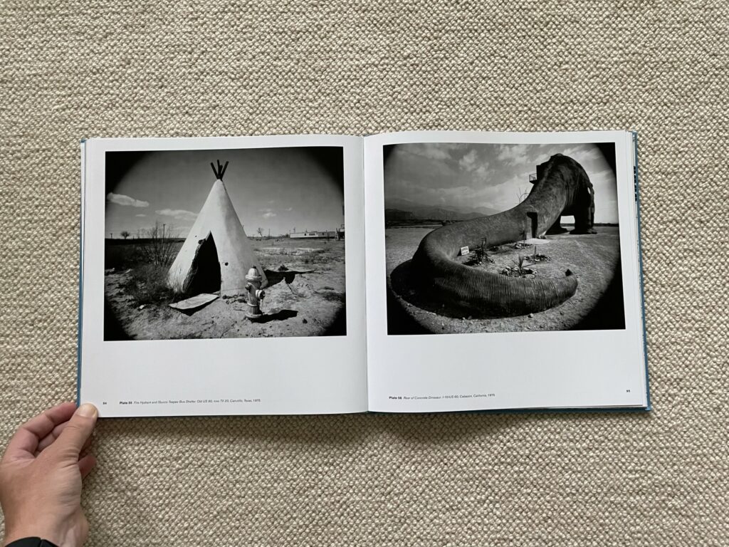
While most of Dow’s photographs rely on tight isolation to aim our attention, a few use vignetting (with curved darkened corners) to achieve a related effect, but with a slightly wider view of the setting and surroundings. He uses this approach for some of the larger ice cream forms, as well as a stack of cannonballs and a teepee-shaped bus shelter, but the effect is perhaps most haunting when applied to the back of a concrete dinosaur hotel, the swoop of its long tail curved right inside the telescoping edges of the dark framing.
Spending time with these images and letting their weathered desires and encouragements wash over me, it became clear that Dow wasn’t simply a visual collector of notable graphic design artifacts or regional oddities. His photographs sharpen our view of their modest American messages, allowing us to see their stereotypes, cliches, and motivations more directly and authentically. While many of Dow’s finds are losing (and now almost certainly have lost) their battles with time, he sees them respectfully, not so much with sepia toned nostalgia for a bygone age, but more with the discerning appreciation of a fellow designer who can readily acknowledge the successes in the work of a colleague. Even in their most romanticized and now-dated forms, many of the design choices seem almost essential or eternal, and Dow’s isolations bring us closer to the clarity of that original thinking. As a map of the “American roadscape”, Dow’s early images smartly pick out fragments of vanishing communication and then deliver their messages to us with pleasingly subtle ambiguity. He’s asked us to look, and to look again, seeing both the elegant surface simplicity and the potential for rich complexity.
Collector’s POV: Jim Dow is represented by Janet Borden in New York (here). Dow’s work has only been intermittently available in the secondary markets in recent years, with prices for the few lots that have sold ranging from roughly $1000 to $5000.