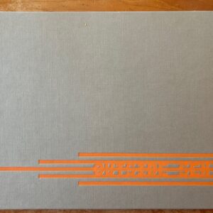
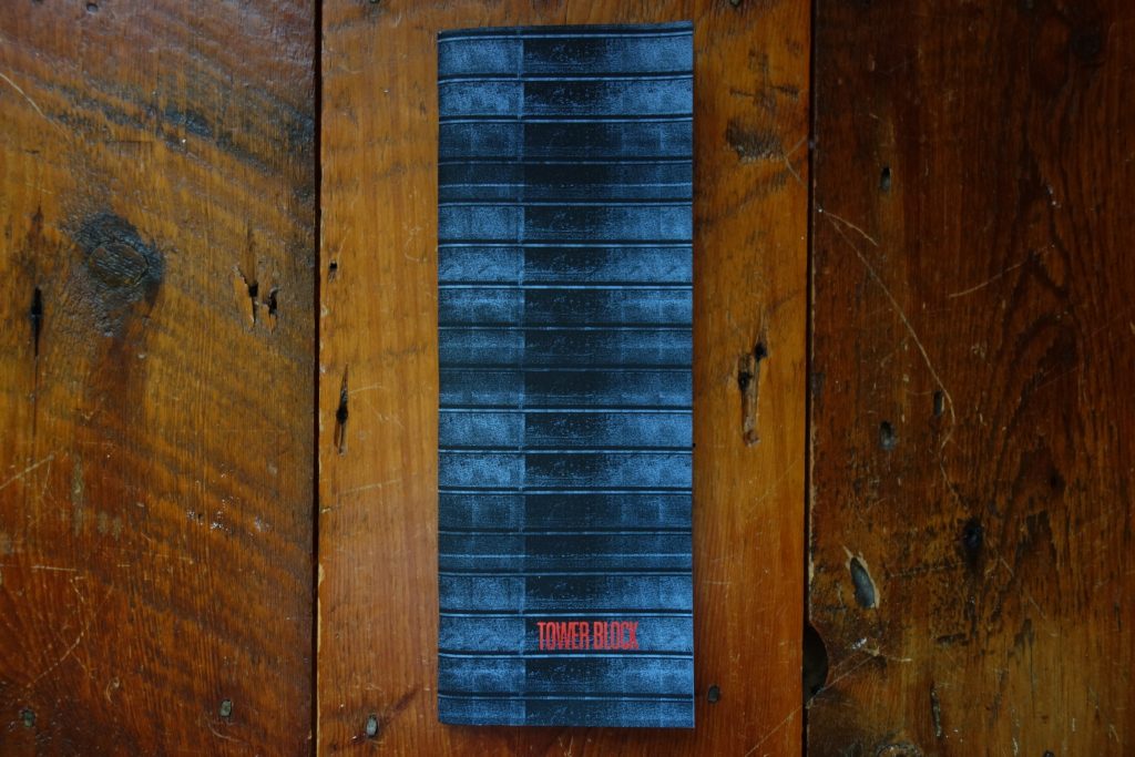
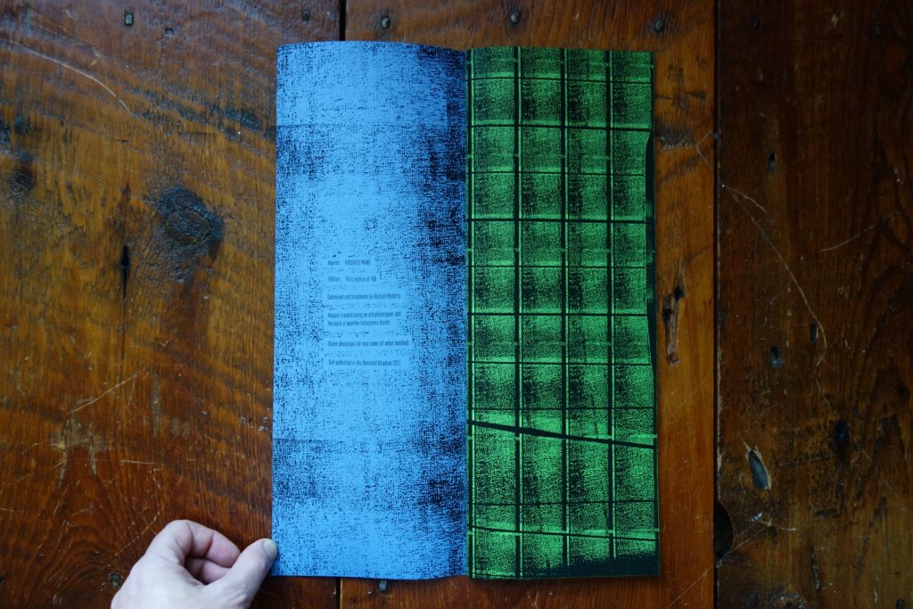
JTF (just the facts): Self published in 2017 (here). Softcover, staple bound, 38 pages, photocopy and foil-blocking on colored paper. A short introductory text is placed on a single page insert. In an edition of 100 copies. (Cover and spread shots below.)


Comments/Context: As digital reproduction multiplies the pictures of our contemporary world into an endless torrent of fleeting imagery, there has been a renewed interest in the artistic charms of the old school photocopy. In the past year, solo gallery shows of the work of Barbara T. Smith (reviewed here) and Pati Hill (reviewed here) as well as the Experiments in Electrostatics group show at the Whitney (reviewed here) have pulled us back to appreciating these earlier forms of mechanized image making, effectively unearthing the aesthetic seeds and roots of today’s ubiquitous scanning technologies.
For artists, one of the key strengths of photocopy technology was that compared to using the photographic film and paper of the same time period, it was a much faster and cheaper way to experiment. It also encouraged performative trial and error, as well as the exploration of iteration and serial imagery, where small transformations could quickly become exaggerated distortions. And it was a technical approach that generated unpredictable flares and hollows of light, delivering final imagery that was resolutely textural, with grittiness and grain embedded in the process. In short, it was a surprisingly flexible technology, with a quick and dirty aesthetic to match.
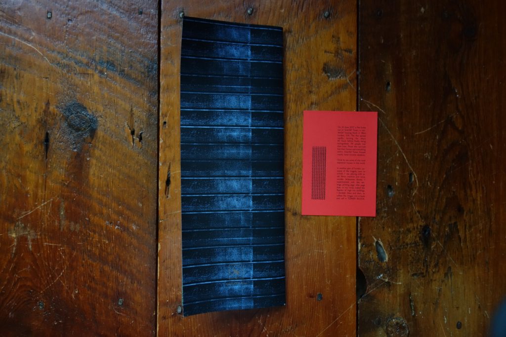
Richard Roberts’ recent photobook Tower Block cleverly embraces this experimental photocopy mindset. In the summer of 2017, the British artist was playing around with an old Xerox machine, turning wooden letterpress blocks into geometric abstractions. He quickly observed that depending on how the blocks were arranged and which settings he used on the copier, the results came out looking like high rise buildings.
At roughly the same time, the Grenfell Tower fire took place in North Kensington, killing some 74 residents in the worst residential fire in the UK since World War II. Given the housing block’s location in a posh neighborhood and its relatively low income ethnic-minority inhabitants, the broader social implications of the tragedy (from fire safety and building regulations to the response of local and national politicians) made headlines long after the flames were put out. So Roberts decided to turn his photocopy experiments into a photobook inspired by Grenfell.
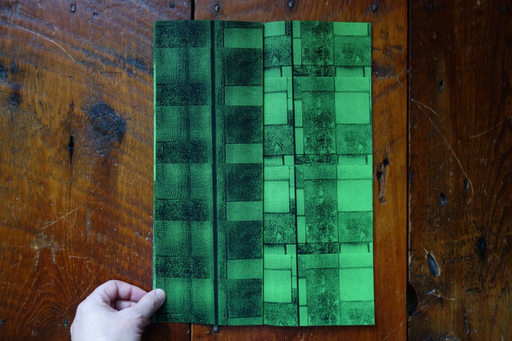
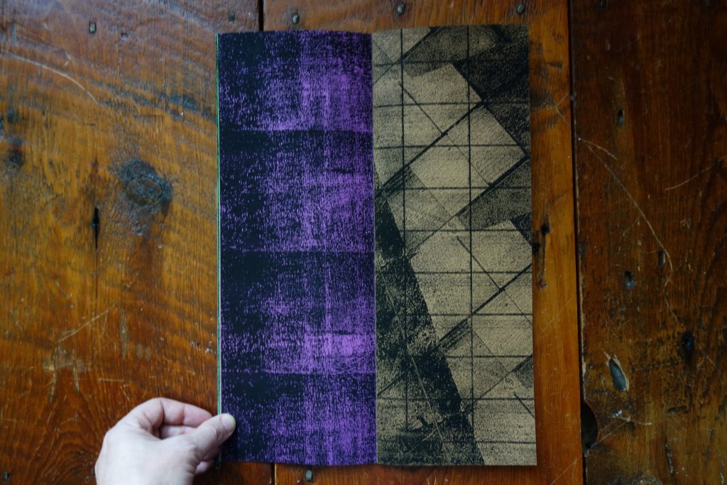
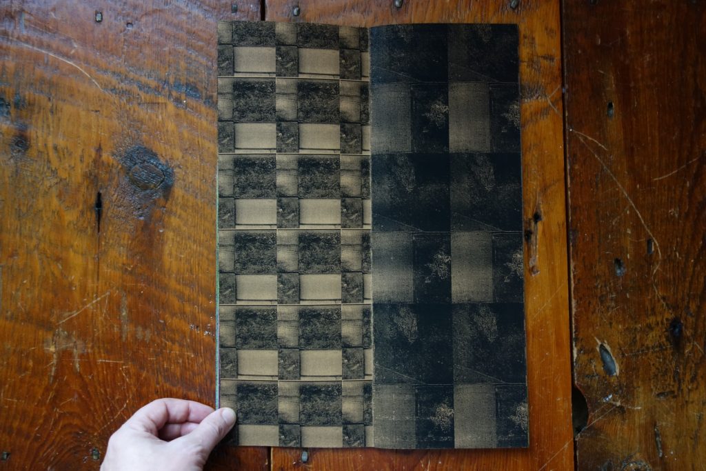
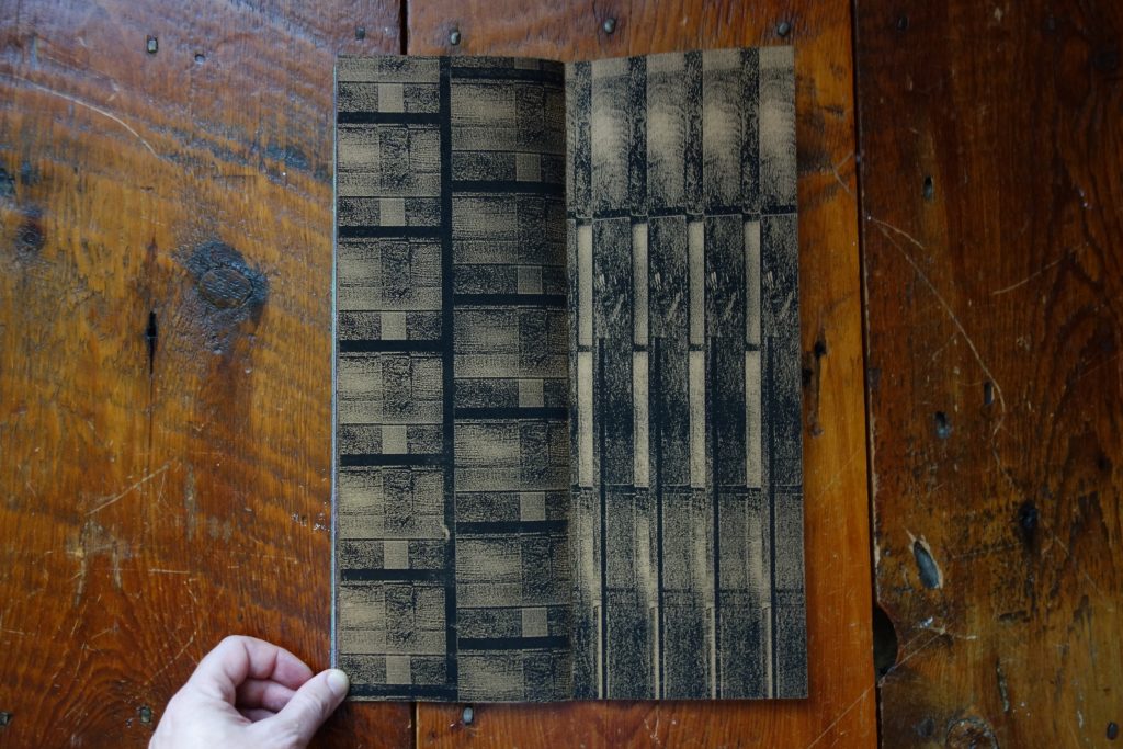
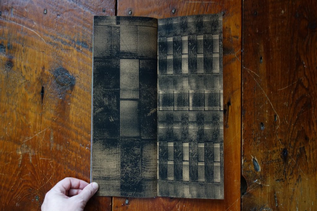
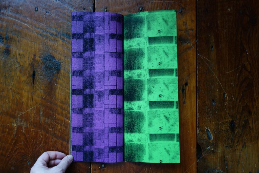
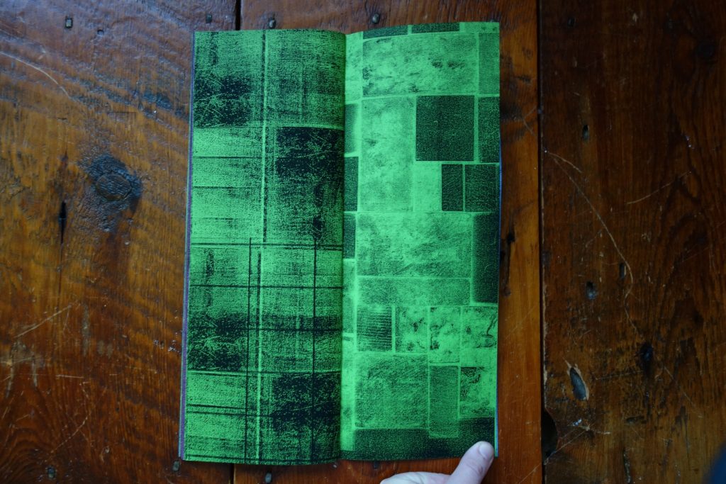
Tower Block is a tall vertical book (not unlike the skyscraper it mimics) and its simple, saddle stitched construction places its full-spread folded images into mismatched pairs. Printed on blue, green, purple, and ultimately brown papers, the images are gridded in different ways, echoing the architectural look of sleek windows, stone cladding, regular patterns of balconies, and insistent decorative striations. Roberts’ illusion that these photocopied letterpress blocks might actually be modern towers and apartment buildings is effective enough that one can page through the entire book before figuring out the trick (until the insert at the back gives away the secret).
Part of the reason this visual inversion is possible is because the photocopy process inherently reduces the legibility of the imagery it is reproducing – the resolution is degraded with each pass of the light, adding grain and tactile fuzziness to something that was once crisp and precise. So Roberts’ blocks are plausibly convincing, the cropped views of geometric patterns dissolving into simplified ghosts of the real thing.
One of the design features of Tower Block that I found most intelligent is that its pages are uncoated, allowing the photocopy ink to come off on your fingers. This unruly messiness and smudge-ability would normally be a massive negative (who wants black ink all over your hands?), but in the context of the Grenfell Tower fire parallel, the ink becomes something akin to soot and smoke, the ash covering and obscuring the imagery, but also seeping into everything it touches. It’s like the hallucinatory buildings have been burnt to a crisp, the perfect forms now cracked and etched by the flames and literally falling apart in your fingers.
This push and pull of order and chaos, or precision and decay, is powerful, the beauty of the regular geometries undermined by both the scarring of the black photocopy aesthetic and the horror of the actual tragedy to which it connects. In many ways, this is a very simple book. But the execution of Tower Block is near pitch perfect, the imagery and photobook design so elegantly well integrated that it’s hard not to be moved by the memorable final product. Roberts’ smart book is an important reminder that not every great photobook is necessarily complicated, expensive, or overproduced – sometimes the DIY guerilla aesthetic of the zine (or the photocopy) is just what fits best for delivering a particular kind of artistic message.
Collector’s POV: Richard Roberts does not appear to have consistent gallery representation at this time. As a result, interested collectors should likely follow up directly via the artist’s website (linked in the sidebar).