Shen Wei, I Miss You Already @Daniel Cooney
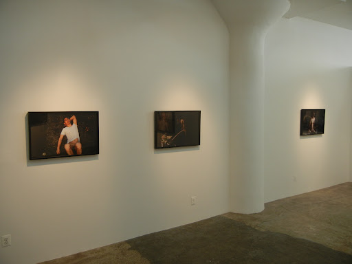
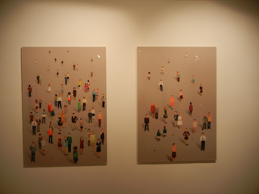
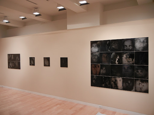
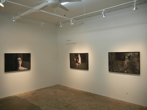 JTF (just the facts): A total of 10 large scale color photographs, framed in black and unmatted, and hung in the divided gallery space. All of the works are digital chromogenic prints, made between 2009 and 2012. The prints come in two sizes: 20×30 (in editions of 5) and 30×45 (in editions of 3). The show includes 4 pictures in the smaller size and 6 in the larger size. (Installation shots at right.)
Comments/Context: Given that there aren’t many male nudes in contemporary Chinese photography, Shen Wei’s new self-portraits could certainly be called cultural outliers. His documents of self expression follow the path of the calm and the understated rather than the overtly provocative or the knowingly political, tracing an inward-looking personal exploration with remarkably restrained sensitivity. There is still, of course, tension in these pictures, but it is reserved and quiet, open but uncertain.
 Most of Shen’s images play with the angles of his body: bent knees on a window sill, an arched back bend, a straight leg interrupting a table top still life, a triangular elbow propping up his head. His graceful stance in a submerged boat, using his outstretched leg to make concentric ripples in the light dappled water reminded me of Thomas Eakins. A few others offer complex, unknowable situations and interactions: a hand on his neck that might be either a caress or a choke, a bedside scene flanked by a nude woman and a sprawled man that offers any number of possible explanations. Shadows engulf many of the photographs, drawing our attention to the central figure in the light and adding a layer of introspective melancholy.
The best of these photographs left me impressed with Shen’s growing compositional talents. When the pictures work, he successfully walks the line between realism and lyricism, all within the context of something genuinely personal.
 Collector’s POV: The prints in this exhibit are priced in ratcheting editions, as follows: the 20×30 prints start at $2500 each and the 30×45 prints start at $3500 each (one print in this size had already reached $4500). Shen’s work has very little secondary market history, so gallery retail is still likely the best option for those collectors interested in following up.
Rating: * (one star) GOOD (rating system described here)
Transit Hub:
Shen Wei, I Miss You Already
Through October 27th
508 West 26th Street (new location)
New York, NY 10001
Bernd and Hilla Becher @Sonnabend
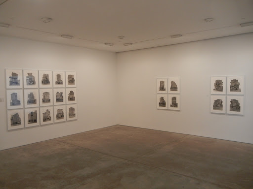
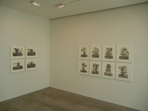
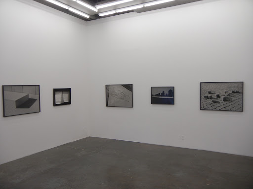
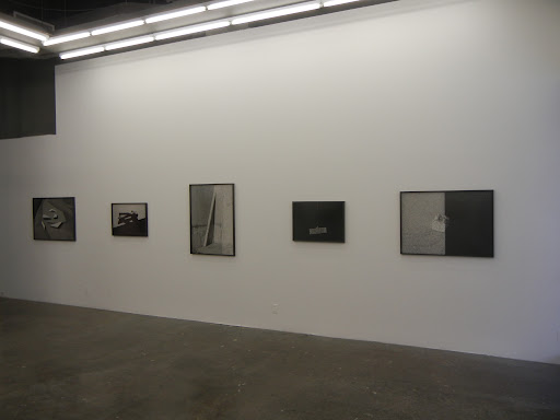
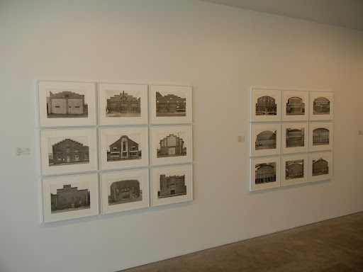 JTF (just the facts): A total of 28 black and white photographic typologies, individually framed in white and matted, and hung against white walls in the entry gallery, the two side rooms in the front, and two of the rooms in the rear. All of the works are made up of gelatin silver prints, in groups of 2 to 15 prints, made between 1963 and 1998 and printed recently. The combinations in the typologies are never repeated, so they are all unique works. (Installation shots at right.)
The works on view come from three different subject matter series, with a mix of traditional typologies (one image per location) and other works which combine multiple perspectives of a single structure or site. For each series, the number of typologies, their makeup (number of prints), and the overall dimensions are provided below:
Industrial Facades:
6 nine image typologies, each sized 56×68
Coal Bunkers:
1 two image typology, sized 37×22
2 four image typologies, each sized 38×46 (or reverse)
3 six image typologies, each sized 37×55
2 eight image typologies, each sized 38×76
2 nine image typologies,each sized 68×55
Stone Works:
1 two image typology, sized 22×41
5 three image typologies, each sized 22×64 or 38×42
5 four image typologies, each sized 38×46 (or reverse)
1 fifteen image typology, sized 68×94
 Comments/Context: What struck me most about the new show of photographs by Bernd and Hilla Becher at Sonnabend is something I really should have realized a very long time ago. Drag your hand across the volumes of their work on our library shelves and the idea starts to take hold: gas tanks, water towers, blast furnaces, framework houses, industrial facades, coal mine tipples, mineheads, and even a few industrial landscapes. To gather enough pictures to make their signature typologies, to find half a dozen or a dozen structures which exhibit the same underlying architectural forms so they can be grouped together for comparison, the sheer vastness of their artistic effort has to have been truly staggering. Across forty years and countless miles, they built up a vernacular archive like no other. And here we have a show of coal bunkers and stone works (with their own architectural idiosyncrasies), plus some more industrial facades, evidence that the archive was even bigger than we had assumed.
The large typologies of industrial facades in the entry gallery will feel the most familiar to Becher-philes. They use boxy factories and warehouses to highlight stepped roof lines in brick, curved barrel roofs, arched windows, rectangular boxes with repeating window patterns, peaked roofs with vertical striping, and buildings decorated with external pipes running horizontally. The theme and variation style of the typology structure focuses crisp attention on these overlooked details.
 While traditional typologies have also been employed for the coal bunkers and stoneworks, with their boxy squared off forms, train tracks running underneath, angled chutes/conveyors, and cylindrical holding areas, the Bechers also used an organizational form called the “development” that instead collects multiple views of the same structure into one stand alone architectural portrait. Some of the images are frontal (on each side) while others use angled perspectives. The effect is almost like a stop motion circular panorama, where the viewer moves around the site to see the building from every vantage point. These works are not collections of like objects, but an in-depth examination of one place. The Bechers’ rigid conceptual approach still comes through, but the intimate attention being paid somehow seems more intense. Trapezoidal shapes, arched concrete, graduated angled roof lines, wood siding in vertical and horizontal directions, these all seem more like personality traits of an individual rather than commonalities of a group. When hung together in a room, these “developments” tell a very different story about the evolution of functional motifs than the typologies; they provide a closer investigation of both similarities to and deviations from a common form, and they seem to imply both cross pollination of architectural ideas as well as elemental, universal styles that evolve strictly from local usage.
So for those of you who may think you have already seen everything the Bechers had to offer, this show brings together both lesser known subject matter and an unexpected conceptual twist on their signature typology. As always, the work is exquisitely crafted and meticulously considered; what I appreciated here was the sense of smart freshness that seemed to reanimate their much celebrated and highly influential photographic approach.
 Collector’s POV: The works in this show are priced as follows, and have stayed consistent (without price escalation) over the past few years. The works are priced based on the number of prints in the typology. As such:
2 image typologies: $26000
3 image typologies: $39000
4 image typologies: $52000
6 image typologies: $78000
8 image typologies: $104000
9 image typologies: $117000
15 image typologies: $195000
The Bechers’ work is now consistently available at auction, in every season and every geography. Prices for single images have ranged from roughly $3000 to $35000 in recent years; typologies have ranged between roughly $25000 to $180000 during that same time.
 Rating: ** (two stars) VERY GOOD (rating system described here)
Transit Hub:
- Museum Collections: MoMA (here), Tate (here), Met (here), Getty (here), Guggenheim (here), Walker (here)
Through October 27th
536 West 22nd Street
New York, NY 10011
Walid Raad @Paula Cooper
Barney Kulok, Building @Nicole Klagsbrun
 JTF (just the facts): A total of 23 black and white photographs, framed in black and unmatted, and hung in the main gallery space and the smaller back room. All of the works are gelatin silver prints, made in 2011 or 2012. The prints are sized either 20×28 or 29×40 (or reverse) and are available in editions of 6+4AP. There are 12 prints in the small size and 11 prints in the large size on view. A monograph of this body of work was recently published by Aperture (here) and is available from the gallery for $80. (Installation shots at right.)
Comments/Context: Just prior to his death, the famed architect Louis Kahn designed a memorial park for Franklin D. Roosevelt, fittingly to be placed on the then recently renamed Roosevelt Island here in New York. Nearly forty years later, that park has finally been built and is scheduled to open to the public later this month. During its recent construction, Barney Kulok made in-progress photographs of the site, the rough chaos of building pared down to richly dark black and white pictures, full of attention to texture and surface.
 At first glance, Kulok’s photographs feel like a throwback to the early days of Callahan, Siskind and Metzker, where light and shadow were used explore the abstraction of simple city forms. A squiggly bent wire and its shadow, the dense black shadow of a hammer and chisel, a tight mesh pattern on a white wall, Kulok’s images seem cut from this same Modernist cloth, albeit in larger contemporary sizes. Several of the works linger over Kahn’s smooth geometries, playing with contrasts in tonality of edging and in finished/unfinished materials: a rectangular block in white offset by a dark trapezoidal shadow, perfect cubes of grey granite thrown haphazardly over the finished cobblestone walkway, a circular pile of sandy joint filler against the graph paper squares of the granite, alternating stripes of black shadow on a concrete stair interrupted by a short plank of wood. Construction debris is found to be surprisingly elegant: a leaning 2×4, a brick plumb line, a bent corner hinge, a sponge, they all become quiet still lifes when seen in tactile isolation.
In general, I found it surprisingly satisfying to see that well-executed black and white can still be relevant to the contemporary discussion. These photographs are crisp and defined without seeming overly old school or derivative. The subject matter lent itself well to a high contrast study, and Kulok has delivered a set of images that are graceful and luxurious.
 Collector’s POV: The works in this show are priced as follows. The smaller 20×28 prints are $4500 and the larger 29×40 prints are $6000. Kulok’s work has only just begun to enter the secondary markets, so gallery retail is likely the only option for those collectors interested in following up.
Rating: * (one star) GOOD (rating system described here)
Transit Hub:
Through October 27th
534 West 24th Street
New York, NY 10011
Ruud van Empel, Sunday @Stux
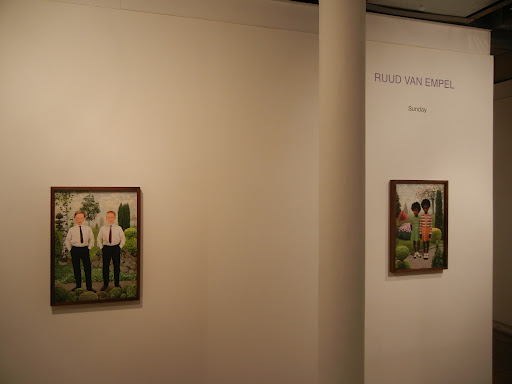 JTF (just the facts): A total of 7 color works, hung in the upper viewing area in the back of the gallery. 5 of the works are archival pigment prints, framed in brown wood, from 2012. These prints are sized 28×20, and are available in editions of 7+2AP. The other 2 works are archival pigment prints mounted to Dibond and Plexiglas, unframed, also from 2012. These works are sized 59×41, and are available in editions of 5+2AP. (Installation shots at right.)
Comments/Context: Ruud van Empel’s small show provides two new bodies of work to contemplate, both in his now-signature style of flawlessly stitched together, composite imagery. At this point, van Empel’s digital collages of meticulously rendered but somehow surreal children are immediately identifiable, and these new projects don’t stray too far from his proven visual formula.
 Most of the images in the exhibit substitute a backdrop of manicured, formal gardens for the lush jungle vegetation the artist has regularly employed as a setting. But there is something over-the-top and manic about these manufactured gardens filled with endless topiaries, pruned evergreens, boxwood hedges and shrubbery specimens. Kids primly stand in their Sunday best (thus the title of the series), freckly red haired boys in proper coats and ties, and black children in snappy blazers and bow ties or sweater dresses and mary janes. As they pose on the gravel paths, with a stray peacock or dove nearby, the gardens engulf and overtake them, controlled nature on the verge of out of control. For the first time, van Empel has also introduced an older lady as a subject, seen up close, in a fur collared coat. The background of her portrait explodes with angular, geometric forms in green, with a nod to the Renaissance, but inexplicably dense and layered.
The other two images on view play with linear perspective in new ways. A crowd of kids of varying sizes (and varying outfits) is arrayed against a formless grey background, seemingly following the rules of aerial depth perception but floating unrooted to any landscape. Shadows are cast by the children (so there is a consistent light source), but otherwise they have no connection to a setting or narrative. The works almost seem like a temporary peg board resting place for van Empel’s fancy fabricated kids, as though he was simply waiting to insert them into some other elaborate scene but they have been stranded in this endless netherworld in the meantime. While the colors are bright and energetic, the works felt oddly dispiriting, like the well-meaning kids were trapped in some kind of cleaned-up stylish hell.
Part of what I like about van Empel’s work is this sense of discomfort that grows as you look as his photographs. The first glance always seems placid and inviting, but a closer examination always seems to uncover an undercurrent of the threatening, the puzzling, or the unsettlingly mismatched. It’s a hyper-perfect world, where the fastidious, glossy detail is often slightly disturbing.
 Collector’s POV: The works in this show are priced as follows. The smaller 28×20 prints are $24000 and the larger 59×41 prints are $32000. Van Empel’s prints have become more consistently available in the secondary markets in recent years. Prices at auction have ranged between roughly $15000 and $120000.
Rating: * (one star) GOOD (rating system described here)
Transit Hub:
Ruud van Empel, Sunday
Through October 20th
530 West 25th Street
New York, NY 10001
Fischli & Weiss @Andrew Kreps
Judy Fiskin: The End of Photography and Selected Photographs @Greenberg Van Doren
 JTF (just the facts): A total of 75 black and white photographs, custom framed in white wood with no mat, and hung against grey striped walls in the main gallery space. The show also includes 1 video, which is on display in the entry area. The gelatin silver prints are mostly vintage, made between 1973 and 1988, with a few modern prints made in 2006. Paper sizes are either 5×7 or 6×8 (or reverse), with images roughly 2×2 or 2×3 (or reverse). All of the prints come in editions of 6+2AP. The video is a Super 8 film on digital video with sound, running 2 minutes and 28 seconds; it is available in an edition of 10+2AP. Some Aesthetic Decisions: The Photographs of Judy Fiskin, a new catalog raisonne recently published by the Getty (here), is available at the reception desk. (Installation shots at right.)
The following projects are included in the show, with the number of relevant prints on view and their dates as background:
Stucco: 11 prints, 1973-1976
35 Views of San Bernardino: 4 prints, 1974
Military Architecture: 10 prints, 1975
Desert: 3 prints, 1976
Long Beach: 5 prints, 1980
Dingbat: 12 prints, 1982-1983
My Trip to New York: 19 prints, 1984-1986
Jersey Shore: 3 prints, 1986-1988
New Orleans: 5 prints, 1987
New Architecture: 3 prints, 1988
Comments/Context: Judy Fiskin’s tiny, couple-of-inches-square black and white prints seem both anachronistic and unexpectedly modern in these days of the humongous and the over sized. From the center of the gallery, her prints from the 1970s and 1980s are completely illegible, minuscule dots circling the room. They require nose-to-the-frame engagement to even decipher their subjects, and when you get up close, their black bordered edges make it feel like you’re looking through the viewfinder along with the artist; it’s as if you’re along for the ride.
 This show is a mini-retrospective sampler, gathering prints from a variety of her projects across two decades. At first glance, the bleached out, high contrast deadpan of the photographs might recall the Bechers, Ed Ruscha, or the New Topographics photographers, but even though her visual formula is strict and methodical, the pictures seem more about quirks and outliers than vernacular patterns. I liked the edge of wit in her Southern California flat roofed stucco houses (often with mirrored geometries or palm trees) and her Dingbat apartment blocks, punctuated by quiet oddities of shrubbery and surface decoration. In the 1980s, Fiskin shifted her gaze East, documenting the elaborate roof lines of the Jersey shore and the mixed-up stand alone bungalows and duplexes of New York. She even took time to capture the over-the-top architecture of cemetery tombs in New Orleans. Across the various subjects, she consistently found overlooked details worth noting, small eccentricities that seem to stick out as obvious once she had highlighted them. Her photographs are evidence of conscious looking, of searching for the individuality and personality that had been easily passed by in the apparent monotony of these everyday structures.
The front room contains Fiskin’s 2006 film, The End of Photography, where moving images of this same Southern California architectural aesthetic are cut together and overlaid with a spoken eulogy to the black-and-white, analog world. The voice-over is a repeated cadence of “no more” followed by a catalog of items once found in a darkroom: no more enlarger, no more tray, no more beaker, no more developer, no more radio, etc. ending with “no more photography”. It points to the comfortable details of a now vanished world, and the uncertainty felt as these traditional technologies and processes have been washed away by the new. I have to admit that I had a mixed reaction to this message of this film, as it elicited both a real nostalgia for the old (and the subtleties of what has been lost) and a lack of patience for the underlying bitterness being expressed at being forced to change.
Overall, I think this Fiskin overview is smart and well-constructed, especially in its coverage of many of her early projects. In putting together the historical puzzle of 1970s/1980s American photography, I think her personal take on local vernacular architecture (particularly in California) merits inclusion among the better known names that define the period.
 Collector’s POV: The prints in this show are priced at $5000 each. The video is available for $10000. Fiskin’s work has little or no secondary market history, so even though these photographs date back several decades, gallery retail is likely the only option for those collectors interested in following up. Fiskin is also represented by Angles Gallery in Los Angeles (here).
Rating: * (one star) GOOD (rating system described here)
Transit Hub:
Through October 27th
730 Fifth Avenue
New York, NY 10019
Fazal Sheikh: Ether @Pace/MacGill
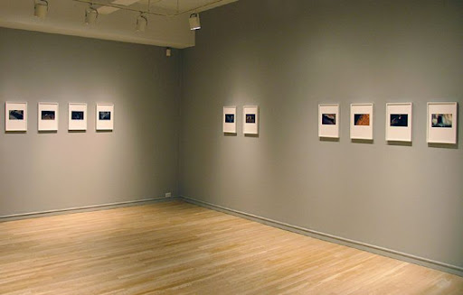
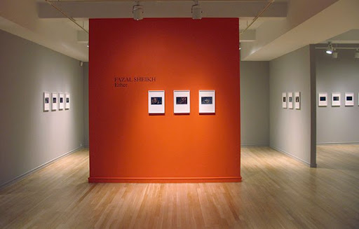 JTF (just the facts): A total of 38 black and white and color photographs, framed in white and unmatted, hung against orange and khaki walls in the main rooms of the gallery. All of the works are pigment prints on handmade Innova Smooth Cotton Natural White paper mounted to board, made between 2008 and 2011. Most of the prints are sized roughly 5×8, and are available in an edition of 7; 4 prints are sized slightly larger at roughly 9×7, and are also available in an edition of 7. There is no photography allowed in the gallery, so the installation shots at right are via the Pace/MacGill website.
Comments/Context: Fazal Sheikh’s nighttime images of the Ganges river holy city of Varanasi are steeped in a quiet sense of meditative calm. Instead of pointing his camera at the crowded chaotic hustle of everyday Indian life, he has chosen to document the motionlessness of dark repose, when the city sleeps and tranquility and peace return to its streets and alleys. His pictures capture the endless cycle of birth and death in this spiritual place, grasping for the dissolving, elemental strands of earth, air, fire, water, and the ephemeral, elusive ether.
 Sheikh’s images of slumbering people form the core of this show. Bodies lie covered in sheets and blankets and serene, undisturbed faces peek out from the shadows. Those merely sleeping and those who have passed on seem indistinguishable and interchangeable, the transition from the weary to the corpse a completely natural one. Each lies in restful but safe vulnerability, bathed in a warm glow, moving from dark bronze to softly golden as the hours pass. Even the dogs are asleep, curled up on stone platforms, near muddy puddles.
The remaining images in the show provide a supporting backdrop for these dusty, shrouded forms, creating a noticeable rhythm around the gallery. The photographs are grouped into small sets, where sleepers are flanked by the wilting flowers of a shrine, the glowing embers of a fire, or the misty, star-filled sky. An interior wall pairs images of newborns in swaddling clothes with the dead covered in garlands, reinforcing the cyclicality of this life. The overall effect is one of stillness and harmony, of spiritual rest and natural rebirth, often ending with a view into the dark night.
In this age of monumental contemporary photography, Sheikh’s intimate prints are a welcome surprise. They encourage a slower, more attentive engagement with the work, rather than a fast-food inhalation of imagery. And they successfully evoke a specific mood, one that flies in the face of the conventional view of the tumult and pandemonium of Indian street life. Shiekh’s photographs are like a hushed lullaby, a gentle moment of reflection on things larger and more intangible.
 Collector’s POV: The photographs in this show are priced at $4000 each. Sheikh’s work has not yet reached the secondary markets, so gallery retail is likely the only option for those collectors interested in following up.
Rating: * (one star) GOOD (rating system described here)
Transit Hub:
Through October 20th
32 East 57th Street
New York, NY 10022
Sally Mann: Upon Reflection @Edwynn Houk
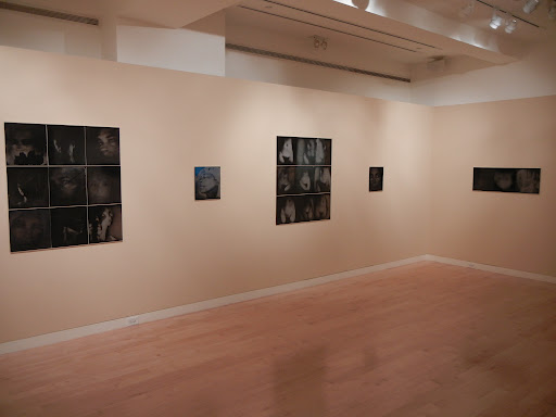 JTF (just the facts): A total of 23 black and white photographic works, unframed and hung against light peach colored walls in the main gallery space and the smaller side room. All of the works are ambrotypes (unique collodion wet-plate positives on black glass), made between 2006 and 2012. Each unit print is sized roughly 15×14. The individual works are arranged into groups and grids of 1, 3, 6, 9, and 20 prints, and are divided by subject matter into two projects: Self-Portraits and Omphalos. There are 17 works from Self-Portraits and 6 works from Omphalos on view. (Installation shots at right.)
Comments/Context: In the future, when some museum does a full and comprehensive retrospective of Sally Mann’s work, I think it will be fascinating to consider how her embrace of the wet-plate collodion process has changed the trajectory of her artistic life. In my view, there is a very distinct break right in the middle of her prolific career, a before wet-plate and after wet-plate bright line where her work took an entirely new direction. Some will argue that the progression is smoother than I am making out, that she has always thoughtfully focused her camera on her family and the land around her, but to my eye, while the subjects haven’t evolved dramatically, the mood is meaningfully different, perhaps a byproduct of the ghostly look and feel of the wet-plate prints, or perhaps a turn inward toward a more complex and personal psychological landscape.
 What is new here is that after a riding accident laid her up with serious injuries in 2006, she boldly turned the camera on herself, making countless head shot portraits and nude torsos. There are no smiling, happy faces in this parade, however; her expressions cover the territory from deadpan to grave, with a few stops for steely, weary, wise, zombie-eyed, and almost meditatively ecstatic in between. The tonalities shift from washed out grey to brown to bronze to shadowy black, and the chance movements of the chemicals create unexpected spectral drips, swirls, and highlights that often obscure the image. Some of the works have also been scratched and abraded, with the emulsion flaking and chipping off, exposing areas of crackly black glass. Seen together as grids and typologies, the faces become a taxonomy of subtle emotional states; a wisp of hair or the details of wrinkles make some of the pictures humanly specific, while others drift into silhouette or death mask, the personal features erased and blurred. Mann’s torso images are generally more abstract, reducing her body to a sculptural mass of white with a shadowy hint of a belly button or a dark triangle. The classical forms seem smooth and weathered, like fertility symbols from antiquity, at once haunting and timeless. The variation in these images is more subtle, elemental curves repeated with minute changes in brightness and contrast.
While Mann’s images her nude husband were tender in their unflinching truth, these images of her own face and body seem tougher to me, even in their most elegant state. When she does engage the camera, her gaze is strict and penetrating, and I felt a sense of quiet defiance, a letting down of her guard but with a knowing resignation to and acceptance of what she was letting in. Taken together, the works are a rich, multi-dimensional portrait, full of dark, complex emotions and ephemeral moods, riding on an undercurrent of inner strength.
 Collector’s POV: The prints in this show are priced based on the number of prints included in the work/grid. The single print works are $20000, the 3 print works are $36000, the 6 print works are $60000, the 9 print works are $84000, and the 20 unit work is $172000. Mann’s photographs are widely available in the secondary markets. Auction prices for Mann’s prints have generally ranged between $3000 and $70000 in recent years, with most still under $20000. Her earlier works were printed in editions of 10 and 25, so these new unique works will clearly have a different scarcity value. Mann is also represented in New York by Gagosian Gallery (here).
Rating: * (one star) GOOD (rating system described here)
Transit Hub:
Through November 3rd
745 Fifth Avenue
New York, NY 10151
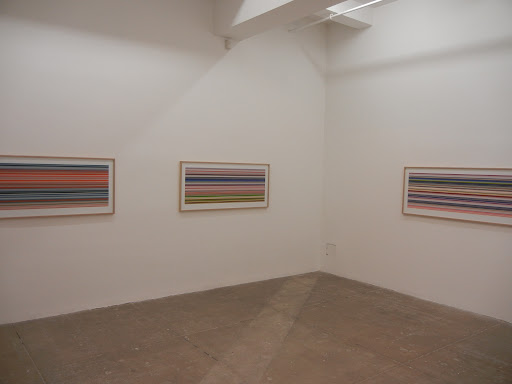
Gerhard Richter, Painting 2012 @Marian Goodman
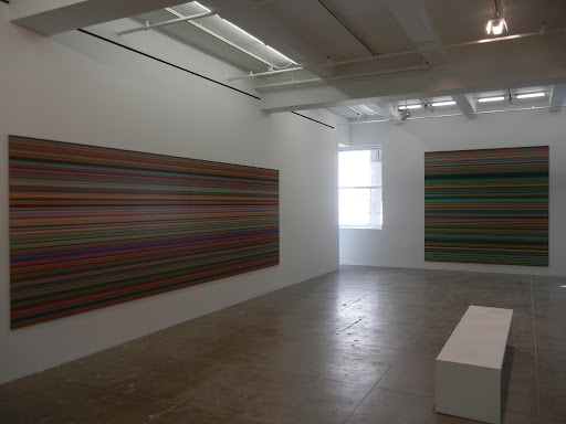 JTF (just the facts): A total of 9 monumental color works, 10 smaller color works, and 1 glass/steel sculpture, displayed in the north and south galleries and in the smaller north viewing room. The large scale works are digital prints, unframed and mounted between Aludibond and Perspex (Diasec), made in 2011 and 2012. The works range in size from 63×118 to 79×236, in both square and rectangular formats, and are each unique (edition of 1). The smaller works are also digital prints, but mounted on Aludibond and framed in blond wood and matted. All of these works are sized 20×56 and were made in 2012; they are also unique (edition of 1). The sculpture in the south gallery is made of 6 panes of glass and a steel frame, from 2002-2011. A catalog of the exhibit is available from the gallery for $65. A second book detailing the intermediate steps leading up to the finished works on display (called Patterns) is available for review at the reception desk. (Installation shots at right.)
Comments/Context: When we look back on the history of digital art in a decade or two, I think that the works in this show, namely Gerhard Richter’s recent strip paintings, will be seen as a watershed moment. They represent the defining instant when software-driven art making went mainstream, when one of our most important and influential painters made the drastic jump and fully embraced a new kind of artistic thinking. To be sure, plenty of artists have been using all kinds of digital technologies in recent years, but this show really represents a break with the past, and a huge, bold step toward the future. Richter has brought triumphant excitement and extroverted vitality to the digital realm, so it’s no wonder these pictures have been misunderstood by most of the old thinkers; they’re evidence that we’re on our way to somewhere entirely new.
I think it is a fair question to ask why a photography critic like myself is weighing in on works that are being called “paintings”. The fact is that these works reside in the Venn diagram intersection of painting, photography, and software driven art, and their endpoint is a digital photographic print. Richter’s process began with a high resolution scan (AKA a photograph) of one of his densely colored squeegee paintings (Abstract Painting 724-4, from 1990). This digital file was then vertically divided in an exponential progression (2, then 4, then 8, all the way to 4096), creating a multitude of sliver thin strips of color, which were each mirrored and repeated horizontally (by the software), effectively stretching the colors out into extended lines. Output as digital prints and mounted, these files became the “strip paintings”. So let’s be honest. These aren’t even remotely “paintings” as we traditionally define them, even if that is a better term to use when trying to sell them for a big price. There is no hand crafting, no gesture, no mark of the artist whatsoever. They are manipulated photographs.
 Let’s also be clear that Richter and his team aren’t a bunch of genius coders. The software required to do this image fracturing, mirroring, and reassembling was likely quite straightforward; plenty of competent software engineers could have cranked it out. But the simplicity of the software isn’t really my point. What’s important here is that Richter has taken his interest in structure and embodied it in something invisible, namely the underlying software. He’s merged many of his previous ideas about abstraction, chance, compositional rigor, and photographic reproduction into a conceptual architecture built in code. Information has been translated into visual output in a modular, iterative, quantified fashion. In one swift move, he has displaced the physicality (the “thing”ness) of painting with pure, unadulterated, rational logic.
It is really impossible to comrehend the presence of these works from gallery installation shots or computer screen reproductions. At every distance, from 20 feet to 6 inches, they shimmer with an optical intensity that seems unprocessable by the human eye. The effect is that they are somehow hard to see and utterly precise at the same time. This isn’t some gimmicky Op Art trickery, intentionally designed to make our eyes blur or swim; no, I think this feeling is entirely a byproduct of the minute resolution of the lines and the nature of the color. Richter has long been interested in color, and these pictures introduce nothing less than a revolution in color. Walk back through the history of painting and you’ll find realistic color, Impressionistic color, painterly color, and more recently industrial color and even commercial color. These works take color somewhere new, call it technological or electronic color, where Richter has moved beyond the mechanistic to the hard edged intellectualism of computerized purity. The way light interacts with this color is altogether original, and can only really be understood when seen close up.
If we talk about Constructivism being rooted in the clarity of underlying geometry, perhaps what Richter is exploring here is a kind of Digital Constructivism, a 21st century version which replaces the idolization of the geometric form with the raw power of smart software. There is an undeniable connection between the shimmering electricity of Mondrian’s Broadway Boogie Woogie and the staggering sensations of these new Richters; we’re just a century further along in our refinement of the organizing principles and the brightness of the possibilities. Similarly, these strips extend far beyond pared down Minimalism, even though they are all horizontal lines; put one of these next to an elegant Agnes Martin and it will shout it down – its vibrating energy is just too great. The mathematical aesthetic has been taken to its logical extreme in these images, and that extreme points toward high density, high complexity innovation.
My guess is that when we stand in the future and look back at these Richters, they may look surprisingly simplistic from that wiser vantage point; in the coming years, artists are going to use software technology to move far beyond what’s on display here. But there is something undeniably exciting about photographs (yes, photographs) that demolish so many barriers, that open up so much thrilling, unexplored white space. The 80 year old Richter has shown us what the bridge to the new world looks like; now we just have to walk across.
 Collector’s POV: The monumental scale works in this show were priced starting at 1300000€ and the smaller prints were priced at 20000€. I say “were” in that all of the works were either already sold or on hold when I visited the gallery. Richter’s photographic works (the overpainted photographs as well as other works that might be categorized as photography) are intermittently available in the secondary markets, mostly in Contemporary Art auctions rather that Photography auctions. Recent prices for these works have ranged from roughly $10000 to $200000; Richter’s paintings price at an altogether different and meaningfully higher level.
Rating: *** (three stars) EXCELLENT (rating system described here)
Transit Hub:
- Artist site (here)
- Exhibit: Centre Pompidou, 2012 (here)
- Features/Reviews: New Yorker (here), NY Times (here)
Gerhard Richter, Painting 2012
Through October 13th
Marian Goodman Gallery
24 West 57th Street
New York, NY 10019
James Welling, Overflow @David Zwirner
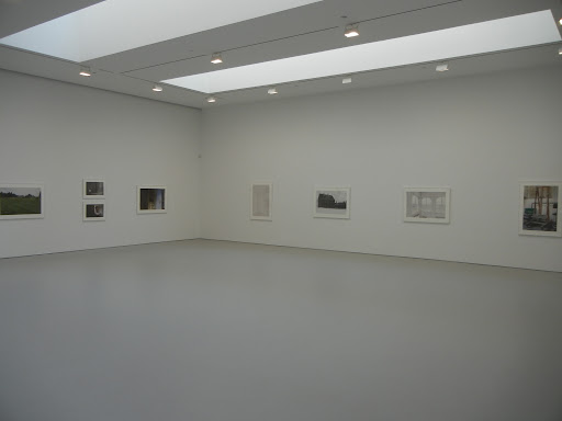 JTF (just the facts): A total of 42 black and white and color works, framed in white and matted, and hung in two connected gallery spaces and a smaller side room down an adjacent hallway. 29 of the prints come from the series Wyeth, made between 2010 and 2012. All of these works are archival inkjet prints on rag paper, available in editions of 5. The prints come in one of two sizes (or reverse): 16×24 (with one at 18×16) or 28×42; each image is available either small or large, but not both. There are 19 in the smaller size and 10 in the larger size on view. The front gallery contains 6 abstract works from the series Fluid Dynamics, made between 2009 and 2012. These are archival inkjet prints, available in editions of 5, sized either 48×40 or 52×40. The side room contains 7 works from the Frolic Architecture project, made in conjunction with poet Susan Howe in 2010 and 2011. These are gelatin silver prints, in editions of 3 or 4, sized either 18×14 or 22×17. This room also contains a glass case with several copies of the related book. (Installation shots at right.)
Comments/Context: James Welling’s newest show combines three recent projects that all revolve around the relationship between photography and painting. It’s evidence of complex thinking, of dissecting and reconsidering how the two mediums can interact, both in the physical gesture and in the pictorial scaffolding.
 The main body of the exhibit is made up of images from Welling’s project channeling Andrew Wyeth. Welling traveled to various locations in Maine and Pennsylvania to visit landmarks, recreate certain scenes, explore the artist’s studio, and generally immerse himself in Wyeth’s environment and mindset. The result is a set of pictures which are quintessentially New England, spare and unadorned, simple and quietly intense: a dark shingled saltbox looms against the grey sky, a set of white framed windows frosted with misty ice, a chimney rising from a pitched roof, a barn flanked by scrubby grass and wildflower meadows. Interiors echo with empty stillness: a doorknob, a rustic cabinet, Wyeths’ dry pigments, a cup and saucer. The project is at once an investigation of place and a communing with the painter’s tactile sense of formal precision. Even the scenes which are not direct recreations feel etched with the same sense of pared down care and acute attention.
 The other two projects on view are process driven photographic abstractions, images made from chemicals and wet paper, full of drips, swirls, splotches, and gestural motion. The Fluid Dynamics series starts with this kind of darkroom experimentation and then layers digital color gradients on top of the images later; a few underlying compositions become the basis for several color riffs, almost like satellite photos or fractals, from soft ice white, to pink and light blue, to copper brown and darker blue. The works in side room also turn on this painterly kind of craftsmanship, but this time in gelatin silver, with folds, lines and washes of ghostly white flowing into light-filled grey abstractions. Both sets of images are physical (almost sculptural), playing with movement and fluidity in the depths of the process.
On the surface, the bodies of work in this show could hardly be more different. And yet I took away a common sense of probing, of looking at painting in all kinds of ways, of parsing it down in search of its relevance to photography. Welling is clearly an artist who is thinking rigorously and systematically, who is constantly unpacking his influences and rebuilding his tool box from the ground up.
 Collector’s POV: The prints in this show are priced as follows. The images from the Wyeth series are either $15000 (16×24) or $22000 (28×42). The larger works from the Fluid Dynamics series are $25000 and the smaller ones from the Frolic Architecture series are $12000. Welling’s photographs have been become more available in the secondary markets in recent years, with auction prices ranging between $2000 to $22000.
Rating: * (one star) GOOD (rating system described here)
Transit Hub:
Through October 27th
525 West 19th Street
New York, NY 10011