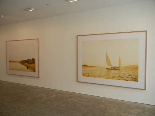
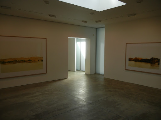
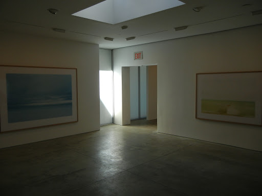
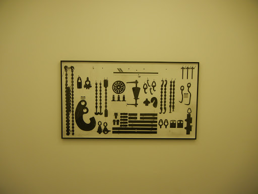
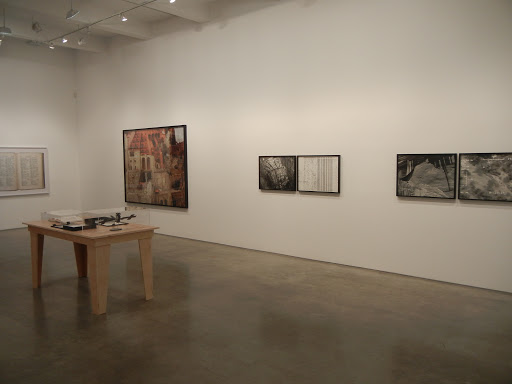
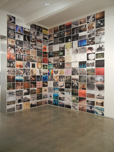
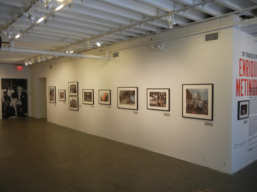
 JTF (just the facts): A total of 80 black and white and color photographs, framed in black and matted, and hung in the divided gallery space and the book alcove. All of the works on view are modern prints, made from negatives taken between 1948 and 1995. 60 are gelatin silver prints, 18 are c-prints, and 2 are extra large mural style prints on adhesive vinyl. Physical dimensions for the framed prints are either 11×14 or 16×20 and all of the prints are available in editions of 15. The show also includes 1 video, 1 glass case with a selection of 9 newspaper spreads, and 1 set of 10 unframed c-prints (with accompanying bag) made between 2009 and 2011 and displayed in the book alcove. The show was curated by Trisha Ziff. A monograph of this body was recently published by Aperture (here) and is available in the bookshop for $50. (Installation shots at right.)
Comments/Context: The Mexico City tabloid pictures of Enrique Metinides are the most consistently astonishing and impressive photographs I have seen all year. Spanning more than 50 years and gathering together the artist’s greatest hits and favorites, this show delivers a parade of excellence without pause – there isn’t a boring, forgettable image in this entire joyous exhibit. I choose the word joyous with significant care in this case, as it isn’t exactly obvious to think that a series of gruesome, voyeuristic images of corpses, car crashes, and grisly accidents could be as well-crafted, lively and empathetic as these photographs are. While Weegee’s flash-lit invasive garishness and Arnold Odermatt’s elegant twisted cars and campy police procedures can easily be trotted out as viable comparisons given their common subject matter, I came away convinced that Metinides is a true original, with a particular talent for stepping back to capture the complexities and beauty of the larger scene surrounding a central tragedy.
 In a city as densely populated as Mexico City, Metinides clearly had plenty of opportunities to capture dramatic moments, but there are just too many smartly composed pictures here to chalk his success up to lucky right time, right place coincidence. His single frame vignettes run the gamut from the everyday (murdered spouses, drunken bar fights, overturned vehicles, and highway pileups) to the unexpected and freakish (snow drifts in liquor stores, fiery gas explosions, flash floods, derailed trains, collapsed hotels, and small planes crashed into the streets). But in Metinides’ hands, these accidents become the raw material for powerful stories that go far beyond the straightforward documentation of events. An electrocuted telephone engineer dangles from the overhead wires like a pieta. A woman hit by a car slumps between upended light poles, her dazed eyes offset by perfect hair and nails. A truck smashes through a living room wall, leaving the painting above untouched. And a bloody mother clutches her child and her handbag with equal determination.
 Like Weegee, Metinides has a particular flair for including the reactions of onlookers and passersby, using their expressions and gestures to decorate the main action. A dead family lies in a smashed car, the curious crowd peering in through the shattered window. A body floats in a canal, with throngs of spectators reflected in the murky water. A stabbing victim is fanned by an outstretched arm holding a cowboy hat. And an overturned bus in a hole draws such a crowd that an ice cream cart sets up shop to service the customers. Grief and anguish come in many forms, from a woman literally tearing her hair out in a crazed frenzy to the defeated slump of a woman embracing a child’s coffin and from the grimace of a boy with his hand trapped in a meat grinder to the lonely swing of a hanging suicide in a majestic old tree. Metinides also clearly had an awareness of movies, as many of his pictures are boldly cinematic: an action-packed shootout takes place in a grocery store, suicide jumpers perch atop tall buildings, and plane crash survivors lie dazed and bloodied in front of a broken fuselage. Even his still lifes feel energetic, with crashed train cars, melted dolls, a murder weapon held by a pen in the barrel, and an x-ray of a tequila bottle inexplicably wedged into a pelvis all telling stories brimming with life.
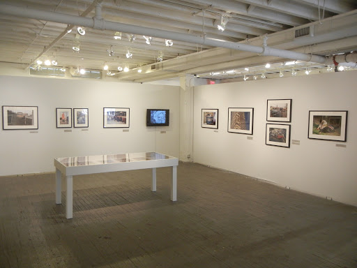 In the end, while these pictures are filled with horrors usual and unusual, they have been crafted with such skill that the heightened emotions are balanced by brilliantly thoughtful framing. The pictures never descend into intrusive exploitation and never lose sight of the genuine sorrow on display. Don’t be put off by the bus crashed over the viaduct or the drowning victim being pulled out of the pool – there are richly intense and profoundly human moments to be seen here, all captured by an artist who deserves much more recognition than he has heretofore received.
Collector’s POV: Unlike the prints in most Aperture shows, these modern prints are actually for sale. The 11×14 prints are $1800 each and the 16×20 prints are $2500 each. The set of 10 toy prints with bag is $1500. Metinides’ work has very little secondary market history in the past decade, with only a handful of lots coming up for sale and finding buyers in that time. Prices have ranged between $1500 and $2500, but this is likely not entirely representative of the market for his best vintage work. If gallery representation or other sources of Metinides’ vintage work exists the US or elsewhere, please add the information in the comments.