JTF (just the facts): Published in 2019 by Roma Publications (here). Stitched softcover, 84 pages, with 12 six-page, double sided foldouts in color. Aside from a short text on the front cover, there are no texts of essays included. In an edition of 500 copies. Design by Mevis and Van Deursen. (Cover and spread shots below.)

Comments/Context: Design and construction aren’t usually where we start when considering a new photobook. Perhaps we are traditionalists, but the “photo” part of a photobook still tends to grab us first, with the “book” part of the integrated art object typically seen in service of those pictures. But the innovative physicality of Misha de Ridder’s high up close by is hard to ignore, its page turns forcing a different mode of hands-on engagement than we’re used to.
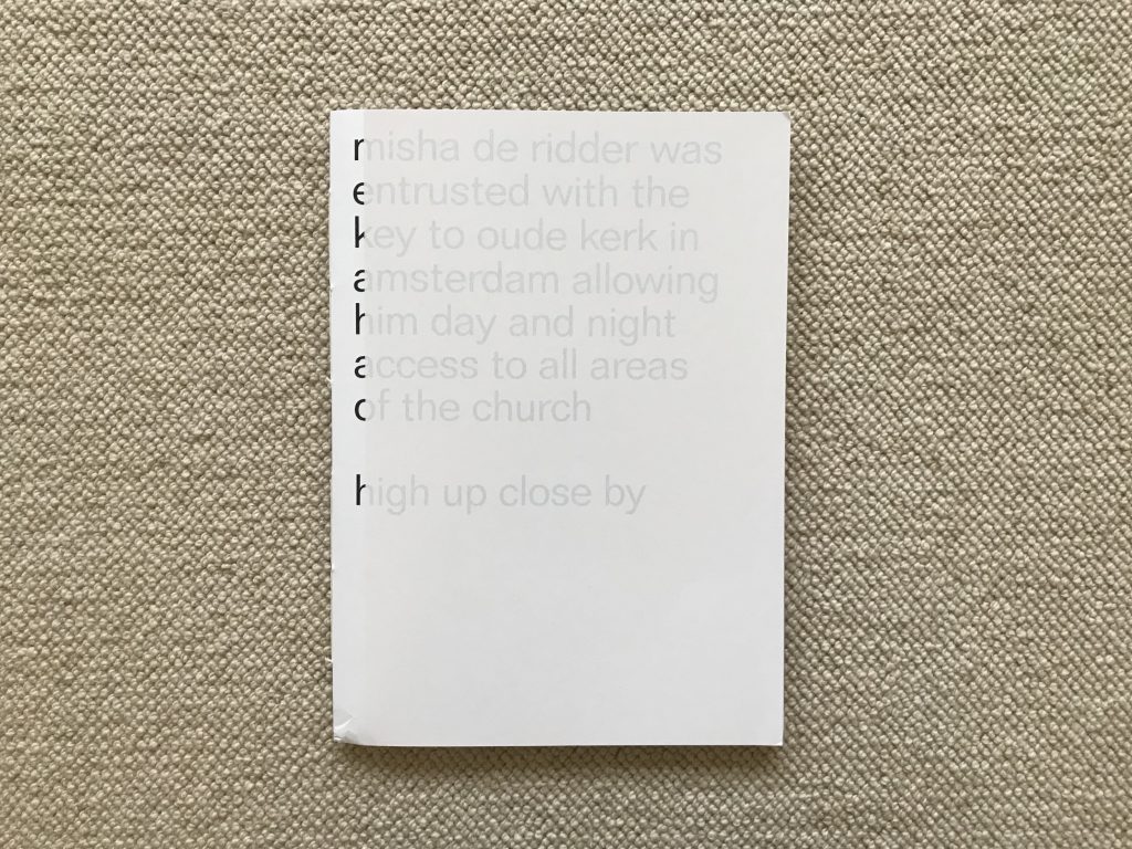
The cover itself is a clue that our assumptions about how a photobook normally functions have been upended. The front uses the short explanatory text that provides some background to the project as a design element, in effect pulling it out from inside and turning it into a typography exercise. The title of the book lingers below this text, the entire cover veiled by a thin screen of white, interrupting our ability to see the words clearly. On the inside of the cover and on the back, the acknowledgements and colophon are rotated, printed, and similarly veiled, again re-prioritizing the placement of this kind of supporting information.
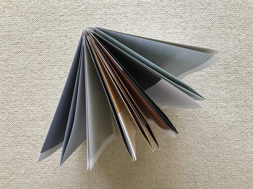
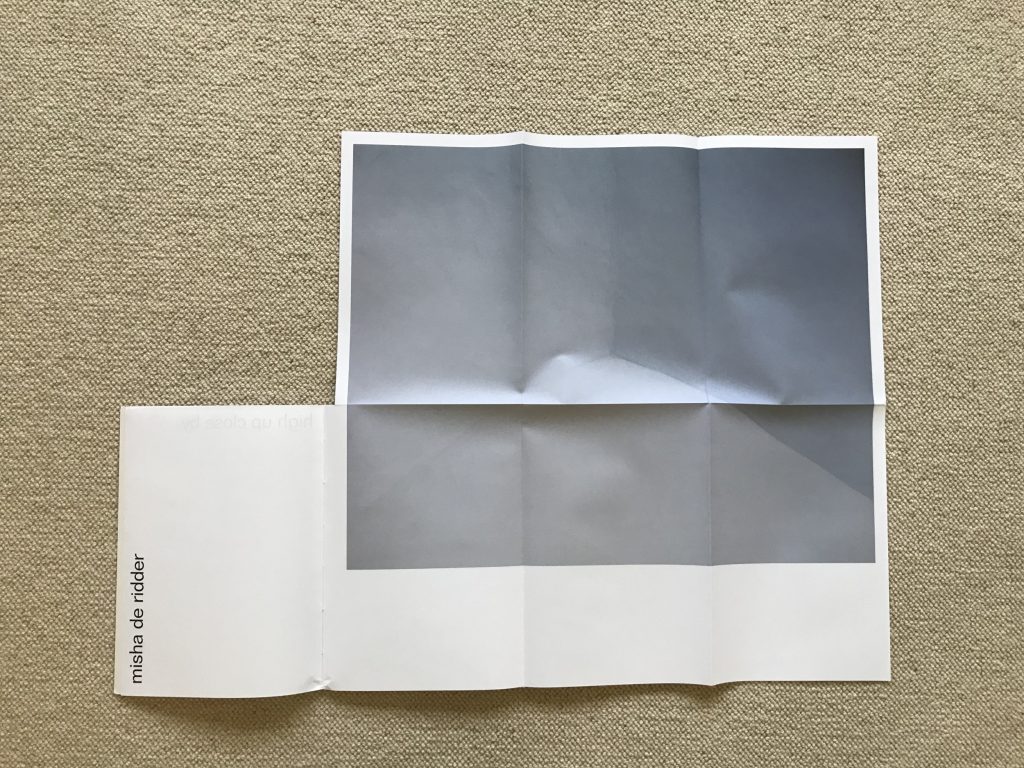
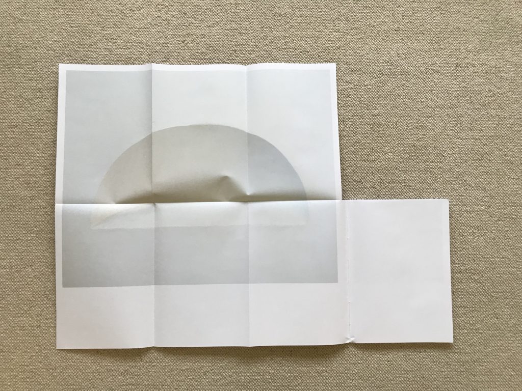
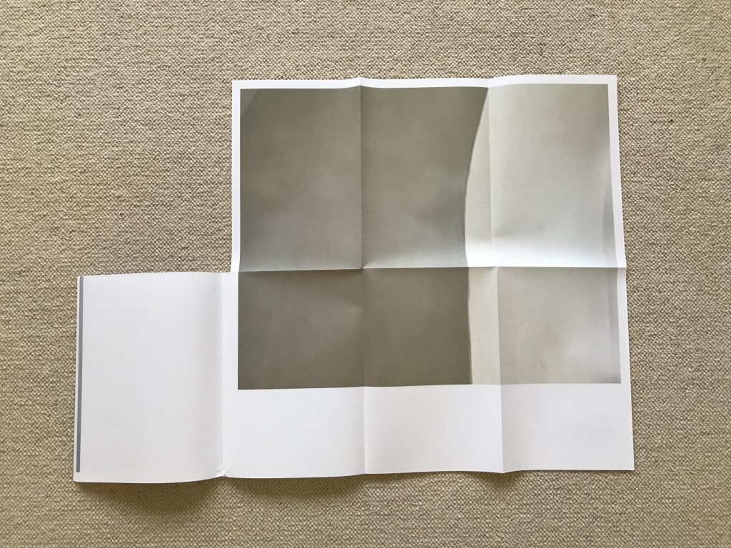
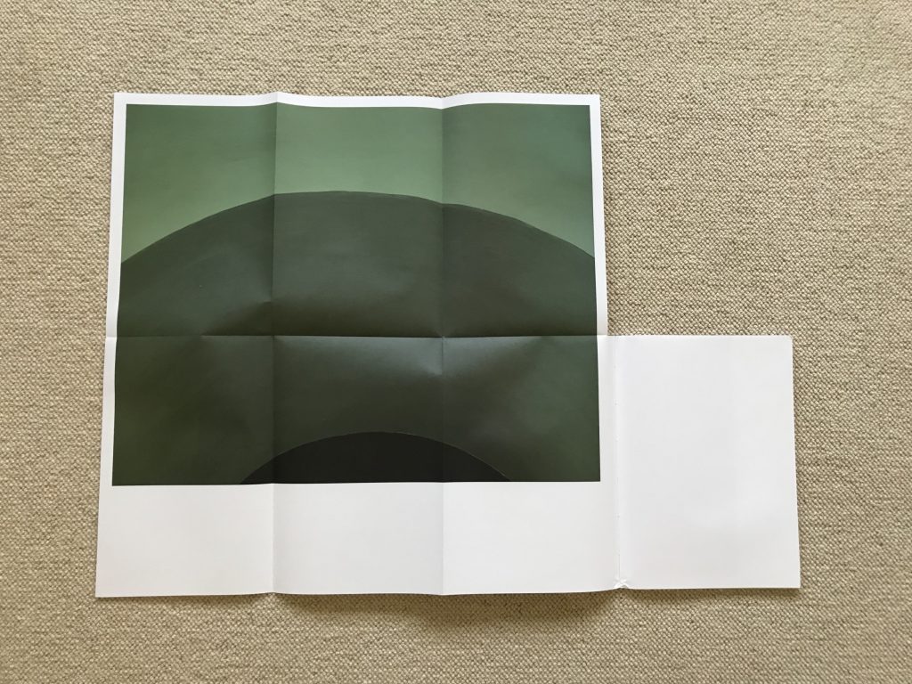
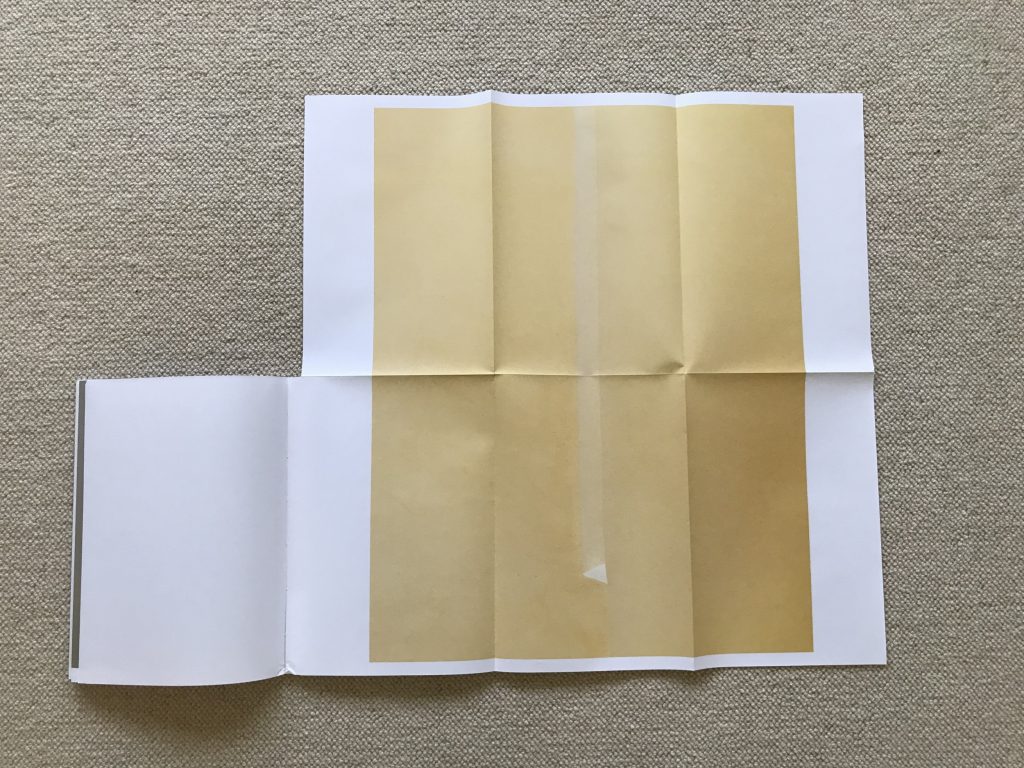
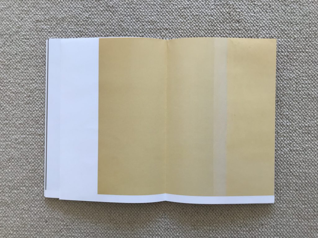
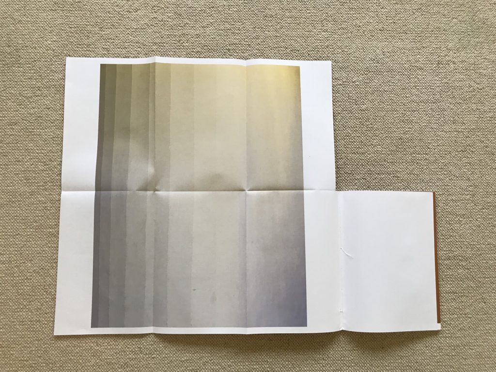
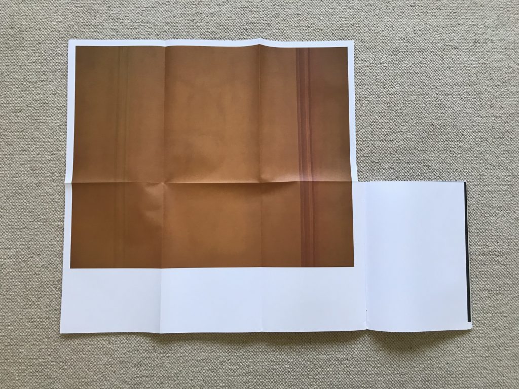
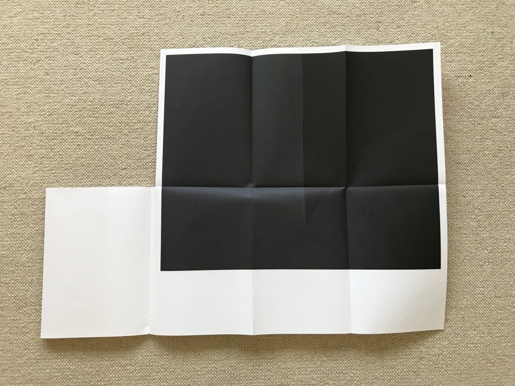
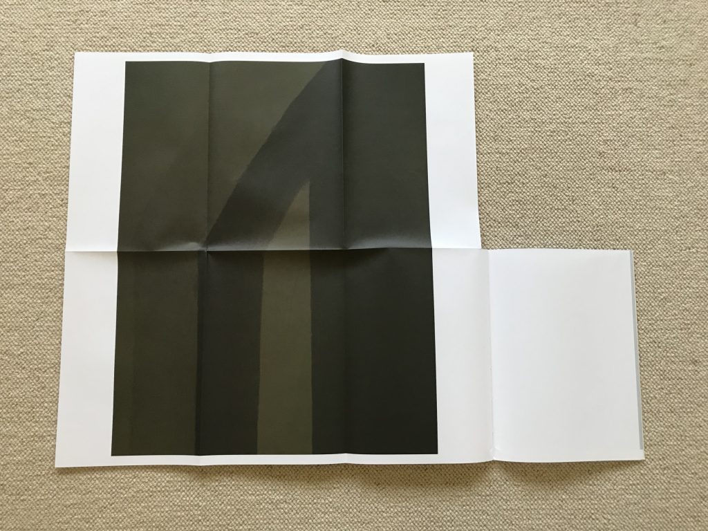
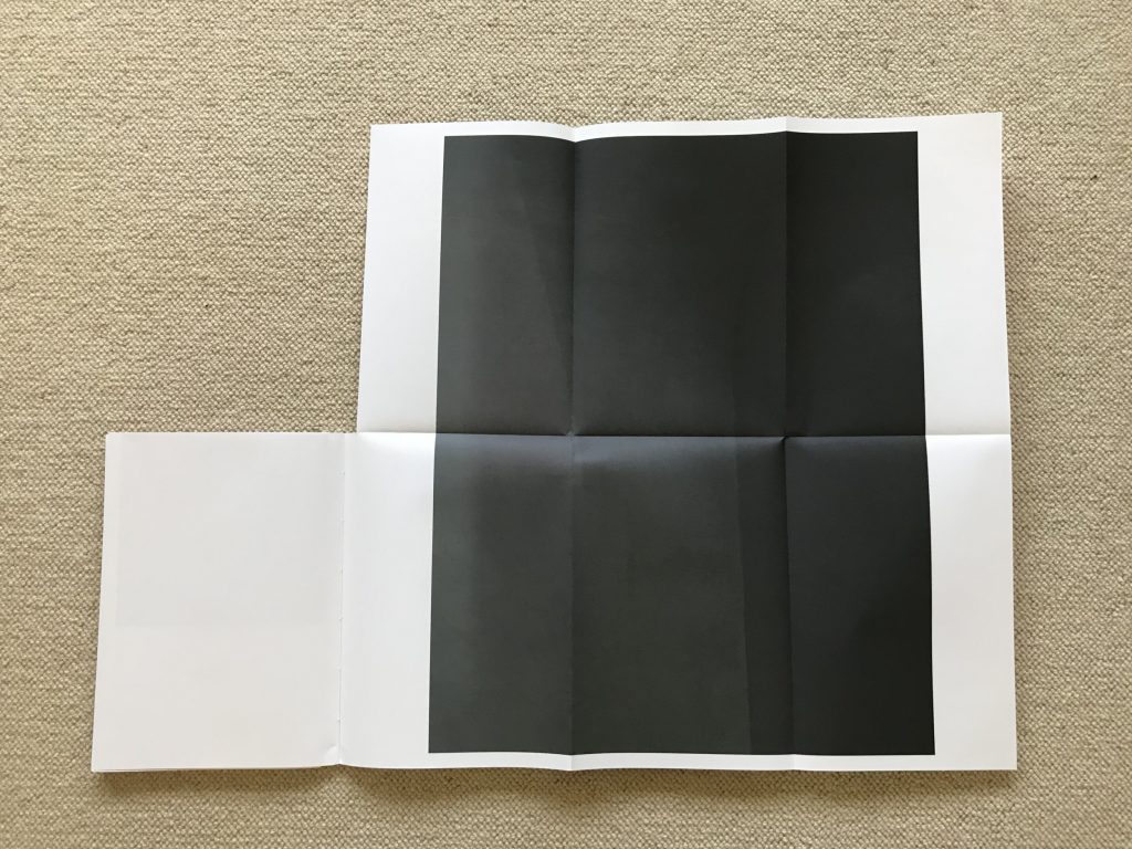
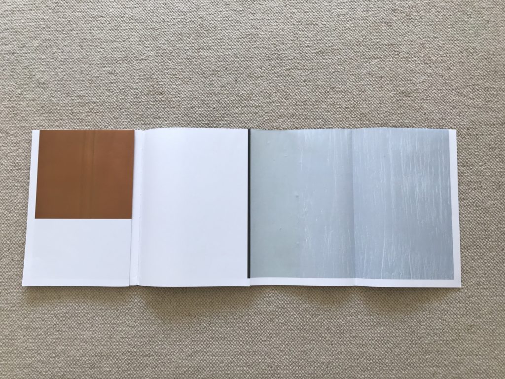
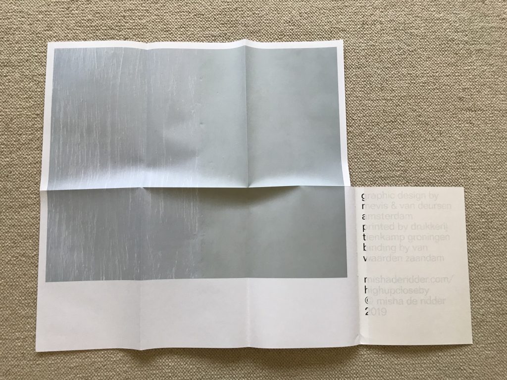
The flow of forward page flips is also radically altered. The book is made up of six fold outs, each one initially folded inward so that the book still looks like a book from the outside. Each foldout then accordions out to the side, revealing three side-by-side panels, and this three panel section then unfolds vertically to expand to a full six panel image. This large image then turns over to reveal a second six panel image on the reverse. The reader can then leave that image unfolded or refold it back up and move on to the next two-sided image. So there are no standard page turns in this photobook, and the combinations of overlapped images (and partial reversed images) are variable, depending on the reader’s folding choices.
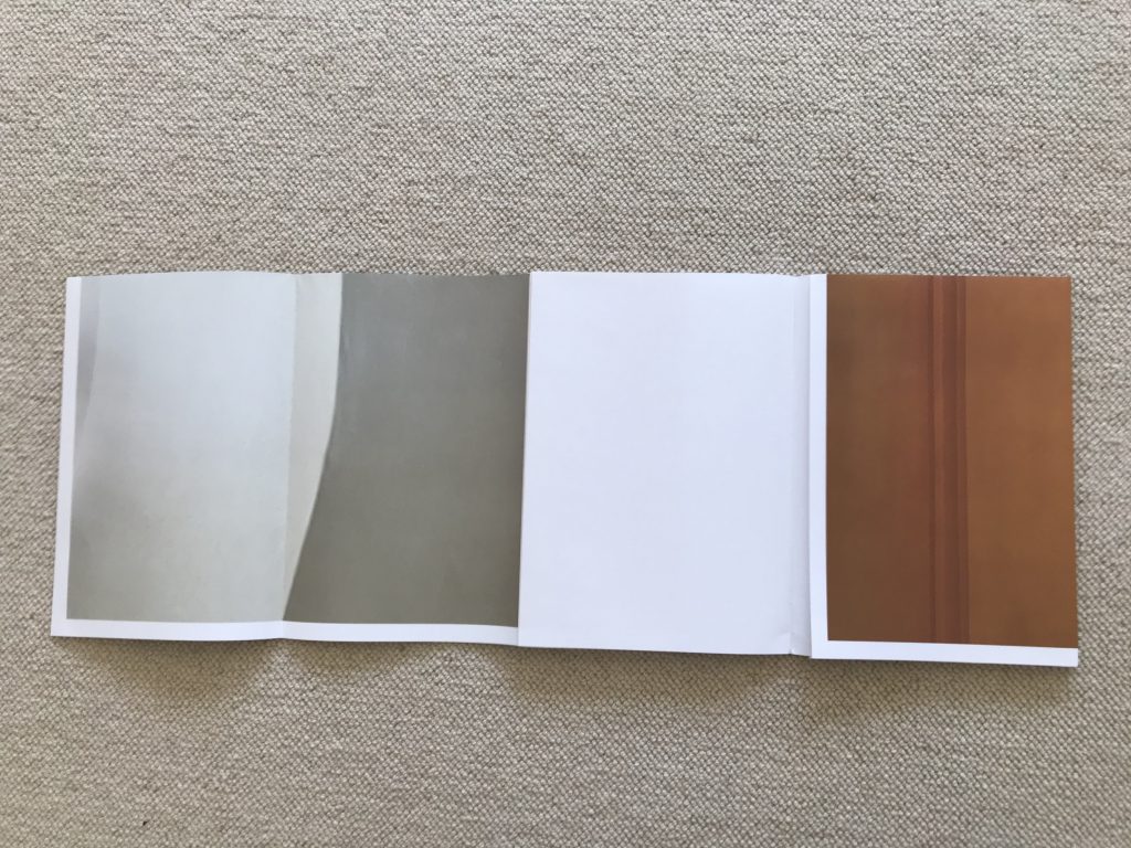
This visual display system would be a disaster for most types of photography, particularly those with a sense of narrative or dense with documentary content – the breaking up of the images into fragmented tiles would be maddening. But in this case, because de Ridder’s photographs lean toward color field abstraction, the interleaved folding remixes the partials with each movement. Even the normally overlooked white space on the pages is transformed into an active element – when the tiles are isolated, the white borders are cut into lines and rectangles that rebalance the geometric image fragments.
De Ridder made the twelve photographs in the book in a single day in the summer of 2017, when he was given unconstrained day and night access to Oude Kerk, Amsterdam’s oldest church. But it would be nearly impossible to discern this special subject matter from de Ridder’s images – there are no religious symbols, ornate moldings, stained glass windows, or other architectural details that would give away the location to any but the most observant local. Instead, de Ridder has focused the lens of a high resolution camera on up-close painted details. Perhaps they are corners, arches, doorways, windows, or just edges of walls – we can’t know for sure because de Ridder has cropped them down into flat fields of color.
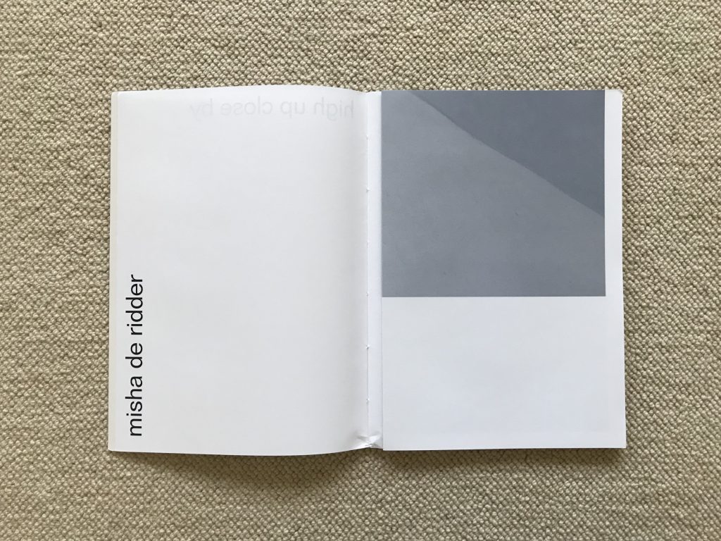
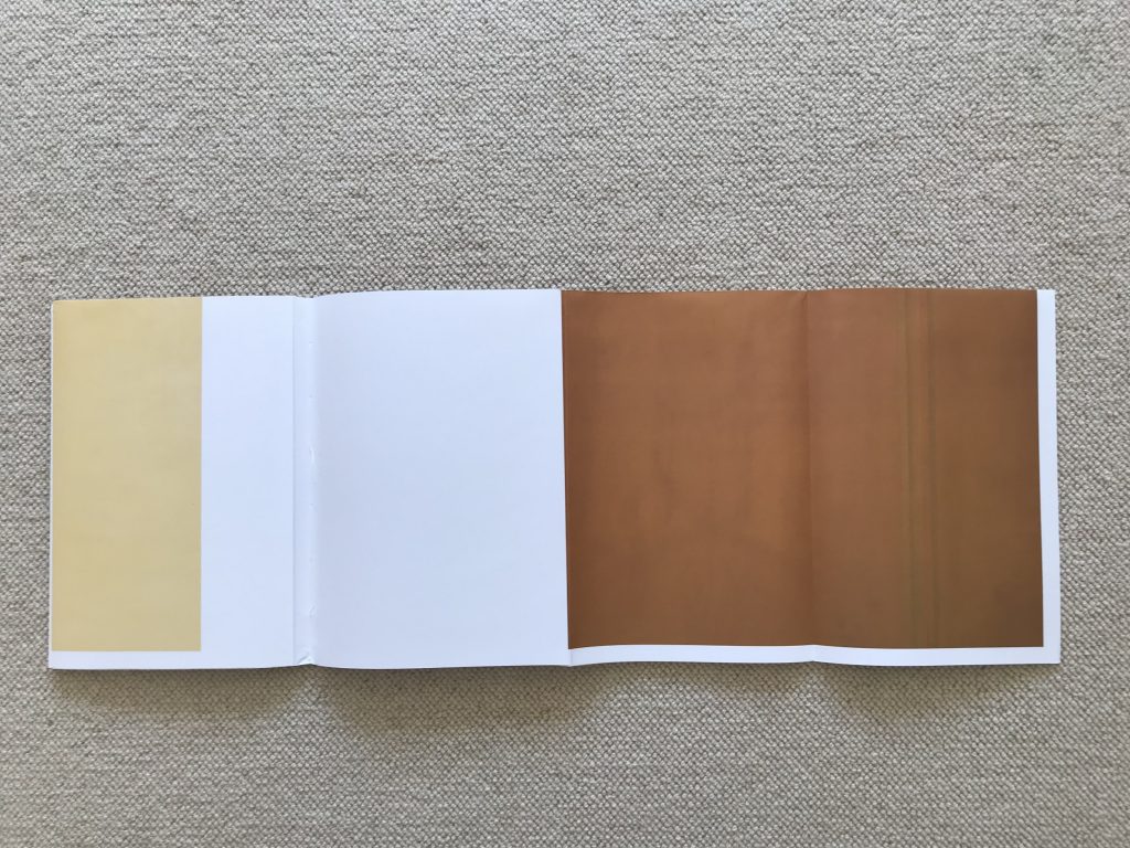
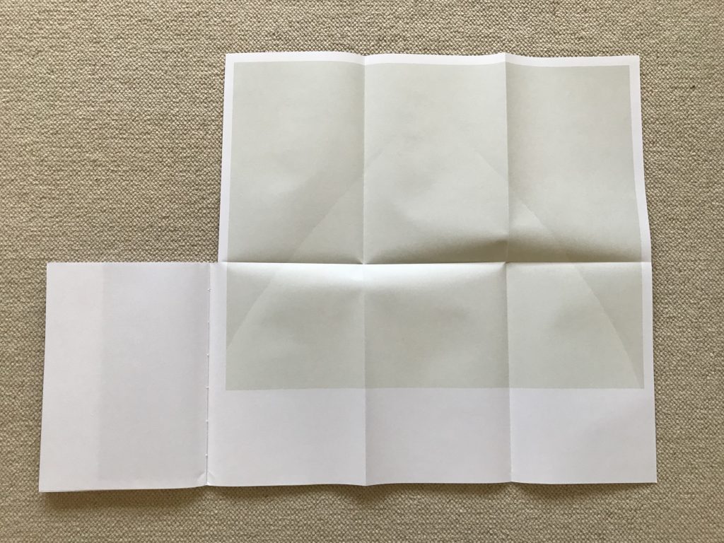
De Ridder’s photographic minimalism is engagingly tactile, the subtle play of light and shadow activating the spaces and creating muted stripes, arcs, and angles. Elemental geometries slowly emerge from the pages: a soft grey corner divides into three planes, a curved niche becomes a perfect semicircle, a green opening bends into concentric arcs, and a fluted column is flattened into vertical stripes in soft gradation. His colors are similarly rich and supple – scenes in butter yellow, rusty orange, deep charcoal grey, and loden green pull us into their flattened spatial dynamics. In general, the compositions are quiet, meditative, and sublimely pared down. In one case, raking light across a wall creates brush stroke highlights that scrape down a surface of icy light blue. In another, an expanse of creamy whiteness offers just a hint of a ghostly triangle. When these images are then divided into subparts and relayered by the re-folding process, the component geometries are unlocked and cleverly reshuffled.
Seen as one integrated statement, de Ridder’s high up close by definitely feels more like an art object than a mass produced photobook. The combination of photographs and paper construction transforms the calm, understated compositions into something more intricately sophisticated and almost playful, asking us to see them as forms that can be broken and reassembled in ever changing ways. The more I have folded and unfolded this photobook, the more complex and enchanting it has become. Its unexpected phsyicality asks us to rethink how we assume simple geometries fit together, and to ponder how single images can be both one and many.
Collector’s POV: Misha de Ridder is represented by Albada Jelgersma in Amsterdam (here). De Midder’s work has little action history at this point, so gallery retail remains the best option for those collectors interested in following up.