


Comments/Context: Like photographers, architects face a complicated burden. A proposed structure must provide shelter and utility, but those are merely the basics. There are building codes and construction technologies to consider, both in continual flux. Shifting styles and genres come into play, regional, historic, and projected into the future. So while blueprints might occasionally aspire to be recognized as art, they’re always dragged back to earth by one thing or another: a client’s whim perhaps, or material costs or engineering challenges, or any number of other considerations.
Perhaps the biggest X-factor is that architectural design is a public act. A building joins the fabric of common space for an indefinite period of time, so it must play well with others in shifting circumstances. But no matter how carefully planned, the future is uncertain. The fate of any building eventually falls into the care of subsequent generations—into “the people’s trust”, if you will— and what happens down the line is anyone’s guess. In fact, as Stewart Brand articulated in the minor classic How Buildings Learn, unforeseen adaptations are often more likely than prescribed uses. Rebutting Louis Sullivan’s maxim “Form follows function” was Brand’s sly rejoinder: “Function melts form.”
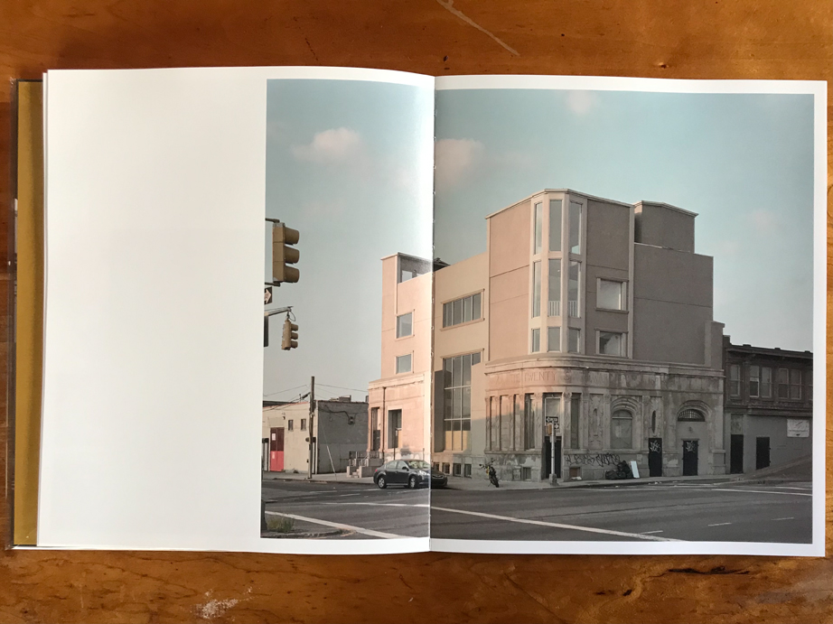
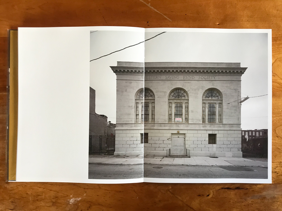
Consider the glut of buildings constructed to house regional banks in America’s east coast cities around the turn of the 20th century. Designed during the infancy of modern finance, they were built to project security in an era of cyclical economic disruptions. After the boom-bust crashes of 1873, 1884, 1890, 1893, and 1907, banks sought to portray an aura of stability and security. For better or for worse, in the early 1900s that meant Neoclassical architecture referencing the great civilizations of the past. Hundreds of new banks adopted the styles of Greek and Roman revivalism, with imposing columns fronting various vestibules, arches, and cupolas. Across their upper prows were often inscribed classical lettering with reassuring words like “TRUST” and “SAVINGS”, along with olive laurels, great seals, and pairs of statuette eagles.
With foundations of stone or concrete, these institutions were intended to last, and many are still standing. But the neighborhoods around them have changed, along with transportation options, ownership, and general aesthetics. Most have outlived their intended utility as bank vaults. They remain scattered about in their original locations, but their outer forms have long since been melted by function.
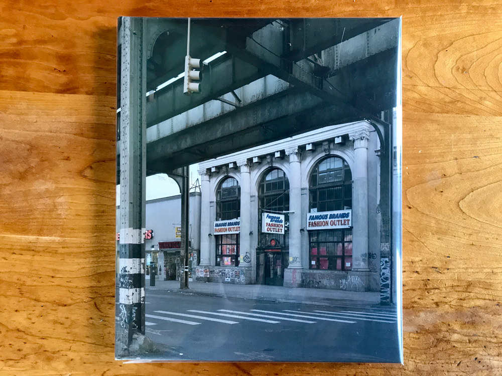
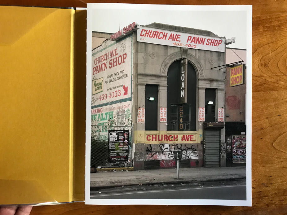
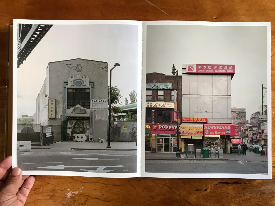
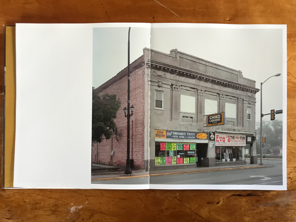
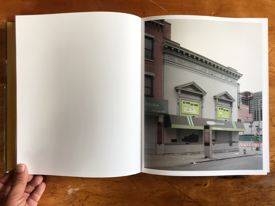
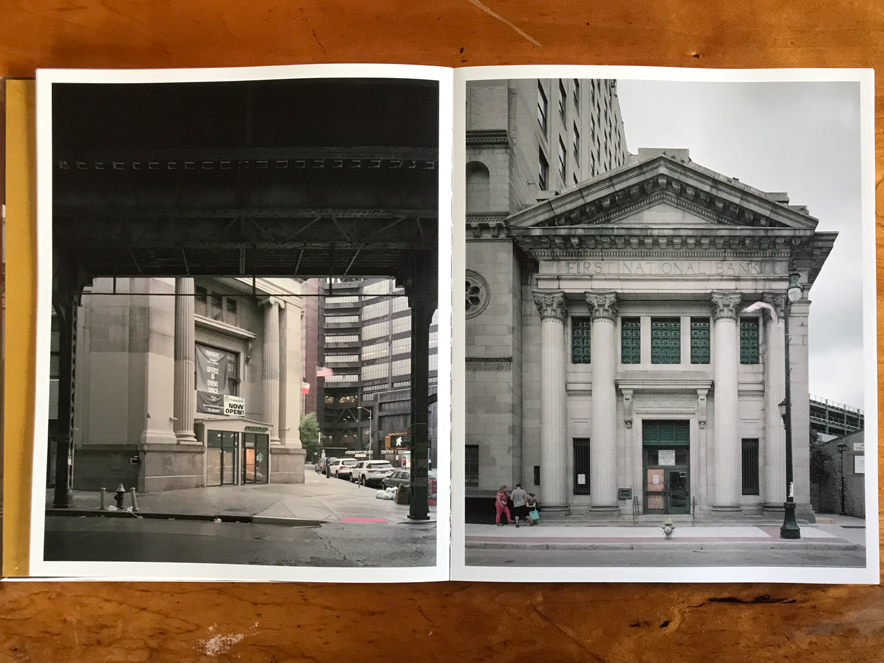
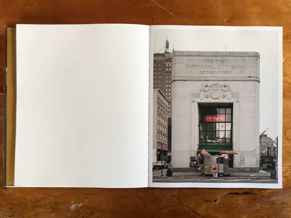
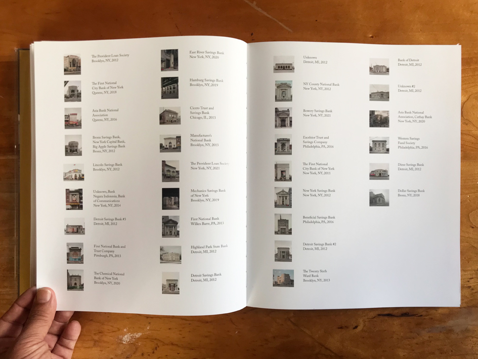
Thirty-three such buildings comprise Michael Vahrenwald’s latest monograph The People’s Trust. He shot them recently over a nine year period — 2012-2020, as the U.S. was once again booming from its latest bust — but most can trace their roots back a century or more. Their core structures are remarkably intact. But one hundred years is a long time, and exterior renovations are inevitable. Although most (presumably zoned for commerce?) remain business oriented, they no longer appear very bankish, and added accoutrements have strayed far from Neoclassical. Instead many house consumer retail and chain shops, garnished with ads and placards printed on cheap materials.
Vahrenwald seems to have honed in on the most chintzy and degrading examples for his book. The former Lincoln Savings Bank in Brooklyn has become home to a McDonald’s, for example, while the Twenty-Sixth Ward bank nearby doesn’t even merit occupancy. It’s been clumsily modified, abandoned, and graffitied. A formerly esteemed New York Savings Bank is now a CVS Pharmacy. And so on. These poor buildings are of course inanimate objects, and can’t feel a thing. But it’s hard not feel empathy for them. At one time they were the prides of their towns, perhaps appearing in Chamber of Commerce photos or post cards. Now they lurk sheepishly on secondary byways, draped with banners like a two-bit show horse blaring crude plugs: SUPER DISCOUNT 100% HUMAN HAIR. PUCKERS FLAVORED VODKA $15.99. SPACE AVAILABLE. ORAL SURGERY ORTHODONTICS. One must admire Americans’ ceaseless drive for reinvention and dealmaking. But still, yikes. How the mighty have fallen.
Wahrenwald has taken a similar approach photographically with each bank. He generally stands apart at a distance of 50 yards or so, perhaps across the street (an early prototype included in the afterward indicates the cropping loosened as he developed the project). From this vantage point, he can capture the entire building, warts and all. Most are simple structures of just one or two stories. He typically photographs straight on, treating facades as architectural head shots. The banks fit comfortably inside his frames, their sides squared up vertically with an architectural lens. He might capture bits of vernacular detail too, including other buildings, vegetation, sidewalks, and infrastructure. But these elements appear only as supporting context surrounding the star attraction.
The resulting book is something of a typology, but with enough diversity of place, time, and style to avoid uniformity. Some photos show snow on the ground, or fog. After so many decades of change, it seems unlikely these buildings could still project any regal aura, but they do, and Vahrenwald does his best to capture something of their better days. “As I began photographing,” he writes, “I couldn’t help but register the headstrong optimism in these buildings, the grandiose way in which they were fortresses built to last— all that in contradistinction to what they’re used for now. It fascinates me, that in their current state, these structures still project so much of their former authority.”
The People’s Trust is not an overtly political book. There are no events, slogans, actions, or people. It’s a mere glance at the built environment. But it’s hard to witness the fate of these buildings without reflecting on broader currents. The adaptation of grand old banks by fly-by-night hucksters is a caricature (forgive the pun: a thin facade) of societal shifts, perhaps with the makings of a morality tale. It might opine on the plywood veneer of the U.S. economy, with boom-bust cycles inevitable no matter how solid its foundation. Like so much of photography, these pictures attempt to preserve and resuscitate the past. They might be a subcategory of ruin porn, although more thoughtfully approached than most of that genre. “The project’s not about what I like or don’t like,” he writes, “but about how odd these buildings are today in a world where the aesthetics (as well as the simple facts) of power, wealth, & class have all fundamentally changed.” Even if they are not opinionated, his photos seem to be making a statement.
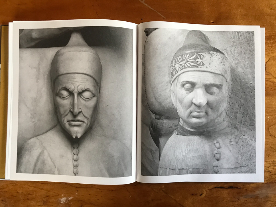
Beyond his photo career, Vahrenwald has some experience too as a bookmaker. He is the cofounder of the publisher ROMAN NVMERALS, which has printed several photobooks of note since its inception in 2015. This book is not one of them—it’s published instead by Kominek— but it bears evidence of intelligent design throughout. Gold tinged end pages, for example, and Swiss binding with spreads easily flattened. Shifting paper types and reproduction effects delineate book parts, while the title and header fonts are bold and innovative. The title MICHAEL VAHRENWALD THE PEOPLE’S TRUST takes up a full two pages in huge (150 pt?) crimson all-caps, an imposing nod to the classical stance of its contents. ESSAY BY MICHAEL SCHEPPE is written on the next spread in the same bold typeface, and the German critic’s long informative essay lives up to the font. It’s quite extensive and meandering, ruminating on Venetian art, financial history, sculpture, architecture, Trumpism, and other topics over thirty-plus pages. A helpful rear index lists photos by thumbnail, place, and date.
Perhaps the most clever and incisive design element, and a flippant counter to the academic weight of Scheppe, is a short story by Richard Brautigan called “Complicated Banking Problems”, recounting a dreamy visit to the bank teller in surrealist prose. It’s tucked in the flow of photos, and hits such an offbeat and humorous note that I found myself laughing out loud. I suppose the story touches tangentially on banking, but it seems more about daily absurdities and Brautigan’s poetic observations. Who says banking must be serious all the time? If the people’s trust falls short of its duty on occasion, the problem is surmountable. Life goes on. Buildings find new uses, adaptations, and future entrustments.
Collector’s POV: Michael Vahrenwald is represented by the commercial agency ESTO (here). Vahrenwald’s work has little secondary market history at this point, so direct contact with the artist via his website (linked in the sidebar) is likely the best option for those collectors interested in following up.


Weird choice of cities – Philidelphia, Detroit mixed with New York – why stop there? Where is the story? It makes no sense and feels arbitrary, a missed opportunity.
Good questions. I don’t know how exact sites were chosen, but the concentration in large northeast cities seems logical since they had dense urban cores which might attract regional banks, and also experience some organic evolution as the cities grew. Could also be they were more accessible to the author (based in NY)? I suppose any curated selection of cities would be arbitrary in its own way.