JTF (just the facts): Published in 2019 by Editorial RM (here). Hardcover, 136 pages, with 66 color reproductions. Includes and essay by James Oles and a list of plates. In an edition of 1100 copies. Design by José Luis Lugo. (Cover and spread shots below.)


Comments/Context: For many 20th century photographic masters, whose formative years were filled entirely with making images in black and white, the arrival of more widely available and easier to use color photography posed both challenges and opportunities. Particularly for those who had built their artistic careers in the middle of the century, their training had taught them to see in black and white, and most had spent decades painstakingly refining that specific vision. So when color came along, they had a range of potential choices – ignore it (and keep working as they had previously), experiment with it (but remain committed to black and white), or embrace it (and essentially relearn how to see in color).
The path of the side project or late career experimentation was selected by many major figures in photography, but their results in color are often overlooked, deliberately omitted, or forgotten, as they don’t easily fit into the established arcs of their careers. Ansel Adams shot in color, as did Edward Weston, Walker Evans, Aaron Siskind, and André Kertész. In particular, Helen Levitt, Harry Callahan, and Garry Winogrand (reviewed here) were all quite successful in making a more active transition to color, each making discrete bodies of work in color that stand up well to the best of what they made in black and white.
Manuel Álvarez Bravo is yet another member of the 20th century photographic canon who has an underknown color career. While the Mexican photographer is largely known for his black and white work, some 3100 color photographs are to be found in his archive. But his major retrospectives and museum shows have only skimmed across the very top of this work. His 1978 show at the Corcoran Gallery of Art in Washington, D.C., included 185 prints, 9 of which were in color (including the cover of the catalog). His 1997 retrospective at MoMA included 173 images, just 6 in color. And his 2012/2013 retrospective at the Jeu de Paume and the Fundación MAPFRE did the best job of including a somewhat wider sample his color work, with 14 color images on view in an exhibition of 151 prints.
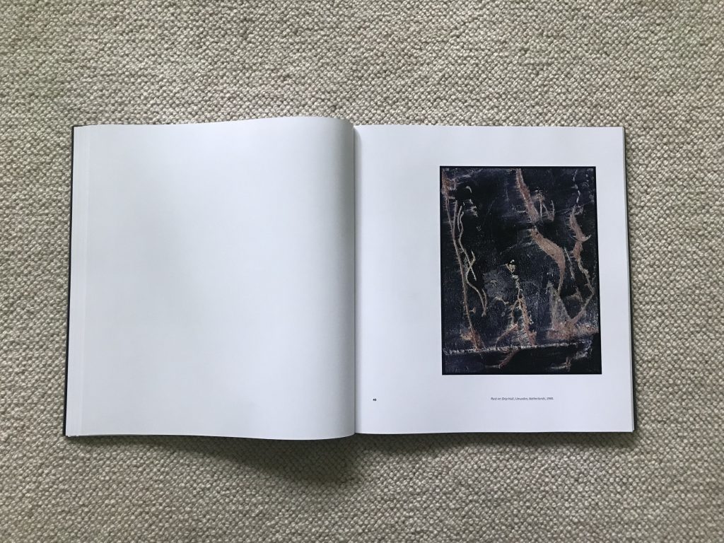
For the first time, this photobook examines Álvarez Bravo’s color work in much more breadth and depth, and it turns out Álvarez Bravo wasn’t just a passing dabbler. His interest in color photography was relatively consistent across his whole career – he made a few autochromes in the 1920s (sadly now lost), more dye transfers in the 1940s and 1950s, and through the 1960s, color became further integrated into his artistic practice. Manuel Álvarez Bravo in Color gathers together a total of 66 images from various time periods (many reprinted from never before seen negatives and slides), and provides the most complete published survey of this underappreciated work to date.
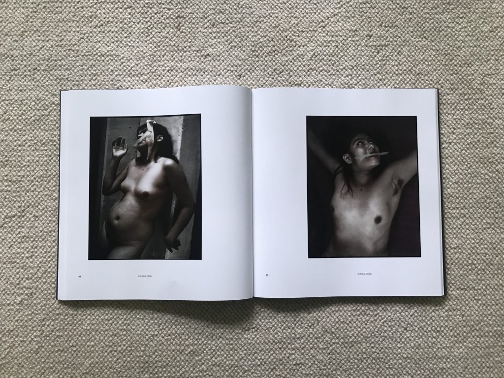
The first photograph in the book should be familiar, at least somewhat. A young woman with a white hat peers into a circular hole in a wall of checkerboard tile – in black and white, it’s a famous Álvarez Bravo image entitled Daughter of the Dancers, which found its way to the cover of the MoMA catalog. What’s fascinating is that we can now compare it to a variant image taken just seconds apart, but in color. Here it’s a wider view, with blue sky, puffy clouds, green trees, a flanking stone gate, and an octagonal pavilion overhead, and the tiles we now see are actually maroon and white. While the variant is more compositionally ordered than the cropped black and white image we already know, the image is clear evidence that Álvarez Bravo was shooting simultaneously in both color and black and white, and other pictures date this approach to as early as the early 1930s. A handful of other color variants of well known black and white images provide additional proof – he made color versions of The Skull Factory and Day of the Dead (both holding skulls), as well as color variants of the nude with a comb and of Maudelle Bass on the terra cotta patio. In these pictures, he was side-buy-side testing the two ways of seeing, adapting and recalibrating his eye on the fly.
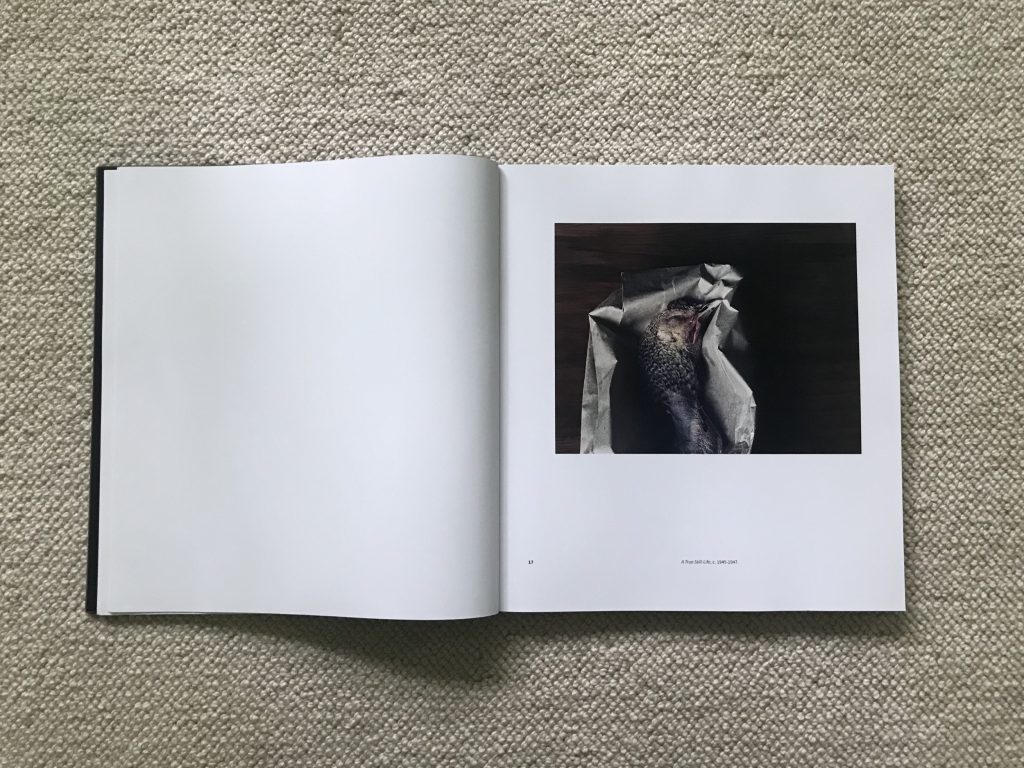
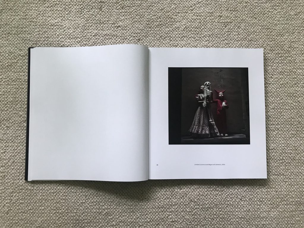
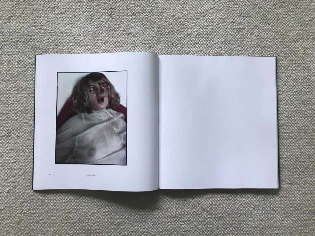
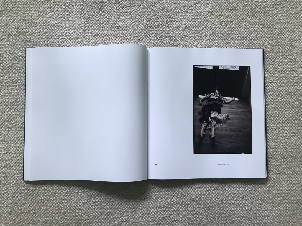
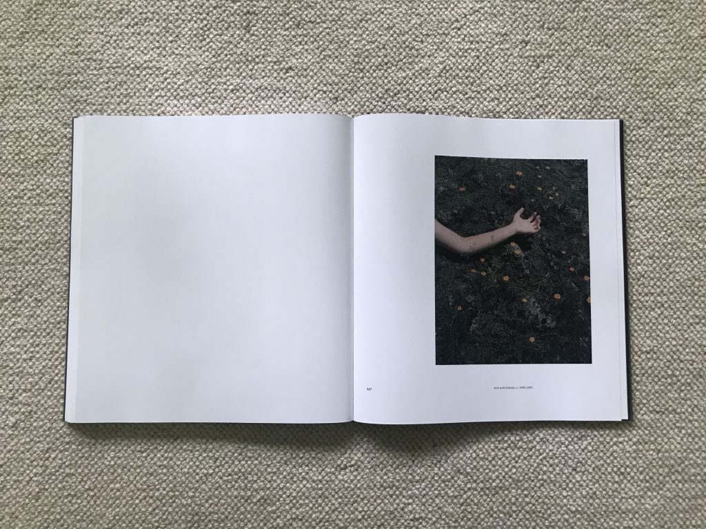
Flipping through this volume, part of what we watch Álvarez Bravo do is start to rethink his usual subject matter in color. His unique blend of Modernism, celebration of Mexican cultural heritage, and a dash of hot weather Surrealism gets infused here with splashes of color that alter the balance and tone of his photographs. A staged scene with his children holding a skeleton now simmers with the red of a devil costume and a polka-dotted dress. A series of images of a face-wrapped woman carrying a large wooden mask is subtly enlivened by shades of pink. Another woman lies tenderly on the floor near a doorway dappled by incoming light, her dress and sash in matching purple. A quiet still life of a dead bird in a paper bag swirls with the colors in the feathers. And a double exposure picture of a skull headed dancer with a painted violin pops with layered movement and splashes of green, purple, and red. In each of these cases, it’s as if Álvarez Bravo has composed the image in his traditional manner (any one of these examples would function well in black and white), and then decided to push it back in its real world hues.
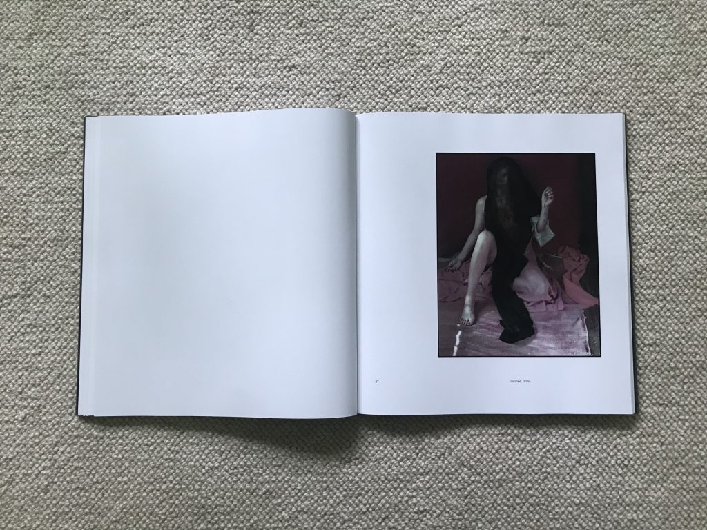
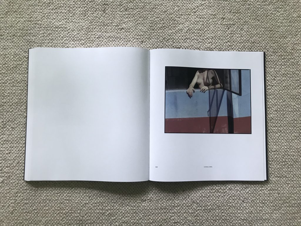
This color shifting inevitably leads Álvarez Bravo to noticing the colors of the world first, and using those colors to initiate new compositions. A bright red and yellow smock dress is the reason for a picture of his wife Colette. The same can be said of a neat pile of pink bricks at a brick factory – that unusual color is what’s important. Another veiled nude arrangement connects four different variations of red and pink, while a later nude is placed in a window above a wall striped in blue and red. These are images driven by seeing color out in the world and then allowing it to anchor his image making.
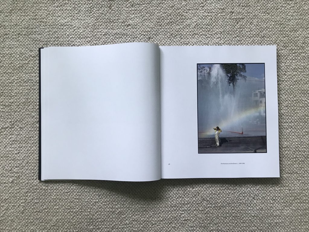
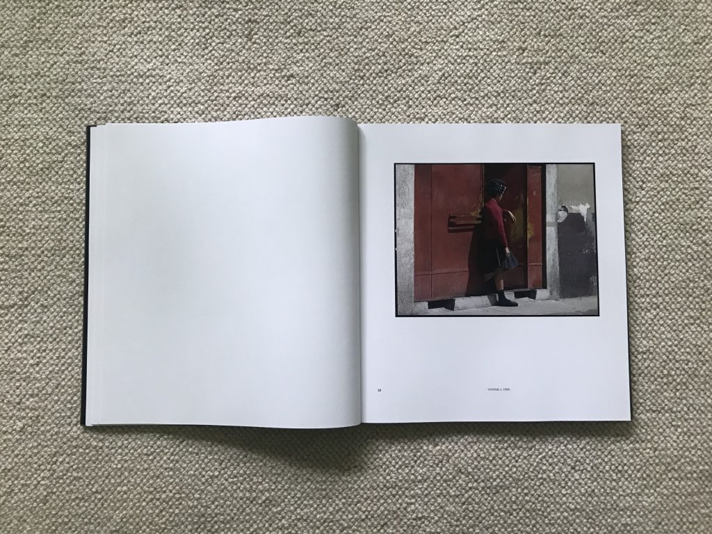
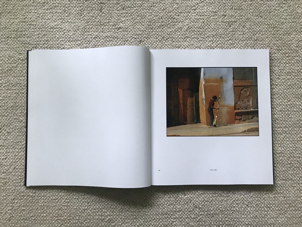
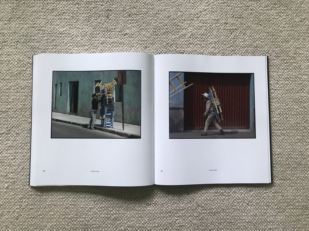
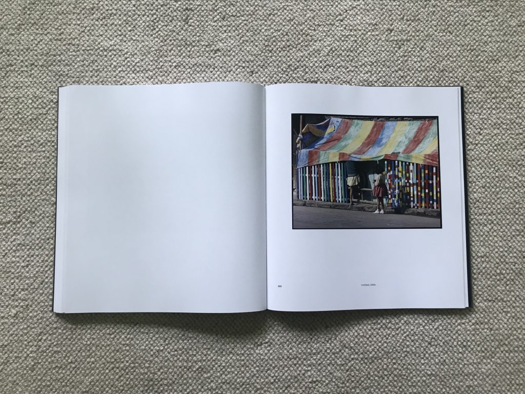
As Álvarez Bravo’s color approach gets more sophisticated, we see him moving toward more overt color studies, where the images are both in color and essentially about color. Some of the strongest color photographs in this edit are street scenes, where Álvarez Bravo has used the backdrop of a colored wall or doorway to capture passersby. He can then play visual games with matching and contrast: a blue dress and a blue Pepsi-Cola ad, a green wall and a v-shaped tree with green leaves, a red jacket and a red doorway, red and purple clothing against a yellow wall, a man carrying a precarious stack of blue chairs against a green wall, and a symphony of orange behind a boy sweeping the sidewalk. The eye-popping topper in this series features two girls (one in a polka dot skirt) standing near a brightly painted shop with rainbow slats and a striped awning – it’s a buoyant color jamboree that pulsates with joyful energy.
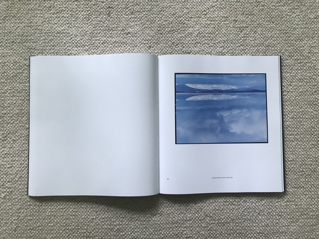
He makes similar color studies in many of his 1960s landscapes. The dry hills of late summer are arranged into strips of orange, and the black of lava fields is sprinkled with yellow grasses. Waterscapes offer more compositional options, from the mottled blue and white of a reflected sky to small islands and telephone poles marching across a reflection of light blue. And one layered scene flattens a mountain scene into soft horizontal stripes in muted shades of yellow, pink, and dull gray. These see color for its own sake, as primary rather than secondary.
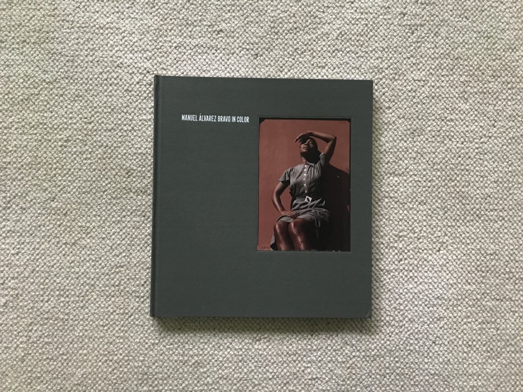
The design of Manuel Álvarez Bravo in Color is formal and elegant. The reproductions are given lots of white space on the square format pages, giving the photobook a photographs first orientation. And the cloth wrapped cover is matched to the color of the dress in the tipped-in image, creating a sophisticated first impression. The result is a book that will function equally well as scholarly reference or coffee table ready display.
In the end, Álvarez Bravo’s work in color takes some time to fully appreciate – my first impression was that it was fine but somewhat underwhelming (at least as compared with some of his iconic works), but additional time spent with the images has revealed more and more nuance and subtlety. There is much more complexity here than just passing fancy or intermittent distraction; it is clear from these results that Álvarez Bravo actively attempted to recalibrate his eye to take advantage of the power of color. His black and white photographs still belong as his most important and influential legacy, but these pictures in color broaden our understanding of his consistent curiosity about the medium.
Collector’s POV: The estate of Manuel Álvarez Bravo is represented by Throckmorton Fine Art in New York (here). Álvarez Bravo’s prints are widely available in the secondary markets, with a large number of later prints available at auction. Recent prices have ranged between $2000 and nearly $300000, with most later prints under $10000 and increasingly rare vintage prints routinely fetching five and low six figures.