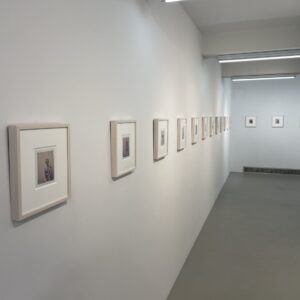
 JTF (just the facts): A total of 11 large scale color works, framed in black and matted, and hung in the main gallery space. All of the works are square format chromogenic prints, made between 2007 and 2009. The prints come in two sizes: 28×28, in editions of 15, and 38×38, in editions of 6; there are 9 small prints and 2 large prints in the show. The images were taken in various gardens in France, England, and the US (Kentucky and Louisiana). (Installation shots at right.)
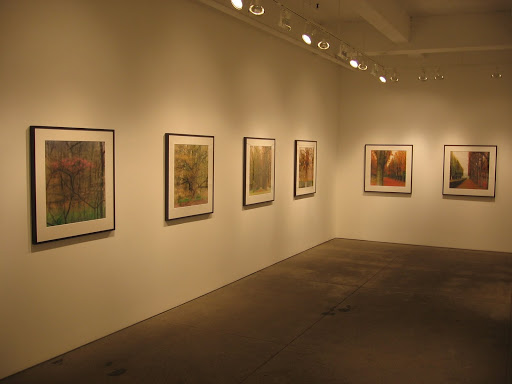
Comments/Context: I’ve always thought that Lynn Geesaman’s photographs were about the simple poetry of tranquil gardens. Her works have a dreamy, almost hallucinatory, feel to them, a shimmering painterly effect that softens the formality of long rows of trees, perfectly pruned hedges, or unusual botanical specimens. Her pictures capture a world of hazy beauty, a delicate mix of Atget and throw back Pictorialism.
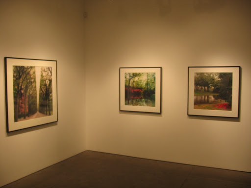 What I found surprising in this show is that for the first time I saw a conceptual edge in her pictures, a move beyond the decorative to something more challenging and subtly ironic. Shaped trees and carefully orchestrated vistas have been enhanced by brilliant exaggerated colors: bright orange, deep red, vibrant green and smashing pink. The dissonance isn’t overpowering, but somehow the rules of landscape photography seem to have been broken; the gardens have become more stylized and fabricated, the human hand controlling the natural world seems more obvious, the blurry romance a little more sinister. The most unexpected picture in the show is one from the Hampton Court Gardens in England, where a cluster of perfect conical evergreens sits in front of a jumble of tall scaffolding covered in red cloth. This is the first image I have ever seen by Geesaman that so overtly contrasts the natural and the artificial; it still glistens with glimmery light, but we’re a long way from artful reflections in still ponds. Seeing this image entirely changed my mindset, and when I circled back to see the other pictures once again, I was suddenly much more attuned to the ways in which the view was being manipulated, both by the garden designer and the photographer.
.
I have always been intrigued by the unique diffusion process that creates Geesaman’s signature hazy effect, but these new works forced me to look beyond the obvious beauty of the idealized gardens and to see how the artist was adding a nuance of commentary underneath that I had entirely missed before. I’m sure many viewers will still be enthralled by the easy loveliness of these pictures and will continue to enjoy them at face value. But I think the unlikely conceptual skepticism and the tiniest hint of absurdity give these pictures another richer level of meaning that takes them away from the conventional and toward something quite a bit more thought provoking.
I have always been intrigued by the unique diffusion process that creates Geesaman’s signature hazy effect, but these new works forced me to look beyond the obvious beauty of the idealized gardens and to see how the artist was adding a nuance of commentary underneath that I had entirely missed before. I’m sure many viewers will still be enthralled by the easy loveliness of these pictures and will continue to enjoy them at face value. But I think the unlikely conceptual skepticism and the tiniest hint of absurdity give these pictures another richer level of meaning that takes them away from the conventional and toward something quite a bit more thought provoking.
Collector’s POV: The works in this show are priced as follows. The smaller 28×28 prints are $4250 (including the frame). The larger 38×38 prints are $6700 (including the frame). Geesaman’s work does not have much auction history, so determining a secondary market price window is difficult. As such, gallery retail is likely the best option for interested collectors at this point.
Luckily, Geesaman’s work is represented by quite a few galleries around the US. In addition to Yancey Richardson in New York, her representatives include Robert Koch in San Francisco (here), Catherine Edelman in Chicago (here), Thomas Barry in Minneapolis (here), Scheinbaum & Russek in Santa Fe (here), and Jackson in Atlanta (here).
.
.
Rating: * (one star) GOOD (rating system described here)
.
.
Transit Hub:
- Book: Gardenscapes, 2003 (here)
Lynn Geesaman
Through July 9th
Through July 9th
535 West 22nd Street
New York, NY 10011