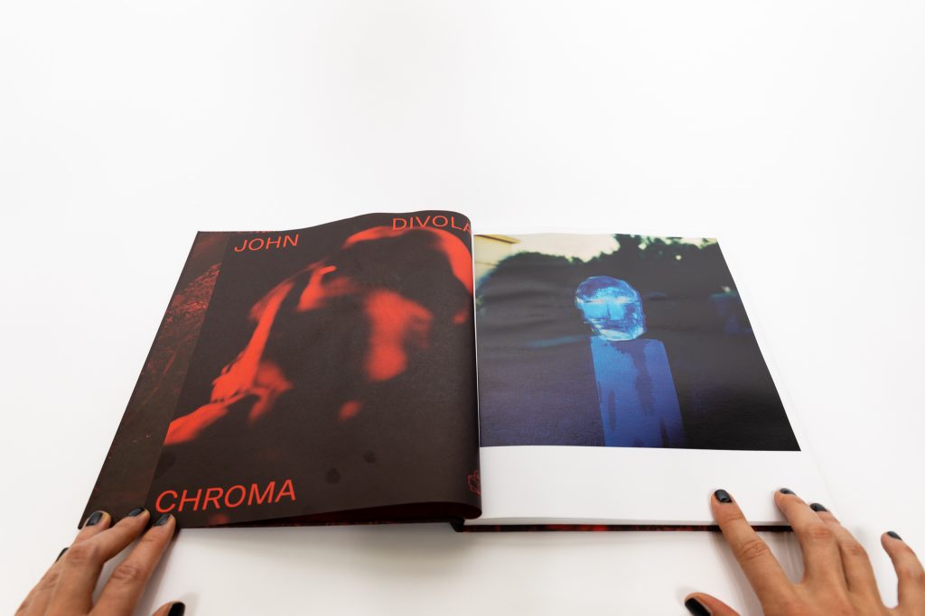
JTF (just the facts): Published in February 2020 by Skinnerboox (here). Hardcover, 80 pages, with 56 color photographs. Includes an interview conducted by David Campany. In an edition of 800 copies. Design by Federico Carpani. (Cover and spread shots below.)


Comments/Context: Is it possible to photograph phenomena that cannot be seen? While our initial response might be a defiant no, it’s precisely the subject matter of John Divola’s latest photobook Chroma. In this project, Divola is primarily interested in attempting to photograph the unphotographable, like “gravity, magnetism, which way water drains, and the things I see when I press my eyes with the palms of my hands.” This lesser known body of work was shot in the early 1980s but has never been published before in book format.
For almost five decades, John Divola has been working across conceptual art, photography, and installation, exploring the edge between the abstract and the specific. He constantly plays with the photographic process, intentionally makes things to be photographed, and experiments with pushing boundaries. In his highly acclaimed series Zuma, complex in both its process and content, he photographed sunsets framed through long abandoned oceanside houses. Right after that, he made a black and white series documenting MGM Studio’s New York City back-lot in Culver City, California, ultimately exposing the thin line between reality and artifice. This led to his interest in photographing things one can’t photograph.
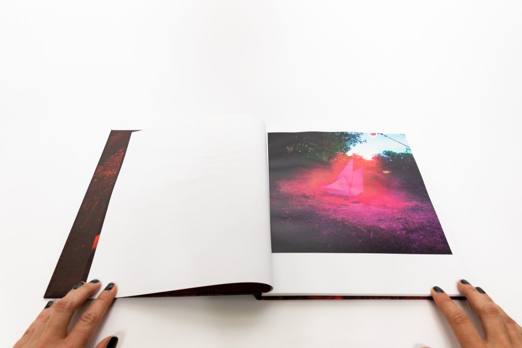
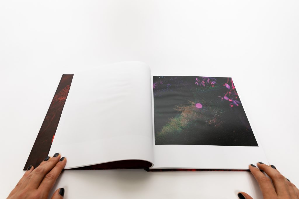
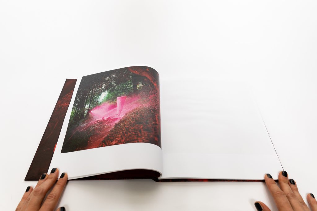
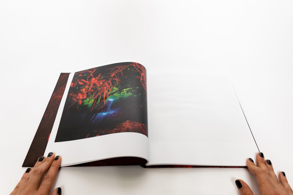
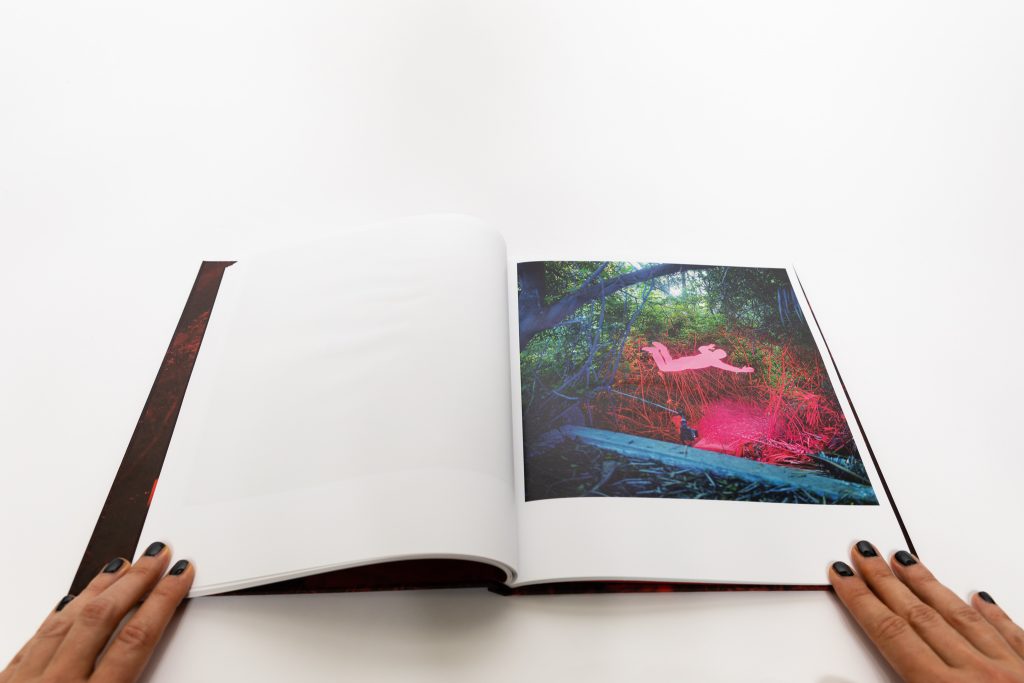
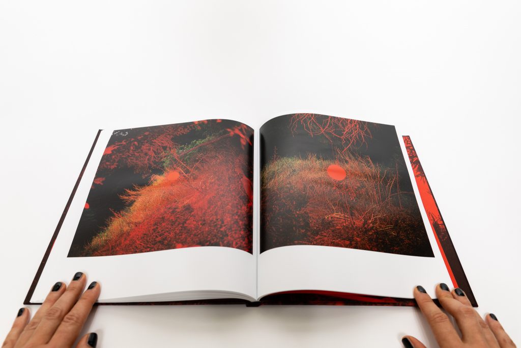
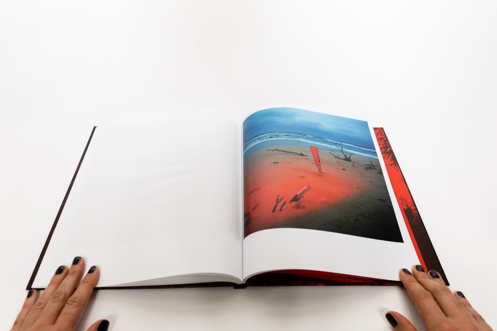
The cover of Chroma immediately stands out – it is a red-tinted full bleed photograph of the woods with a red dot in the middle, like a hovering sun. The image on the end paper inside depicts a cutout silhouette of a man inexplicably falling into the same scene. In this short introduction, we see some of the main aesthetic elements that will later reappear throughout the book – overstaturated and high contrast colors (an extension of the color treatments Divola had been experimenting with since the mid 1970s); and cutout silhouettes and shapes inserted into existing settings (often nature). The images feel mysterious, psychedelic, and slightly alien, as the vibrant red color disrupts the perception of the scene, and the red dot adds another layer of ambiguity.
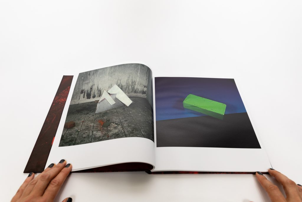
Chroma brings together several bodies of work made between 1982 and 1985. To make the invisible visible, Divola deploys a number of strategies: visual metaphors (in the form of silhouettes, geometric forms, and fairly simple generic three-dimensional sculptures created on site), diptychs and juxtapositions, alternate perspectives, and as the title indicates, the use of colored light. In these works, Divola uses cibachrome processing, which was often used for industrial purposes and allows the subsequent images to last longer but also pushes the color of the images towards oversaturation.
Overall the design of Chroma is elegant and simple – there are no distracting elements and all of the images are printed in square format. The sequencing of the photographs alternates between the different categories of images, but the use of intense color unifies the flow of pictures at a more abstract level. The gelled flash lighting technique used to produce the otherworldly colors is also a part of some of the images, the actual flash equipment visible, deliberately bringing us inside Divola’s process – he’s actively showing us that he’s manipulating the colors. Divola also uses cropping and resizing to restage versions of the same image or scene. The falling red man from the front endpaper appears later full sized, showing more of the wooded setting where it was shot, and the silhouette is lit up to appear magenta with the foreground painted blue. In a sense, Divola has laid out the variables that he can change, and then proceeds to play with those aesthetic options.
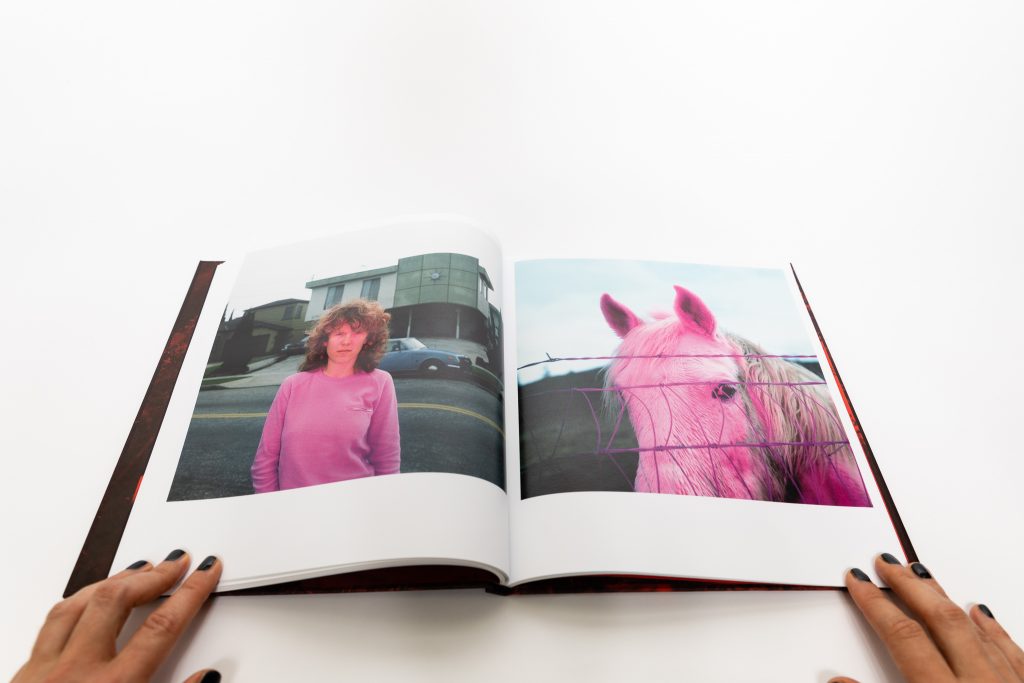
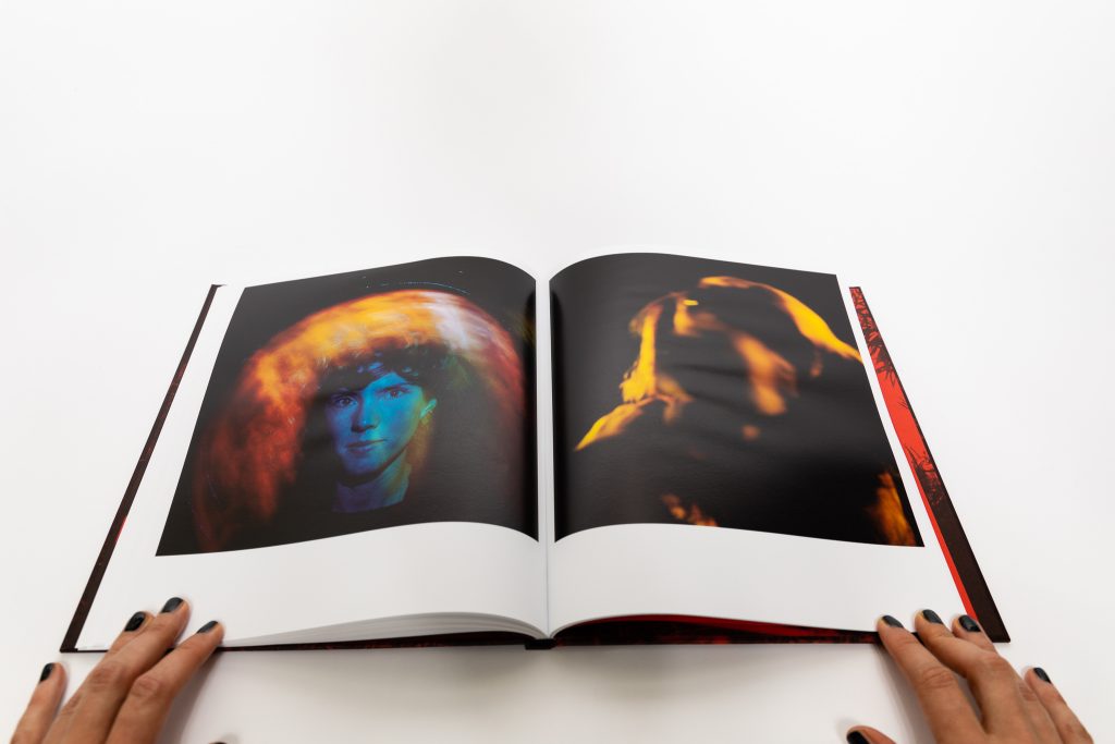
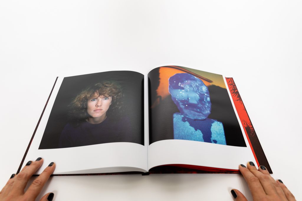
The first image in the book is a melting block of ice shown sitting on top of a pedestal lit in an intense deep blue; the shape of the ice block is suggestive of a human head, with eyes peering back at us. The block of ice will reappear several times in the book with different color overlays – magenta, as well as gold, and another version of blue, but more tightly cropped. The block of ice is also a part of one of the diptychs, where it is paired with a portrait of a woman (images of her will also appear again and again, although we never find out her identity).
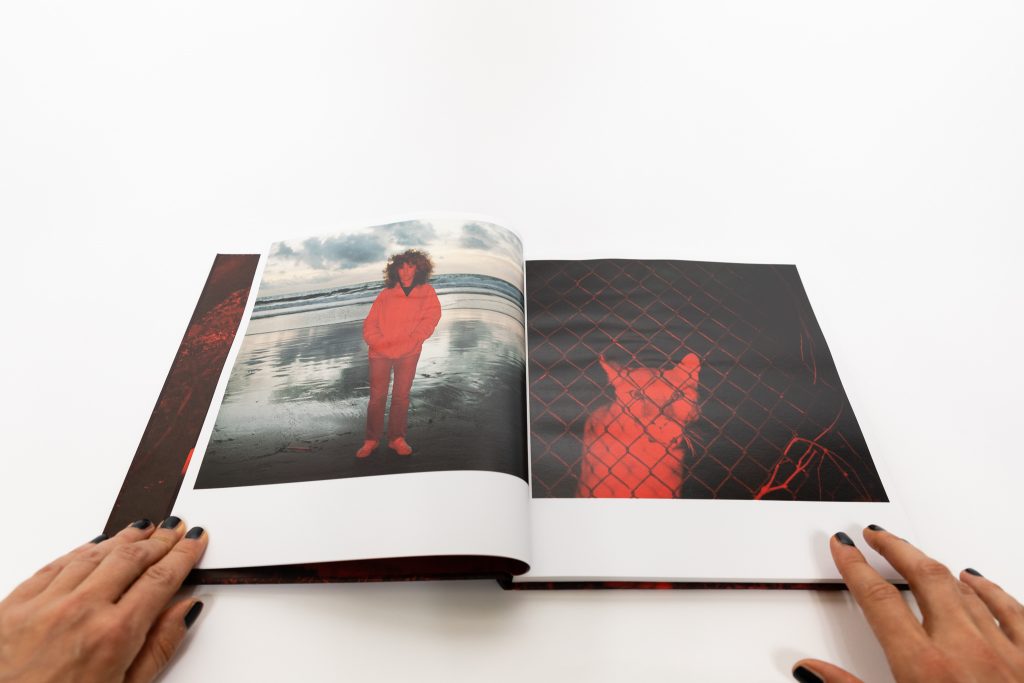
Divola’s use of diptychs goes beyond the simple pairing of two images together – he brings in color to change the perception of his subjects and to alter the way the images are being read. At times, it is essentially the same image we are looking at, but with two different color treatments. A diptych at the end of the book shows almost identical photos of a silhouette looking into a room through the window blinds (we only see the shape of the head framed by the window) but one of the images is highly saturated red, whereas the other is cold blue, creating different moods. This variation is particularly striking in the reappearing portraits of the woman: some shot close up, others include more of the environment, and these are then paired with an image of a cat, a goat, and a horse, each drawing parallels between her face and that of the animal. We first see her posing at the beach during the sunset, she stands still, hands in her pockets, looking straight back at us and her whole body is painted magenta while the ocean behind her is desaturated dark blue. Her portrait is paired with an image of a cat looking back at us through a chainlink fence, the whole image tinted red. The pairing of the two makes the spooky cat somehow appear almost human, and the windblown woman almost feline.
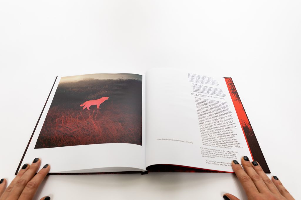
Yet another diptych shows an image of a red tinted dog taken during sunset against the darkening blue sky, matched with a close up of a horse in purple against some greenery. The interplay of hot and cold colors creates a dramatic and mysterious connection between the images, and selective coloring (where one part of the image is intensified while the rest is muted) is a reappearing device as well. Divola paints pairs with different colored lights – red, pink, blue, yellow, magenta – rendering the perception of the two almost opposite. In his hands, color and its intensity have the power to transform our reactions, and the more unusual the choice of color, the more the mind struggles to interpret the set of photographs. These pairings are at times odd and unexpected, the strangeness intensified by the dominant color overlaying the images.
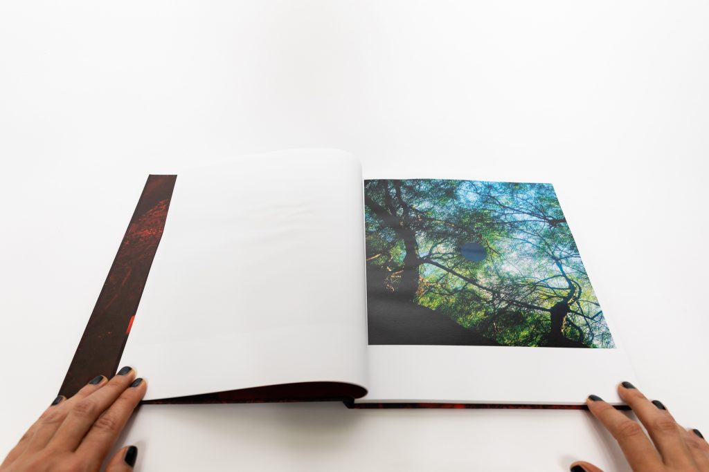
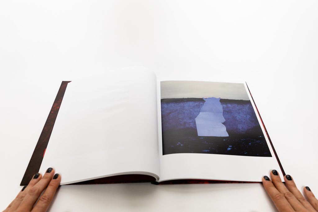
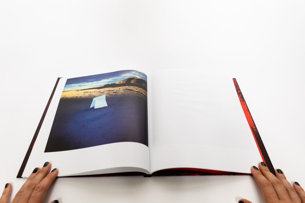
Odd cutouts and silhouettes offer us another visual challenge, as they disrupt the images in which they are placed. Circles, triangles, and squares positioned in the middle of photographs reappear several times; these intrusions are more subtle, as the color of cutouts is not too intense but yet their presence is undeniable. The cutouts of the human silhouettes, like the falling man we saw at the very beginning of the book, disrupts the atmosphere of the images more. The scenes with the human, and a few animal cutouts, create an eerie sense that something is missing. One image shows a peaceful serene beach from a distance with the white shape of a human standing in the air, just a step away from the rock overlooking the beach, the hovering form feeling very out of place. This visual language is at times hard to decipher, and the meaning of shapes remains somewhat elusive.
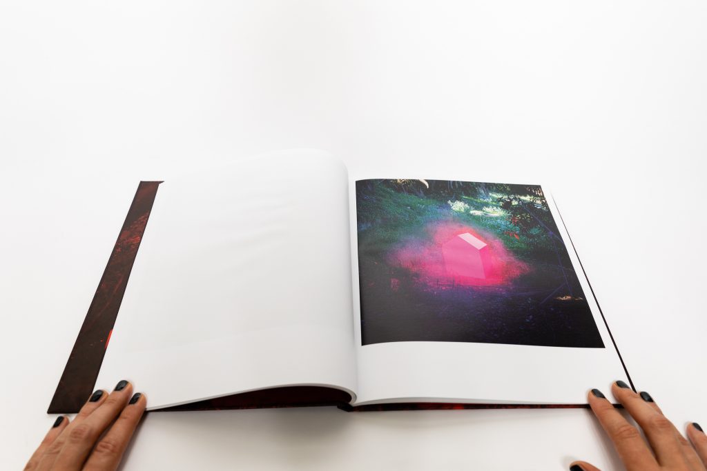
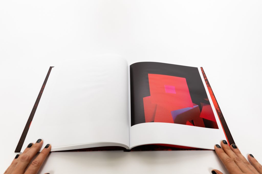
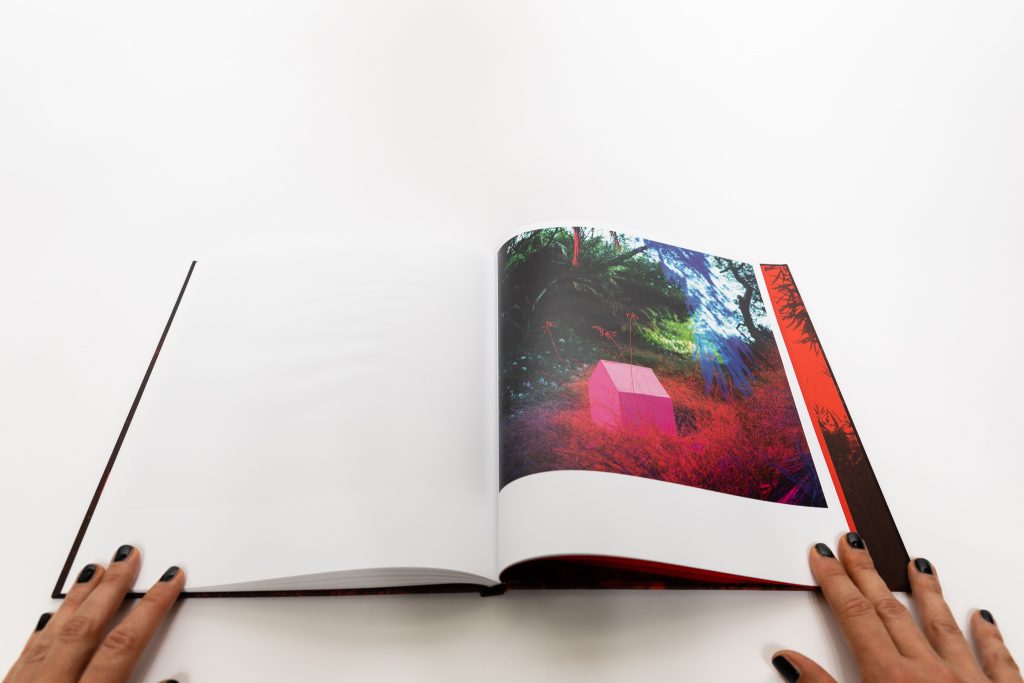
The three dimensional sculptures created on site, and again lit by gelled flash to create a surreal visual experience, are the last tool in Divola’s tool box. Perhaps the strongest sculpture is one that looks like a tornado, an upside down cone shaped object that appears at the beach in translucent magenta light and again by the water but in two different variations, a darker shade of blue and again magenta colored similar to the way it is treated in the woods. It looks like some kind of abstract totem, or ghostly symbol. A minimalist house-like structure is another variation on the theme, the sculpture appearing to be buried in the debris in the woods almost like an apparition, surrounded by magenta light in one image and darker red in another. Most of these images also allow the flash itself to become a part of the image, but its presence doesn’t make the images less visually challenging and disorienting. Our response is one of wonder and perhaps unsatisfied curiosity, but the works are visually striking nonetheless.
With its bright tints and colors, Chroma definitely has 1980s feel to it. But Divola gets far beyond the simplicity of vibrancy, pushing us to wrestle with how color changes our perception of an image, its content, and its mood. Chroma is a beautifully produced book, equal parts playful and daring. It invites us on a perplexing visual journey, showing us the possibilities of seeing what cannot be seen, at least not in a “standard” way.
Collector’s POV: John Divola is represented by Gallery Luisotti in Santa Monica (here) and Office Baroque in Brussels (here). Divola’s work has only been intermittently available at auction in recent years. Prices have generally ranged between $1000 and $22000, but these few data points may not be particularly representative of the actual market for his work.


Terrific artist with an exemplary and creative career.