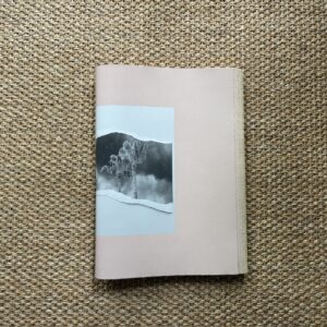
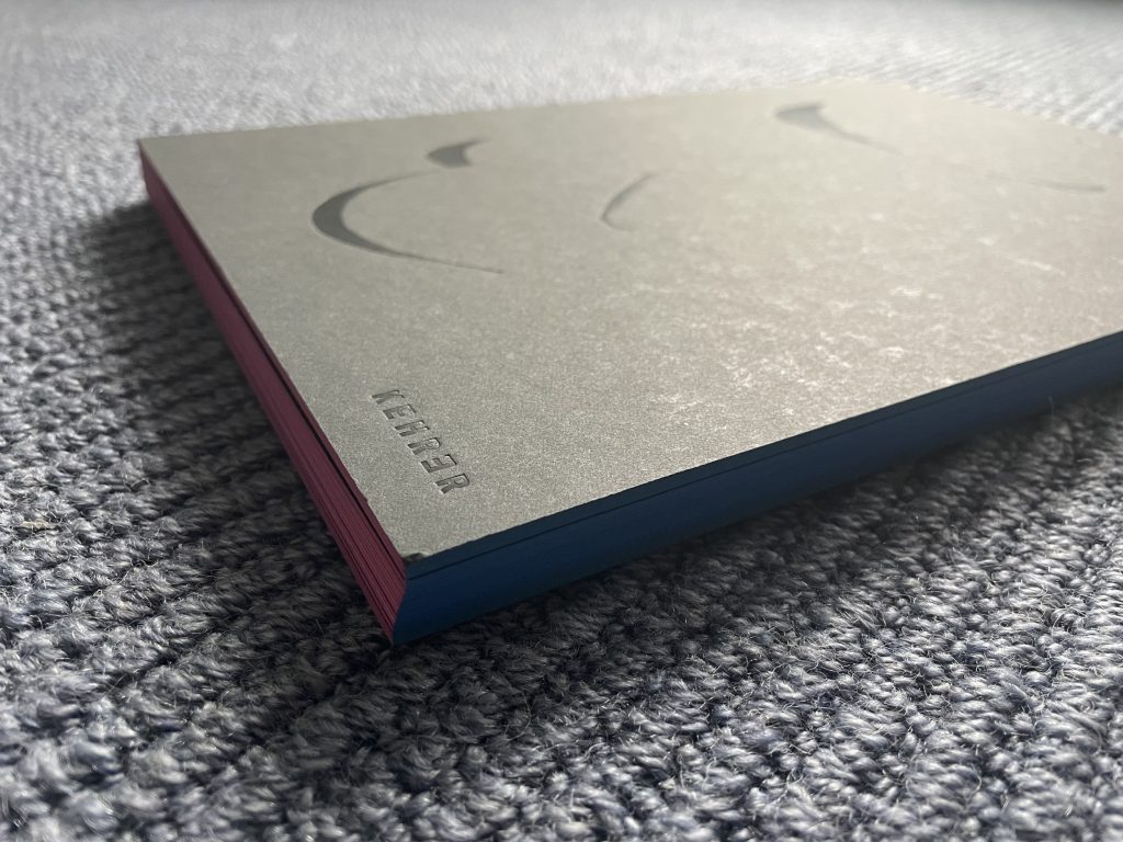
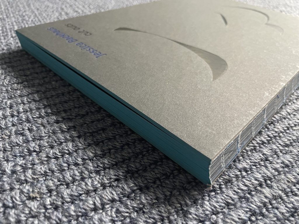
JTF (just the facts): Published in 2021 by Kehrer Verlag (here). Open spine softcover with colored edging (22.2 x 31.1cm), 128 pages, with 50 color reproductions. Includes an essay by Katharina Scriba, and a quote by Sonia Delaunay. Design by Hannah Feldmeier and the artist. In an edition of 750 copies. (Cover and spread shots below.)


Comments/Context: Intention and accident are generally competing, or even opposing, forces in the making of art. Often an artist takes painstaking efforts to control everything about a certain artistic process, only to find that something unplanned has upended all that hard work. But within that frustration, in some cases, the introduction of chance (deliberate or otherwise) can be powerfully liberating, as it creates the unpredictability that can open up new artistic possibilities.
For the German photographer Jessica Backhaus, her past few projects had pushed her closer and closer toward abstraction, and so in recent years, she had become increasingly interested in collage techniques, where she could create abstract compositions of arranged geometric shapes. Her plan was to make a straightforward studio setup, where the shapes she had cut out from colored papers could be set against colored backgrounds and photographed in bright sunlight. Within these constraints, she could then experiment with the interaction of color and form.
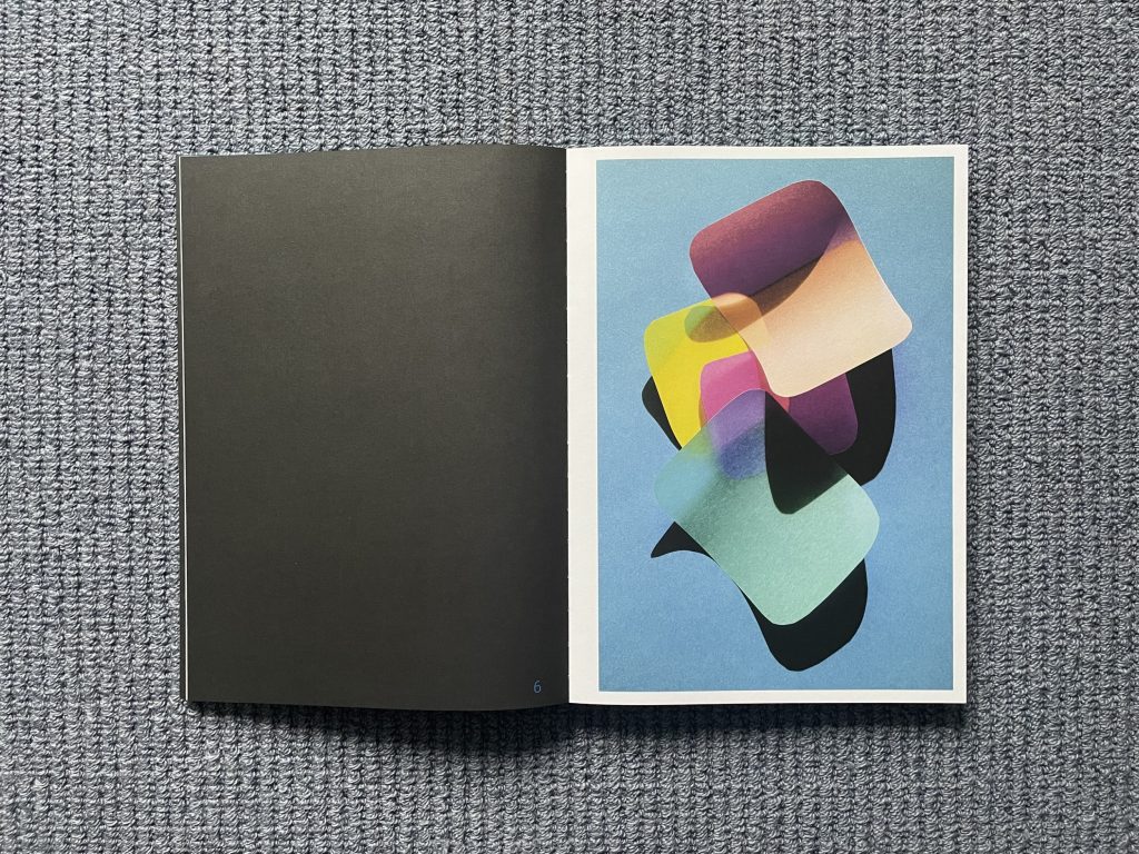
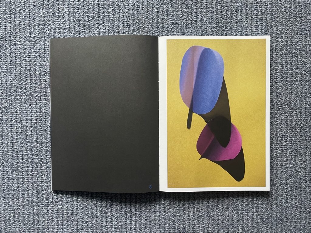
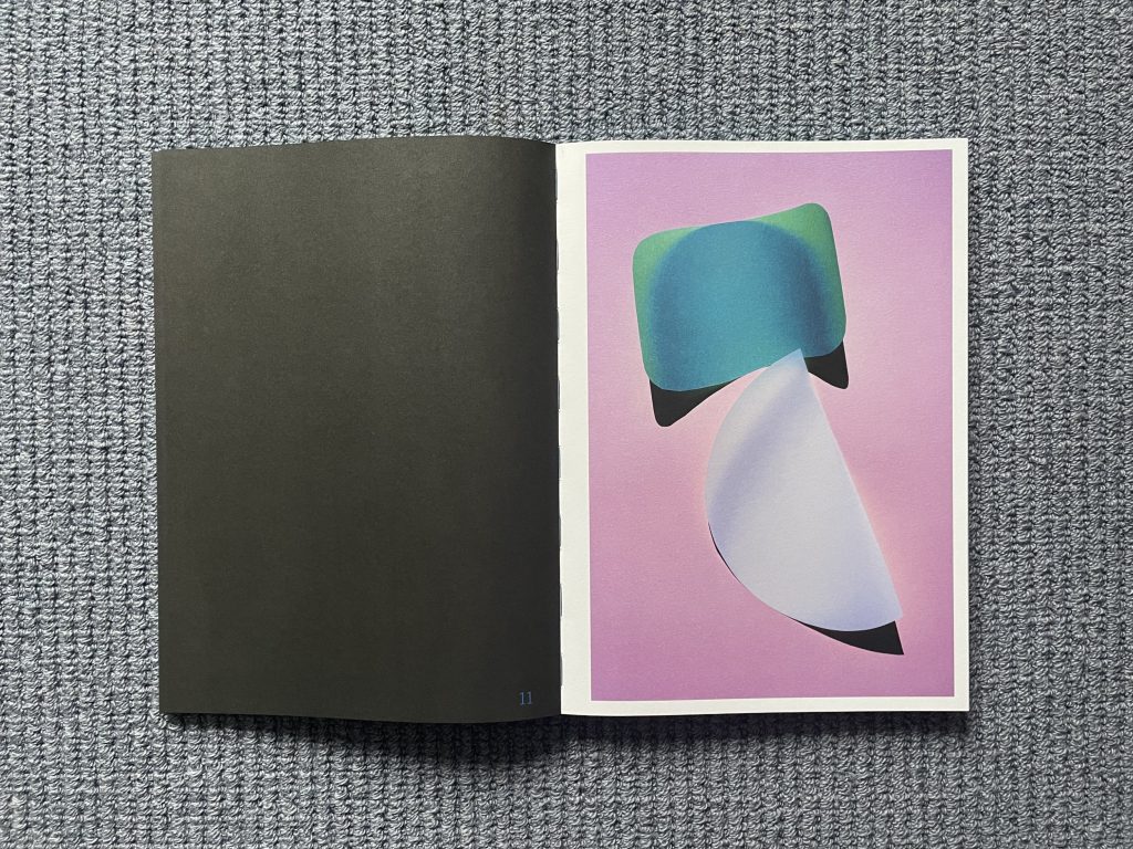
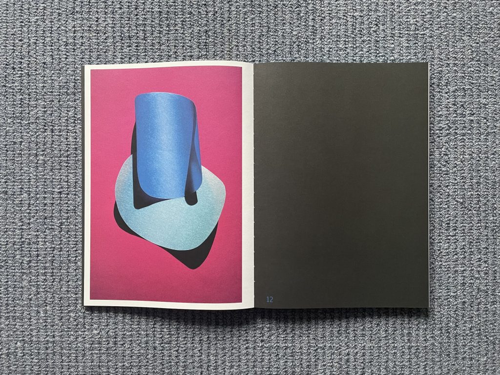
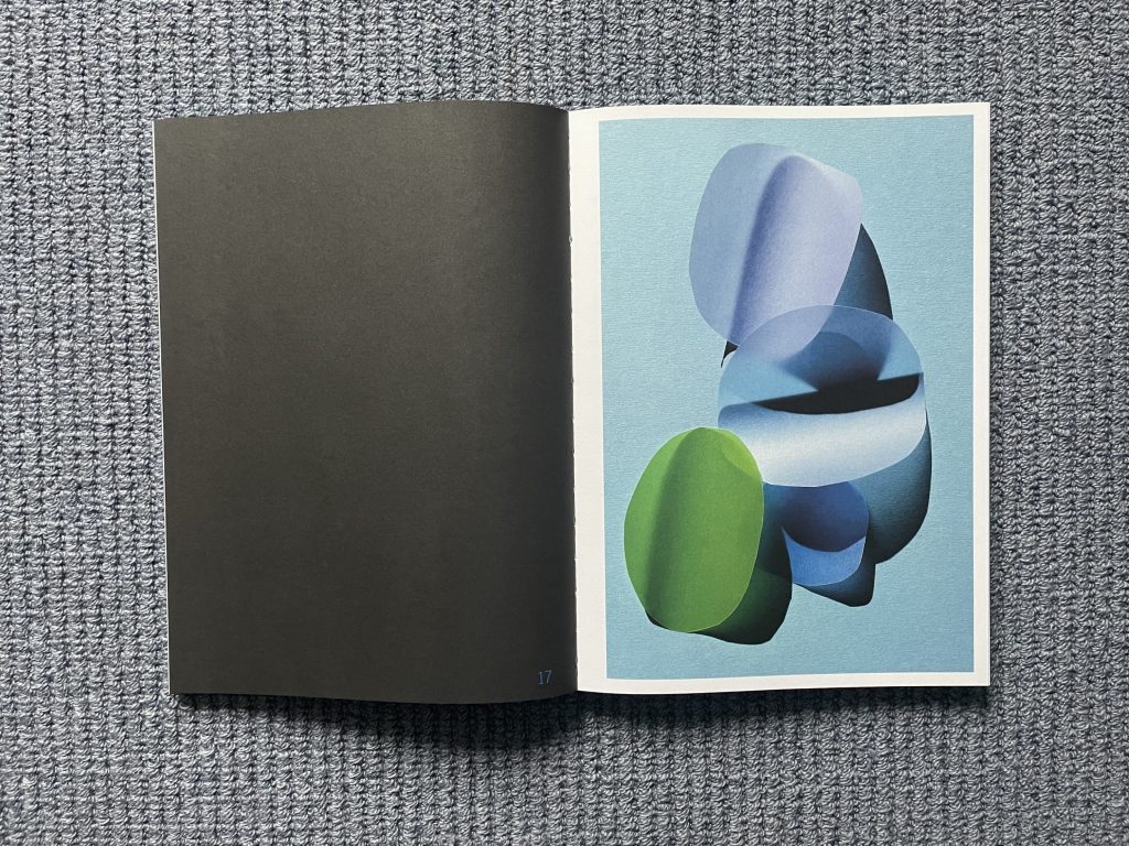
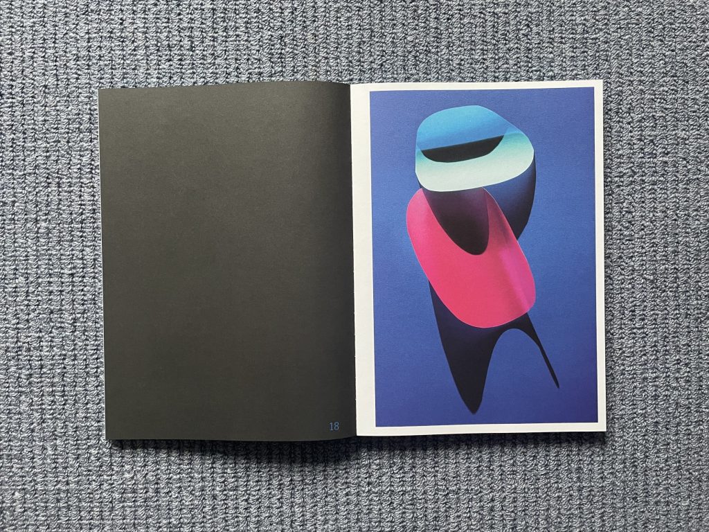
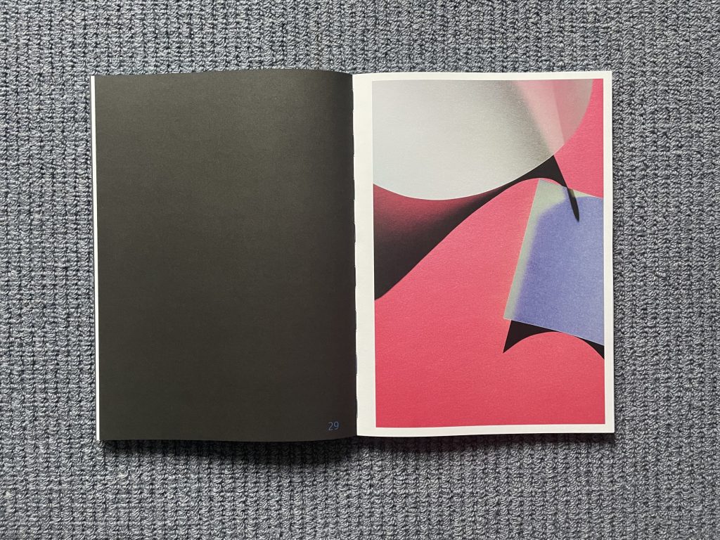
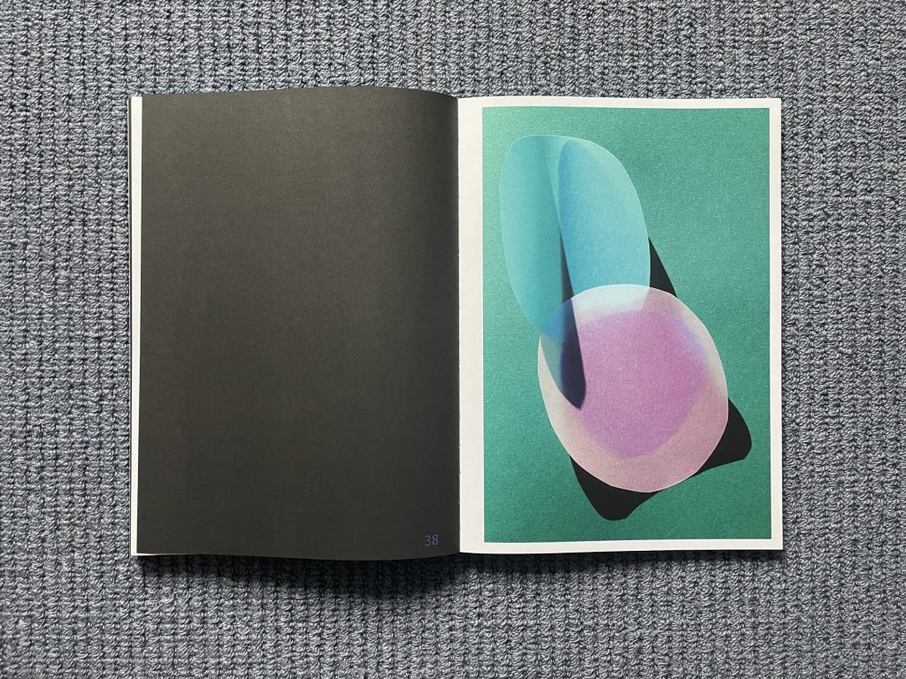
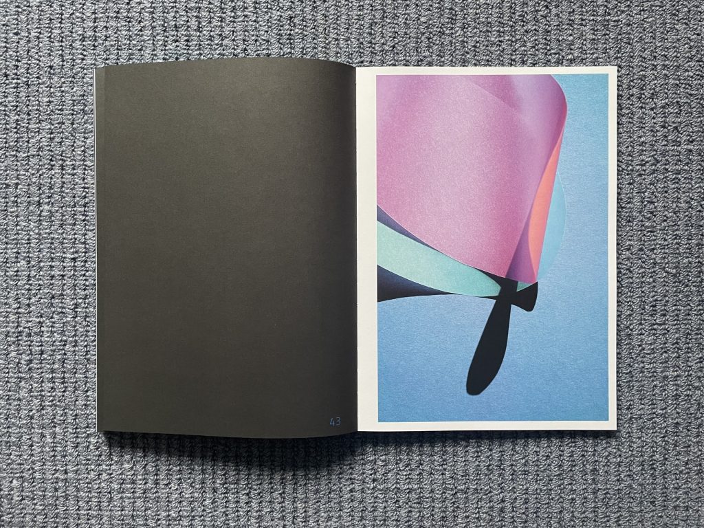
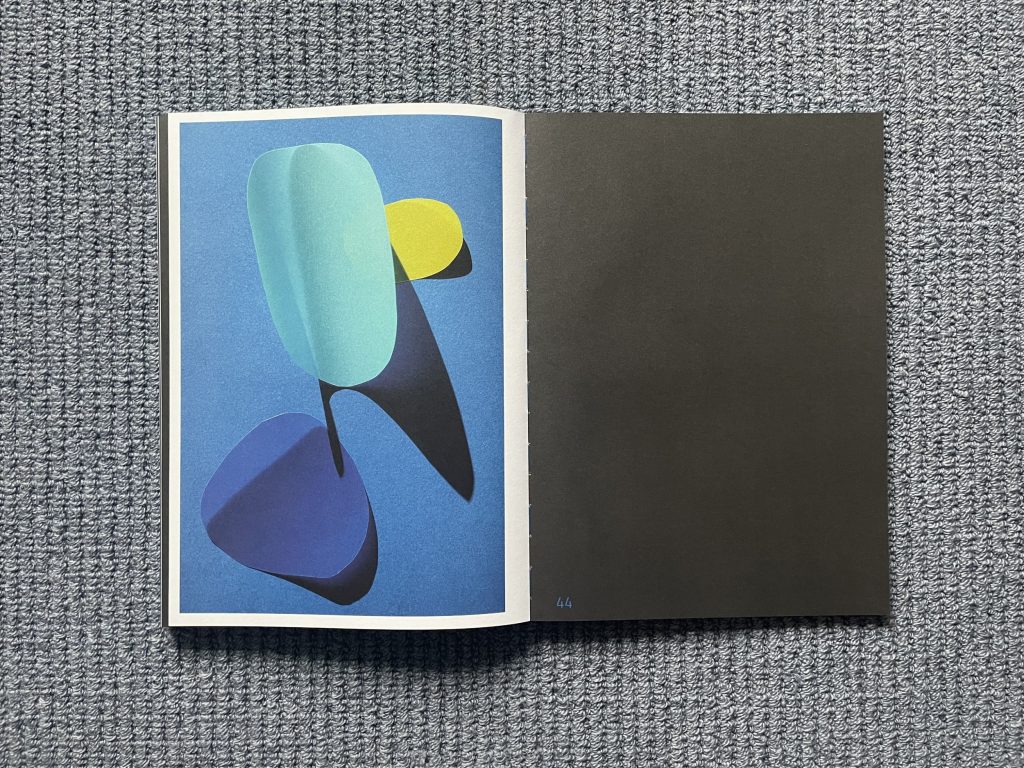
Arrangements of cut paper have long been a surprisingly rich subject for photographers, and all of Backhaus’s planning might have led to an intriguing series of flat layers of color, with clean lines and overlapped edges, especially when she was playing with transparent papers. But when she laid out the compositions and left them on the table in the sun to prepare the exposures, serendipity intervened – the surprisingly intense heat from the sun started to warp the thin papers. The edges curled up, the forms bent, and the shapes rose up from the flatness of the backdrop to create dark shadows. Her initial annoyance was probably palpable, that is until she realized that what was happening was actually making the compositions more complicated and extraordinary.
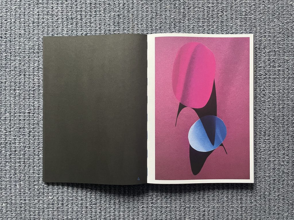
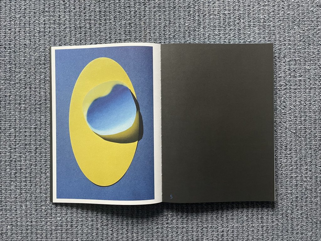
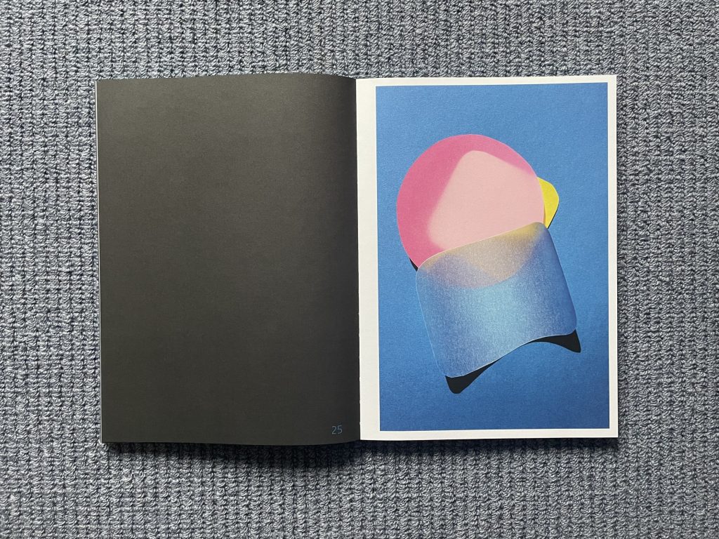
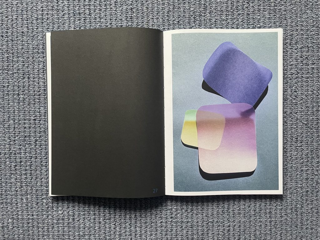
With this unforeseen variable now suddenly available, Backhaus went forward to create the images that are found in Cut Outs. In general, the compositions consist of between two and six shapes, which are set against a uniform color background. Most of the shapes are vaguely circular or ovoid, with a few semicircles, eggs, jelly beans, and other forms with rounded edges mixed in; a few others have harder, sharper edges, like squares and rectangles. The colored papers Backhaus has used range from fully opaque to thinly transparent (all with just a bit of visible texture), so depending on her layering choices in any given work, the shapes and the underlying ground color interact in different ways.
The curling edges of these shapes, and the resulting shadows they cast both across and underneath the papers, are the unexpected activating element – there is a kind of magic that occurs when the distortions start to happen. Depending on the angle of the light and the resulting curvature of the heated papers, the shadows elongate in alternate directions and with varying undulating severity, creating waves and fingers of blackness that recalibrate the existing geometric relationships. And when the papers are particularly diaphanous, the color combinations become more fluid, with translucent layers showing through from underneath with additive complexity. The best of these compositions are at once extremely simple and energetically alive, the popping brightness of primary yellow, or blue, or magenta then transformed into something more subtle and altogether unpredictable, like a lively dance.
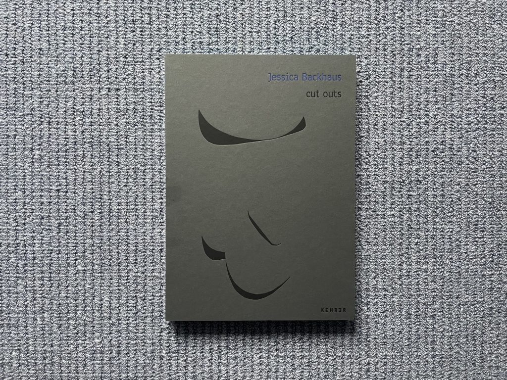
The design of Cut Outs is similarly inspired. The thick cardboard cover offers the usual artist’s name and photobook title, but the graphic isolates just the shadows cast in one of the compositions, turning them into the mysteriously unidentifiable subject. Colored edges hint at the color action inside, and the blackness of the covers is repeated on black interior pages that surround and envelop the brightly glowing vertical images. The result is a kind of elegant tunneling effect, where each page turn leads to a shining jewel-like picture that jumps out from the darkness. Even the supporting essays and colophon repeat this surrounding blackness, with blue text set against black pages. In a sense, the design and construction of Cut Outs are quite simple and restrained, but that minimalism helps to successfully amplify the attention aimed at the photographs.
In the same way that light passes across a sculpture by Alexander Calder and creates elongated shadow play, light is the energizing force in these indirectly sculptural photographs. Surprises of light drive Backhaus’s theme and variation exercise to sublimely iterative and experimental heights. With Cut Outs, she has delivered proof of the potential for visual magic in constrained artistic circumstances – within the fixed constraints of her studio-based colored paper constructions, she has discovered something expressively open ended. Her images are rooted in essential clarity and directness, but are still capable of joyful wonder.
Collector’s POV: Jessica Backhaus is represented by Robert Morat Galerie in Berlin (here) and Robert Klein Gallery in Boston (here), among others. Her work has little secondary market history at this point, so gallery retail likely remains the best option for those collectors interested in following up.