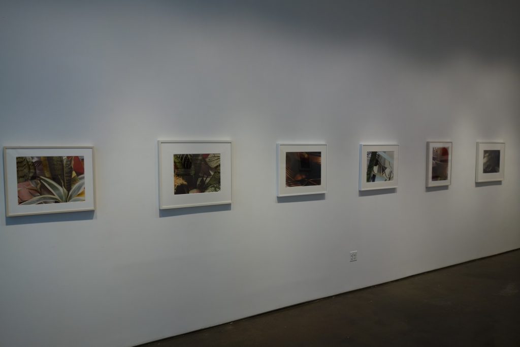
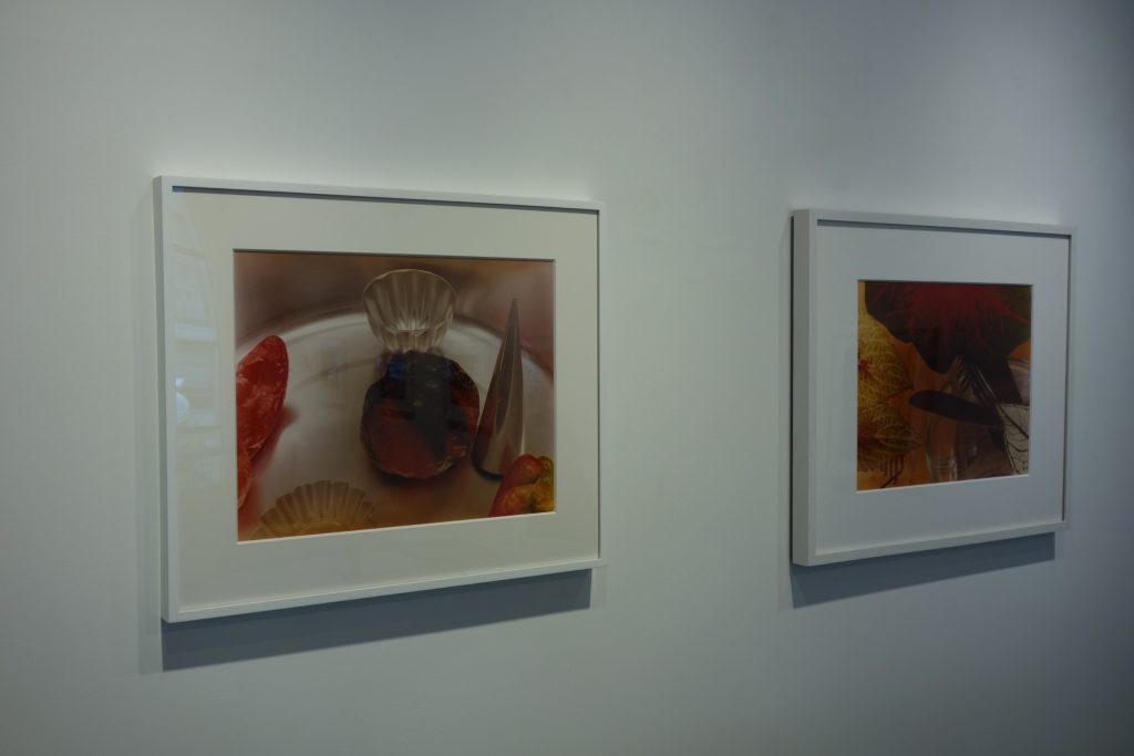
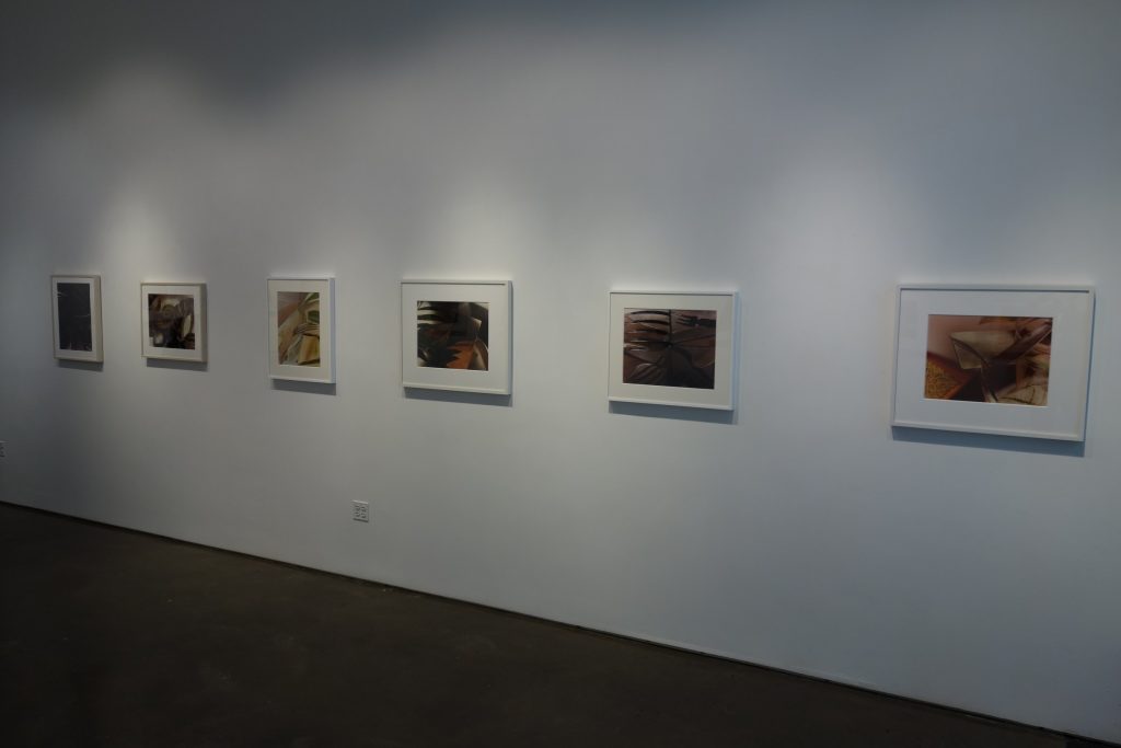
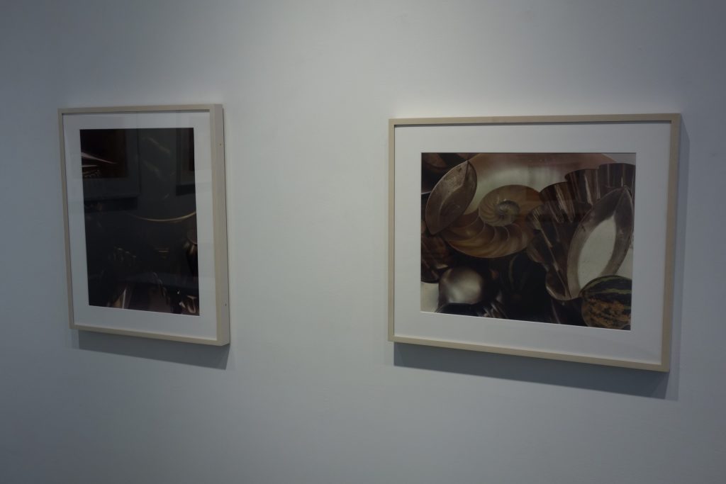
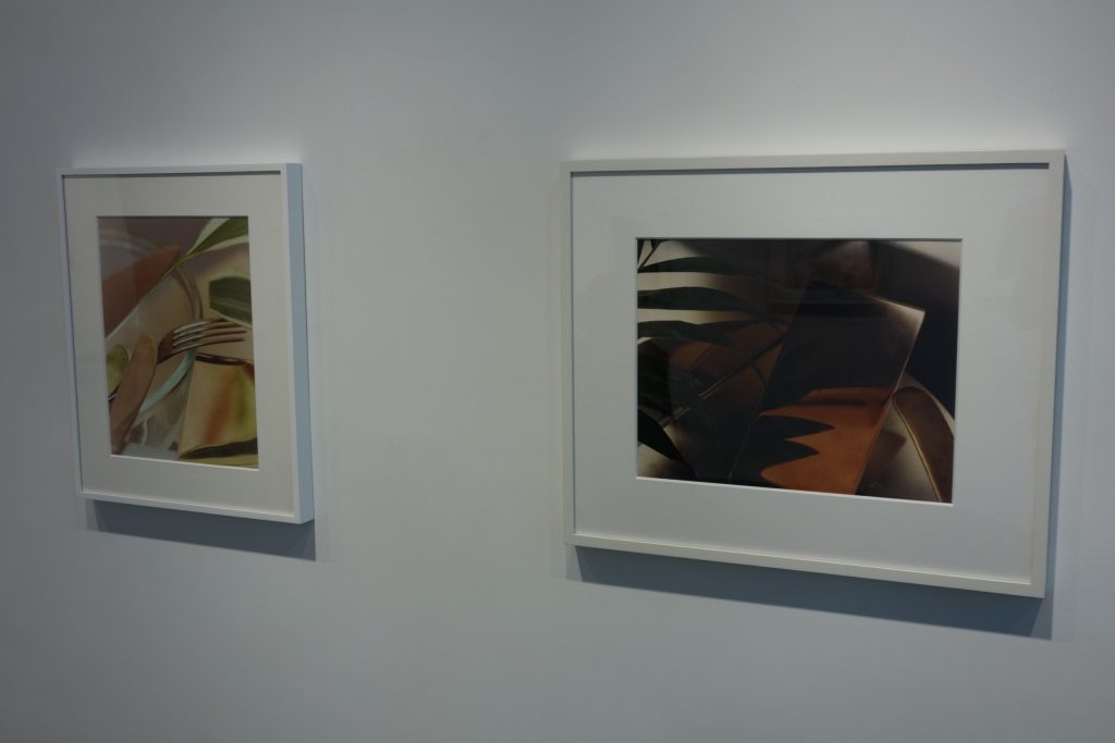
JTF (just the facts): A total of 14 color photographs exhibited on the East and West walls of the gallery, with one over the front desk. All are vintage C-prints dated 1978-79, published in editions of 3, sized 16×20 inches or the reverse, and untitled. (Installation shots below.)

Collector’s POV: Is there a more luminous show of photographs in New York at the moment than these vintage kitchen still lifes by Jan Groover? I doubt there could be.
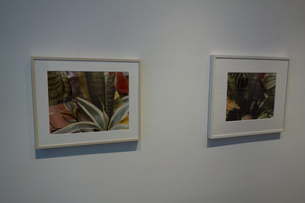
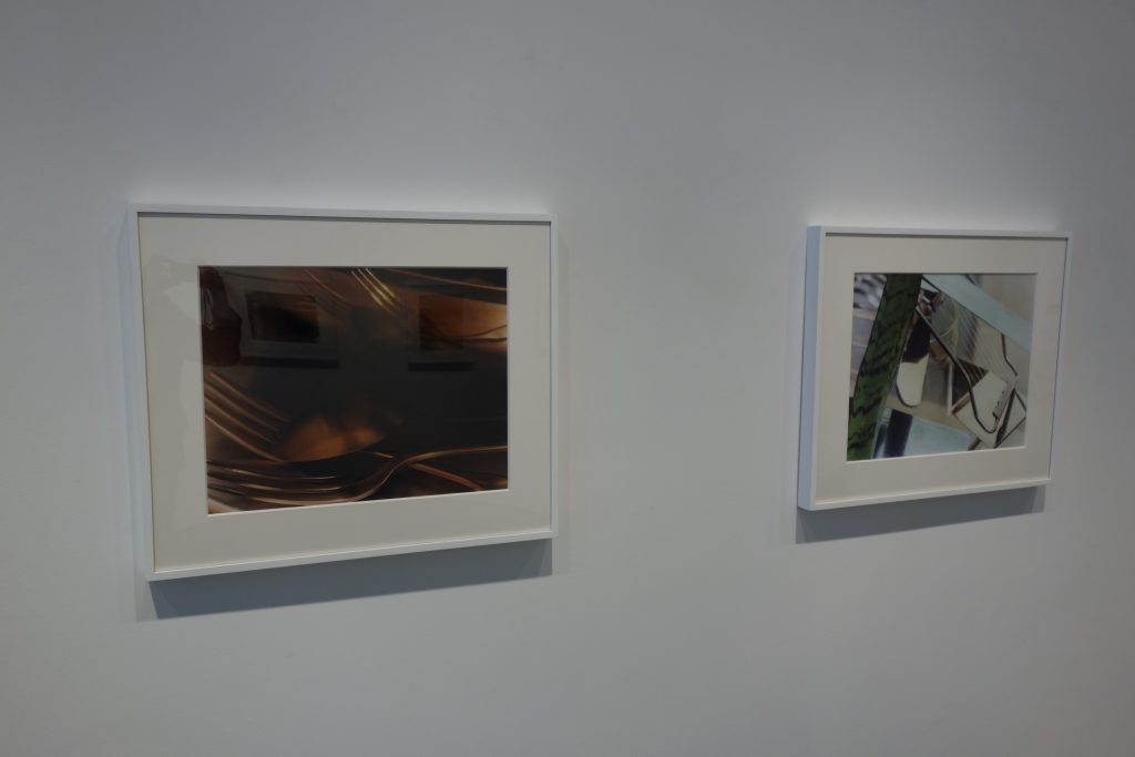
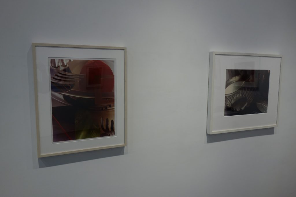
Unassuming in scale, each of these gems on the walls of Borden’s one-room jewel-box of a gallery is meant to entice. Sensual curves and dusky shadows, unexpected reflections in metal and refractions in glass, mingle within a warm gold-silver-sepia tonality, accented in a few prints by tarty splashes of red or green.
Notwithstanding their seductive depths, Groover’s photographs are never coy about what they are: items of kitchen equipment, transformed into abstract shapes through the lens and mechanisms of a view camera, and the geometric fantasies of an artist. Wholly confident in their status as works of art that can stand on their own, they have no need to gesture toward historic or cosmic themes outside the frame.
Trained as a painter and married to one (Bruce Boice), Groover did not disguise her continual debt to the older tradition. As Kevin Moore pointed out in Starburst: Color Photography in America, 1970-1980, she was one of the first young photographers acclaimed by New York critics and collectors in the late ‘70s because, even if unsure about what was uniquely interesting about her work, they could grasp that her still-lifes owed a lot to Cézanne. (She and Robert Mapplethorpe were a mismatched couple as personalities but both were pioneers in gaining credibility for photography within the wider art market during this period.)
With a photographer who proclaimed that form was everything, it’s dangerous to find ulterior meanings in the objects Groover chose for her arrangements. She would probably see the humble materiality of her still-lifes as emulations of Chardin or Morandi. The apparent divide in this series between the worlds of the kitchen (butter knives, forks, brioche pans, a glass dessert coupe) and of nature (leaves of houseplants, bodies of fruits and vegetables) doesn’t lead us to a larger statement about her times.
Whereas Irving Penn’s still-lifes often comment on the cruelty of the human appetite, on the necessity of killing to eat and survive, what was important for Groover was not the contrast between the hard, stamped metals of cooking tools and the soft, yielding flesh of organic matter, but only the various edges, textures, densities, masses, hues, streaks, and translucencies of things. The recipe changed as she added or subtracted objects, moved lights and increased or masked their intensity.
An improvisational formalist and not one whose pictures had to conform to a pre-visualized theory, she was more Ellsworth Kelly than Josef Albers. As she says in the 1994 documentary, Tilting at Space, whenever she didn’t like the way something looked on her ground glass, she would “try something else.” She bought most of the items that formed the basis for the compositions in this show at wholesale restaurant supply stores near her studio on the Bowery. She picked up what caught her eye, not because she had a shopping list or a master plan.
Some of her kitchen-still lifes in platinum-palladium from the early ‘80s carried precarious undertones. The business end of a sharp knife might be prominent; or a clay pot and flower might be so near the edge of a table that they were in danger of falling off and breaking. Objects affirmed the flat surfaces on which they rested.
Such minor notes aren’t audible in this kitchen series, unless the tines of forks and the spiny leaves of an agave can be considered menacing. And most of her arrays here seem to defy gravity, floating without visible means of support. The shifts, swings, and tilts of her view camera destabilize things but don’t dematerialize them. In none of these photographs is there one clear source of light.
The modernist photographer to whom she is most often compared is Edward Weston. “For fecundity of invention and quality,” she was his only true heir, according to John Szarkowski. There are a couple of Weston motifs in this series. Within a nesting group of cake and brioche pans, Groover has tucked the halved shell of a chambered nautilus. A green and a red pepper can be glimpsed in two other photographs. She doesn’t present them in isolation, though, as he often does, and she juggles color with more dexterity than he dared.
Groover’s aloof attitude toward “content” has sidelined her from the mainstream. Among her contemporaries, Barbara Kasten and Jed Devine have continued the still-life tradition in photography that she represented, while Laura Letinsky (b. 1962) may be her closest disciple among the younger generation. None of them, however, make prints that are as simultaneously sumptuous and austere.
Repeated exposure to certain artists can make their achievement grow larger or smaller. Groover’s table-top black-and-whites left me indifferent when I first saw them 40 years ago. Not until her MoMA retrospective, organized by Susan Kismaric in 1987, did I begin to warm up to the cool assurance of her pictures, especially in color. Nothing could be further from the politicized theatrics of today’s art world than her stubborn formalism. Which is why she seems more necessary—and radical—than ever. It’s high time we had a chance to take her full measure again.
Collector’s POV: The prints in this show priced at $28000 each. Groover’s work has not been routinely available in the secondary markets in recent years, so gallery retail likely remains the best option for those collectors interested in following up.


Thank you!!!