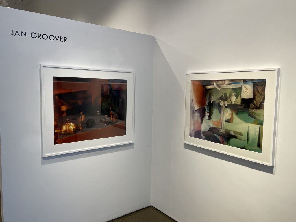
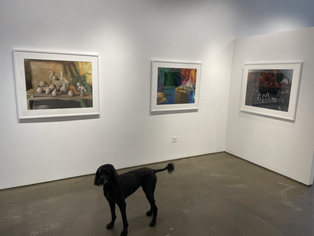
JTF (just the facts): A total of 9 large scale color photographs, framed in white and unmatted, and hung against white walls in the main gallery space. All of the works are vintage chromogenic color prints, made in 1988, 1989, or 1990. Physical sizes are all roughly 36×46 inches (with some minor variations), and the prints were planned to be available in editions of 5, although not all the editions were printed in full. (Installation shots below, with Wilma the poodle in a cameo role.)


Comments/Context: Back in 2012, Janet Borden held a small retrospective of the work of Jan Groover, which was titled “Formalism is Everything”. Groover had died recently, and the show was an edited summary of her career, skipping quickly across her many superlative bodies of work. I actually reviewed the exhibit (here), but even with the benefit of a decade of looking intensely at photography since, I’m not sure I had internalized what Groover meant with that catchy title phrase until I spent time looking closely at her large color still lifes from the late 1980s, which are on view now.
On the surface, “formalism is everything” is entirely straightforward. It is a definitive statement of artistic priorities, with essentially no room for wavering or misinterpretation. It says that for whatever situation or subject matter that was placed in front of her camera, Groover was single-mindedly interested in its formal qualities. What was there, whether it be a tangle of body parts, a passing truck, a pile of dirt, an industrial warehouse, or some dishes in the kitchen sink, didn’t matter – it was how those things fit together when seen though her camera that was important.
And it was relatively easy to nod my head and say, yes, I understand what this means – hey you, pay attention to form, and arrangement, proportion, spatial dynamics, and other ways forms connect to each other. But it’s not as easy as it seems to really, intellectually, leave subject matter behind. It requires acknowledging that the pieces themselves (and what we have come to think they represent or mean, and all the associations we bring to them) don’t really matter at all, at least in this instance; what’s central is how Groover has put these objects together.
The first photograph in the show – the one that sits under the artist’s name on the front facing wall – is a gathering of still life objects on a nondescript platform, with a wooden support of some kind in the background, and a blast of whiskey-colored light coming from the side. The arrangement includes several small glass bottles with stoppers, a pear and a plum, and a single fork snuggled in between two of the bottles. There is no narrative to be pulled from this setup, no story or allegory or reference being made. But what is there in front of the camera is quietly magical. The angle of the light creates distorted amber glows on two of the bottles that look like electricity, and casts an unexpected square frame shadow on the pear at the end of the lineup. When observed closely, the still life objects form a kind of daisy chain, with the fork, the plum stem, and various shadows linking the arrangement into a back-and-forth stepping parade. And the wider lines of the pedestal and shelving subtly angle together, pulling our eye right along this left to right pathway. There is nothing accidental about any of this, which of course exactly why a Groover photograph can be so engrossing.
Two pictures hung on opposing walls are variants of each other, with essentially the same general setup which Groover has then modified iteratively with slightly different objects and a different palette of lighting. One is more sparse than the other, with just two objects placed on boards on the two pedestal tables, the backdrop made from crumped paper and leftovers from Groover’s spray painting efforts; it is lit in a red, yellow, and blue pattern, with a tiny sculptural figure in a featured lit position and a single pear in shadow. In the second image, Groover has added a small pitcher and a tiny shoe to the right hand pedestal, and changed the lighting to a sunny rainbow of colors, with the bright area now placed on the right side objects, leaving the tiny figure in deep shadow. Looking back and forth between the pictures, we can watch as Groover tweaks the subtle balance of the compositions, by adding a few new objects to attract our attention, resetting the angle and color of the lights, and generally pushing our eye (and the focal plane) here and there.
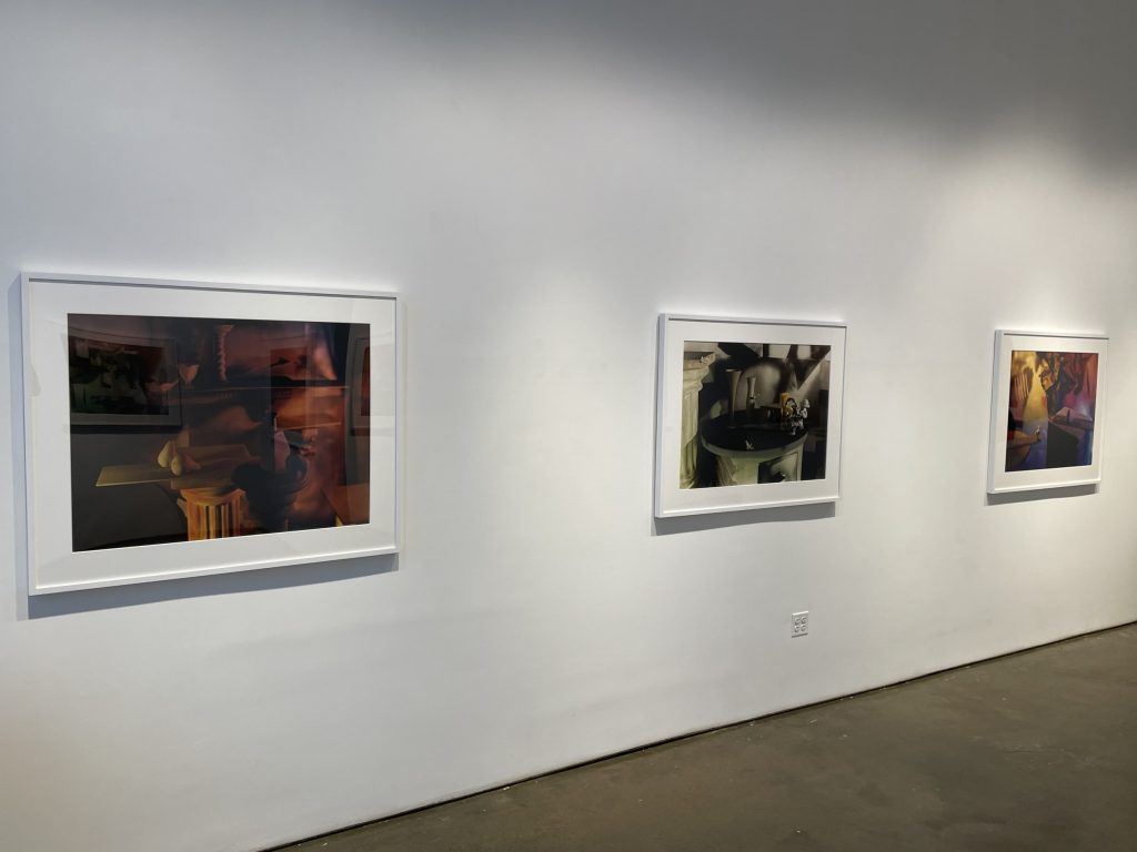
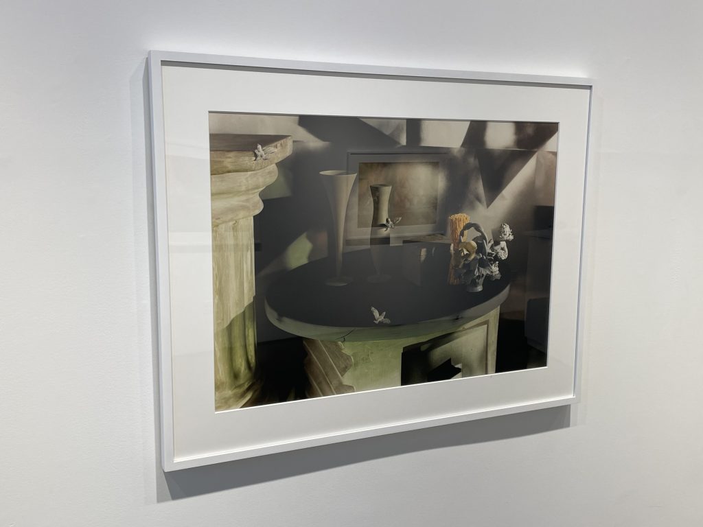
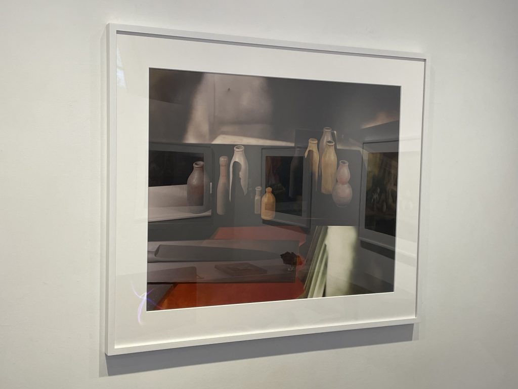
Three other works introduce more insistent verticality into the compositions, often in the form of a fluted column (or two). This leads to visual friction between the horizontal planes of the tabletops and shelves and these verticals, especially when the various arranged objects are more upright, like vases and other fragments of taller sculpture. In a light greenish image, Groover distracts us from this conflict with three tiny birds perched on various edges and a couple of frillier objects on the right side, but then we notice the sharp shadow angles on the painted backdrop, and the whole exercise starts to swirl, with the point of a shadow insisting that we look back at the cluster of objects on the right. In a darker brown work, there are actually five horizontals at different heights, and two pears are given the spotlight, between columns above and below. And in a green and orange combination, the columns take center stage, with a surreal arm fragment reaching down from the top of the composition, and various pitchers and bottles pulling our eye upward against the grain of another handful of horizontals.
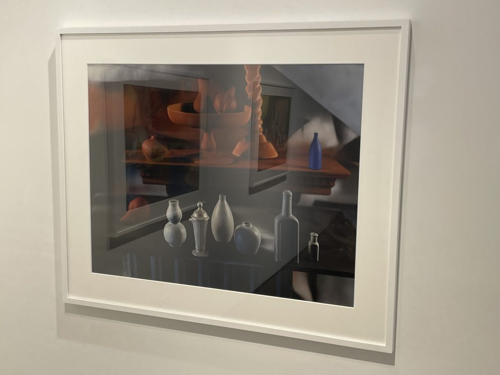
The final two works on view gather many more objects into the still life arrangements, in some cases upwards of a dozen painted fruits, bottles, and small sculptural tchotchkes. In one, Groover seems to be playing with the contrast of rounds and non-rounds, with bulbous fruits interrupted by a vessel with a steeply pointed spout, a headless one-armed soldier, and the back of a cherub. In the other, she seems to be playing a color game, with one group of greys and another group of browns, with a single unexpectedly blue bottle set in the upper right hand corner to unbalance the whole scheme.
When I finally released myself from trying to backfit some kind of story to these choices, objects, and setups, I could see them better for their meticulousness, and thereby revel in all the tiny decisions Groover made to place an object or a light source in a very particular way. In many ways, these are deeply strange still lifes, with colors that seethe and object combinations that at first glance feel altogether odd – there is no soothing Morandi-like paring down going on here. Instead, Groover feels like an engineer, crafting images that are intricately constructed and technically precise, with each and every element expertly controlled to achieve the fleeting result. Their beauty takes shape as a reflection of Groover’s mind, as only a very highly tuned intellect would create photographs like these.
Collector’s POV: The prints in this show are priced at $20000 each. Groover’s work has not been routinely available in the secondary markets in recent years, so gallery retail likely remains the best option for those collectors interested in following up.