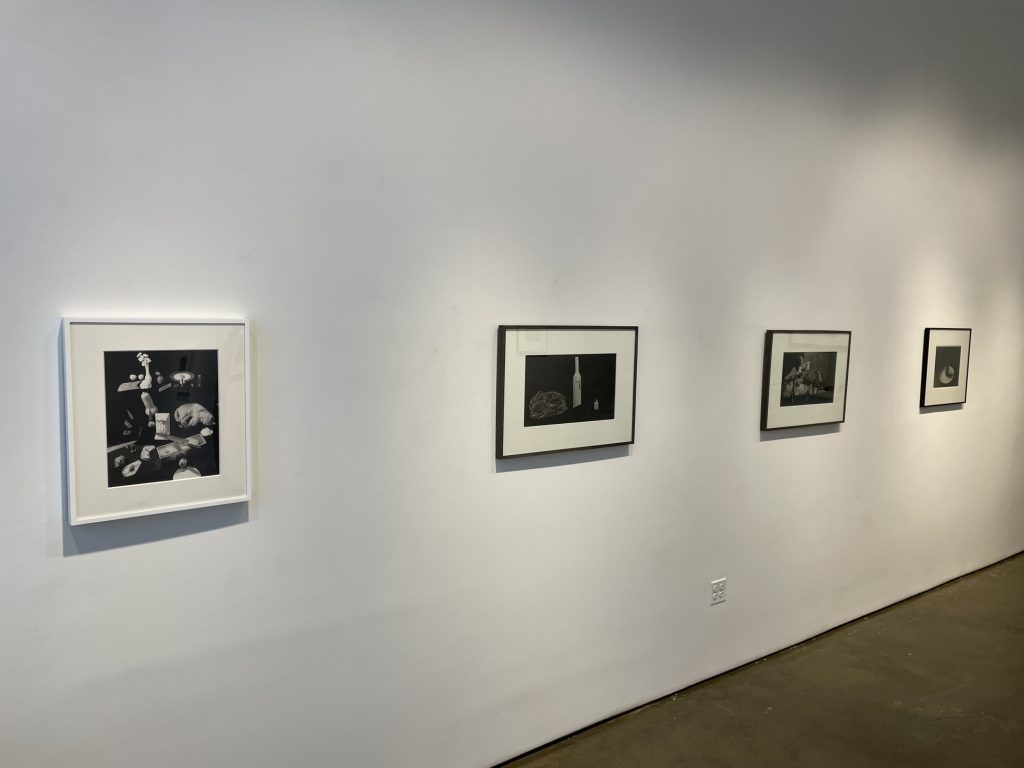
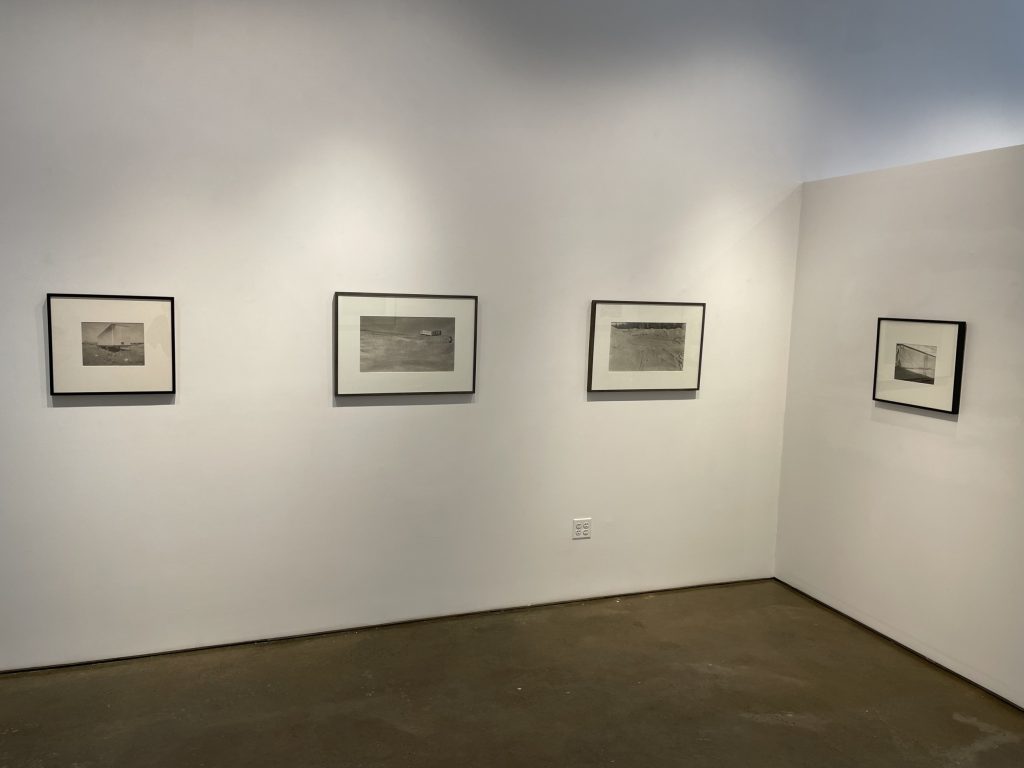
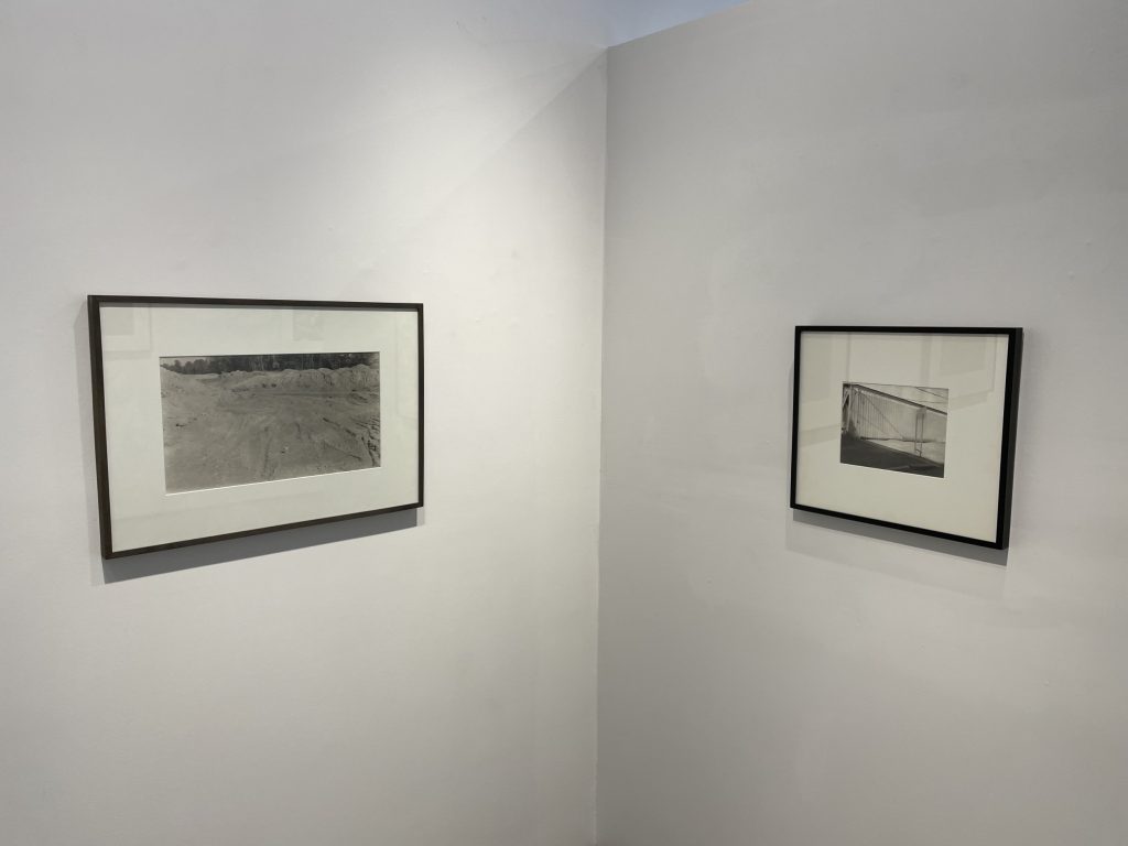
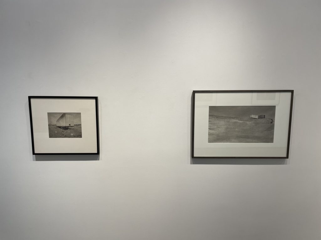
JTF (just the facts): A total of 11 black-and-white and color photographs, variously framed and matted, and hung against white walls in the single room gallery space. 9 of the works are platinum palladium contact prints, made between 1981 and 1997. These works are sized 12×20, 11×14, 8×10, or 4×5 inches, and are available in editions of 15. The show also includes 1 gelatin silver print, from 1991, sized 14×11, in an edition of 15, and 1 chromogenic print, from 1988, sized 20×24 inches, in an edition of 5. (Installation shots below.)


Comments/Context: In the years after the death of an artist, there is generally a period of consolidation, when all of the excitement and noise that surrounded his or her career starts to slowly dissipate, leaving behind the durable essence of his or her artistic contributions. In some cases, when this inevitable reckoning takes place, we find that the artists we were so interested in before aren’t quite as original as we had remembered – time can be (and usually is) a relentless and unforgiving critic. But in the case of Jan Groover, the passing of time hasn’t diminished the force of her work at all; in fact, her precisely crafted photographs continue to stand up well to any scrutiny we might offer.
Groover died roughly a decade ago, and in the years since, a series of gallery shows have been arranged to highlight her various projects, phases, and bodies of work. A 2012 survey show (reviewed here, appropriately titled “Formalism is Everything”, a repeated Groover motto) provided a summary of her work just after she died, and since then, gallery shows devoted to her industrial images (in 2015, reviewed here) and her kitchen sink still lifes (in 2019, reviewed here) have taken deeper dives into particular subject matter themes.
This new show of Groover’s work cuts across her archive with a process imperative, gathering together (mostly) images made in platinum, making for a more eclectic experience, since the subject matter quickly ranges across several genres. Groover had a meticulous artistic temperament, and her prints were crafted with this same exacting precision; when executed in platinum, and particularly when printed on more textured papers, her prints have a tactile richness and luminosity that adds to their controlled compositional order.
In many ways, this show revels in Groover’s subtle tonalities, and its organization is largely driven by clusters of light and dark. The two images on the front walls are light, one an elegant portrait of two pears, the other a more complex arrangement of shiny metal kitchen equipment, including a knife and various baking tins and molds. The study of pears is really a sublime exercise in light and shading, with a crumpled backdrop and cast shadows across the setup providing a full range from light to dark, with the platinum print further softening the gradations. The kitchen arrangement uses the flattening eye of the camera to play with the metallic forms, and Groover shows off her affinity for exacting alignment by placing the point of the cone at the exact edge of the knife and the arc of the central wedge at the apex of the smaller scalloped teardrop to the left – these are the kinds of intensely perfect setups that are the hallmark of an uncanny Groover composition.
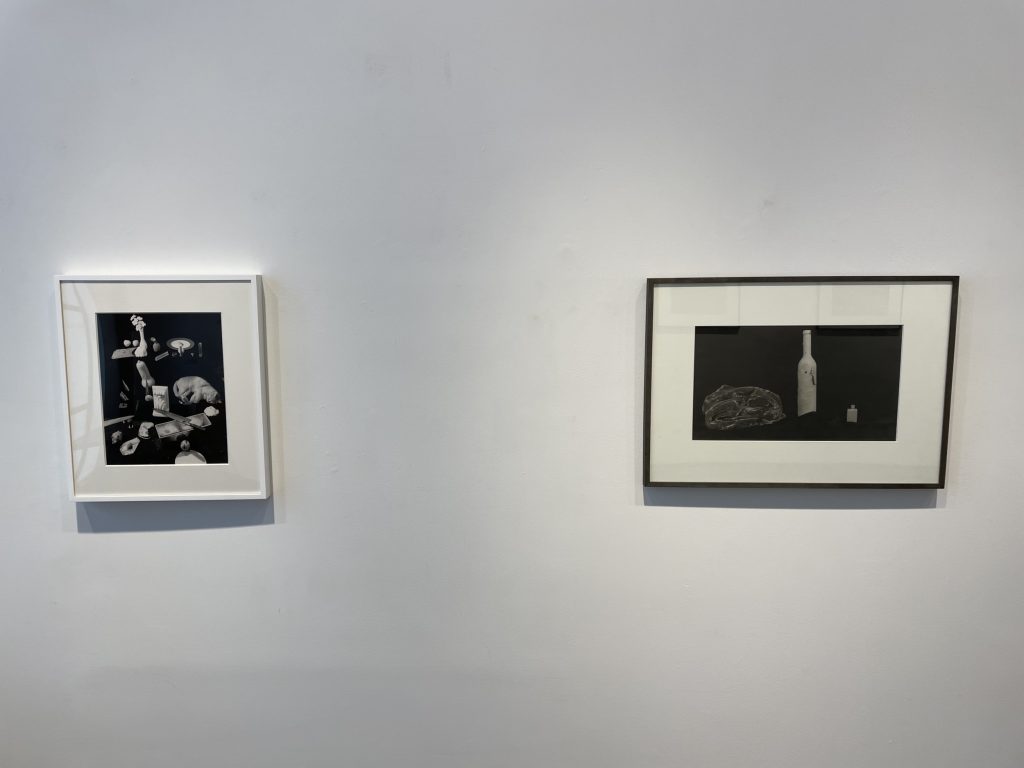
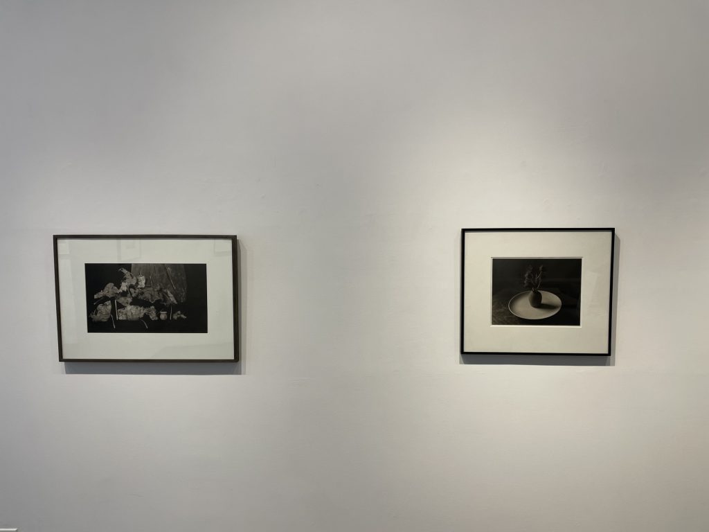
Along the left wall of the gallery and around behind the desk, the tones turn dark, with a handful of images dominated by silky blacks. Three of these images use a black velvet backdrop as the setting for still life arrangements, and this choice turns out to be aesthetically intriguing, because the velvet tends to disappear into uniform darkness, creating an undefined space where objects seem to hover and shift. One composition aims for elemental simplicity, with a thin white bottle in the center, a tiny grey bottle on the right, and a rumpled pile of slightly lighter fabric on the left, the three objects seemingly bumping along on the velvet waves underneath. Another uses the same general setup for a gathering of dry leaves (and one tiny pitcher), their crinkled decaying textures overlapped with dusty textural complexity. The last of these three photographs is the most ambitiously offbeat – a still life centered on a real sleeping cat, who is then surrounded by a quirky grab bag of objects, the whole group floating in the darkness like the whirling confusion of a dream; printed in gelatin silver, the image’s tonal contrasts pop with even more vibrancy.
The two other dark pictures spread to the edges of Groover’s compositional approaches. One reduces the setup to a single vase on a round white plate, with a sprig of a succulent plant housed in the vessel. This is a delicately old school (almost Pictorial) photograph, with Groover showing off her precision by aligning the exact spot where the curve of the plate meets the top edge of the vase, and the platinum tonalities drifting into lovely dark indistinctness. The largest work in the show then moves to other end of spectrum, opting for more chaotic overlays and interactions of pears, architectural pediments, and the dappled sheets of paper Groover used as backdrops and coverups while spray painting her still life objects. The resulting setup feels nested in on itself, and somehow claustrophobic, with flares of light and dark interrupted by unexpected spots of brown and yellow, and one curving animal horn anchoring the whole arrangement (this is the only color work on view in the show).
The show returns to lighter tones with a final group of industrial images, set outside at construction sites and work areas. These works essentially reprise ideas from the 2015 gallery show, albeit in a tighter grouping of pictures. Groover’s use of the platinum process for these often grubby scenes is almost counterintuitive, as it wouldn’t immediately seem obvious to care whether images of temporary trailers, weedy dirt piles, and empty grades of sandy gravel were printed with extreme tactile richness. But the elegant subtleties of these images are what gives them their enduring interest; it’s the the tiny furrows of dirt, the repetition of corrugated tin, and the nuanced gradations of grey that draw us in. In a few cases, the arrangement of Groover’s compositions recalls the Modernist sand dunes of Edward Weston, albeit with a decidedly more unimpressive set of visual realities. But even in these forgettable zones, Groover finds a way to make them her own – in a smartly contrasty scene of light and dark angles, the back of a road sign is precisely aligned with the roofline of a trailer, with the kind of exacting perfection that feels almost perplexing it’s so spot on.
While this small show doesn’t cover all of the richness and complexity of Groover’s work in platinum, it does offer a satisfying roundup of well-crafted images, most infused with the kind of extraordinary formalist thinking that only Groover could deliver. In general, these are quiet pictures, ones that likely won’t show particularly well on the Internet. But in person, they consistently deliver a flash of something unexpectedly exceptional, revealing secrets to those who invest the time to look closely.
Collector’s POV: Most of the prints in this show are priced at $10000 each, with the single larger color print at $15000. Groover’s work has not been routinely available in the secondary markets in recent years, so gallery retail likely remains the best option for those collectors interested in following up.