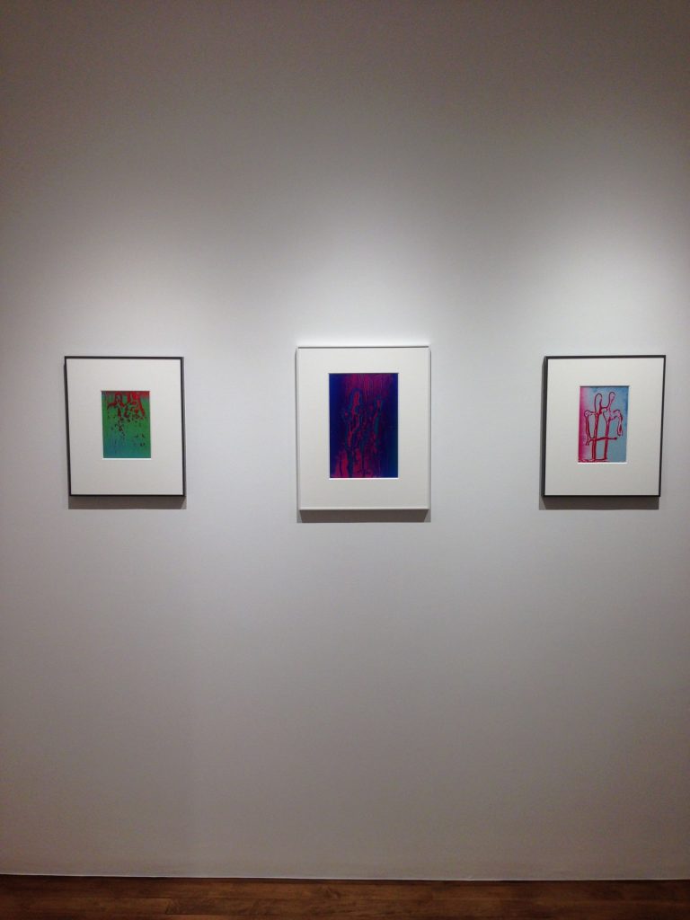
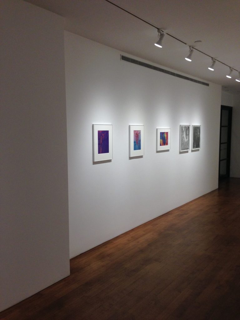
JTF (just the facts): A total of 29 black-and-white and color prints, framed in white and matted, and exhibited on the two walls of the foyer and the four walls of the gallery. The show includes 10 vintage gelatin silver prints and 19 dye transfer prints, dated from 1946 to 1984. Sizes vary from roughly 4×5 to 20×15. (Installation shots below.)


Comments/Context: Henry Holmes Smith (1909-1986) has been an artist more beloved by his former students than by museum curators or the market. Many more years of his adult life were spent teaching (in Chicago and Bloomington) than on building a career in the New York art world. His name appears most often in history books for having founded the first MFA program in photography, at Indiana University, where he was a professor from 1947 until his retirement in 1977. For much of that time his abstract photographs existed mainly as curiosities, removed from the field of action.
Although never entirely off the radar screen—in 1987 Andy Grundberg and Katherine McCarthy Gauss included him in their traveling exhibition and catalog, Photography and Art: Interactions Since 1946; and in 1992 the Howard Greenberg Gallery did a small retrospective exhibition and catalog—his body of work has been only partially and intermittently on public view, ensuring that its dimensions and quality were hard to evaluate.
This sample of 29 prints is therefore welcome and timely. The experimental spirit that he encouraged in his writings is more in synch with the zeitgeist than perhaps at any time since the late ‘60s-early ‘70s. Mariah Robertson and Matthew Brandt are only two of the many younger artists whose color pictures wouldn’t look out of place next to his.
Smith is most commonly mentioned in textbooks as a disciple of Moholy-Nagy, who recruited him in 1937 as an instructor in photography at the New Bauhaus and then for the Institute of Design. Their close relationship can be misleading. The exiled European believed that photography (unlike painting) should contain some reference, however tenuous, to the real world of objects. The camera in his mind functioned as a tool to destabilize our comforting views of life and the celebrated norms of art photography.
Smith did not share the opinion that photographs need to keep one foot in the recognizable. He was an American, 14 years younger than his mentor, and sympathetic to the post-war abstract expressionists of his native country. His images perform no function in correcting our vision and were often as non-objective (and purposeless) as any painting by Ad Reinhardt.
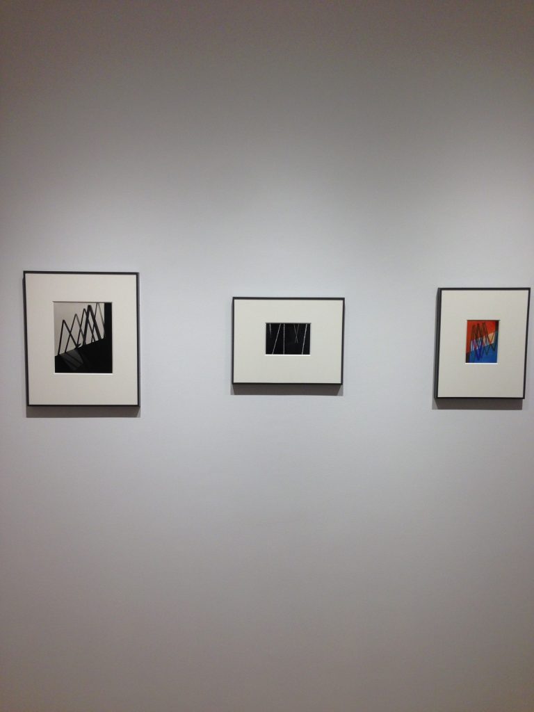
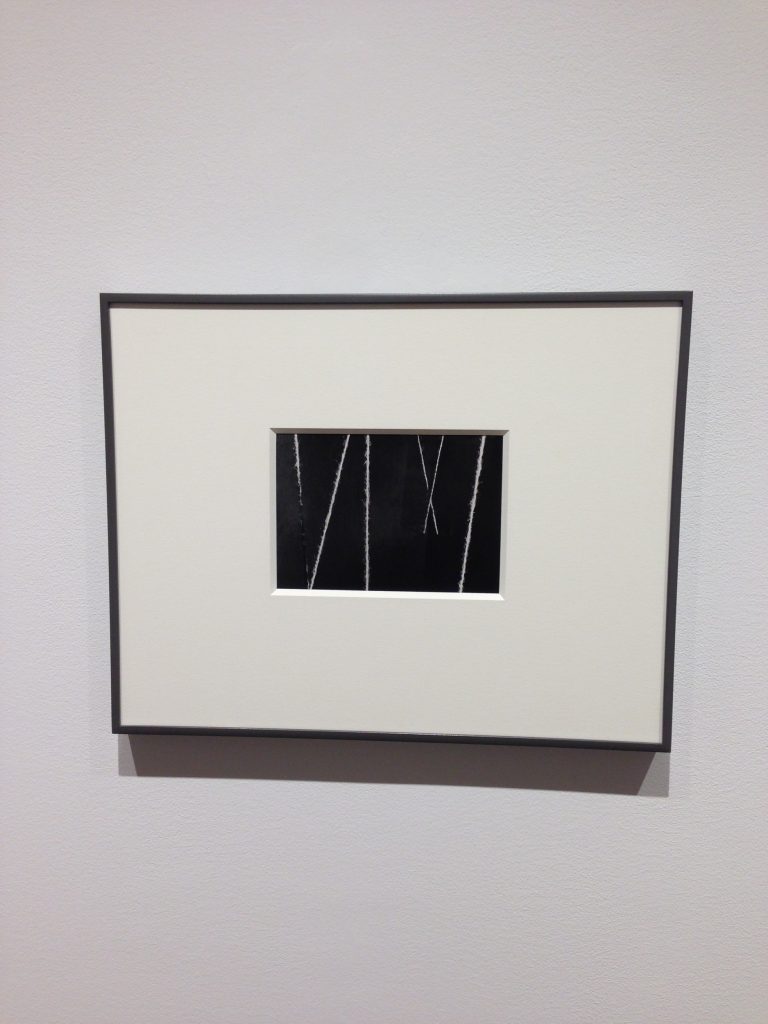
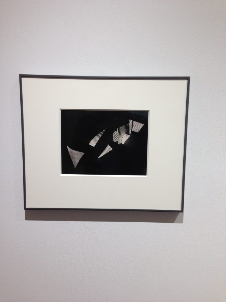
Smith waffled in these convictions, as did Moholy-Nagy. One of his black-and-white light studies from 1946 in this show is made from a succession of upside-down V-shaped lines and shadows with no obvious correlation to the world; another untitled print from the same year is clearly produced with pieces of twine, in the style of a Zeke Berman still-life or Fred Sandback sculpture.
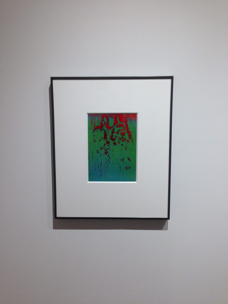
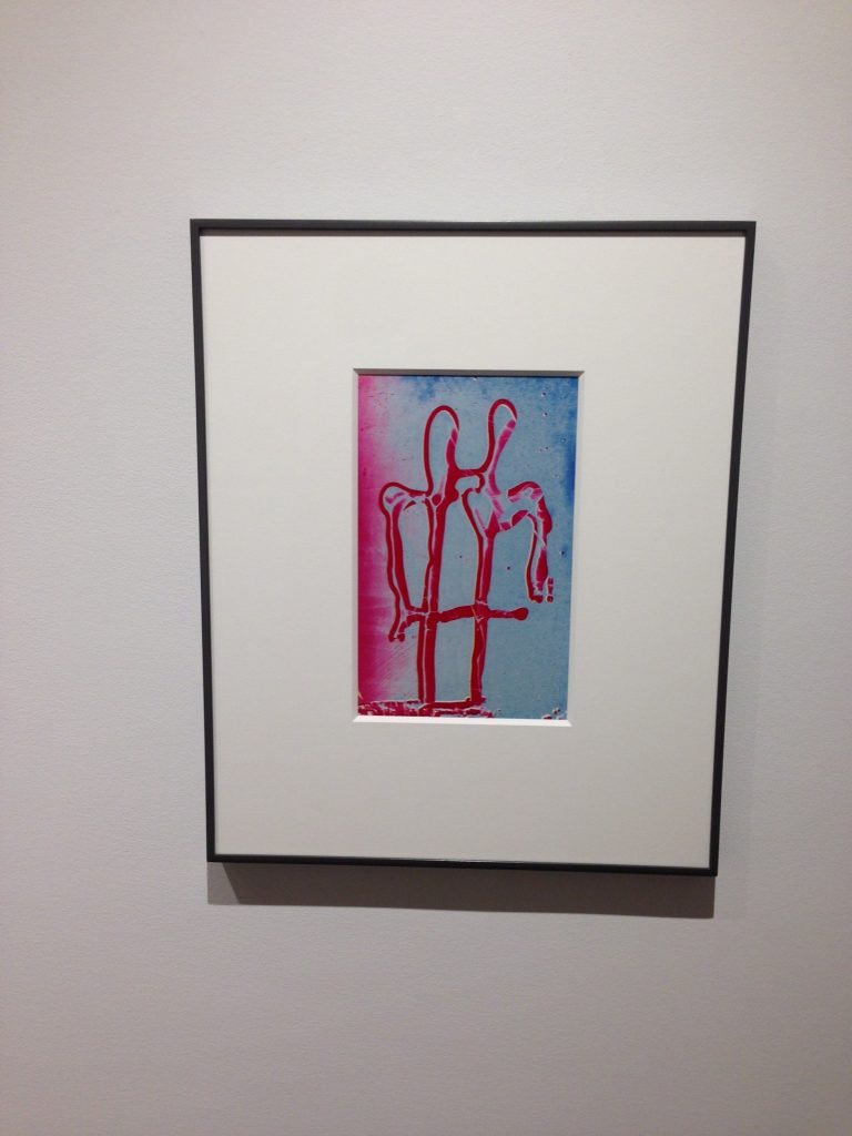
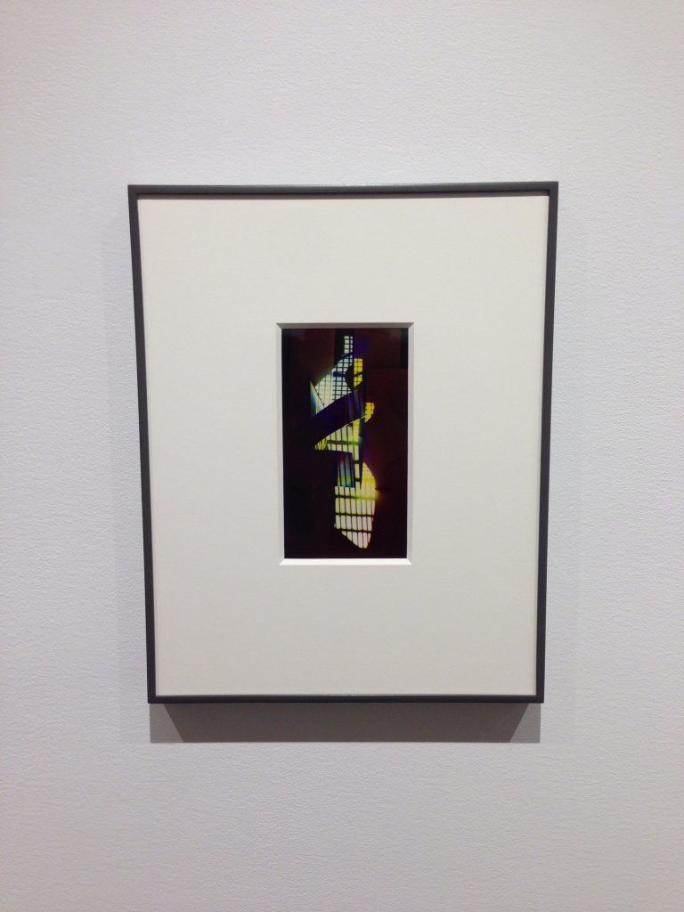
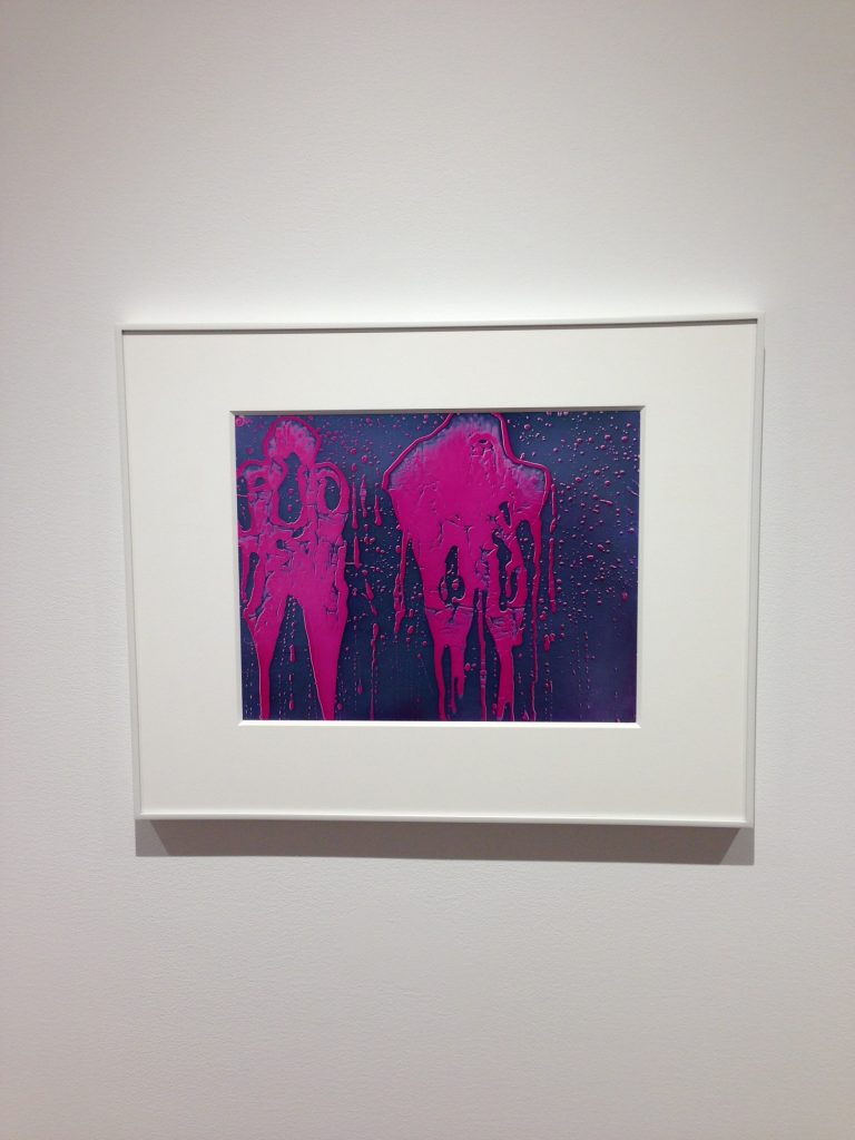
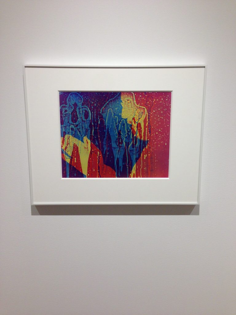
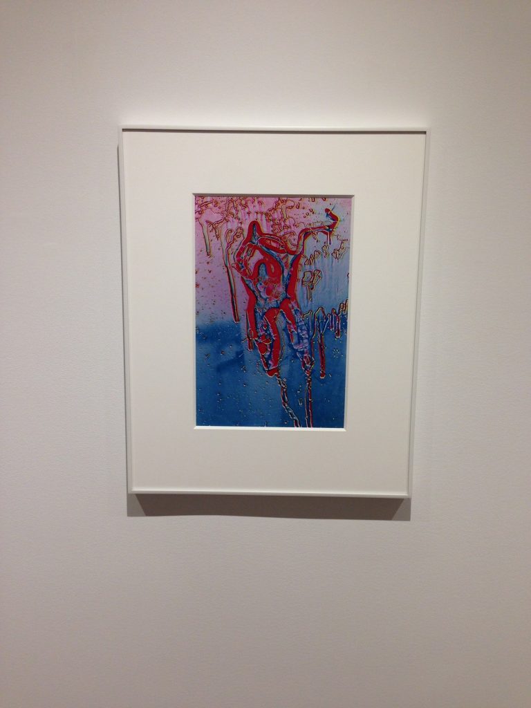
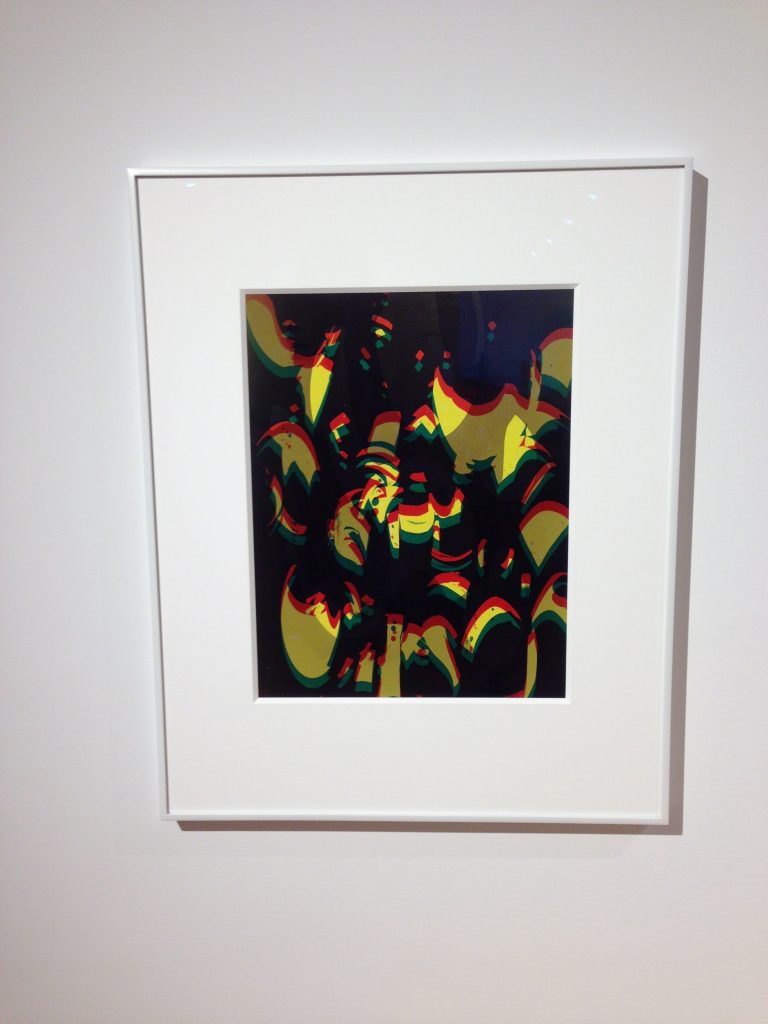
In the late ‘40s-early ‘50s, Smith developed a technique whereby he would drip karo syrup over a glass plate, make a contact print, re-photograph it with a 4×5 camera, and use the negative of the swirling pools as a matrix. If he liked an abstract form, he might reuse it later, in combinations with other colors and shapes (his recycling of material is the reason certain works are dated over a period of time rather than as a single year.)
This concept of theme and variations carried him further away from straight photography and deeper into the realm of print-making and music. Individual prints with identical motifs were now bound to each other more than to reference points and spaces outside the frame.
The painters of the New York School had a weakness for cloudy mytho-poetic titles, the words underneath an image designed to add layers of portentous or whimsical meaning. Mark Tobey, Jackson Pollock, Mark Rothko, Barnett Newman, and others read Jung and wanted their viewers to locate archetypes and other symbols in their patterns of color.
Smith rather meekly followed suit in giving literal names to abstract forms. In three examples here, after he had drawn coupled shapes on the glass with his syrup, he decided to call them Pair (1951-1970), Man and Wife (1960-1970), and Mother and Son (1951-1961). Perhaps if his titles were less banal and had invoked Greek and Roman history, as Cy Twombly pretentiously did, Smith would not seem in these pieces like a corny Sunday painter.
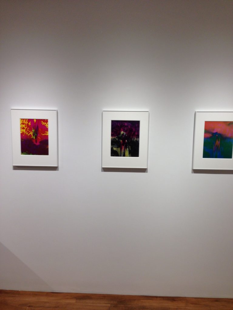
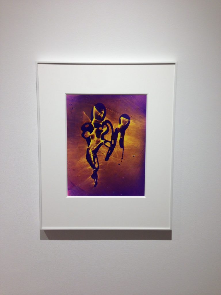
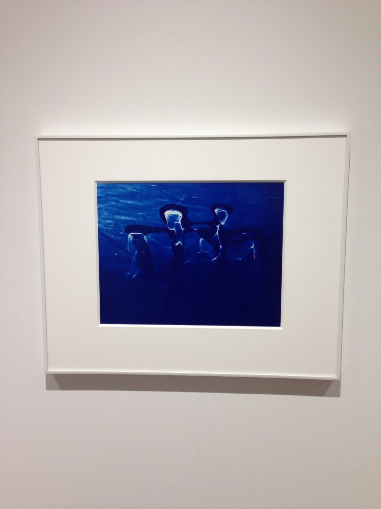
Tonal reversals were so overdone in the ‘60s by art directors for record companies and rock concert promoters that some of us may never again be able to take solarization seriously. Smith’s reputation has suffered among baby boomers who remember these trippy color schemes with nostalgia overlaid by condescension.
Which is not to say that this technique couldn’t produce ravishing effects. Light Dancers (1952-1984) is aptly named. Lambent yellow waves flicker seductively in and around a twisted purple figure that could be an ankh and serves as support. The whirling palette of red and yellow and black in Death of Punch (1960-1975) has an explosive force of shrapnel, as if a harlequin doll had been struck by a bomb. The same motif might create different moods. The fork-like cluster in Going Up (1972-1984) is a purple blur at the top of the frame. Against a hot background of yellow, red, and magenta, it seems to burn as if propelled from a volcano. Whereas in Burst (1972-1984), the shape floats in a quiet, misty haze of pink and green. Both are gorgeous manifestations of photographic color and painting with light.
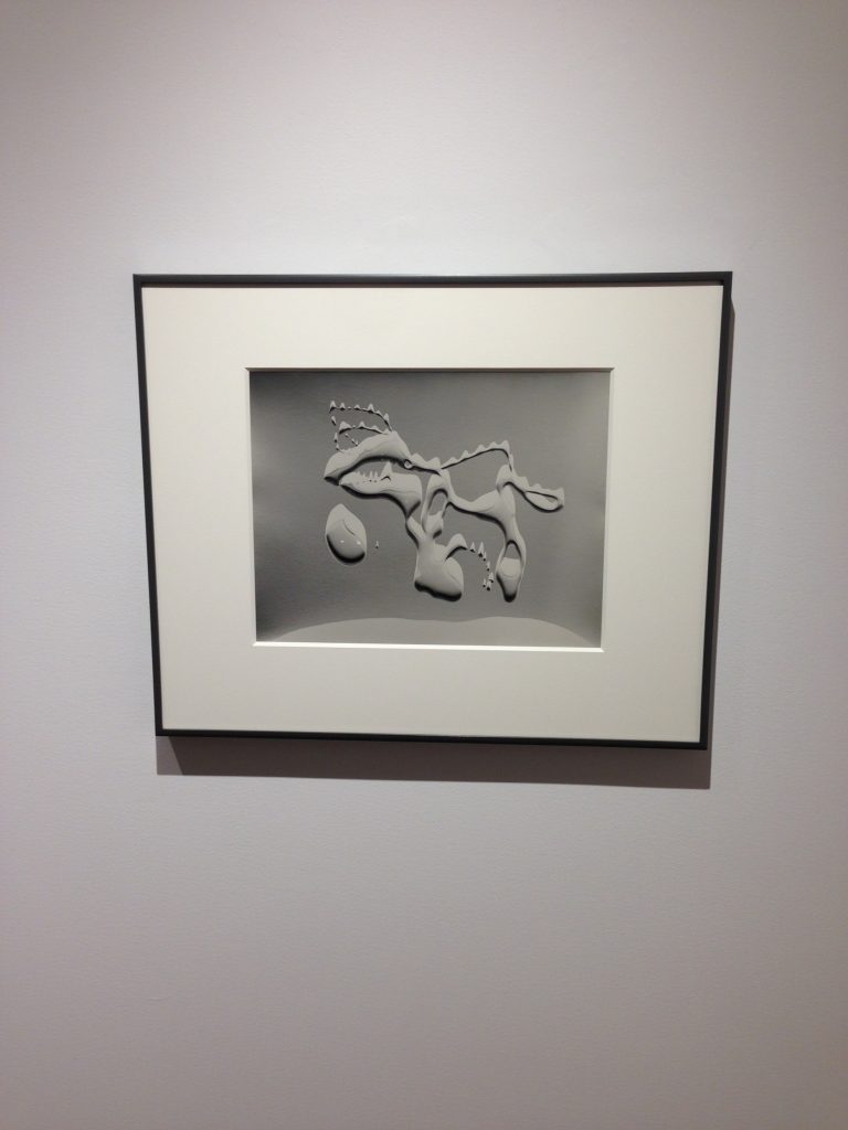
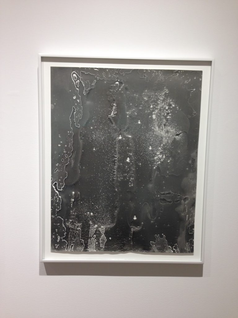
The highlights of the show nonetheless are three black-and-white prints. All are untitled. The example from 1950 has a looping figure with smooth contours, like one of Yves Tanguy’s melting gray mountains but with what could seen as an eye and teeth, reminiscent of a creature by David Smith or Adolph Gottlieb. The two other examples from 1984 are less beholden to Surrealism. Among the largest prints here, they are also more tactile, with a viscous, pitted, lunar surface. Tiny flares of white peek through the craters, a sign perhaps that Smith photographed them against a light table.
One wishes that he could have lived long enough to have the tools to make giant prints. His preference for the expensive and labor-intensive dye transfer process may have stunted his career. He went bigger with some silk-screened posters. But perhaps he was too respectful of traditional darkroom craft to have adapted to cheap digital scanners and printers. As this show demonstrates, it wasn’t lack of imagination or skill that prevented him from enjoying more acclaim.
Collector’s POV: The works in this show are priced as follows. The vintage gelatin silver prints range from $6000 to $12000, while the dye transfers range from $4000 to $15000. Smith’s work has little secondary market history, with only a few lots changing hands at auction in the past several years. As a result, gallery retail likely remains the best option for those collectors interested in following up.


Fabulous use of photographic color theory!!!
RGB=YMC brilliant and I would buy them all!
http://www.ellencareyphotography.com