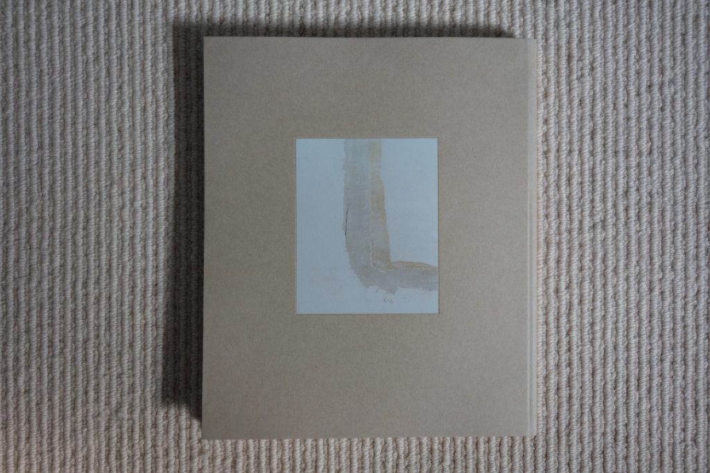
JTF (just the facts): Published in 2017 by Loose Joints (here). Flexibound with foil embossed cover, 160 pages, with 90 color reproductions. There are no texts or essays included. In an edition of 1000 copies. (Cover and spread shots below.)


Comments/Context: Making a photobook and giving it the name Paintings is a provocative move. It brings with it a whole host of tacit assumptions about what we think such a deliberate medium inversion might mean conceptually and about what a painterly photograph is supposed to look like.
Starting back with the Pictorialists in the late 19th century, trying to make a “painting” using the tools of photography has generally meant turning photography against its better nature, consciously softening the exacting crispness and straight objectivity generated by the mechanisms of the camera so that the resulting image looked more like a painting. The Pictorialists mimicked the compositional arrangements of earlier painters, employed antique processes to generate unusual tonalities, deliberately enhanced textures and employed special paper stocks to create more tactile surfaces, and added gestural movement via blur or darkroom chemical manipulation to make the works more obviously hand-crafted.
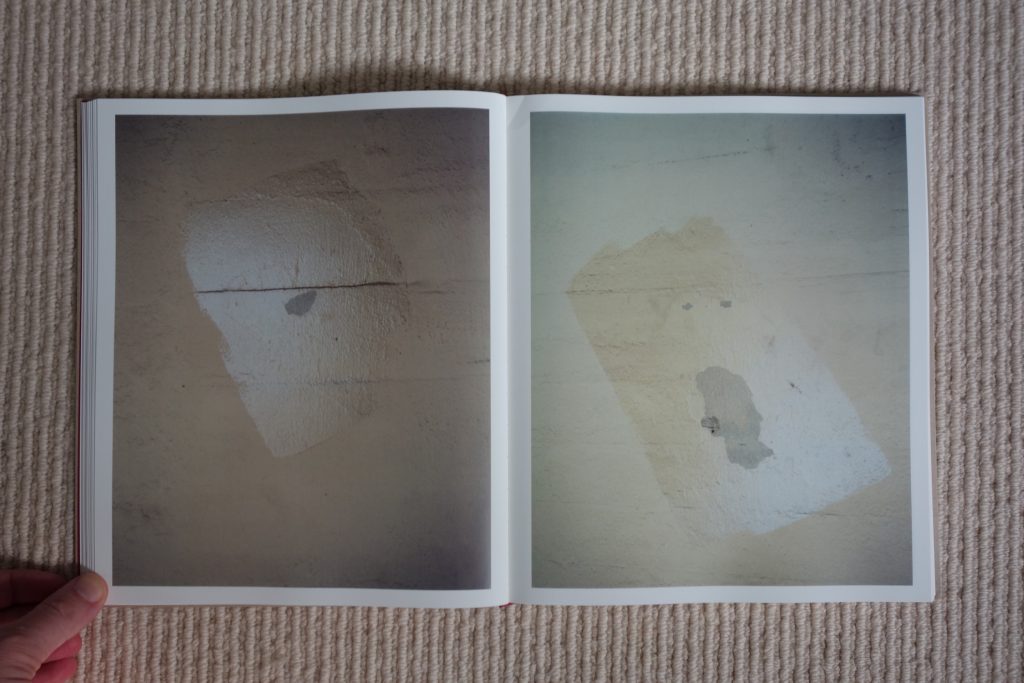
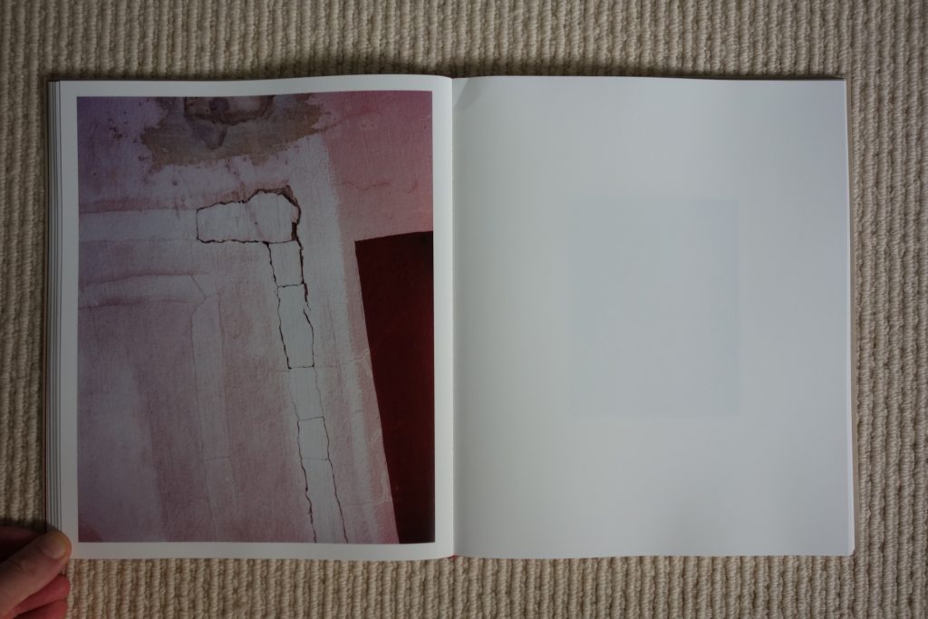
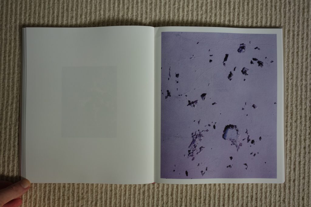
In the century since the Pictorialist approach went out of style, many photographers have continued to be seduced by painterliness, and chased its definition in different ways. In the 1940s and 1950s, photographers used the arrangements of found objects, peeling painted walls, and gestural graffiti as the subject of compositions that were parallel to (and part of) the Abstract Expressionist movement in painting. More recently, mottled painterly surfaces have been explored via deliberate graininess and pixelization, gestural movement has been generated by energetic splashes of darkroom chemicals and expressive physical (and digital) mark making, and mist, smoke, fog, and blur have been employed to reduce legibility and increase uncertainty. And for some reason, whenever a photographer uses color with sophistication and nuance, he or she is almost always labeled as being painterly.
In the case of the British photographer Harley Weir, her painterly photographs seem rooted in a desire to intentionally recalibrate her eye, rather than some more mystical affinity with specific artistic ideals drawn from painting. In her short career, Weir has become known for her edgy fashion and portrait photography, so this project is an outlier, or perhaps better, a chance to leave behind certain ingrained approaches to picture making while being forced to embrace others.
If Weir’s photographs were printed extra large and hung in a white cube gallery like paintings normally are, we’d both be impressed by the variety of her stylistic choices (at least within the definitional confines of abstraction) and hard pressed to draw conclusions about her dominant ideas. But that breadth isn’t necessarily a negative – it’s evidence of an eye in the midst of a wide-ranging problem solving exercise, where valid solutions sometimes present themselves that lie outside the normal boundaries of intention.
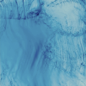
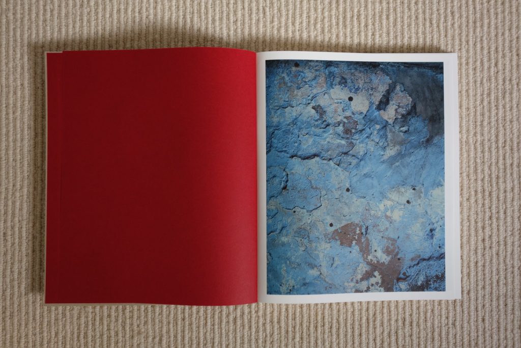
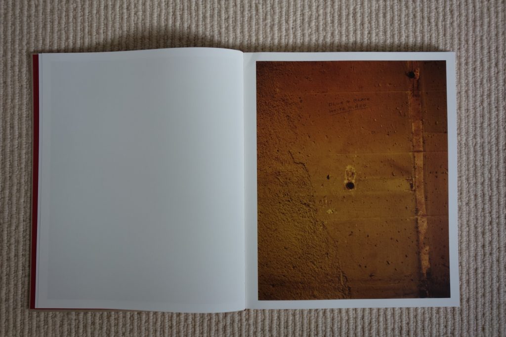
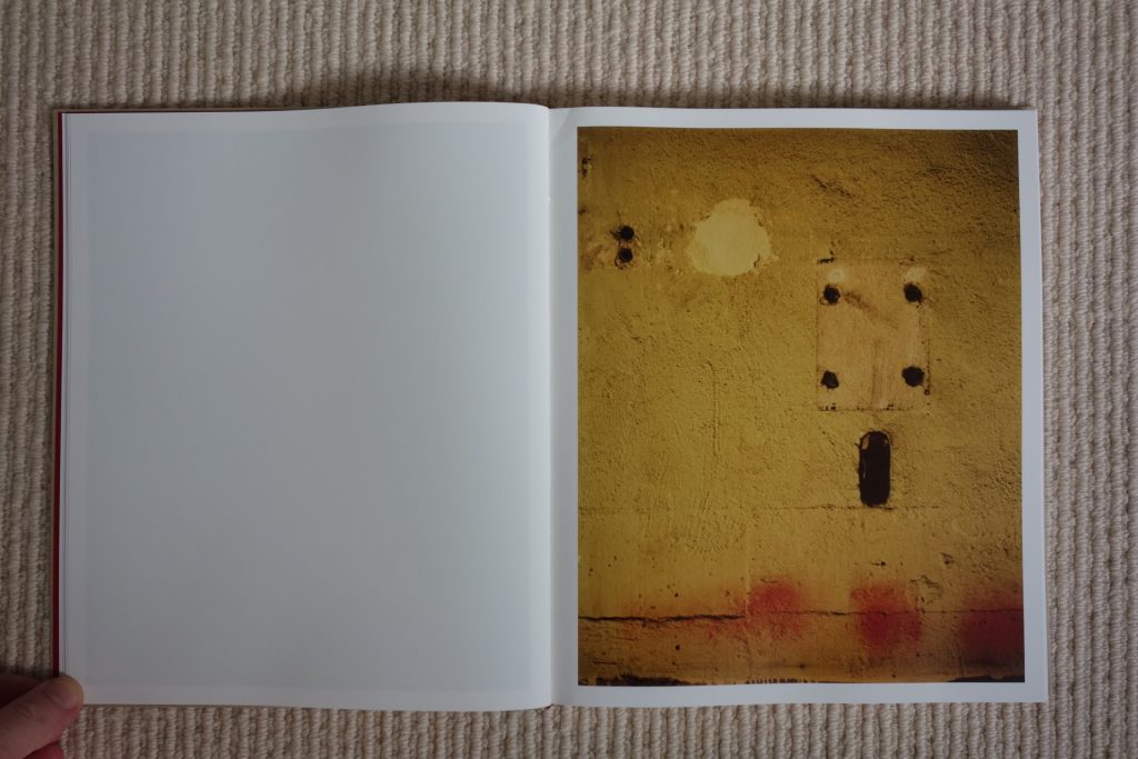
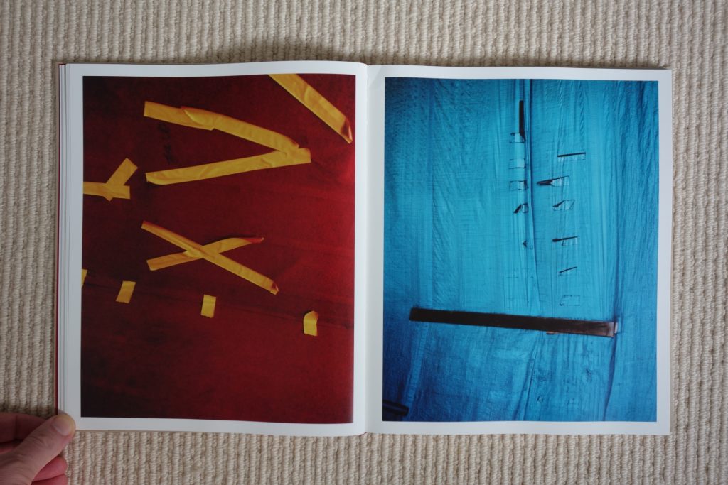
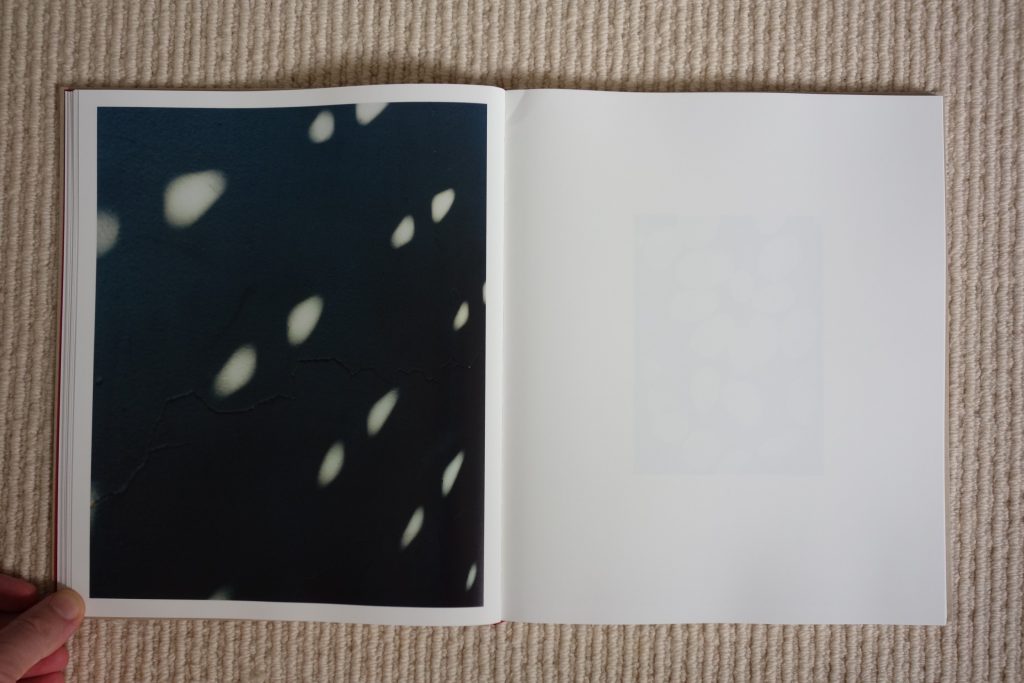
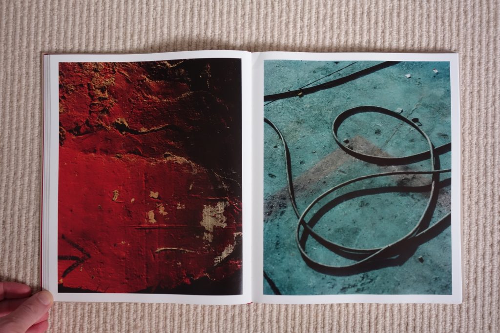
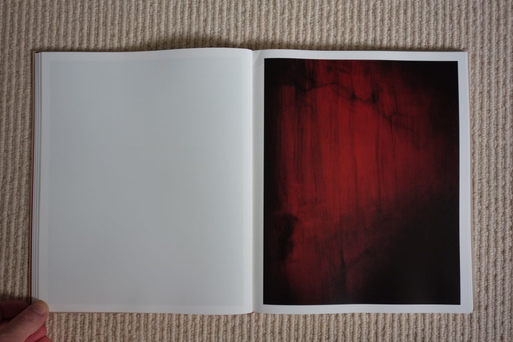
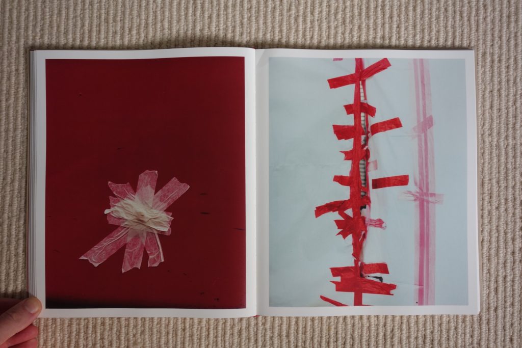
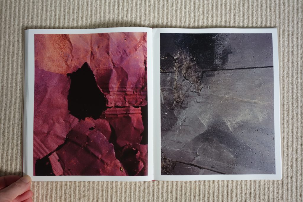
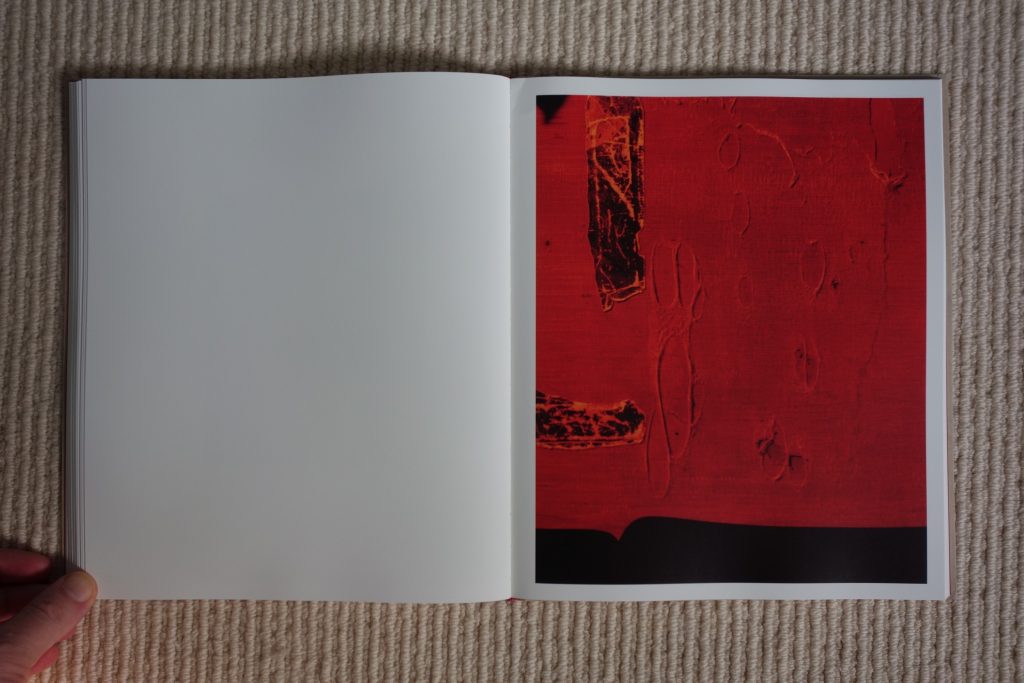
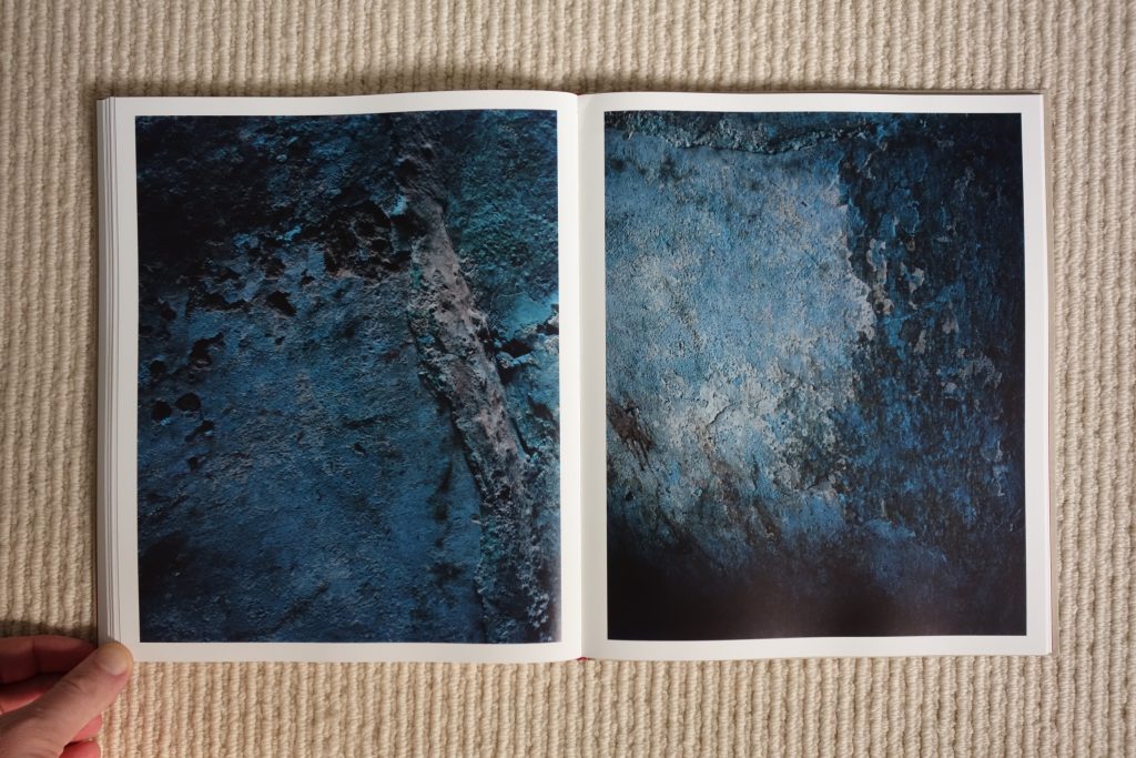
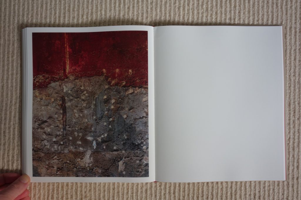
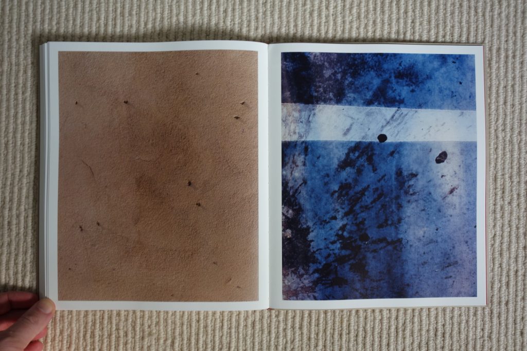
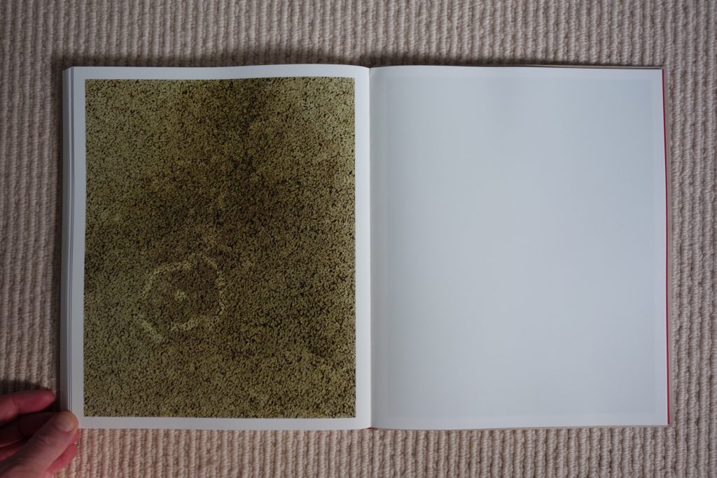
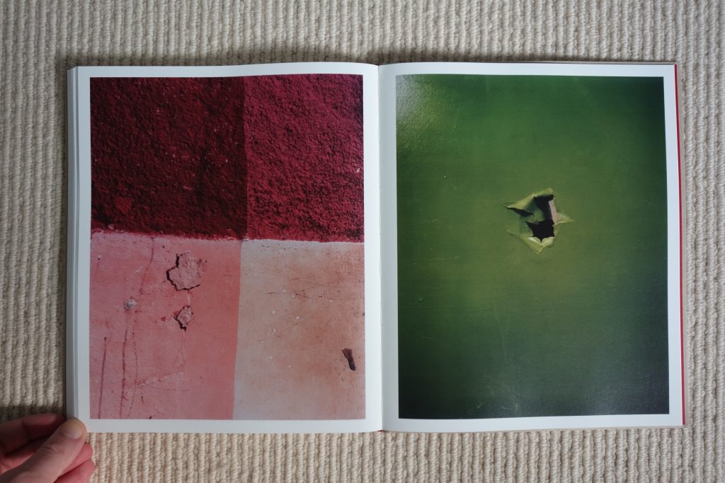
As seen in Weir’s commercial work, she is a talented colorist, and this ease and comfort with vibrant colors comes through strongly in these new compositions. Her palette is largely drawn from saturated Earth tones, where beige, mustard yellow, rust, soft pink, sky blue, and olive green hold sway, and she often mutes these tones further via texture and surface interest. But even when she plunges into shinier turquoise, electric blue, and dazzling red, these selections never feel overly clean or machined; her colors are always rooted in a tactile human presence rather than a sleek projection.
Compositionally, Weir doesn’t limit herself to aping the masters of abstraction. Yes, there are loopy squiggles, squared off grids, dark tears and holes, leaky veils, color blocks, expressive Xs and zips, and plenty of gritty all-over thickness and crunchiness, each of which brings to mind one celebrated painter or another, but this variety doesn’t feel reverential exactly. Instead, she’s applying a reduction technique to her own approach to photography, paring it back to these essentials of abstract form and movement, which just happen to bring her full circle to the essences of painting. The same might be said for her newfound interest in texture and surface; she ranges from glossy smoothness to splattery stucco-like roughness without missing a beat, and each stop along the spectrum of options is investigated with the same warmth and clarity.
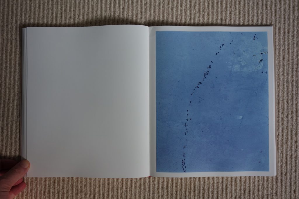
It’s very hard to articulate in words where deadpan and dull transitions into energetic and vital, but Weir’s photographic abstractions are consistently leaning toward the end with more punch, without ever crossing into the territory where visual shouting and deliberate annoyance live. She delivers restraint with richness, making found tape marks, watery stains, and a trail of ants into gestures that have surprising control and authority.
In the end, Paintings is a photobook that earns its brash title far better than we might have predicted. Just as Wolfgang Tillmans’ extra large abstractions have gradually found favor, it won’t surprise me if Weir’s well-made pictures offer her a bridge to a new audience that reaches far beyond her usual realm of youthful fashion and culture. Delivered at the right scale and in the right context, they just might cross over with an impressive flash of momentum.
Collector’s POV: Harley Weir is represented by Art Partner in New York/London/Paris (here). Her work has little secondary market history at this point, so gallery retail likely remains the best option for those collectors interested in following up.