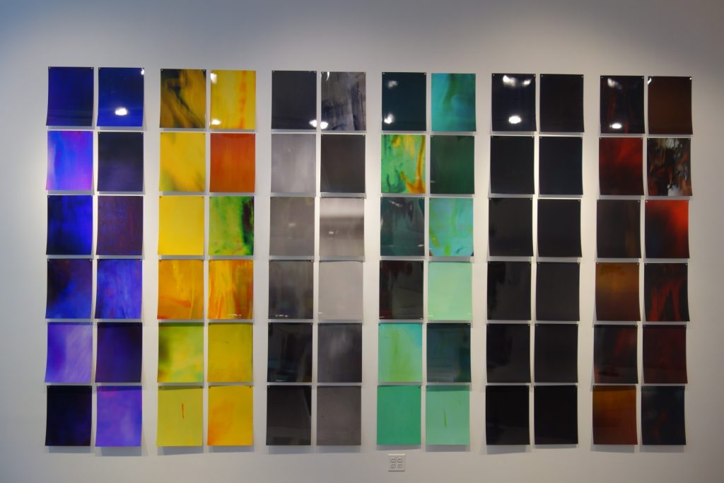
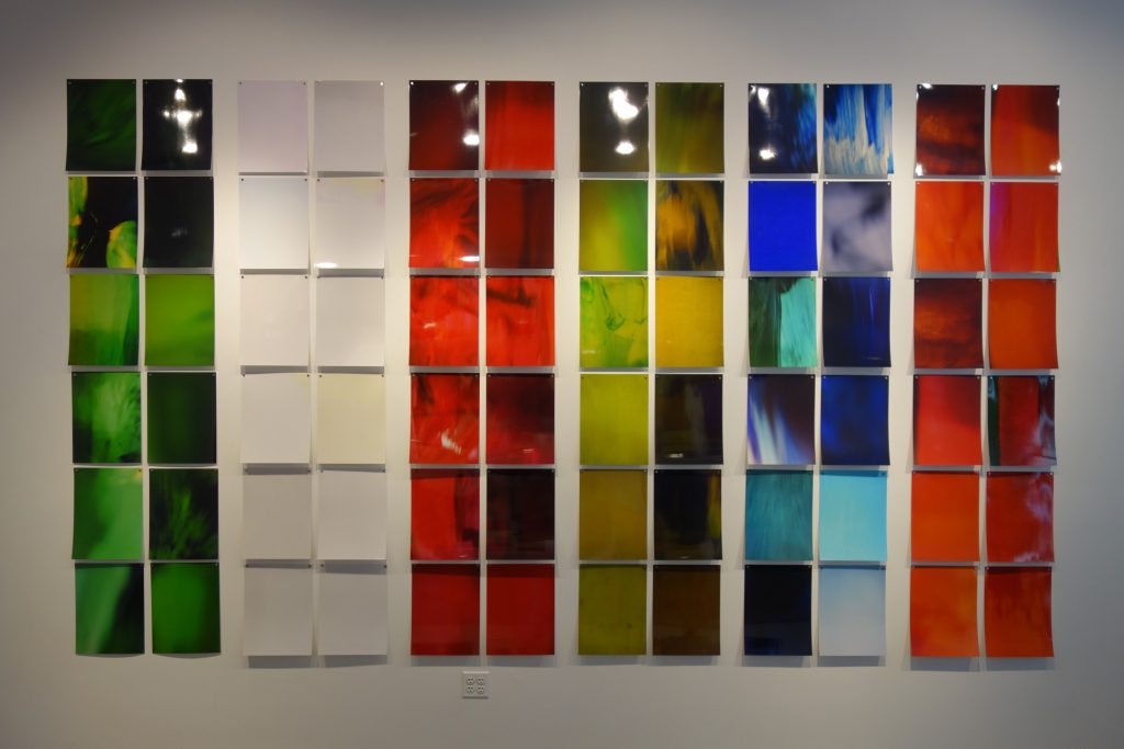
JTF (just the facts): A total of 156 color photographs, unframed and affixed to the wall with magnets in the main gallery space. All of the works are chromogenic color prints, arranged into 13 groups of 12 prints and organized by primary color. Each print is sized 16×12 inches and is available in an edition of 7. Some editions are reserved as full sets, others are available as individual color groups. (Installation shots below.)

Comments/Context: Hanno Otten’s career-long interest in the nuances of color has taken him in countless artistic directions. Over the years, he has made photographs, photograms, paintings, sculptures, and even installations, each an investigation of the properties, surfaces, and technicalities of color. For Otten, color is a tightly constrained subject with seemingly endless recursive possibilities.
His newest works explore the layering and interaction of mediums, via up-close photographs taken of his own paintings. Each image is cropped so tightly that any hint of representation dissolves away, leaving behind lush blurs of gestural color that Otten has categorized into a spectrum of hues. The color themes have been arranged (and installed) in groups of twelve glossy prints, loosely evoking the color samples at a paint store.
But Otten’s works go somewhere quite different than Gerhard Richter’s color charts. Each of Otten’s fragments isn’t a flat commercial sample, but a piece of color improvisation or an isolated piece of a larger whole. Many are filled with subtleties of movement and detail – a gentle cacophony of swirls, whorls, marbling, flecks, glares, and distortions that give each image personality and richness. Others are softly textured, or vividly waved, or just anything but uniform. Each color theme – red, brown, orange, as well as various blues, yellows, greens, and purples – wanders from light to dark, with intermediate stops that challenge the idea of color as something simple or predictable. When examined closely, some individual works actually include several colors, with one dominant hue interleaved with the fluid streams or clouded remnants of others.
Otten’s studies of the tiny variations of white, grey, and black require more sustained looking to appreciate, but once the viewer acclimatizes to the artist’s level of acute observation, each one actually reveals itself as a selection of variants and hybrids much more complex and engaging than might have expected. The greys especially seem to feel like an understated meditation on the intermediate tones of black and white photography.
The physicality of this immersive installation also prevents any feeling of aloofness. Standing in the gallery and looking at the grids of prints is an enveloping experience, encouraging the constant comparisons of theme and variation. Each print is tactile and present (especially when the paper curls up slightly at the bottom), as opposed to being entirely abstracted. Seen together as one integrated installation, the prints coalesce toward an elemental sense of harmony, the gestural motifs repeating themselves inside the color themes like refrains.
Otten has built this body of work with a framework of structure and order, but at its core, it feels light, airy, and open. He’s harnessed the elusive qualities of color within his room-filling matrix, but his colors seem reluctant to be tied down, always grasping for new ways to morph and change.
Collector’s POV: The prints in this show are sold in groups of 12 ($3000 for the group) or as a full set of 156 ($29000). Otten’s work has little secondary market history, so gallery retail remains the best option for those collectors interested in following up.