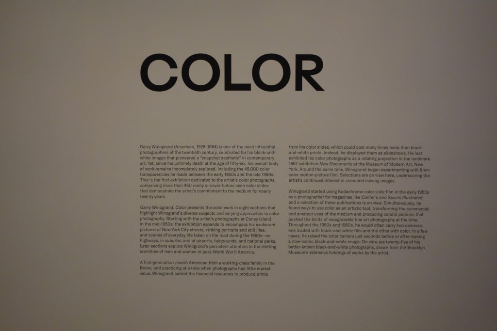
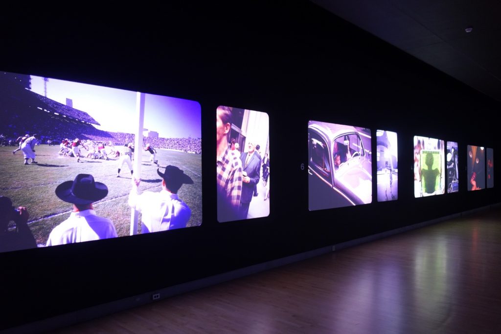
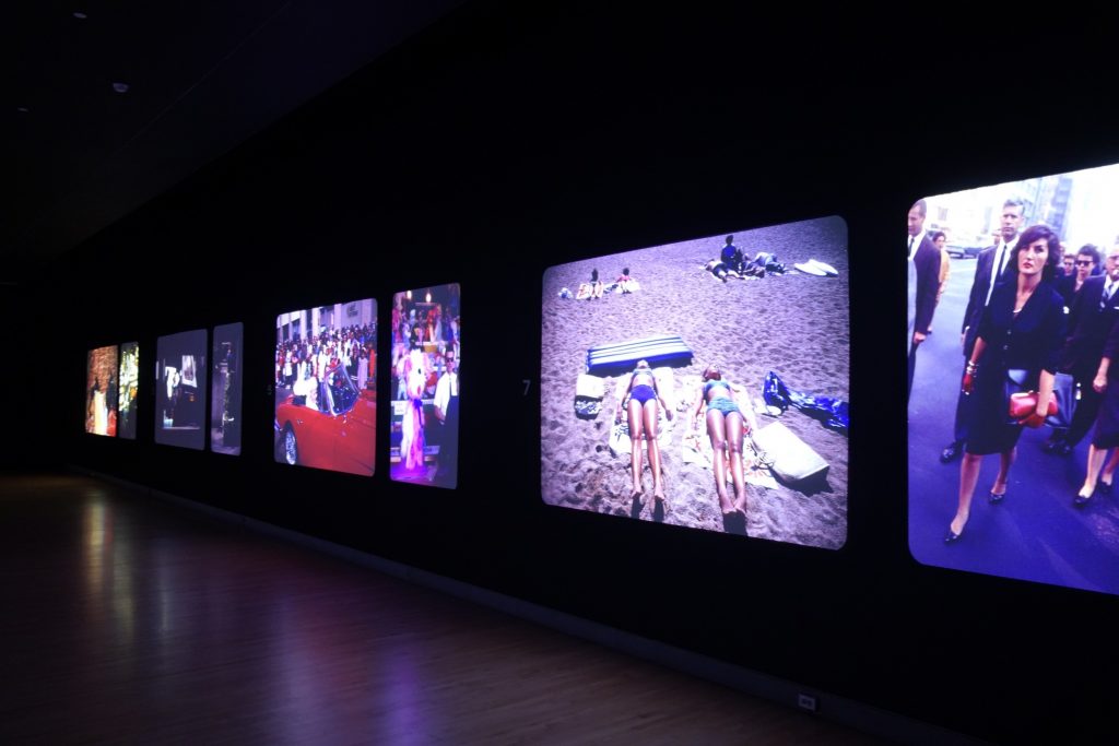
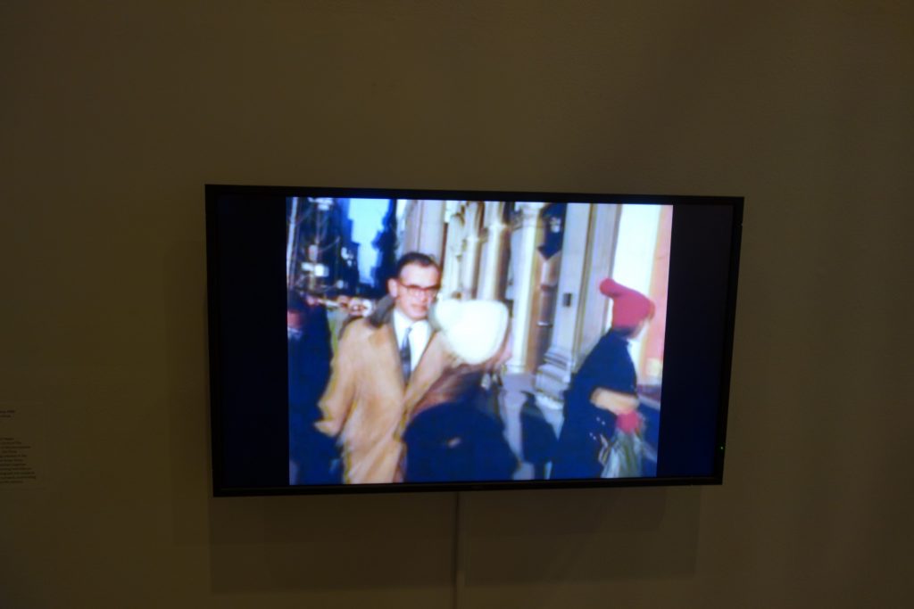
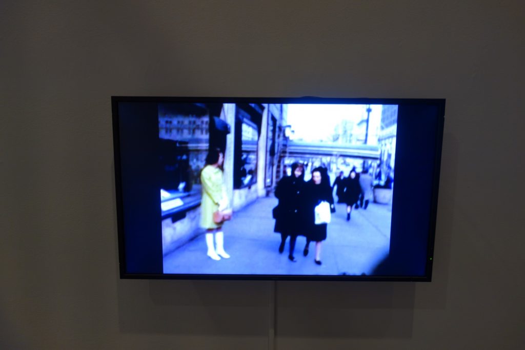
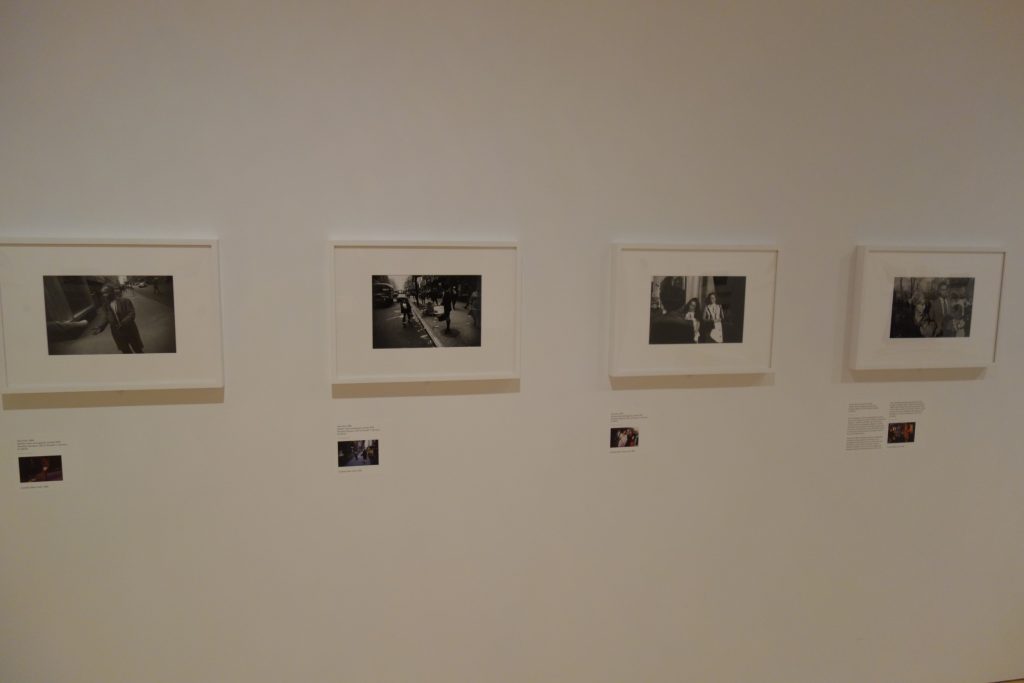
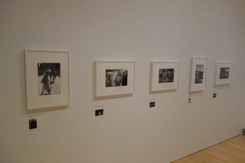
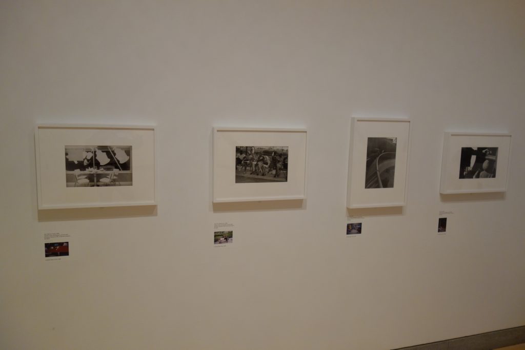
JTF (just the facts): A total of 490 color and black and white photographs, displayed in a series of 4 rooms. Aside from the 25 black and white images in the last room which are framed in white and matted, the works are displayed as rotating slideshows. The first set in the entry room uses a traditional slide projector format, while the eight numbered sections are shown in a large darkened room as paired sets (horizontal and vertical images for each section). The details of the works by named section are as follows:
- New Documents Exhibition, 1967: 40 color slides
- 1 Coney Island, 1952-58: 33 color slides
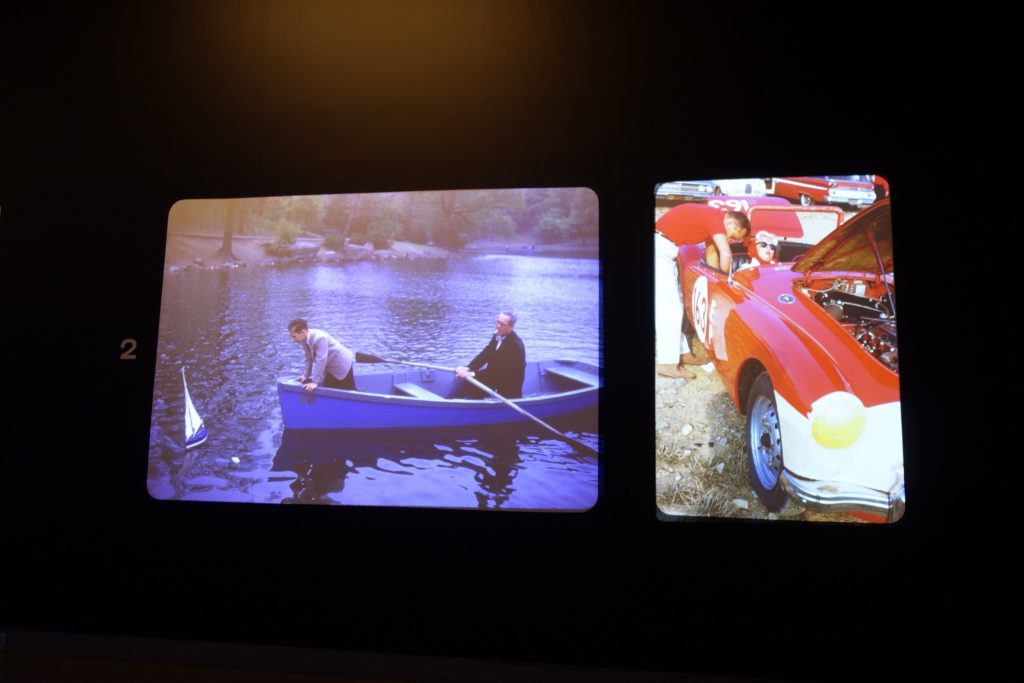
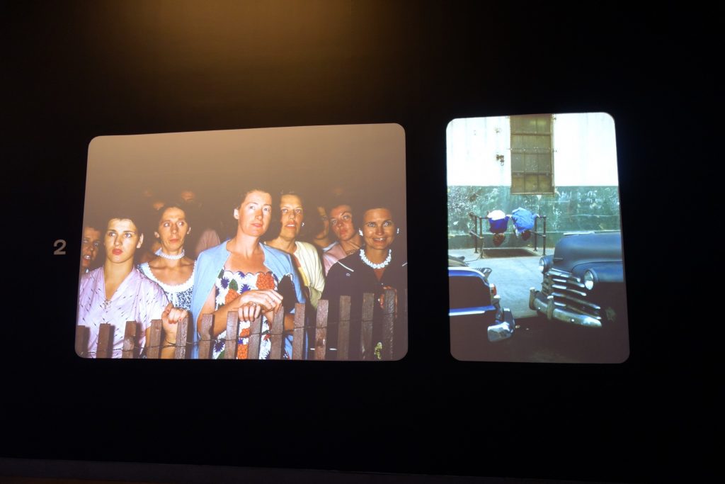
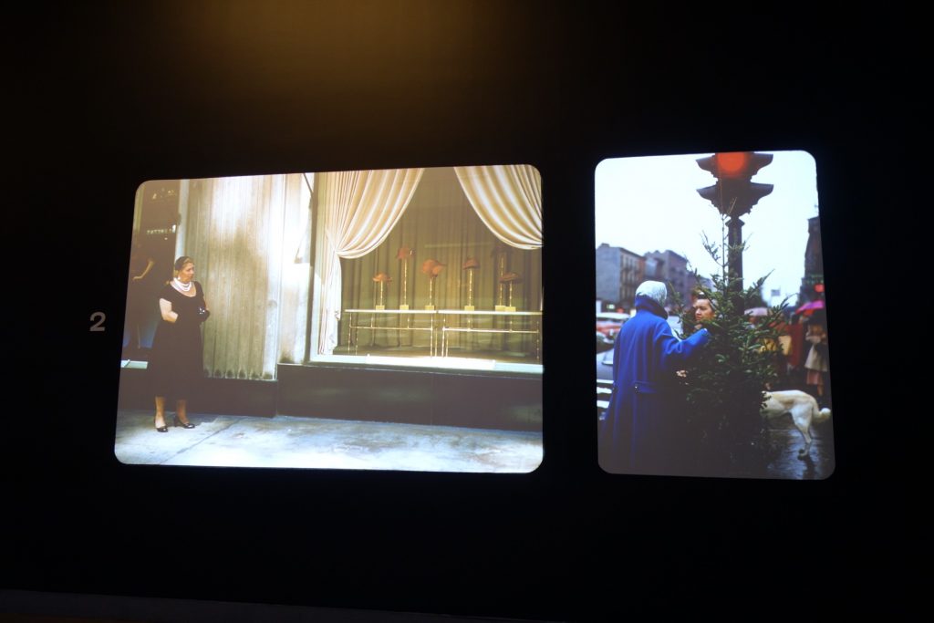
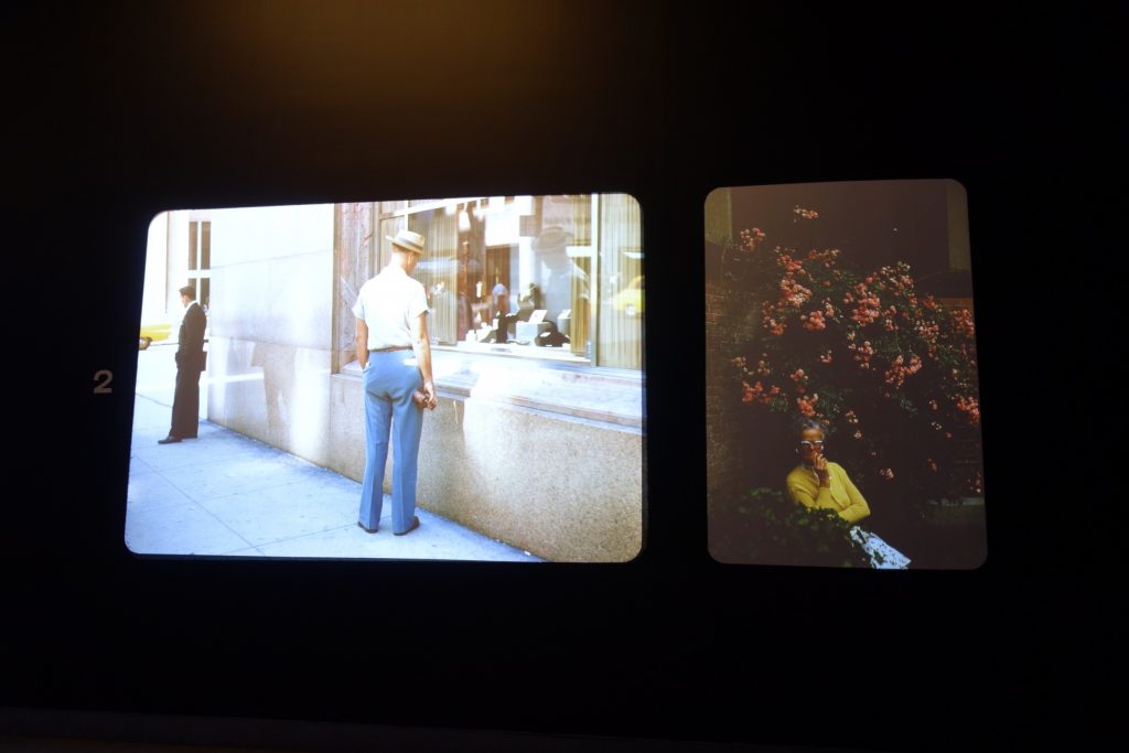
- 2 Early Color, 1950s: 48 color slides
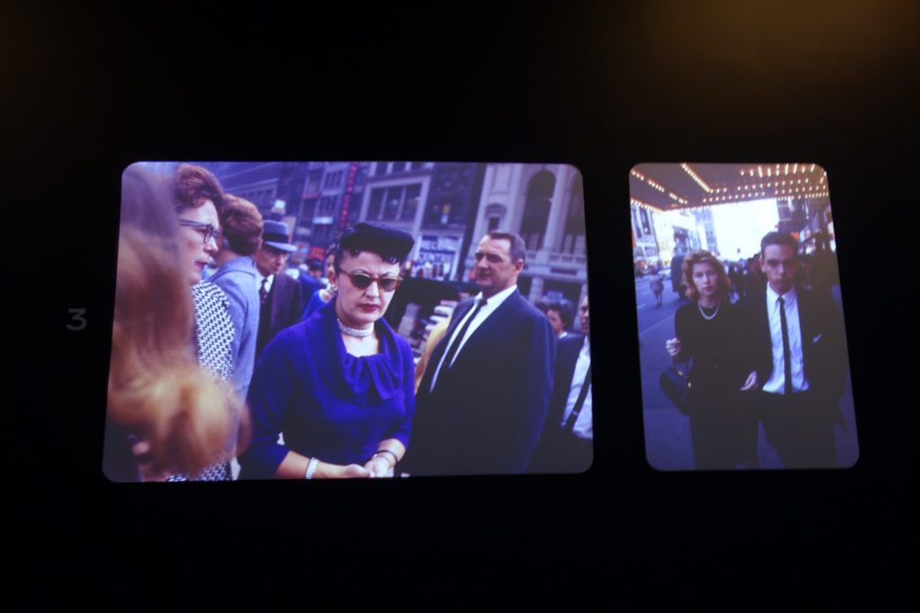
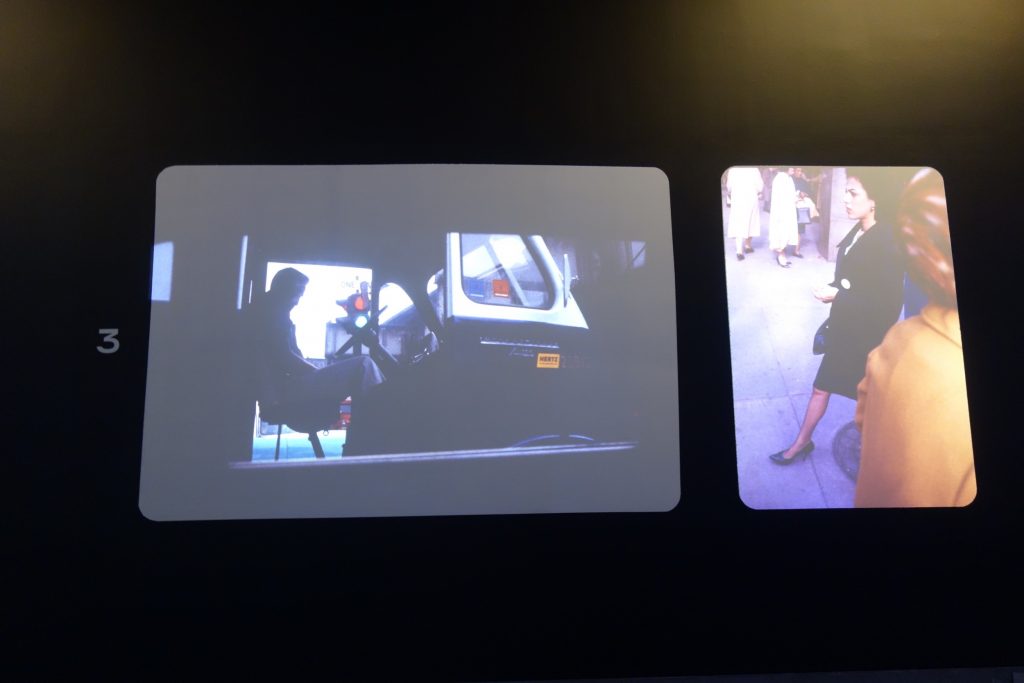
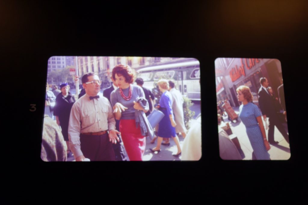
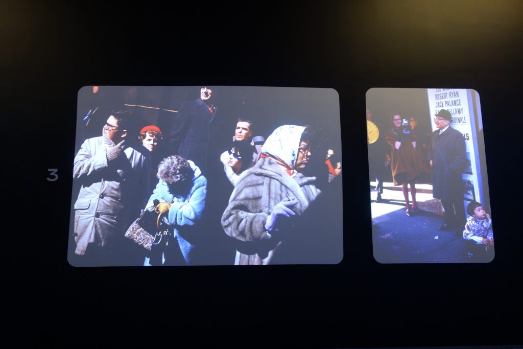
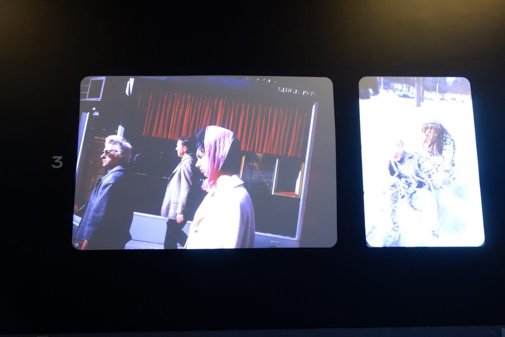
- 3 In the Streets, 1960s: 76 color slides
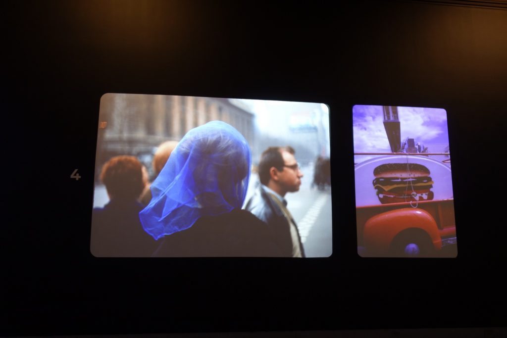
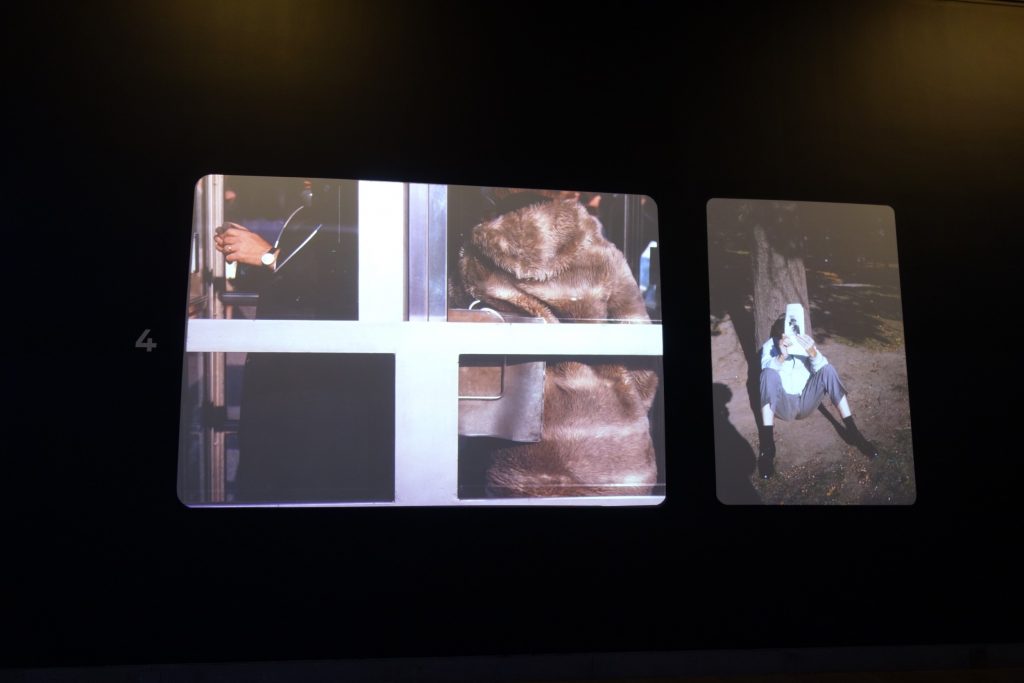
- 4 Portraits and Still lifes, 1960s: 49 color slides
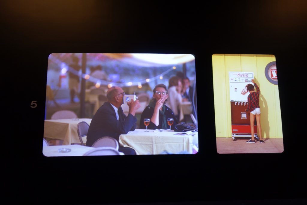
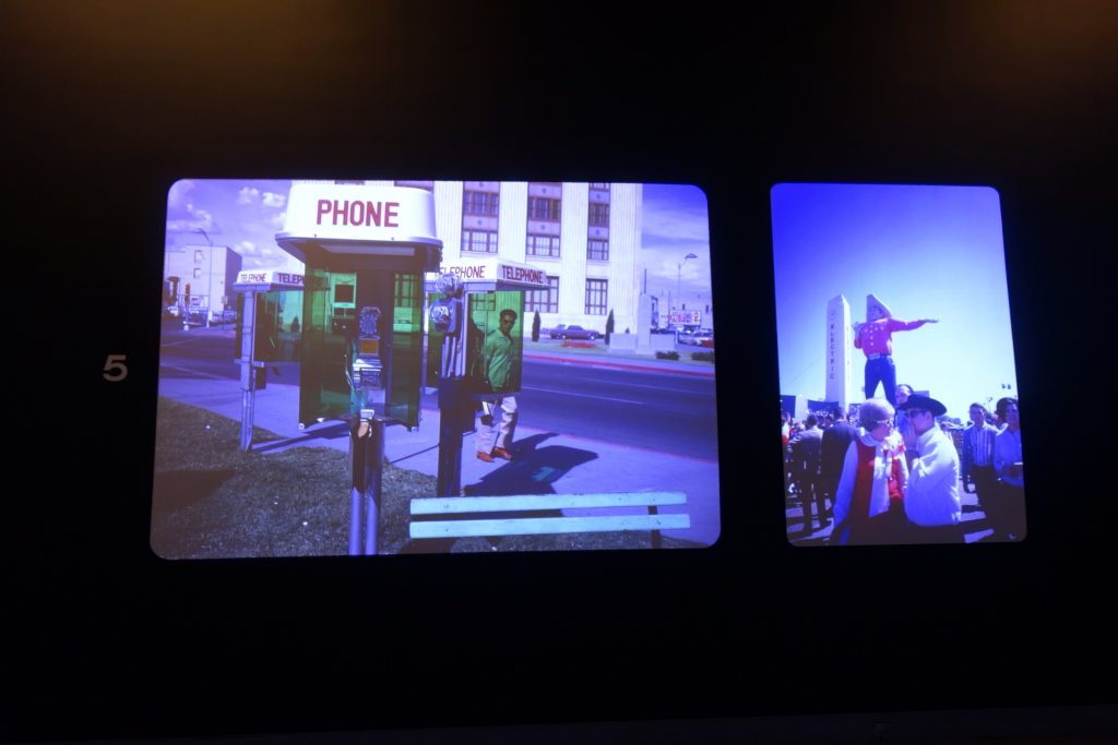
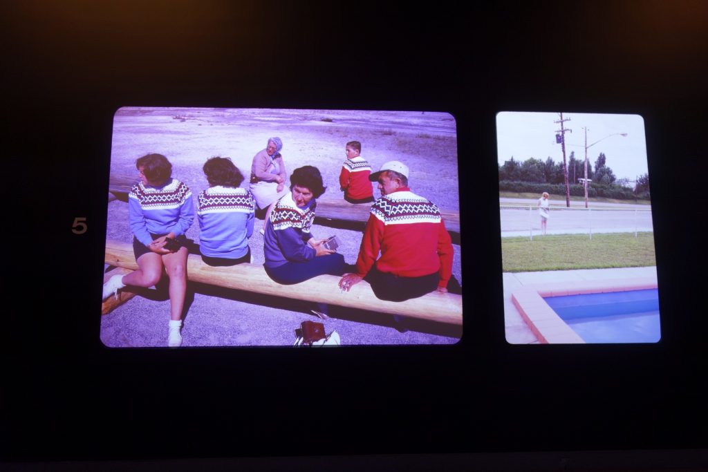
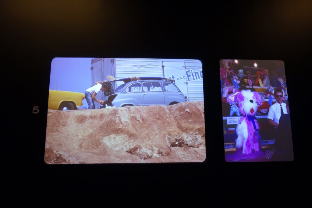
- 5 On the Road, 1960s: 60 color slides
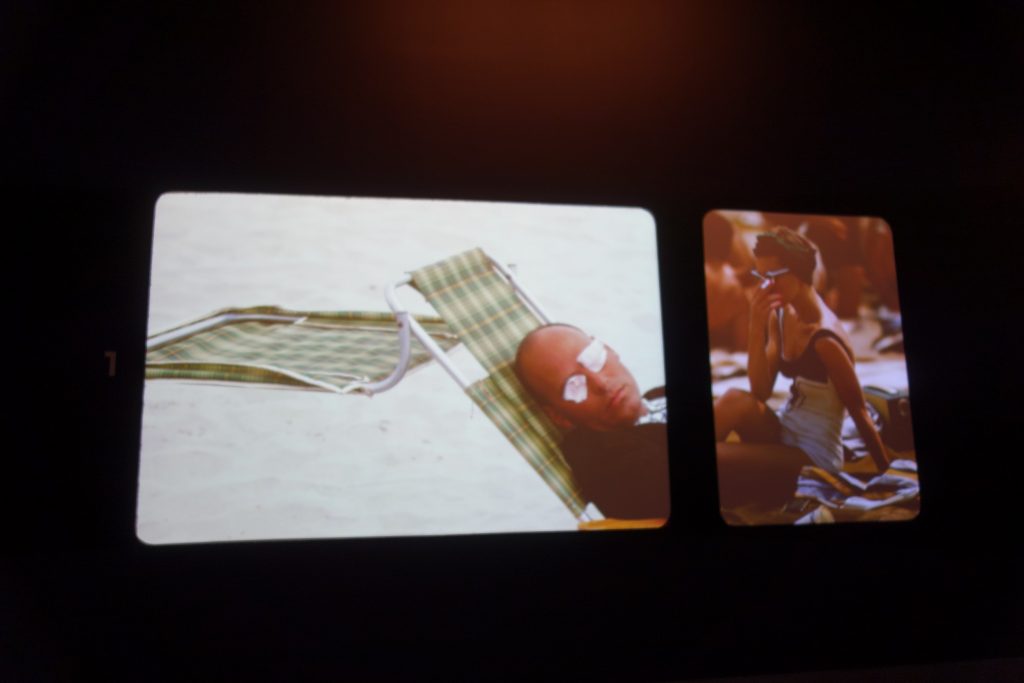
- 6 Travel, 1960s: 50 color slides
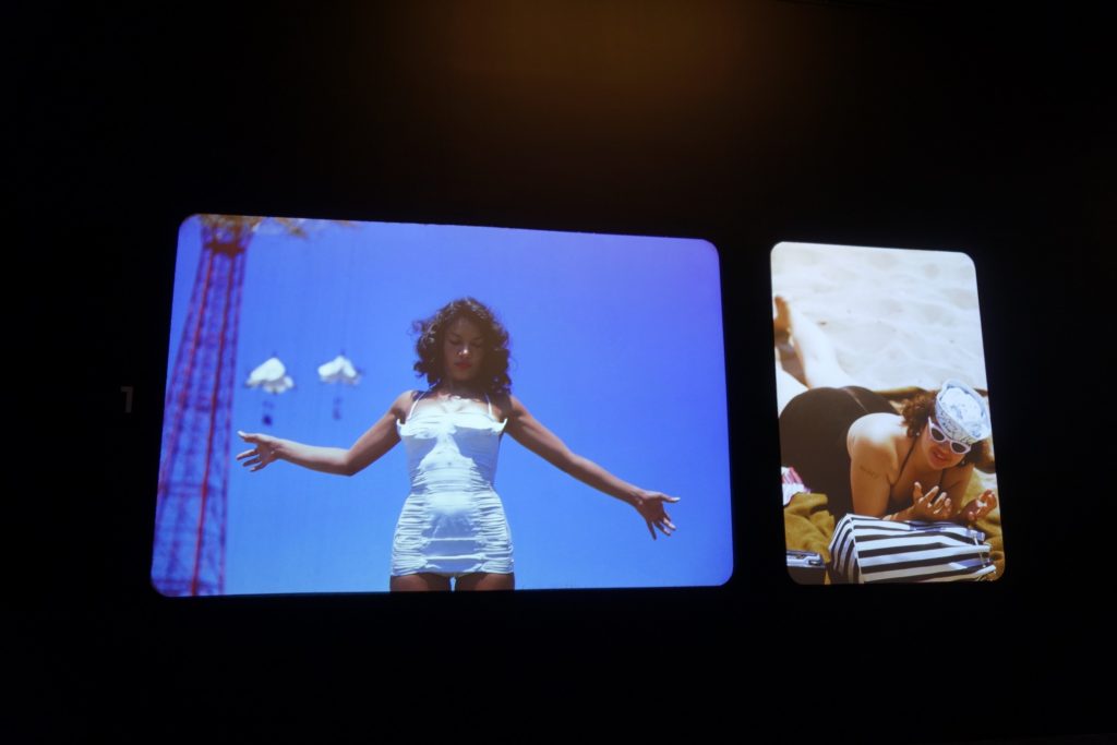
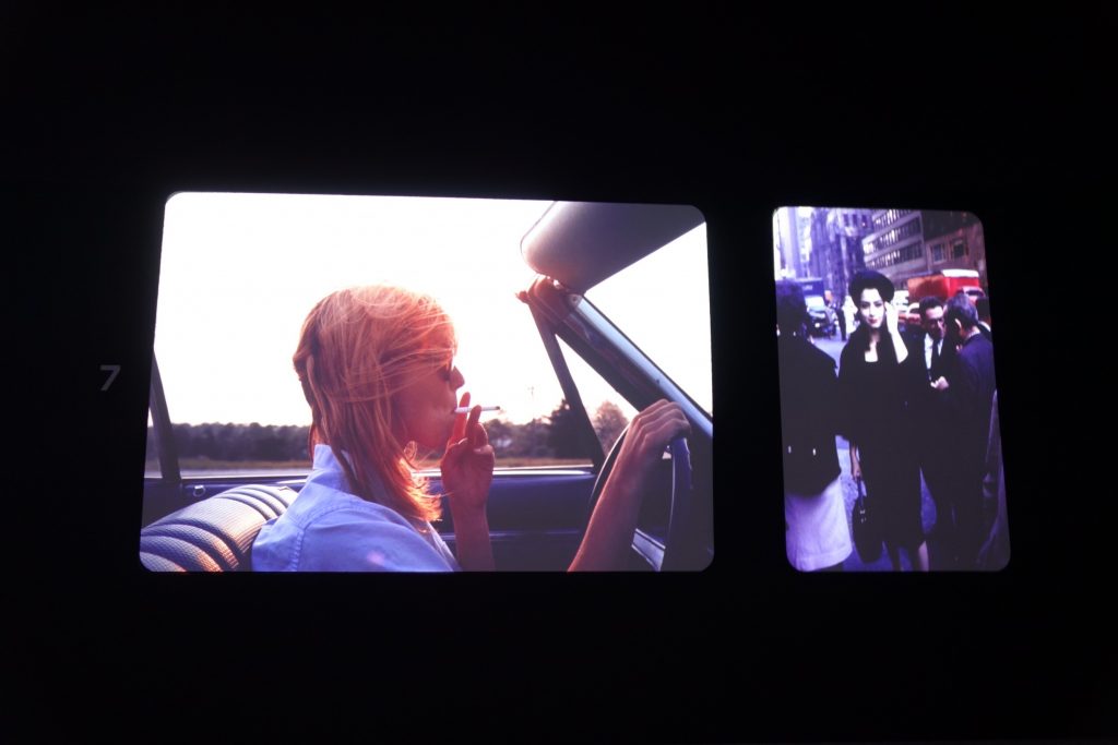
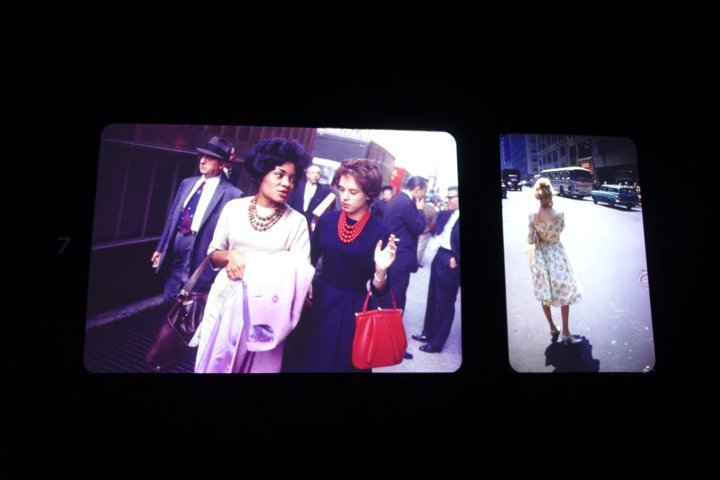
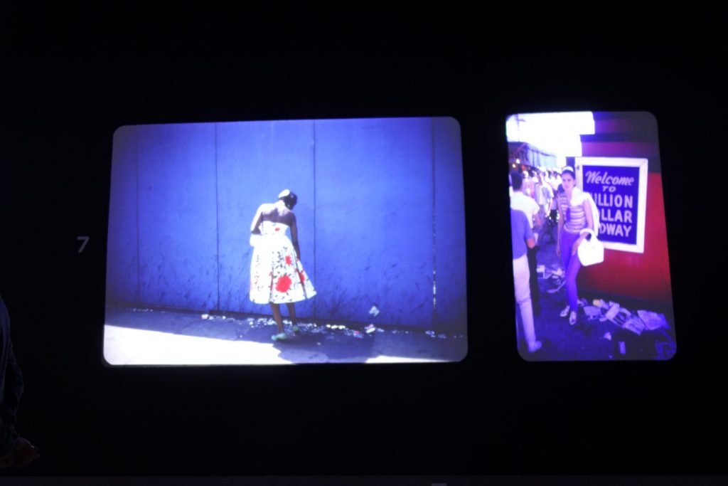
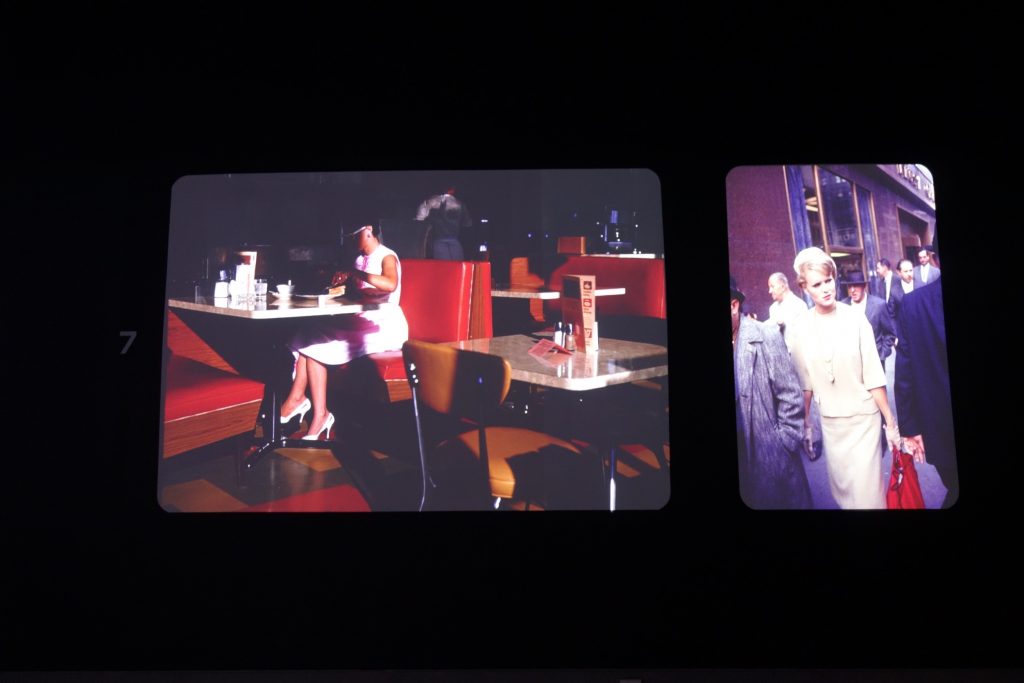
- 7 Women, 1960s: 55 color slides
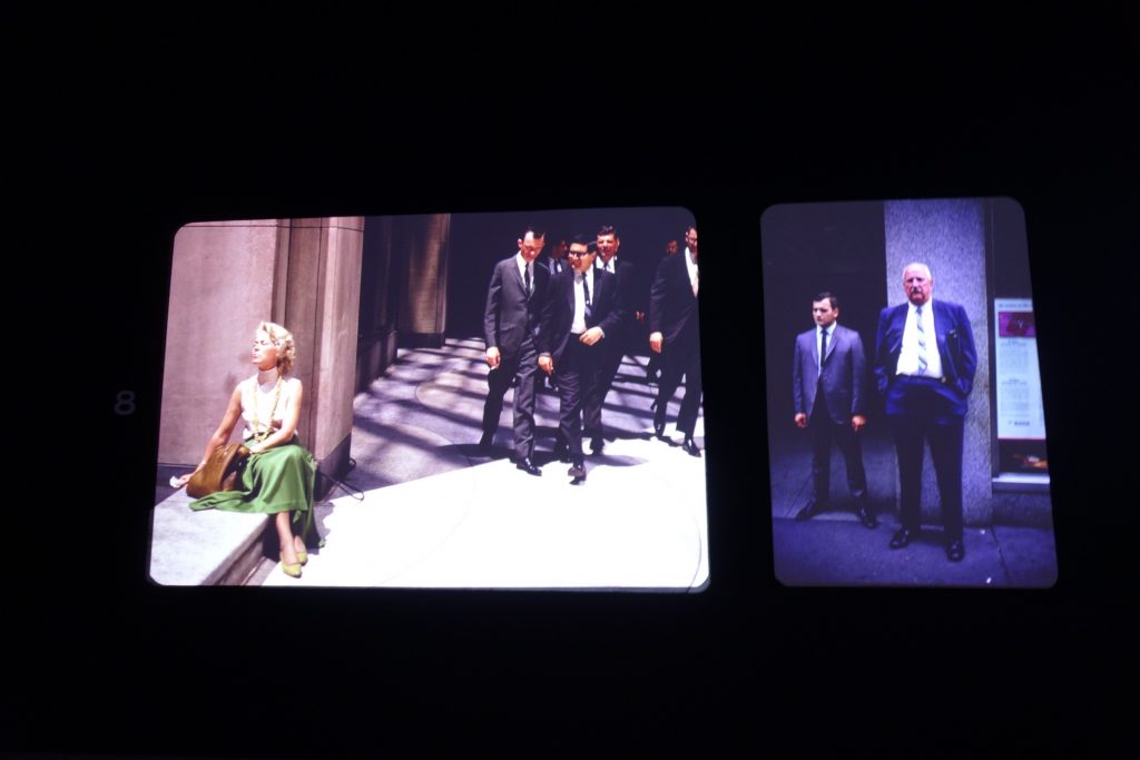
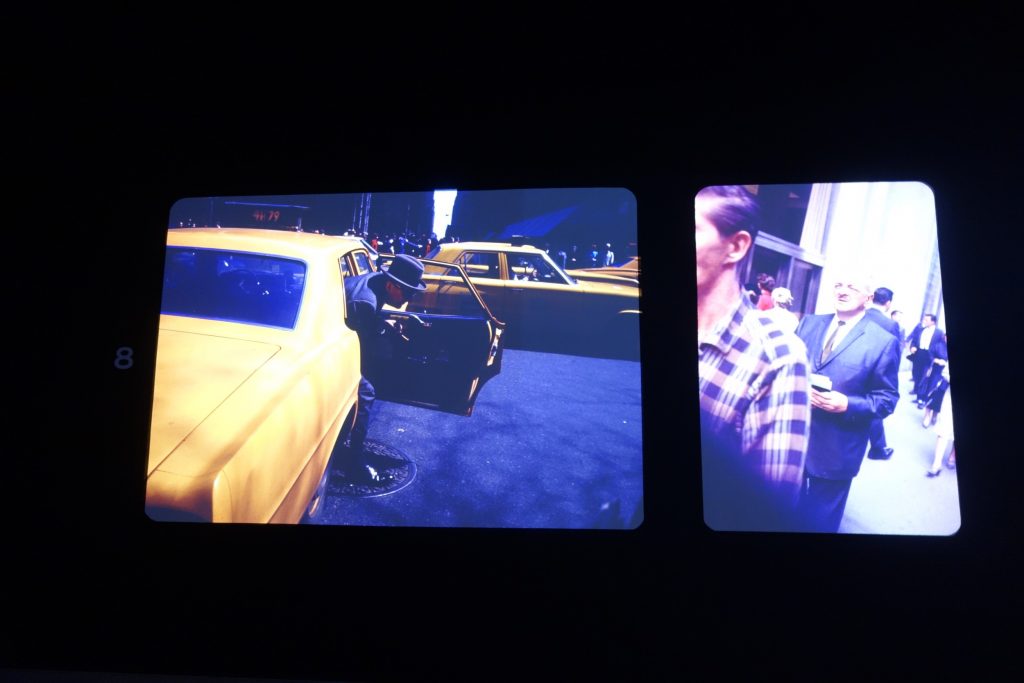
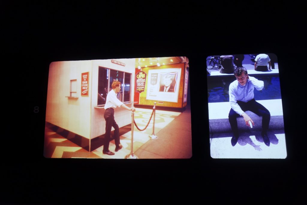
- 8 White Masculinity, 1960s: 54 color slides
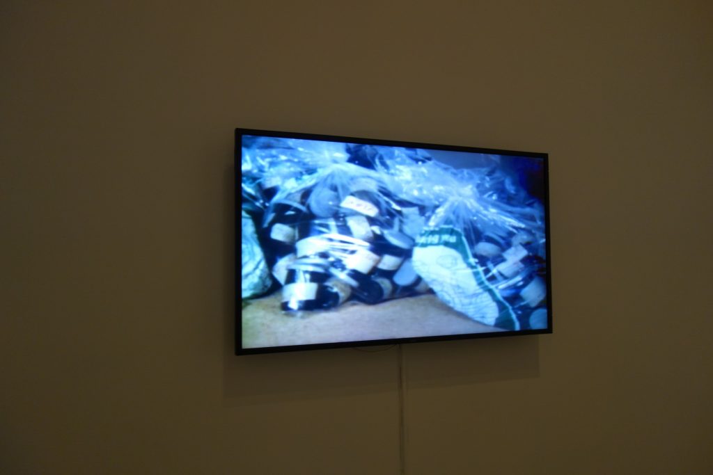
- 2 8mm films, 1 TV program, displayed on video screens
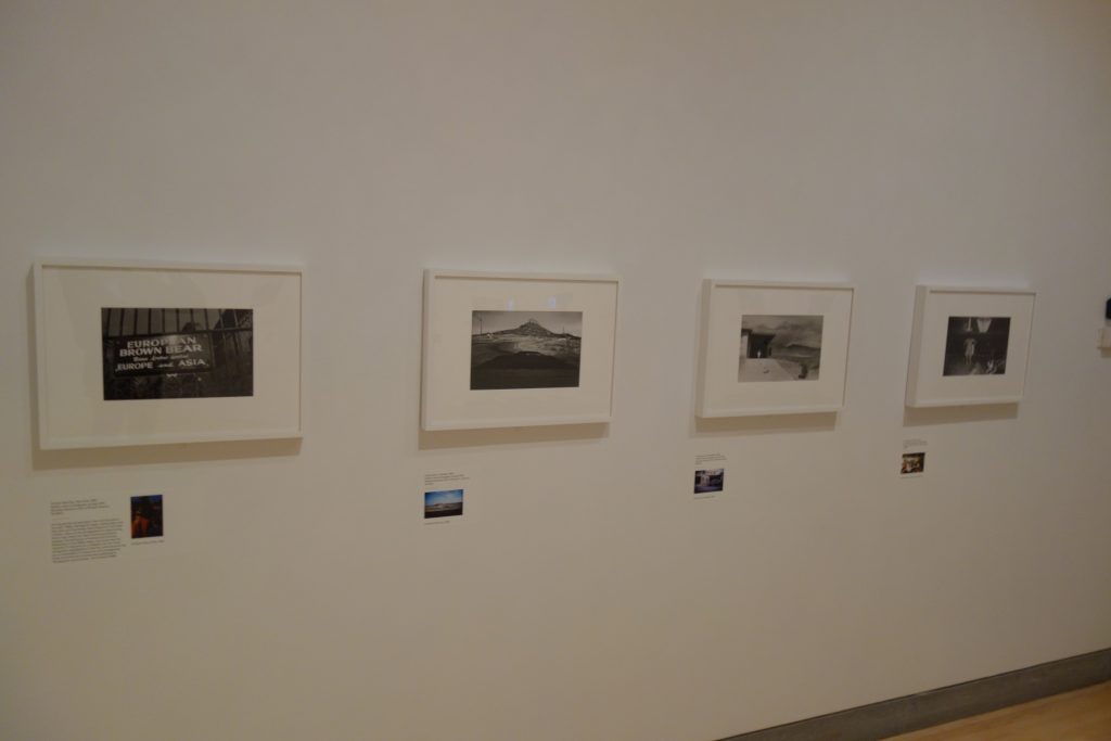
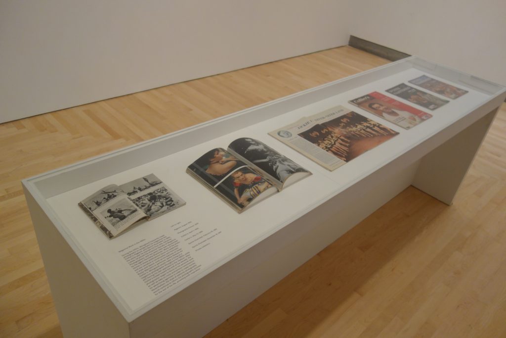
- Winogrand in Black and White: 25 gelatin silver prints, 1 vitrine with 6 magazine spreads
Curated by Drew Sawyer, with Michael Almereyda and Susan Kismaric. (Installation shots below.)


Comments/Context: The history of color photography as a recognized medium for fine art is often tied to William Eggleston’s one-person show of color prints at MoMA in 1976. Various forms of color photography (going all the way back to the autochromes made at the turn of the century) had of course appeared prior to this now famous show, and many artists who had grown up steeped in the nuances of black and white also experimented with color when it first arrived on the scene. But the Eggleston exhibit was undeniably a watershed moment – it overtly gave color the seal of approval of the photography establishment, and that public acceptance, along with the composition and subject matter of images themselves, provoked strong reactions on all sides.
But that history might have played out quite differently if a projector hadn’t malfunctioned a decade earlier, which is where this survey of the essentially unknown color photography of Garry Winogrand begins. Back in 1967, Winogrand was part of a three-person show at MoMA with Diane Arbus and Lee Friedlander called New Documents. With the benefit of hindsight, we now know just how influential this show turned out to be, both in terms of the momentum it added to the reputations of its three participants (particularly Arbus), but also in the ways that it expanded the boundaries of documentary photography to include the imperfections, the eccentricities, and even the ugliness of everyday life in America in the 1960s.
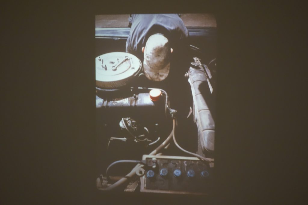
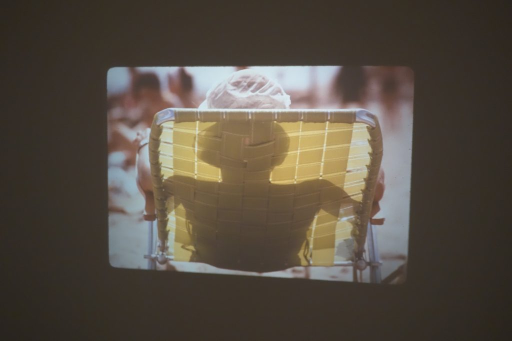
As part of that exhibition, in addition to his black and white pictures, Winogrand showed a rotating projection of 80 color transparencies running on a carousel, most of which had been made during his travels across the country in 1964. A man in a green mesh beach chair, a melting red popsicle left on the sidewalk, a man in a blue shirt working on a car engine, a woman’s green dress pressed against a bus window – these and other images provided a flicker of excitement. But a failure with the display led to the quick removal of this part of the exhibit – apparently some of the images were burned or damaged, and the entire installation was never even listed on the exhibition checklist. Only after some recent curatorial research is it even clear what images Winogrand originally chose for the display. So the tantalizing question of whether Winogrand’s color photographs might have been intriguing enough to pre-empt what Eggleston would ultimately deliver was never really answerable, at least until now.
Garry Winogrand: Color begins with a recreation of that original carousel, albeit with only 40 representative slides. The very existence of this stubborn group of pictures is critical for a couple of reasons: it proves that Winogrand not only shot in color, but that he developed some rolls, actually made some edits of those images, and selected a group of final photographs for a museum exhibit – in short, he took his color work seriously enough to pay attention and work through the process of reviewing and choosing the pictures. Sadly, these are the only color images that Winogrand took that come with the assurance that he personally approved their selection, which brings us to the inherent challenges faced by this show.
After his death, some 45000 color transparencies were found (most made between the early 1950s and the late 1960s), in addition to filing cabinets filled with plastic bags of thousands of rolls of undeveloped film and loose contact sheets, and various curators have spent years sifting through all of these photographs, trying to make sense of the massive archive. His 2014 retrospective at the Met (reviewed here) used many of the black and white discoveries from one investigative thread of that larger ongoing process to understand (and reposition) both Winogrand’s approach to photography and his output in his later years. This new exhibit attempts to bushwhack a similar path through the unkempt jungle of overlooked color imagery to shape an understanding about his heretofore largely undefined relationship with color.
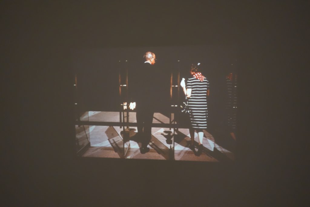
The main body of this exhibit is installed in one massive, darkened room, with eight pairs of displays projected on the opposing walls, essentially mimicking how most people looked at color photography in the 1960s and 1970s – in slideshows. The curators have grouped the images into thematic, subject matter driven sections, each one represented by a pair of screens (one for horizontal images, the other for vertical). The images (some 400 of them) flicker by quite quickly, preventing much in-depth examination or reflection. There are standouts, solid works, and forgettable pictures in seemingly equal measure, leading to the conclusion that the curators deliberately opted for an inclusive, exploratory sampler of Winogrand’s color photography on this first pass through the imposing pile. As a result, the whole installation feels mostly like a sprawling Winograndian stream of consciousness, a rotating flow of impressions and moments rather than a definitive assessment or statement about Winogrand’s color efforts.
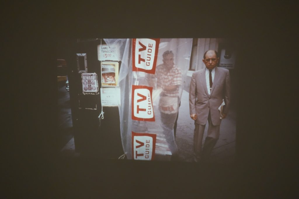
Throughout his career, Winogrand was known to be an almost manic shooter when working in the streets (and clips of him shooting included a TV interview program on view here confirm this behavior). In a sense, he was a visual magpie, his eye constantly attracted (and distracted) by what he saw – people, activity, movement, and the changing spatial relationships of walking on foot – and framing that action with his camera seems to have been one way he tried to process the world around him.
He apparently often carried two cameras around his neck, one loaded with black and white film and the other loaded with color, and he switched between the two on the fly. This small detail actually turns out to be important, I think, as it implies that he found the two approaches somewhat interchangeable. Winogrand was using both cameras to actively shoot, and so when he used the color film, he was by definition shooting in color. The distinction that is worth thinking about is that very few of the images in this show feel like they are about color in the way that Eggleston’s consistently were (and still are).
Winogrand seems to have used the color film in much the same way he used his black and white film – it simply allowed him to include the real colors of life in the scenes he chose to construct. This is not to say that he was unaware of the new relationships and compositional forces at work when he used color, just that he may not have been deliberately thinking that one camera was for one thing and the other was for something entirely different. It turns out he shot his famous image of a couple carrying monkey babies in Central Park with both cameras, just seconds apart, and even though one of the monkeys is actually wearing a bright red coat, it is the black and white image that we have come to know.
Winogrand’s first forays in color took place at Coney Island in New York in the early 1950s, where the colors of swimsuits, blankets, blue skies, and tangled sandy bodies caught his eye. His other works from this early period cover a wide range of other subjects and street scenes, and the best of the images find Winogrand building his compositions with color as the key pressure point. A woman in a yellow sweater backed by a blooming pink rosebush, a kid pointing a red squirtgun down the street, the sun-drenched afternoon edge of a red truck, a green Christmas tree momentarily topped by a stop light – these are images that function best because of the color they include.
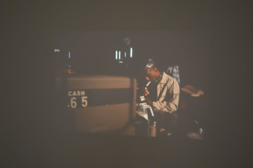
In the early 1960s, the vast majority of Winogrand’s pictures were being made in the streets, and so images of men, women, and crowds fill up several thematic sections in this show. Often, a splash of color (a dress, a scarf, a handbag, a jacket, a sharp black suit) is what grabs Winogrand, and the rest of the composition accommodates that central observation. In other cases, color is more an accessory to a gesture, a movement, or an expression, or a scene setting motif that surrounds the complex interplay of isolated pedestrians.
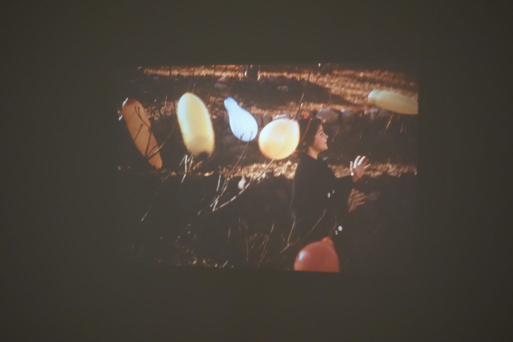
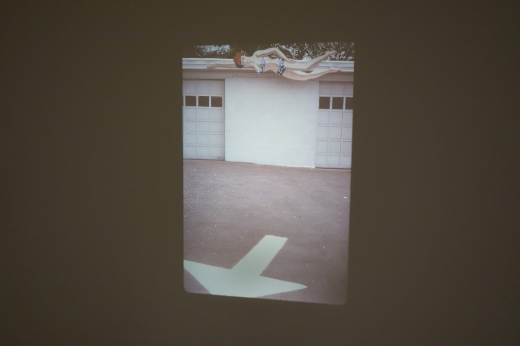
After winning a Guggenheim Fellowship in 1964, Winogrand set out on the road, and his subject matter evolves towards cars, buses, airplane travel, transportation, and the eccentric roadside tourist attractions and fairs of middle America, many of which are filled with eye-popping colors. But with a few exceptions, it never really feels like color is Winogrand’s primary aim – instead, the banalities, the romance, and the oddball quirkiness of the road are what he’s interested in; the color stories simply help enhance (and even exaggerate) his discoveries.
In the end, there is an immersiveness to this show that is highly successful in communicating Winogrand’s vision – a little all over the place, a bit obsessive, but consistently locked into a vein of American energy. As I sat watching the various slideshows spin by, I wondered about a different potential cut of this work, a much tighter, say 100 or 150 image edit, with all the fat and flab cut out, perhaps even shown as physical prints to allow more savoring of details. In some ways, it could be a powerhouse, as there would be plenty of undeniably excellent images that really do engage the subtleties of color and make a more authoritative case for Winograd’s rightful place in the color history books. But the fact that Winogrand never really edited the work himself seems to make the looser and more rambling approach offered in this exhibit feel right. The ever turning slideshows capture the fleeting, here-and-gone quality of Winogrand’s overall approach, the next slide always offering an opportunity to be astonished just one more time.
Collector’s POV: As this is a museum show, there of course no posted prices. Winogrand’s prints and portfolios (in black and white) are routinely available in the secondary markets, with single image prices ranging from roughly $1000 to nearly $60000 and multi-image groups/portfolios often ranging into six figures.