JTF (just the facts): Published in 2019 by Art Paper Editions (here). Newsprint tabloid, 30×37 cm, 64 pages, with 75 illustrations in color and black & white. In an edition of 1000 copies. Design by Erik Kessels. (Cover and spread shots below.)


Comments/Context: Erik Kessels is a prolific bookmaker. Never mind the pesky fact that he has rarely touched a camera. His books appropriate found photos, of which the supply is virtually inexhaustible. For Kessels, photographs are less fine art than disposable goods, as expendable as cereal or gasoline. “People consume photographs,” he says, “they don’t look at them anymore.” Past projects such as 24 Hours In Photos—a room sized installation of every picture uploaded to Flickr in one day—have put that outlook into practice, and Kessels’ Amsterdam-based advertising firm Kessels/Kramer seems equally eager to test the limits of consumption. Under his guidance, it has published 70 photobooks to date and counting.
In focusing on appropriated imagery, Kessels has dovetailed with general photographic currents. Whereas once upon a time, the primary task of a photographer was image-making, in recent decades the role has expanded to include a curatorial dimension. This is true for increasingly broad swaths of the fine art photography world, especially photobooks. Monographs from Ron Jude, Thomas Sauvin, Sam Contis, and Carmen Winant—to name just a few examples—have demonstrated that found images can operate on equal footing with hard-earned exposures. For some photographers, including Kessels’ Dutch compatriot Paul Kooiker, curatorial lines are blurred even further. Applying a bemused appropriator’s approach to his own pictures, Kooiker has produced a steady stream of intriguing photobooks.
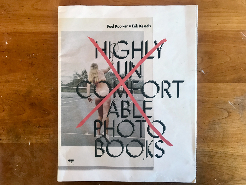
But why stop at photographs? It turns out that found photobooks too can receive the same treatment. This is the conceit behind a series of tabloid broadsheets authored jointly by Kessels and Kooiker. Printed without fuss on non-archival newspaper and titled with ironically accurate descriptions, each one opens a narrow window into the eclectic personal libraries of Kooiker and Kessels. The first was Terribly Awesome Photo Books in 2012. Next up was Incredibly Small Photo Books in 2014. This past fall came the latest in the series, Highly Uncomfortable Photo Books (HUPB). All are published by Art Paper Editions using similar size, format, and design elements.
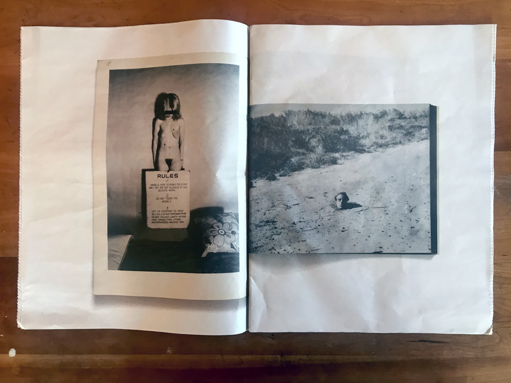
A quick glance at the cover of HUPB hints that its contents may indeed prove uncomfortable, just as advertised. It shows a nude woman swinging a tennis racket at an overhead serve, photographed from the baseline. Her body is partly obscured by the title lettering, and also by a large hand-drawn X. This is a page from Basic Tennis, part of a bizarre “How-To” series illustrating various outdoor recreations using nude models. Perhaps these books were intended as soft-core porn when published originally in the early seventies; it’s hard to know for sure. What’s certain is that athletics and titillation are an awkward combination. Looking at this book some fifty years after its release, it’s hard to slot it comfortably into any nonironic context, except perhaps the deep-dive bookshelves of serious photo nerds.
In another nod to seventies soft-core, the best place to begin HUPB is probably at the centerfold. This is a two page spread with cover shots of every book included. There are forty-four in all, each one represented by a small icon and basic information: title, publisher, year, size, and language. According to Kessels, the books were sourced “from the need to find images that exist on the fringe of regular commercial photo books. It’s only in this area that it’s possible to find images with an uncontrived quality. Books like this are rarely available in regular shops and have to be found, like a treasure, in thrift stores and from antiquaries.” Browsing the titles one can sense the thrill of the hunt, as we peek vicariously over the shoulder of two compulsive crate-diggers.
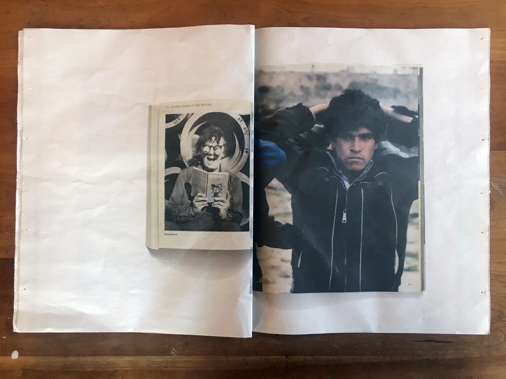
Like any hip-hop artists worth their salt, Kooiker and Kessels have taken this “fringe” material, obscured categories and expectations, stripped away pretentions to high or low art, and then presented their sampling sources as a homogenous plasma. Classic photobooks such as Nancy Burson’s Faces (1993), Les Krims’ Making Chicken Soup (1972), Jo Spence’s Putting Myself In The Picture (1988), and Michael Schmelling’s The Plan (2009) dot the centerfold alongside bygone underperformers like Dictionary of Russian Gesture by Barbara Monahan (1983). Patricia Perry and Marietta Lynch’s Mommy And Daddy Are Divorced (1985) and Gilbert Oakley’s 1970 guide An A To Z Of Spanking won’t likely turn up on any photography 101 syllabus. Nor will the 1955 Romanian medical compendium Dermotologie & Verenologie.
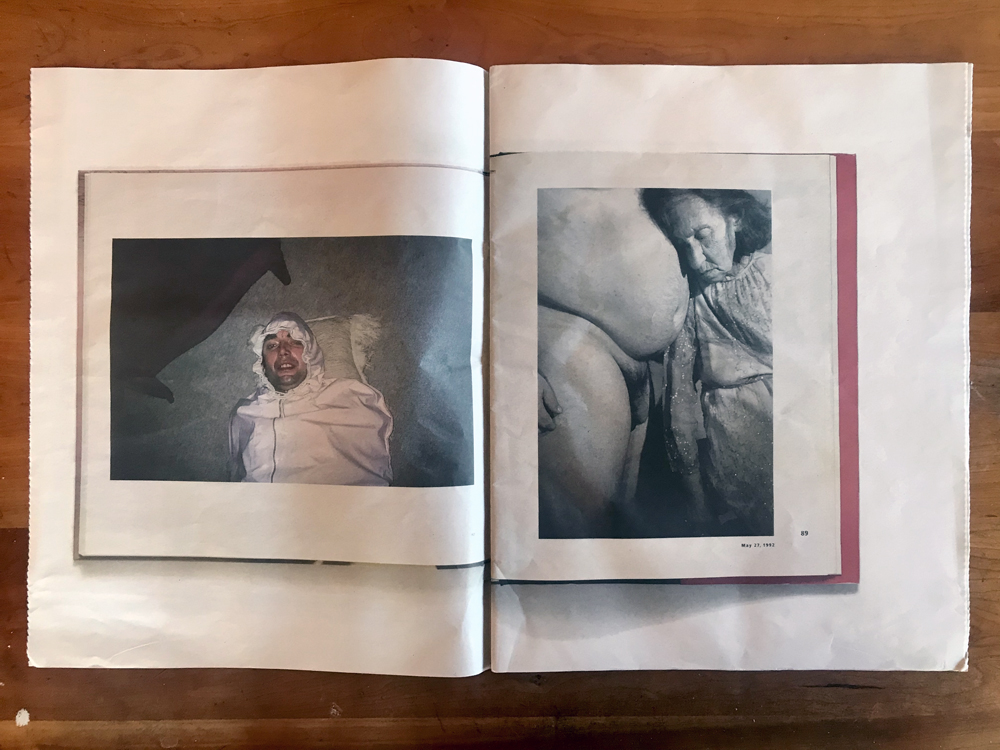
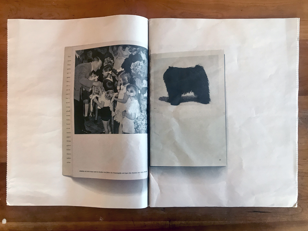
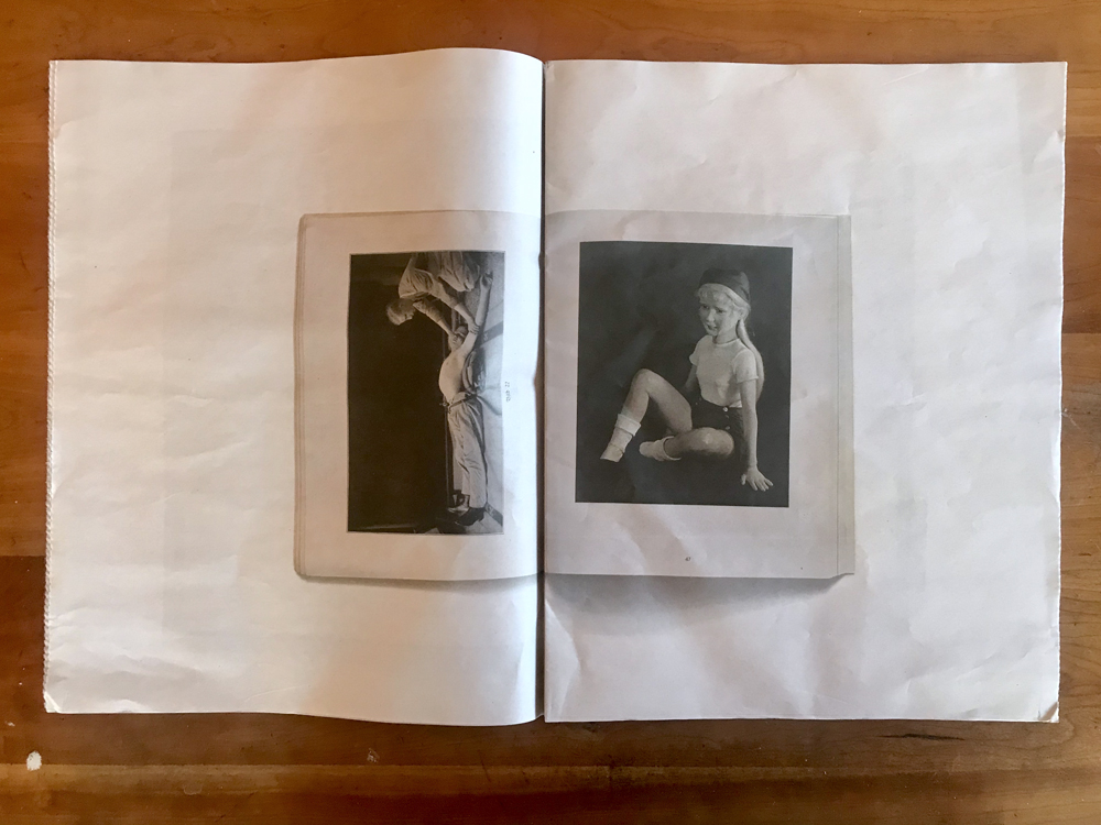
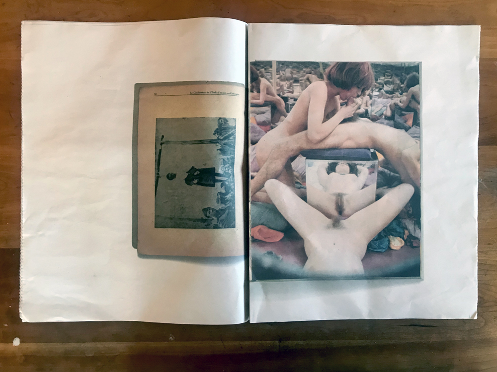
Represented here only by cover, it’s hard to know what any particular book is about or how to put it into context. But for present purposes that’s fine, because only one spread from each title is shown. HUPB employs a design style for this task which is clever and potentially expansive. Each full tabloid page (60 cm by 37 cm) shows an original facsimile spread printed in the center of its front and back. When these pages are halved and nested into a tabloid fold, the result is a sequence of diptychs, each one formed from two half-images. Each pair is a sort of simplified collage, bifurcated vertically in the center into a dual image. For the first half of the pamphlet these depict one split, and in the second half we see the reverse combination (it makes more sense when seen in person). With no page numbers or staples, the loose leaves can be reshuffled by the reader into countless new permutations. For the purpose of this review, I’ll leave my copy intact and refer to the original sequencing.
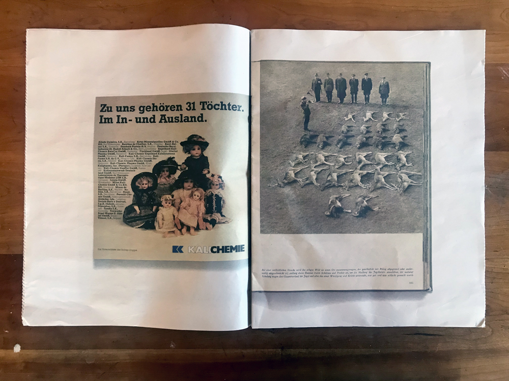
As the title implies, the books are highly uncomfortable, and the same can be said for particular samplings. With such material it would be tough to create any diptychs that feel tame, but Kooiker and Kessels seem to take extra pleasure in disturbing doublets. “Elements on their own often have no relevance,” says Kessels, “unless they are put together or juxtaposed with something else,” an edict which HUPB thrusts in the viewer’s face at every turn. One of the first spreads shows a man on the floor in what looks like infant clothing. He is paired with a sleepy couple, an older woman in wrinkled frock nodding off near her partner’s naked fat midsection. What’s going on here? Both halves of the diptych are cryptic at first. A bit of sleuthing online reveals the original sources (the first image is from Polly Borland’s The Babies and the second from Donigan Cumming’s Pretty Ribbons), but without that effort the reader remains ignorant and open to suggestion.
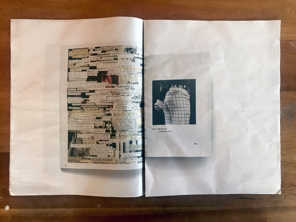
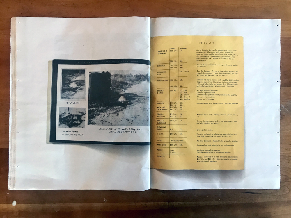
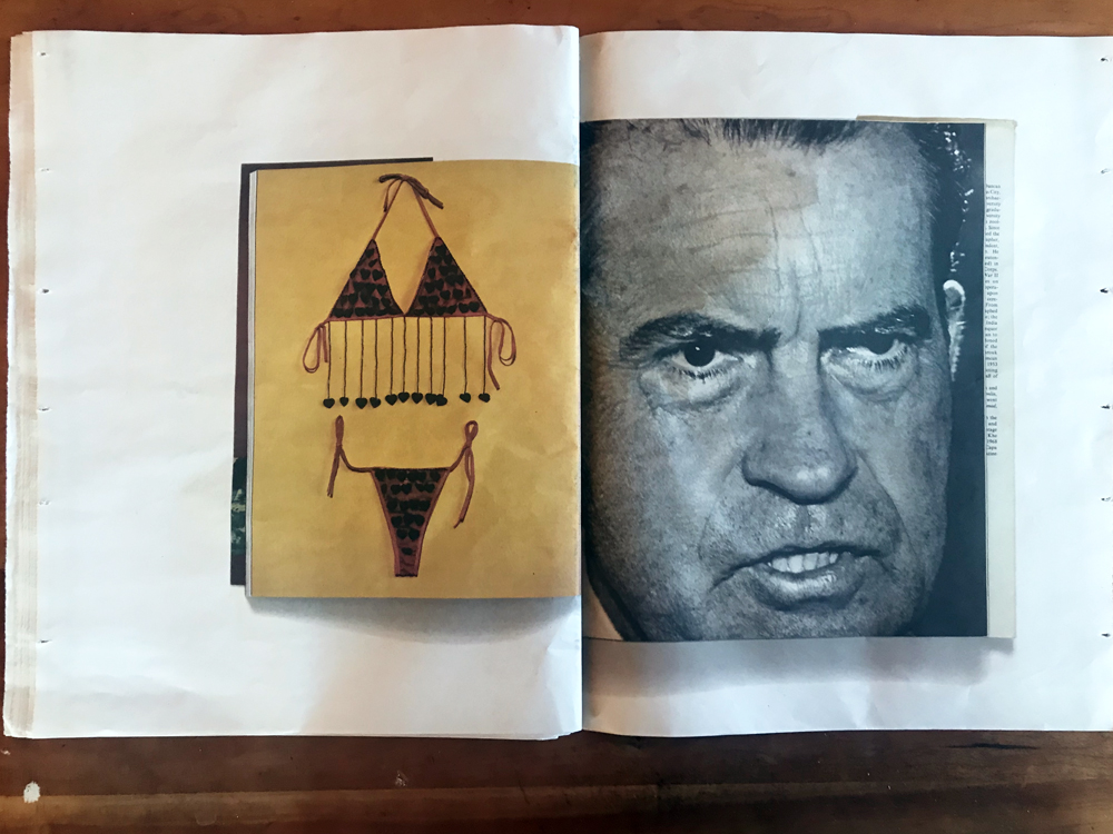
A few pages later the helpless reader is shown a strange rubber toy paired up with a woman doing calisthenics. Then a German tennis player’s thin form roughly complements an elongated headshot of Bashar Al-Assad. A man with arms akimbo sits across the fold from a woman breastfeeding a bearded man. A page of small notes in German gets matched with a thumb pointed at someone’s seat, with the label “Kiss my ass!” Freakish and peculiar images pile on. As the material incorporates orgy photographs, rotting corpses, and a price list of sexual fetishes, the discomfort level rises. The reader is unsure how to process any of these things, while beset by a creeping sense of pranksterism.
If HUPB has a goal—an uncertain proposition—it’s to reveal the latent absurdities of an image-based culture. The basic strategy to get there is visual discontinuity, an outlook in line with Kessels’ profession. For a communications executive, images are merely tools to be applied as needed in support of ulterior motive. In the right context, a piece of fruit might represent a computer, or a mermaid might be a brand of coffee. A branding guru might be “a visual sorcerer” or “modern anthropologist” (both labels have been attached to Kessels). Strip away a picture’s origins and the possibilities stretch wide open. Of course, photographic artists have been tinkering with this formula for decades. Artists ranging from Mandel and Sultan to Penelope Umbrico to Joachim Schmid to Johanna Calle have all taken a shot. But few have pushed the element of whimsical humor as far as Kessels and Kooiker. Their tabloids come with a wink and a nod, edging occasionally into outright laughter.
For Kessels, this is familiar territory. A farcical element is evident in most of his books. Titles like Missing Links, Shit, Human Zoo, Failed It, Shining In Absence, the Useful Photography series, and the In Almost Every Picture series have more in common with Spinal Tap than high art. Paul Kooiker—whose latest book The Rumour features 19 donkey photos as “…a statement about surrealism”—fits the brief as well. Both authors realize that by celebrating the basic absurdities of everyday existence, expectations are turned on their head.
“We are submerged in slick, beautiful, highly produced creative work – in fashion, design and the arts,” says Kessels, “But perhaps even more inspirational than this are examples of ordinary people’s creativity. Their mundaneness makes them no less worthy of attention.” If one considers early millennial compendiums like Andrew Roth’s The Books of 101 Books or the three Parr/Badger volumes as examples of “highly produced” books, the Kooiker/Kessels tabloids are a natural rejoinder. They may be low-budget affairs printed on cheap newsprint, featuring outlandish titles. But who’s to say they’re any less authoritative? If photography continues its current path of splintering and reconsumption, the Kooiker/Kessels tabloids may eventually prove prescient.
Collector’s POV: Paul Kooiker is represented by Tegenboschvanvreden in Amsterdam (here) and Galerie Zink in Germany (here). And although he has curated numerous exhibitions, Erik Kessels does not appear to have consistent gallery representation at this time, so interested collectors should likely connect with him directly via his website (linked in the sidebar.) Kooiker’s work has little secondary market history, so gallery retail likely remains the best option for those collectors interested in following up.