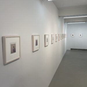
JTF (just the facts): A total of 33 black-and-white and color photographs, framed in black and matted, and hung against white walls in the single room gallery space. 28 of the works are gelatin silver prints (including 1 diptych), made between 1957 and 1972. Physical sizes range from roughly 9×7 to 13×17 inches (or the reverse), and no edition information was provided on the checklist. The other 5 works are c-prints, made between c1965 and c1970. These prints range in size from roughly 8×13 to 11×13 (or the reverse), and again, no edition information was provided. (Installation shots below.)
Comments/Context: With hand-crafted line drawings on the wane in the magazine world of the early 1950s, commercial illustrator David Attie knew he had to make the jump to photography. So he signed up for Alexey Brodovich’s class at the New School (which was held in Richard Avedon’s studio), and in preparing his very first assignment, stumbled on the photomontage techniques that would become his path forward. A wavering, underexposed image of the interior of Penn Station, on view in this show, was his creative starting point, the usually sturdy beams of the station made strangely flexible by his layering of imagery.
In the subsequent years (through the 50s and 60s), Attie’s photomontages would grace the covers of Time, Newsweek, Vogue, Bazaar, and other magazines large and small, leading to a range of other commercial work, including celebrity portraits and book illustrations. This tightly edited sampler show provides a succinct survey of Attie’s photographic career, particularly highlighting the innovation found in his decades-before-Photoshop image experiments.
Many of Attie’s early works use New York city, and its notable landmarks, as raw material for deliberate pictorial disruption. Images of Times Square at night, the Flatiron building, the Brooklyn Bridge, Washington Square Park, and the wider city skyline are all interrupted by Attie’s techniques. Some are made watery, with the city’s straight lines and bold geometries dissolving into insubstantial uncertainty. Others use the flight of pigeons to create foreground distraction in front of the iconic views, with a hint of threat that Alfred Hitchcock would amplify in The Birds just a few years later. And a pair of images (one from slightly later in Las Vegas) layer fragments of neon signage into cacophonous overlaps of stylized, energetic wordplay.
Attie’s in-studio constructions are even more risk-taking and unexpected. His first big break in commercial photography came in montages made for Esquire (commissioned by Brodovich), illustrating Truman Capote’s Breakfast at Tiffany’s. As seen here, Attie created a shifting still life of a guitar, a weary house plant, and a cat seen three times (or more), the ghosts of the animal pushing elusive movement throughout the composition. Attie’s images for Bill Manville’s 1960 memoir Saloon Society employ similar techniques, mixing female nudes and faces with multiplied arrangements of hazy liquor bottles and atmospheric wisps of smoke. Other works pushed boundaries in other directions, building arrays of eyes with dark feathery eyelashes, adding reversed tonality blocks to male heads, and sinking toy ships and airplanes in bubbling water.
When Attie applied some of these montage innovations to his commissioned portraits, the results were often electric. His portraits of Lorraine Hansberry are perhaps his best known, especially the one here where the smiling playwright is doubled by her own thinking face. In other portraits, Attie used montage as allusive embellishment, with conductor Leonard Bernstein’s baton given light trails, songwriters Jerry Leiber and Mike Stoller intermingled with their own musical scores, and Broadway producer David Merrick surrounded by the neon lights of his shows. Many years later, even photographer Lisette Model got the montage treatment, her seated portrait given a ghostly instability.
While there are only a handful of Attie’s works in color on view in this show, their frenetic energy is hard to overlook. A 1965 montage of box stamps (like “fragile”, “handle with care”, “rush”, arrows with “up”) adds color to the typography jumble, the stamps piled on top of each other until they become a whirlwind of graphic design. A pharmaceutical montage from 1970 offers a deeper edge of cynicism, with smokestacks, x-rays, and a skeleton interleaved with pills and families. And sexy playfulness is the mood of Attie’s 1968 image of a model with his view camera, the alternate silhouettes split into cyan, magenta, and yellow, and overlapped into one hybrid image that feels like a dance.
Based on the visual evidence presented here, Attie deserves to be better recognized for his mid-century contributions to magazine photography, and to photographic manipulation more broadly. His recent exhibit at the Brooklyn Historical Society and his inclusion in the current Modern Look: Photography and the American Magazine show at the Jewish Museum (with two images from the Saloon Society series) are a start. Some seventy years later, his explorations of photomontage remain durably inspired, innovative, and visually dynamic.
Collector’s POV: The works in this show are priced between $5000 and $8500. Attie’s work has little secondary market history, so gallery retail remains the best option for those collectors interested in following up.


