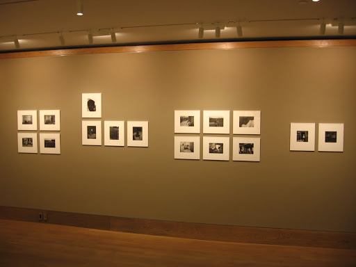
 JTF (just the facts): A total of 43 black and white images, framed and matted in extremely thin white frames with very little depth, and hung in groups against light brown walls in the main gallery space. All of the images were taken in 1967 and 1968 and are vintage 8×10 (or reverse) gelatin silver prints. The works have been installed as a historically accurate recreation of the 1970 show at the MoMA; installation photographs from the original exhibit (found in the price list booklet) show that the prints have been hung in the same manner (subject to the constraints of this particular space). (Installation shots at right.)
In addition to the prints in the main gallery, there are a variety of other ancillary mini-exhibits also on view. In the book alcove, there are 16 images from the expanded version of East 100th Street; these are works that did not appear in the MoMA exhibit. They are 11×14 modern prints, framed and matted in thicker white frames, and hung against cream colored walls. A glass case also holds a sample of vintage books.
The first viewing room holds a total of 11 platinum prints of Central Park, made by Davidson in the 1990s and printed in 2008. The works are either 5×12 or 6×10 and are framed and matted in black.
The second viewing room has a total of 6 vintage images from Davidson’s series on Brooklyn gangs from the 1950s. Most of the images are approximately 13×9 (or reverse) and are framed and matted in black.
And finally, in the back room near Greenberg’s office, there is a small selection of 6 vintage images by Man Ray: 2 rayographs, 2 nudes and 2 portraits (Picasso and Cocteau). The works are from the 1920s and 1930s and are variously framed and matted.
 Comments/Context: Since its publication in 1970, Bruce Davidson’s East 100th Street has been a controversial body of work. Many have hailed it as a classic of social documentary photography, while others have criticized it as particularly exploitative. This exhibit is a kind of time machine, taking us back to the show of these images at the MoMA, as curated by John Szarkowski; the sequencing and grouping, even the frames are for the most part exactly the same. Of course, it is impossible to also transport our minds back nearly 40 years and react to the images in the same polarized way visitors did back then. All we can do is see them through the lens of the present, a kind of revisionist history of the resonance of the pictures and how well they have aged.
.
.
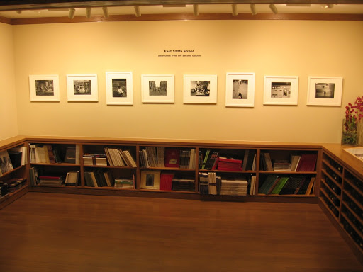 Seeing how Szarkowski edited and displayed Davidson’s work is an interesting sidelight to this exhibit. The images in the book alcove didn’t make Szarkowski’s show, so there is a contrast set up, an “in” and “out” dynamic that is intriguing. Szarkowski clearly gravitated toward Davidson’s interior relatively up-close portraits; his show is nearly all examples of this genre, while many of the additional images are pictures Davidson took in the street, of buildings, and of people from a distance, setting the scene. Szarkowski also avoided a simple “all in a line” hanging for the prints; there are groups, grids, pairs, and uneven out of line images that break the monotony, all carefully selected to work together or in juxtaposition. Seeing his unconventional hanging of this work was a good reminder of just how much difference attention to these details can make in telling the story of a body of work.
.




I'm not sure why you're surprised at the “knowing looks” on the subjects' faces. Davidson used a large format camera, mounted on a tripod, for this project. The subjects' cooperation — their awareness of being photographed by a white man with a large camera — is essential to an understanding of the images.
As for the “awkward tension” you perceive in each image, I suggest that that may say something about you as a viewer than anything else. Portraiture is 1 part subject, 1 part photographer, and 1 part viewer. Some viewers may not like confronting the fact — and it is a fact — that poor people live just blocks from them, in horrific conditions hard to imagine from a Park Avenue co-op.
But you're right about the passage of time; it allows us to get away from the whole “social critique” aspect of the pictures, and lets us just see the pictures as pictures, free from both do-gooder cheerleading and PC bitching.
And, for my 2 cents, they're damn good pictures.
All potentially fair points.
I guess the thing that struck me about this show is that if we look at these pictures from a current vantage point, without the heightened racial tension of a white photographer making pictures of black subjects at that time, and simply look at them as a group of portraits, I would submit that the tension, reluctance, awkwardness, whatever we want to call it makes the pictures somewhat less successful. Maybe the question really is: can we look at these pictures in a “race-blind” way, and if we do, how do they stand up? (You may argue that this is precisely impossible, but bear with me.) Put DeCarava's (or others – pick your favorite) portraits of similar subjects side by side with these, and judge them on their merits alone (not on the race of the photographer, or the history, but on the ability to capture the real emotions of the subjects) and I bet the “distance” in Davidson's pictures would be even more noticeable.
This is not meant as a knock against Davidson or his accomplishments, just an exercise in cross time period comparison. I certainly agree they are well made pictures. I guess I just saw them quite differently this time, taken more fully OUT of their historical context.